The Albertsons Logo History, Colors, Font, And Meaning

Imagine a beacon, vivid and familiar, guiding countless shoppers to their weekly bounty of goods. The Albertsons Logo stands as more than a mere marker; it encapsulates a legacy—an intricate tapestry of community, nourishment, and trust.
Nestled within its curves and colors thrives a saga of American retail prowess, each swirl a chapter, every hue a character. The evolution of this emblem mirrors the retail giant’s journey, a reflection of the industry’s pulse and society’s evolving tastes.
Readers are about to embark on a rich exploration, a dive into the depths of how an icon shapes consumer heartbeats, sways market tides, and carves a niche in the bustling supermarket saga.
This unveils the significance of a logo, beyond the graphic design sphere, beyond the vibrant storefront—it’s the silent envoy of a brand’s soul.
By closing this narrative, expect to unravel the impact of branding strategy, and the logo’s influence on customer loyalty—vital knowledge residing within the emblematic emblem of Albertsons Companies.
Dive deep into the extraordinary narrative. Decode the symbol. Witness the power.
The Meaning Behind the Albertsons Logo
![]()
You know, when I look at a logo, it’s like peeling an onion. Layers and layers of meaning, right? Let’s unravel that onion for the Albertsons Logo.
Symbolism and Connection
The Albertsons logo, at its core, embodies trust and community. The prominence of the name suggests a brand that stands confidently in the market, giving you that warm, fuzzy “hey, I can rely on them” vibe. The straightforward design kinda says, “We’re here, we’re dependable, and we got what you need.”
The Brand Message
Every logo has a story, and this one’s telling you about legacy and commitment. It doesn’t shout; it subtly whispers about quality and value. It’s like Albertsons is saying, “Come on in, friend. We’ve been around, and we know our stuff.”
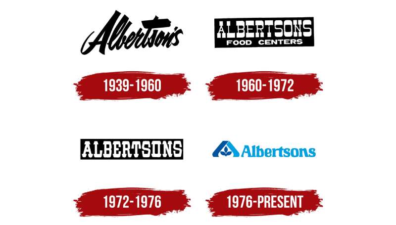
The History of the Albertsons Logo
Okay, so here’s a trip down memory lane.
The Humble Beginnings
When you dig deep, you’ll find that Albertsons started off as this little vision. A single store, an entrepreneur’s dream. As the company expanded, so did its brand identity. The logo evolved, growing with the times yet holding onto its roots.
Adaptation Over the Years
Like any good outfit, Albertsons knew when to change their look to keep things fresh. It’s been tweaked here and there, but always maintained that familiarity. You know, like when you get a haircut but still look you.
The Colors of the Albertsons Logo

Colors, oh the drama they bring! Here’s the scoop:
Blue: Trust and Loyalty
Do you see that blue? It’s not just any blue. It’s the blue of trustworthiness, of loyalty, and of depth. It feels inviting and safe.
The Font Used in the Albertsons Logo
Let’s talk typefaces!
Bold and Legible
The font screams clarity. There’s no squinting here. It’s bold, legible, and oh-so contemporary. It’s like that friend who always speaks their mind – straightforward and clear.
Albertsons in Pop Culture
This is where things get fun!
Movies and TV Shows
You’d be surprised how many times the logo has made sneaky appearances in the background of your favorite scenes. It’s become this low-key symbol of everyday America.
Influencers and Albertsons
Even in the digital age, that logo’s popping up in the most unexpected places, with online celebs casually referencing or showcasing the brand.
The Artistic Perspective
Ever looked at a logo and thought, “What would an artist say?”
Abstract Interpretation
If I were to paint the Albertsons logo, I’d see it as a dance between tradition and modernity. The lines, the colors, they all converge to create this harmonious balance.
Iconic Status
In the world of design, achieving iconic status isn’t easy. But with its recognizability and timeless appeal, Albertsons has firmly planted its flag in that territory.
The Albertsons logo isn’t just a brand mark. It’s a tapestry of history, emotion, and artistry. Every time you glance at it, there’s a story waiting to be told.
FAQ On The Albertsons Logo
What does the Albertsons Logo represent?
The emblem embodies the corporate identity of Albertsons, a testament to its roots in the grocery industry and its promise of quality. The blue color conveys reliability, while the script asserts a personal, friendly approach to retail.
How has the Albertsons Logo changed over time?
Over decades, the logo has adapted, reflecting modern tastes and branding strategies. It has transitioned from a retro look to a more contemporary aesthetic while maintaining core elements that honor the company’s rich history.
Who designed the original Albertsons Logo?
The original design sprung from the creative minds eager to represent Joe Albertson’s vision. Detailed records of the individual designer are elusive, a common reality of the era’s advertising campaigns.
What colors are used in the Albertsons Logo?
Traditionally, blue and white hues dominate the palette, promoting a clean, trustworthy image. The choice echoes a visual identity synonymous with freshness and hygiene, crucial in the food retail sector.
Is the Albertsons Logo trademarked?
Absolutely, the Albertsons logo is a legally protected trademark. This shields the brand’s visual identity and prevents unauthorized use, securing its unique market positioning.
Can the Albertsons Logo be used for personal or commercial purposes?
Usage of the logo for any commercial sign or personal promotion without explicit permission infringes on trademark laws. Legal use is typically reserved for official branding and partner marketing.
What significance does the font of the Albertsons Logo have?
The Albertsons logo’s script-like font imparts a sense of approachability and warmth—key branding elements. It’s designed to evoke feelings of home and familiarity, essential for a business centered on daily family needs.
Are there different versions of the Albertsons Logo for various products?
Within Albertsons’ broad range of product brands, such as Signature Select and Lucerne, branding is tweaked to suit different products while keeping the overarching brand identity intact.
How does the Albertsons Logo enhance customer experience?
A consistent logo across all platforms and stores fosters a cohesive customer experience. It ensures brand recognition, comfort, and trust in the brand’s promise of quality.
What impact has the Albertsons Logo had on the company’s success?
The logo has played a pivotal role, acting as a silent ambassador for the company. Its positive consumer perception bolsters Albertsons’ brand equity, influencing both customer loyalty and sales.
Conclusion
In this exploration, the journey through the curves and hues of the Albertsons Logo has been revealing. It’s witnessed as more than mere graphic design; it’s the heartbeat of a brand that feeds millions. This emblem isn’t just plastered on store fronts or weekly ads; it resides in the fabric of grocery history, woven into every customer experience and brand strategy.
Drawing this story to a close, one can’t help but admire the logo’s role in solidifying consumer trust and enhancing brand recognition. It has become a beacon of retail identity that stands strong in the ever-evolving landscape of supermarkets.
From discussing the intricate embroidery of its visual identity to assessing the silent power it exerts in the competitive arena of food and drug retailers, this narrative seals the understanding that behind every successful logo is a tale of corporate branding, customer loyalty, and market triumph. It’s these stories that inspire and provoke thought, leaving a lasting imprint, much like the symbol of Albertsons itself.
If you liked this article about the Albertsons logo, you should check out this article about the 7-Eleven logo.
There are also similar articles discussing the Aldi logo, the Carrefour logo, the Circle K logo, and the Costco logo.
And let’s not forget about articles on the Giant logo, the QuikTrip logo, the Safeway logo, and the Sainsbury’s logo.
Bogdan Sandu, a seasoned designer with 15 years of diverse experience, has been designing websites since 2008.
Renowned for his expertise in logo design and visual branding, Bogdan has developed a multitude of logos for various clients.
His skills extend to creating posters, vector illustrations, business cards, and brochures. Additionally, Bogdan's UI kits were featured on marketplaces like Visual Hierarchy and UI8.
Latest posts by Bogdan Sandu (see all)
- The Capcom Logo History, Colors, Font, And Meaning - 26 April 2024
- Earth Color Palettes Grounded in Nature: 40 Examples - 26 April 2024
- The EA Logo History, Colors, Font, And Meaning - 25 April 2024