

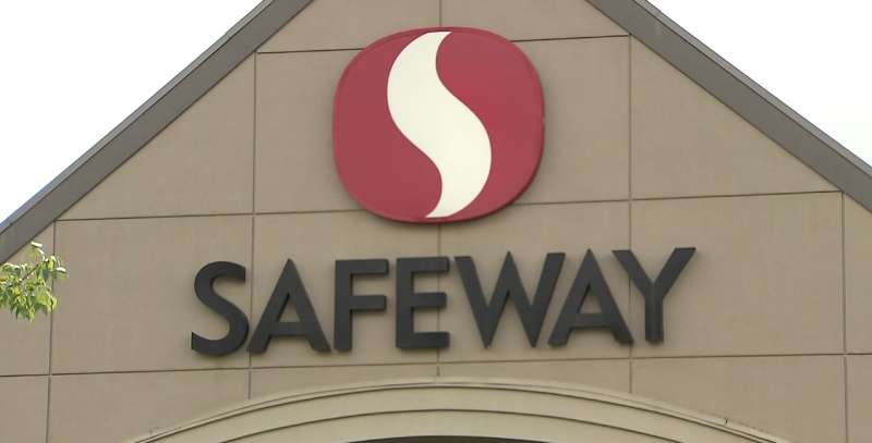
The Safeway Logo History, Colors, Font, And Meaning
Every brand carries a story in its emblems. The Safeway Logo is no less – an icon that has evolved with time, standing as a testament to the supermarket’s rich heritage.
This insignia isn’t merely a label; it’s a mosaic of memories for countless shoppers, a beacon of familiarity, and a chapter in the anthology of American retail.
In this deep-dive examination, we unfurl the intricacies behind a symbol that graced countless storefronts.
As the digital brush strokes delineate the design trends, one gains insight into how a logo fosters customer loyalty, morphing from a mere graphic to a retail titan’s flag bearer.
You’re poised to uncover the mastery behind the hues, the strategic marketing that the emblem silently screams, and the story it tells—an odyssey of brand recognition and supermarket symbolism.
From the embodiment of corporate branding to the nuances of grocery store emblems, the curtain rises on an exposé of the visual identity system that is Safeway’s public face.
The Meaning Behind the Safeway Logo
A Symbol of Trust
You see, logos aren’t just designs. They tell stories. The Safeway logo is more than just a name in a design. It’s a symbol of trust, quality, and a commitment to serving communities.
Every time someone walks into a Safeway store, they’re expecting a certain experience, right? This logo reassures customers that they’re in good hands.
Familiarity and Home
Have you ever thought about why some logos just feel… comforting? The Safeway logo, with its recognizable design, evokes a sense of familiarity.
For many, it feels like home, like walking into a neighbor’s kitchen. The design does an awesome job of making folks feel at ease.
The History of the Safeway Logo
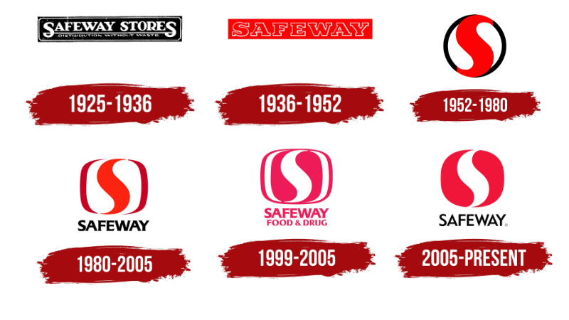
Humble Beginnings
Way back when Safeway started small. Just like the sketches behind any piece of artwork, Safeway’s logo has its roots.
Over the years, it has been tweaked and polished. It’s like watching a kid grow up, you know? Every change reflects a new chapter in the brand’s journey.
Evolution and Adaptation
Like any good design, the Safeway logo evolved with time. It adapted to the vibes and trends of different eras.
Sometimes it was about staying fresh and relevant. Other times, it was about standing out from the crowd. But always, always, it stayed true to its core values.
The Colors of the Safeway Logo
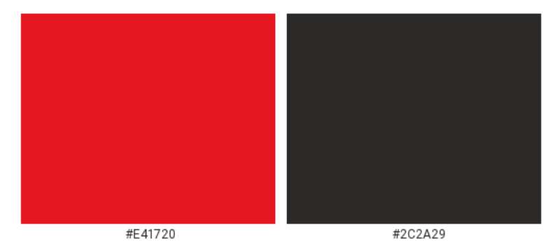
Red: Passion and Energy
Red isn’t just a random choice. Nope. It symbolizes passion, energy, and love. Safeway’s use of red indicates their passion for quality and their energy in serving communities.
White: Purity and Simplicity
White, on the other hand, speaks of purity and simplicity. It’s like the canvas of a painting – unassuming, but super crucial. In the Safeway logo, white reflects the brand’s straightforward commitment to its customers.
Black: Sophistication and Strength
Black in the Safeway logo is more than just a design choice; it’s a statement. This color embodies sophistication, strength, and reliability. It’s a color that commands respect and suggests a solid foundation. In the context of Safeway, black anchors the other colors, adding a level of seriousness and authority to the brand’s image.
The Font Used in the Safeway Logo
Classic Yet Contemporary
Have you ever looked at a font and felt something? The font in the Safeway logo is like a bridge between classic and contemporary vibes. It’s bold, making a statement, but still friendly and welcoming.
Legibility and Recognition
The clear, easy-to-read font ensures that even from a distance, you recognize the brand. It’s like spotting an old friend in a crowd. Familiar and comforting.
The Shape and Layout
A Circular Dance
The elements in the Safeway logo play around in a circular dance. Circles often symbolize unity and completeness. For Safeway, it represents the complete and unified shopping experience they offer.
Balance and Proportions
The logo isn’t just slapped together. Nope. There’s a clear thought on balance and proportions. Every element has its space, making the entire design harmonious and pleasing to the eyes.
Cultural Impact and Reception
More Than Just A Store
Over the years, the Safeway logo has become synonymous with grocery shopping for many. It’s transcended its status as just a logo and become a cultural icon in its own right.
Memories and Nostalgia
For some, it brings back memories of childhood grocery trips or late-night snack runs. It’s more than just ink and color; it’s an emblem of shared experiences and stories.
FAQ On The Safeway Logo
How has the Safeway Logo changed over time?
Its transformation tells a story; from simple typography to a dynamic, ribbon-esque emblem. The current iteration boasts modernity, subtly nodding to its origins. A dance between tradition and innovation, encapsulating the store’s history while marching forward.
What does the Safeway Logo represent?
More than just a name, it’s a beacon of quality, trust, and stability in the retail world. The logo’s elements symbolize promise – promise of freshness, variety, and community rapport. It’s a visual handshake between the supermarket and its patrons.
Who designed the Safeway Logo?
The logo’s exact design lineage is shrouded in brand archives. However, its evolution suggests fingerprints of skilled design firms over time, all honoring the core tenets of retail marketing and brand identity consistency.
Why did Safeway choose its current logo color scheme?
Chosen for visual impact, the red and white color scheme stands for vitality and purity. These hues resonate with customers’ pulse and align with the principles of color psychology, reflecting Safeway’s spirited commitment to quality and cleanliness.
Is the Safeway Logo trademarked?
Certainly, as with any corporate branding asset of its stature. The logo holds trademark status, safeguarding its uniqueness and the brand equity it commands. This legal protection signals the retail giant’s position in the supermarket industry.
What role does the Safeway Logo play in marketing?
This emblem functions silently yet potently in the realm of visual marketing. It’s both a navigational tool and a silent herald of the shopping experience, instrumental in ad campaigns and establishing brand recall.
How do customers perceive the Safeway Logo?
It stands as a symbol of familiarity and trust. For shoppers, Safeway’s logo is synonymous with grocery quality and consistency, entwining with their routine, becoming a part of community fabric and nurturing customer loyalty.
How often has the Safeway Logo been redesigned?
Over decades, it’s seen only a handful of redesigns. Each time, the changes were subtle yet powerful, ensuring the logo adapts to the tides of time and retail imaging demands without losing its iconic character.
What marketing strategies has Safeway implemented with its logo?
Safeway has seamlessly woven the logo into comprehensive branding strategies. From billboards to shopping bags, it’s omnipresent, ensuring brand recognition.
The strategy extends to online platforms, keeping the supermarket chain aesthetics consistent across digital and physical realms.
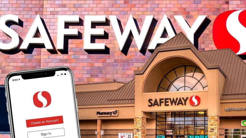
How is the Safeway Logo utilized inside the stores?
It’s far more than an outside emblem. Inside, it marks every turn, reinforcing brand presence and guiding the shopping journey.
Through consistent storefront branding and visual identity systems, the logo assures a uniform experience, making every aisle part of the larger Safeway narrative.
Conclusion
Peering through the lens of branding, the Safeway Logo is more than a mere emblem. It’s an enduring narrative, entwined with America’s retail saga, mingling familiarity with vivacious freshness that the supermarket realm demands.
This cherished icon stands proudly, promising an odyssey of shopping experiences where every corner turned whispers quality. Illuminating grocery aisles and sparking recognition, the logo—sleek, modern, yet respectfully reminiscent of its lineage—navigates the tides of time with stalwart grace.
In dissecting its palette and design, the evolution reflects a mindful orchestration of visual identity, supermarket symbolism, and an unabating pledge to consumer trust.
As the final sentiments on this tapestry of visual communication settle, let’s acknowledge the emblem’s prowess in the grand theater of the grocery chain – a beacon both of heritage and of forward stride, harmonizing the symphony of brand recognition and consumer allegiance. This insignia isn’t just seen; it’s experienced—a signature that writes itself into the daily lives of the loyal.
If you liked this article about the Safeway logo, you should check out this article about the 7-Eleven logo.
There are also similar articles discussing the Albertsons logo, the Aldi logo, the Carrefour logo, and the Circle K logo.
And let’s not forget about articles on the Costco logo, the Giant logo, the QuikTrip logo, and the Sainsbury’s logo.
Bogdan Sandu, a seasoned designer with 15 years of diverse experience, has been designing websites since 2008.
Renowned for his expertise in logo design and visual branding, Bogdan has developed a multitude of logos for various clients.
His skills extend to creating posters, vector illustrations, business cards, and brochures. Additionally, Bogdan's UI kits were featured on marketplaces like Visual Hierarchy and UI8.
Latest posts by Bogdan Sandu (see all)
- Brewed to Perfection: Coffee Color Palettes for Warm Designs - 8 May 2024
- The Singha Logo History, Colors, Font, And Meaning - 7 May 2024
- Soft Cream Color Palettes for Subtle Designs - 7 May 2024