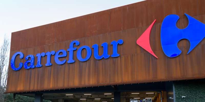
The Carrefour logo is one of the most recognizable retail brand marks in the world, built around a clever negative space design that hides a letter “C” between two opposing arrows. Carrefour, founded in France in 1958, has refined its visual identity across several decades. The current logo uses a clean, modern wordmark paired with a bold symbol in red and blue. It has gone through roughly five major design iterations since the brand launched.
Few retail logos carry as much design history as Carrefour’s. Its symbol is regularly cited in branding discussions about negative space, sitting alongside logos like FedEx as examples of hidden visual meaning done well.
What Is the Carrefour Logo?
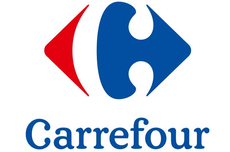
The Carrefour logo is a combination mark featuring a negative space “C” symbol formed by two opposing arrows in red and blue, paired with a bold sans-serif wordmark. The current version was refined in the 1980s and is closely associated with French design agency work, representing movement, direction, and crossroads.
- Design Type: Combination mark (symbol + wordmark)
- Primary Elements: Negative space arrow symbol, sans-serif typography, dual-color scheme
- Official Introduction Date: The core symbol concept was introduced in 1966; the modern refined version took shape in 1981
- Designer/Agency: The 1966 symbol was created by Marcel Revol; later refinements involved various brand consultants
- Trademark Status: Registered trademark, owned by Carrefour S.A., protected across all major global markets
- Color Palette: Carrefour Blue (#004A97), Carrefour Red (#E3000F)
- Usage Context: Store signage, packaging, digital platforms, marketing materials, uniforms, and shopping carts
How Has the Carrefour Logo Evolved Over Time?
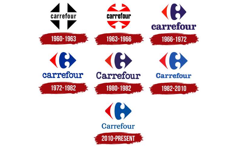
Carrefour’s visual identity has shifted from a text-heavy early mark to the tight, symbol-driven design seen today. The biggest leap happened in 1966 when the brand introduced the iconic arrow concept. Since then, changes have mostly been refinements rather than full overhauls.
Original Carrefour Logo (1958-1966)
- Years Active: 1958-1966
- Design Description: Simple wordmark using the Carrefour name in a basic serif typeface, no symbol
- Color Scheme: Black and white
- Designer: Unknown/internal
- Context: Brand launched as a regional French hypermarket; identity was functional, not designed for global reach
- Key Changes from Previous: First version, no predecessor
- Cultural Significance: Reflected the no-frills retail culture of postwar France
Arrow Symbol Introduction (1966-1973)
- Years Active: 1966-1973
- Design Description: Introduction of the negative space “C” formed by a red arrow pointing left and a blue arrow pointing right
- Color Scheme: Red and blue, black wordmark
- Designer: Marcel Revol
- Context: Carrefour was expanding rapidly; the brand needed a symbol that communicated scale and movement
- Key Changes from Previous: First use of the arrow mark and dual-color system
- Cultural Significance: Introduced one of the earliest known negative space techniques in retail branding
Refined Wordmark Era (1973-1981)
- Years Active: 1973-1981
- Design Description: Symbol retained; wordmark updated with a cleaner sans-serif style and tighter letter spacing
- Color Scheme: Red, blue, white
- Designer: Unknown/internal brand team
- Context: Carrefour was going international; the identity needed to read well across different languages and signage formats
- Key Changes from Previous: Typography modernized, overall mark made more compact
- Cultural Significance: Signaled Carrefour’s shift from regional chain to international retailer
Modern Identity (1981-2009)
- Years Active: 1981-2009
- Design Description: The arrow symbol became more geometric and balanced; wordmark locked to the right of the symbol in a consistent layout
- Color Scheme: Blue (#004A97) and Red (#E3000F)
- Designer: Various brand consultants
- Context: Brand consolidation after international expansion into Asia, Latin America, and the Middle East
- Key Changes from Previous: Tighter geometry, standardized color values, defined clear space rules
- Cultural Significance: The version most associated with Carrefour’s peak global growth period
Current Logo (2009-Present)
- Years Active: 2009-present
- Design Description: Slightly slimmer wordmark, arrows made more precise, cleaner digital-ready proportions
- Color Scheme: Same blue and red, optimized for screen display
- Designer: Internal brand team with external consultants
- Context: Digital retail growth required the logo to work cleanly at small sizes and across mobile interfaces
- Key Changes from Previous: Minor optical adjustments, better scalability
- Cultural Significance: Positions Carrefour as a modern retailer without abandoning its iconic symbol
What Do the Design Elements of the Carrefour Logo Mean?
The Carrefour logo is built around a single, smart idea: negative space. The white gap between a red arrow and a blue arrow forms the letter “C,” the brand’s initial. Everything in the mark ties back to the word “carrefour,” which means “crossroads” in French.
The opposing arrows suggest movement in multiple directions. That connects directly to what a crossroads represents: choice, access, and connection. For a retailer selling thousands of products under one roof, that symbolism fits.
What Does the Symbol Represent?
The arrow pair represents direction and choice, both core to the hypermarket concept.
The hidden “C” links the abstract symbol back to the brand name without spelling it out. It rewards attention. Most shoppers walk past it without noticing, but once seen, it’s hard to unsee.
Opposing arrows also suggest the meeting of supply and demand, or the gathering of goods from many sources to one place. Whether that was the original intent or a happy coincidence, it works.
Why Did Carrefour Choose These Specific Colors?
- Blue (#004A97)
- Pantone: Pantone 286 C
- Symbolic meaning: Trust, stability, reliability
- Psychological impact: Calming, promotes confidence in the brand
- Brand connection: Common in retail and financial branding; signals dependability
- Red (#E3000F)
- Pantone: Pantone 485 C
- Symbolic meaning: Energy, urgency, action
- Psychological impact: Stimulates attention, often used to signal value and deals
- Brand connection: Red is a standard in grocery and fast retail; it drives impulse behavior
Together, blue and red mirror the French flag. That’s not accidental. Carrefour is a French brand and has leaned into that origin throughout its history. The color theory at play here is straightforward: contrast between warm and cool creates visual tension that draws the eye directly to the symbol.
What Typography Style Is Used in the Carrefour Logo?

The wordmark uses a custom sans-serif typeface with slightly rounded terminals and uniform stroke weight. It reads cleanly at all sizes, which matters when you’re putting it on everything from a shopping bag to a building facade.
The letterforms are confident but not aggressive. There’s no kerning that feels forced; the spacing between characters is even and open.
Early versions used a heavier, more compressed style. The shift toward the current lighter weight happened gradually through the 1980s and 1990s, tracking the broader move in retail branding away from heavy slab styles toward cleaner sans-serif font designs.
What Are the Hidden Meanings in the Carrefour Logo?
The most discussed hidden element is the letter “C” formed in negative space between the two arrows. It’s one of the better-known examples of this technique in global branding.
The arrows themselves point in opposite directions, which some interpret as Carrefour serving both buyers and sellers, or connecting producers to consumers. That reading makes sense given the crossroads meaning of the name.
There’s also the French flag read in the colors, which ties the brand’s identity to its national origin even as it operates in over 30 countries. Whether all of this was planned from the start or built up through brand storytelling over time, the result is a mark with more depth than it first appears.
How Does the Carrefour Logo Compare to Competitor Logos?
Carrefour’s logo stands apart from most major retail competitors through its use of a meaningful symbol rather than a purely typographic mark. Most large grocery chains rely on wordmarks or simple geometric shapes. Carrefour’s negative space arrow is genuinely distinctive.
Among grocery store logos, very few use abstract symbols with hidden meaning. Most lean on color alone to differentiate.
The Tesco logo is purely typographic with a striped underline, relying on familiarity rather than symbol-based recognition. The Walmart logo uses a spark symbol but it doesn’t carry the same embedded brand narrative. The Aldi logo uses a simple geometric mark in a rectangular frame, clean but without hidden layers.
The Lidl logo takes a more colorful approach with a circular emblem using red, yellow, and blue. Bold, recognizable, but again not built around symbolic depth. Kroger’s logo sticks to a clean italic wordmark with no accompanying symbol at all.
What separates Carrefour is that its symbol tells a story. The crossroads concept, the hidden “C,” the national color reference: it adds up to something most retail logos don’t attempt.
What Are the Technical Specifications of the Carrefour Logo?
Official Color Codes
- Primary Color: Carrefour Blue
- Hex: #004A97
- RGB: (0, 74, 151)
- CMYK: (100, 51, 0, 41)
- Pantone: 286 C
- Secondary Color: Carrefour Red
- Hex: #E3000F
- RGB: (227, 0, 15)
- CMYK: (0, 100, 93, 11)
- Pantone: 485 C
- Accent Color: White
- Hex: #FFFFFF
- RGB: (255, 255, 255)
- CMYK: (0, 0, 0, 0)
- Used for the negative space element and reversed-out wordmark applications
Dimensions and Proportions
- Aspect ratio: Approximately 3:1 (width to height) for the full combination mark
- Minimum size requirements: Symbol should not be reproduced smaller than 15mm in height for print; 40px for digital
- Clear space specifications: Minimum clear space equal to the height of the “C” symbol on all sides
- Official usage guidelines: The symbol may be used independently of the wordmark in some applications; the wordmark should not be used without the symbol in primary brand contexts. Colors should never be swapped or altered. A single-color black or white version is permitted for specific reproduction constraints.
For print production, the logo is supplied as a vector graphic to ensure clean output at any size. Using a bitmap version for large-format print is not recommended, as it will lose sharpness. For web use, a high-resolution JPEG or PNG with transparent background is standard. The recommended DPI for print reproduction is 300 minimum.
What Cultural Impact Has the Carrefour Logo Had?
Carrefour operates in over 30 countries, which means its logo appears on storefronts, packaging, and advertising across vastly different cultural contexts. That kind of reach makes the mark genuinely global in its recognition.
The hidden “C” concept has been referenced in design education for decades. It shows up in courses on negative space and logo design principles as a clean example of how a symbol can do double duty, functioning both as an abstract graphic and as a letter.
In France specifically, the logo carries strong national associations. The red-white-blue color reading (with white appearing in the negative space of the symbol) connects the brand to French identity in a way that resonates at home while remaining neutral enough to work internationally.
The crossroads symbolism also translates well across cultures. A meeting point, a place of exchange, a hub of activity: those concepts are universally understood, which is part of why the brand identity has held up across such different markets.
How Does the Carrefour Logo Fit Into the Overall Brand Identity?
The logo is the center of a broader brand guidelines system that covers signage, digital, packaging, uniforms, and in-store materials. The arrow symbol appears independently in some contexts, particularly in digital applications where space is limited.
Carrefour’s sub-brands (Carrefour Market, Carrefour Express, Carrefour Bio) each carry the core symbol with modified wordmarks, keeping the family connection clear while differentiating by store format.
The color palette of blue and red runs through every brand touchpoint, from store signage to loyalty card design. That consistency is what builds recognition over time. A shopper in Brazil and a shopper in Poland will see the same core visual language.
The typography system extends beyond the logo wordmark into a broader typographic hierarchy used across all communications, with the logo font informing headline styles in advertising and in-store signage.
The brand style guide governs all of this. It sets rules for how the logo interacts with photography, how much white space must surround it, and which color combinations are approved for different backgrounds.
How Should the Carrefour Logo Be Used?
Official Usage Do’s
- Use the approved full-color version on white or light neutral backgrounds
- Use the all-white reversed version on the official blue or red backgrounds
- Maintain the required clear space on all sides of the mark
- Use only officially supplied files from Carrefour’s brand portal or authorized brand partners
- Reproduce at or above the minimum size specifications for both print and digital
Official Usage Don’ts
- Do not alter, rotate, or distort the symbol or wordmark
- Do not change the color values or substitute unofficial colors
- Do not place the logo on busy photographic backgrounds without an approved container
- Do not use the logo in contexts that could imply endorsement without authorization
- Do not recreate the logo from scratch; always use the official supplied files
Where to Access Official Files
Official logo files are available to authorized partners and vendors through Carrefour’s brand management portal. Press and media outlets can request high-resolution assets through Carrefour’s official press contact channels. Unofficial downloads from third-party sites may not meet current brand specifications and should be avoided for any professional use.
Licensing and Trademark Protection
The Carrefour logo is a registered trademark of Carrefour S.A. in all major global markets. Unauthorized commercial use, reproduction, or modification of the mark is prohibited under trademark law. Any use of the logo in co-branded materials, partnerships, or supplier contexts requires written authorization from Carrefour’s brand or legal team. The trademark covers both the combined mark and the arrow symbol used independently.
FAQ on The Carrefour Logo
What Does the Carrefour Logo Mean?
The logo represents a crossroads, which is the literal translation of “carrefour” in French.
The two opposing arrows form a hidden letter “C” in the negative space between them, tying the abstract symbol back to the brand name.
What Colors Are Used in the Carrefour Logo?
The official colors are Carrefour Blue (#004A97) and Carrefour Red (#E3000F).
Blue signals trust and reliability. Red drives energy and attention. Together they also mirror the French flag, which connects the brand to its national origin.
When Was the Carrefour Logo Created?
The original wordmark dates to the brand’s founding in 1958.
The iconic negative space arrow symbol was introduced in 1966, designed by Marcel Revol. The current refined version has been in use since around 2009, with only minor adjustments made over the years.
Is There a Hidden Letter in the Carrefour Logo?
Yes. The white space between the red and blue arrows forms the letter “C,” the first letter of Carrefour.
It’s a classic negative space technique, and one of the better-known examples of hidden meaning in retail logo design globally.
What Font Does the Carrefour Logo Use?
The wordmark uses a custom sans-serif typography with uniform stroke weight and slightly rounded terminals.
It was developed specifically for the brand. No publicly available typeface is an exact match, though it shares characteristics with geometric sans-serif styles common in European retail branding.
How Many Times Has the Carrefour Logo Changed?
The Carrefour brand identity has gone through roughly five major iterations since 1958.
The most significant shift was in 1966 with the introduction of the arrow symbol. Changes after that point were mostly refinements to digital pixel readiness, proportions, and color standardization rather than structural redesigns.
What Is the Carrefour Logo Design Type?
It is a combination mark, meaning it pairs an abstract symbol with a wordmark.
The arrow symbol can also be used independently in certain contexts, such as app icons or small-format digital placements, while still maintaining clear brand recognition.
What Are the Carrefour Logo Color Codes?
Blue: Hex #004A97, RGB (0, 74, 151), CMYK (100, 51, 0, 41), Pantone 286 C.
Red: Hex #E3000F, RGB (227, 0, 15), CMYK (0, 100, 93, 11), Pantone 485 C. White (#FFFFFF) appears as the negative space element within the symbol itself.
Who Designed the Carrefour Logo?
Marcel Revol created the original arrow symbol concept in 1966.
Subsequent refinements to the Carrefour visual identity involved various external brand consultants and internal design teams, particularly during the brand’s international expansion phases through the 1980s and 1990s.
How Does the Carrefour Logo Compare to Other Supermarket Logos?
Most major supermarket logos rely on typographic emphasis or simple color blocks rather than symbolic depth.
Carrefour’s use of negative space and hidden meaning sets it apart within the grocery retail category. It is one of very few supermarket brand marks regularly referenced in design education for its conceptual approach.
Conclusion
The Carrefour logo is a strong example of how a retail brand mark can carry real conceptual weight without overcomplicating the design.
The hidden letter “C,” the crossroads symbolism, the French flag color reference: none of it feels forced. It all connects back to the corporate identity in a way that holds up across decades and dozens of markets.
For anyone studying graphic design principles or retail branding strategy, this logo is worth a close look. The brand identity system built around it is consistent, scalable, and genuinely meaningful.

Renowned for his expertise in logo design and visual branding, Bogdan has developed a multitude of logos for various clients.
His skills extend to creating posters, vector illustrations, business cards, and brochures. Additionally, Bogdan's UI kits were featured on marketplaces like Visual Hierarchy and UI8.
He also wrote in the past years on sites like Design Your Way, WebDesignerDepot, WPDean, Designmodo, Speckyboy, Slider Revolution, and more.
- The Windsurf Logo History, Colors, Font, And Meaning - 10 October 2026
- How to Remove Background From Product Photos (No Photoshop) - 10 October 2026
- How Designers can Build a Stronger Online Creative Identity - 9 October 2026

Bogdan Sandu is a seasoned designer who has been designing websites since 2008. Renowned for his expertise in logo design and visual branding, Bogdan has developed a multitude of logos for various clients. His skills extend to creating posters, vector illustrations, business cards, and brochures. Additionally, Bogdan's UI kits were featured on marketplaces like Visual Hierarchy and UI8. He also wrote in the past years on sites like Design Your Way, WebDesignerDepot, WPDean, Designmodo, Speckyboy, Slider Revolution, and more.
You Might Also Like