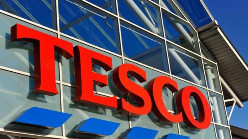
The Tesco logo is one of the most recognized retail identities in the UK, built around a clean blue wordmark that has carried the brand through decades of growth. As a logo, it functions as the visual anchor for everything Tesco puts in front of customers, from store signage to packaging to digital platforms. The design has gone through several changes since Jack Cohen founded the company in 1919, but the core identity has stayed remarkably consistent. Tesco currently operates as one of the largest grocery retailers in the world, and its logo reflects that scale with a no-nonsense, accessible aesthetic.
What Is the Tesco Logo?
The Tesco logo is a blue wordmark featuring the brand name in a custom rounded sans-serif typeface, officially updated in 2016. It drops the red and blue stripe device used in earlier versions and uses a flat, single-color design built for clarity across digital and physical touchpoints.
- Design Type: Wordmark (logotype only, no symbol or icon)
- Primary Elements: Custom rounded sans-serif lettering spelling “Tesco”
- Official Introduction Date: Current version introduced 2016
- Designer/Agency: Designed in collaboration with Tesco’s internal brand team; earlier redesigns involved external agency consultants
- Trademark Status: Registered trademark of Tesco PLC
- Color Palette: Tesco Blue (#005DAA), white background variants, and black version for specific applications
- Usage Context: Store signage, product packaging, Tesco.com, the Tesco app, Clubcard materials, Tesco Mobile, Tesco Bank, and all marketing materials
How Has the Tesco Logo Evolved Over Time?
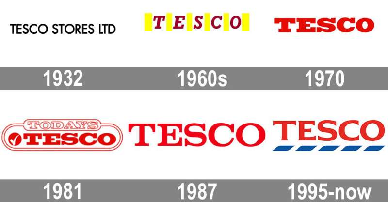
The Tesco logo has gone through roughly five distinct phases since the 1930s, shifting from basic hand-lettered text to a refined digital-ready wordmark. Each change reflected where the brand was heading, not just what looked current at the time.
Original Tesco Logo (1930s-1970s)
- Years Active: 1930s to early 1970s
- Design Description: Simple text-based lettering with no strong graphical system behind it
- Color Scheme: Black and white, limited color application
- Designer: Unknown
- Context: Tesco was expanding rapidly across the UK; the logo was functional rather than strategic
- Key Changes from Previous: N/A (original version)
- Cultural Significance: Represented a scrappy, value-focused retailer built on market stall origins
Stripe Era Logo (1970s-1995)
- Years Active: Early 1970s to 1995
- Design Description: Wordmark paired with a red and blue horizontal stripe device above and below the text
- Color Scheme: Red, blue, and white
- Designer: Not publicly documented
- Context: Tesco was becoming a major supermarket chain and needed stronger shelf and signage presence
- Key Changes from Previous: Introduction of the stripe device; stronger use of color
- Cultural Significance: The stripes became closely associated with Tesco’s identity throughout this era
Refined Stripe Logo (1995-2010)
- Years Active: 1995 to 2010
- Design Description: Cleaner, more refined version of the stripe logo with tighter typography and a more modern feel
- Color Scheme: Blue dominant, with red accent stripes
- Designer: External branding consultants involved in the refresh
- Context: Tesco was growing internationally and needed a more polished, scalable identity
- Key Changes from Previous: Cleaner geometry, more consistent proportions, improved legibility at smaller sizes
- Cultural Significance: The logo that most UK shoppers over 30 associate with Tesco
Transitional Logo (2010-2016)
- Years Active: 2010 to 2016
- Design Description: Simplified version of the stripe logo, reducing visual complexity while retaining brand recognition
- Color Scheme: Blue and red
- Designer: Internal brand team
- Context: Tesco was navigating a difficult period commercially and pulled back on aggressive design changes
- Key Changes from Previous: Subtle refinements rather than full redesign
- Cultural Significance: Maintained continuity during a period of brand uncertainty
Current Logo (2016-Present)
- Years Active: 2016 to present
- Design Description: Clean blue wordmark only; stripes removed entirely; rounded custom sans-serif letterforms
- Color Scheme: Tesco Blue (#005DAA) on white
- Designer: Tesco internal brand team with agency support
- Context: Digital-first retail environment demanded a cleaner, more versatile mark
- Key Changes from Previous: Complete removal of stripe device; single-color primary usage; modernized letterforms
- Cultural Significance: Signals Tesco’s push toward a leaner, more modern brand positioning
What Do the Design Elements of the Tesco Logo Mean?
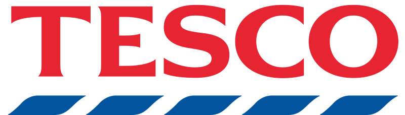
The current Tesco logo strips away ornament and keeps only the name. That choice is deliberate. Blue communicates reliability. Rounded letterforms soften what could otherwise feel like a cold corporate mark. The result is a wordmark that feels approachable without being playful.
What Does the Tesco Wordmark Represent?
A wordmark puts the name front and center with no distractions.
For a retailer with Tesco’s level of recognition, that makes sense. The name is the brand.
No icon is needed to support it. The rounded letterforms keep it from feeling clinical, which matters when you’re trying to appeal to everyday shoppers across all demographics.
What Is the Historical Context Behind the Logo’s Design?
The stripe device used from the 1970s onward came from a period when retail brands competed heavily on shelf signage.
Stripes created visual separation on cluttered fascias. Dropping them in 2016 reflected a shift toward digital-first design thinking, where flat, single-color marks work better across screens, apps, and small-format applications.
Why Did Tesco Choose These Specific Colors?
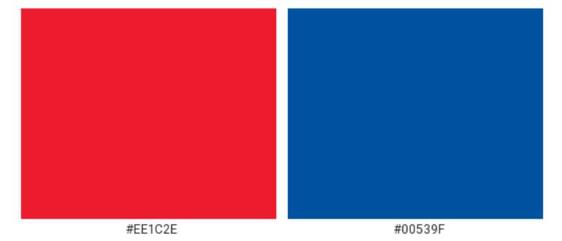
- Tesco Blue (#005DAA)
- Color Name: Tesco Blue
- Hex: #005DAA
- Pantone: Pantone 286 C (approximate)
- Symbolic Meaning: Trust, dependability, stability
- Psychological Impact: Blue is widely associated with reliability, which is exactly what a grocery retailer wants customers to feel. It’s the same logic behind many blue logos in retail and finance.
- Brand/Industry Connection: Blue dominates grocery and retail branding globally because of its calming, trustworthy qualities
- White
- Color Name: White
- Symbolic Meaning: Cleanliness, simplicity, openness
- Psychological Impact: Provides strong contrast against the blue wordmark; improves legibility across all applications
- Brand/Industry Connection: Standard background color in retail brand systems for maximum versatility
What Typography Style Is Used in the Tesco Logo?
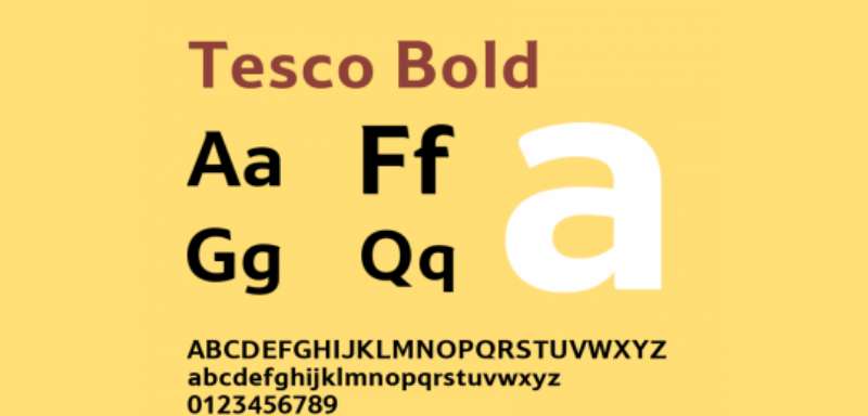
The Tesco wordmark uses a custom rounded sans-serif typeface.
It’s not an off-the-shelf sans-serif font. The letterforms have been drawn specifically for the brand, with slightly softened terminals and consistent stroke weights that hold up well at any size.
Earlier logo versions used slightly more rigid, condensed letterforms. The 2016 update introduced rounder, more open shapes that work better at small sizes on digital interfaces. Typography choices like this are never accidental at brand scale.
What Are the Hidden Meanings in the Tesco Logo?
There’s no elaborate hidden symbol in the Tesco mark. It doesn’t have the kind of embedded imagery you find in logos like FedEx or Carrefour.
What’s intentional is what was removed. Dropping the stripes in 2016 was a deliberate signal that Tesco was moving away from its older, more cluttered brand identity.
The rounded letterforms subtly suggest friendliness and accessibility without spelling it out. That kind of quiet design decision is easy to miss but shapes how people feel about the brand over time.
How Does the Tesco Logo Compare to Competitor Logos?
Tesco’s clean blue wordmark sits within a broader pattern of UK grocery branding. Most major supermarket chains use blue as a dominant color, but each takes a different approach to typography and supporting elements.
The Sainsbury’s logo uses orange, which immediately differentiates it from Tesco on a visual level. Orange reads as warm and approachable, while Tesco’s blue leans more toward dependability.
The Morrisons logo uses yellow and black with a bolder, more expressive typographic style. It feels more working-class and direct compared to Tesco’s more neutral positioning.
The Lidl logo takes a completely different route with a circular emblem system using red, blue, and yellow. It’s more icon-driven, which reflects Lidl’s European design roots.
The Aldi logo also uses a combination mark with a distinct symbol, contrasting with Tesco’s stripped-back wordmark approach.
Among all the major UK grocery store logos, Tesco’s is arguably the most minimal. That minimalism has both advantages and limitations. It’s flexible and timeless, but it doesn’t have the immediate visual distinctiveness of a strong symbol or a bold color contrast system.
What Are the Technical Specifications of the Tesco Logo?
Official Color Codes
- Primary Color: Tesco Blue
- Hex: #005DAA
- RGB: (0, 93, 170)
- CMYK: (100, 45, 0, 33)
- Pantone: Pantone 286 C (approximate; official Pantone spec should be confirmed via Tesco brand guidelines)
- Secondary Color: White
- Hex: #FFFFFF
- RGB: (255, 255, 255)
- CMYK: (0, 0, 0, 0)
- Alternate Version: Black
- Hex: #000000
- RGB: (0, 0, 0)
- CMYK: (0, 0, 0, 100)
- Usage: Single-color print applications where blue reproduction is not possible
Dimensions and Proportions
- Aspect Ratio: Approximately 4:1 (width to height) for the standard horizontal wordmark
- Minimum Size Requirements: Not publicly published; standard practice for wordmarks of this type is a minimum of 20mm wide in print and 80px wide in digital
- Clear Space: Standard brand practice requires clear space equal to the cap height of the wordmark on all sides
- Official Usage Guidelines: Available through Tesco’s brand and marketing teams for approved commercial partners; not publicly distributed
- File Formats: Official assets include vector graphics formats (EPS, SVG) for scalable use, plus PNG for digital
What Cultural Impact Has the Tesco Logo Had?
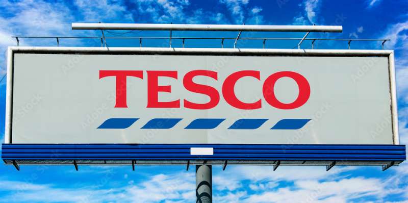
Tesco’s logo has become a shorthand for everyday British life in a way that few retail brands manage.
For decades, the blue and red stripe version was as familiar as any street sign in the UK. It appeared on carrier bags, receipts, delivery vans, and high street storefronts in nearly every town.
The logo shift in 2016 was noticed and debated publicly, which itself says something about how embedded it was in British culture. People don’t argue about logo changes for brands they don’t care about.
Internationally, the Tesco mark carries weight in markets like Ireland, Hungary, and the Czech Republic, where the brand has a strong presence. It reads as a British export, which has both positive and neutral associations depending on the market.
The Clubcard specifically has made the logo a fixture in loyalty and rewards culture. Millions of UK households interact with the Tesco brand identity weekly through that card alone, which keeps the visual mark at a high frequency of exposure.
How Does the Tesco Logo Fit Into the Overall Brand Identity?
The Tesco logo doesn’t operate alone. It anchors a broader brand system that includes the Clubcard, Tesco Mobile, Tesco Bank, and the F&F clothing line.
Each sub-brand adapts the core identity while keeping the wordmark as the primary recognizable element.
The logo works alongside a set of brand guidelines that govern how color, typography, and spacing are applied across all touchpoints. A strong brand style guide keeps that system consistent whether you’re looking at a Tesco Express fascia or a mobile app notification.
The visual hierarchy across Tesco’s communications always positions the wordmark prominently, with supporting elements like product photography and color fields playing secondary roles.
Packaging design under the Tesco own-brand range extends the logo into a full product identity system, making the mark visible at scale across thousands of SKUs in-store.
How Should the Tesco Logo Be Used?
Official Usage Guidelines
- Do: Use the logo in its approved color versions (blue on white, white on blue, black on white)
- Do: Maintain the required clear space around the wordmark at all times
- Do: Use vector file formats for print to maintain quality at all sizes
- Don’t: Stretch, distort, or recolor the logo outside of approved brand specifications
- Don’t: Place the logo on busy or clashing backgrounds that reduce legibility
- Don’t: Recreate the wordmark using a substitute typeface
- Don’t: Use the logo in any context that implies official Tesco endorsement without authorization
Where to Access Official Logo Files
- Official Tesco logo assets are not available for public download
- Commercial partners and suppliers must request assets directly through Tesco’s brand and marketing department
- Press and media inquiries for logo use can go through Tesco’s press office
Licensing and Trademark Information
- The Tesco logo is a registered trademark of Tesco PLC
- Unauthorized commercial use of the Tesco wordmark or any close imitation is a trademark infringement
- Editorial and journalistic use is generally permitted under fair use principles, but commercial reproduction requires written permission
- Any use that could create confusion about official Tesco affiliation should be avoided without explicit licensing
FAQ on The Tesco Logo
What does the Tesco logo look like?
It’s a clean blue wordmark. No icon, no symbol.
The brand name is set in a custom rounded sans-serif typeface in Tesco Blue (#005DAA) on a white background. Simple, flat, and built to work anywhere from store signage to a mobile app.
When was the current Tesco logo introduced?
The current version launched in 2016.
It dropped the long-running red and blue stripe device that had defined Tesco’s visual identity since the 1970s. The update moved the brand toward a cleaner, more digital-friendly design.
What font does the Tesco logo use?
Tesco uses a custom-drawn rounded sans-serif typeface, not a standard off-the-shelf font.
The letterforms have softened terminals and consistent stroke weights. It reads as friendly and neutral, which suits a mass-market grocery retailer targeting virtually every household in the UK.
What color is the Tesco logo?
The primary color is Tesco Blue, hex #005DAA.
There’s also an approved white reverse version and a black single-color variant for specific print applications. The RGB value is (0, 93, 170), and the CMYK breakdown is approximately (100, 45, 0, 33).
How many times has the Tesco logo changed?
Roughly five times since the 1930s.
The Tesco logo evolution moved from basic text lettering through the iconic stripe era, two refined stripe versions, and finally the current minimal wordmark. Each change tracked a shift in the company’s scale and market positioning.
Who designed the Tesco logo?
The 2016 redesign was handled by Tesco’s internal brand team, reportedly with external agency input.
Earlier versions involved outside branding consultants, though specific designer credits were never made fully public. This is fairly typical for large corporate logo projects at that scale.
What do the colors in the Tesco logo mean?
Blue signals trust, reliability, and stability. It’s no accident that most major UK supermarkets lean on blue in their brand identity.
Color psychology backs this up. Blue consistently scores high for dependability in consumer research, which is exactly the association a grocery retailer wants to own.
What happened to the red stripes in the Tesco logo?
They were removed entirely in the 2016 rebrand.
The red and blue stripe device had been part of the Tesco logo since the early 1970s. Dropping it was a deliberate move toward minimalism, better suited to digital platforms where complex logo devices lose clarity at small sizes.
How does the Tesco logo compare to other supermarket logos?
It’s the most minimal of the major UK chains.
The Sainsbury’s logo uses orange, Morrisons uses yellow and black, and both Lidl and Aldi use combination marks with symbols. Tesco’s wordmark-only approach is cleaner but less visually distinctive at a glance.
Can I download and use the Tesco logo?
Not without permission. The Tesco logo is a registered trademark of Tesco PLC.
Official assets are only available to approved commercial partners through Tesco’s brand team. Unauthorized commercial use is a trademark infringement. Editorial and press use is generally acceptable, but anything commercial needs written authorization.
Conclusion
The Tesco logo is a case study in how a major retail brand can strip back its visual identity and come out stronger for it.
Removing the stripe device was a risk. Most people recognized it. But the 2016 wordmark has proven to be a more flexible, durable mark across digital platforms, packaging design, and store signage alike.
The Tesco brand color, the custom rounded letterforms, the flat single-color system. All of it points to a corporate identity built for longevity, not trend-chasing.
For anyone studying UK supermarket branding or retail logo evolution, Tesco’s history is worth paying close attention to.

Renowned for his expertise in logo design and visual branding, Bogdan has developed a multitude of logos for various clients.
His skills extend to creating posters, vector illustrations, business cards, and brochures. Additionally, Bogdan's UI kits were featured on marketplaces like Visual Hierarchy and UI8.
He also wrote in the past years on sites like Design Your Way, WebDesignerDepot, WPDean, Designmodo, Speckyboy, Slider Revolution, and more.
- Canva vs PowerPoint: Which Is Better for Presentations? - 22 September 2026
- How to Install Fonts on Mac (Step-by-Step Guide) - 20 September 2026
- From Mockup to Code: How AI-Augmented Development Speeds Up the Design Handoff - 19 September 2026

Bogdan Sandu is a seasoned designer who has been designing websites since 2008. Renowned for his expertise in logo design and visual branding, Bogdan has developed a multitude of logos for various clients. His skills extend to creating posters, vector illustrations, business cards, and brochures. Additionally, Bogdan's UI kits were featured on marketplaces like Visual Hierarchy and UI8. He also wrote in the past years on sites like Design Your Way, WebDesignerDepot, WPDean, Designmodo, Speckyboy, Slider Revolution, and more.
You Might Also Like