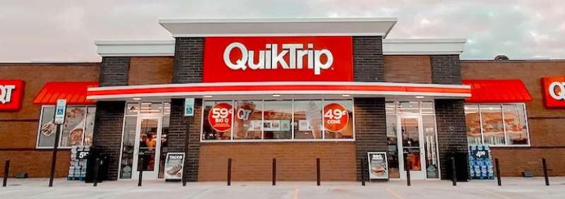
The QuikTrip logo is the official visual mark of QuikTrip Corporation, a Tulsa, Oklahoma-based convenience store and gas station chain. It functions as the primary brand identifier across hundreds of retail locations throughout the United States. The logo has gone through several updates since the company’s founding in 1958, each reflecting shifts in the brand’s growth and market positioning.
Within the convenience store industry, QuikTrip’s branding sits alongside a small group of chains that have built genuine visual recognition at the regional and national level. The red-and-white color scheme, bold wordmark, and consistent application across signage, fuel canopies, and packaging put it in the same conversation as Circle K, Wawa, and Sheetz when it comes to recognizable fuel retail logo design.
The current version of the logo is a clean, bold wordmark using a customized sans-serif typeface in red and white. It was updated in the late 2000s to reflect a more modern retail identity. QuikTrip handles its brand design internally rather than through a publicly named external agency. The company was founded by Chester Cadieux in 1958, and the logo has gone through roughly four to five notable iterations over its history.
What Is the QuikTrip Logo?
The QuikTrip logo is a bold red wordmark featuring the “QT” monogram as its dominant visual element, paired with the full brand name. Introduced in its current form in the late 2000s, it was developed internally to reflect a cleaner, more modern convenience retail identity.
- Design Type: Combination mark (monogram icon paired with wordmark)
- Primary Elements: “QT” lettermark, full “QuikTrip” wordmark, bold sans-serif typography
- Official Introduction Date: Current version introduced approximately 2008-2010
- Designer/Agency: Developed in-house by QuikTrip Corporation
- Trademark Status: Registered trademark under QuikTrip Corporation with the USPTO
- Color Palette: Primary Red (#DA291C), White (#FFFFFF)
- Usage Context: Store signage, fuel canopies, uniforms, packaging, digital platforms, marketing materials, and the QuikTrip mobile app
How Has the QuikTrip Logo Evolved Over Time?
The QuikTrip logo has moved from a simple text-based mark in the 1950s to a bold, recognizable combination mark today. Each major update tracked the company’s physical expansion and growing brand confidence across new U.S. markets.
Original QuikTrip Logo (1958-1970s)
- Years Active: 1958-early 1970s
- Design Description: Simple text-based wordmark with minimal graphic elements, reflecting the stripped-down commercial signage common to small Midwestern retail businesses of the era
- Color Scheme: Red and white
- Designer: Unknown
- Context: QuikTrip launched in Tulsa as a small convenience store chain. The original mark was functional, not strategic.
- Key Changes from Previous: N/A, first version
- Cultural Significance: Represented a grassroots Midwestern retail brand at its earliest stage
Transitional QuikTrip Logo (1970s-1990s)
- Years Active: Early 1970s-late 1990s
- Design Description: Introduced more structured typography and began formalizing the red color usage across signage. The “QT” abbreviation started gaining traction as a secondary identifier during this period.
- Color Scheme: Red and white, more consistently applied
- Designer: Unknown
- Context: QuikTrip was expanding aggressively through the Midwest and Southeast, requiring more consistent visual standards across locations.
- Key Changes from Previous: More uniform typography, stronger color consistency across signage systems
- Cultural Significance: The brand started building regional recognition, with the logo becoming a familiar roadside sight across multiple states
Modernized QuikTrip Logo (2000s-Present)
- Years Active: Late 2000s-present
- Design Description: Clean, bold combination mark featuring a stylized “QT” monogram alongside the full “QuikTrip” name in a custom sans-serif typeface. The design is tight, confident, and built for high visibility at signage scale.
- Color Scheme: Red (#DA291C) and White (#FFFFFF)
- Designer: In-house
- Context: Introduced to align with major store redesigns and the launch of QT Kitchens, which repositioned QuikTrip as more than a gas station.
- Key Changes from Previous: More refined letterforms, stronger visual hierarchy, better performance across digital and physical applications
- Cultural Significance: Cemented QuikTrip’s identity as a premium convenience brand, separating it visually from discount fuel competitors
What Do the Design Elements of the QuikTrip Logo Mean?
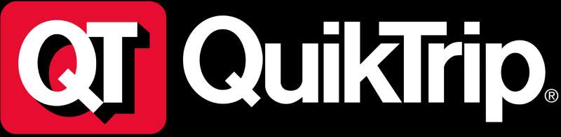
The QuikTrip logo uses bold, high-contrast design elements to communicate speed, reliability, and accessibility. Every visual choice reinforces the brand’s core promise: a fast, clean, dependable stop.
The “QT” monogram serves as the logo’s anchor.
It creates instant recognition at highway speeds, where full wordmarks often fail. The letters are compact, bold, and built to read clearly from a distance on fuel canopies and roadside signage.
What Is the Symbolic Meaning Behind the QuikTrip Logo?
Red signals urgency and energy, two things a gas station brand genuinely needs to project.
The bold letterforms suggest reliability and strength. White space in the mark keeps it from feeling heavy or dated.
The “QT” abbreviation doubles as a brand nickname, which is rare. Most customers actually call the stores “QT,” so the monogram reinforces an existing cultural behavior rather than forcing a new one.
Why Did QuikTrip Choose These Specific Colors?

Understanding the color psychology behind the QuikTrip palette helps explain why the brand reads as energetic and trustworthy at the same time.
- Red
- Hex: #DA291C
- Pantone: Pantone 485
- Symbolic Meaning: Energy, speed, urgency
- Psychological Impact: Grabs attention fast, drives impulse decisions, common in red logos for food and fuel retail
- Brand Connection: Matches the “quick” in the brand name; red has been a consistent fuel retail color across the industry
- White
- Hex: #FFFFFF
- Symbolic Meaning: Cleanliness, clarity, accessibility
- Psychological Impact: Provides contrast that makes the red pop; reinforces the brand’s emphasis on clean, well-maintained stores
- Brand Connection: White backgrounds on signage keep the logo readable in both daylight and at night with backlighting
What Typography Style Is Used in the QuikTrip Logo?
The QuikTrip wordmark uses a bold, customized sans-serif font with tight letter spacing.
The letterforms are slightly condensed, which helps the name fit cleanly across signage without losing weight or impact. There’s no kerning that feels loose or casual. Everything is tight and deliberate.
Earlier logo versions used less refined typography with more generic letterforms. The current version has custom modifications that make the typeface feel proprietary rather than off-the-shelf.
Readability at distance was clearly a priority. The thick strokes and open counters in the letters perform well on backlit signage, which is exactly where this logo spends most of its life.
What Are the Hidden Meanings in the QuikTrip Logo?
There’s no confirmed hidden symbol or subliminal geometry in the QuikTrip logo. It doesn’t use negative space tricks the way FedEx does, for example.
That said, the “QT” abbreviation functions as a kind of dual-meaning element. “QT” is casual American slang for something quiet or secretive (“on the QT”), but in this context the brand has fully reclaimed it as a term of familiarity and affection.
Most loyal customers use “QT” without thinking about “QuikTrip” at all. That level of nickname adoption is something brand strategists rarely achieve on purpose. Whether intentional or not, it works.
How Does the QuikTrip Logo Compare to Competitor Logos?
QuikTrip’s logo holds up well against competitors. It’s bolder and more consistent than most, with a color identity that’s genuinely ownable in the convenience sector.
The Circle K logo uses a similar red-and-white scheme but leans on a circular emblem rather than a wordmark.
Wawa’s logo uses a goose illustration, which gives it personality but reduces versatility at small sizes.
The 7-Eleven logo is arguably more iconic globally, but its dated design hasn’t aged as cleanly as QuikTrip’s current mark.
Speedway’s logo, for comparison, feels more generic. The QuikTrip mark has more visual weight and confidence. Among regional fuel and convenience brands, QuikTrip’s logo is one of the more professionally executed.
What Are the Technical Specifications of the QuikTrip Logo?
Official Color Codes:
- Primary Color: Red
- Hex: #DA291C
- RGB: (218, 41, 28)
- CMYK: (0, 81, 87, 15)
- Pantone: 485 C
- Secondary Color: White
- Hex: #FFFFFF
- RGB: (255, 255, 255)
- CMYK: (0, 0, 0, 0)
- Pantone: N/A (process white)
Dimensions and Proportions:
- Aspect Ratio: Approximately 3:1 (width to height) for the full wordmark
- Minimum Size: The full wordmark should not be reproduced smaller than 1 inch wide in print to maintain legibility
- Clear Space: Standard brand guidelines typically require clear space equal to the height of the “Q” on all sides
- File Formats Available: Vector graphics (EPS, SVG) for scalable use; PNG with transparent background for digital; JPEG for general use. Print applications require a minimum of 300 DPI to avoid bitmap degradation.
- Official Usage Guidelines: QuikTrip controls trademark usage strictly; unauthorized reproduction for commercial purposes is not permitted
What Cultural Impact Has the QuikTrip Logo Had?
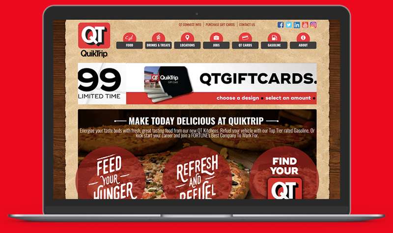
The QuikTrip logo has become a genuine cultural shorthand in the regions where the chain operates. Saying “meet me at QT” is a normal sentence in Phoenix, Atlanta, Tulsa, and dozens of other cities.
That kind of verbal brand shortcut is rare. Most convenience chains don’t achieve it.
The logo contributes to this partly because it’s so consistently applied. Every store looks the same. Every sign uses the same red. Over years of exposure, the visual becomes automatic, almost instinctive.
QuikTrip also has an unusually loyal customer base for a gas station brand, and the logo plays a role in that. People wear QT shirts and hats without irony. That says something about how deeply the brand identity has landed.
How Does the QuikTrip Logo Fit Into the Overall Brand Identity?
The logo is just one part of a broader identity system that includes store architecture, employee uniforms, QT Kitchens branding, the QuikTrip app, and in-store signage. Everything connects back to the same red-and-white visual language.
The brand guidelines that govern the logo also extend to how the brand presents itself on fuel pump screens, loyalty program materials, and social media.
This kind of brand style guide consistency is what separates mature retail brands from ones that feel patched together.
QuikTrip also uses the “QT” monogram independently in some contexts, like app icons and small-format applications, which shows they’ve thought carefully about how the identity scales. The logo and the broader brand system feel like they were built together rather than in separate phases.
How Should the QuikTrip Logo Be Used?
Official Usage Do’s:
- Use the logo on approved red or white backgrounds only
- Maintain the required clear space around all versions of the mark
- Use the vector version for any print application above business-card scale
- Reproduce the logo at sufficient resolution (300 DPI minimum for print)
- Reference the brand as “QuikTrip” in text, with “QT” acceptable as a secondary reference
Official Usage Don’ts:
- Do not alter the logo colors or apply unapproved color treatments
- Do not stretch, distort, or reposition the logo elements
- Do not place the logo on busy backgrounds that reduce legibility
- Do not use the logo in a way that implies endorsement without authorization
- Do not recreate the logo from scratch using generic fonts
Where to Access Official Logos:
Official logo files are not publicly distributed for third-party use. Media outlets, vendors, and partners must request brand assets directly through QuikTrip’s corporate communications or vendor relations teams.
Licensing and Trademark Protection:
The QuikTrip name and logo are registered trademarks of QuikTrip Corporation. Any commercial use without written authorization is a trademark violation. Journalists and editorial uses typically fall under fair use, but commercial reproduction, merchandise, and promotional materials require explicit permission from QuikTrip Corporation.
FAQ on The QuikTrip Logo
What colors does the QuikTrip logo use?
The QuikTrip logo uses red and white. The red is a bold, high-contrast shade (hex #DA291C, roughly Pantone 485) that reads well on backlit signage. White provides the contrast.
What font is used in the QuikTrip logo?
QuikTrip uses a customized bold sans-serif typography style with tight letter spacing. The letterforms appear to be modified rather than pulled straight from a standard typeface library. No official font name has been publicly confirmed.
When was the current QuikTrip logo introduced?
The current version was introduced approximately 2008-2010, aligning with major store redesigns and the rollout of QT Kitchens. It replaced an older wordmark with a cleaner, more modern combination mark.
What does “QT” stand for in the QuikTrip logo?
QT is simply an abbreviation of QuikTrip. Over time it became a standalone brand nickname that customers use naturally. The QT monogram now functions as a recognizable brand mark on its own, separate from the full wordmark.
Who designed the QuikTrip logo?
QuikTrip handles its corporate identity in-house. No external design agency has been publicly credited for the current logo. The brand identity system, including signage and packaging, is managed internally by QuikTrip Corporation.
How does the QuikTrip logo compare to other convenience store logos?
It holds up well. The red-and-white color palette is consistent and ownable. Compared to competitors, the QT mark has stronger visual weight and cleaner execution than most regional fuel retail brands.
Is the QuikTrip logo trademarked?
Yes. The QuikTrip name and logo are registered trademarks of QuikTrip Corporation with the USPTO. Commercial use without written authorization is a trademark violation. Editorial and journalistic use typically falls under fair use.
What file formats are available for the QuikTrip logo?
Official formats include vector files (EPS, SVG) for scalable print use and PNG with transparent background for digital. These are not publicly distributed. Vendors and media must request assets directly through QuikTrip’s corporate team.
What is the symbolism behind the QuikTrip logo design?
Red signals speed and energy, which fits a convenience store branding context well. The bold, condensed letterforms suggest reliability. There are no confirmed hidden symbols, but the QT abbreviation carries strong cultural recognition in markets where the chain operates.
Has the QuikTrip logo ever been redesigned?
Yes, several times. The logo evolution spans roughly four to five iterations since the company’s founding in 1958. Each update tracked the brand’s growth, moving from a basic text mark toward the polished combination mark used today.
Conclusion
The QuikTrip logo is a solid example of fuel retail branding done right. Bold red, tight typography, and a monogram that customers actually use in conversation. That combination is harder to pull off than it looks.
From its early text-based mark to the current QT combination mark, the logo’s evolution tracks a brand that grew with purpose.
The QT brand identity works because it’s consistent across store signage, packaging, uniforms, and digital platforms. Logo color psychology, corporate visual identity, and retail brand recognition all point in the same direction here. Clean, fast, dependable.

Renowned for his expertise in logo design and visual branding, Bogdan has developed a multitude of logos for various clients.
His skills extend to creating posters, vector illustrations, business cards, and brochures. Additionally, Bogdan's UI kits were featured on marketplaces like Visual Hierarchy and UI8.
He also wrote in the past years on sites like Design Your Way, WebDesignerDepot, WPDean, Designmodo, Speckyboy, Slider Revolution, and more.
- The Windsurf Logo History, Colors, Font, And Meaning - 10 October 2026
- How to Remove Background From Product Photos (No Photoshop) - 10 October 2026
- How Designers can Build a Stronger Online Creative Identity - 9 October 2026

Bogdan Sandu is a seasoned designer who has been designing websites since 2008. Renowned for his expertise in logo design and visual branding, Bogdan has developed a multitude of logos for various clients. His skills extend to creating posters, vector illustrations, business cards, and brochures. Additionally, Bogdan's UI kits were featured on marketplaces like Visual Hierarchy and UI8. He also wrote in the past years on sites like Design Your Way, WebDesignerDepot, WPDean, Designmodo, Speckyboy, Slider Revolution, and more.
You Might Also Like