The Metro Logo History, Colors, Font, And Meaning
Dive beneath the bustling urban sprawl to discover a world where function meets artistry: the Metro Logo. At the intersection of utility and design, these icons shepherd millions daily, a silent yet potent beacon of mobility.
Woven into the fabric of cities, they are more than mere symbols; they distill the essence of their transit systems into a solitary emblem.
The journey embarked upon here delves into the core of urban identity. Visual storytelling unravels, revealing the power held within color schemes, typography, and minimalist design that connect commuters to corners of concrete jungles.
Each stroke, each hue, each decision encapsulates a narrative—a shared human experience cradled in the hidden depths below.
By article’s end, a tapestry of knowledge awaits—from unraveling the Metro system branding to appreciating the meticulous crafting of public transportation iconography.
Armed with a graphic designer’s lens, one will unearth the finesse behind the signs guiding our daily adventures. Discover, understand, and perhaps, imagine; what tales do these emblems hold within their simple contours?
The Meaning Behind the Metro Logo
Deep Dive into Its Essence
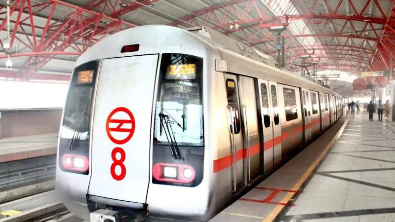
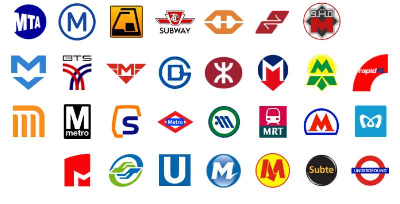
Metro logos, you see them often, right? In many big cities worldwide, metro logos are more than just symbols. They’re like road signs for the underground world.
Now, when we talk about the meaning behind them, it’s an intersection of art and utility. A well-designed logo tells a story and guides commuters.
Cultural Context
Ever noticed how metro logos sort of mirror the vibes of the city they belong to? For example, in a city with a rich history, you might see elements in the metro logo that are nods to the city’s past.
It’s more than just a random design. It’s about connecting with the community, the local spirit, and yes, the daily commuter.
The History of the Metro Logo
Roots and Origins
Long before touchscreens and digital ticketing, metros had logos. Back then, it wasn’t about branding but clear identification. A logo would help people identify the entry to the underground world of trains.
The evolution of metro logos can be traced alongside the development of urban aesthetics.
Pivotal Changes
Over the decades, changes in design trends, city values, and technological advancements have all played a role. There’s a push and pull between staying modern and retaining historical elements.
The Colors of the Metro Logo
Psychology of Colors
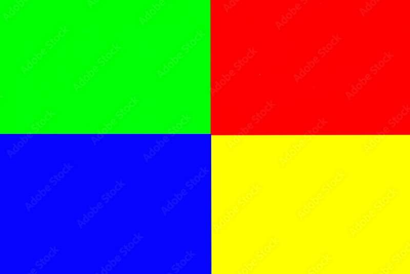
Blue. Red. Green. Yellow. These are some common metro logo colors. But they’re not just randomly selected. Colors evoke emotions, set moods, and influence decisions. A blue might convey trust and dependability, while a bright yellow could suggest energy and alertness.
Regional Influences
Colors in metro logos might also be influenced by regional or cultural factors. Maybe it’s the color of the city’s flag, a historical event, or just the vibe of the local scene.
The Font Used in the Metro Logo
Speaking Through Typography
Fonts speak, folks! The typography used in a metro logo isn’t just for readability. It tells a story. A bold font might suggest strength and stability. A more cursive one? Elegance and sophistication.
Trends Over Time
Just like with fashion, font trends come and go. What was in vogue in the 80s might not be the thing now. But some cities choose to retain those retro vibes, making their metro logos a nostalgic trip.
Iconography in the Metro Logo
Beyond Just Letters
Symbols and icons in a metro logo can provide instant recognition. Whether it’s an underground train, city landmarks, or abstract elements, iconography dives deeper into the essence of the metro system.
Decoding the Symbols
Every symbol has a tale. Maybe it’s a nod to the city’s history, its topography, or just an artistic expression. It’s fascinating to decode what each element represents.
Influence of Pop Culture
When Movies and Songs Chip In
Ever seen a movie or heard a song referencing a metro? Pop culture influences public perception. And sometimes, this trickles down to how metro logos are seen or even designed.
Evolving with Time
Metro logos might evolve, adapting elements from pop culture, ensuring they remain contemporary and in tune with the times. It’s a dance between staying relevant and holding onto tradition.
FAQ On The Metro Logo
What is the significance of a Metro Logo?
The Metro Logo serves as an emblem for the city’s rhythm, harnessing design’s power to navigate the intersection of function and form.
It’s more than aesthetics; it’s a visual shorthand for the vibrant network of the underground, conveying brand identity and ensuring a seamless commuter experience across transit lines.
How do Metro Logos impact commuter behavior?
Remarkably, they guide daily movements with the subtlety of a whisper. Commuters oft find themselves drawn to the familiarity of the Metro Logo, an anchor amidst the transient chaos of city life.
It’s a silent navigator, an unspoken director, spearheading flows of urban passage with deft precision.
What goes into designing a Metro Logo?
Designing is akin to alchemy, a blend of minimalist design, poignant color schemes, and illustrative typography.
Each Metro Logo distills the essence of its city into a digestible icon, a meticulous craftwork that resonates equally with daily commuters and out-of-town visitors, bridging gaps in universal visual language.
How do Metro Logos vary from city to city?
Each city’s soul imbues its Metro Logo, reflecting individuality through local landmarks, cultural heritage, or design elements synonymous with the city’s identity.
From the London Underground’s iconic roundel to the stark simplicity of New York City Subway’s intertwined letters, these differences are cartographs of local character.
How are Metro Logos utilized in branding and marketing?
They’re not just on station signs; Metro Logos flourish in marketing as a stamp of urban connectivity.
They adorn everything from souvenir mugs to official transit maps, transmuting into scalable visual ambassadors of both the metro system and the metropolitan essence it circulates within.
What are the legal considerations for using Metro Logos?
Nestled within the domain of trademarks and intellectual property, Metro Logos are guarded entities against unauthorized reproduction.
Such protections ensure that the integrity and association of the emblem with public service and trust are not diluted or misappropriated through illicit usage.
Can Metro Logos influence the perception of a city’s public transport system?
Absolutely. Think of it as a narrative enigma wrapped in simplicity; a well-executed Metro Logo becomes symbolic of the efficiency and reliability of a city’s public transit.
It’s an indirect pledge, a compact visual promise that shapes public perception and invokes civic pride.
How have Metro Logos evolved with modern design trends?
As design sails towards the shores of modernism, Metro Logos have embraced this voyage.
The evolution is evident in the sleek lines, bold colors, and dynamic forms which align with contemporary sensibilities, ensuring relevance and adapting to the pulsing cadence of urban evolution.
What challenges are faced when redesigning a Metro Logo?
Redesigning is a tightrope walk between respect for legacy and the charge towards innovation.
It’s about remolding public sentiment and user familiarity with a fresh yet recognizable icon, ensuring that the revamped emblem maintains its wayfinding efficacy and continues to resonate with the community.
How does a memorable Metro Logo affect tourism?
Like a lighthouse to ships, a distinctive Metro Logo can become a beacon for tourists.
It not only aids in navigation but also transcends to become part of the tourist experience, often finding its way into travel narratives, photos, and memories; a silent yet compelling advocate for the city’s attractions.
Conclusion
In essence, weaving the story of the Metro Logo into the urban fabric isn’t simply about creating an image; it’s an act of encapsulating the dynamic spirit of entire cities within a singular visual narrative. Like a complex chord that resonates with clarity, a logo emerges, not just seen but felt, through the ebb and flow of metropolitan life.
- Bold transcending trends,
- Timeless in its essence,
- Embraced by the masses.
It’s concluding then, that this confluence of design and function births more than a symbol; it reflects the very soul of urban mobility. Consider the task at hand, distilling practicalities and pride into a graphic that must stand as a beacon of both familiarity and innovation. The responsibility is vast, as every curve and color cast in these logos shapes the onward march of cities and the hearts beating within.
Ultimately, as the day closes just as it has opened, with a journey, let this emblem serve as a silent testament to the stories unfurled in its silent contours, the silent guide through the steel veins of our urban landscape.
If you liked this article about the Metro logo, you should check out this article about the ShopRite Logo.
There are also similar articles discussing the Speedway Logo, the Sprouts Farmers Market Logo, the HEB logo, and the Kroger logo.
And let’s not forget about articles on the Lidl logo, the Meijer logo, the Morrisons logo, and the Publix logo.
Bogdan Sandu, a seasoned designer with 15 years of diverse experience, has been designing websites since 2008.
Renowned for his expertise in logo design and visual branding, Bogdan has developed a multitude of logos for various clients.
His skills extend to creating posters, vector illustrations, business cards, and brochures. Additionally, Bogdan's UI kits were featured on marketplaces like Visual Hierarchy and UI8.
Latest posts by Bogdan Sandu (see all)
- After Dark: Night Color Palettes for Mysterious Designs - 27 April 2024
- The Capcom Logo History, Colors, Font, And Meaning - 26 April 2024
- Earth Color Palettes Grounded in Nature: 40 Examples - 26 April 2024