


The Meijer Logo History, Colors, Font, And Meaning
In a world where a single image can speak volumes, the Meijer Logo stands out—a beacon of familiarity in the bustling retail seascape. This emblem is more than mere graphics; it’s a narrative, a legacy woven into a tapestry of commerce and community.
Today, we delve into the essence of this iconic insignia: from its inception to its evolution and the psychological imprint it leaves on the consumer psyche.
By the end of this exploration, an understanding of how this logo exemplifies the quintessence of brand identity and consumer brand association shall unfold.
We’ll dissect the elements—font style, corporate colors, and that signature Meijer symbol—peeling back the layers to reveal the strategy behind the design.
Our journey through the visual identity of a supercenter logo design will leave no stone unturned.
Prepare for an odyssey into the realm of marketing materials, a glimpse into the firmament of corporate branding, and the revelation of why this logo’s elegance lies in its simplicity and strategic brilliance.
The Meaning Behind the Meijer Logo
![]()
When we think about logos, it’s more than just a pretty graphic, right? Each element in a logo often holds deeper meaning, representing a brand’s core values and identity. The same goes for the Meijer Logo.
Symbolism in the Design
Every curve, every color in the Meijer Logo isn’t just for show. There’s a thought process.
The Meijer Logo is designed in a way that represents the brand’s commitment to providing quality goods and services to its customers. Its simplicity underscores the company’s straightforward approach, always keeping the customer’s needs first.
Brand Identity
Logos help build a brand’s identity and the Meijer Logo is no different. When you see it, it reminds you of all the times you’ve popped into their store for a quick grocery run or some home essentials. It’s familiar, dependable, and solid – just like the Meijer brand.
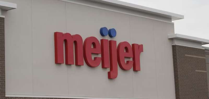
The History of the Meijer Logo
![]()
Oh man, if logos could talk! The history of the Meijer Logo is like a fun trip down memory lane.
Evolving with Times
From its inception, the Meijer Logo has undergone several changes. Each transformation mirrored the shifts in design trends of the times and the brand’s evolution. It’s like watching your favorite band change its music style, but still rock!
Staying True to Roots
While the design evolved, the essence of the logo remained unchanged. It always encapsulated the brand’s dedication to its customers and its promise of quality.
The Colors of the Meijer Logo
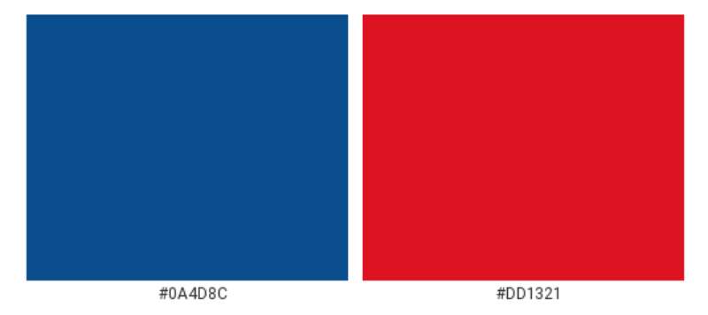
Colors, my friend, they’re more than just eye candy!
Significance of the Chosen Hues
The Meijer Logo contains blue. Blue often represents trust, reliability, and responsibility – precisely what Meijer promises its customers. That’s some deep color psychology right there!
The Power of Consistency
Sticking with a consistent color palette ensures brand recognition. That blue in the Meijer Logo? Instantly recognizable and makes you think, “Ah, good ol’ Meijer!”
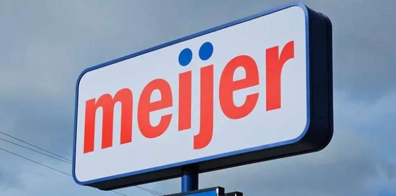
The Font Used in the Meijer Logo
Fonts, the unsung heroes of design!
Typography Matters
The font used in the Meijer Logo is clean, bold, and unpretentious. It aligns perfectly with the brand’s ethos – providing clear value without unnecessary frills.
The Human Touch
Despite its clean lines, there’s a warmth to the font. It’s like a handshake – firm yet friendly. That’s the vibe the Meijer brand gives off, always welcoming its customers.
The Adaptability of the Meijer Logo
The real test of a logo? How adaptable it is!
On Different Platforms
From massive billboards to tiny app icons, the Meijer Logo holds its own. It’s versatile, ensuring the brand’s identity remains consistent across platforms.
Timeless Appeal
While staying contemporary, there’s a timeless quality to the Meijer Logo. It’s not swayed by fleeting design trends, ensuring it always feels relevant.
The Impact of the Meijer Logo on Branding
Last, but certainly not least, let’s talk about the real-world impact!
Driving Customer Recognition
Every time you see that familiar font and color, you’re reminded of Meijer’s commitment to quality. It’s more than a logo; it’s a promise.
Setting It Apart
In the sea of brands, the Meijer Logo stands tall, setting it apart from its competitors. It’s a beacon of trust and reliability in the retail world.
FAQ On The Meijer Logo
What does the Meijer logo represent?
The emblem stands as a beacon of the brand’s values. It symbolizes a commitment to community, value, and quality. The signature “M” reflects Meijer’s identity, inviting trust and familiarity within the retail space.
Has the Meijer logo undergone changes?
Yes, it’s evolved. The logo has seen subtle shifts, reflective of the company’s growth and response to the dynamic landscape of retail industry trends. Each redesign carefully balances heritage with innovation.
What colors are used in the Meijer logo?
Primarily, it boasts a bold blue and vibrant red. These hues are pivotal to the brand’s visual identity, symbolizing qualities like trust and vitality—pillars upon which Meijer prides itself.
Is the Meijer logo trademarked?
Absolutely, the logo is a protected trademark. This safeguards the emblem from unauthorized use, maintaining the integrity of the Meijer, Inc. reputation and brand equity.
What font is used in the Meijer logo?
The logo utilizes a bespoke, sans-serif typeface. It’s sleek, modern, and engineered for legibility. Such custom font style is coherent with Meijer’s corporate design strategy.
How often has the Meijer logo been redesigned?
It’s been updated selectively, with consideration for maintaining brand recognition. The logo isn’t whimsically changeable but is revised to reflect modern aesthetics and marketing strategy.
What elements make the Meijer logo unique?
Its simplicity and recognizable “M” make it distinctive. This clarity of design is a strategic choice, reinforcing the Meijer brandmark as a fixture in the consumer’s mind.
How does the Meijer logo impact branding?
It’s a critical corporate branding component, encapsulating the company’s essence upon display—akin to a visual handshake. The logo is pivotal in forming first and lasting impressions.
How is the Meijer logo used across the brand?
The logo finds its place across all marketing materials—from in-store signage to digital platforms. Consistent logo use accords with branding guidelines, ensuring a cohesive company logo history.
Can the Meijer logo be used by third parties?
Usage by third parties requires permission. Meijer controls its graphic elements under trademark law to prevent brand dilution—it’s a cornerstone of brand loyalty and consumer perception management.
Conclusion
Embarking on a visual journey, we’ve dissected the nuances of the Meijer Logo, a symbol that stretches beyond the façade of a retail giant. It’s a narrative etched in hues of trust-injected blue and energy-laden red, whispering the tale of quality, community, and steadfast value.
- From the tailored font style to the meticulously trademarked emblem,
- From the strategy behind the retail chain emblem to its application across varied marketing materials,
- From its logo redesign to the protection under trademark law,
our exploration has revealed layers of strategic design impulses driving the silent communicator that is the Meijer brandmark.
As we part ways with this odyssey of design and strategy, we leave with a heightened appreciation for the entity that does more than mark packages and signposts—it carves an indelible mark upon the mindscape of shoppers, signifying a beacon of dependability in the world of retail.
If you liked this article about the Meijer logo, you should check out this article about the ShopRite Logo.
There are also similar articles discussing the Speedway Logo, the Sprouts Farmers Market Logo, the HEB logo, and the Kroger logo.
And let’s not forget about articles on the Lidl logo, the Metro logo, the Morrisons logo, and the Publix logo.
Bogdan Sandu, a seasoned designer with 15 years of diverse experience, has been designing websites since 2008.
Renowned for his expertise in logo design and visual branding, Bogdan has developed a multitude of logos for various clients.
His skills extend to creating posters, vector illustrations, business cards, and brochures. Additionally, Bogdan's UI kits were featured on marketplaces like Visual Hierarchy and UI8.
Latest posts by Bogdan Sandu (see all)
- The Activision Blizzard Logo History, Colors, Font, And Meaning - 29 April 2024
- Rainbow Color Palettes for Joyful Designs - 29 April 2024
- The Bethesda Logo History, Colors, Font, And Meaning - 28 April 2024