The ShopRite logo is the official visual mark of ShopRite Supermarkets, a cooperative grocery chain operating primarily across the northeastern United States. It represents one of the most recognized identities in American retail food branding. Owned and operated under Wakefern Food Corporation, ShopRite’s brand mark has gone through several updates since the chain was founded in 1946, reflecting broader shifts in how grocery store logos communicate value, trust, and accessibility to everyday shoppers.
Within the history of supermarket branding, ShopRite sits alongside major retailers that have used logo updates to signal price positioning and community focus. Its visual identity has consistently leaned into bold, accessible design choices rather than premium aesthetics, which fits the cooperative’s core mission.
The current logo is a wordmark-based design featuring bold, rounded lettering in red and white. It was introduced in the early 2000s as part of a broader brand refresh. No single external design agency has been publicly credited for the current iteration.
ShopRite was founded in 1946 when a group of independent grocers joined forces under Wakefern Food Corporation. The brand has gone through at least four notable logo iterations since its founding, each reflecting a different era of retail design.
What is the ShopRite Logo?
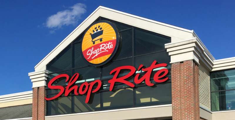
The ShopRite logo is a bold red wordmark featuring rounded, capitalized lettering set against a white background. It was introduced in its current general form in the early 2000s. The design is wordmark-based, with no standalone icon, built to communicate affordability and accessibility across signage and packaging.
- Design Type: Wordmark (text-only logo)
- Primary Elements: Bold capitalized sans-serif lettering, red and white color scheme
- Official Introduction Date: Current version introduced circa early 2000s; brand established 1946
- Designer/Agency: No publicly credited external agency for the current version
- Trademark Status: Registered trademark under Wakefern Food Corporation
- Color Palette: Primary red (#CC0000 approx.), white (#FFFFFF)
- Usage Context: Store signage, product packaging, weekly circulars, digital platforms, loyalty card materials, and marketing campaigns
How Has the ShopRite Logo Evolved Over Time?
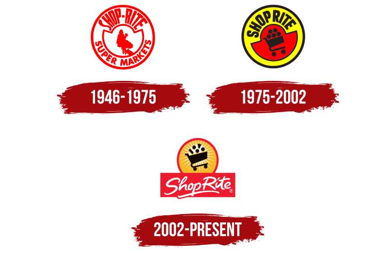
ShopRite’s logo has gone through several visual shifts since 1946, moving from ornate mid-century lettering styles toward cleaner, bolder wordmark designs.
Each update reflected both internal brand strategy and the changing visual language of American retail at the time.
Original ShopRite Logo (1946-1960s)
- Years Active: 1946 to early 1960s
- Design Description: Script-influenced lettering with decorative elements typical of mid-century American retail signage
- Color Scheme: Red and white, common for food retail of the era
- Designer: Unknown
- Context: Introduced when eight independent grocers formed a buying cooperative to compete against larger chains
- Key Changes from Previous: N/A (first version)
- Cultural Significance: Represented cooperative grocery power at a time when independent stores were losing ground to larger retail groups
Mid-Century ShopRite Logo (1960s-1980s)
- Years Active: 1960s to 1980s
- Design Description: Bolder block lettering, reduced decorative detail, more structured layout reflecting modernist retail trends
- Color Scheme: Red and white retained
- Designer: Unknown
- Context: American supermarket chains were standardizing their visual systems during this period; ShopRite followed suit
- Key Changes from Previous: Dropped script influences, moved toward heavier sans-serif-adjacent lettering
- Cultural Significance: Signaled ShopRite’s growth from a small cooperative into a recognizable regional chain
Late 20th Century ShopRite Logo (1980s-2000s)
- Years Active: 1980s to early 2000s
- Design Description: Rounded, friendly letterforms with a slightly italicized feel; red remained dominant
- Color Scheme: Red and white with occasional blue accents in supporting materials
- Designer: Unknown
- Context: Retail branding broadly shifted toward approachable, family-friendly aesthetics during this period
- Key Changes from Previous: Softer, more rounded letterforms; less rigid structure
- Cultural Significance: Positioned ShopRite as a community-focused, accessible grocery option in the Northeast
Current ShopRite Logo (Early 2000s-Present)
- Years Active: Early 2000s to present
- Design Description: Clean, bold red wordmark with consistent weight across all letterforms; no tagline in the core mark
- Color Scheme: Red (#CC0000 approx.) and white
- Designer: No publicly credited agency
- Context: Part of a broader brand refresh aimed at modernizing store appearance and digital presence
- Key Changes from Previous: Simplified letterforms, more uniform weight, cleaner overall execution
- Cultural Significance: Reflects the contemporary retail trend toward clean, scalable wordmarks that work across both physical and digital environments
What Do the Design Elements of the ShopRite Logo Mean?
The ShopRite logo uses bold, red wordmark lettering to communicate straightforward value and no-frills reliability. The lack of a symbol or icon keeps the brand name itself as the primary identifier.
Red drives urgency and appetite associations. The clean wordmark avoids distraction, putting the name front and center.
This is a deliberate choice. Shoppers should recognize the name instantly, not decode an abstract mark.
Why Did ShopRite Choose These Specific Colors?
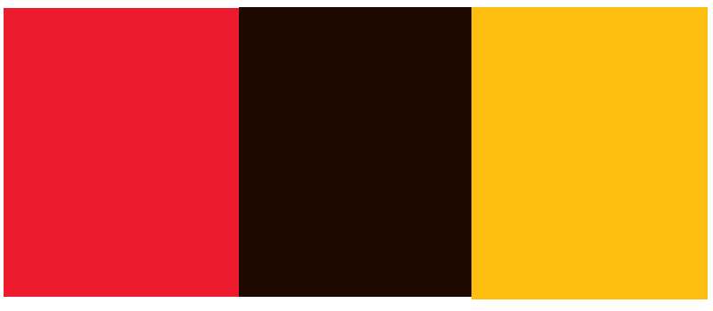
- Red
- Hex: Approximately #CC0000
- Pantone: Close to Pantone 485
- Symbolic meaning: Energy, urgency, action
- Psychological impact: Stimulates appetite and draws attention; widely used in food retail for this reason. Color psychology research consistently shows red increases purchase impulse in retail environments.
- Brand/industry connection: Red is one of the most common colors in supermarket branding. See red logos across major retail brands for context.
- White
- Hex: #FFFFFF
- Symbolic meaning: Cleanliness, simplicity, openness
- Psychological impact: Creates contrast, improves legibility, signals hygiene (relevant for food retail)
- Brand/industry connection: White backgrounds in grocery branding reinforce cleanliness and straightforward value messaging
What Typography Style Is Used in the ShopRite Logo?
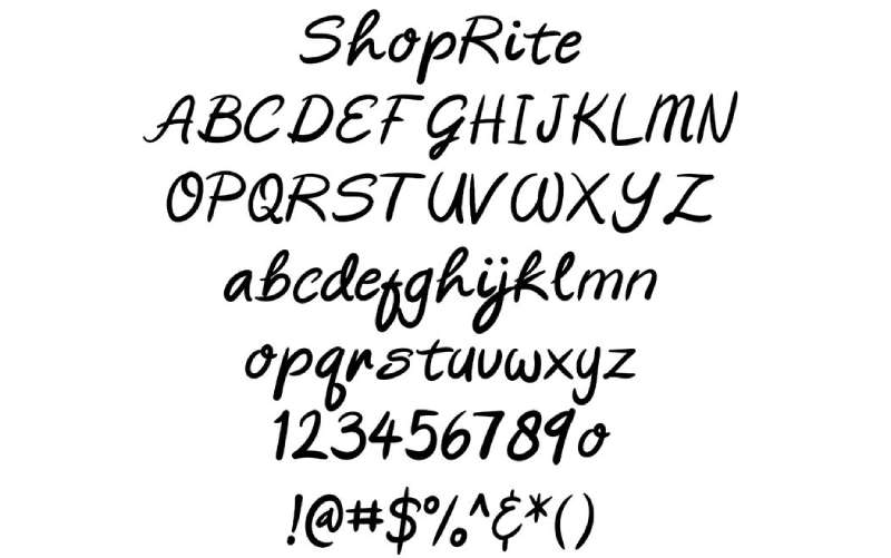
The ShopRite wordmark uses a bold, rounded sans-serif-style custom lettering. It is not a publicly identified off-the-shelf font.
The letterforms are uniform in weight with no dramatic thick-thin contrast. This keeps the mark readable at small sizes on packaging and large sizes on storefront signage.
Over the decades, the typography shifted from more decorative, script-influenced lettering toward the current clean, blocky wordmark. The rounded edges soften what could otherwise feel like a rigid, corporate mark.
What Are the Hidden Meanings in the ShopRite Logo?
There are no publicly documented hidden or subliminal elements in the ShopRite logo. It is a straightforward wordmark built for recognition and legibility.
The name “ShopRite” itself does carry intentional meaning: “right” as in correct, fair, and value-driven. That’s the closest thing to embedded symbolism in the mark.
No designer has made public statements about intentional hidden visual elements. What you see is genuinely what you get here, which fits the brand’s no-frills positioning.
How Does the ShopRite Logo Compare to Competitor Logos?
ShopRite’s wordmark-only approach contrasts with competitors that use icons or emblems alongside their name. The red-and-white palette is shared across much of the grocery sector, making differentiation more dependent on letterform style than color.
Compared to the Kroger logo, ShopRite’s mark is simpler and less icon-dependent.
The Publix logo uses a more traditional serif-adjacent approach, giving it a warmer, legacy feel compared to ShopRite’s utilitarian wordmark.
The Walmart logo added the spark symbol to differentiate its wordmark. ShopRite has never taken that route, staying fully text-based.
The Whole Foods Market logo uses a similar no-frills wordmark approach, though it targets a premium market position. Both brands use simplicity but for different strategic reasons.
The Aldi logo is an interesting comparison. Both Aldi and ShopRite compete on value. Aldi uses a more geometric, abstract mark while ShopRite sticks to pure wordmark territory.
The Trader Joe’s logo is far more illustrative and personality-driven, reflecting a fundamentally different brand positioning despite both being grocery chains.
Among grocery store logos broadly, ShopRite sits squarely in the utilitarian camp: bold, red, simple, and built for recognition over personality.
What Are the Technical Specifications of the ShopRite Logo?
Official Color Codes
- Primary Color: Red
- Hex: #CC0000 (approximate; exact proprietary values not publicly disclosed)
- RGB: (204, 0, 0) approximate
- CMYK: (0, 100, 100, 20) approximate
- Pantone: Approximately Pantone 485 C
- Secondary Color: White
- Hex: #FFFFFF
- RGB: (255, 255, 255)
- CMYK: (0, 0, 0, 0)
- Pantone: White
Note: Exact official color codes are proprietary to Wakefern Food Corporation and not publicly documented. The values above are based on visual analysis and widely referenced approximations.
Dimensions and Proportions
- Aspect ratio: Horizontal wordmark; wider than tall, typically around 4:1 width-to-height ratio
- Minimum size requirements: Not publicly documented; standard retail practice recommends no smaller than 1 inch wide in print applications
- Clear space specifications: Not publicly documented; standard brand practice requires clear space equal to the cap height of the wordmark on all sides
- File formats available: Vector graphics (AI, EPS, SVG) for scalable use; PNG with transparent background for digital. JPEG and bitmap formats available for specific use cases.
- Resolution: For print, a minimum of 300 DPI is standard
What Cultural Impact Has the ShopRite Logo Had?
ShopRite is a genuinely embedded institution across the Northeast, particularly in New Jersey, New York, and Pennsylvania. The logo carries significant community weight in these areas, appearing on storefronts that have served families for generations.
The annual ShopRite LPGA Classic golf tournament has put the brand on national television for decades, giving the logo exposure well beyond its core grocery market.
In low-to-middle income communities throughout the Northeast, ShopRite stores are often the primary full-service grocery option. The logo, by extension, carries associations with access and community.
It has also become a recognizable presence in pop culture references tied to New Jersey identity, appearing in everything from local news to casual conversation as shorthand for everyday grocery life in the region.
How Does the ShopRite Logo Fit Into the Overall Brand Identity?
The ShopRite logo is the anchor of a broader brand identity system that includes store signage, private-label packaging, weekly circular design, loyalty card materials, and digital storefronts. Every touchpoint uses the same red-and-white color system established by the wordmark.
The logo connects directly to the ShopRite private label product line, which uses consistent red-and-white packaging. This creates strong repetition across the shopping experience.
Wakefern’s cooperative structure means individual store owners operate under the ShopRite brand. The logo serves as the unifying mark across hundreds of independently owned locations, which is a genuinely interesting challenge for brand consistency.
The brand style guide (not publicly available) governs how the mark appears across all member stores and marketing materials, keeping the identity coherent despite decentralized ownership.
How Should the ShopRite Logo Be Used?
Official Usage Guidelines
- Do: Use approved logo files sourced directly from Wakefern Food Corporation or the official ShopRite media/press resources
- Do: Maintain clear space around the logo and preserve original proportions
- Do: Use the logo on white or light neutral backgrounds for maximum legibility
- Don’t: Alter the logo’s colors, stretch or compress proportions, add drop shadows, outlines, or other effects
- Don’t: Place the logo on busy backgrounds that reduce contrast or legibility
- Don’t: Recreate the logo from scratch or use unofficial versions found on third-party sites
Where to Access Official Logos
- Official press and media inquiries should be directed to Wakefern Food Corporation’s communications department
- ShopRite’s official website (shoprite.com) may include press kit resources for media use
- Vendor and partner usage requires formal approval from Wakefern
Licensing and Trademark Details
- The ShopRite name and logo are registered trademarks of Wakefern Food Corporation
- Unauthorized commercial use of the logo is prohibited under U.S. trademark law
- Editorial and informational use (journalism, design analysis, historical reference) generally falls under fair use, but commercial reproduction requires explicit permission
- Partners, suppliers, and franchised store operators work under formal licensing agreements with Wakefern
FAQ on The ShopRite Logo
What does the ShopRite logo look like?
It is a bold red wordmark on a white background.
The lettering is capitalized, rounded, and uniform in weight. There is no standalone icon or symbol. Just the name, clean and direct.
What colors does the ShopRite logo use?
The primary color is red, approximately #CC0000, paired with white.
Red is standard across grocery store branding for its appetite and urgency associations. White provides contrast and signals cleanliness, which matters in food retail.
Has the ShopRite logo changed over the years?
Yes. The ShopRite brand identity has gone through at least four notable iterations since 1946.
Early versions used more decorative lettering. Over time, the design simplified into the bold, clean wordmark used today. Each update tracked broader retail design trends.
Who designed the ShopRite logo?
No external agency or designer has been publicly credited for the current version.
This is fairly common with cooperative grocery chains. Wakefern Food Corporation manages the brand internally, and logo updates tend to happen without public announcements or designer attribution.
What font does the ShopRite logo use?
The wordmark appears to use a custom or heavily modified sans-serif font.
It is not a publicly identified typeface. The letterforms are rounded and consistent in weight, built for legibility across store signage and product packaging at any size.
What is the ShopRite logo’s symbolic meaning?
The name itself carries the core meaning. “Right” signals fairness, value, and correctness.
There are no documented hidden visual elements. The cooperative grocery model ShopRite was built on is the real brand story, and the straightforward wordmark reflects that no-frills philosophy directly.
Where can I download the official ShopRite logo?
Official logo files are not publicly available for open download.
Media and press requests go through Wakefern Food Corporation’s communications team. For editorial use, high-resolution versions can sometimes be found via press releases. Vendor and partner use requires formal approval.
What file formats is the ShopRite logo available in?
For professional use, the logo should be used as a scalable vector file such as SVG, AI, or EPS.
PNG with a transparent background works for digital platforms. Bitmap formats are fine for web use but not recommended for print, where 300 DPI minimum applies.
How does the ShopRite logo compare to other supermarket logos?
ShopRite stays wordmark-only, which sets it apart from chains that pair text with a symbol.
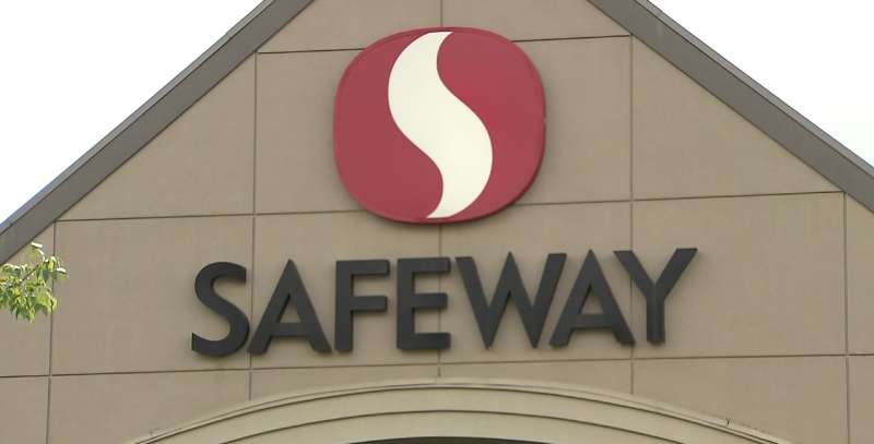
The Target logo uses a bold icon. The Safeway logo adds an “S” mark. ShopRite skips all that. Among grocery store logos, its approach is notably minimal.
Is the ShopRite logo trademarked?
Yes. The ShopRite name and logo are registered trademarks of Wakefern Food Corporation.
Unauthorized commercial use is prohibited under U.S. trademark law. Editorial and informational use generally falls under fair use, but any commercial reproduction requires explicit written permission from Wakefern.
Conclusion
The ShopRite logo is a straightforward example of retail wordmark design that has stayed relevant through simplicity rather than reinvention.
Its red-and-white color scheme, clean corporate branding, and no-icon approach reflect the cooperative grocery model it was built on.
From its 1946 origins through each logo iteration, the visual identity has consistently prioritized recognition and accessibility over style.
For anyone studying supermarket brand identity or retail visual design, ShopRite is a useful case: sometimes the most effective logo is just a name, well-set, in the right color.

Renowned for his expertise in logo design and visual branding, Bogdan has developed a multitude of logos for various clients.
His skills extend to creating posters, vector illustrations, business cards, and brochures. Additionally, Bogdan's UI kits were featured on marketplaces like Visual Hierarchy and UI8.
He also wrote in the past years on sites like Design Your Way, WebDesignerDepot, WPDean, Designmodo, Speckyboy, Slider Revolution, and more.
- The Windsurf Logo History, Colors, Font, And Meaning - 10 October 2026
- How to Remove Background From Product Photos (No Photoshop) - 10 October 2026
- How Designers can Build a Stronger Online Creative Identity - 9 October 2026

Bogdan Sandu is a seasoned designer who has been designing websites since 2008. Renowned for his expertise in logo design and visual branding, Bogdan has developed a multitude of logos for various clients. His skills extend to creating posters, vector illustrations, business cards, and brochures. Additionally, Bogdan's UI kits were featured on marketplaces like Visual Hierarchy and UI8. He also wrote in the past years on sites like Design Your Way, WebDesignerDepot, WPDean, Designmodo, Speckyboy, Slider Revolution, and more.
You Might Also Like