The Whole Foods Market Logo History, Colors, Font, And Meaning
Imagine a symbol catching your eye — a radiant apple embraced by a leafy green flourish. That’s the emblem of a revolution in pantries.
The Whole Foods Market Logo stands as more than mere branding; it’s a herald for wholesome sustenance and conscious consumerism.
Peek behind the curtain, and you’ll uncover a narrative woven through typography and color, a tale of organic ethos meeting modern marketplace sensibilities.
Here, we delve into the essence of what makes this insignia an emblematic beacon in the aisles of sustainably-sourced, nutrition-laden goods.
By journey’s end, you’ll have gained insights into the design philosophy that mirrors the values of Whole Foods Market — a testament to the power of logos in narrating a company’s heart and soul.
Amidst the discourse, expect to traverse topics from the company’s ecologically-aware practices to its alignment with fair trade products and non-GMO assurance, revealing the substance behind the symbol.
So, let your curiosity about that familiar green emblem guide you through an exploration of imagery and ideology, bridging the gap between iconic graphics and the quest for health-conscious living.
The Meaning Behind the Whole Foods Market Logo
Deep Dive into its Essence
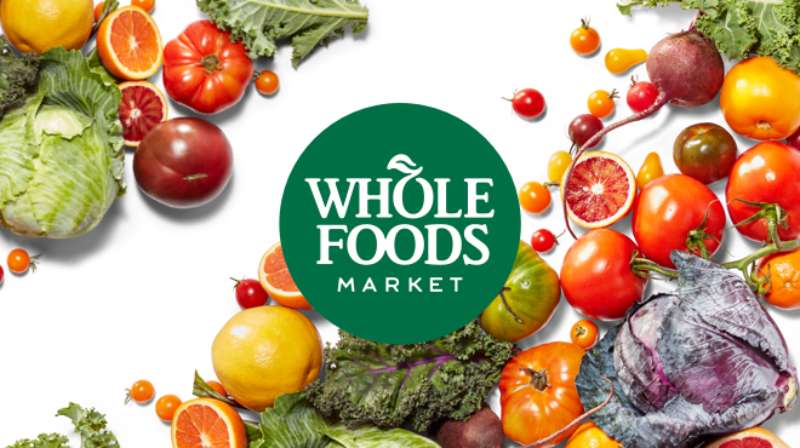
The Whole Foods Market logo isn’t just another random emblem we pass by in grocery aisles. It’s a representation of a commitment: to organic, fresh, and health-conscious products.
The logo speaks volumes about the brand’s dedication to providing quality, sustainable, and organic products to its consumers.
Emblem of Purity
The design’s straightforward nature, bearing the name “Whole Foods Market,” doesn’t just stand for the brand but symbolizes its wholesome offerings.
Whole Foods stands for completeness, purity, and everything natural. When you see the logo, you feel assured of its promise to keep things real.
Promise of Quality
Ever noticed the crisp and clear lines? It portrays the store’s clear stance on organic and natural products, their commitment to quality, and their transparent relationship with consumers.
The History of the Whole Foods Market Logo
The Humble Beginnings
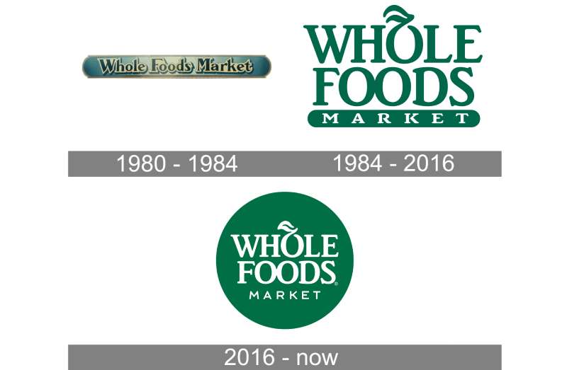
Started in 1980, Whole Foods has seen a lot of seasons. And just like the brand, its logo has evolved. It began as a simple, earthy representation mirroring their then, small organic store’s spirit.
Evolution Over Time
Over the years, the logo underwent minor tweaks, adjusting to contemporary design sensibilities. Each change, though, stayed true to its roots – retaining the brand’s central essence and commitment to quality.
The Colors of the Whole Foods Market Logo
Shades of Passion
Green is not just green here. It’s the color of life, of nature. Whole Foods’ signature green hue represents its commitment to organic living, sustainability, and eco-friendliness.
A Play on Contrast
Then there’s the white – a color of purity and simplicity. Together, green and white create a visual contrast, mirroring the brand’s pure, fresh offerings amidst a complex, processed world.
The Font Used in the Whole Foods Market Logo
A Statement in Simplicity
The font is as straightforward as the brand’s values. It’s neat, clear, and unpretentious. The sans-serif typography gives it a modern touch while maintaining its classic feel, resonating with both young avocado-toast lovers and our granola-loving folks.
Brand Perception and Whole Foods Logo
The Power of First Impressions
Before even stepping into the store, the logo does its magic. It sets the scene, prepping customers for a unique shopping experience. That logo ensures trust and a sense of eco-friendly, health-conscious community.
Global Recognition

It’s not just a local star. The logo has gone global, becoming a beacon for organic food lovers worldwide. It’s not just recognized; it’s respected.
The Emotional Connect: Why We Love It
A Sense of Belonging
You know, every time I walk past it, there’s this innate sense of trust. It’s not just a store; it’s a community hub for those who love and appreciate the goodness of nature.
More than Just Design
While the shades, fonts, and design play their part, it’s the emotion it stirs that’s the real winner. It’s not just a logo; it’s a feeling. A good one, at that.
FAQ On The Whole Foods Market Logo
What’s the story behind the Whole Foods Market logo?
The logo encapsulates the brand’s commitment to natural, organic food and environmentally responsible practices. It’s designed to evoke a sense of freshness and purity, signaling to customers that they’re entering a space that prioritizes health and sustainability.
How has the Whole Foods logo evolved over time?
From its humble beginnings, the logo matured into a polished emblem. The evolution reflects the brand’s growth from a local store to an international chain. Each redesign subtly honed its message, refining the balance between nature and sophistication.
Why does the Whole Foods logo use green?
Green is synonymous with growth, vitality, and nature. It’s a visual nod to fresh, natural produce and Whole Foods’ commitment to eco-friendly products. It inherently communicates the brand’s essence, almost without a word.
What does the leaf in the Whole Foods logo represent?
That singular leaf symbolizes the brand’s focus on plant-based foods and natural ingredients. It’s a delicate reminder that Whole Foods champions a connection with nature, advocating for organic farming and a healthier diet for its community.
Is there any significance to the font used in the Whole Foods Logo?
Absolutely. The clean, sans-serif font mirrors the brand’s forward-thinking approach and clarity of purpose. It reflects a modern, accessible brand while maintaining a touch of elegance.
Did Amazon’s acquisition of Whole Foods change the logo?
Despite the acquisition, the logo retained its identity. A testament to its strength and customer recognition, it stands unchanged, maintaining Whole Foods Market’s distinct brand within Amazon’s portfolio.
What does the Whole Foods logo tell consumers about the brand?
It’s a beacon of quality and trust. A shorthand for health-conscious consumers to recognize a store that aligns with their values — from certified organic products to sustainable practices and community engagement.
Can you find the Whole Foods logo on every product in the store?
Not on every product, but it’s prominent on Whole Foods Market private label goods. These products adhere to the brand’s high standards, from cruelty-free sourcing to non-GMO assurance, reinforcing the logo’s promise.
How does the Whole Foods Market logo impact customer perception?
A successful logo like Whole Foods’ green emblem instantly conveys the brand’s narrative, affecting customer perception. It signals a premium shopping experience prioritizing health, sustainability, and planet-friendly products.
Is the Whole Foods Market logo copyrighted?
Yes, as with most corporate logos, it’s legally protected. Whole Foods Market, Inc., holds the copyright, safeguarding the emblem’s unique identity and fortifying the brand’s intellectual property.
Conclusion
Winding through the collection of thoughts about the Whole Foods Market Logo, a pattern emerges, reflecting the intricate landscape of brand identity. This emblem, a green icon on a field of white, captures the spirit of a movement where nutrition and ethics dance in tandem.
- It’s a signal amidst the visual noise,
- a beacon for the eco-conscious,
- a stamp of premium quality.
In every brush stroke of its leaf, every curve of the font, the story of a corporate entity deeply intertwined with sustainable practices and health-conscious choices unfolds. What began as a splash of color has solidified into a symbol resonating far beyond its physical manifestation, reaching into the hearts of those walking the aisles in search of organic, non-GMO, and fair trade products.
As eyes set upon it, they see more than simply a logo. It’s a promise, a commitment, the epitome of Whole Foods Market’s pledge to nourish and nurture both people and the planet.
If you liked this article about the Whole Foods Market logo, you should check out this article about the ShopRite logo.
There are also similar articles discussing the Speedway logo, the Sprouts Farmers Market logo, the Target logo, and the Tesco logo.
And let’s not forget about articles on the Trader Joe’s logo, the Vons logo, the Walmart logo, and the Wegmans logo.
Bogdan Sandu, a seasoned designer with 15 years of diverse experience, has been designing websites since 2008.
Renowned for his expertise in logo design and visual branding, Bogdan has developed a multitude of logos for various clients.
His skills extend to creating posters, vector illustrations, business cards, and brochures. Additionally, Bogdan's UI kits were featured on marketplaces like Visual Hierarchy and UI8.
Latest posts by Bogdan Sandu (see all)