
Auntie Anne’s Logo History, Colors, Font, and Meaning
Ever locked eyes with a swirl that twisted your thoughts to cravings? That’s the power of the Auntie Anne’s logo.
Snap, here’s a visual that doesn’t just mark a spot in the mall’s corridor; it’s a sensory trip down comfort-lane. Now, you’re about to unwrap the icon that heralds doughy delights, one golden twist at a time.
This insignia isn’t just about graphic design. No, it’s an emblem that rolls together brand recognition and corporate identity into one aromatic package.
By thread’s end, you’ll be versing in the art of visual branding as we knead through the logo evolution of this famed pretzel outpost.
Not merely a logo, it stands as a beacon for franchise branding, a testament to a sweet-salted legacy baked in trademark colors.
Here’s the twist; from the first dip into the warm waters of inspiration to the finishing salt sprinkle of understanding how an emblem style can define a customer’s journey, you’ll grasp it all.
With every paragraph, unravel the strands that Auntie Anne’s has woven into its iconic visual identity system—no fluff, just the essence of design allure and brand assets mastery.
The Meaning Behind the Auntie Anne’s Logo
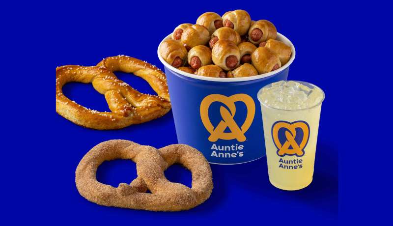
Step into a bustling mall food court; the wafting aroma of fresh, warm pretzels is unmistakable. At its center stands a beacon, the distinctive emblem that marks the source of this olfactory delight – the Auntie Anne’s logo. What this emblem bears is not just a marketing device, but a tale steeped in heritage, homeliness, and handcrafted quality.
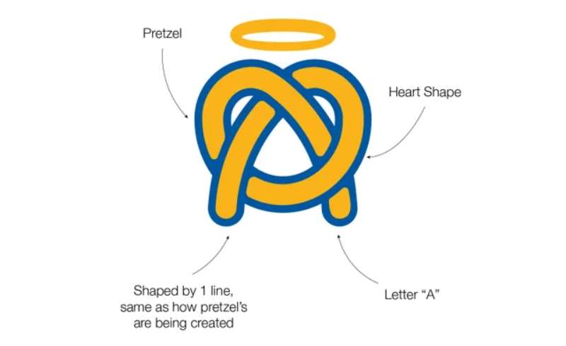
Twist-shaped and simple, the logo embodies the essence of the company’s iconic product, hand-rolled pretzels. The emblem reflects the brand’s commitment to tradition, with a contemporary touch that speaks to modern aesthetics. At its core, it represents a timeless craft—a looped ribbon of dough, transformed by hand into a golden-brown treat, embodying the labor of love and care that defines every product from the baking company.
Beaconing trust, the logo is a stamp of consistency. Through its design, consumers are reassured that each bite, irrespective of geographic location, will deliver the same nostalgic taste of Auntie Anne’s brand.
The History of the Auntie Anne’s Logo
In the annals of graphic design for food brands, the Auntie Anne’s logo stands as a chapter rich in evolution. Since its birth in 1988, Anne Beiler’s simple pretzel bakery has burgeoned into a global franchise business model. The logo, just like the business, has adapted and matured, embracing new forms while maintaining its iconic visual identity.
From its inception, the logo has stood as the company’s flag, signalling homemade baking perfection. In the early years, it bore a rustic, almost pastoral feel—echoing the market stand where the first pretzel was sold. Subsequent redesigns have polished its appearance, endowing it with a more modern, streamlined guise while retaining the brand identity and snack brand element that customers identify as uniquely Auntie Anne’s.
Each modification has been carefully calibrated, ensuring the logo’s core DNA—a symbol of warm comfort—remains intact.
The Colors of the Auntie Anne’s Logo

Color psychology is pivotal in defining a brand’s tone and customer engagement. The Auntie Anne’s logo harnesses the power of color to encapsulate its brand essence. Primarily festooned in a warm blue and white, the hues evoke feelings of reliability and freshness—paramount characteristics of the food retail logo.
The blue bespeaks reliability and trust, a nod to the company’s reputation for consistency and quality. This is further underscored by white, denoting cleanliness and purity, reflecting the company’s commitment to high standards in food preparation and customer service.
The clever use of color in the logo thus does more than attract the eye; it communicates the company’s values at a glance.
The Font Used in the Auntie Anne’s Logo
Typeface selection is never incidental. The Auntie Anne’s logo utilizes a custom script font that serves the dual purpose of conveying warmth and fostering brand loyalty and customer recognition.
The typeface evokes a sense of homemade charm and approachability. The font’s craftsmanship resonates with the hand-made quality of the pretzels, reinforcing the overall branding elements. The sweeping curves and easy-to-read letters mirror the smooth, circular shape of Auntie Anne’s signature product, making it as delightful to the eyes as the pretzels are to the palette.
It’s a calculated nod to both heritage and recognition—ensuring the Auntie Anne’s name is remembered long after the last bite of the pretzel.
The Impact of Design Elements
Every component of the Auntie Anne’s logo—from spacing to symbol to snack food logo trends it embraces—has been meticulously selected to maximize impact. For instance, the contrast in size between the graphical twist and the text invites the observer to savor both separately, while viewing them as part of a cohesive whole.
The logo’s design respects principles of visual hierarchy and balance, ensuring legibility while enhancing the attractiveness of Auntie Anne’s physical and digital real estate. It stands out on storefronts, packaging, and advertising materials; a visual identity ready-made for marketing and advertising strategies.
The subtle touch of the heart nestled within the pretzel silhouette in recent renditions speaks to the brand’s dedication and homemade origins—a brand signature that endears and remains memorable.
Logo’s Functionality Across Media
![]()
The ingenuity of the Auntie Anne’s logo is also evident in its versatility. The snack company logo is engineered to be identifiable across various platforms, a requisite in the contemporary QSR Magazine defined landscape.
Be it the high-resolution renderings seen on the vast façades of Auntie Anne’s outlets or the miniaturized icons that punctuate digital interfaces, the logo retains its essence. This adaptability ensures that whether on a mobile app or an expansive billboard, the brand’s story is told unwaveringly—each glance reinforces brand identity in the Fast food and snack industry.
The scalability of the logo underscores its smart design – an entity built for longevity and ubiquitous presence amidst a rapidly evolving visual identity in fast food domain.
FAQ On The Auntie Anne’s Logo
Who created the Auntie Anne’s logo?
The logo design—that masterpiece of snacking art—isn’t the work of just one mind. It’s the offspring of collaborative creativity, finessed by design teams and brand strategists.
A fusion of visual branding and corporate identity, it’s meant to convey warmth and homely goodness.
What do the colors in the Auntie Anne’s logo represent?
Think of the logo’s trademark colors like a recipe. The blue stands for trust and reliability. Those gold tones? They’re the hue of freshly-baked pretzels. It’s all about stirring up feelings of comfort and savoriness, making you yearn for a bite.
Has the Auntie Anne’s logo changed over time?
Absolutely, it’s churned through transformations like dough in the hands of an expert baker. The tweaks reflect settling times and an evolving brand image—keeping it fresh yet familiar. This good ol’ twist symbol’s been spruced up to stay crispy in a fast-moving world.
What is the significance of the pretzel shape in the logo?
That iconic twist isn’t just for kicks. It beckons to the heart of Auntie Anne’s, their hand-rolled pretzels. It’s a nod to the craftsmanship, the handmade quality—a symbol etched into the brand’s visual identity system and our cravings too.
How does the Auntie Anne’s logo contribute to its brand recognition?
Now, this bad boy is charged with making the brand stick, like dough to a baking tray. It’s a visual handshake, an emblem style that spells familiarity. Across malls and snacking nooks, one glimpse promises a warm, buttery treat—an anthem in graphic design.
Why is the Auntie Anne’s logo considered effective for marketing?
Hit them with nostalgia, and that’s some savory marketing strategy. See, the logo’s round, wholesome vibe turns heads.
It’s a timeless piece of visual branding that resonates with a comfort food classic, triggering our sensory memories—think big on impact, minimal on frills.
In what ways has the Auntie Anne’s logo impacted the food and beverage sector?
This isn’t just another snacking sign; it’s branding elements like this that up the ante in munch-munch land. It stands out, setting the bar for how a corporate logo can define a culinary experience—seamlessly blending corporate branding into the food court scene.
What design principles are evident in the Auntie Anne’s logo?
This delightful swirl is steeped in simplicity, balance, and recognition. It’s got that corporate identity charm with its bold, yet uncluttered look—screaming brand guidelines done right. An exercise in how less is, very much, more.
How does the Auntie Anne’s logo influence franchise branding?
In the fast food franchise rodeo, this logo is a bucking bronco. It packs a punch of continuity, giving each franchisee a slice of the trusted Auntie Anne’s essence. Brand loyalty, it’s baked right into that visual cue, settling into our “comfort eats” spot.
What are the future prospects for the Auntie Anne’s logo in brand evolution?
Well, she’s a fluid dame, dancing with times and tides. Brand assets like these are primed for evolution while sticking to the roots. The logo is geared to remain a relevant marker in the expansive snack industry—a breadcrumb trail leading to the next big twist.
Conclusion
And there you have it. Like the final twist in a pretzel’s journey from flour to golden, we’ve wrapped up our exploration of the Auntie Anne’s logo. We’ve picked apart the strands—from the emblem style to the kaleidoscope of trademark colors—and now, standing back, we’ve got ourselves a full picture.
This isn’t just a lesson in branding elements; it’s a deep dive into how the warp and weft of design weave together an identity that’s both seen and felt. The logo’s visual branding, a silent herald of comfort, etches itself into our memories with the promise of a warm, doughy reprieve. The Auntie Anne’s masterpiece, an untold story baked into an icon, serves as a beacon in the bustling snack industry, a testament to brand guidelines wielded with finesse.
So the next time that swirl catches your eye, you’ll recognize the craft, the strategy, the heart beneath its twists.
If you liked this article about Auntie Anne’s logo, you should check out this article about the Five Guys logo.
There are also similar articles discussing the Tim Hortons logo, the Hardee’s logo, the Papa John’s logo, and the Jollibee logo.
And let’s not forget about articles on the Quiznos logo, the Chipotle Mexican Grill logo, the Carl’s Jr. logo, and the In-N-Out Burger logo.
Bogdan Sandu, a seasoned designer with 15 years of diverse experience, has been designing websites since 2008.
Renowned for his expertise in logo design and visual branding, Bogdan has developed a multitude of logos for various clients.
His skills extend to creating posters, vector illustrations, business cards, and brochures. Additionally, Bogdan's UI kits were featured on marketplaces like Visual Hierarchy and UI8.
Latest posts by Bogdan Sandu (see all)
- The Benefits Of Print on Demand - 13 May 2024
- Earthly Delight: Rich Brown Color Palettes - 13 May 2024
- Designer Fonts: What Font Does Balenciaga Use? - 13 May 2024