The Carl’s Jr. Logo History, Colors, Font, and Meaning
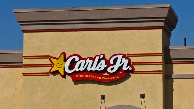
Every brand has a heartbeat, a visual thump that pulses its essence to the world. The Carl’s Jr. logo is more than just a symbol; it’s the face of a fast-food legacy, an emblem that’s weathered the changing tastes of generations.
Herein lies a tapestry of culture, art, and gastronomy, woven into the fabric of an iconic star.
In these lines, a journey awaits, one that’ll unfurl the threads of Carl’s Jr.’s graphic evolution.
The transformation from a humble hot dog cart to an international QSR titan is mirrored in the logo that has become synonymous with bold flavors and an even bolder business model.
By the finale, a hidden world will reveal itself – the world of layers, colors, and typography in logos.
This isn’t just for the artistically inclined; it’s for the curious, the brand identity aficionados, the everyday consumer seeking to peek behind the curtain of a fast-food insignia that beckons with the promise of satisfaction.
Prepare to dissect, to appreciate, to critique. This is where graphic design meets a star-spangled brand, and you’re about to learn how they dance together under the bright lights of the market stage.
The Meaning Behind the Carl’s Jr. Logo
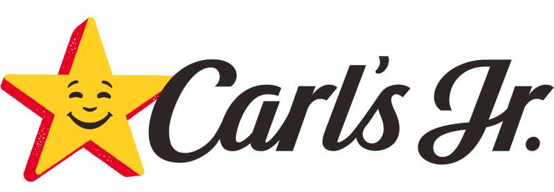
At its core, a logo is a distillation of a company’s mission, values, and identity into a visual symbol. Delving into the meaning of the Carl’s Jr. logo, the star strikes as a symbol of excellence. It projects an image of quality and satisfaction, akin to awarding a star to an actor for an outstanding performance. The idea is to communicate to the patron they are engaging with a brand that is a cut above the rest in the fast food industry.
The Happy Star, the centerpiece of the visual identity, is not just an ordinary star. It carries with it a sense of joy and friendliness, aligning with the brand’s commitment to customer service and satisfaction. It’s an avatar representing the interaction between the patron and the brand experience — a happy ending to the quest for a fulfilling meal. Beyond the star, the typography chosen complements the playful yet confident persona the company embodies.
The History of the Carl’s Jr. Logo
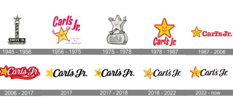
Tracing back through the annals of logo evolution, the Carl’s Jr. emblem has undergone transformations that mirror the business’s growth. The original design, birthed by the founder Carl Karcher, emphasized the brand’s humble beginnings with a simpler, more modest aesthetic. As the company expanded, the logo matured accordingly.
The modifications have marked distinct eras of the brand’s narrative, each logo redesign serving as a new chapter where Carl Karcher Enterprises found new ways to connect with its audience. Each shift in design aligns with a strategic pivot in the branding strategy or changes in the corporate identity. The most recent incarnation still pays homage to the founding trademark image but with a more contemporary spin suited for today’s digital-first consumer landscape.
The Colors of the Carl’s Jr. Logo
Color psychology plays a pivotal role in brand recognition. Delve into the palette, and you’ll find that the Carl’s Jr. corporate identity is awash with reds and yellows — a classic combination in fast food symbol iconography. Red conjures feelings of excitement and appetite. It’s bold; it’s a call to action. Meanwhile, yellow illumines happiness and friendliness, reinforcing the Happy Star’s smiling visage.
Together, these hues don’t just catch the eye; they invite the potential customer into the warm, inviting world of charbroiled burgers and quick-service dining. Strikingly, the consistency of this color scheme has also lent itself to a strong association with the brand, solidifying its status in the visual branding elements hall of fame.
The Font Used in the Carl’s Jr. Logo
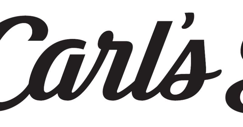
Typography is to text what tone is to speech. The Carl’s Jr. logo utilizes a bold, sans-serif font, which communicates clarity and modernity. The typeface is friendly yet firm, resonating with the company’s philosophy of being straightforward and customer-centric. It must be noted though, the particular font used in the logo is not a run-of-the-mill selection but a tailored type that enhances unique branding graphics.
Evolution of the Design Process
In the realm of logo creation, the Carl’s Jr. emblem stands as a testament to evolving design sensibilities. Each iteration represents not just a shift in aesthetics, but an embrace of new technologies and design principles. The progression from a simple, no-frills logo to a sleek and dynamic family emblem of both Carl’s Jr. and its sister company, Hardee’s, involved rigorous sketching, digital artwork, and customer feedback loops.
A key to successful restaurant branding has been maintaining the logo’s distinct integrity while ensuring relevance in the ever-shifting cultural sands. This delicate dance of respecting tradition and courting innovation has been crucial.
Brand Synergy and Co-branding
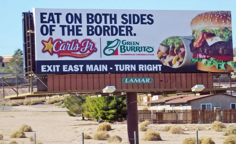
Hardee’s, the sister company and sometimes co-branded partner of Carl’s Jr., shares the Happy Star. This strategic move allows customers to recognize the co-relationship between the two entities, driving home a message of synergy and familiarity. The dual nature of this advertising campaigns device bolsters brand strength and extends market reach for both brands under the CKE Restaurants umbrella.
Co-branding becomes a powerful tool in signaling to the consumer an assured quality and experience, regardless of the banner they dine under. The shared design elements act as an overall company mascot — one emblem to unite two brand stories.
FAQ On The Carl’s Jr. Logo
What’s the story behind the Carl’s Jr. logo?
It’s a classic tale of Americana, really. Born from a hot dog stand, the Carl’s Jr. logo is now a happy star radiating brand identity. It’s come to symbolize hearty meals and a family-owned enterprise that challenged the fast-food big leagues.
How has the Carl’s Jr. logo evolved over the years?
Steadily, my friend, and with intent. From a charming ’50s vibe to the sleek star logo we know today, each tweak mirrored the times. Reflecting growth, retaining that brand recognition, it whispers of innovation while nodding respectfully to its roots.
Why does the Carl’s Jr. logo use a star?
Stars have that timeless allure, right? They’re beacons of aspiration, victory. Carl’s Jr. tapped into this universality, sculpting a corporate branding icon that beams quality, American dream success, and – dare I say – a celestial taste experience.
What are the color meanings in the Carl’s Jr. logo?
Boldness in red, optimism in yellow – Carl’s Jr. chose hues that shout “attention” and “cheer.” This isn’t just fast food; it’s a statement of brand loyalty, of choice. Red, after all, isn’t just a color. It’s an emotion, and it sells.
What kind of typography does the Carl’s Jr. logo use?
Powerful and no-nonsense. The typography complements the brand’s forthright nature. Practical, readable. It’s the visual identity‘s handshake – firm, solid, leaving a lasting impression of reliability and trust.
Is the Carl’s Jr. logo trademarked?
Fort Knox levels of protection here – trademarked logo, through and through. In the fast food industry, your logo’s your armor. It’s legal clout, keeping the brand’s integrity snug and safe.
What does the Carl’s Jr. logo represent?
It’s more than munching on a burger; it’s an experience. The logo shouts foodservice: fast, quality, indulgent. A promise delivered by a star, a guarantee of a meal that’ll make your day just a little better.
How does the Carl’s Jr. logo affect its marketing?
Think of it as the maestro of the advertising campaign orchestra. It cues the appetite, sets the brand strategy tempo. That logo wields power; it’s the visual chorus to the “Eat Like You Mean It” anthem.
Can you identify the Carl’s Jr. logo from afar?
Like spotting an old friend in a crowd! That iconic logo punches through clutter, a beacon of familiarity in a sea of signs. Drive-thru logos interspersed, that star leads the hungered traveler home.
What is the difference between the Carl’s Jr. and Hardee’s logo?
Siblings with their quirks, alright? While Carl’s Jr. flaunts its star, Hardee’s swings with a bit more of the Southern charm. Linked by parent company prowess, they serve similar feels in their locales, common in quality, unique in symbol.
Conclusion
Closing this loop, we’ve circled the galaxy that is the Carl’s Jr. logo. Not just a sign, not just a star— but a tale; a beacon glowing from the billboards, a symbol served up with a side of nostalgia and a hefty helping of modernity.
Let’s pause. Breathing in the essence of this conversation, we’ve dived deep into the layers— the reds, the yellows, the typography standing sentinel. All strategic. All intentional. The happy star has whispered its many secrets into our ears.
- The star? A compass in the vast fast-food industry.
- Its colors? The soundless trumpeters of brand warmth.
- The typeface? A toast to clarity and brand recognition.
We part ways now, our mental palettes wealthier, sated with the savory knowledge of how a mere logo can encapsulate a corporate saga. Carl’s Jr.’s emblem, it turns out, is more than a sign; it’s a story served up under amber skies, across forever bustling freeways.
If you liked this article about the Carl’s Jr. logo, you should check out this article about the Five Guys logo.
There are also similar articles discussing the Tim Hortons logo, the Hardee’s logo, the Papa John’s logo, and the Jollibee logo.
And let’s not forget about articles on the Quiznos logo, the Chipotle Mexican Grill logo, the Auntie Anne’s logo, and the In-N-Out Burger logo.


