The Papa John’s Logo History, Colors, Font, and Meaning

Ever paused mid-bite of a steaming slice to mull over what sets your favorite pizza joint apart? Think brand image—like the unmistakable Papa John’s logo. This beacon of cheesy delights didn’t just pop up one day; it’s a visual identity crafted to linger in your mind’s eye long after the last pepperoncini has been polished off.
In the piping hot realm of pizza wars, that emblem is no small fry—it’s a corporate insignia intertwined with Papa John’s story.
It speaks of visual branding components, the whiff of freshly baked dough, and decades of pizza artistry.
Dive in as we slice through layers, unearthing the logo’s transformation from a humble company symbol to an iconic brand emblem.
You’ll digest the essence of effective logo design, the ingredients that make a marketing material sizzle, and why getting that graphic identity right is as crucial as the secret sauce.
Through the crust, cheese, and toppings, we’ll explore how this logo evolution mirrors the journey from a local pizzeria to a global pizza chain powerhouse.
Secure your slice of knowledge and discover the design, psychology, and strategy behind a logo that redefines brand recognition.
The Meaning Behind the Papa John’s Logo

We all recognize it, right? That friendly circle with Papa John’s neatly scripted inside. But have you ever stopped to ponder what it actually means? What’s the story behind the logo? Well, buckle up, ’cause we’re going on a little journey of discovery.
A Slice of Identity
At the heart of it, the Papa John’s logo is all about identity. It’s a nod to the man behind the pizza – Papa John himself.
The logo stands as a testament to the founder’s vision – to deliver better pizza and better ingredients. A promise, if you will, that’s as clear as the letters emblazoned on the logo.
A Circle of Trust
Now, about that circle. A circle, in design, often symbolizes unity and perfection. In the Papa John’s logo, the circle brings a sense of togetherness, a promise of unity in delivering the perfect pizza. It’s a circle of trust between the brand and the customer.
The History of the Papa John’s Logo
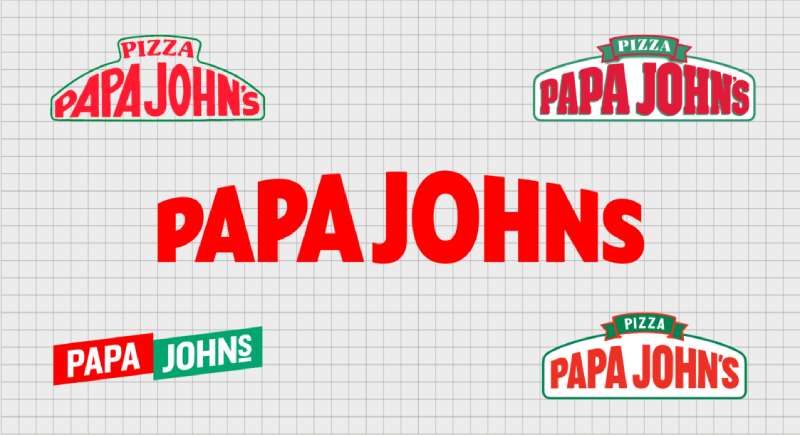
Journey back with me to 1984, when Papa John’s was just a small pizza joint. Let’s uncover the evolution of the logo that’s now a staple in our pizzeria landscape.
The Birth of a Logo
Picture a broom closet. That’s right, a broom closet. That’s where Papa John’s started. The original logo was simple – a basic design with the words “Papa John’s Pizza”. It was a humble start for a logo that would soon take the world by storm.
The Evolution
Over time, the Papa John’s logo evolved, reflecting the growth and dynamism of the company. The circle was introduced, encapsulating the brand’s name and giving it a more distinct identity. The logo we see today is a refined version of that evolution.
The Colors of the Papa John’s Logo

Ever thought about why the Papa John’s logo is red and green? These aren’t just random picks from the color palette. They speak volumes about the brand and its offerings.
Seeing Red
Red is a color that’s often associated with passion, energy, and love. In the Papa John’s logo, red represents the passion and dedication that goes into making every single pizza.
Going Green
Green, on the other hand, symbolizes freshness. It’s a nod to the fresh ingredients that Papa John’s is so famous for.
The Font Used in the Papa John’s Logo

Now, let’s talk about the font. That distinctive script spells out “Papa John’s” in the logo. It’s more than just a typeface. It’s a statement.
More Than Letters
The font used in the Papa John’s logo is customized, a unique script that’s instantly recognizable. It exudes a friendly and welcoming vibe, much like the founder himself.
An Identity Inscribed
The unique script also underscores the brand’s individuality. It’s a constant reminder that Papa John’s is not just another pizza chain, but a brand with its own identity and values.
The Impact of the Papa John’s Logo
Beyond the colors and the font, the logo has a significant impact on the brand’s identity and perception.
A Memorable Mark
The Papa John’s logo, with its distinctive circle, unique font, and bold colors, is easily recognizable. It’s a memorable mark that stands out in the crowded pizza market.
A Promise Delivered
Remember that promise we talked about earlier? The logo is a constant reminder of that promise – better ingredients, better pizza. It’s a visual representation of the brand’s commitment to quality, resonating with customers every time they see it.
The Versatility of the Papa John’s Logo
An oft-overlooked aspect, but equally important, is the versatility of the Papa John’s logo. It’s not just a logo, it’s a design chameleon, adapting itself to various applications while still maintaining its identity.
Fits Like a Glove
Whether on a pizza box, a storefront, or a digital ad, the logo fits seamlessly. Its simple, round design allows for easy adaptation across various mediums without losing its essence.
A Colorful Affair
The logo’s color scheme is also versatile. The red and green pop against different backgrounds, ensuring the logo stands out wherever it’s placed.
The Future of the Papa John’s Logo
While the Papa John’s logo has seen subtle changes over the years, it has largely remained true to its original design. But what does the future hold?
Maintaining a Legacy
While we can’t predict the future with absolute certainty, one can guess that the Papa John’s logo will continue to carry its legacy forward. The core elements – the circle, the unique script, the red and green – are likely to remain.
Adapting to Change
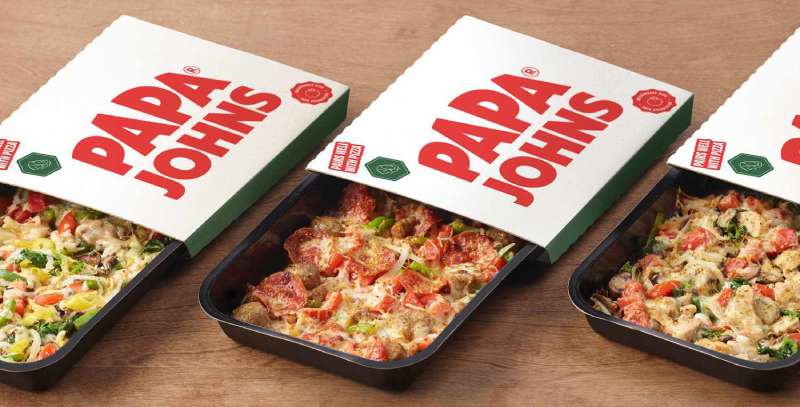
That said, the logo could see further refinements to stay relevant in a constantly evolving market. Perhaps more modern touches while keeping the brand’s essence intact. One thing’s for sure – we’ll be keeping our eyes peeled for the next slice of the Papa John’s logo story.
FAQ On The Papa John’s Logo
Why did Papa John’s change their logo?
They shifted gears to keep up with the times. Imagine a sleeker, more contemporary vibe. That’s what they were gunning for. Less is often more in the design game, and tossing out those extra details made for a sharper, scalable graphic identity.
What does the Papa John’s logo represent?
This brand emblem—it’s like a flag waving that promise of a better pizza. It stands for quality and a commitment John Schnatter made. Simple, recognizable, and, dare I say it, almost as iconic as the pie itself.
What colors are in the Papa John’s logo?
Red and green with a dash of yellow for zest! It’s a nod to Italian flags, heritage, and of course, basil, tomatoes, and cheese! These trademark colors aren’t just random; they scream pizza with every glance.
When was the Papa John’s logo first created?
Way back in ’84, John Schnatter kicked off this whole gig, logo and all. Picture this: a young entrepreneur spinning dough and dreams all woven into this visual promise—now that’s the birth of an iconic brand emblem.
Is there a meaning behind the choice of typography in the Papa John’s logo?
Absolutely, it’s all about vibing friendly yet bold. They rolled with a custom typeface to serve up warmth, familiarity, and a dash of zest. It’s that special blend that helps the logo typography pop and stick in your memory.
Has the Papa John’s logo been consistent over the years?
Steady but with a sense of adventure, you know? Slight tweaks, nothing wild. Keeping that brand consistency, evolving without losing their soul. It’s about staying fresh while holding onto those cozy feels—the essence of a go-to family pizza place.
What are the guidelines for using the Papa John’s logo for marketing?
It’s a tight ship. Rules for logo visibility—like don’t stretch it, stick to color palettes, and give it space to breathe. They’re kinda protective of their baby; it’s about respecting that brand image and making sure it hits just right.
How has the Papa John’s logo impacted their branding?
Huge impact—it’s the face of their game. Drives home that brand recognition every time you catch a glimpse. It’s like a shortcut straight to your pizza-loving brain, triggering all those warm, fuzzy, cheesy memories.
What is featured on the Papa John’s logo besides text?
It’s slick—just the founder’s name circling up with a classic feel. No fuss of extra imagery needed when you’ve got a logo design so tied to the brand image. It’s about knowing when the words alone are enough to conjure up that appetite for pie.
How can I obtain permission to use the Papa John’s logo?
You’ll want to get in touch with their branding battalion—Corporate Identity department’s the name. They’ll guide you through the do’s and don’ts, making sure you’re all set to use that trademark design without stepping on any toes.
Conclusion
So there we have it, the full pie and nothing but the pie, dishing out the skinny on the Papa John’s logo. From the roots tangled in corporate identity to its leap into a minimalistic future, we’ve traversed a brand saga stitched in red and green.
- To think, every curve of that typography, every hue choice, all deliberate.
- It’s like each curl of steam rising off a hot slice mirrors the brand’s evolution.
Wrapping this up, it’s clear – a logo transcends being just a doodle on a pizza box. It’s a visual handshake, a graphic identity that greets you before the aroma hits your doorstep. Beyond mere trademark colors, it’s a story, a promise, a little paper flag staked on the landscape of our comfort foods. When next you spy that familiar emblem, tip your cap to the craft behind the crest, the art behind the eatery, the design behind the dinner.
If you liked this article about the Papa John’s logo, you should check out this article about the Five Guys logo.
There are also similar articles discussing the Tim Hortons logo, the Hardee’s logo, the Jollibee logo, and the Quiznos logo.
And let’s not forget about articles on the Chipotle Mexican Grill logo, the Auntie Anne’s logo, the Carl’s Jr. logo, and the In-N-Out Burger logo.
- Green Color Palettes for Designers To Use - 11 May 2024
- Digital Style: What Font Does Cash App Use? - 11 May 2024
- The Coors Light Logo History, Colors, Font, And Meaning - 10 May 2024


