
The Tim Hortons Logo History, Colors, Font, and Meaning

Imagine your morning joe without the familiar sight of that red and white emblem, the one with a sprinkle of Canadiana—the Tim Hortons logo. It’s not just a symbol; it’s a beacon for coffee lovers and a testament to good ol’ fashioned brand storytelling.
This piece of design has brewed together a nation’s warmth, a hockey legend’s legacy, and that unmistakable sense of community.
In this spill-the-beans article, you’ll uncover the layers beneath the Tim Hortons emblem that has graced countless cups and store signs.
We’ll explore its design evolution, from its humble beginnings to becoming an iconic brand identity, and dive deep into the elements that form its current visual branding components.
This isn’t just about aesthetics; it’s a lesson in fostering customer loyalty through the careful craft of a logo’s evolution.
So turn off that coffee pot for a minute and lean in. You’ll come away with insights into how this emblem echoes far beyond its visual appeal, solidifying Tim Hortons’ image in the hearts and minds of millions.
Let’s pull back the curtain on how a logo can encapsulate a brand’s essence and their journey through the bustling intersection of marketing campaigns and graphic design.
The Meaning Behind the Tim Hortons Logo
The Emblem of Hospitality
Consider this: a logo is the face of a brand, the emblem that greets you before you’ve even tasted the product. That’s exactly what the Tim Hortons logo is all about. It’s about hospitality, a warm welcome, and the promise of a great coffee, and a comforting meal.
The central focus of the design is the name itself – Tim Hortons. This alone stands as a testament to the person behind the brand, a legendary hockey player who wanted to provide Canadians with quality coffee and doughnuts.
The History of the Tim Hortons Logo
The Early Days
Time for a trip down memory lane. The original Tim Hortons logo was remarkably different from the one we know today. Back in 1964, it was a simple, straightforward design, featuring a wordmark with “Tim Horton Donuts” in a straight line.
The Evolution
Fast forward a few years, and the logo has seen some significant changes. The most noticeable transformation is the switch from a straight line format to a circular design.
This change allowed the logo to become more recognizable and memorable, essential traits for any brand looking to make a name for itself.
The Colors of the Tim Hortons Logo
The Power of Red
So, about the red in the Tim Hortons logo. Ever wondered why it feels so inviting? That’s the power of color psychology, my friend.
Red is a color often associated with energy, passion, and action. It’s also known to stimulate appetite. Quite clever for a food and beverage chain, don’t you think?
The Calmness of Brown
And then there’s the brown. It’s there in the wordmark, grounding the logo, and providing a sense of stability. Brown is often linked with reliability and comfort – again, perfect for a brand that wants to be your go-to coffee spot.
The Font Used in the Tim Hortons Logo
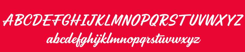
Simplicity Speaks Volumes
The font in the Tim Hortons logo speaks volumes about the brand’s personality. It’s simple, it’s straightforward, and it’s easily readable. That’s a big deal in the world of design. It shows that the brand is approachable and friendly, with no frills attached.
The Power of Typography
Typography can be a powerful tool in creating an identity, and in the case of Tim Hortons, it does just that. The lettering in the logo is bold, indicating a sense of strength and reliability.
Yet, it maintains a soft, rounded quality, keeping the overall feel of the logo warm and welcoming.
The Effect of the Tim Hortons Logo on Brand Recognition
The Role of Consistency
Over the years, the Tim Hortons logo has seen some changes, but the core elements – the circular design, the bold lettering, the warm colors – have remained consistent. This consistency plays a significant role in making the brand easily recognizable to millions of people worldwide.
The Magic of Branding
Branding is a magical thing. A well-designed logo, like the one Tim Hortons has, can evoke feelings, prompt memories, and build connections. It’s a testament to the power of good design, and how it can help a brand carve out a special place in the hearts of its customers.
The Influence of the Tim Hortons Logo on Other Brands
Setting a Standard
The Tim Hortons logo, with its bold simplicity and strategic color usage, has become somewhat of a standard in the food and beverage industry. Other brands looking to convey a similar message of warmth, reliability, and community have taken cues from its design.
Inspiring Design Trends
Beyond just setting a standard, the logo has also influenced design trends in the industry. The combination of a bold, readable typeface with warm, inviting colors has become a popular choice for food and beverage brands.
The use of a circular frame has also seen an uptick, as brands strive to communicate a sense of community and unity, just like Tim Hortons.
The Future of the Tim Hortons Logo
Embracing the Digital Age
As we move further into the digital age, the logo might see more tweaks and refinements. It’s important for a logo to look good not only on a shop front but also on a website or a mobile app. Expect the logo to evolve, but without losing its core identity.
A Testament to Time
Despite any changes that might come, one thing is certain: the Tim Hortons logo will continue to be a familiar sight for millions of people worldwide.
As a testament to time, it will continue to tell the story of a brand that started with a simple goal – to serve great coffee and doughnuts to its community.
And that’s the beauty of a well-designed logo. It’s not just a graphic element; it’s the story of the brand, its history, its values, and its vision for the future.
FAQ On The Tim Hortons Logo
What’s the story behind the Tim Hortons logo?
Oh, the tales it could spill if it could talk! Rooted in Canadian heritage, this logo started out as a nod to its co-founder, the NHL defenseman Tim Horton.
As the brand stretched beyond the rinks of Canada, so did its image—moons into an identity beloved by donut and coffee geeks alike.
Has the logo changed over the years?
Change is the only constant, right? That maple leaf? Got sharper, bolder. The font? More solid, less frilly.
They’ve tweaked their trademark aesthetics a few times—always keeping that nostalgic vibe but polishing it up for a modern look that slings more than just coffee; it hawks a chunk of Canada, too.
Why does the logo include a maple leaf?
Nothing screams ‘Canada’ louder than our prized leaf! Tim Hortons clutches it close, a testament to its roots.
It’s a glimpse of home for Canadians wherever they find themselves, from a crowded intersection in Toronto to the alleys of Dubai. It’s about the brew, sure, but it’s also about belonging, eh?
Is the Tim Hortons logo trademarked?
You bet it is! Companies don’t mess around when it’s about guarding their corporate image. There’s heaps of paperwork trail behind that deceptively simple emblem.
It’s not just a logo; it’s a sentinel of intellectual property rights, defending a brand that’s exploded beyond its first Ontario haunt.
What do the colors in the logo represent?
Colors talk. Red? It’s the warm blanket of a Canadian flag. White? The cool whisper of a clean, fresh start. Slap them into the Tim Hortons logo and what you’ve got isn’t just a color scheme; it’s a dynamic, vibrant brand personality that’s all about the warm fuzzies of a hot brew.
What’s the significance of the font in the logo?
Typeface isn’t just a bunch of letters; it’s the unsung hero of visual identity systems. Tim Hortons swings with a font that’s easy on the eyes, rounded just like their Timbits. It says ‘friendly.’ It says ‘approachable.’ It makes you think, “Here’s a spot where the coffee’s always on.”
Does the logo have different versions for international markets?
Marketing’s a wild beast. One logo to rule them all? Not quite. While the core elements stick, there’s wiggle room depending on where you’re at.
International expansion sometimes calls for a tweak or two – making sure the symbolism isn’t lost in translation, because a brand extends way beyond its graphics.
Who designed the original Tim Hortons logo?
Tucked behind that classic emblem is a designer who sparked the first draft, pairing Tim Horton’s star power with a visual punch.
Over time, various branding agencies have put their spin on it, each leaving a fingerprint that’s just as vital as the bakers behind those fresh morning pastries.
What are the guidelines for using the Tim Hortons logo?
Rules, rules, rules. They’re there for a reason. From cup to billboard, this logo marches out in step with strict branding guidelines.
It’s all about maintaining the main squeeze, the brand integrity—keeping it fresh, yet timeless. Every use whispers the brand’s story, making sure it’s not just loud but clear.
How is the Tim Hortons logo leveraged in their marketing campaigns?
Crank up the impact; that’s what logos do in ad games. Tim Hortons stamps its logo on every marketing cannonball.
From social media blasts to community endorsements, they aim to drum up more than just sales—each shot paints a deeper hue on the brand canvas, leaving you hankering for a cuppa.
Conclusion
Wrapping this up, the Tim Hortons logo, it’s more than a mark. It’s stitched into the fabric of the everyday, a nod to heartwarming brews and sugary bites. The design narrative we’ve traced here, it’s one that spotlights the evolution of a visual handshake between a brand and its patrons.
So, contemplating the logo’s origins, the meticulous trademark tweaks, and the slick dance of color and type – it’s been quite the design adventure, hasn’t it? We’ve seen the maple leaf flourish, saga-like, evolving yet rooted, just as much as we’ve seen the strategic play of brand identity and intellectual property rights come into the limelight.
Dive into the doughnut hole, and you find a robust collage of marketing campaigns and a brand recognition strategy that’s more culturally rich than your morning double-double. The emblem that graces Tim Hortons’ venues, it’s really a portal to a brand universe—a place where memories are just as warm as the coffee served.
If you liked this article about the Tim Hortons logo, you should check out this article about the Five Guys logo.
There are also similar articles discussing the Hardee’s logo, the Papa John’s logo, the Jollibee logo, and the Quiznos logo.
And let’s not forget about articles on the Chipotle Mexican Grill logo, the Auntie Anne’s logo, the Carl’s Jr. logo, and the In-N-Out Burger logo.
Bogdan Sandu, a seasoned designer with 15 years of diverse experience, has been designing websites since 2008.
Renowned for his expertise in logo design and visual branding, Bogdan has developed a multitude of logos for various clients.
His skills extend to creating posters, vector illustrations, business cards, and brochures. Additionally, Bogdan's UI kits were featured on marketplaces like Visual Hierarchy and UI8.
Latest posts by Bogdan Sandu (see all)
- Green Color Palettes for Designers To Use - 11 May 2024
- Digital Style: What Font Does Cash App Use? - 11 May 2024
- The Coors Light Logo History, Colors, Font, And Meaning - 10 May 2024