The Jollibee Logo History, Colors, Font, and Meaning
Picture this: the striking red and yellow hues leaping out, and the unmistakable buzz of a cheerful bee. That’s the Jollibee logo, a beacon of Filipino fast-food flair that stands as a cultural icon, far beyond mere branding.
It’s a visual anthem, a tapestry weaving together tasty fried chicken, heartwarming spaghetti, and the warm, inviting smile of the brand’s beloved bee mascot.
Dive into the hive where graphic design intersects with heart and heritage.
This article unpacks the layers behind that ubiquitous emblem, delving into its graphic symbolism and the storytelling craft that catapults a simple logo into an emotional brand experience.
By the end you’ll have a plate full of insights—from brand identity to the psychology of color schemes in marketing.
No doubt, whether you’re here to appreciate the subtleties of corporate identity or to draw inspiration for your own design ventures, the journey of the Jollibee logo is poised to leave you enriched.
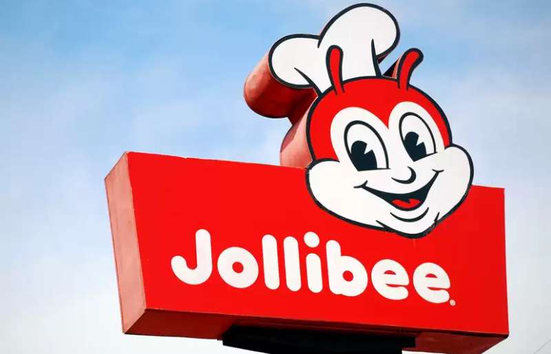
The Meaning Behind the Jollibee Logo
![]()
Let’s dive in and get a closer look at the Jollibee logo.
Unraveling the Mascot
The heart of the logo is the bee mascot. Now, a bee? You might ask. It’s not just any bee, it’s Jollibee!
Jolly is a word that signifies happiness and enjoyment. Combine that with a bee, an insect known for its hard work and you’ve got a mascot that represents a jolly, hard-working company.
Understanding the Chef’s Hat
Notice the chef’s hat on Jollibee’s head? It’s not just an accessory, it represents the brand’s commitment to quality food. It’s like a promise that Jollibee’s going to cook up something tasty and satisfying just for you.
The History of the Jollibee Logo
![]()
Let’s jump in our time machine and delve into the past.
The Early Days
The Jollibee logo has not always been the same. It started out as a simple design with the word “Jollibee” and a bee character. The bee was pretty different back then, more like a comic strip character than a restaurant mascot.
The Evolution
Over the years, Jollibee has changed. He’s become more rounded, more inviting. The logo has evolved along with the company, adapting to the changing tastes and expectations of its audience.
The Colors of the Jollibee Logo
![]()
Color speaks volumes. Let’s decode the colors of the Jollibee logo.
Red: The Color of Passion
The dominant color in the logo is red. It’s a color that’s often associated with energy, passion, and love. It grabs attention and stirs emotions.
The Font Used in the Jollibee Logo
![]()
Typography matters. The font used in the Jollibee logo plays a key role in its identity.
Bold and Friendly
The font is bold and friendly, much like Jollibee himself. It’s easy to read, which makes it approachable and accessible to everyone.
Stylistic Consistency
The style of the font matches the overall look and feel of the logo, maintaining a consistent brand image. It’s a balance between fun and professionalism.
The Impact of the Jollibee Logo
What’s the real-world impact of this logo?
Brand Recognition
Jollibee’s logo is instantly recognizable. Its distinct design and color scheme make it stand out, leading to high brand recognition.
Cultural Significance
In the Philippines, Jollibee is more than just a fast food chain. It’s a cultural icon. The logo represents a source of national pride, a symbol of homegrown success.
The Future of the Jollibee Logo
Where does the logo go from here?
Adapting to Change
The future of the Jollibee logo will likely involve adapting to evolving consumer preferences and technological advancements. The key is to evolve without losing the essence of the brand.
Staying True to Its Roots
Despite any changes, it’s likely that the Jollibee logo will continue to stay true to its roots. It will always symbolize a brand that is jolly, hard-working, and committed to serving tasty and satisfying food.
FAQ On The Jollibee Logo
Why does the Jollibee logo feature a bee?
Think about it; bees are hardworking, friendly, and they make sweet stuff. Jollibee’s bee mascot embodies these qualities, symbolizing the company’s commitment to diligent service and the joy they want customers to feel.
It’s a visual nod to their promise of happy, buzzing dining experiences.
What’s the significance of the colors in the Jollibee logo?
Red and yellow, the hues of energy and happiness. They’re strategic, see? Red screams passion and grabs your attention, while yellow lights up with friendliness and cheer. It’s a bold combo that’s all about creating a hospitable vibe – a signature in the fast-food scene.
When was the Jollibee logo created?
Let’s rewind to 1978. That was when the Jollibee logo first made its debut, alongside the brand’s initial growth spurt. Over the years, it’s evolved, but the essence, that bee with a chef’s hat, has been buzzing around since the early days of Jollibee’s story.
Who designed the Jollibee logo?
Here’s the deal: specific designer deets are kinda hazy. We know it was baked in-house during Jollibee’s formative years, with a pinch of Filipino flair. Whoever it was, they nailed it, blending cultural touchpoints with universal appeal in the brand mascot.
Has the Jollibee logo changed over time?
Absolutely, logos gotta evolve. Jollibee’s logo has seen tweaks here and there, keeping it fresh while clinging to its roots. Each redesign fine-tuned the graphics, pumped up the colors, and modernized the look without losing that iconic brand identity.
What does the Jollibee logo represent?
More than just fast food. It’s a symbol, a heart-tickling emblem of Filipino joy and family-focused dining. The Jollibee logo dishes out a visual story of cultural pride, as much a part of the Philippines as it is a signpost for tasty treats.
Can you tell me about the font used in the Jollibee logo?
Think playful yet confident. That font’s all about readability with a side of fun. It matches the brand’s voice – friendly and approachable. While not officially named, it’s clearly tailored to mirror Jollibee’s spirited vibe.
Is the Jollibee logo trademarked?
You bet it is. It’s not just a logo, it’s a legal shield, a trademarked slice of the company, safeguarding the iconic brand mascot and the elements that make up Jollibee’s visual identity. This means no one else can snag the design or the buzz for themselves.
What message does the Jollibee logo convey to its customers?
One word: joy. The smiling bee in chef’s attire, that electric color hit – it’s a happiness beacon. Jollibee’s branding is a promise of not just food, but an uplifting, satisfying customer experience. There’s an upbeat, feel-good tale in every detail.
How does the Jollibee logo appeal to its target audience?
It’s a masterclass in striking a chord with the masses. Kid-friendly? That bee’s a win. Familiarity? The name’s written right there, bold and inviting. Jollibee’s target audience seeks familiarity, cheer, and a sense of belonging. This logo rings those bells loud and clear.
Conclusion
Wrapping it up, we’ve journeyed through the vibrant landscape of the Jollibee logo. The iconic bee has served more than just a visual treat; it’s etched deep in the fabric of branding excellence. With each curve and color, it’s a storyteller unraveling tales of joy, warmth, and an unmistakable promise of a hearty feast.
Let’s take a step back—those colors, red and yellow, weren’t just picked at random, guys. They’re the DNA of the logo, triggering all those feel-good vibes. And that bee? It’s no ordinary insect. It’s the epitome of brand mascot mastery, symbolizing a industrious yet jovial spirit that’s become synonymous with Filipino hospitality.
Fast food, quick smiles, and a dash of nostalgia—that’s what this logo packs. So next time you spot that cheerful bee, remember, it’s more than a simple brand emblem; it’s a rich emblem of a cultural powerhouse that connects with millions, serving smiles one bucket at a time.
If you liked this article about the Jollibee logo, you should check out this article about the Five Guys logo.
There are also similar articles discussing the Tim Hortons logo, the Hardee’s logo, the Papa John’s logo, and the Quiznos logo.
And let’s not forget about articles on the Chipotle Mexican Grill logo, the Auntie Anne’s logo, the Carl’s Jr. logo, and the In-N-Out Burger logo.
Bogdan Sandu, a seasoned designer with 15 years of diverse experience, has been designing websites since 2008.
Renowned for his expertise in logo design and visual branding, Bogdan has developed a multitude of logos for various clients.
His skills extend to creating posters, vector illustrations, business cards, and brochures. Additionally, Bogdan's UI kits were featured on marketplaces like Visual Hierarchy and UI8.
Latest posts by Bogdan Sandu (see all)
- Rainbow Color Palettes for Joyful Designs - 29 April 2024
- The Bethesda Logo History, Colors, Font, And Meaning - 28 April 2024
- Out of This World: Space Color Palettes for Cosmic Designs - 28 April 2024