The Quiznos Logo History, Colors, Font, and Meaning
Picture this: You stroll through downtown, your eyes catch a familiar sight—the Quiznos logo perched above. There’s warmth in its familiarity, a story behind those fiery hues and snappy font.
We often overlook the power nestled in these symbols, how they encapsulate a brand’s spirit, whisper tales of toasted subs, and even influence our choices without uttering a single word.
Here’s the deal: You’re about to unwrap the layers behind that iconic emblem.
By the end, you’ll have a rich taste of its evolution, grasp the intrepid design decisions, and why, like that perfectly toasted bun, a logo’s crunch is vital for brand identity
Expect to dive into the sea of branding elements, explore the bustling Fast-Food Industry, and decode the visual brand identity that sets the stage for consumer perceptions.
Ready to journey through the twist and turns of the Quiznos mascot? Buckle up; your design sensibilities will never see a sandwich shop symbol the same way again.
The Meaning Behind the Quiznos Logo
More Than Just a Sandwich
Ah, the Quiznos logo. It’s not just about sandwiches, you know? There’s some real thought and purpose behind it. It’s more than just a pretty face. It tells a story.
The logo is made up of three main elements:
- The Quiznos name
- The iconic red “Q”
- The phrase “Toasty Subs”
Each of these elements is designed to deliver a specific message to the viewer.
A Name to Remember
The Quiznos name in the logo is straightforward. It’s a way for the brand to say, “Hey, this is us!” It’s bold and clear, just like their subs.
The Q Factor
The red “Q” is a bit more nuanced. It’s the first letter of the brand name, sure, but it also represents quality. It stands out, like a beacon guiding hungry sandwich lovers to a toasty haven.
Toasty Subs, Warm Hearts
Lastly, the phrase “Toasty Subs” emphasizes Quiznos‘ unique selling point – their toasted sandwiches. It’s a warm invitation, a promise of a cozy and delicious meal.
The History of the Quiznos Logo
Once Upon a Time
The Quiznos logo, like any great masterpiece, has a backstory. It hasn’t always looked the way it does today.
The Early Days
In the beginning, the logo was a bit more simplistic. It was just the Quiznos name, rendered in a chunky, bold font. No frills, no fuss. Just a promise of a good sandwich.
Adding Some Color
As the brand grew, so did the logo. The red “Q” was introduced, adding a pop of color and an element of fun.
The Toasty Touch
Finally, the “Toasty Subs” tagline was added. A reflection of the brand’s commitment to providing warm, toasted sandwiches. It was the finishing touch that completed the logo we know and love today.
The Colors of the Quiznos Logo
Ever notice the colors they use? There’s that dark green “Quizno’s” text with its nifty, unique letter shapes. But that’s not all. They also sometimes use in their branding materials Lust, Light French Beige, and Dark Olive Green making a show too.
So, you might be wondering, why these colors? Well, each one carries its own vibe – quality, sincerity, and energy. It’s a total sandwich mood, right?
Now, for you code lovers out there, here’s the breakdown:
- Lust:
#E21F26(In RGB, it’s226, 31, 38) - Light French Beige:
#D0AB7B(And in RGB,208, 171, 123) - Dark Olive Green:
#4D7335(RGB goes like77, 115, 53)
Quick side note here:
Quiznos sometimes rocks black, gray, neon green, and orange. But hold up! They’re not official logo colors. Just some extra flavor they sprinkle around.
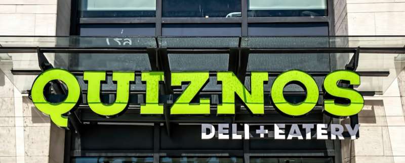
The Font Used in the Quiznos Logo
Bold and Beautiful
The font used in the Quiznos logo is bold and blocky. It’s easy to read and it’s unmistakable. It’s a font that says, “We’re here, we’re Quiznos, get used to it.”
Quiznos Logo Evolution
Always On the Move
Just like the brand, the Quiznos logo has evolved over time. It’s a living, breathing entity. It changes, it adapts, it grows. It’s a reflection of the brand’s journey.
The Future is Bright
As for what’s next for the Quiznos logo? Well, only time will tell. But one thing’s for sure – it will continue to be a symbol of quality, warmth, and toasty deliciousness.
Impact of the Quiznos Logo
Standing Out in a Crowd
In a sea of fast food logos, the Quiznos logo stands out. It’s unique, it’s memorable, it’s a true representation of the brand.
The Power of Recognition
Thanks to its distinct design, the Quiznos logo has become instantly recognizable. It’s a visual cue that triggers a craving for a toasty sub. It’s more than a logo, it’s a symbol of a beloved sandwich chain.
The Quiznos Logo in Pop Culture
More than Just a Logo
The Quiznos logo isn’t just a symbol of a sandwich chain, it’s also a part of pop culture. It’s made appearances in movies, TV shows, and music videos. It’s even been featured in various internet memes.
Logo Love

Whether it’s a Quiznos hat in a sitcom, or a Quiznos shirt worn by a famous musician, the logo’s presence in pop culture has helped to amplify the brand’s visibility and further embed it in the hearts and minds of the public.
So, there you have it. The Quiznos logo is not just a simple design. It’s an icon.
It’s a representation of the brand’s commitment to quality, warmth, and toasty deliciousness. It’s a beacon for sandwich lovers everywhere. And that, my friends, is the power of a well-designed logo.
FAQ On The Quiznos Logo
Who designed the Quiznos logo?
Well, the creator’s identity is somewhat shrouded in mystery, not your typical celeb designer story.
What’s clear is how their craft turned the Quiznos brand into a beacon for toasty subs. Graphic design mavens speculate an in-house team or hired guns were behind this iconic insignia.
What does the Quiznos logo represent?
It’s a toast to simplicity, really. This emblem dishes out an image of a warm, inviting sub haven. You’ve got the red talkin’ passion, and the pepper—oh, that hints at the spice and zest in every bite. It’s the visual handshake of the brand’s promise.
Has the Quiznos logo changed over time?
As sure as bread turns to toast, logos evolve. Yet, the Quiznos face-lifts have been subtle, maintaining the old flame. It’s about tweaking for freshness while keepin’ that Quizno essence—a tightrope walk between nostalgia and the hip now.
Why doesn’t Quiznos use its mascot in the logo anymore?
Times change, and so do marketing strategies. The mascot bowed out, giving the stage to a more streamlined, modern look. It’s a hat tip to the clean and sleek over the clutter of yesteryear—the sleek lettering, the zest, as always, on point.
What are the official colors of the Quiznos logo?
We’re talkin’ about a duo that packs a punch—red and yellow. Red’s the powerhouse, right? It’s bold, fiery, like their grill. Then there’s yellow—bright as a sunny day, just like the optimism bubbling in each store. They’re colors with purpose, speaking Quiznos without a word.
Is the Quiznos logo trademarked?
Oh, it sure is, and it’s a no-brainer. In the battleground that’s the Fast-Food Industry, protecting your visual brand identity is like holding onto your secret sauce recipe. That trademark is the suit of armor for Quiznos’ mark of distinction.
What font is used in the Quiznos logo?
The font, as unique as their offerings, custom-crafted just for them. It’s bold, it’s playful—reflecting that warm, toasted sandwich goodness. They opted out of those run-of-the-mill typefaces for something with a tad more character, a signature stroke for the brand.
Can I use the Quiznos logo for my project?
Careful there—using a trademarked logo without a green light can land you in hot soup. Always get the thumbs up from the suits running the show. They gotta protect their bread and butter, and so should you—stick to the rules.
What is the significance of the red color in the Quiznos logo?
The red is no joke—it’s the heartbeat of their branding elements. Think warmth, energy, and a kick that lingers. It’s the sizzle in Quiznos branding, a visual whisper of the toasty, mouth-watering experience that awaits within their walls.
How has the Quiznos logo impacted the company’s brand recognition?
Like a lighthouse in choppy seas, the iconic logo is beaconing customers. It’s more than ink on a sign—it’s a promise, an identity. It’s that familiar nod across the street, a symbol that’s grown synonymous with getting your sub fix in a snug ambiance.
Conclusion
And there we have it, we’ve toasted the end of our journey through the the Quiznos logo saga. Graphic Design, a dash of red, a sprinkle of tradition—it’s been quite the ride. From branding elements that write history to trademarks that guard legacies, this emblem’s a storyteller.
We’ve unpacked the hues and fonts, the silent yet loud visual communication that yells ‘toasty’ without making a sound. We’ve marveled how a simple graphic transcends being merely a company insignia. It’s a beacon for the hungry, an ally for the quick bite seeker.
It’s the little things, right? The stroke of a font, the curve of a Q, that can hold a mirror to a brand’s soul. So, next time you pass by that red and yellow sign, know that behind every curve and color, there’s a craft mastered, a story of warmth, and a tradition of toasty subs well kept.
If you liked this article about the Quiznos logo, you should check out this article about the Five Guys logo.
There are also similar articles discussing the Tim Hortons logo, the Hardee’s logo, the Papa John’s logo, and the Jollibee logo.
And let’s not forget about articles on the Chipotle Mexican Grill logo, the Auntie Anne’s logo, the Carl’s Jr. logo, and the In-N-Out Burger logo.
Bogdan Sandu, a seasoned designer with 15 years of diverse experience, has been designing websites since 2008.
Renowned for his expertise in logo design and visual branding, Bogdan has developed a multitude of logos for various clients.
His skills extend to creating posters, vector illustrations, business cards, and brochures. Additionally, Bogdan's UI kits were featured on marketplaces like Visual Hierarchy and UI8.
Latest posts by Bogdan Sandu (see all)
- Out of This World: Space Color Palettes for Cosmic Designs - 28 April 2024
- The Bungie Logo History, Colors, Font, And Meaning - 27 April 2024
- After Dark: Night Color Palettes for Mysterious Designs - 27 April 2024