The Chipotle Logo History, Colors, Font, and Meaning
Imagine this: a symbol not only tantalizes your taste buds but encapsulates an entire food philosophy.
The Chipotle Mexican Grill logo—it’s more than just a visual marker for a place to grab lunch. It’s a beacon for fresh, bold flavors wrapped in a culture of sustainability.
Fast-casual dining has revolutionized the way we experience food, and central to that revolution stands Chipotle, a brand that’s woven its identity into our very fabric of urban life.
The logo itself? A story of heritage, vision, and the daring pursuit of simplicity.
Crack open the story behind this iconic emblem, and you’ll sink your teeth deep into the DNA of a brand that’s about more than just burritos and bowls—it’s about a commitment to gourmet Mexican cuisine and a pledge to ingredients that speak of integrity.
By the end of this read, you’ll unravel the threads of design, branding, and the sit-down-and-stay-awhile vibe that Chipotle has cooked up.
Ready to dive into the tapestry of typography, color palettes, and what makes that foil-wrapped delight a symbol of modern eating? Let’s slice into the story.
The Meaning Behind the Chipotle Logo
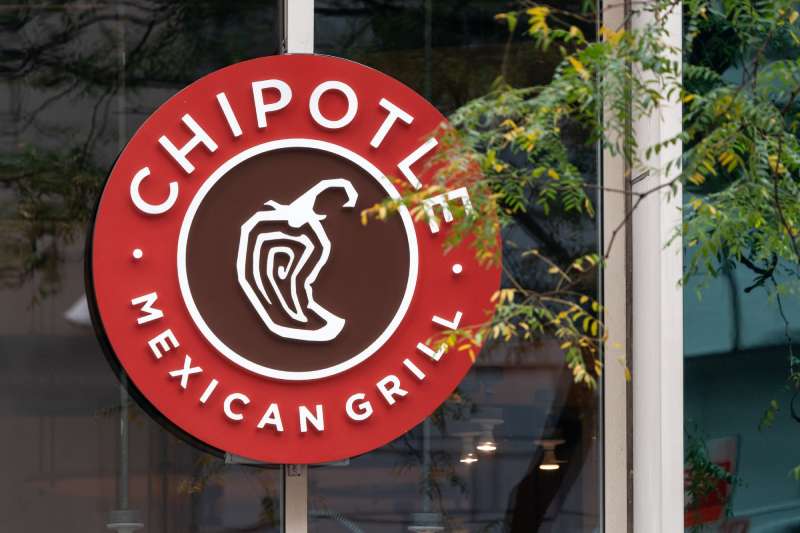
![]()
In a whirl of vivid brand identities, the emblem for Chipotle stands distinct. It cradles more than a mere visual aesthetic; it’s steeped in narrative. The brand’s essence is encapsulated—the ethos of offering fast-casual dining with a touch of gourmet sophistication.
The center stage holds the chili, a nod to the Mexican grill lineage, rendering the branding palpable, savory to one’s food imagination. It’s not just an icon; it’s a herald of flavors, a beckoning for the culinary voyage that’s to follow.
Around this pepper icon, simplicity dances with complexity. The starkness of the image denotes a return to basics, a respite from the cluttered visual feasts of rival brands. It’s an invitation to honesty, to authenticity in both food and design.
The logo whispers the tale of Chipotle’s journey, of its commitment to the twin pillars of quality and integrity, of its brand equity that continues to burgeon. It is not simply seen. It is experienced.
The History of the Chipotle Logo
![]()
Tracing back to the roots of this visual identity, the timeline is as rich as the recipes. The inaugural logo, birthed from the embryonic days of Chipotle’s inception, depicted a fundamental design. Its evolution mirrors the growth of Chipotle—from a local haunt in Denver to a formidable presence.
The iterations have been few but formidable. Each redesign has been a thoughtful reimagining, a logo evolution that balances the familiar with the bold. The refresh swayed but did not sway from the original vision, a testament to the brand’s unwavering pillar.
It’s a historical ledger, a chronicle of design simplicity and growth. With each redesign, Chipotle consolidated its visual and corporate identity, edging further into the echelons of iconic brands. The logo redesign journeys resonate with an accommodating narrative—one that cherishes its origins and eagerly embraces its future.
The Colors of the Chipotle Logo
![]()
The hues exude a deliberate selection, a strategic color palette that conveys more than aesthetic allure. The deep red is charged with appetite, a psychological nudge toward warmth and craving, a universal symbol of bold flavors.
Complementing the red is the earthy, nurturing brown, a representation of the natural, the sustainable ethos Chipotle endorses. Their visual identity hinges on these colors, telegraphing a non-verbal dialogue with the consumer, one that hints at mouthwatering delicacies crafted with conscientious sourcing.
Together, these colors form a tandem of both visual and sensory stimulation. The palette is a seamless extension of the Chipotle experience, a branding element that resonates across every customer touchpoint.
The Font Used in the Chipotle Logo
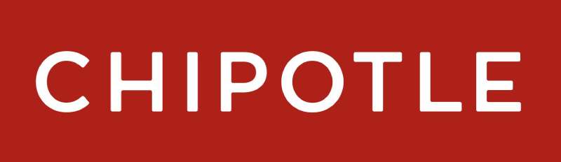
The lettering that accompanies Chipotle’s emblem is a typographic tale with a branding element twist. It boasts a bespoke touch, individuality, and a clear, unmistakable mark. This isn’t just typography in logos; it’s a character, a personality woven into the letterforms.
With a nod to Mexican typography, while eschewing the trappings of the cliché, the font speaks with a visual identity that’s both contemporary and laced with heritage. It’s the artful balance of readability and distinctiveness, capturing attention without the shout, without the frill.
With subtlety, the typography upholds the company moniker, rendering it unforgettable, making it a conversation with the onlooker’s mind. It’s a brand identity transcribed not just for the eye, but for the memory.
Crafting a Unique Visual Language
Every stroke, every choice in the Chipotle’s visual presentation is a deliberate graphic design decision. The choreography of elements is more than mere decor—it’s a uniquely crafted language. The white space, the positioning, the interplay of logo and type—all speak volumes in a hushed, assured tone.
It’s the crispness, the cleanliness of design that allows for such a distinctive voice. The visuals aren’t vying for attention; they are the attention. The visual branding of Chipotle encapsulates this philosophy, this poignant restraint that tells the tale of quality without verbosity.
The Impact of Branding on Consumer Perception
Chipotle’s branding, particularly its logo, carries the weight of significant influence. It shapes perceptions, informs expectations, carries a legacy. Consumers don’t merely see a logo; they assimilate a narrative, a story of a brand that pledges wholesome ingredients and a sustainable approach to their fast-casual offerings.
The brand recognition Chipotle has garnered through its logo and broader branding elements has been a cornerstone of its market presence. Each nuance in its logo plays its part in forging a connection, in anchoring Chipotle’s place in the fast-casual restaurant landscape not just as another option, but as a distinctive choice.
In essence, the logo stands as the silent ambassador, its potency lying in its ability to convey such a multitude of facets, from brand image to implied quality, with the merest glance.
FAQ On The Chipotle Mexican Grill Logo
What inspired the Chipotle logo?
Ever caught a glimpse of that pepper and thought, “What’s the deal?” Well, Chipotle’s not just slinging great food; it’s celebrating Mexican heritage.
The chili is a nod to their namesake, literally meaning “smoked chili.” The logo’s simplicity speaks volumes, mirroring their food philosophy—straightforward, quality ingredients with no fuss.
Does the Chipotle logo have hidden meanings?
Hidden? Maybe not front and center, but think deeper. That pepper? It’s about fiery passion for eats. The typography? Bold, just like their flavors.
Consider it a symbol, a stamp of gourmet Mexican kitchen charm. It’s not just about the look; it’s taste, quality, and a pinch of mystery all rolled in one.
How has the Chipotle logo evolved over time?
Change is the spice of life, right? The Chipotle logo has had its share, maturing like a fine wine. From a fuller, detailed chili to a sleeker, modern emblem, it’s grown up.
Now, it’s less about the bells and whistles, more about delivering that clean, green, sustainability-driven identity.
Is the Chipotle logo trademarked?
You bet. Every curve and line of that logo is Chipotle’s alone, legally speaking. They’ve staked a claim, ensuring when you spot that distinctive Chipotle branding, you’re not mistaking it for some other burrito joint.
It’s theirs, protecting the symbol that stands for their fast-casual restaurant reputation.
What colors are used in the Chipotle logo?
Think earthy, think peppers, think heat. The logo’s color palette is a mix of warm tones, reflecting Mexican cuisine. Reds, whites, and a hint of black for depth. Colors that make you think of spice, heartiness, and all those vibrant fixtures of the Chipotle menu.
What does the Chipotle logo represent?
It’s not just about a spicy pepper, folks. This emblem? Represents a revolution in how we do lunch. Fast-casual dining at its most iconic. It’s the face of Chipotle’s “Food with Integrity” pledge, a testament to fresh ingredients, and a beacon for sustainable branding.
How important is logo design for restaurants like Chipotle?
Crucial. That logo? It’s the handshake, the first hello. From a glance at the sign to the packaging of your gourmet burrito, it sets the stage, creating an expectation.
For Chipotle, it declares an unspoken promise of quality and consistency across their franchise. A well-designed logo is key for identity.
Can the Chipotle logo be used for commercial purposes?
Not without a say-so. It’s Chipotle’s corporate identity we’re talking about. Their legal team’s got it under lock and key, meaning you’ll need their thumbs-up for any use that veers into marketing and advertising. Without permission, that’s a no-go zone.
What message does Chipotle intend to send with their logo?
One word: Freshness. That logo’s meant to be like a green light, signaling gourmet Mexican kitchen vibes. It’s Chipotle telling you they’re serious about what they serve. It isn’t just about Mexican cuisine; it’s about an experience that respects the earth and keeps things real.
Is the Chipotle logo effective in attracting customers?
For sure. It’s got pull. That emblem’s a standout mark on the fast-food scene, capturing the essence of what makes Chipotle tick.
It’s an attention-grabber that draws diners in, promising an eating experience that’s cleanup, transparent and straight-up delicious. It’s visual flavor, and folks, it works.
Conclusion
Crafting a conclusion that sticks? Let’s take a crack at it.
We’ve sliced through the layers, uncovering the zest and zeal behind the Chipotle Mexican Grill logo. It’s not just a symbol to identify a spot for a quick bite; it’s a gourmet banner flying high over the landscape of fast-casual eats.
- A beacon of sustainable branding.
- A promise of farm-to-fork freshness, served with a side of social responsibility.
- A narrative of design, dancing through a spectrum from inviting reds to earthy greens, as dynamic as the fresh ingredients they champion.
Chew on this: a logo tells a story. Chipotle’s tells one of revolution—of food, flavor, and the future of how we eat. Brand recognition, the sturdiness of character, an unwavering commitment to quality—it’s all here, seasoned with innovation. As we wrap up, remember, every time that chili catches your eye, it’s not just calling you to dine; it’s inviting you into a moment, a movement—one bold bite at a time.
If you liked this article about the Chipotle Mexican Grill logo, you should check out this article about the Five Guys logo.
There are also similar articles discussing the Tim Hortons logo, the Hardee’s logo, the Papa John’s logo, and the Jollibee logo.
And let’s not forget about articles on the Quiznos logo, the Auntie Anne’s logo, the Carl’s Jr. logo, and the In-N-Out Burger logo.
Bogdan Sandu, a seasoned designer with 15 years of diverse experience, has been designing websites since 2008.
Renowned for his expertise in logo design and visual branding, Bogdan has developed a multitude of logos for various clients.
His skills extend to creating posters, vector illustrations, business cards, and brochures. Additionally, Bogdan's UI kits were featured on marketplaces like Visual Hierarchy and UI8.
Latest posts by Bogdan Sandu (see all)
- The Bethesda Logo History, Colors, Font, And Meaning - 28 April 2024
- Out of This World: Space Color Palettes for Cosmic Designs - 28 April 2024
- The Bungie Logo History, Colors, Font, And Meaning - 27 April 2024