
Hardee’s Logo History, Colors, Font, and Meaning
Imagine a star. Not the kind twinkling in the night sky, but one that’s come to symbolize comfort food for millions.
That’s the power packed into the Hardee’s logo. It’s more than just a sign; it’s a beacon for burger enthusiasts, a marquee of mouthwatering promise.
Sure, it’s nestled above doorways and etched onto wrappers, but have you ever stopped to think about what goes into a logo that stands the test of time? Logos are the silent ambassadors of brands.
They sneak into our psyche, becoming old friends we haven’t met. Hardee’s star does just that. The emblem embodies a legacy of taste bud-tickling adventures and the thrills of fast food done right.
By the end of this read, you’ll unpack the layers behind this iconic fast food emblem. From brand image to visual branding elements, you’ll grasp how strategic strokes and color schemes whisper tales of burgers, shakes, and fries.
Dive into a journey through this design marvel and emerge with insights that transform how you view the branding strategies that drive the global giants in the Quick Service Restaurants sector.
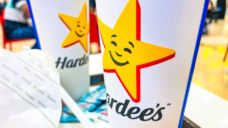
The Meaning Behind the Hardee’s Logo
![]()
Dive into the world of logos and you’ll find a sea of hidden symbols and tales. Hardee’s logo isn’t an exception.
A Star is Born
Hardee’s logo stands out, thanks to its prominent star. Why a star, you ask? Well, stars have always symbolized excellence, quality, and a bit of that ‘sparkle’ we all look for. Hardee’s wanted to shine in the competitive fast-food scene, and the star was their ticket.
Feeling the Smile
Did you notice the subtle smiley face in the logo? Look closely! A crescent-shaped smile, snugly tucked inside the star. It’s a warm, friendly nod to good service and a happy dining experience.
Tracing the History of the Logo
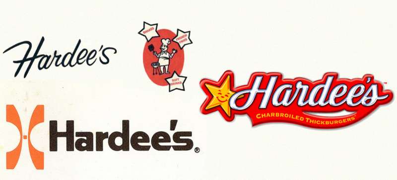
Get ready for a trip down memory lane as we explore the evolution of the Hardee’s logo.
Roots in the 60’s
The original logo was a simple design, a mix of the owner’s name with a chef’s hat. A humble beginning indeed.
Star Power Emerges
The 70’s saw the birth of the star in the Hardee’s logo. Bold and bright, it was a beacon calling out to folks looking for a satisfying meal.
The Smiley Addition
Fast-forward to the new millennium, and we see the introduction of the hidden smiley. A small tweak but one that added a whole lot of personality to the logo.
Revel in the Colors of the Hardee’s Logo
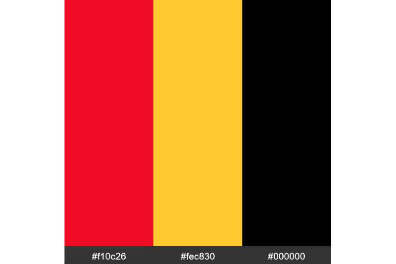
As a designer, I can tell you, colors matter. Let’s decode what the logo colors are saying.
Red: The Color of Passion
Red, the color of energy and passion, is dominant in the logo. It’s meant to spark our appetites and stir our hearts.
Yellow: The Color of Happiness
And the yellow? It’s all about joy, happiness, and warmth. The friendly vibes you want when you’re grabbing a meal.
And good ol’ black.
Decoding the Font Used in the Hardee’s Logo
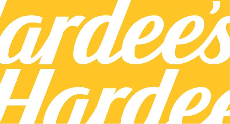
Typography plays a vital role in any design, and Hardee’s logo is no exception.
Bold and Sturdy
The logo uses a strong, bold typeface. It speaks volumes about the brand’s confidence and reliability.
The Impact of the Hardee’s Logo
Every design has an impact, and we’re about to unravel how Hardee’s logo has influenced its brand image.
Brand Recognition
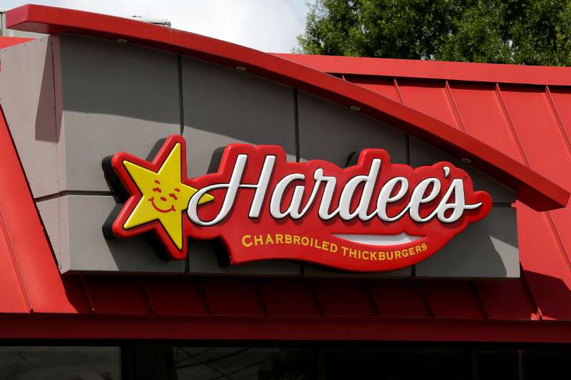
The distinct star and unique colors make the logo highly recognizable. It’s an identity, a symbol that people connect with.
A Sense of Familiarity
Its consistent use over the years has established a sense of familiarity among customers. It’s like a friendly face in a crowd.
The Versatility of the Hardee’s Logo
In design, we love versatility, and the Hardee’s logo is a shining example.
Adaptable Across Platforms
The logo’s design allows it to be adapted across various platforms. Whether it’s a billboard or a burger wrapper, it holds its own.
Timeless Design
Its simple, yet impactful design gives it a timeless quality. It has evolved, yet retained its core elements, ensuring its relevance through the decades.
FAQ On The Hardee’s Logo
Why does Hardee’s have a star in its logo?
The star in the Hardee’s logo isn’t just about shine; it’s a nod to the original moniker, Hardee’s Star Drive-In.
The emblem showcases its heritage, symbolizing quality and stellar service. Bound up in that shape is a legacy, marking the spot for generations seeking comfort food with a dash of nostalgia.
What does the Hardee’s logo represent?
It’s an icon of the Fast Food Industry; think of it as a herald of hearty meals. For those spotting that comforting emblem, it’s an invitation – warm and ever-welcoming. To many, the golden star signifies an oasis of juicy burgers and expertly seasoned fries.
Has the Hardee’s logo changed over time?
Absolutely, the logo’s seen transformations mirroring the brand’s growth. Each evolution elevates its aesthetics, retaining the star while playing with typefaces and contours. It’s a timeline in design, charting the changes while clinging to that nostalgic pull of the original star.
Who designed the original Hardee’s logo?
The backstory’s a bit murky here, a blend of designers and brand strategists dipping their fingers into the branding pot. The original artist may be lost to time, but their legacy remains embedded in those clean lines and that unmistakable star.
Is Hardee’s logo the same as Carl’s Jr.?
Twins, sort of, but not quite identical. Both share similar design elements, reflecting their sibling relationship within CKE Restaurants. Yet, each logo has subtle tweaks – nuances telling apart one star-spangled sign from the other.
Why did Hardee’s choose a star for its logo?
Back in the 60s, the star encapsulated aspiration, quality, and a hint of American Dream. Hardee’s knew what it was doing – a star meant more than fame; it whispered promise, reliability, and a taste of tradition clad in modern convenience.
What colors are used in the Hardee’s logo?
Red, blue, and white dominate – a palette pulled straight from the quilt of national identity. Reds speak passion, whites breathe simplicity, and blues tell tales of trust. Together, they’re a visual handshake, an agreement of taste between brand and customer.
How does Hardee’s logo impact brand recognition?
In the Quick Service Restaurant sector, a logo’s your first hello. Hardee’s star stands out; it’s striking, recognizable, and fills the role of unspoken promise. Spot that star, and you’ve got a menu in your mind before the door chimes your entrance.
What role does the Hardee’s logo play in its branding strategies?
It’s no minor player; it’s center stage, spotlight hogging, and leading the charge. The logo’s the keystone of Hardee’s branding strategies, a cornerstone that holds up the arch of advertising, decor, and packaging. It’s what links the vast chain into a single, coherent identity.
Has the logo contributed to Hardee’s success?
Certainly. It’s a silent salesman, a non-stop endorsement etched in every corner of the brand’s universe.
That star hasn’t just decorated signboards; it’s earned its place as an integral part of the Hardee’s story, etched into the palate’s memory of anyone passing through its doors.
Conclusion
So, we’ve cruised through the twists and turns of the Hardee’s logo, haven’t we? That radiant star navigates more than just the carousel of quick bites—it’s stitched into the fabric of the Fast Food Industry, an insignia of the munch-driven detours across America’s highway.
Here’s the real juice: a logo goes beyond a mere visual branding element. It’s emotion solidified; a graphic anchor towing a fleet of feelings, values, and nostalgia. Staring at that Hardee’s star, customers don’t just see a symbol; they see the happy star mascot reverberating through their own life stories.
From commercial logo design swings to the intricate dance of color scheme and typography, we’ve scoped out the A to Z on a logo that’s as much a landmark as it is a label. It tells of quests—of the franchise business’s climb and its punch in the burger cosmos. And just like that, munch by munch, the star soars, spotlighting the epic saga of Hardee’s.
If you liked this article about the Hardee’s logo, you should check out this article about the Five Guys logo.
There are also similar articles discussing the Tim Hortons logo, the Papa John’s logo, the Jollibee logo, and the Quiznos logo.
And let’s not forget about articles on the Chipotle Mexican Grill logo, the Auntie Anne’s logo, the Carl’s Jr. logo, and the In-N-Out Burger logo.
Bogdan Sandu, a seasoned designer with 15 years of diverse experience, has been designing websites since 2008.
Renowned for his expertise in logo design and visual branding, Bogdan has developed a multitude of logos for various clients.
His skills extend to creating posters, vector illustrations, business cards, and brochures. Additionally, Bogdan's UI kits were featured on marketplaces like Visual Hierarchy and UI8.
Latest posts by Bogdan Sandu (see all)
- Green Color Palettes for Designers To Use - 11 May 2024
- Digital Style: What Font Does Cash App Use? - 11 May 2024
- The Coors Light Logo History, Colors, Font, And Meaning - 10 May 2024