The In-N-Out Burger Logo History, Colors, Font, and Meaning

Imagine a canvas splashed with vibrant red and yellow, crowned with a playful palm tree; you’ve just pictured the memorable In-N-Out Burger logo.
More than just a symbol, it’s a beacon of Californian burger culture, seared into the hearts of fast-food aficionados.
Beneath the glossy finish of this emblem, lies a tale of tradition, quality, and a cult following that rivals heavyweight champions of the quick-service world.
Today, I’m unpacking the layers behind this icon—an image that’s come to represent more than a meal, whispering tales of not frozen, quality you can taste, and an enigmatic secret menu that keeps fans coming back.
By article’s end, you’ll grasp why this isn’t merely graphic design; it’s a masterstroke of branding brilliance that’s kept In-N-Out at the zenith of regional fast food chains.
Dive in for an exploration of In-N-Out history, a dissection of logo elements, and insights into how this American burger emblem became a cult symbol in fast food lore.
The Meaning Behind the In-N-Out Burger Logo
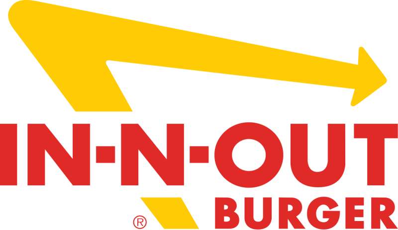
Peeling back the layers, a striking palm tree intersects the company moniker’s ‘N’. More than mere decoration, this symbol roots itself in the Golden State’s aesthetic, evoking sun-dappled road trips and a nod to the drive-thru’s inaugural 1948 location. It whispers of an era when car culture and surfboards were tokens of the California dream.
But delve deeper and you’ll find echoes of a philosophical stance. The palm stands tall and unwavering, reflecting a commitment to enduring quality in a world of fleeting fancies. Simplicity reigns; the logo eschews the clutter that engulfs typical fast food branding, a visual stamp of the chain’s famed less-is-more menu philosophy.
Diner traditions resonate within this insignia, a badge of honor for a menu that’s withstood the test of time, impervious to the whims of food trends. Beneath this emblem lies a silent pledge: come for the burger, stay for the unchanged excellence, the warmth of familiarity in an ever-spinning world.
The History of the In-N-Out Burger Logo
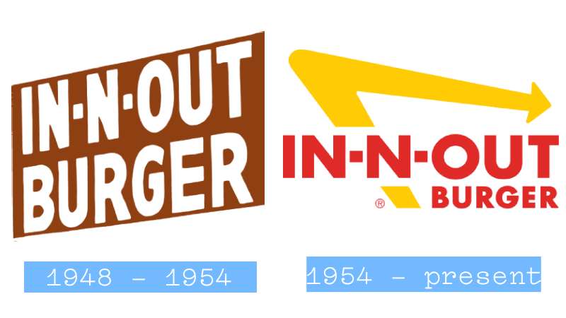
Time travel back to 1948—the story unfolds with Harry and Esther Snyder opening their first burger stand, a novel symphony of sizzling grills and gleeful diners. Innovation loomed large; they pioneered the drive-thru concept, a touch of genius infused with the essence of a burgeoning, automobile-adorned society.
Fast forward through decades: the logo morphs but its soul remains. The iconic yellow arrow debuts in the 1950s, a dynamic beacon that commands attention with confidence and fervor. It evolves from its initial form, taking on a bolder stance as the decades turn, reflecting a brand in constant motion, yet steadfast in its core offerings.
As the ’60s roll in, the palm tree sprouts next to the ‘N’ – an unspoken homage to California’s breezy veneer and the burger joint’s unwavering ethos. It is this version that imprints itself on the hearts of a devoted following, a talisman of tradition amidst the changing tides of the fast food seascape.
The Colors of the In-N-Out Burger Logo

Vibrancy & Vitality: The logo dazzles in a triad of colors: a fiery red, a bold yellow, and pristine white. Each shade, a deliberate choice, whispers tales of the brand’s spirited journey.
Red’s Rich Resonance: Red’s embrace is universal—the color of passion, a herald of heart and appetite-stirring vibrance. It’s no silent background player; this red demands presence, evokes hunger, wafts with aromatic flair, a signal to stop and indulge.
Yellow’s Emotional Echo: Yellow, with its sun-soaked brightness, extols happiness, the bliss of a smile born from that first juicy bite. A beacon to the bleary-eyed traveler, the yellow arrow is an invitation, a guide to a haven where weariness meets satiation.
White’s Whisper of Simplicity: Amidst these potent hues, white stands serene. A canvas unmarred, it breathes cleanliness, ease, a buffer that allows its bolder counterparts to sing.
The Font Used in the In-N-Out Burger Logo
Typography as Tradition: Adding to the logo’s allure is a font that transcends mere text. It’s a tailored suit on the shop’s marquee, a confident, mid-century flair with a casual nod to the streamlined aesthetic.
This chosen typeface, rooted in a 1940s’ vibe, balances retro chic with the clarity of modern boldness. A slender serif complements the script, a design duality that dances between friendly and authoritative.
The Iconography’s Evolution
From Inception to Now: A stroll down memory lane is lined with tweaks and refinements. The arrow, once a mere detail, matures into the logo’s anchor. New storefronts don their updated insignia with pride, a testament to resilience in an age of branding battles. It stands uncluttered, a resilient icon far from the cacophony of contemporaries.
Symbolic Shifts: With each subtle shift, a wink to its humble roots. Even as the palm leaves widen, the arrow sharpens, there remains a steadfastness to the original vision: serve up joy, one burger at a time. It’s evolution with a purpose, a logo living out its legacy.
Branding Beyond Burgers

Cultural Cornerstone: Fragmented into mere font and color, one might miss the logo’s broader cultural embrace. The In-N-Out emblem finds itself stitched into the national conversation, a symbol not just of food but of identity. It’s a cultural bastion that adorns car bumpers, T-shirts, and even tattoos—an inked ode to loyalty.
Brand Extensions: Stare long enough at the logo and you’ll see beyond. Merely a cornerstone of regional cuisine, this symbol breaches its own confines. Its iconography blends into merchandise lines, its arrow pointing to a lifestyle that extends past the menu. With each branded good embossed with this marque, the logo’s narrative deepens, carrying the spirit of In-N-Out across many a mile.
In twisting the narrative of fast food branding, the In-N-Out logo orchestrates a symphony of tradition and modernity—a timeless tale spun into the fibers of an iconic arrow and palm.
FAQ On The In-N-Out Burger Logo
What’s the story behind the In-N-Out Burger logo?
The logo is a snapshot of the In-N-Out legacy—rooted in 1948 Southern-California car culture.
Harry and Esther Snyder opened the first drive-thru, and that iconic logo with a palm tree represents breezy vibes mixed with a passion for fresh, never frozen, fast food that defines the West Coast.
Who designed the In-N-Out logo?
Honestly, the designer’s identity seems lost to history. But what remains clear is their vision: capture the essence of a California classic.
The red and yellow, the palm tree motif—it’s a burger joint graphic turned cultural badge, symbolizing quality you can taste that’s become emblematic of the brand.
Does the palm tree in the In-N-Out logo have a meaning?
Absolutely, the palm tree stands tall, a nod to Californian landscapes. Yet, it goes deeper—symbolizing freshness, growth, and an oasis of quality in a desert of fast-food mediocrity. It whispers of an In-N-Out world where drive-thru dining is less fast food, more lifestyle.
Have there been any changes to the In-N-Out logo over time?
Changes? Minimal. The design has remained strikingly consistent, a testament to In-N-Out’s dedication to tradition.
Small tweaks? Sure, to keep it crisp on digital platforms or the occasional merchandise. But the essence? Unchanged. A timeless beacon in an ever-adaptive industry.
What does the color scheme signify in the In-N-Out logo?
Red symbolizes energy, passion, and appetite—no shocker for a food logo. Yellow radiates warmth, happiness, like a California sun, mirroring the happy customers that swear by their Double-Doubles.
A color combo that screams fast-service with the heart of a casual dining experience.
Is the In-N-Out Burger logo trademarked?
Oh, you bet. That logo is protected like a secret recipe. In a world of copycats, you gotta lock down what’s rightfully yours. So, yeah, if you’re even thinking about lifting that logo… just don’t.
Does In-N-Out Burger’s cult following tie to its logo?
They say a logo’s worth a thousand bites, right? The logo’s hooked into the cult mystique—unknown designer, unchanged style, the iconic palm tree. It’s a visual cue that flips a switch in fans’ brains: “Get ready for taste bud bliss.”
What’s the importance of In-N-Out Burger’s logo in its marketing?
It’s central, like a beef patty in a bun. That logo broadcasts In-N-Out’s brand identity—fast service, yes, but with a quality you can taste vibe. It’s more than marketing; it’s a trusted sign that this American burger outfit stands for something fresh, classic, downright delicious.
How has the logo influenced In-N-Out’s merchandise?
Shirts, hats, even socks—In-N-Out spices up its merchandise with their distinct logo. Each item isn’t just brand extension; it’s a piece of Californian legend. Fashion statement or fan badge, that logo on your chest is a conversation starter.
Could In-N-Out ever change its iconic logo?
Change? That’s a historic question. Anything’s possible, sure. But twist the logo? That’d be like changing the Hollywood sign.
It’s a fixture, a graphic declaration of In-N-Out’s consistent excellence. Modern tweaks to stay on-trend? Maybe. An overhaul? Unlikely. Why mess with near perfection?
Conclusion
So we’ve journeyed through the vivid spectrum that the In-N-Out Burger logo colors in the minds of burger buffs and brand builders alike. This isn’t merely about lines and hues; it’s a story woven into graphic form. A tale that speaks of innovation, drive-thrus and a legacy built on top-notch, quality you can taste.
It stands out, not just as a signpost on the highway, but as the heart of a California burger dream. In the vast skyscape of fast-food culture, that red and yellow, with a whisper of palm tree, is a constant star—etched into an identity that’s far-reaching and awe-inspiringly steadfast.
Grasping this, you don’t just see a logo; you see an emblem rep for West Coast fast food, a seal of dedication, turning customers into loyal followers. It’s a blend of past and present, a beacon that says, ‘Welcome to In-N-Out—where nostalgia meets the grill.’
If you liked this article about the In-N-Out Burger logo, you should check out this article about the Five Guys logo.
There are also similar articles discussing the Tim Hortons logo, the Hardee’s logo, the Papa John’s logo, and the Jollibee logo.
And let’s not forget about articles on the Quiznos logo, the Chipotle Mexican Grill logo, the Auntie Anne’s logo, and the Carl’s Jr. logo.
- Green Color Palettes for Designers To Use - 11 May 2024
- Digital Style: What Font Does Cash App Use? - 11 May 2024
- The Coors Light Logo History, Colors, Font, And Meaning - 10 May 2024


