The Tampa Bay Lightning logo stands as one of the most recognizable marks in professional hockey. It represents Florida’s first major NHL franchise, established in 1992.
Within the broader context of NHL logos, the Lightning’s brand identity carved out unique territory. While many teams relied on animal mascots or regional symbols, Tampa Bay went with raw elemental power.
The current primary logo debuted in 2011. It marked a return to a cleaner, more aggressive lightning bolt design after years of experimentation.
The franchise has used four distinct logo versions since its founding. Each reflects different eras in team history and shifting trends in sports branding.
What Is the Tampa Bay Lightning Logo?
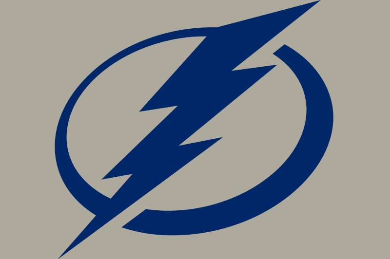
The Tampa Bay Lightning logo features a stylized lightning bolt rendered in blue, white, and black. Introduced in its current form on June 22, 2011, it was created as part of a comprehensive rebrand. The bolt symbolizes power, speed, and the electrical storms common to the Tampa Bay region.
Design Specifications
- Design Type: Combination mark (symbol with wordmark used separately)
- Primary Elements: Angular lightning bolt with sharp geometric edges
- Official Introduction Date: June 22, 2011
- Designer/Agency: Created in collaboration with the NHL and team ownership
- Trademark Status: Registered trademark of the Tampa Bay Lightning and NHL
- Color Palette: Tampa Bay Blue (#002868), White (#FFFFFF), Black (#000000)
- Usage Context: Jerseys, arena signage, merchandise, digital platforms, broadcast graphics
How Has the Tampa Bay Lightning Logo Evolved Over Time?

The Lightning’s visual identity has gone through four major phases since 1992. Each redesign reflected changing aesthetics in sports branding and the team’s own growth as a franchise.
The evolution moved from literal representation to abstraction and back again.
Original Tampa Bay Lightning Logo (1992-2001)
- Years Active: 1992-2001
- Design Description: A circular emblem featuring a detailed lightning bolt striking through storm clouds, with “TAMPA BAY LIGHTNING” text wrapping around the perimeter
- Color Scheme: Black, blue, silver, and white
- Designer: Created during franchise establishment
- Context: Introduced for the team’s inaugural NHL season, needed to establish immediate brand recognition in a non-traditional hockey market
- Cultural Significance: Represented Florida’s emergence as viable NHL territory and connected hockey to the region’s famous thunderstorms
Second Era Logo (2001-2007)
- Years Active: 2001-2007
- Design Description: Streamlined bolt with more aggressive angles, dropped the circular frame for a standalone mark
- Color Scheme: Shifted to a deeper blue with silver accents
- Key Changes from Previous: Removed the storm cloud imagery, simplified the overall composition
- Context: Coincided with the team’s rise to Stanley Cup contention, culminating in the 2004 championship
- Cultural Significance: This version appeared on the franchise’s first Stanley Cup banner
Third Era Logo (2007-2011)
- Years Active: 2007-2011
- Design Description: Featured a more stylized, almost italicized bolt with rounded edges
- Color Scheme: Royal blue replaced the darker shade, increased silver presence
- Key Changes from Previous: Softer aesthetic, less aggressive angles
- Context: Part of Reebok’s league-wide uniform redesign
- Cultural Significance: Often considered the weakest version by fans, though it marked a transitional period for the franchise
Current Logo (2011-Present)
- Years Active: 2011-present
- Design Description: Sharp, angular bolt with clean geometric lines and aggressive forward motion
- Color Scheme: Return to darker Tampa Bay Blue with black and white
- Key Changes from Previous: Eliminated silver entirely, restored aggressive posture
- Context: Introduced under new ownership led by Jeff Vinik
- Cultural Significance: This version has appeared on two Stanley Cup championship teams (2020, 2021)
What Do the Design Elements of the Tampa Bay Lightning Logo Mean?
The lightning bolt serves as the primary focal point of the entire identity. It communicates instant energy and unpredictable power.
The bolt’s forward tilt suggests movement and aggression. That directional movement connects to hockey’s fast-paced nature.
Why Did Tampa Bay Lightning Choose These Specific Colors?
Tampa Bay Blue (#002868) anchors the entire color palette. It reads as authoritative and powerful without the aggressiveness of pure black.
This hue connects to both the water surrounding Tampa Bay and the dark skies that precede thunderstorms.
Black provides grounding and adds weight to the design. White creates necessary separation and ensures visibility on dark backgrounds.
Together, these colors form an analogous color relationship that feels cohesive rather than chaotic.
What Typography Style Is Used in the Tampa Bay Lightning Logo?

The wordmark uses custom typography with sharp angles that mirror the bolt itself.
Letter shapes feature pointed terminals and aggressive serifs. The kerning stays tight, reinforcing intensity.
Earlier versions used rounder, more approachable fonts. The current type feels more urgent and matches the redesigned bolt.
What Are the Hidden Meanings in the Tampa Bay Lightning Logo?
The bolt’s angle isn’t random. It points forward and upward, suggesting progress and aspiration.
Some fans see the negative space between bolt segments as representing Amalie Arena’s iconic tower. Whether intentional or not, it creates a local connection.
The lack of any containing shape differs from many logo approaches. This freedom suggests lightning can’t be contained.
How Does the Tampa Bay Lightning Logo Compare to Competitor Logos?
Among NHL teams, the Lightning logo sits in the abstract symbol category. It doesn’t rely on animal mascots or letterforms alone.
The Carolina Hurricanes logo takes a similar elemental approach with weather imagery. Both teams lean into regional climate identity.
Florida’s other NHL team, the Florida Panthers, went the opposite direction with a literal animal mascot. The Lightning’s abstraction stands out in their shared market.
Compared to Original Six teams like Detroit’s winged wheel or Chicago’s iconic mark, Tampa Bay’s logo feels more modern and aggressive.
The Vegas Golden Knights and Colorado Avalanche use similar angular, aggressive styling in their marks.
What Are the Technical Specifications of the Tampa Bay Lightning Logo?
Official Color Codes
Tampa Bay Blue
White
- Hex: #FFFFFF
- RGB: (255, 255, 255)
- CMYK: (0, 0, 0, 0)
Black
- Hex: #000000
- RGB: (0, 0, 0)
- CMYK: (0, 0, 0, 100)
Dimensions and Proportions
- Aspect Ratio: The primary bolt fits within a roughly 1:1.5 vertical rectangle
- Minimum Size: 0.5 inches for print applications to maintain legibility
- Clear Space: Minimum padding equal to the width of the bolt’s thickest segment
- File Formats: Available as vector graphics (AI, EPS, SVG) and raster formats (JPEG, PNG)
What Cultural Impact Has the Tampa Bay Lightning Logo Had?
The current logo has become synonymous with championship hockey. It appeared on back-to-back Stanley Cup wins in 2020 and 2021.
In Tampa Bay, the bolt symbol transcends hockey. You see it on vehicles, buildings, and tattoos throughout the region.
The logo helped establish Tampa as a legitimate major sports city. It carries weight alongside the Buccaneers and Rays brands.
How Does the Tampa Bay Lightning Logo Fit Into the Overall Brand Identity?

The bolt serves as the hub connecting all brand touchpoints. Jersey designs, arena signage, and digital presence all reference its angles and energy.
ThunderBug, the team mascot, incorporates the same color scheme and electrical theming. Brand guidelines ensure consistency across every application.
Amalie Arena’s interior design echoes the bolt’s sharp geometry. Even the team’s goal horn and light show build on electrical imagery.
How Should the Tampa Bay Lightning Logo Be Used?
Official Usage Guidelines
- Do: Maintain clear space around the logo, use only official color combinations, scale proportionally
- Don’t: Stretch or distort the bolt, place over busy backgrounds without proper contrast, modify colors for personal preference
- Access: Official logos available through NHL media portals and team press resources
- Licensing: Commercial use requires explicit permission from Tampa Bay Lightning and NHL licensing departments
- Trademark: Protected under NHL trademarks, unauthorized reproduction prohibited
FAQ on The Tampa Bay Lightning Logo
What Does the Tampa Bay Lightning Logo Look Like?
The primary logo features a stylized lightning bolt in Tampa Bay Blue, white, and black. It angles forward with sharp geometric edges.
The design communicates speed and electrical power. No circular frame or containing shape restricts it.
When Was the Current Tampa Bay Lightning Logo Introduced?
The current version debuted on June 22, 2011. Jeff Vinik’s ownership group launched it as part of a complete franchise rebrand.
This team logo replaced the softer 2007 version that many fans disliked.
Who Designed the Tampa Bay Lightning Logo?
The NHL worked directly with team ownership on the 2011 redesign. No single famous graphic designer received public credit.
Most professional hockey teams handle logo creation through internal collaboration with league-approved agencies.
What Do the Tampa Bay Lightning Colors Represent?
Tampa Bay Blue connects to the region’s water and stormy skies. Understanding color psychology explains why blue signals trust and power.
Black adds authority. White provides crucial separation for jersey logo visibility on ice.
What Does the Lightning Bolt Symbolize?
The bolt represents Tampa Bay’s famous thunderstorms. Florida leads the nation in lightning strikes annually.
The psychology of shapes tells us angular forms suggest aggression and forward motion. Perfect for hockey.
How Many Times Has the Tampa Bay Lightning Logo Changed?
The franchise has used four distinct versions since 1992. The original featured storm clouds surrounding the bolt.
Each logo redesign reflected shifting trends in sports branding and NHL visual identity standards.
What Font Does the Tampa Bay Lightning Use?
The wordmark uses custom typeface lettering with pointed terminals. It mirrors the bolt’s aggressive angles.
This isn’t a standard sans-serif font you can download. The team commissioned it specifically.
Can I Use the Tampa Bay Lightning Logo for My Project?
Not without permission. The NHL franchise and team hold registered trademarks on all visual assets.
Commercial use requires licensing approval. Fan art exists in a gray area that teams generally tolerate for non-commercial purposes.
Where Can I Download Official Tampa Bay Lightning Logo Files?
Media members access official files through NHL press portals. The team provides assets for legitimate print design and broadcast use.
Fan sites offer unofficial versions. Quality and accuracy vary significantly.
Does Tampa Bay Have an Alternate Logo?
Yes. The shoulder patch features a simplified bolt within a circular frame. It appears on jerseys and select team merchandise.
The “BOLTS” wordmark also serves as a secondary mark for specific applications.
Conclusion
The Tampa Bay Lightning logo proves that sports branding can be both simple and powerful. Four versions later, the Bolts have landed on an ice hockey emblem that works.
It scales perfectly from Amalie Arena’s jumbotron to team apparel. The angular bolt follows solid logo design principles while staying unique among Atlantic Division rivals.
Two Stanley Cup championships now hang beside this mark. That kind of storytelling can’t be designed. It has to be earned.
The lightning bolt started as a regional weather reference. Now it represents championship hockey in Florida.

Renowned for his expertise in logo design and visual branding, Bogdan has developed a multitude of logos for various clients.
His skills extend to creating posters, vector illustrations, business cards, and brochures. Additionally, Bogdan's UI kits were featured on marketplaces like Visual Hierarchy and UI8.
He also wrote in the past years on sites like Design Your Way, WebDesignerDepot, WPDean, Designmodo, Speckyboy, Slider Revolution, and more.
- The Windsurf Logo History, Colors, Font, And Meaning - 10 October 2026
- How to Remove Background From Product Photos (No Photoshop) - 10 October 2026
- How Designers can Build a Stronger Online Creative Identity - 9 October 2026

Bogdan Sandu is a seasoned designer who has been designing websites since 2008. Renowned for his expertise in logo design and visual branding, Bogdan has developed a multitude of logos for various clients. His skills extend to creating posters, vector illustrations, business cards, and brochures. Additionally, Bogdan's UI kits were featured on marketplaces like Visual Hierarchy and UI8. He also wrote in the past years on sites like Design Your Way, WebDesignerDepot, WPDean, Designmodo, Speckyboy, Slider Revolution, and more.
You Might Also Like