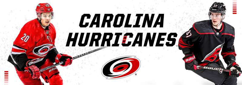
The Carolina Hurricanes Logo History, Colors, Font, And Meaning
Picture this: a whirlwind of energy, bold reds clashing with deep blacks, all converging into a single emblem of raw power and team spirit.
Welcome to the world where the Carolina Hurricanes logo reigns supreme, a symbol that transcends mere graphic design to become an iconic beacon within the National Hockey League.
The tapestry of professional sports is rich with storied crests, but few embody the spirited essence of their team quite like this emblem. Its interwoven elements of hockey crest design and team iconography invite a journey into the heart of sports branding and fan identity.
By tracing the hurricane’s path, readers will unravel the magic behind creating a sports emblem that courses with life, stitches together fan culture, and fuels NHL team insignias with purpose.
Dive into an exploration of shapes and shades that morph into a recognizable force, echoing the cheers of the Carolina Hurricanes Fan Base.
In this article, the anatomy of an emblem will unfold, revealing how a logo encapsulates history, spirit, and community—all swirled together in the eye of the storm.
The Meaning Behind the Carolina Hurricanes Logo
Symbolism & Identity
Whoa, so let’s talk about the deep vibes behind the Carolina Hurricanes logo. It’s not just some random swirl, y’know? It symbolizes power, movement, and the raw energy of a storm.
Hurricanes are fierce, right? The logo captures that fierceness and channels the identity of the team. You want your hockey team to hit the ice like a force of nature, and that’s what this logo screams.
Emotions Conveyed
Alright, ever been in a storm? That rush, that thrill – that’s what this logo wants to make you feel. It’s not just about representing a geographical occurrence; it’s about the emotional response to the power of nature.
It stirs up feelings of excitement, anticipation, and a bit of that adrenaline kick. Perfect for getting you hyped up for a game.
The History of the Carolina Hurricanes Logo
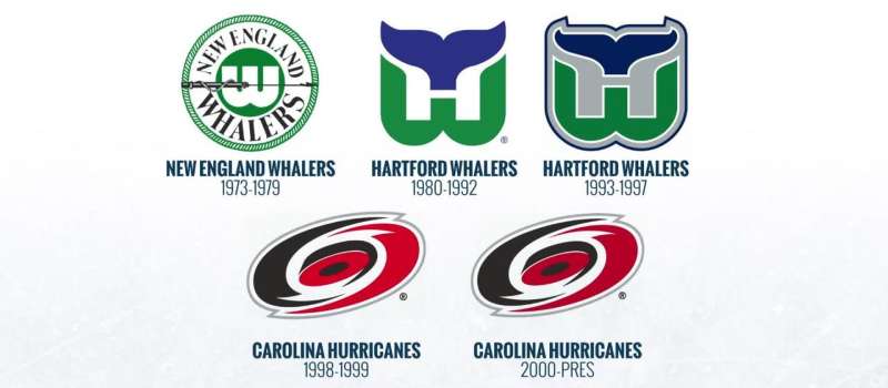
Origins & Inspiration
Let’s rewind a bit. So, back in the day, the team needed a face, right? A symbol. They were inspired by the actual hurricanes, those massive storms that sometimes sweep the coast.
The swirling design, that’s kind of mimicking the satellite images of real hurricanes. Genius, if you ask me. It’s like nature’s own artwork.
Evolution & Changes
Over the years, there have been some tweaks here and there. The core design, though? Still as solid as ever. They’ve played around with the details, and given it some touch-ups. But that iconic whirl? Timeless.
The Colors of the Carolina Hurricanes Logo
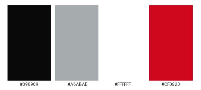
The Red & Black
Alright, peep this: Red symbolizes energy, strength, and passion. Black? It’s all about power, sophistication, and mystery. Combined? You get a logo that’s intense, classy, and oh-so-powerful. Perfect for a team named after a force of nature.
Shades & Tones
It’s not just about slapping on some red and black. The specific shades used, the way they contrast and complement each other, that’s pure artistry. The tones capture the dynamism and energy of the sport and team.
The Font Used in the Carolina Hurricanes Logo
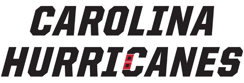
Style & Feel
Fonts, they’re like unsung heroes. The font in the Hurricanes’ logo? Bold, modern, with a touch of aggression. It’s not just letters; it’s about the attitude, the vibe, and the statement they make.
Why It Works
Think of a hurricane: robust, powerful, and dominant. Now, the font mirrors those characteristics. It’s harmonious with the overall design, and together, they’re like the perfect duo on ice.
The Artistry of the Design
Balance & Proportions
Dive a bit deeper and you’ll see the harmony. The logo isn’t just thrown together. The balance between the swirl, the puck, and the typography, it’s meticulously planned. It creates a sense of movement, yet everything feels anchored.
Detailing & Nuances
The little touches, they matter. The subtle shading, the way the puck is positioned, the gradient… every detail is intentional. It’s these nuances that elevate the design from cool to iconic.
Fan Interpretations & Reception
Initial Response
When fans first laid eyes on the logo, reactions were a mixed bag. Some were instantly in love, others? They warmed up to it over time. But hey, that’s art for you.
Today’s Sentiments
Fast forward, and it’s safe to say the logo’s a fan favorite. Over time, it has become synonymous with the team’s identity, representing moments of glory, heartbreak, and everything in between. Fans sport it with pride, a testament to its lasting appeal.
FAQ On The Carolina Hurricanes Logo
What Inspired the Carolina Hurricanes Logo?
The logo encapsulates a storm of passion and power, distilling the ferocity of a hurricane into a sleek, swirling icon. Its inception was a nod to North Carolina’s storm-laden legacy, merging sports team branding with a natural phenomenon notorious in the region.
How Has the Logo Evolved Over the Years?
It’s maintained a remarkable consistency, with subtle refinements enhancing its visual impact.
Minor tweaks have polished the icon, ensuring the emblem’s hockey crest elements remain timeless in an ever-evolving NHL landscape—a beacon of constancy amidst change.
What Do the Colors in the Logo Represent?
A palette of red, black, and white symbolizes intensity, strength, and elegance. It’s a bold statement in sports logo redesigns, where Carolina Hurricanes colors reflect both the menacing power of a storm and the clean, sharp finesse of ice hockey.
Can You Describe the Symbolism Behind the Logo Design?
The logo’s eye doubles as a hockey puck, while the flags denote a hurricane’s force on the Saffir-Simpson scale, cleverly incorporating aspects of the sport and the tempestuous weather.
It’s an artful blend of meaning, an embodiment of hockey emblem design and regional homage.
Is There Significance to the Flag Patterns on the Logo?
Absolutely. Resembling the warning flags seen on North Carolina’s coastlines, the flags on the logo symbolize caution and intensity akin to the approach of a hurricane, ingeniously paired with the thrill and vigour of an NHL match. A characterful merger for sports team branding.
How Often Has The Carolina Hurricanes Logo Been Redesigned?
Rarely. Since its revelation in the ’90s, modifications have been minimal, with the intention to uphold the strength and continuity of the team’s brand identity. It is a testament to the logo’s enduring design that revamps have been kept to a minimum.
How Do Fans Feel About the Logo?
The emblem is held dear, a potent token for the Carolina Hurricanes Fan Base. Wrapped in team pride and local sentiment, fans wear it not just as a logo but a banner—a symbol of unity, tradition, and the communal pulse of PNC Arena.
Does the Logo Reflect Any Local Cultural Elements?
Crafted with a deep sense of locality, the logo mirrors North Carolina’s vulnerability to hurricanes. Its creative contours narrate the region’s resilience, channeling a shared narrative.
Local ties run deep in design, offering audiences more than just a sports emblem design—it’s a regional badge of honor.
What Was the Process Behind the Creation of the Logo?
The process was an intricate dance of drafting, conceptualizing, and aligning with the Carolina Hurricanes colors and ethos.
A careful consideration of regional and sports brand identity, the emblem’s birth was meticulous, drawing from the team’s spirit and Carolina’s meteorological heartbeats.
Is the Carolina Hurricanes Logo Universally Recognized?
Within the National Hockey League, it’s a distinguished icon, instantly connecting to the team and widely acknowledged amongst hockey enthusiasts.
It stands up amongst the ranks of recognizable logos, its unique hurricane motif leaving an indelible mark on the canvas of professional sports identities.
Conclusion
Embarking on this vivid journey through the contours and colors of the Carolina Hurricanes logo, we’ve weathered the storm of creativity and design. Each element, nuanced and symbolic, holds a spectrum of stories—marrying meteorology with the passion of hockey, culminating in a brand identity synonymous with both strength and unity.
- We’ve navigated the reds and blacks clashing in unison, powerful and assertive.
- Uncovered the ingenuity behind the puck that doubles as the eye of the storm.
- Celebrated the steadfast loyalty of fans upholding this emblem as a symbol of pride at PNC Arena.
In the design world, this logo is more than an aesthetic—it’s a heartthrob of a community, a hockey crest brimming with life. As the NHL carves through seasons, this iconic image persists, etched not just on jerseys but in the soul of every fan. The story of the Carolina Hurricanes logo—it’s a legacy of bold identity, where every swirl, flag, and hue resonates with the undying spirit of the game.
If you liked this article about the Carolina Hurricanes logo, you should check out this article about the Buffalo Sabres logo.
There are also similar articles discussing the Calgary Flames logo, the Chicago Blackhawks logo, the Colorado Avalanche logo, and the Columbus Blue Jackets logo.
And let’s not forget about articles on the Dallas Stars logo, the New Jersey Devils logo, the New York Islanders logo, and the Washington Capitals logo.
Bogdan Sandu, a seasoned designer with 15 years of diverse experience, has been designing websites since 2008.
Renowned for his expertise in logo design and visual branding, Bogdan has developed a multitude of logos for various clients.
His skills extend to creating posters, vector illustrations, business cards, and brochures. Additionally, Bogdan's UI kits were featured on marketplaces like Visual Hierarchy and UI8.
Latest posts by Bogdan Sandu (see all)