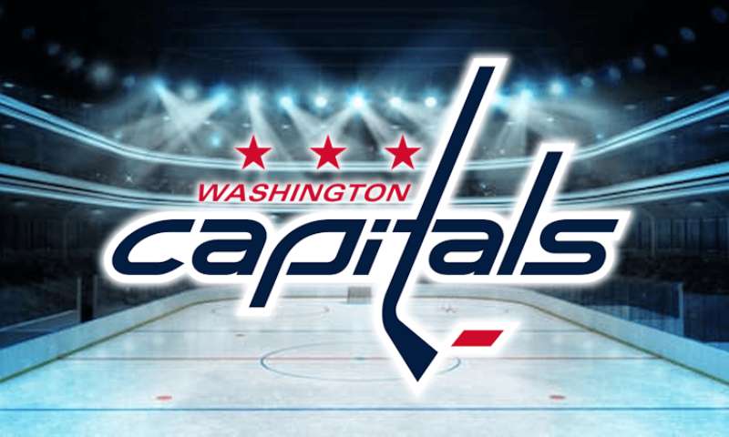
The Washington Capitals logo stands as one of the most recognized marks in professional hockey. It represents the NHL franchise based in Washington, D.C., a team that joined the league during the 1974 expansion.
Within the broader context of NHL logos, the Capitals have cycled through several distinct visual identities. The current primary mark, often called the “Weagle,” debuted in 2007. The franchise has gone through four major logo iterations since its founding.
That 2007 redesign came from the team’s internal creative department working alongside NHL brand consultants. The organization itself was established in 1974, making it one of the younger Original Six-era expansion teams.
What Is the Washington Capitals Logo?
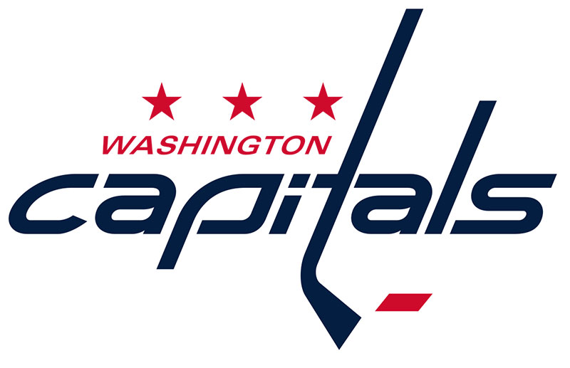
The Washington Capitals logo is a stylized eagle head formed from the letters “W,” “C,” and “T,” officially introduced in 2007. Created by the franchise’s design team, it symbolizes American patriotism through the bald eagle while incorporating the team’s initials into a single cohesive mark.
Design Type: Combination mark (letterform and symbolic imagery merged)
Primary Elements: Eagle head silhouette, integrated “W-C-T” letters, stars
Official Introduction Date: 2007-2008 NHL season
Designer/Agency: Washington Capitals internal design team with NHL Creative Services
Trademark Status: Registered trademark of Monumental Sports & Entertainment
Color Palette:
- Capitals Red: #C8102E
- Navy Blue: #041E42
- White: #FFFFFF
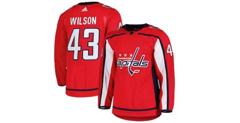
Usage Context: Jerseys, merchandise, arena signage, digital platforms, broadcast graphics, official communications
How Has the Washington Capitals Logo Evolved Over Time?
![]()
The Capitals have worn four primary logos since 1974. Each redesign reflected changing trends in sports branding and shifts in team ownership.
The franchise started with a patriotic red, white, and blue scheme. Then came the controversial “Screaming Eagle” era in the 1990s. And finally, the modern “Weagle” brought things back to basics.
Original Washington Capitals Logo (1974-1995)
Years Active: 1974-1995
Design Description: A hockey stick crossed with a star, surrounded by the team name in a circular arrangement. Simple, clean, very much of its era.
Color Scheme: Red, white, and blue (patriotic palette)
Designer: Unknown (original franchise design team)
Context: Created for the team’s inaugural season. The NHL was expanding, and Washington wanted something that screamed “America’s capital.” The crossed stick and star did exactly that.
Key Changes from Previous: N/A (original mark)
Cultural Significance: Established the red, white, and blue identity that fans still associate with “classic” Capitals hockey. It lasted 21 seasons. That’s staying power.
Screaming Eagle Logo (1995-2007)
Years Active: 1995-2007
Design Description: An aggressive bald eagle in flight, rendered in black, gold, and blue. The eagle clutched a hockey stick in its talons. Very 1990s.
Color Scheme: Black, bronze/gold, blue, white
Designer: NHL Creative Services
Context: The mid-90s saw tons of NHL teams going darker and more aggressive. Think San Jose Sharks logo energy. The Capitals followed that trend hard.
Key Changes from Previous: Complete departure. Gone were the patriotic colors. Gone was the simple star-and-stick. This was a full rebrand attempting to modernize the franchise.
Cultural Significance: Divisive among fans. Some loved the edge. Others hated losing the traditional look. The team won exactly zero championships in this uniform, which probably didn’t help its legacy.
Current “Weagle” Logo (2007-Present)
Years Active: 2007-present
Design Description: The genius here is subtlety. An eagle head profile that cleverly incorporates “W,” “C,” and “T” into its construction. You see the eagle first. Then you notice the letters. It rewards closer inspection.
Color Scheme: Return to red, white, and navy blue
Designer: Capitals internal team with NHL Creative Services collaboration
Context: New ownership under Ted Leonsis wanted to reconnect with franchise history. The black and gold era felt disconnected from Washington’s identity. This logo fixed that.
Key Changes from Previous: Everything changed while somehow feeling familiar. The patriotic colors returned. The eagle stayed but got completely reimagined. The aggression dialed back significantly.
Cultural Significance: This is the logo that won the 2018 Stanley Cup. That alone cements its place in franchise history. Fans overwhelmingly prefer it to the Screaming Eagle era.
What Do the Design Elements of the Washington Capitals Logo Mean?
The Weagle combines national symbolism with team identity through clever letterform integration. The bald eagle represents American strength. The hidden letters ground it in team specificity.
Every element serves double duty. Nothing exists purely for decoration.
Why Did Washington Capitals Choose These Specific Colors?
Red (Capitals Red, #C8102E, Pantone 186 C) represents passion, energy, and the team’s primary identity. It demands attention. Understanding color psychology explains why sports teams gravitate toward red. It signals aggression and competitiveness.
Navy Blue (#041E42, Pantone 289 C) provides grounding and sophistication. It balances the intensity of red while maintaining the patriotic theme.
White (#FFFFFF) creates contrast and ensures readability across applications. It’s the breathing room between red and blue.
What Typography Style Is Used in the Washington Capitals Logo?
The primary wordmark uses a custom serif font with sharp, angular characteristics. It feels authoritative. Traditional but not stuffy.
The letterforms feature extended serifs and consistent stroke widths. Kerning is tight, creating a unified block of text.
Over the years, the typography has shifted from rounded 1970s styles to the current sharper aesthetic. Each era’s font choices reflected broader design trends.
What Are the Hidden Meanings in the Washington Capitals Logo?
The W-C-T letterform is intentional and documented. Designers wanted fans to discover it themselves. That moment of recognition creates connection.
The eagle faces right, symbolizing forward progress. This isn’t accidental. In heraldic tradition, facing right (dexter) indicates movement toward the future.
Three stars appear in some logo variations, referencing the Washington D.C. flag. Local pride baked into the design.
How Does the Washington Capitals Logo Compare to Competitor Logos?
Among Metropolitan Division rivals, the Capitals mark stands out for its conceptual complexity. The Philadelphia Flyers logo uses simple, bold geometry. The Pittsburgh Penguins logo relies on a literal mascot depiction.
The Weagle splits the difference. It’s illustrative but abstract. Symbolic but not cartoonish.
Compared to the Detroit Red Wings logo, which has remained essentially unchanged for decades, the Capitals show more willingness to evolve. Neither approach is wrong. They’re just different philosophies.
The Vegas Golden Knights logo represents the newer school of NHL design. More detail, more complexity, more Vegas. The Capitals feel more restrained by comparison.
What Are the Technical Specifications of the Washington Capitals Logo?
Official Color Codes:
Primary Color: Capitals Red
Secondary Color: Navy Blue
- Hex: #041E42
- RGB: (4, 30, 66)
- CMYK: (100, 85, 36, 35)
- Pantone: 289 C
Accent Color: White
- Hex: #FFFFFF
- RGB: (255, 255, 255)
- CMYK: (0, 0, 0, 0)
Dimensions and Proportions:
- Aspect ratio: Approximately 1:1 for primary mark
- Minimum size: 0.5 inches in print, 50 pixels digital
- Clear space: Minimum of 10% logo height on all sides
- The logo exists as vector graphics for infinite scalability
What Cultural Impact Has the Washington Capitals Logo Had?
The 2018 Stanley Cup championship transformed the Weagle from team logo to city symbol. During that playoff run, the mark appeared everywhere. Bars, restaurants, government buildings.
D.C. embraced hockey in a way it hadn’t before. The logo became shorthand for civic pride.
“Rock the Red” campaigns turned the color scheme into a movement. Fans coordinated clothing. The arena became a sea of red.
How Does the Washington Capitals Logo Fit Into the Overall Brand Identity?
The logo anchors a broader visual system. It works alongside wordmarks, secondary logos, and the “Weagle” alternate mark. Each piece connects through shared colors and design language.
Team brand guidelines specify exactly how these elements interact. Jersey applications differ from digital uses. Arena signage has its own requirements.
The Capitals maintain consistency across touchpoints. From ticket stubs to jumbotron graphics, everything feels unified. That doesn’t happen by accident. It requires intentional visual hierarchy planning.
How Should the Washington Capitals Logo Be Used?
Official Usage Guidelines:
- Never stretch, rotate, or distort the logo
- Maintain minimum clear space requirements
- Use only approved color variations
- Don’t place on busy backgrounds that reduce legibility
- The Weagle should never appear without proper licensing
Where to Access Official Logos:
Media members can request files through the Capitals communications department. Licensed vendors receive assets through NHL brand portals.
Licensing Information:
Commercial use requires explicit permission from Monumental Sports & Entertainment. The NHL handles league-wide licensing agreements for merchandise.
Trademark Protection:
All Capitals marks are federally registered trademarks. Unauthorized commercial use faces legal consequences. Fan art exists in a gray area, but the team generally tolerates non-commercial expressions of fandom.
FAQ on The Washington Capitals Logo
What Does the Washington Capitals Logo Represent?
The Weagle represents American patriotism through a bald eagle. It connects the NHL franchise to its Washington D.C. home.
The design cleverly hides the letters W, C, and T within the eagle’s profile. This dual meaning strengthens the team identity.
When Was the Current Capitals Logo Introduced?
The current primary logo debuted during the 2007-2008 NHL season. Ted Leonsis had recently taken ownership.
He wanted to restore the team’s patriotic visual identity. The Screaming Eagle era was over. Fans celebrated the return to red, white, and blue.
Who Designed the Washington Capitals Logo?
The Capitals internal design team created the Weagle alongside NHL Creative Services. No single designer takes public credit.
This collaboration between franchise staff and league brand consultants produced the hockey team branding fans know today.
What Are the Official Capitals Logo Colors?
The team colors include Capitals Red (#C8102E), Navy Blue (#041E42), and White. These mirror traditional American patriotic schemes.
The color palette replaced the black and gold used during the 1995-2007 period. Fans strongly prefer the current scheme.
What Is the Weagle?
Weagle combines “Washington” and “eagle.” It’s the fan nickname for the current logo.
The eagle emblem forms from integrated letterforms. Look closely. You’ll see the W shape the beak, C form the head, and T create the neck.
Why Did the Capitals Change Their Logo in 2007?
New ownership wanted reconnection with franchise history. The 1990s rebrand to black and gold felt disconnected from Washington’s identity.
The sports team rebrand brought back original colors. It honored the logo history while modernizing the overall look.
How Many Logos Have the Washington Capitals Had?
Four primary logos since 1974. The original star-and-stick lasted until 1995.
Then came the Screaming Eagle. Now the Weagle. Each logo evolution reflected changing trends in professional hockey emblem design and team ownership priorities.
What Font Does the Capitals Wordmark Use?
The wordmark uses a custom typeface with angular serifs. Sharp edges give it authority.
The typography elements evolved from rounder 1970s styles. Today’s version feels more aggressive. It matches the team’s on-ice identity.
What Do the Stars Mean in the Capitals Logo?
Three stars reference the Washington D.C. flag. Local pride matters to the franchise.
Stars appear in secondary logo variations and jersey patches. They connect the hockey franchise to its home city beyond just the team name.
Where Can I Download the Official Capitals Logo?
Media members contact the Capitals communications department. Licensed vendors access files through Monumental Sports brand portals.
Unauthorized commercial use violates trademark protection. The NHL handles merchandise licensing. Fan art for personal use generally gets tolerated by the organization.
Conclusion
The Washington Capitals logo tells a story of franchise growth and regional pride. From the original 1974 mark to today’s Weagle, each iteration reflects shifts in NHL team branding and fan expectations.
The 2018 Stanley Cup championship cemented the current design in D.C. sports history. Alex Ovechkin lifted the trophy wearing that eagle emblem.
Good logo design principles demand both meaning and memorability. The Capitals delivered on both.
Whether displayed at Capital One Arena or on team merchandise worldwide, this hockey emblem represents something bigger than wins and losses. It represents a city.
Renowned for his expertise in logo design and visual branding, Bogdan has developed a multitude of logos for various clients.
His skills extend to creating posters, vector illustrations, business cards, and brochures. Additionally, Bogdan's UI kits were featured on marketplaces like Visual Hierarchy and UI8.
He also wrote in the past years on sites like Design Your Way, WebDesignerDepot, WPDean, Designmodo, Speckyboy, Slider Revolution, and more.
- The Airtable Logo History, Colors, Font, And Meaning - 12 July 2026
- How to Blur Background in Canva: A Quick Tutorial - 11 July 2026
- Typography Trends - 10 July 2026
Bogdan Sandu is a seasoned designer who has been designing websites since 2008. Renowned for his expertise in logo design and visual branding, Bogdan has developed a multitude of logos for various clients. His skills extend to creating posters, vector illustrations, business cards, and brochures. Additionally, Bogdan's UI kits were featured on marketplaces like Visual Hierarchy and UI8. He also wrote in the past years on sites like Design Your Way, WebDesignerDepot, WPDean, Designmodo, Speckyboy, Slider Revolution, and more.
You Might Also Like