
The Vancouver Canucks Logo History, Colors, Font, And Meaning
Imagine the roar of the crowd as a single image flashes across the heart of Rogers Arena, igniting a wave of pride for Vancouverites and hockey enthusiasts alike.
It’s more than just a symbol; it’s a beacon—one that embodies the spirit of a team, a city, and the relentless pursuit of victory on ice. Today, we delve into the essence of the Vancouver Canucks logo, an emblem woven into the fabric of British Columbia sports culture.
As we unpack the history, design evolution, and influence of this iconic NHL team logo, you’ll gain insights into the artistry and intention behind this celebrated hockey insignia.
Beyond mere aesthetics, the logo represents a story, a community, and a rallying cry for fans adorned in team colors and fan gear.
By the time you reach the final line, a deeper appreciation for the Canucks’ visual legacy and its impact on sports branding and identity will be yours. Prepare to embark on a journey through a lens that captures more than meets the eye—a canvas of passion and identity.
The Meaning Behind the Vancouver Canucks Logo
Symbolism and Depth
Logos aren’t just drawings. They carry weight, meaning, and often stories. The Vancouver Canucks logo? It’s layered in symbolism.
With every design iteration, the essence of the team and the city is captured. It represents Vancouver’s fierce spirit, the undying passion for hockey, and the connection between the team and its loyal fans.
City’s Representation
It’s no secret that logos should embody the essence of the place they represent. Vancouver, with its unique blend of urban landscape and natural beauty, finds a hint of its essence in the Canucks logo.
The logo subtly incorporates elements that remind us of Vancouver’s scenic views and dynamic culture.
The History of the Vancouver Canucks Logo
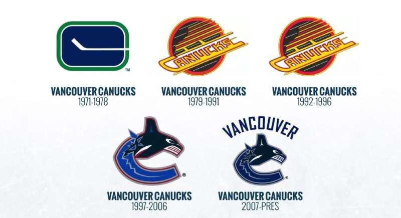
The Beginning: Original Concepts
When we rewind the tape, the initial designs of the Canucks logo were all about representing Vancouver in its purest form. Over the years, various designs have surfaced, each with its own tale, paying homage to the city’s rich culture and hockey lineage.
Evolving Designs: A Timeline
The Canucks logo has undergone several facelifts, each capturing a unique period in the team’s legacy. While every iteration respects its predecessors, it always brings something fresh to the table, mirroring the team’s evolving spirit and aspirations.
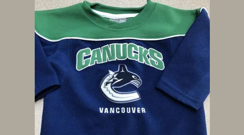
The Colors of the Vancouver Canucks Logo
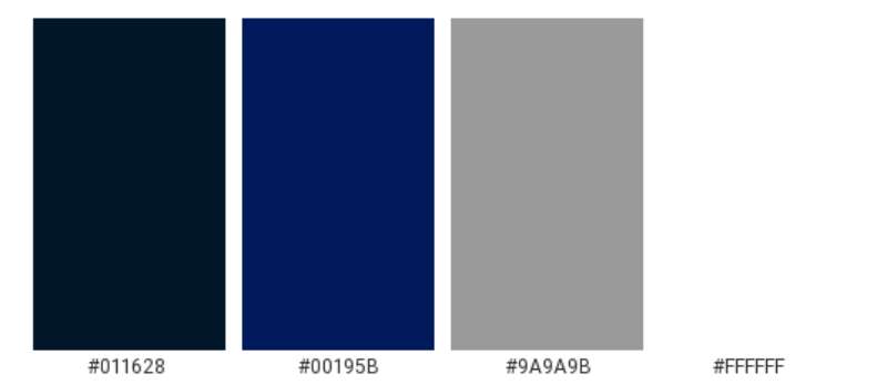
Blue: More than Just a Shade
Blue is predominant in the Canucks logo. But why blue? It represents the vast Pacific that skirts Vancouver, signifying depth, loyalty, and trust. It’s not just a color; it’s the city’s soul mirrored on the team’s jersey.
Green and White: The Earth and Purity
Green speaks of Vancouver’s lush landscapes, the forests, the harmony, and nature. White? It brings a clean slate, purity, and the snowy landscapes that Canada is so famous for.
The Font Used in the Vancouver Canucks Logo
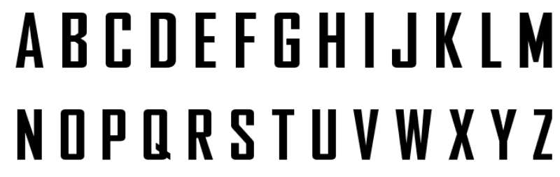
Uniqueness in Typography
Fonts can make or break a design. The Canucks’ choice in typography isn’t just about legibility. It’s about identity. The boldness signifies strength and determination, while its unique curves resonate with a modern, forward-moving spirit.
Fan Reception Over the Years
Love, Controversies, and Everything In Between
Like with all iconic logos, the Canucks emblem has seen its fair share of love and debates. Some designs were instantly loved, while others grew on fans over time. Through the highs and lows, fan reception has played a vital role in shaping the logo’s journey.
Memorable Moments with the Logo
Sports are filled with defining moments. From breathtaking wins to heartbreaking losses, the Canucks logo has been there, sewn onto jerseys, witnessing history. These moments, forever etched in time, give even more depth to the emblem.
Influence on Merchandise and Branding
Beyond the Ice Rink
The power of a great logo is that it transcends its primary platform. The Vancouver Canucks logo doesn’t just belong on a jersey or in the rink; it’s seen on caps, T-shirts, mugs, and more. Its versatility in design has made it a branding marvel.
Collaborations and Special Editions
Over the years, we’ve seen some killer collaborations, where the Canucks logo got a twist, thanks to joint ventures with other brands or special edition releases. These unique takes not only showcase creativity but also the emblem’s adaptability.
FAQ On The Vancouver Canucks Logo
What is the significance of the Vancouver Canucks logo?
The Vancouver Canucks logo isn’t just a mark; it captures the team’s essence and regional pride. Central to its design is the Orca, a powerful symbol of the indigenous culture and natural majesty of British Columbia.
It’s a nod to the area’s heritage and the Canucks’ spirit—a blend of locality and legacy.
Has the Canucks logo always featured an Orca?
Not always. The logo has evolved, with the Orca becoming the centerpiece in 1997. The Canucks’ branding journey began with the ‘Stick-in-Rink’ emblem, followed by a version with a hockey-playing Johnny Canuck, before settling on the iconic whale that leaps out from a sea of blue, a symbol seamlessly connected to team identity.
What colors are used in the Canucks logo?
The Canucks emblem proudly displays a palette of blue, green, silver, and white. These colors reflect the natural elements of Vancouver—ocean blue, forest green, the glimmer of ice and snow.
They harmonize the regional connection and the dynamic energy of a professional hockey franchise.
Why did the Vancouver Canucks change their logo?
As the times change, so do the currents of design and public sentiment. The Canucks’ shifts in logos mirror a desire to keep the branding fresh, relevant, and resonant with fans—a visual evolution that also marks new chapters in the team’s storied NHL history.
How often has the Canucks logo changed?
Transitions in the Canucks’ logo design reflect pivotal moments across decades.
Starting from the stick and rink, moving through the ‘V’ emblem, the introduction of the Orca, slight modifications thereafter, the logo has had several incarnations, reflecting the team’s growth and the shifting tastes of the league and its audience.
Who designed the current Vancouver Canucks logo?
The current logo, an Orca bursting from a ‘C’, comes from the creative think tank at Orca Bay Sports and Entertainment. The concept takes cues from Canucks heritage and geographical significance, balancing sportsmanship with a profound local symbolism.
Is the Canucks logo linked to a specific cultural heritage?
Yes, the Orca is a powerful element in Pacific Northwest indigenous art and lore.
Its integration into the logo pays homage to the rich native culture that permeates Vancouver and the surrounding region, weaving important social and historical threads into the team’s visual representation.
What do fans think of the Vancouver Canucks logo?
Fans display a spectrum of opinions, as with any sports emblem carrying weighty emotional investment. Many embrace the Orca, appreciating its regional relevance and modern flair.
Others have voiced nostalgia for earlier designs, bringing various merchandise sales and fan-inspired paraphernalia into play.
Can the Canucks logo be used for personal or commercial purposes?
The Vancouver Canucks logo is trademark-protected, meaning its usage for commercial gain is restricted and would require formal licensing.
Personal use often falls within the realm of fair use but tread lightly; the protection of brand identity takes precedence in the legal arenas.
What merchandise features the Vancouver Canucks logo?
A sea of products, including jerseys, hats, pucks, and memorabilia, sport the revered Canucks badge.
From local sports outlets to online platforms, the NHL team’s logos emblazon souvenirs that hold a special spot in the hearts of hockey devotees, fostering a sense of belonging and continuity.
Conclusion
In the theatre of sports imagery, the Vancouver Canucks logo has journeyed across the spectrum of change, echoing ambition, location, history. Like the city it represents, the Canucks emblem weaves an intricate story of cultural significance and connection. To celebrate
- history,
- community,
- the evolution of a brand that barely needs words beside it,
is to understand the magnetic pull of what may seem a simple design.
This orca, leaping from the depths of blue, is more than just a figurehead for a professional hockey team; it’s an anchor for fervent fans bedecked in jerseys and an echo of a storied NHL franchise’s legacy that ripples through Rogers Arena and beyond. Through this lens, the logo is unveiled as a beacon, a potent symbol radiating the Canucks’ ideals. As we venture forward, it serves as a banner under which memories will continue to be cherished, games fiercely played, and history passionately written.
If you liked this article about the Vancouver Canucks logo, you should check out this article about the Ottawa Senators logo.
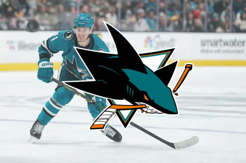
There are also similar articles discussing the Philadelphia Flyers logo, the Pittsburgh Penguins logo, the San Jose Sharks logo, and the St. Louis Blues logo.
And let’s not forget about articles on the Tampa Bay Lightning logo, the Toronto Maple Leafs logo, the Vegas Golden Knights logo, and the Washington Capitals logo.
Bogdan Sandu, a seasoned designer with 15 years of diverse experience, has been designing websites since 2008.
Renowned for his expertise in logo design and visual branding, Bogdan has developed a multitude of logos for various clients.
His skills extend to creating posters, vector illustrations, business cards, and brochures. Additionally, Bogdan's UI kits were featured on marketplaces like Visual Hierarchy and UI8.
Latest posts by Bogdan Sandu (see all)
- Green Color Palettes for Designers To Use - 11 May 2024
- Digital Style: What Font Does Cash App Use? - 11 May 2024
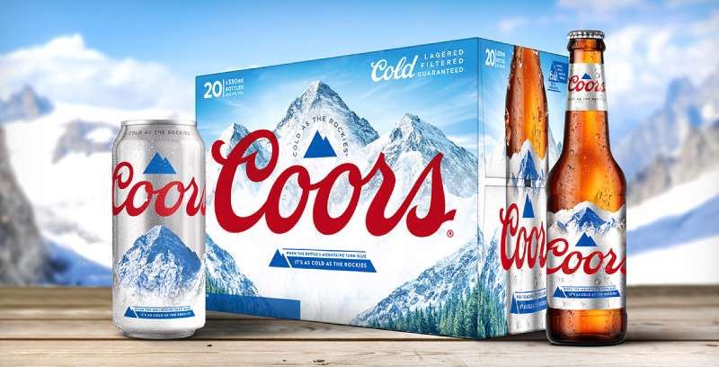
- The Coors Light Logo History, Colors, Font, And Meaning - 10 May 2024