The Ottawa Senators logo stands as one of the most recognizable emblems in professional hockey. It represents Canada’s capital city franchise in the National Hockey League.
This logo functions within a broader tradition of NHL logos that blend regional identity with athletic imagery. The current version debuted in 2007, designed by the team’s internal creative department.
Ottawa’s hockey roots stretch back to 1883 with the original Senators franchise. The modern team, established in 1992, has used four primary logo designs across its history.
What is the Ottawa Senators Logo?
![]()
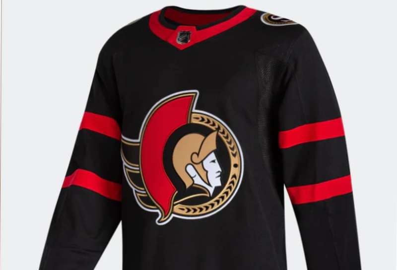
The Ottawa Senators logo features a stylized Roman centurion head in profile, facing right, rendered in black, red, and gold. Introduced in 2007, it replaced the previous 3D centurion design and represents the team’s connection to Canada’s parliamentary capital and the concept of senators as figures of authority.
Design Specifications
- Design Type: Combination mark (emblem with integrated wordmark on alternate versions)
- Primary Elements: Two-dimensional centurion helmet profile, stylized plume, geometric facial features
- Official Introduction Date: June 2007
- Designer/Agency: Ottawa Senators internal design team
- Trademark Status: Registered trademark of the Ottawa Senators Hockey Club
- Color Palette: Senate Red (#C52032), Senate Black (#000000), Senate Gold (#C2912C)
- Usage Context: Center ice, jerseys, merchandise, arena signage, digital platforms, broadcast graphics
How Has the Ottawa Senators Logo Evolved Over Time?
![]()
The franchise has undergone four significant logo changes since 1992. Each redesign reflected shifting trends in sports branding and the team’s growing identity.
The evolution moved from cartoonish to sophisticated. Early designs emphasized playfulness while later versions pursued a more serious, athletic look.
Original Ottawa Senators Logo (1992-1997)
- Years Active: 1992-1997
- Design Description: Cartoonish centurion face inside an oval border, featuring exaggerated features and a friendly expression
- Color Scheme: Red, black, white, and gold accents
- Designer: Tony Milchard
- Context: Created for the expansion franchise entering the NHL, designed to be approachable and marketable
- Key Changes from Previous: First logo for the modern franchise (no predecessor)
- Cultural Significance: Established the centurion as the team’s central symbol, connecting to Ottawa’s role as Canada’s political capital
Revised Centurion Logo (1997-2007)
- Years Active: 1997-2007
- Design Description: Three-dimensional rendering of the centurion with metallic shading, more aggressive expression, laurel wreath detail
- Color Scheme: Red, black, gold with silver highlights
- Designer: Ottawa Senators design department
- Context: Updated to match the era’s trend toward 3D sports logos, coinciding with the team’s move toward competitive success
- Key Changes from Previous: Removed oval border, added dimensional shading, made expression more fierce
- Cultural Significance: Represented the franchise’s maturation from expansion team to playoff contender
Current Simplified Logo (2007-Present)
- Years Active: 2007-present
- Design Description: Flat, geometric centurion profile with clean lines and streamlined features
- Color Scheme: Senate Red, Senate Black, Senate Gold (formalized color names)
- Designer: Ottawa Senators internal creative team
- Context: Part of a league-wide shift toward cleaner, more reproducible logos that work across digital platforms
- Key Changes from Previous: Removed 3D effects, simplified geometry, standardized proportions
- Cultural Significance: Aligned with minimalist design trends while maintaining brand recognition
Heritage “O” Logo (2011-Present, Alternate)
- Years Active: 2011-present (secondary mark)
- Design Description: Stylized letter “O” with internal laurel wreath pattern
- Color Scheme: Primarily red with black and cream accents
- Designer: Ottawa Senators creative department
- Context: Introduced for heritage jersey programs, pays homage to original 1917-1934 Ottawa Senators
- Key Changes from Previous: Completely different approach, focusing on letterform rather than centurion imagery
- Cultural Significance: Bridges modern franchise with Ottawa’s hockey legacy
What Do the Design Elements of the Ottawa Senators Logo Mean?
The centurion helmet carries deep symbolic weight. It connects directly to the concept of senators as guardians and leaders.
Roman imagery wasn’t accidental. Ottawa serves as Canada’s capital, where the Senate operates as part of Parliament.
The rightward-facing profile suggests forward momentum. It’s a subtle choice that implies progress and ambition.
Why Did the Ottawa Senators Choose These Specific Colors?
Red represents passion and Canadian identity. It ties the franchise to national pride while creating strong contrast on the ice.
Black adds authority and sophistication. It grounds the more vibrant red and prevents the logo from feeling too aggressive.
Gold references the laurel crowns worn by Roman senators. It introduces prestige and connects to the team’s political namesake.
- Senate Red: Hex #C52032, symbolizes energy, determination, Canadian heritage
- Senate Black: Hex #000000, represents strength, elegance, formality
- Senate Gold: Hex #C2912C, signifies achievement, tradition, senatorial authority
What Typography Style Is Used in the Ottawa Senators Logo?
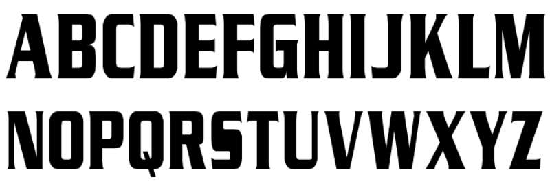
The primary logo doesn’t include typography. It relies entirely on the centurion symbol.
Secondary wordmarks use custom lettering. The letterforms feature sharp serifs that echo Roman inscriptions.
Jersey numbers and names use a proprietary font with angular cuts. This maintains visual consistency across all team materials.
What Are the Hidden Meanings in the Ottawa Senators Logo?
The helmet plume curves suggest a stylized “S” shape. Whether intentional or not, it reinforces the Senators name.
The centurion’s nose and brow form an angular profile. Some see it as aggressive. Others find it dignified.
The gold trim around certain elements mimics the gilded details found in Parliament buildings. It’s a quiet nod to Ottawa’s architecture.
How Does the Ottawa Senators Logo Compare to Competitor Logos?
Within Canadian NHL franchises, Ottawa takes a unique approach. The Toronto Maple Leafs logo uses a natural symbol. The Montreal Canadiens logo relies on letterforms.
Ottawa chose human imagery. This sets them apart from the animal mascots favored by teams like the Vancouver Canucks or Calgary Flames.
The centurion concept finds some parallel in the Vegas Golden Knights logo. Both use helmet imagery. But Ottawa’s execution leans classical while Vegas goes medieval.
Among Eastern Conference rivals, Ottawa maintains a traditional look. The Buffalo Sabres logo and Detroit Red Wings logo share similarly clean, iconic approaches.
What Are the Technical Specifications of the Ottawa Senators Logo?
Official Color Codes
Senate Red
Senate Black
- Hex: #000000
- RGB: (0, 0, 0)
- CMYK: (0, 0, 0, 100)
- Pantone: Black C
Senate Gold
- Hex: #C2912C
- RGB: (194, 145, 44)
- CMYK: (0, 25, 77, 24)
- Pantone: PMS 7555 C
Dimensions and Proportions
- Aspect Ratio: Approximately 1:1 (square bounding box)
- Minimum Size: 0.5 inches (12.7mm) for print applications
- Clear Space: Minimum padding equal to the height of the helmet plume on all sides
- File Formats: Available in vector graphics (AI, EPS, SVG) and raster formats (JPEG, PNG)
What Cultural Impact Has the Ottawa Senators Logo Had?
The centurion became synonymous with Ottawa hockey. It appears throughout the city on everything from transit ads to restaurant menus.
Fans adopted the imagery for personal expression. Tattoos featuring the logo remain popular among dedicated supporters.
The design influenced local amateur teams. Youth hockey organizations in the Ottawa Valley frequently reference the centurion aesthetic.
How Does the Ottawa Senators Logo Fit Into the Overall Brand Identity?
The logo anchors a complete visual system. Every touchpoint references the centurion in some way.
Arena graphics at Canadian Tire Centre extend the Roman theme. Columns and laurel motifs appear throughout the concourses.
Merchandise maintains strict brand guidelines. Colors stay consistent. Typography follows established rules.
The mascot Spartacat embodies a friendlier version of the warrior concept. He makes the brand accessible to younger fans.
How Should the Ottawa Senators Logo Be Used?
Official Usage Guidelines
- Do: Maintain minimum clear space around the logo
- Do: Use approved color variations (full color, single color, reversed)
- Do: Download official files from NHL licensing partners
- Don’t: Stretch, rotate, or distort the logo
- Don’t: Add effects like shadows, gradients, or outlines
- Don’t: Place the logo on busy backgrounds that reduce legibility
Accessing Official Logos
Licensed vendors receive logo files through NHL Brand Central. Media outlets can request assets through the team’s communications department.
Fan use falls under standard trademark restrictions. Personal, non-commercial use is generally tolerated. Commercial applications require licensing agreements.
Trademark Protection
The Ottawa Senators logo is a registered trademark. The NHL actively monitors unauthorized usage. Counterfeit merchandise remains an ongoing concern for the league and franchise.
FAQ on The Ottawa Senators Logo
What Does the Ottawa Senators Logo Represent?
The centurion helmet symbolizes strength and leadership. It connects to Ottawa’s role as Canada’s capital city, where the Canadian Senate operates.
The Roman imagery reflects authority. Senators were respected figures in ancient Rome, and that prestige transfers to the hockey franchise.
When Was the Current Ottawa Senators Logo Introduced?
The team unveiled the current design in June 2007. It replaced the three-dimensional version that had been used since 1997.
This update followed league-wide trends toward cleaner design elements. The flat, geometric style works better across digital platforms and merchandise.
Who Designed the Ottawa Senators Logo?
The Ottawa Senators internal creative team handled the 2007 redesign. Tony Milchard created the original 1992 expansion logo.
Unlike some NHL teams that hire outside agencies, Ottawa kept logo development in-house. This approach maintained consistency with the franchise’s existing brand style guide.
What Are the Official Colors of the Ottawa Senators Logo?
Senate Red, Senate Black, and Senate Gold form the official color palette. Each hue carries specific meaning.
Red represents Canadian identity and passion. Black adds formality. Gold references the laurel wreaths worn by Roman senators.
Why Did the Ottawa Senators Choose a Centurion for Their Logo?
The centurion connects to the team’s name. Senators held power in ancient Rome, and centurions protected Roman interests.
Ottawa serves as the seat of Canadian government. The psychology of shapes in the helmet conveys protection and authority. It’s a clever way to link sport with civic pride.
Has the Ottawa Senators Logo Changed Over the Years?
Yes. The franchise has used four primary logos since 1992. Each version refined the centurion imagery while maintaining brand recognition.
Early designs looked cartoonish. Later versions grew more sophisticated. The current iteration embraces clean lines and geometric simplicity.
What Is the Heritage “O” Logo?
Introduced in 2011, the heritage logo features a stylized letter “O” with laurel wreath details. It honors the original Ottawa Senators franchise from 1917 to 1934.
Teams wear it during special games. It appears on alternate jerseys and vintage merchandise throughout the season.
Where Can I Download the Official Ottawa Senators Logo?
Licensed media outlets access files through the team’s communications department. NHL Brand Central provides assets to approved vendors.
Fan sites sometimes offer unofficial versions. But for commercial use, you need proper licensing from the Ottawa Senators Hockey Club or NHL.
Can I Use the Ottawa Senators Logo for Personal Projects?
Personal, non-commercial use is generally tolerated. The NHL monitors trademark usage but rarely pursues individual fans.
Commercial applications require licensing agreements. Selling merchandise with the logo without permission violates trademark law. The league actively fights counterfeit products.
What Font Does the Ottawa Senators Use on Jerseys?
The team uses a custom typeface for jersey numbers and names. Sharp serifs echo Roman inscription lettering.
This proprietary design maintains visual hierarchy across all team materials. You won’t find it in standard font licensing libraries.
Conclusion
The Ottawa Senators logo stands as a distinctive mark in NHL team branding. That centurion helmet does more than identify a hockey club. It tells a story about Canada’s capital and its political heritage.
Good logo design principles show up throughout. The balance between tradition and modern aesthetics works well.
From the Canadian Tire Centre ice to fan jerseys across the Atlantic Division, this franchise visual identity remains instantly recognizable. Few sports emblems connect so directly to civic pride.
The Senators got it right.
Renowned for his expertise in logo design and visual branding, Bogdan has developed a multitude of logos for various clients.
His skills extend to creating posters, vector illustrations, business cards, and brochures. Additionally, Bogdan's UI kits were featured on marketplaces like Visual Hierarchy and UI8.
He also wrote in the past years on sites like Design Your Way, WebDesignerDepot, WPDean, Designmodo, Speckyboy, Slider Revolution, and more.
- Canva for Teams Review: Is It Worth the Business Plan? - 24 July 2026
- 5 Brand Compliance Checkpoints Every Enterprise Should Automate - 23 July 2026
- Timeless Open Sans Font Pairing for Any Project - 22 July 2026
Bogdan Sandu is a seasoned designer who has been designing websites since 2008. Renowned for his expertise in logo design and visual branding, Bogdan has developed a multitude of logos for various clients. His skills extend to creating posters, vector illustrations, business cards, and brochures. Additionally, Bogdan's UI kits were featured on marketplaces like Visual Hierarchy and UI8. He also wrote in the past years on sites like Design Your Way, WebDesignerDepot, WPDean, Designmodo, Speckyboy, Slider Revolution, and more.
You Might Also Like