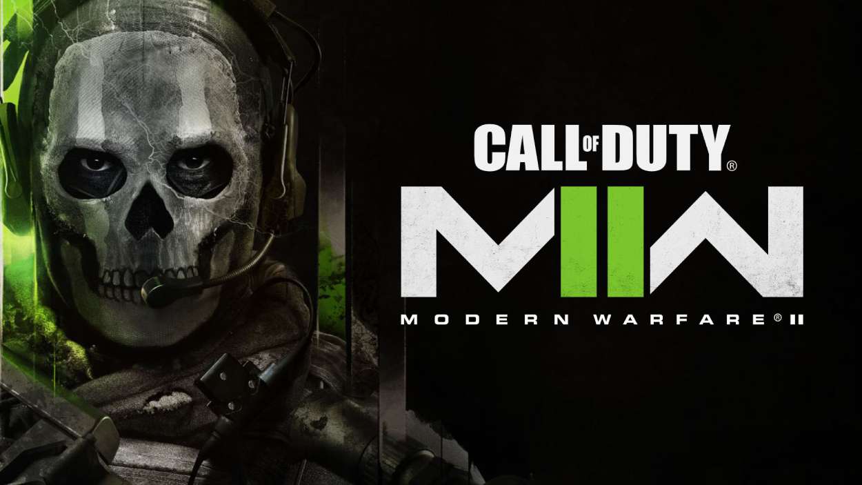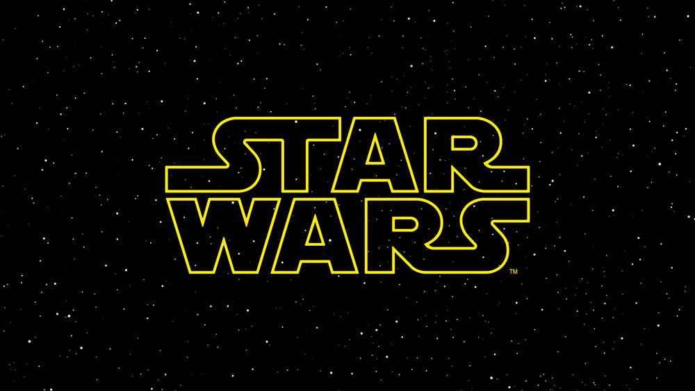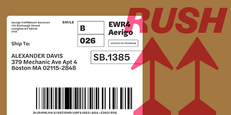
Oswald’s condensed proportions and clean geometry dominate countless websites, but using the same typeface as everyone else kills brand differentiation.
You need alternatives that capture Oswald’s vertical emphasis and modern sans serif clarity while bringing fresh character to your projects. Finding fonts similar to Oswald means understanding what makes condensed grotesques work: tall x-height, narrow letterforms, and strong typographic hierarchy that commands attention without overwhelming layouts.
This guide presents 26 professional alternatives spanning free Google Fonts to premium offerings. Each option delivers that signature condensed aesthetic with unique characteristics for headlines, display typography, and brand identity work.
You’ll discover geometric sans serif families with extensive weight variations, Swiss-inspired grotesques optimized for digital screens, and bold display fonts that maintain readability at any size. Whether you need variable font technology, multilingual glyph support, or simply want to break free from Oswald’s ubiquity, these alternatives provide professional typography without sacrificing the clean minimalist aesthetic your projects demand.
Fonts Similar To Oswald
| Font Name | Primary Classification | Key Distinguishing Attributes | Semantic Context |
|---|---|---|---|
| Oswald (Reference) | Condensed Sans-Serif | Narrow width, vertical stress, geometric structure, high x-height | Digital headlines, modern branding, web typography |
| Alternate Gothic | Grotesque Condensed | Historical gothic roots, extreme condensation, industrial aesthetic | Vintage posters, traditional typography, retro branding |
| Franklin Gothic | American Gothic | Bold presence, moderate condensation, classic proportions | Editorial design, newspaper headlines, corporate identity |
| News Gothic | Grotesque Sans | Neutral design, functional legibility, subtle condensation | News publications, editorial content, information design |
| Roboto | Neo-Grotesque | Dual nature (mechanical + humanist), open apertures, optimized for screens | Android interface, Material Design, app typography |
| Open Sans | Humanist Sans | Wide proportions, friendly appearance, high legibility, open forms | Body text, UI elements, accessible design, readability-focused |
| Barlow | Condensed Grotesque | Rounded terminals, low contrast, semi-condensed variants | Transportation signage, wayfinding, modern web design |
| Poppins | Geometric Sans | Circular forms, consistent width, international support, monolinear | Contemporary branding, startup identity, global interfaces |
| Sofia Pro | Geometric Sans | Elegant geometry, refined proportions, multiple weights | Fashion branding, luxury design, editorial headlines |
| Graphik | Neo-Grotesque | Neutral tone, extensive family, Swiss-inspired precision | Tech companies, corporate branding, systematic design |
| Gilroy | Geometric Sans | Bold geometric construction, modern aesthetic, high contrast weights | Tech startups, app interfaces, contemporary web design |
| Industrial | Display Condensed | Mechanical structure, utilitarian design, strong vertical emphasis | Industrial design, manufacturing, technical contexts |
| Roboto Condensed | Neo-Grotesque Condensed | Compressed width, maintains Roboto’s dual nature, optimized spacing | Mobile interfaces, compact layouts, information density |
Alternate Gothic
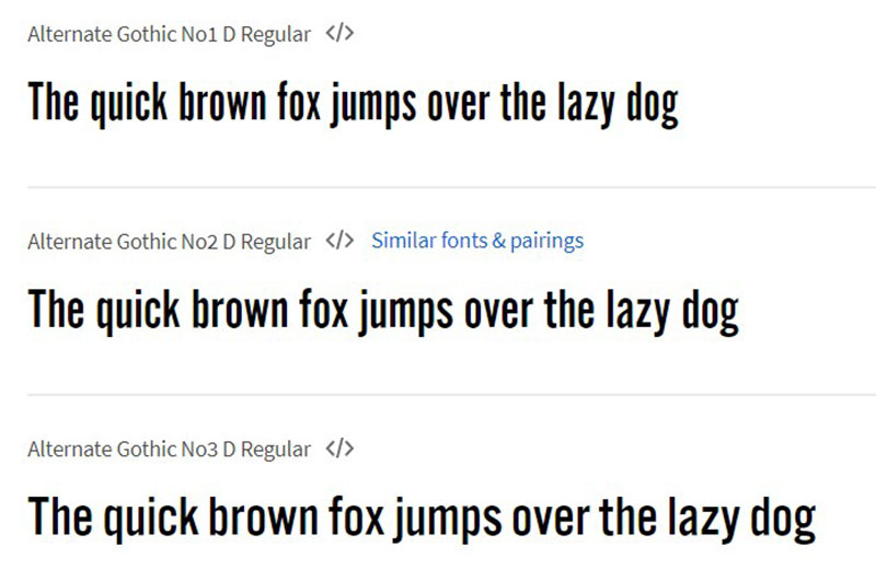
A condensed sans serif with American typographic roots spanning ten weights across four distinct widths.
What It Is
Alternate Gothic represents Morris Fuller Benton’s 1903 design expanded into 40 total styles through ATF’s digital revival. The typeface offers straight-sided “pillbox” rounds for circular letters, distinguishing it from similar grotesque families.
Key Characteristics
- Tall x-height paired with narrow proportions creates vertical emphasis
- Low waist positioning with springy, tension-filled letterforms
- Ten weight range from thin to black across condensed to extended widths
- Careful spacing calibration maintains readability despite condensed structure
How It Works
Functions as a space-saving display face where compact layouts require impact. Mechanical skeleton provides formal tone while maintaining legibility at smaller sizes through optimized character spacing and distinctive letterform structure.
Benefits
Delivers commanding headlines without sacrificing clarity. Wide weight selection creates typographic hierarchy across advertising, editorial, and digital projects while maintaining brand consistency through single family usage.
When to Use
Best for projects demanding condensed proportions with professional polish. Magazine layouts, newspaper headlines, advertising campaigns, and corporate presentations requiring Oswald’s vertical tension with expanded weight flexibility.
Exensa Grotesk
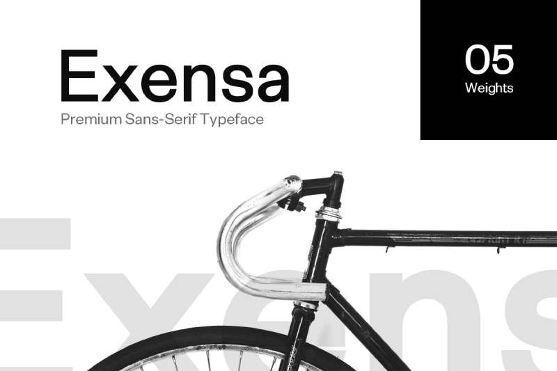
A Swiss-inspired geometric sans serif providing five weight variations optimized for contemporary digital and print applications.
What It Is
Exensa Grotesk delivers light through black weights with matching obliques across geometric letterforms. Berlin-based Designova created this typeface balancing precision with expressive character.
Key Characteristics
- Five complete weight options spanning light to black
- Clean geometric construction with minimal stroke variation
- Swiss Design principles applied to modern contexts
- Oblique versions complement each weight
How It Works
Operates across display and text sizes through weight variation. Lighter weights handle extended reading while heavier options establish hierarchy. Geometric structure maintains consistency across scale changes without losing definition.
Benefits
Provides typographic flexibility without requiring multiple font families. Professional applications benefit from the broad weight range while geometric clarity ensures brand recognition across various media. Web, print, and branding projects maintain cohesive voice.
When to Use
Ideal for corporate presentations, editorial layouts, and responsive web designs needing consistent aesthetic. Works particularly well when projects require Oswald’s clean aesthetic with broader weight selection for nuanced hierarchy.
Mriya Grotesk
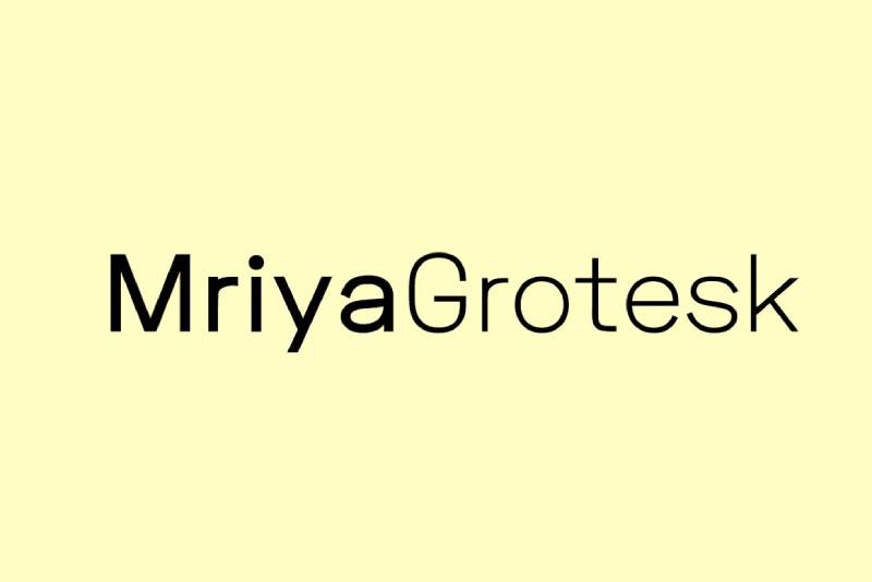
A pure sans serif combining four weights with matching italics for versatile web and print typography.
What It Is
Mriya Grotesk offers light, regular, bold, and heavy weights plus italic versions across geometric letterforms. Fontastica designed this family maintaining premium aesthetics while serving practical typographic needs.
Key Characteristics
- Four weights from light to heavy plus complete italic set
- Geometric simplicity paired with refined proportions
- Latin language support with multilingual glyph coverage
- Balanced structure suitable for body text and display
How It Works
Adapts to body text through lighter weights while heavier options command attention in headlines and logotypes. Italic versions add editorial flexibility. Geometric foundation ensures consistent brand voice across applications.
Benefits
Functions across marketing graphics, corporate identities, and editorial content. Single family handles diverse typographic requirements while geometric structure maintains professional appearance. Lower weight count simplifies font management compared to larger families.
When to Use
Perfect for branding projects, marketing materials, and corporate communications requiring clean geometric aesthetic. Web applications benefit from optimized screen rendering while print materials leverage sharp letterforms.
Kanetin
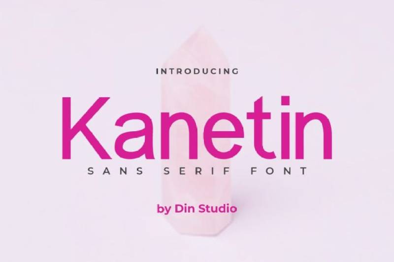
An elegant condensed sans serif with unique letterform details designed for professional branding and display typography.
What It Is
Kanetin is a sans-serif font by Din Studio featuring refined proportions and distinctive character touches. Single weight design concentrates on display applications and brand identity work.
Key Characteristics
- Unique letterform details create distinctive personality
- Elegant condensed proportions maintain readability
- Multilingual support with PUA encoding
- Professional-grade character set including numerals and punctuation
How It Works
Functions primarily as display typography for headlines, quotes, and branding elements. Condensed structure saves horizontal space while elegant details prevent monotony. Character uniqueness establishes brand differentiation.
Benefits
Creates memorable brand identities through distinctive letterforms. Professional projects gain sophistication without sacrificing clarity. Single weight simplifies implementation while maintaining strong visual presence.
When to Use
Best suited for brand identity work, printed materials, and quotations requiring standout typography. Projects emphasizing elegance over extensive weight variation benefit most from Kanetin’s refined character.
Celesta
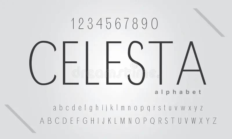
A minimal sans serif optimized for extreme size flexibility from small body text to large display applications.
What It Is
Celesta spans regular through extra bold weights with oblique versions. Designed by Corgi Astronaut, this font handles sizes from 5pt text to oversized titles while maintaining legibility.
Key Characteristics
- Ten total styles across five weights with obliques
- Extreme size flexibility from micro text to billboard scale
- Clean letterforms with minimal ornamentation
- Thin lettered construction maintains elegance
How It Works
Adapts letterform proportions for size extremes. Small text applications benefit from careful spacing while large titles leverage clean geometry. Weight variation creates hierarchy without requiring multiple families.
Benefits
Single family handles diverse typographic requirements across dramatic size ranges. Editorial projects gain flexibility for various layout needs. Cost-effective solution for projects requiring multiple typographic voices.
When to Use
Ideal for editorial design, magazine layouts, and advertising requiring both micro and macro typography. Projects needing Oswald alternatives with extreme size flexibility benefit from Celesta’s adaptive design.
Ashdon Sans
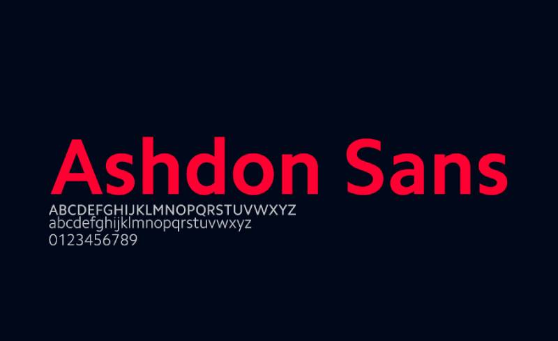
A clean, legible condensed sans serif offering clarity across regular, bold, and light variations.
What It Is
Ashdon Sans provides three core weights maintaining Oswald’s clean legibility through refined letterforms. Condensed proportions deliver space efficiency without sacrificing readability.
Key Characteristics
- Three essential weights covering primary hierarchy needs
- Clean legibility matching Oswald’s clarity standards
- Condensed structure optimized for compact layouts
- Simplified weight selection streamlines implementation
How It Works
Three-weight system covers headline, subhead, and body text requirements. Condensed proportions maximize content density while maintaining professional appearance. Straightforward structure simplifies typographic decision-making.
Benefits
Covers essential typographic needs without overwhelming choice. Budget-conscious projects benefit from focused weight selection. Implementation simplicity accelerates design workflow.
When to Use
Perfect for projects requiring Oswald’s aesthetic with simplified weight structure. Editorial content, corporate materials, and digital interfaces benefit from streamlined typographic palette.
Industrial
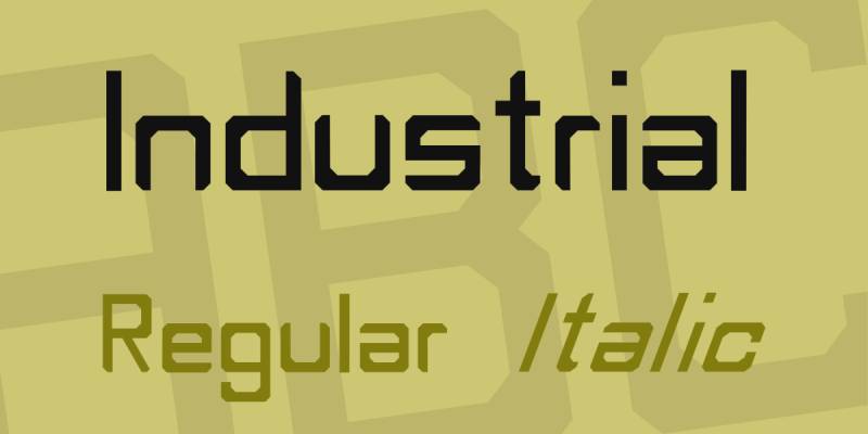
A softer take on condensed grotesque typography featuring three weights with refined curves.
What It Is
Industrial balances geometric structure with softened curves across three weights. Designed for both body text and display applications, it tempers mechanical precision with approachability.
Key Characteristics
- Three weights spanning light to bold applications
- Softer curves reduce geometric harshness
- Balanced structure suits body text and display
- Condensed proportions with humanist touches
How It Works
Softer curves create warmth while maintaining condensed efficiency. Three weights handle typical hierarchy requirements. Works at both text and display sizes through careful optical adjustments.
Benefits
Provides friendlier alternative to purely geometric condensed faces. Signage applications benefit from improved readability. Poster design gains approachable personality without sacrificing impact.
When to Use
Best for projects requiring condensed proportions with softer personality. Wayfinding systems, poster design, and public-facing communications benefit from Industrial’s approachable character.
AS Grammatika
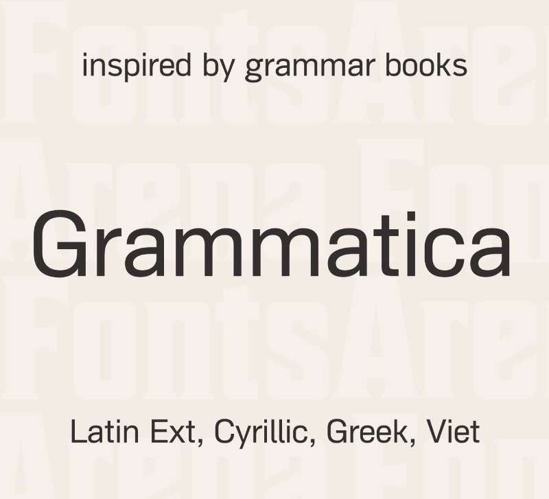
A five-weight condensed sans serif with oblique versions providing comprehensive typographic coverage.
What It Is
AS Grammatika delivers light through heavy weights plus matching obliques. Ten total styles provide extensive hierarchy options through single family structure.
Key Characteristics
- Five weights from light to heavy with full oblique set
- Comprehensive typographic coverage through ten styles
- Condensed proportions maintain vertical emphasis
- Oblique versions expand editorial flexibility
How It Works
Wide weight range creates nuanced hierarchy while obliques add editorial emphasis. Condensed structure saves horizontal space across applications. Single family handles complex layout requirements.
Benefits
Reduces font licensing needs through comprehensive single-family solution. Complex editorial projects benefit from extensive weight selection. Obliques provide emphasis without requiring separate italic designs.
When to Use
Ideal for editorial design, corporate communications, and complex layouts requiring extensive typographic flexibility. Projects needing more weight options than Oswald provides benefit from AS Grammatika’s range.
Devina Rodent
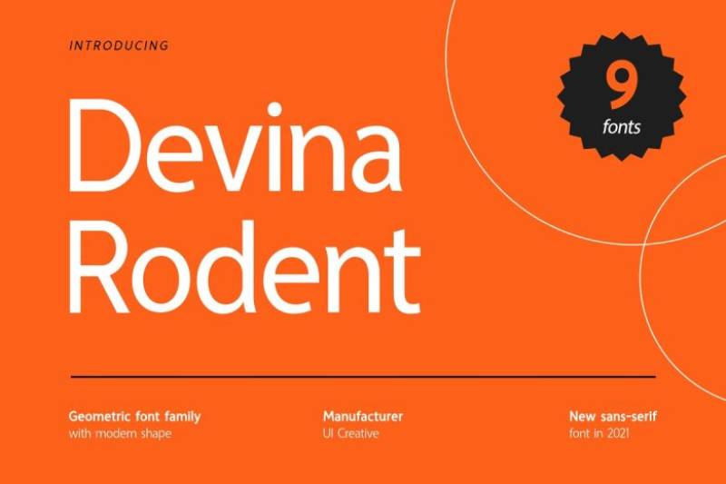
A contemporary geometric sans serif with distinctive character and modern proportions.
What It Is
Devina Rodent combines geometric foundations with unique letterform details creating memorable display typography. Modern interpretation of condensed sans serif principles.
Key Characteristics
- Geometric construction with distinctive character touches
- Modern proportions suited to contemporary design
- Display-oriented letterforms with strong personality
- Condensed structure with visual interest
How It Works
Functions primarily in display applications where personality matters. Geometric foundation ensures professionalism while unique details create differentiation. Condensed proportions maintain space efficiency.
Benefits
Creates memorable headlines through distinctive character. Projects requiring brand differentiation benefit from unique letterforms. Modern aesthetic appeals to contemporary design sensibilities.
When to Use
Best for display typography, brand identity work, and headline applications requiring personality. Projects where visual distinctiveness outweighs extreme flexibility favor Devina Rodent’s character.
Albori
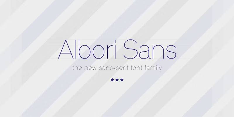
A modern sans serif combining clean geometry with functional design principles.
What It Is
Albori provides clean geometric letterforms with functional proportions. Contemporary design balances aesthetic appeal with practical usability across applications.
Key Characteristics
- Clean geometric construction
- Functional proportions optimize readability
- Modern aesthetic suited to digital applications
- Balanced letterforms maintain consistency
How It Works
Geometric structure creates visual consistency while functional proportions ensure readability. Clean design adapts across digital and print media. Balanced approach serves multiple contexts.
Benefits
Versatile application across web design, print materials, and digital interfaces. Clean aesthetic maintains professional appearance. Functional design ensures long-term usability.
When to Use
Suitable for web applications, corporate materials, and modern branding requiring clean sans serif aesthetic. Projects prioritizing functionality alongside visual appeal benefit from Albori’s balanced approach.
Articulat
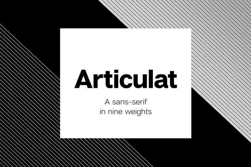
A refined grotesque sans serif with technical precision and comprehensive character sets.
What It Is
Articulat delivers technical precision through refined grotesque letterforms. Comprehensive character coverage supports multilingual applications with professional polish.
Key Characteristics
- Technical precision in letterform construction
- Comprehensive character sets for multilingual support
- Refined grotesque aesthetic with modern proportions
- Professional-grade typographic features
How It Works
Technical construction ensures consistency across sizes. Comprehensive character sets enable global applications. Refined aesthetic balances historical grotesque traditions with contemporary needs.
Benefits
Global projects benefit from extensive language support. Technical precision ensures predictable rendering. Professional features support sophisticated typography.
When to Use
Ideal for international brands, technical documentation, and projects requiring extensive character coverage. Global communications benefit from Articulat’s multilingual capabilities.
Neohead
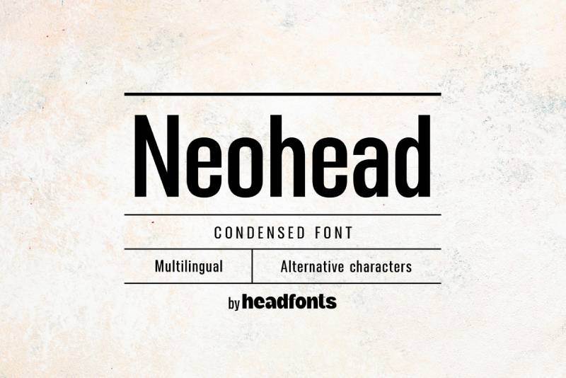
A modern minimalist condensed font with perfectly balanced spacing for functional readability.
What It Is
Neohead delivers modern minimalist design through condensed letterforms with precise spacing. Optimized balance ensures readability across small and large sizes.
Key Characteristics
- Modern minimalist design philosophy
- Perfectly balanced spacing ensures functionality
- Condensed proportions maximize space efficiency
- Readable at both micro and macro scales
How It Works
Precise spacing calibration maintains readability despite condensed proportions. Modern aesthetic suits contemporary applications. Size flexibility accommodates diverse layout requirements.
Benefits
Functions effectively across dramatic size ranges. Modern aesthetic appeals to contemporary design sensibilities. Space efficiency benefits compact layouts without sacrificing legibility.
When to Use
Perfect for modern branding, contemporary advertising, and digital interfaces requiring condensed sans serif with minimalist aesthetic. Projects emphasizing clean contemporary design favor Neohead’s approach.
Bobcat
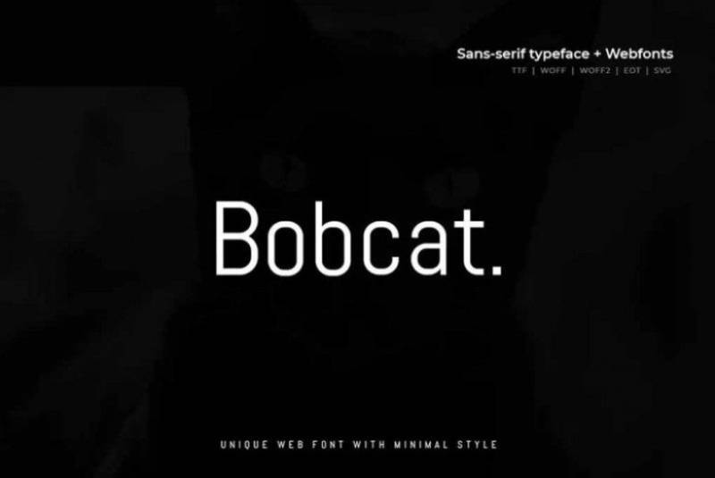
A sleek, simple modern sans serif with minimal design and strong visual presence.
What It Is
Bobcat provides sleek minimal typography with clean geometric foundations. Modern interpretation of condensed sans serif principles with streamlined character.
Key Characteristics
- Sleek minimal design reduces visual noise
- Simple geometric letterforms ensure clarity
- Modern aesthetic suited to contemporary contexts
- Strong visual presence despite simplicity
How It Works
Minimal design approach creates visual clarity. Geometric foundations ensure consistency. Modern proportions adapt to contemporary layout requirements.
Benefits
Clean aesthetic maintains attention without distraction. Modern design appeals to progressive brands. Simplicity accelerates implementation and maintains long-term relevance.
When to Use
Suitable for modern branding, startup identity work, and contemporary digital products. Projects requiring clean minimal aesthetic without ornamentation benefit from Bobcat’s streamlined approach.
Bergman Sans
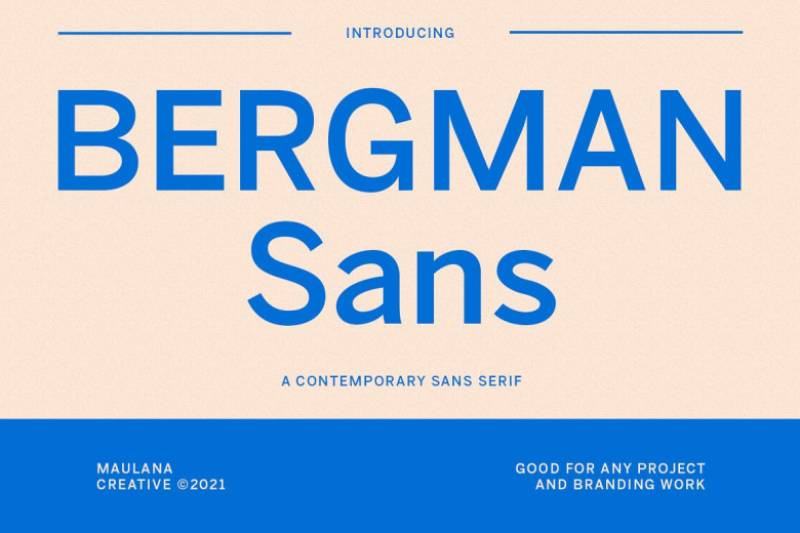
A carefully designed sans serif prioritizing high legibility and clarity across applications.
What It Is
Bergman Sans delivers high legibility through careful letterform design. Upper and lowercase characters, numbers, punctuation, and full multilingual support serve professional typography.
Key Characteristics
- High legibility as primary design criterion
- Complete character sets including multilingual support
- Upper and lowercase with numerals and punctuation
- Careful design ensures clarity across contexts
How It Works
Legibility-focused design maintains clarity across sizes. Complete character sets handle professional requirements. Multilingual support enables global applications.
Benefits
Professional projects benefit from comprehensive character coverage. Logo design, movies, books, and magazine titles gain clarity through legibility focus. Strong display applications maintain readability.
When to Use
Ideal for projects requiring strong display font with guaranteed legibility. Logo design, book titles, magazine headlines, and movie credits benefit from Bergman Sans’s clarity focus.
Morgaty
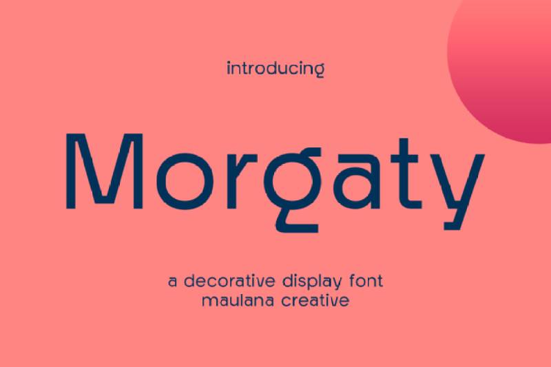
A condensed display font with distinctive character and bold visual impact.
What It Is
Morgaty combines condensed proportions with bold personality for display applications. Strong visual presence suits headline and branding contexts.
Key Characteristics
- Condensed structure with bold visual weight
- Distinctive character creates memorability
- Display-oriented design optimized for impact
- Strong personality suits brand differentiation
How It Works
Bold condensed structure commands attention in headlines. Distinctive character creates brand recognition. Display optimization ensures impact at larger sizes.
Benefits
Creates memorable brand presence through distinctive design. Display applications benefit from strong visual impact. Personality aids brand differentiation in crowded markets.
When to Use
Best for display typography, brand identity, and headline applications requiring bold personality. Projects prioritizing memorability and impact favor Morgaty’s distinctive approach.
Sentcita
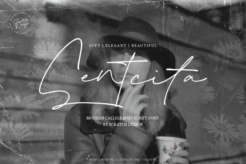
A balanced sans serif combining clarity with contemporary design sensibilities.
What It Is
Sentcita provides balanced letterforms with contemporary proportions. Modern design principles create versatile typography for current design contexts.
Key Characteristics
- Balanced proportions ensure visual harmony
- Contemporary design suits modern applications
- Clear letterforms maintain readability
- Versatile structure adapts to varied uses
How It Works
Balanced design creates visual stability. Contemporary proportions suit modern layout requirements. Clear structure ensures functional performance.
Benefits
Versatile application across multiple design contexts. Contemporary aesthetic maintains relevance. Balanced design simplifies implementation.
When to Use
Suitable for contemporary design projects, modern branding, and digital applications. Projects requiring current aesthetic with functional performance benefit from Sentcita’s balanced approach.
Atrament
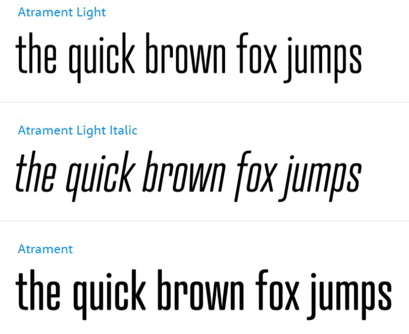
A bold condensed font with strong character and commanding visual presence.
What It Is
Atrament delivers bold condensed letterforms with commanding presence. Strong character suits display applications requiring immediate impact.
Key Characteristics
- Bold condensed proportions create vertical emphasis
- Strong visual presence commands attention
- Display-optimized letterforms ensure impact
- Commanding character aids memorability
How It Works
Bold weight creates immediate visual impact. Condensed structure saves horizontal space. Display optimization ensures effectiveness at headline sizes.
Benefits
Creates powerful headlines through bold condensed structure. Display applications gain immediate impact. Strong character aids brand recognition.
When to Use
Perfect for bold headlines, impactful display typography, and brand identity requiring commanding presence. Projects needing maximum impact from condensed proportions favor Atrament’s bold approach.
Roboto

A neo-grotesque sans serif with mechanical skeleton balanced by friendly curves across extensive weight range.
What It Is
Roboto features mechanical precision softened by open curves across six weights with matching italics. Google’s Christian Robertson designed this versatile family for Android then expanded it across Google products.
Key Characteristics
- Neo-grotesque structure with humanist touches
- Six weights from thin to black with italics
- Natural reading rhythm despite mechanical skeleton
- Condensed and slab variants available
How It Works
Dual nature balances geometric structure with friendly openness. Letters settle naturally into proportional widths. Extensive weight range handles complex hierarchy. Condensed variant addresses space-constrained layouts.
Benefits
Widely adopted across digital products ensures familiarity. Free availability through Google Fonts reduces costs. Extensive weight selection handles diverse requirements. Natural reading rhythm improves user experience.
When to Use
Ideal for digital products, websites, and applications requiring familiar, readable typography. Projects benefiting from proven track record and extensive testing favor Roboto’s reliable performance.
Open Sans
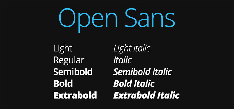
A humanist sans serif with large x-height optimized for screen and print legibility.
What It Is
Open Sans by Steve Matteson delivers humanist proportions with tall lowercase letters. Designed for cross-media usage with emphasis on digital screen optimization.
Key Characteristics
- Large x-height improves legibility
- Humanist proportions create friendly appearance
- Optimized for both screen and print
- Multiple weights with italics available
How It Works
Tall x-height increases lowercase letter visibility. Humanist structure creates natural reading flow. Open letterforms prevent confusion at small sizes. Cross-media optimization ensures consistency.
Benefits
Excellent readability across media types. Free availability reduces project costs. Proven performance in body text applications. Humanist character creates approachable tone.
When to Use
Perfect for body text, user interfaces, and applications prioritizing readability. Projects requiring friendly, approachable typography benefit from Open Sans’s humanist character combined with technical optimization.
News Gothic
A classic American grotesque with straightforward proportions and timeless utility.
What It Is
News Gothic represents early 20th century American grotesque design. Morris Fuller Benton created this workhorse face balancing clarity with space efficiency.
Key Characteristics
- Classic American grotesque proportions
- Straightforward letterforms ensure clarity
- Timeless design maintains relevance
- Condensed variants available
How It Works
Straightforward construction ensures legibility. Efficient proportions work in space-constrained contexts. Classic design avoids trendy elements ensuring longevity.
Benefits
Timeless aesthetic maintains relevance across decades. Proven performance in editorial contexts. Neutral character suits diverse content. Condensed options address layout constraints.
When to Use
Suitable for editorial design, news publications, and contexts requiring neutral, reliable typography. Projects valuing timeless design over contemporary trends favor News Gothic’s classic approach.
Trump Gothic
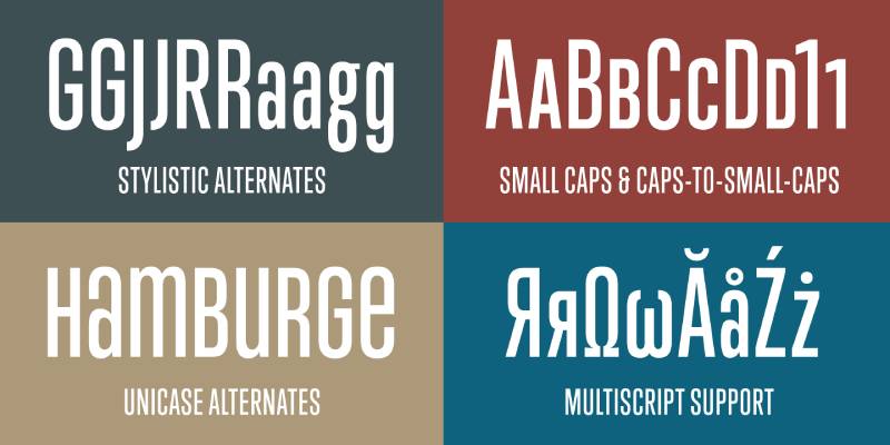
A refined grotesque with elegant proportions and sophisticated character.
What It Is
Trump Gothic delivers refined grotesque design with elegant proportions. Sophisticated letterforms balance functionality with aesthetic refinement.
Key Characteristics
- Refined grotesque letterforms
- Elegant proportions create sophistication
- Balanced structure maintains readability
- Professional character suits serious contexts
How It Works
Refined proportions create sophisticated appearance. Grotesque structure ensures clarity. Balanced design serves professional requirements while maintaining visual interest.
Benefits
Professional applications benefit from sophisticated character. Elegant proportions elevate visual presentation. Refined design distinguishes projects from casual typography.
When to Use
Ideal for professional communications, corporate materials, and projects requiring sophisticated sans serif. Applications valuing refinement over casual approachability favor Trump Gothic’s elegant character.
Trump Soft
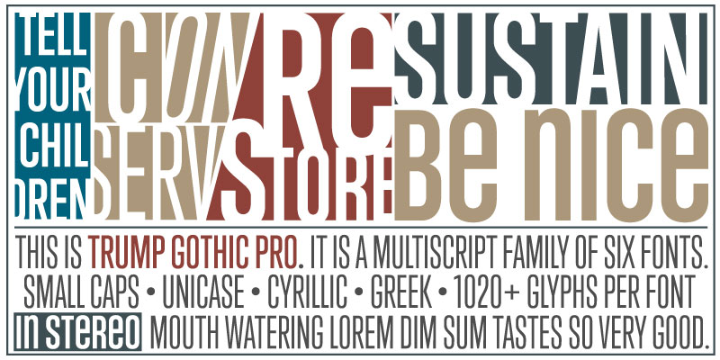
A softened interpretation of grotesque principles with rounded terminals and approachable character.
What It Is
Trump Soft applies rounded terminals to grotesque foundations creating approachable personality. Softened character balances professionalism with friendliness.
Key Characteristics
- Rounded terminals soften geometric structure
- Approachable character maintains professionalism
- Grotesque foundations ensure functionality
- Friendly appearance without casual tone
How It Works
Rounded terminals reduce geometric harshness. Grotesque structure maintains professional appearance. Balance between friendliness and formality serves diverse contexts.
Benefits
Creates approachable yet professional typography. Softened character reduces intimidation. Rounded terminals improve perceived friendliness while maintaining credibility.
When to Use
Perfect for customer-facing communications, healthcare applications, and contexts requiring approachable professionalism. Projects balancing authority with accessibility benefit from Trump Soft’s friendly character.
Neographik
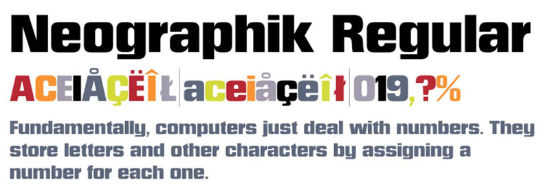
A contemporary geometric sans serif with modern proportions and clean execution.
What It Is
Neographik delivers contemporary geometric design through clean letterforms. Modern interpretation balances historical geometric traditions with current design requirements.
Key Characteristics
- Contemporary geometric construction
- Modern proportions suit current design
- Clean execution ensures clarity
- Balanced structure maintains functionality
How It Works
Geometric foundations create visual consistency. Modern proportions adapt to contemporary layouts. Clean execution ensures professional appearance across applications.
Benefits
Contemporary aesthetic maintains current relevance. Geometric structure ensures predictable performance. Clean design accelerates implementation.
When to Use
Suitable for modern branding, contemporary design projects, and applications requiring clean geometric aesthetic. Projects emphasizing current design trends favor Neographik’s contemporary approach.
Franklin Gothic
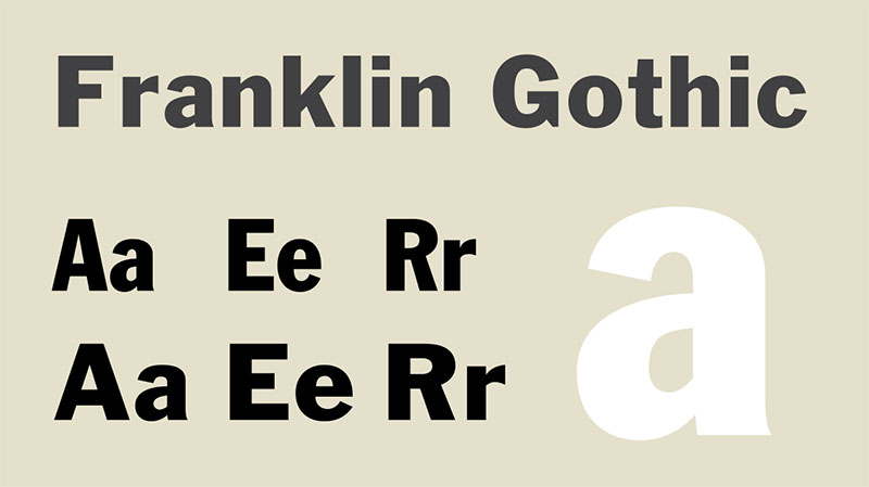
A classic American sans serif with robust character and extensive weight range.
What It Is
Franklin Gothic represents Morris Fuller Benton’s 1902 American grotesque design. Double-storey a and g distinguish it from European models while multiple weights serve diverse hierarchy needs.
Key Characteristics
- Classic American grotesque proportions
- Double-storey a and g create distinctive character
- Extensive weight range from book to extra condensed
- Timeless design maintains relevance
How It Works
Robust letterforms ensure legibility across applications. Extensive weights create sophisticated hierarchy. American grotesque character provides familiar readability.
Benefits
Timeless design avoids dated appearance. Extensive adoption proves reliability. Wide weight selection addresses diverse requirements. Classic character maintains professionalism.
When to Use
Ideal for editorial design, corporate communications, and projects requiring classic American typography. Applications valuing proven reliability over novelty favor Franklin Gothic’s established character.
Sofia Pro
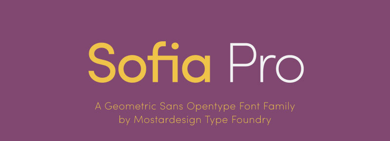
A geometric sans serif combining geometric precision with soft rounded details.
What It Is
Sofia Pro blends geometric structure with rounded letterform details. Multiple weights with italics provide comprehensive typographic tools.
Key Characteristics
- Geometric foundations with soft details
- Multiple weights create hierarchy options
- Rounded elements add friendly character
- Comprehensive family with italics
How It Works
Geometric precision ensures consistency. Rounded details soften mechanical appearance. Multiple weights enable nuanced hierarchy while maintaining family consistency.
Benefits
Balances geometric clarity with approachable personality. Comprehensive weight range handles complex typography. Rounded details distinguish it from purely geometric competitors.
When to Use
Perfect for modern branding requiring friendly geometric aesthetic. Digital products, contemporary marketing, and approachable brands benefit from Sofia Pro’s balanced character.
Graphik

A contemporary grotesque sans serif with precise construction and extensive weight range.
What It Is
Graphik delivers precise grotesque design across eight weights with matching italics. Christian Schwartz created this functional family balancing historical grotesque traditions with contemporary requirements.
Key Characteristics
- Precise grotesque construction
- Eight weights from thin to black
- Matching italics provide emphasis options
- Contemporary proportions suit modern use
How It Works
Precise construction ensures consistent performance. Wide weight range creates sophisticated hierarchy. Contemporary proportions adapt to current design requirements while maintaining grotesque clarity.
Benefits
Extensive weight selection handles complex typography. Precise construction ensures predictable behavior. Contemporary design maintains current relevance. Professional character suits serious applications.
When to Use
Ideal for brand identity systems, editorial design, and projects requiring extensive typographic control. Applications demanding precise, contemporary grotesque benefit from Graphik’s comprehensive approach.
CoFo Sans
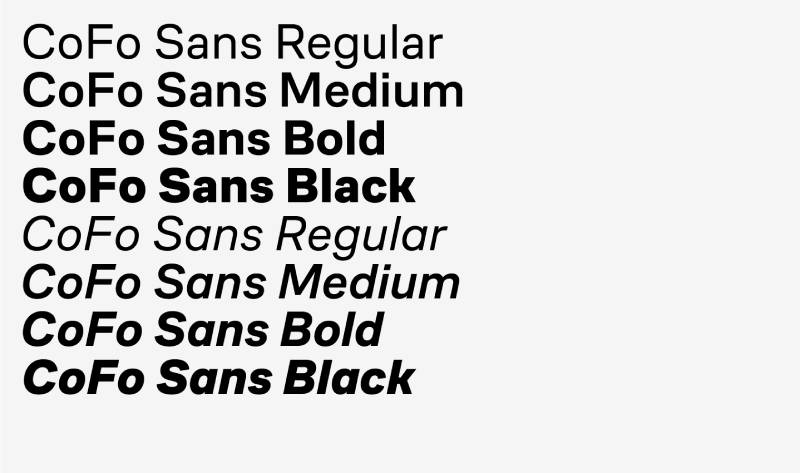
A modern grotesque with clean proportions and functional design principles.
What It Is
CoFo Sans provides clean grotesque design with functional proportions. Modern interpretation serves contemporary design requirements while respecting grotesque traditions.
Key Characteristics
- Clean grotesque proportions
- Functional design prioritizes usability
- Modern aesthetic suits current projects
- Balanced structure ensures versatility
How It Works
Clean proportions create visual clarity. Functional approach ensures practical performance. Modern aesthetic adapts to contemporary layout requirements.
Benefits
Functional design ensures reliable performance. Clean aesthetic maintains professional appearance. Modern proportions suit current design contexts.
When to Use
Suitable for contemporary projects, functional design applications, and contexts prioritizing usability. Projects valuing function over ornamentation benefit from CoFo Sans’s pragmatic approach.
Barlow
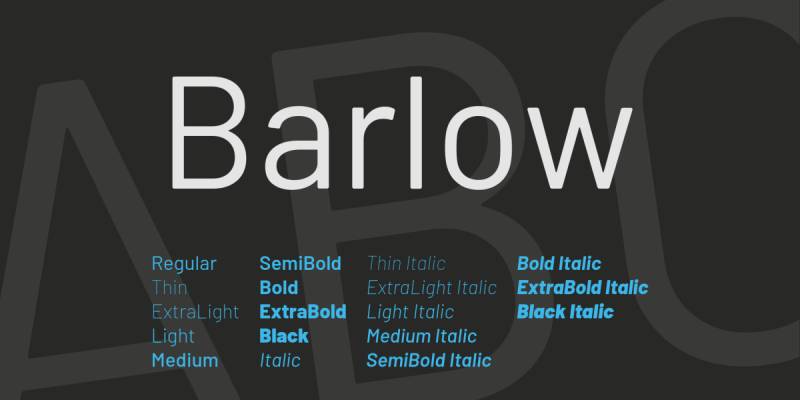
A low-contrast grotesque designed for digital screens with extensive weight selection.
What It Is
Barlow delivers low-contrast letterforms across nine weights optimized for digital screens. Jeremy Tribby designed this family specifically for California highway signage aesthetics applied to digital contexts.
Key Characteristics
- Low contrast optimized for screens
- Nine weights from thin to black
- Condensed and semi-condensed variants
- Highway Gothic inspiration creates clarity
How It Works
Low contrast ensures screen readability. Wide weight range creates hierarchy flexibility. Highway Gothic influence provides functional clarity. Condensed variants address space constraints.
Benefits
Free availability through Google Fonts. Screen optimization ensures digital performance. Extensive weight selection handles complex requirements. Highway Gothic heritage ensures proven clarity.
When to Use
Perfect for digital interfaces, websites, and applications requiring extensive weight selection. Projects emphasizing screen readability with free licensing benefit from Barlow’s comprehensive offering.
Gilroy
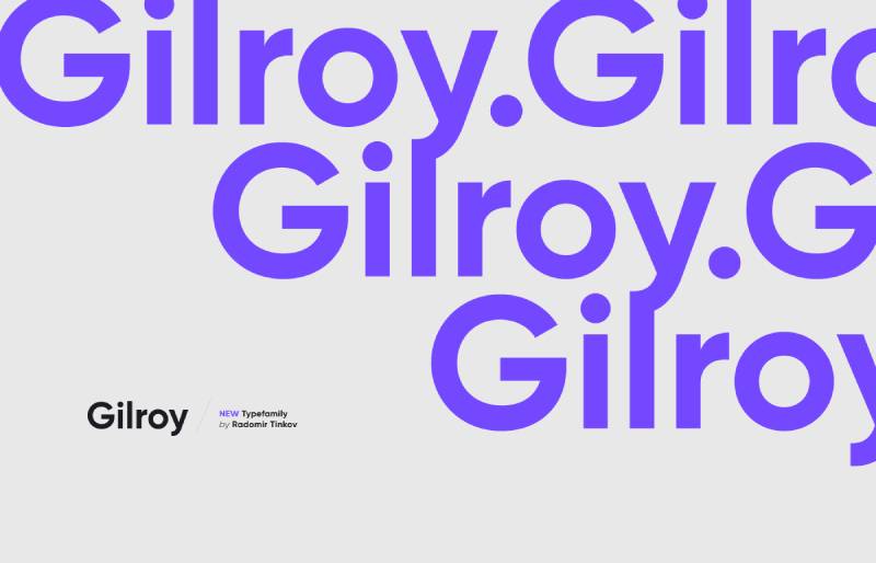
A modern geometric sans serif with clean lines and contemporary proportions.
What It Is
Gilroy provides clean geometric design with modern proportions. Multiple weights serve hierarchy needs while maintaining geometric consistency.
Key Characteristics
- Clean geometric construction
- Modern proportions suit contemporary design
- Multiple weights create hierarchy
- Contemporary aesthetic maintains relevance
How It Works
Geometric structure creates visual consistency. Modern proportions adapt to current layouts. Multiple weights enable sophisticated typography while maintaining coherent family character.
Benefits
Contemporary aesthetic appeals to modern sensibilities. Clean geometric structure ensures professional appearance. Multiple weights provide typographic flexibility.
When to Use
Ideal for modern branding, contemporary marketing, and digital products requiring clean geometric aesthetic. Projects emphasizing current design trends benefit from Gilroy’s contemporary character.
Poppins
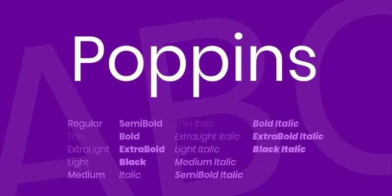
A geometric sans serif supporting both Devanagari and Latin scripts with international character.
What It Is
Poppins delivers geometric design with international character. Supporting Devanagari and Latin scripts with multiple weights creates globally applicable typography.
Key Characteristics
- Geometric construction with international scope
- Devanagari and Latin script support
- Multiple weights from thin to black
- International character enables global use
How It Works
Geometric foundations ensure consistency across scripts. Multiple weights create hierarchy in both writing systems. International design serves global audiences.
Benefits
Global script support enables international projects. Geometric clarity maintains consistency. Free availability reduces costs. Multiple weights provide typographic flexibility.
When to Use
Perfect for international projects, global brands, and applications requiring Devanagari support. Projects serving diverse audiences benefit from Poppins’s comprehensive international character coverage.
FAQ on Fonts Similar To Oswald
What makes a font similar to Oswald?
Condensed sans serif proportions with tall x-height and narrow letterforms define Oswald alternatives. Look for geometric construction, strong vertical emphasis, multiple weight variations, and clean minimalist aesthetic optimized for headlines and display typography across digital platforms.
Is Oswald a condensed or extended font?
Oswald is a condensed font with narrow proportions designed to save horizontal space. Vernon Adams created it by reworking Alternate Gothic to fit pixel grids better, making the condensed structure ideal for headlines and responsive web layouts.
What font is closest to Oswald?
Alternate Gothic most closely matches Oswald since Vernon Adams based Oswald directly on this Morris Fuller Benton design. League Gothic and Bebas Neue also deliver nearly identical condensed proportions with similar geometric sans serif characteristics and vertical emphasis.
Can I use Roboto instead of Oswald?
Roboto works as an Oswald alternative but offers wider proportions and more humanist character. Use Roboto Condensed for closer matching since standard Roboto lacks Oswald’s narrow structure. Both are free Google Fonts with extensive weight options.
What’s the best free alternative to Oswald?
Open Sans Condensed and Barlow provide excellent free alternatives through Google Fonts. Both offer condensed proportions, multiple weights, and screen optimization. League Gothic delivers the closest match to Oswald’s exact proportions while remaining completely free.
How many weights does Oswald have?
Oswald offers six weights ranging from extra light to bold through variable font technology. The variable fonts axis allows precise weight adjustment between 200 and 700, providing greater typographic flexibility than traditional static font files.
Is Oswald good for body text?
Oswald works poorly for body text due to condensed proportions that reduce readability in long passages. Reserve it for headlines, display typography, and short text blocks. Pair with wider sans serif like Open Sans for body content.
What font pairing works with Oswald?
Pairing fonts like Merriweather, Lora, or Georgia with Oswald creates effective hierarchy. Use serif fonts for body text while Oswald handles headlines. Roboto also pairs well when consistent sans serif aesthetic matters more than contrast.
Does Oswald support multiple languages?
Oswald supports Latin, Latin Extended, Cyrillic, and Vietnamese scripts through comprehensive glyph sets. Kalapi Gajjar and Alexei Vanyashin added Cyrillic support in 2016, making it suitable for international projects requiring multilingual typography across different writing systems.
What’s better than Oswald for logos?
Franklin Gothic, Alternate Gothic, or custom condensed grotesques often work better for logo design than Oswald. Their wider commercial licensing, distinctive character, and brand differentiation prevent the ubiquity problem while maintaining similar condensed aesthetic and professional appearance.
Conclusion
These fonts similar to Oswald deliver condensed sans serif aesthetics without sacrificing brand uniqueness. From Alternate Gothic’s historic roots to contemporary options like Barlow and Graphik, each alternative provides distinctive character while maintaining the vertical emphasis and clean geometry that makes Oswald effective.
Your choice depends on specific project requirements. Need extensive weight variations for complex hierarchy? Consider AS Grammatika or Sofia Pro. Prioritizing free licensing? Roboto Condensed and Open Sans deliver proven performance without costs.
The best typography choices support your content rather than overwhelming it. Test multiple alternatives in actual layouts before committing. Pay attention to kerning, leading, and how letterforms interact at your intended sizes.
Strong typographic foundations built on thoughtful font selection create lasting visual impact while maintaining the professional polish modern projects demand.
If you enjoyed reading this article on fonts similar to Oswald, you should check out these articles with fonts similar to Roboto, Gotham, Calibri, Trajan, Rockwell, Baskerville, Montserrat, and Brandon Grotesk.

Renowned for his expertise in logo design and visual branding, Bogdan has developed a multitude of logos for various clients.
His skills extend to creating posters, vector illustrations, business cards, and brochures. Additionally, Bogdan's UI kits were featured on marketplaces like Visual Hierarchy and UI8.
He also wrote in the past years on sites like Design Your Way, WebDesignerDepot, WPDean, Designmodo, Speckyboy, Slider Revolution, and more.
- The Windsurf Logo History, Colors, Font, And Meaning - 10 October 2026
- How to Remove Background From Product Photos (No Photoshop) - 10 October 2026
- How Designers can Build a Stronger Online Creative Identity - 9 October 2026

Bogdan Sandu is a seasoned designer who has been designing websites since 2008. Renowned for his expertise in logo design and visual branding, Bogdan has developed a multitude of logos for various clients. His skills extend to creating posters, vector illustrations, business cards, and brochures. Additionally, Bogdan's UI kits were featured on marketplaces like Visual Hierarchy and UI8. He also wrote in the past years on sites like Design Your Way, WebDesignerDepot, WPDean, Designmodo, Speckyboy, Slider Revolution, and more.
You Might Also Like