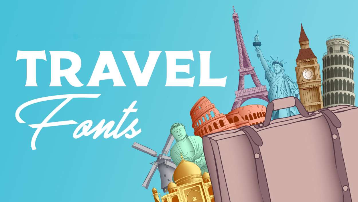
The right typeface can make someone book a trip before they’ve finished reading. That’s the power of the best travel fonts.
Whether you’re designing a travel blog, destination poster, or tourism branding, your font choice sets the emotional tone instantly. Adventure, luxury, wanderlust, relaxation. Each feeling demands different letterforms.
This guide covers 40+ fonts perfect for travel-related projects. You’ll find options for every style:
- Vintage scripts for nostalgic appeal
- Bold display fonts for headlines
- Clean sans-serifs for web readability
- Handwritten styles for authentic vibes
From Google Fonts freebies to premium typefaces on Creative Market, we’ve researched licensing, readability, and real-world applications. Let’s find your perfect travel font.
The Best Travel Fonts
| Font Name | Style Category | Primary Use Context | Semantic Attributes |
|---|---|---|---|
| Absolute | Display / Bold | Headers, impactful statements | Strong presence, confidence, authority |
| Ragstar | Vintage / Rustic | Adventure branding, retro themes | Nostalgic, authentic, weathered character |
| Theridge | Geometric / Modern | Contemporary travel brands | Clean lines, minimalist, urban aesthetic |
| Aurelig Vintage Scripts | Script / Calligraphic | Luxury travel, elegant branding | Sophisticated, handcrafted, personal touch |
| Misty Meadows | Script / Flowing | Nature travel, serene experiences | Gentle, organic, tranquil atmosphere |
| Travelnesia | Display / Brush | Travel blogs, wanderlust content | Energetic, spontaneous, exploratory spirit |
| Wonderful Wilderness | Handwritten / Casual | Outdoor adventures, camping sites | Approachable, natural, adventure-ready |
| Camar | Sans-serif / Clean | Modern travel apps, digital interfaces | Professional, legible, functional design |
| Bilbao | Display / European | European travel, cultural tours | Cosmopolitan, cultured, destination-specific |
| Explorer | Display / Adventure | Expedition branding, discovery themes | Bold, pioneering, expedition-oriented |
| Traveler | Sans-serif / Neutral | General travel content, versatile use | Balanced, accessible, universal appeal |
| Quirk | Display / Playful | Creative travel stories, unique angles | Distinctive, memorable, personality-driven |
| Mahalo | Script / Tropical | Beach destinations, island getaways | Relaxed, welcoming, tropical warmth |
| Clearwater | Display / Flowing | Water-based travel, coastal themes | Fluid, refreshing, aquatic associations |
| Carnavonts | Display / Festive | Festival travel, cultural celebrations | Vibrant, celebratory, cultural richness |
| World Explorer | Display / Global | International travel, worldwide themes | Worldly, comprehensive, globe-trotting |
| Coolvetica | Sans-serif / Swiss-inspired | Modern design, Helvetica alternative | Timeless, neutral, design-conscious |
| Chlorinar | Display / Stylized | Tech-forward travel, futuristic brands | Contemporary, sharp, technical precision |
| Cyrano | Display / Elegant | Refined travel experiences, upscale | Graceful, poetic, artistic sensibility |
| Park Lane | Serif / Classic | Luxury travel, high-end publications | Prestigious, traditional, upmarket appeal |
| Indira K | Display / Exotic | Cultural travel, ethnic themes | Distinctive, cultural depth, exotic appeal |
| Ontel | Display / Retro | Vintage travel posters, classic style | Nostalgic, mid-century aesthetic, timeless |
| Amne Sans | Sans-serif / Minimalist | Clean interfaces, modern websites | Streamlined, uncluttered, clarity-focused |
| Salonica | Display / Mediterranean | European coastal travel, Greek themes | Warm, Mediterranean character, historic |
| Amelline | Script / Delicate | Romance travel, intimate experiences | Refined, feminine touch, elegant flow |
| Open Sans | Sans-serif / Humanist | Body text, long-form content, UI | Highly readable, neutral, web-optimized |
| Futura PT | Sans-serif / Geometric | Modern branding, headlines, posters | Forward-thinking, geometric clarity, iconic |
| Brandon Grotesque | Sans-serif / Contemporary | Lifestyle brands, editorial design | Stylish, fashionable, modern appeal |
| Playfair Display | Serif / Transitional | Editorial headers, luxury content | Elegant, high-contrast, editorial quality |
| Museo Sans | Sans-serif / Humanist | Cultural institutions, museum sites | Approachable, informative, educational tone |
| DIN | Sans-serif / Industrial | Wayfinding, signage, technical docs | Utilitarian, efficient, engineering-focused |
| Freight Sans Pro | Sans-serif / Versatile | Professional publications, corporate | Reliable, professional, business-appropriate |
| Droid Sans | Sans-serif / Humanist | Mobile interfaces, Android apps | Screen-optimized, digital-friendly, readable |
| Avenir Next | Sans-serif / Geometric | Premium branding, corporate identity | Refined, balanced, professional polish |
| Canela | Serif / Elegant | Premium travel magazines, luxury | Sophisticated, contemporary serif, refined |
| Poppins | Sans-serif / Geometric | Web interfaces, modern content | Friendly, accessible, contemporary feel |
| Lato | Sans-serif / Humanist | Corporate websites, body text | Warm, stable, business-friendly |
| Circular | Sans-serif / Geometric | Tech brands, modern startups | Clean, modern, tech-savvy aesthetic |
| Archipelago | Display / Tropical | Island travel, resort branding | Exotic, island-inspired, vacation mood |
| Hammock | Display / Relaxed | Leisure travel, relaxation themes | Laid-back, carefree, vacation mindset |
| Forever Summer | Script / Casual | Beach content, summer campaigns | Breezy, seasonal, perpetual vacation |
Absolute
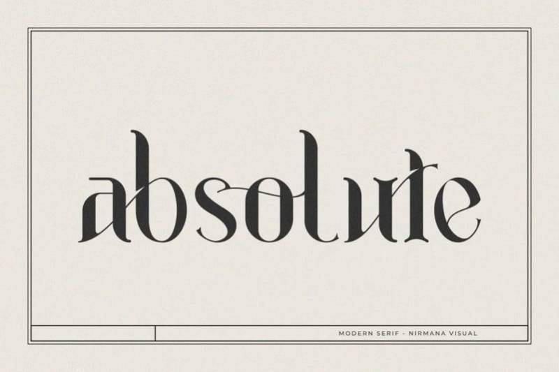
A striking font duo combining bold brush strokes with refined handwritten letterforms. Absolute brings raw energy to travel branding while maintaining elegance for upscale tourism projects.
Font Classification
Handwritten font duo featuring brush script paired with a natural artistic style. The combination creates flexibility for varied travel design needs.
Primary Travel Use Cases
- Travel agency logos and brand identity
- Social media graphics for vacation content
- Invitation designs for destination events
- Adventure blog headers
Works well for projects needing both bold statements and softer supporting text.
Readability Characteristics
Headlines perform best at larger sizes where brush texture shines. The handwritten style maintains legibility down to medium sizes. Not recommended for body text or small print applications like boarding passes.
Visual Personality
Adventurous yet sophisticated. The brush component feels spontaneous, like travel sketches made on the road. Meanwhile, the script version adds polish for luxury travel materials.
Pairing Recommendations
Pair the brush style with clean sans serifs like Montserrat for body copy. The handwritten version works alongside geometric sans fonts. Using both styles together creates instant typographic hierarchy.
Availability & Licensing
Free for personal use. Commercial license available through Creative Market. Designed by Arief Tri Sulistiyono. Formats include OTF and TTF.
Ragstar
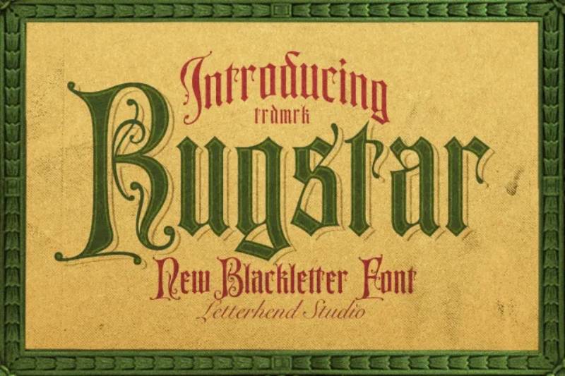
Bold and rounded, Ragstar delivers that in-depth feeling travel designers chase. It brings designs to life without trying too hard.
Font Classification
Sans-serif font with rounded terminals and generous letter spacing. The weight sits on the heavier side, giving it presence in any layout.
Primary Travel Use Cases
- Travel poster headlines
- Destination branding
- Tourism website headers
- Wanderlust merchandise
The friendly curves make it approachable for family vacation materials while staying modern enough for boutique travel brands.
Readability Characteristics
Excellent at display sizes. Those rounded edges reduce visual strain even on bright, colorful travel backgrounds. Holds up reasonably at medium sizes but loses impact when pushed too small.
Visual Personality
Warm and inviting. Think sunset beach vibes rather than corporate airport signage. There’s something inherently optimistic about the letterforms.
Pairing Recommendations
Combine with lighter sans serif fonts for paragraph text. The weight difference creates natural visual hierarchy. Script fonts work as accent elements alongside Ragstar headlines.
Availability & Licensing
Available through font marketplaces. Check license terms for commercial travel projects. Multiple weights may be available depending on the version.
Theridge
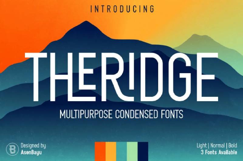
Clean, condensed, and inspired by actual hiking trips through forest landscapes. Theridge captures highland adventure in typographic form.
Font Classification
Condensed sans-serif display font available in three weights: light, normal, and bold. The narrow letterforms pack more text into tight spaces.
Primary Travel Use Cases
- Outdoor adventure branding
- Mountain destination guides
- Hiking and camping materials
- Urban exploration content
- Vintage-style travel posters
Works across retro and modern contexts. That’s pretty rare.
Readability Characteristics
The condensed nature limits small-size applications. Stick to headlines, logos, and display text. At proper sizes, the clean geometry reads effortlessly.
Performs well on both screen and print.
Visual Personality
Hipster meets highlands. There’s vintage charm mixed with contemporary minimalism. The font suggests exploration without screaming “ADVENTURE” at you.
Pairing Recommendations
Match with wider sans serif fonts for body text. The condensed-to-regular width contrast works beautifully. Geometric typefaces complement Theridge’s structured letterforms.
Availability & Licensing
Created by Bayu Noor Witarsa, published by Asenbayu. Free version available for personal use. Commercial license through MyFonts and Creative Market.
Aurelig Vintage Scripts
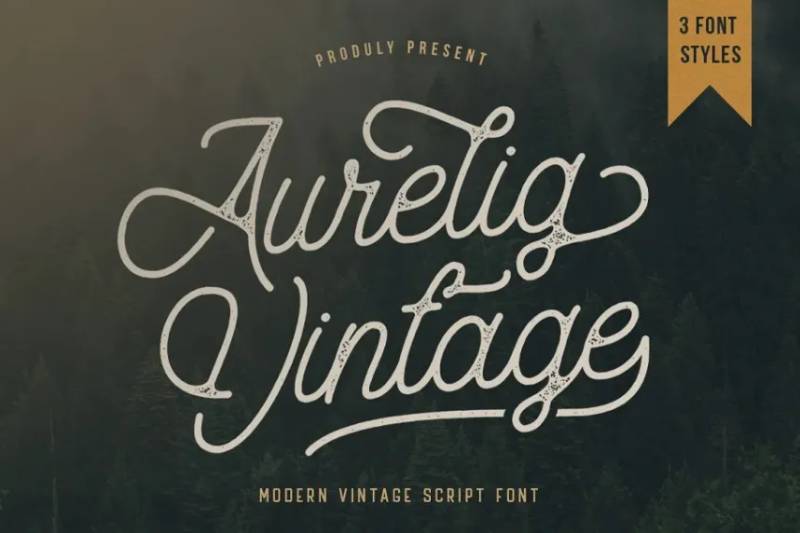
Monoline script dripping with retro authenticity. Every character carries intentional imperfection, making designs feel handcrafted and genuine.
Font Classification
Monoline script font with three versions: clean, vintage, and rough. Each offers different texture levels for varied project needs.
Primary Travel Use Cases
- Vintage travel postcards
- Traditional-style branding for lodges
- Package design for travel souvenirs
- T-shirt lettering for tourist destinations
- Retro travel poster design
The imperfect shapes connect viewers to handwritten travel journals.
Readability Characteristics
Best at larger display sizes where the character details shine. The monoline construction (consistent stroke width) maintains clarity even with decorative alternates active. Not ideal for body text or lengthy descriptions.
Visual Personality
Nostalgic but never dusty. The font channels mid-century travel brochure aesthetics while staying relevant for modern wanderlust content. Authentic and approachable.
Pairing Recommendations
Pair with clean serif or sans-serif fonts for supporting text. The script style provides emphasis while partners handle readability. Stylistic alternates and ligatures create custom looks.
Availability & Licensing
Created by Vultype Co. Available on Creative Market, Envato Elements, and Font Bundles. Includes Western European character support. Free personal use demo available; commercial license required for client work.
Misty Meadow
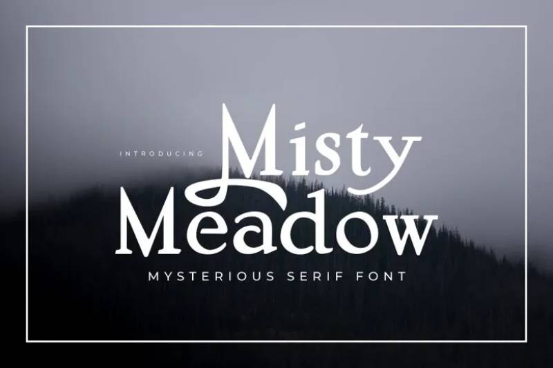
Mysterious and classical, this serif font adds atmosphere to any travel project. It belongs in fantasy guidebooks and enchanted destination materials.
Font Classification
Serif font with mystical styling and OpenType features. Alternative glyphs for most characters enable customization.
Primary Travel Use Cases
- Vintage travel typography
- Destination signage with character
- Travel merchandise and apparel
- Packaging for artisan travel goods
- Atmospheric travel blogs
Best for projects wanting emotional depth over generic modern looks.
Readability Characteristics
Performs well at both large and small sizes due to its serif structure. The mystical styling doesn’t compromise legibility. Works in print and on screen.
Alternative characters add visual interest without sacrificing clarity.
Visual Personality
Enigmatic and classical. Think misty mountain villages, ancient forests, destinations with stories to tell. The font adds gravitas and wonder simultaneously.
Pairing Recommendations
Pair with simple sans-serif fonts to balance the decorative nature. Use alternate glyphs sparingly for headlines while keeping body text standard.
Availability & Licensing
Designed by AndrewPixel. Free for personal use; commercial license available. Requires OpenType-compatible software (Photoshop, Illustrator, InDesign, CorelDraw) to access all features.
Travelnesia
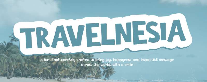
Bold, bouncy, and absolutely fun. This cartoony display font makes travel designs smile.
Font Classification
All-caps sans-serif font with rounded corners and playful baseline variations. Available in regular and shadow styles.
Primary Travel Use Cases
- Travel posters targeting families
- Vacation t-shirt designs
- Postcards and greeting cards
- Website headers for adventure blogs
- Food and beverage labels at tourist destinations
The shadow version adds depth for eye-catching displays.
Readability Characteristics
Display only. The bouncy baseline makes extended reading difficult. Perfect for headlines, single words, or short phrases. The cartoon styling demands attention from across the room.
Visual Personality
Playful and energetic. There’s no seriousness here. The font screams “LET’S GO!” without a hint of corporate stiffness. Family-friendly adventures in letterform.
Pairing Recommendations
Balance with neutral sans-serif fonts for information text. The playfulness needs grounding from simpler typefaces. Avoid pairing with other decorative fonts.
Availability & Licensing
Created by Alexatype. Demo version free for personal use on DaFont and FontSpace. Full version with commercial license available through their store. Includes TTF, OTF, and WOFF formats.
Wonderful Wilderness
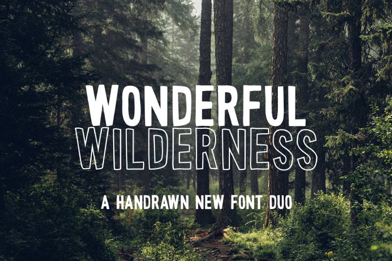
Hand-drawn font duo built for outdoor adventure. The filled and outline versions create layering opportunities that standard fonts can’t match.
Font Classification
Sans-serif display duo featuring:
- Filled version with grainy texture
- Outline version for layering effects
Both share the same letterforms, enabling creative combinations.
Primary Travel Use Cases
- Camping and outdoor branding
- Adventure travel logos
- Wilderness-themed apparel
- National park merchandise
- Forest retreat materials
The rough texture feels like stamps or woodblock prints. Authenticity in every letter.
Readability Characteristics
Strictly display sizes. The hand-drawn quality and texture demand space. Headlines, logos, and accent text only. The texture may appear muddy at small sizes.
Visual Personality
Rugged, outdoorsy, and genuine. This isn’t a polished corporate typeface. It’s the font for people who actually go outside. Hipster credibility built in.
Pairing Recommendations
Pair with clean sans-serif fonts for body copy. The textured nature needs smooth companions. Layer both versions together for dimensional effects in print design projects.
Availability & Licensing
Created by Salt & Pepper Designs. Available on Font Bundles, Creative Market, Envato Elements, and Etsy. Commercial license included with purchase. OTF and TTF formats.
Camar
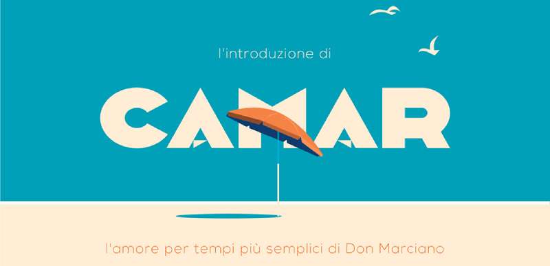
Art Deco elegance meets modern simplicity. Originally designed for postcards, Camar channels the era when travel meant something grander.
Font Classification
Geometric sans-serif display font with Art Deco influences. Consistent letter widths create a calm, rhythmic reading flow.
Primary Travel Use Cases
- Luxury travel branding
- Vintage-style postcards
- Fashion-forward travel content
- Boutique hotel identities
- Social media graphics for upscale tourism
The font suggests sophistication without pretension.
Readability Characteristics
Best at display sizes where the geometric precision shows. The uniform letter widths aid reading rhythm. Works well for headlines and short text blocks. Not designed for lengthy body copy.
Visual Personality
Timeless elegance. The Art Deco roots evoke an era of ocean liners and grand hotel lobbies. Simple yet refined, the font makes any travel destination feel like a destination worth visiting.
Pairing Recommendations
Pair with modern serifs or humanist sans-serif fonts for body text. The geometric nature creates interesting contrast with more organic typefaces. Keep supporting fonts simple to maintain elegance.
Availability & Licensing
Designed by Don Marciano. Free demo version for personal use. Full version and commercial license available through Creative Market. OTF format.
Bilbao
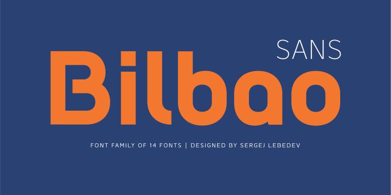
A hybrid font blending sans-serif, slab, and monospace characteristics. Named after the Spanish city famous for its mix of ancient and modern architecture, Bilbao mirrors that fusion in letterform.
Font Classification
Geometric sans-serif with slab and mono influences. The family includes 18 styles with italics from Thin to Bold.
Primary Travel Use Cases
- Sophisticated travel branding
- Display headlines for destination marketing
- Editorial travel layouts
- European tourism materials
The fusion of type styles makes it unexpectedly versatile.
Readability Characteristics
Strong legibility across weights. The geometric details ensure clarity at display sizes. Lighter weights work for extended reading; heavier weights dominate headlines.
Visual Personality
Friendly yet professional. There’s cultural sophistication here that suits cosmopolitan travel brands. The rounded shapes soften what could feel too industrial.
Pairing Recommendations
Works well with classic serif fonts for body copy. The geometric nature pairs nicely with humanist typefaces. Keep supporting fonts simple to let Bilbao’s character show.
Availability & Licensing
Designed by Mateusz Machalski. Published by Borutta/Machalski. Demo version free for personal use. Full commercial license available through MyFonts.
Explorer
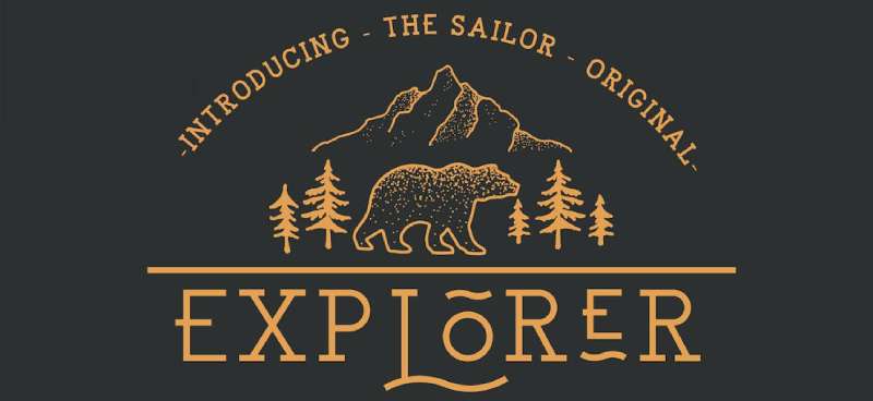
Part of the Sailor Typeface family, Explorer screams travel without saying a word. The glyphs and ligatures inspire wonder before you’ve even read the content.
Font Classification
Serif display typeface with four weights: Light, Regular, Medium, and Bold. Clean vintage styling throughout.
Primary Travel Use Cases
- Travel agency logos
- Destination headlines
- Adventure brand identities
- Small text blocks in travel materials
Explorer handles both big statements and subtle details.
Readability Characteristics
Minimalist design maintains readability across weights. The clean lines ensure legibility at various sizes. Works for headlines and small text, though display use is primary.
Visual Personality
Modern vintage. Explorer captures old-world travel aesthetics without feeling dated. There’s maritime influence in the bones of this font, like compass roses and nautical charts.
Pairing Recommendations
Combine with sans-serif fonts for body copy. The serif character provides contrast against cleaner typefaces. Script fonts as accents complete the travel aesthetic.
Availability & Licensing
Created by NEWFLIX.Bro. Free for personal use on Font Bundles and DaFont. Commercial license required for client projects.
Traveler
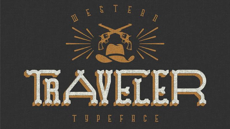
Brush-style hand-drawn look with subtle baseline variations. The adventure concept lives in every stroke.
Font Classification
Brush script with bold characters and cool ligatures. The hand-drawn aesthetic feels authentic, not manufactured.
Primary Travel Use Cases
- Logo marks for adventure brands
- Typographic quotes on travel content
- Packaging for travel products
- Blog headlines
The ligatures create unique character combinations.
Readability Characteristics
Display sizes only. The brush texture demands space to breathe. Small applications lose the hand-crafted details that make Traveler special.
Visual Personality
Adventurous and bold. This font doesn’t sit still. It wants to move, explore, discover. The subtle baseline shifts suggest motion and spontaneity.
Pairing Recommendations
Balance with clean sans-serif fonts. The brush energy needs calm partners. Use Traveler for headlines only; let simpler fonts handle body text.
Availability & Licensing
Available on Envato Elements and UI8. Commercial license included with subscription or purchase. OTF and TTF formats.
Quirk
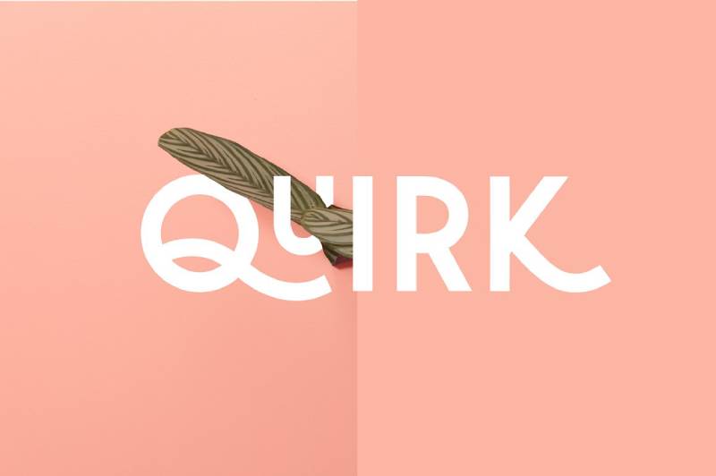
A stackable display font that lives up to its name. The unique way letterforms combine makes designing genuinely fun.
Font Classification
Display sans-serif with stackable alternate characters. All caps with small caps options. Modern and playful simultaneously.
Primary Travel Use Cases
- Creative travel branding
- Social media graphics
- Poster headlines
- Logo design
- Package design for travel products
Works anywhere playfulness enhances the message.
Readability Characteristics
Designed for display impact, not extended reading. The stacking feature creates visual interest at larger sizes. Keep it big and bold.
Visual Personality
Chunky, funky, and approachable. The soft corners prevent shouting despite the bold weight. It’s confident without being aggressive.
Pairing Recommendations
Pairs well with bold sans-serif fonts. The playful nature benefits from structured companions. Avoid combining with other decorative fonts.
Availability & Licensing
Created by The Routine Creative/Alex Cottles. Available on Creative Market and Etsy. OTF and TTF formats. Commercial use permitted.
Mahalo
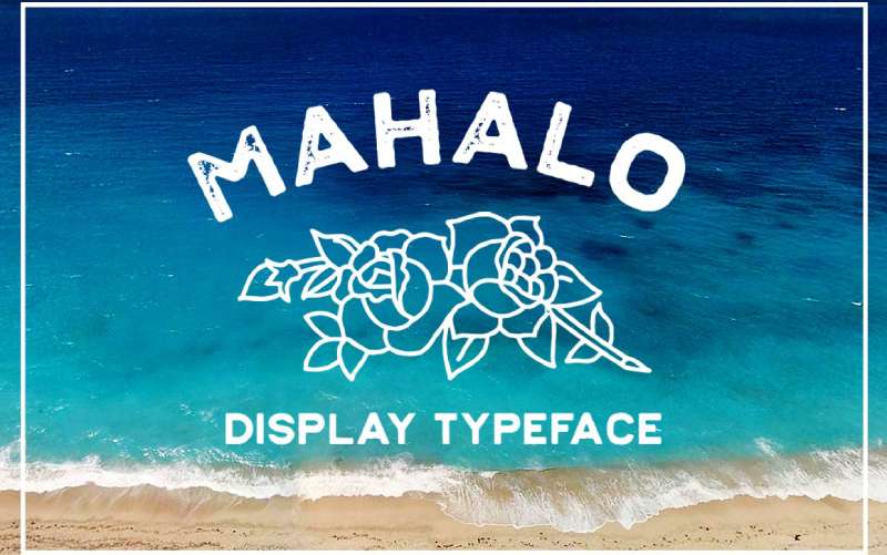
Born in Hawaii from actual vintage signage inspiration. Strong and bold, yet welcoming enough to say “aloha.”
Font Classification
All-caps display font with solid and textured (stamped) versions. The dual styles offer versatility.
Primary Travel Use Cases
- Hawaiian and tropical branding
- Beach resort materials
- Island destination marketing
- Vacation merchandise
The stamped version adds authenticity for print design projects.
Readability Characteristics
Display sizes perform best. The bold weight commands attention. The stamped version requires larger sizes to show texture detail.
Visual Personality
Tropical warmth with vintage charm. Mahalo channels old Hawaii tourism materials without feeling kitsch. Welcoming but substantial.
Pairing Recommendations
Combine with script fonts for a full Hawaiian feel. Clean sans-serifs provide balance for informational text. The textured version pairs well with distressed graphics.
Availability & Licensing
Designed by Mark Richardson. Available on Creative Market. Includes tropical symbols as bonus. Commercial license available.
Clearwater
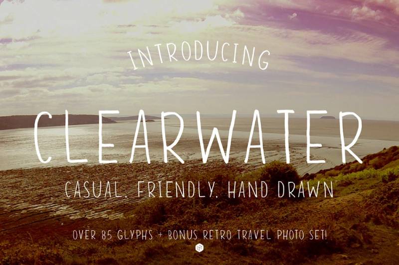
Hand-drawn and inspired by wanderlust itself. The nostalgic feel transports viewers before they’ve read a word.
Font Classification
Hand-drawn sans-serif with capitals, numerals, and common symbols. Over 90 glyphs total.
Primary Travel Use Cases
- Travel blog headers
- Wanderlust merchandise
- Nostalgic travel marketing
- Retro-styled destination content
Includes bonus retro travel photos.
Readability Characteristics
Clear and easy to read despite hand-drawn origins. Works at display sizes and smaller applications. Unusual versatility for a handmade font.
Visual Personality
Casual, nostalgic, and adventurous. Clearwater feels like notes scribbled in a traveler’s journal. Personal and authentic without pretension.
Pairing Recommendations
Works with both serif and sans-serif body fonts. The hand-drawn nature provides variety against more structured typefaces.
Availability & Licensing
Created by jmarsh. Available on Creative Market and MasterBundles. Includes webfont kit. TTF and OTF formats.
Carnavonts
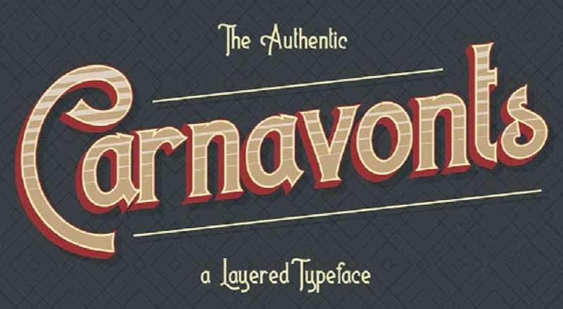
Carnival-inspired layering font from the nostalgic nineties. Four styles to play with for dimensional effects.
Font Classification
Layered display font with 3D extrude, gradient, outline, and solid options. Uppercase, lowercase, ligatures, and stylistic alternatives included.
Primary Travel Use Cases
- Theme park materials
- Carnival and festival branding
- Fun destination marketing
- Retro travel posters
- Entertainment venue signage
The layering creates depth impossible with single-style fonts.
Readability Characteristics
Display only. The dimensional effects demand size to work properly. Small applications flatten the layering that makes Carnavonts special.
Visual Personality
Fun, nostalgic, and celebratory. The font screams “good times ahead.” Perfect for destinations that prioritize entertainment and joy.
Pairing Recommendations
Use simple fonts alongside to prevent visual overwhelm. The layering provides enough complexity. Keep supporting text clean and legible.
Availability & Licensing
Available on Creative Market. Multiple layering styles in package. Commercial license available.
World Explorer
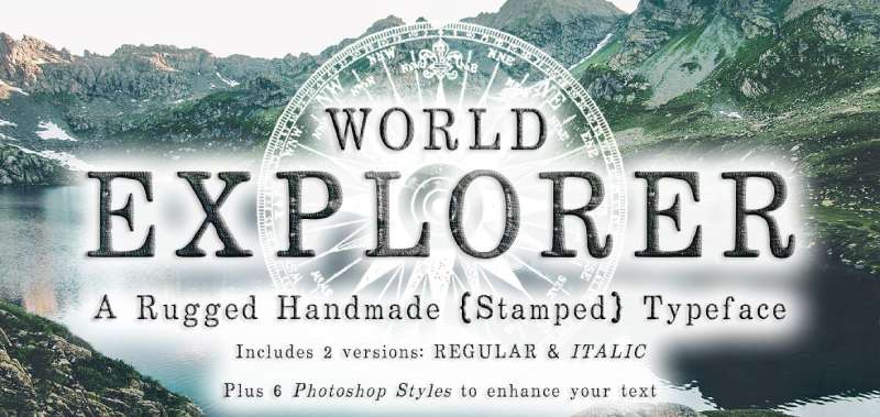
Handmade stamped font originating from vintage rubber stamps and ink pads. Rugged, rustic, and ready for adventure.
Font Classification
Hand-stamped serif display font. Bold and rough with strong character. Both casual and vintage simultaneously.
Primary Travel Use Cases
- Outdoor adventure branding
- Rustic wedding travel themes
- Farm-to-table tourism
- Folk festival materials
- Urban street food marketing
Works across wilderness to urban contexts.
Readability Characteristics
Display sizes only. The stamped texture requires space. Headlines and logos are ideal applications.
Visual Personality
Well-traveled and authentic. World Explorer feels like passport stamps from forgotten adventures. Rugged charm without trying too hard.
Pairing Recommendations
Combine with clean fonts for balance. The texture provides enough visual interest. Photoshop styles included add extra effects options.
Availability & Licensing
Created by Le Paper Cafe/Anissa Craig. Available on Creative Market. Demo free for personal use. Commercial license required for client work. Includes Photoshop style bonuses.
Coolvetica
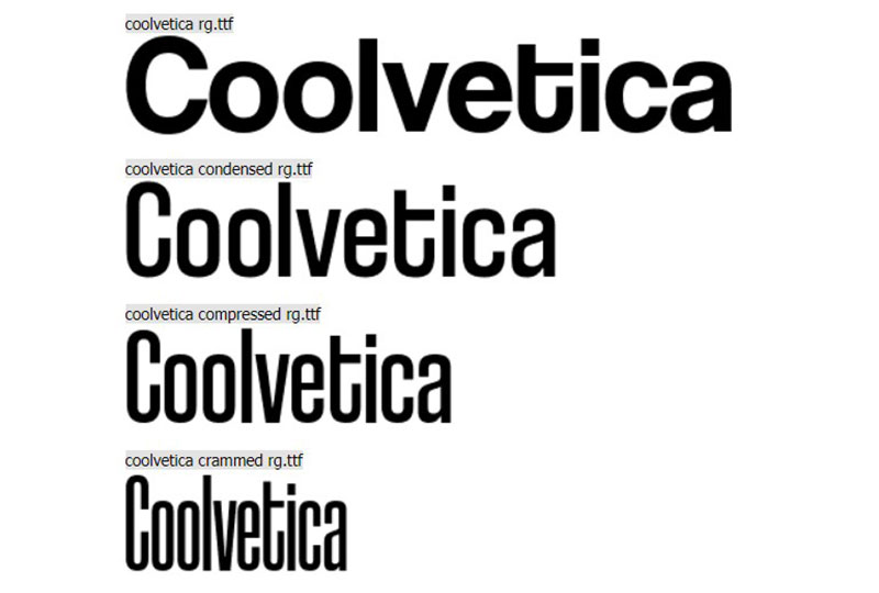
Scratch-built retro typeface inspired by 1970s American logo designs. This was the era of Helvetica modifications, and Coolvetica captures that perfectly.
Font Classification
Sans-serif display font with tight kerning and funky curls. Available in Regular, Italic, Condensed, and Compressed variants.
Primary Travel Use Cases
- Retro travel branding
- Vintage poster design
- Nostalgic tourism materials
- 70s-themed destination marketing
- Album art for travel content
The funky personality suits playful travel brands.
Readability Characteristics
Display only. Not intended for paragraphs or book text. Big, funky headings and titles are the sweet spot.
Visual Personality
Retro energy with modern execution. Coolvetica channels American storefronts from fifty years ago. Nostalgic yet relevant.
Pairing Recommendations
Clean, minimalist fonts like Roboto or Raleway balance the playful curves. Avoid other retro fonts to prevent style overload.
Availability & Licensing
Created by Ray Larabie/Typodermic Fonts. Free for personal and commercial use. Desktop license covers most uses. Available on DaFont, FontSpace, and direct from Typodermic.
Chlorinar

Bold display font with industrial undertones. The strong character commands attention in any travel context.
Font Classification
Display sans-serif with bold presence. Clean geometry with slight industrial edge.
Primary Travel Use Cases
- Adventure travel branding
- Extreme sports tourism
- Industrial city destinations
- Urban exploration content
Works for travel brands wanting edge over elegance.
Readability Characteristics
Display sizes preferred. The bold weight reads clearly at large scales. Maintains presence even at medium sizes.
Visual Personality
Strong and direct. No-nonsense attitude for travel brands that skip the frills. Adventure without the sentiment.
Pairing Recommendations
Balance with lighter weights for body text. Humanist sans-serifs soften the industrial edge when needed.
Availability & Licensing
Check font marketplaces for current availability. Verify license terms before commercial use.
Cyrano
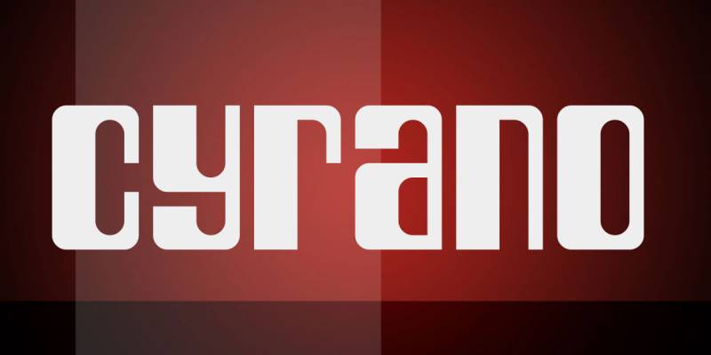
Elegant display font with theatrical flair. The name evokes romance and drama, and the letterforms deliver.
Font Classification
Display font with distinctive character styling. Balances elegance with readability.
Primary Travel Use Cases
- Luxury travel marketing
- Romantic destination branding
- Theatre and cultural tourism
- European travel materials
Suits destinations with historical or romantic appeal.
Readability Characteristics
Works best at display sizes. The distinctive styling shows best when given room. Headlines and featured text are ideal.
Visual Personality
Dramatic elegance. Cyrano suggests Paris balconies and moonlit adventures. Romantic without being saccharine.
Pairing Recommendations
Pair with classic serif or clean sans-serif fonts. The drama needs simple supporting players.
Availability & Licensing
Available through font marketplaces. Check specific license terms for commercial travel projects.
Park Lane
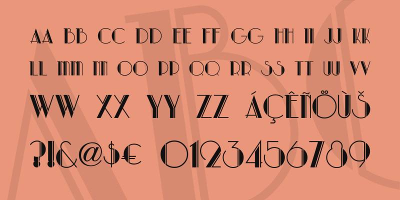
Art Deco elegance for sophisticated travel branding. The geometric precision evokes the golden age of travel.
Font Classification
Art Deco display font with geometric construction. Classic styling with refined letterforms.
Primary Travel Use Cases
- Luxury hotel branding
- Vintage travel posters
- High-end destination marketing
- Classic airline aesthetics
Perfect for evoking 1920s-1930s travel glamour.
Readability Characteristics
Display focus. The geometric styling maintains clarity at larger sizes. Not designed for body text applications.
Visual Personality
Sophisticated glamour. Park Lane channels ocean liner elegance and grand hotel lobbies. Timeless luxury in letterform.
Pairing Recommendations
Combine with serif fonts for body copy. The Deco styling provides strong headlines while traditional serifs handle readability.
Availability & Licensing
Available through various font sources. Verify license for commercial travel applications.
Indira K

Elegant display font with unique character. The styling suggests cultural sophistication.
Font Classification
Display font with distinctive letterform design. Combines elegance with visual interest.
Primary Travel Use Cases
- Cultural tourism branding
- Boutique hotel identities
- Destination marketing with heritage focus
- International travel materials
Works for brands emphasizing cultural richness.
Readability Characteristics
Display sizes optimal. The distinctive characters need room to be appreciated. Headlines and featured text work best.
Visual Personality
Culturally sophisticated. Indira K suggests destinations with deep heritage and refined taste.
Pairing Recommendations
Pair with clean, readable fonts for supporting text. The display styling provides focal points.
Availability & Licensing
Check font marketplaces for availability and license terms.
Ontel
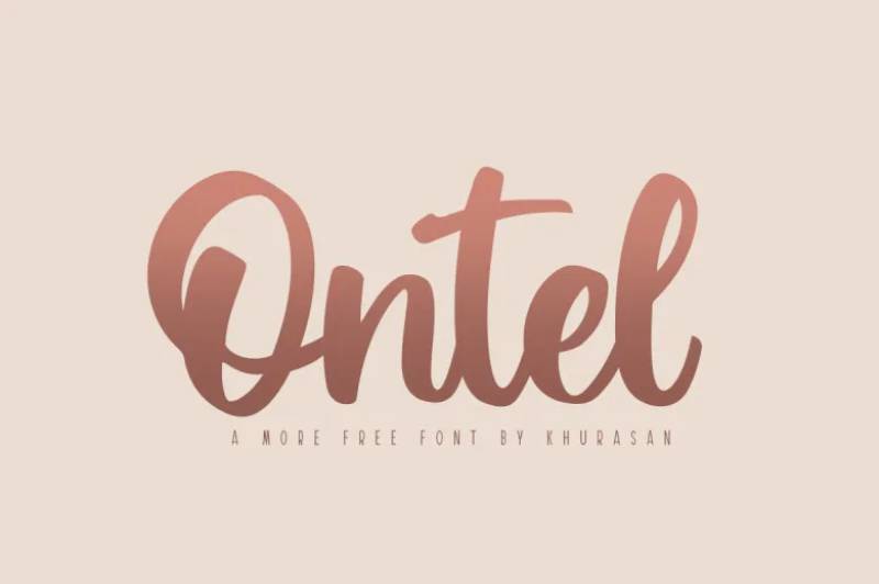
Modern display font with contemporary styling. Clean lines meet creative character.
Font Classification
Display sans-serif with modern geometric influences. Clean and contemporary execution.
Primary Travel Use Cases
- Modern travel apps
- Contemporary destination branding
- Tech-forward travel companies
- Urban travel marketing
Suits digital-first travel brands.
Readability Characteristics
Performs well at display and medium sizes. Clean geometry aids legibility. Modern styling doesn’t sacrifice clarity.
Visual Personality
Contemporary and forward-looking. Ontel suits travel brands embracing technology and innovation.
Pairing Recommendations
Works with other modern sans-serifs. The clean style pairs well with geometric font families.
Availability & Licensing
Available through font marketplaces. Verify license for commercial projects.
Amne Sans
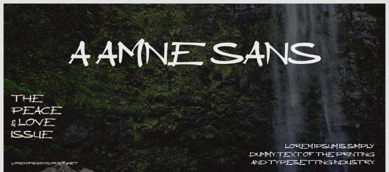
Clean sans-serif for versatile travel applications. Modern without unnecessary complexity.
Font Classification
Sans-serif font family with multiple weights. Clean, modern construction throughout.
Primary Travel Use Cases
- Travel website body text
- Mobile travel apps
- Marketing materials
- Wayfinding and signage
Versatile enough for both display and text use.
Readability Characteristics
Strong legibility across sizes. Multiple weights allow flexibility. Works on screen and in print.
Visual Personality
Modern and approachable. Amne Sans doesn’t distract from content while maintaining contemporary appeal.
Pairing Recommendations
Works with display fonts for headlines. The clean nature provides excellent supporting text.
Availability & Licensing
Check availability on font marketplaces. Review license terms for travel projects.
Salonica
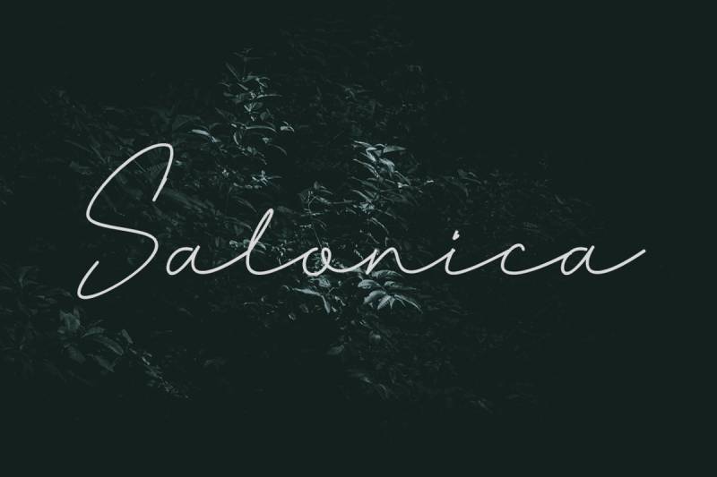
Handwritten script with filmy, mysterious qualities. Light letterforms demand larger applications.
Font Classification
Script font with light, airy strokes. Elegant yet accessible styling.
Primary Travel Use Cases
- Beach and exotic destination marketing
- YouTube thumbnails and banners
- Romantic travel content
- Wanderlust social media
The light weight creates sophistication.
Readability Characteristics
Requires larger sizes due to light strokes. Display focus. The delicate nature doesn’t survive small applications.
Visual Personality
Mysterious and glamorous. Salonica adds film-worthy elegance to travel content. Dreamy quality suits aspirational marketing.
Pairing Recommendations
Pair with clean sans-serifs for information. The script provides accent moments while partners handle readability.
Availability & Licensing
Available for personal and commercial projects. Check license specifics on font platforms.
Amelline
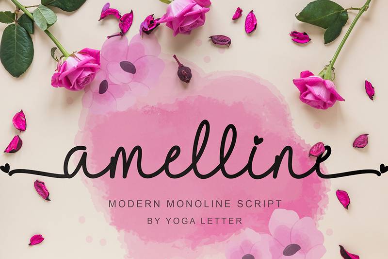
Modern monoline script with elegant, French vibes. Beautiful for aesthetic travel poster design.
Font Classification
Modern monoline script font. Elegant curves with consistent stroke weight.
Primary Travel Use Cases
- European destination marketing
- Luxury travel brands
- Wedding destination materials
- Aesthetic travel posters
The French sensibility suits sophisticated travel content.
Readability Characteristics
Display sizes recommended. The script styling needs room. Headlines and accent text work best.
Visual Personality
Elegant sophistication. Amelline channels Parisian style and continental refinement. Romantic without being excessive.
Pairing Recommendations
Combine with classic serifs or clean sans-serifs. The script provides contrast against more structured typefaces.
Availability & Licensing
Free for personal and commercial use. Available on font platforms.
Open Sans
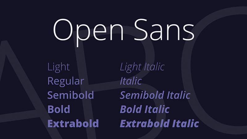
The workhorse of web design with excellent travel applications. Steve Matteson’s humanist design reads beautifully everywhere.
Font Classification
Humanist sans-serif with optimized legibility. Available in multiple weights and styles.
Primary Travel Use Cases
- Travel website body text
- Mobile travel apps
- Booking interfaces
- Travel guides and itineraries
Google Fonts availability makes web implementation seamless.
Readability Characteristics
Exceptional across all sizes. Designed specifically for legibility on screens. Print performance equally strong. One of the most readable fonts available.
Visual Personality
Friendly and neutral. Open Sans doesn’t impose personality, allowing content to speak. Professional without being cold.
Pairing Recommendations
Works with nearly any display font. The neutral nature makes it a universal partner. Pairs especially well with geometric sans-serifs and classic serifs.
Availability & Licensing
Free via Google Fonts. Open source license allows commercial use. Web font, desktop, and app formats available.
Futura PT
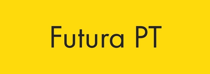
The geometric classic reimagined for modern screens. Paul Renner’s 1927 design remains startlingly relevant.
Font Classification
Geometric sans-serif with extensive family. PT version optimized for digital use.
Primary Travel Use Cases
- Premium travel branding
- Airline identities
- Luxury hotel marketing
- Modern travel magazines
The geometric precision suits sophisticated travel brands.
Readability Characteristics
Strong at display sizes. Geometric construction maintains clarity. Extended text applications possible with appropriate leading and size.
Visual Personality
Timeless modernity. Futura suggests forward motion and progress. Sophisticated without being stuffy.
Pairing Recommendations
Combine with serif fonts for warmth. The geometric nature benefits from organic companions. Works well as both headline and supporting font.
Availability & Licensing
PT version available through ParaType. Adobe Fonts includes Futura variations. Commercial license required.
Brandon Grotesque
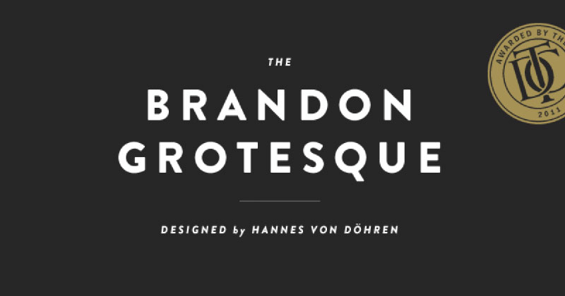
Elegant geometric sans with Art Deco influences. The x-height and proportions create distinctive appeal.
Font Classification
Geometric sans-serif with high x-height. Multiple weights available.
Primary Travel Use Cases
- Boutique travel brands
- Design-forward tourism marketing
- Luxury destination content
- Modern travel magazines
The elegant geometry elevates travel materials.
Readability Characteristics
Excellent legibility. The high x-height aids reading. Works at display and text sizes with appropriate weight selection.
Visual Personality
Sophisticated elegance. Brandon Grotesque feels curated and intentional. Premium quality in every letterform.
Pairing Recommendations
Works beautifully with script fonts. The geometric base provides stability for more expressive partners.
Availability & Licensing
Commercial font. Available through MyFonts and Adobe Fonts. License required for travel projects.
Playfair Display
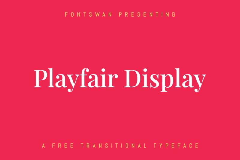
High-contrast transitional serif perfect for luxury travel content. The dramatic thick-thin strokes demand attention.
Font Classification
Transitional serif font with high contrast. Display-optimized design.
Primary Travel Use Cases
- Luxury travel magazines
- Hotel branding
- Destination marketing headlines
- Travel book covers
The elegance suits upscale travel content.
Readability Characteristics
Display focus due to high contrast. Headlines and featured text optimal. Body text possible at larger sizes with careful leading.
Visual Personality
Sophisticated drama. Playfair Display channels editorial elegance and timeless refinement. Luxury without excess.
Pairing Recommendations
Combine with clean sans-serifs like Lato or Open Sans. The high contrast needs calm partners. Classic serif plus sans-serif pairing works exceptionally well.
Availability & Licensing
Free via Google Fonts. Open source license. Excellent web font performance.
Museo Sans

Rounded geometric sans with friendly character. The soft terminals create approachable elegance.
Font Classification
Geometric sans-serif with rounded endings. Multiple weights available.
Primary Travel Use Cases
- Family travel brands
- Friendly destination marketing
- Travel app interfaces
- Welcoming tourism materials
The rounded nature prevents cold corporate feeling.
Readability Characteristics
Strong across sizes. Geometric construction aids clarity. The rounded terminals soften without reducing legibility.
Visual Personality
Friendly sophistication. Museo Sans feels welcoming without being childish. Professional approachability.
Pairing Recommendations
Works with serif fonts for formal applications. Pairs well with script fonts for casual contexts. Versatile foundation font.
Availability & Licensing
Free weights available. Full family commercial. Available through Typekit/Adobe Fonts and direct licensing.
DIN

German industrial standard turned design favorite. The functional clarity suits information-heavy travel applications.
Font Classification
Industrial sans-serif. Originally designed for German road signage. Multiple weights in extended families.
Primary Travel Use Cases
- Airport and transit signage
- Travel wayfinding systems
- Technical travel information
- Maps and infographics
- Modern travel branding
Industrial roots mean excellent functional performance.
Readability Characteristics
Exceptional clarity. Designed for critical information display. Works at all sizes, especially for wayfinding where legibility matters most.
Visual Personality
Functional precision. DIN feels engineered and reliable. German efficiency in letterform.
Pairing Recommendations
Works with warmer serif fonts to soften industrial edge. Pairs well with humanist sans-serifs for variety without conflict.
Availability & Licensing
Multiple DIN versions available. FF DIN, DIN Next, DIN Pro through various foundries. Commercial license typically required.
Freight Sans Pro
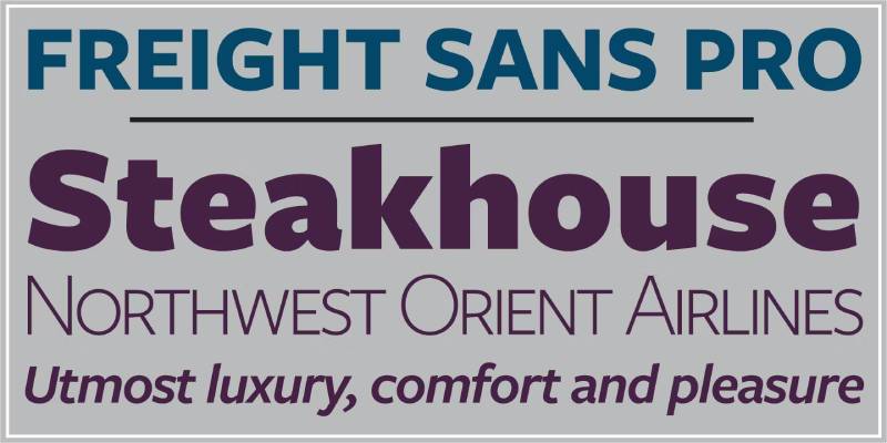
Phil’s Fonts’ versatile workhorse. Strong at text sizes with enough character for headlines.
Font Classification
Humanist sans-serif with extensive family. Multiple weights and widths available.
Primary Travel Use Cases
- Travel guide body text
- Editorial travel content
- Brand identity systems
- Multi-use travel materials
Versatile enough for complete brand systems.
Readability Characteristics
Excellent text performance. The humanist structure aids extended reading. Display use equally effective.
Visual Personality
Refined practicality. Freight Sans Pro balances personality with function. Distinctive without distraction.
Pairing Recommendations
Part of larger Freight family, pairs naturally with Freight Text. Works with geometric sans-serifs for contrast.
Availability & Licensing
Commercial font through GarageFonts/Phil’s Fonts. Available on Adobe Fonts with subscription. License required.
Droid Sans
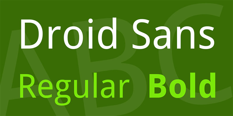
Android’s original system font. The screen optimization makes it reliable for travel app interfaces.
Font Classification
Humanist sans-serif optimized for mobile screens. Clear, open letterforms.
Primary Travel Use Cases
- Travel mobile applications
- Digital booking interfaces
- Screen-first travel content
- Cross-platform travel tools
Designed for digital environments from the start.
Readability Characteristics
Strong small-size legibility. Screen optimization ensures clarity on mobile devices. Open letterforms prevent confusion.
Visual Personality
Functional clarity. Droid Sans prioritizes communication over personality. Reliable rather than remarkable.
Pairing Recommendations
Works with bolder display fonts. The neutral nature provides stable support. Avoid pairing with fonts too similar in character.
Availability & Licensing
Free via Google Fonts. Open source license allows commercial use.
Avenir Next
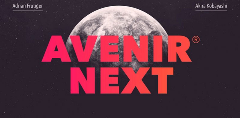
Adrian Frutiger’s classic updated for modern use. The geometric humanist balance creates exceptional versatility.
Font Classification
Geometric humanist sans-serif. Extensive weight range. Optimized OpenType features in Next version.
Primary Travel Use Cases
- Premium travel branding
- Corporate tourism materials
- Airline and hospitality identities
- Travel publication design
The refinement suits sophisticated travel brands.
Readability Characteristics
Superior across all sizes. The humanist touch softens geometric precision. Works equally well for headlines and body text.
Visual Personality
Refined sophistication. Avenir Next feels considered and intentional. Premium quality without pretension.
Pairing Recommendations
Works beautifully alone across weights. Pairs with serif fonts for traditional contrast. The versatility enables complete design systems.
Availability & Licensing
Commercial font. Available through Linotype and Adobe Fonts. License required for commercial use.
Canela
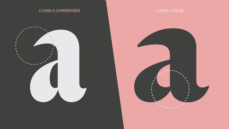
A unique blend of serif warmth and sans-serif simplicity. The unexpected combination creates memorable travel materials.
Font Classification
Serif/sans hybrid with distinctive character. Multiple weights with careful optical sizing.
Primary Travel Use Cases
- Boutique hotel branding
- Editorial travel features
- Luxury destination marketing
- Design-forward tourism content
The unique character suits brands wanting distinction.
Readability Characteristics
Text version optimized for body copy. Display version excels at large sizes. The hybrid nature maintains readability while adding interest.
Visual Personality
Unexpected elegance. Canela surprises without confusing. Contemporary refinement with historical resonance.
Pairing Recommendations
Works with clean sans-serifs. The distinctive nature benefits from simpler companions. Avoid other unusual fonts in combination.
Availability & Licensing
Commercial font by Commercial Type. Available through their website and select retailers. License required.
Poppins
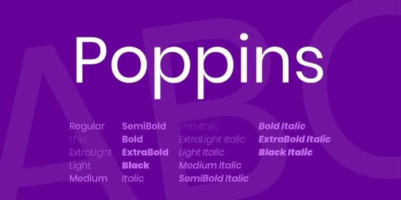
Geometric sans-serif from Indian Type Foundry. The friendly precision suits modern travel interfaces.
Font Classification
Geometric sans-serif with circular bowls. Full weight range available.
Primary Travel Use Cases
- Travel app interfaces
- Modern destination websites
- Social media travel content
- Startup travel brands
Google Fonts availability ensures easy web implementation.
Readability Characteristics
Excellent screen legibility. Geometric construction maintains clarity at all sizes. The open letterforms prevent visual confusion.
Visual Personality
Friendly modernity. Poppins feels approachable and contemporary. Energetic without being aggressive.
Pairing Recommendations
Works with serif fonts for contrast. Pairs well with other Google Fonts for web projects. The geometric nature enables clean, systematic design.
Availability & Licensing
Free via Google Fonts. Open source license allows commercial use.
Lato

Łukasz Dziedzic’s warm sans-serif. The semi-rounded details create friendly professionalism.
Font Classification
Humanist sans-serif with subtle warmth. Extensive weight and style options.
Primary Travel Use Cases
- Travel website design
- Booking platform interfaces
- Professional tourism materials
- Travel guide publications
Extremely popular for web due to Google Fonts availability.
Readability Characteristics
Exceptional across sizes. The humanist structure aids extended reading. Warm details improve screen rendering.
Visual Personality
Warm professionalism. Lato balances friendliness with credibility. Approachable without sacrificing authority.
Pairing Recommendations
Classic pairing with Playfair Display. Works with most display fonts. The neutral warmth adapts to various headline styles.
Availability & Licensing
Free via Google Fonts. Open source license allows commercial use.
Circular

Lineto’s geometric masterpiece. The circular forms create instant recognition for modern travel brands.
Font Classification
Geometric sans-serif with perfectly circular bowls. Multiple weights available.
Primary Travel Use Cases
- Tech-forward travel startups
- Modern booking platforms
- Contemporary destination branding
- Digital travel products
Used by major brands including Spotify and Airbnb.
Readability Characteristics
Strong at all sizes. The circular consistency aids legibility. Modern screen optimization ensures digital clarity.
Visual Personality
Contemporary precision. Circular feels designed for today’s interfaces. Fresh and intentional.
Pairing Recommendations
Works alone across weights. Pairs with serif fonts for warmth. The distinctive geometry provides strong foundation.
Availability & Licensing
Commercial font by Lineto. License required. Premium pricing reflects quality.
Archipelago
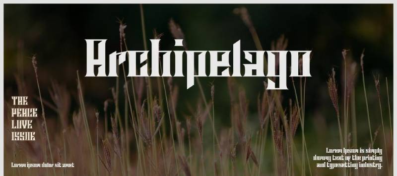
Created while traveling across islands. The condensed geometric sans with rounded corners embodies Swiss design sensibility.
Font Classification
Condensed geometric sans-serif with rounded corners. Available in Regular, Condensed, Thin, and Thin Condensed variants.
Primary Travel Use Cases
- Travel poster headlines
- Island destination branding
- Packaging for travel products
- Modern travel logos
The Swiss-style precision suits sophisticated travel materials.
Readability Characteristics
Headlines, posters, titles, and captions work best. The condensed nature packs text efficiently. Clean geometry ensures clarity at display sizes.
Visual Personality
Modern and simple. Archipelago captures island-hopping inspiration in geometric form. Contemporary without feeling cold.
Pairing Recommendations
Works with wider fonts for body text. The condensed-to-regular contrast creates natural hierarchy. Geometric companions maintain consistent styling.
Availability & Licensing
100% free font family by Vladimir Nikolic/Fenotype. Personal and commercial use permitted.
Hammock
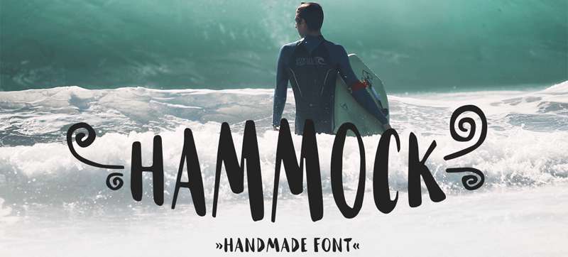
Free handmade font embodying travel passion. The crafted quality suits authentic adventure brands.
Font Classification
Handmade display font with natural imperfections. Authentic hand-drawn character.
Primary Travel Use Cases
- Surf and beach branding
- Product packaging for travel goods
- Adventure logo design
- Nature-focused tourism
Embodies passion for travelling, surfing, and nature.
Readability Characteristics
Display sizes required. Handmade texture needs space. Headlines and logos suit best.
Visual Personality
Authentic and passionate. Hammock feels made with love. The imperfections add charm rather than weakness.
Pairing Recommendations
Balance with clean fonts for information. The handmade quality provides personality while partners ensure readability.
Availability & Licensing
Free for personal and commercial use. Available on font sharing platforms.
Forever Summer
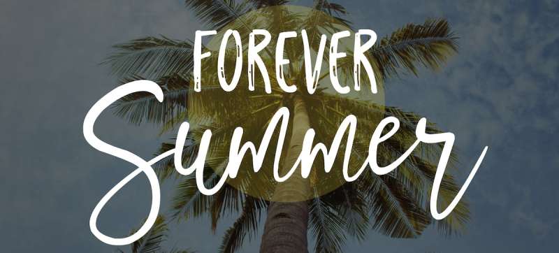
Fun-loving font duo coupling script with playful sans-serif. Marker brush strokes create eye-catching aesthetics.
Font Classification
Font duo featuring script and sans-serif options. Marker brush texture throughout.
Primary Travel Use Cases
- Summer vacation marketing
- Beach destination content
- Travel greeting cards
- Typography quotes for travel brands
Bonus ornaments enhance design options.
Readability Characteristics
Display applications preferred. The brush texture shows best at larger sizes. Script for accents; sans-serif for more readable applications.
Visual Personality
Fun and energetic. Forever Summer captures vacation excitement. Gritty texture prevents generic feeling.
Pairing Recommendations
Use both fonts together for complete design systems. The duo creates built-in unity while offering variety.
Availability & Licensing
Available on font marketplaces. Commercial license typically included with purchase. Ornament bonuses add value.
FAQ on The Best Travel Fonts
What makes a font good for travel design?
Travel fonts should evoke emotion and match your destination’s personality. Look for typefaces that suggest adventure, relaxation, or luxury depending on your project. Readability matters too, especially for travel blogs and booking interfaces.
Are free travel fonts good enough for professional projects?
Absolutely. Google Fonts offers excellent options like Open Sans, Poppins, and Lato. These work beautifully for travel websites and apps. Just verify the license covers commercial use before launching your project.
Which fonts work best for travel posters?
Bold display fonts like Coolvetica, Futura, and condensed sans-serifs create impact. Vintage scripts add nostalgia. The key is choosing typefaces that read clearly from a distance while capturing destination vibes.
What font pairing works for travel blogs?
Combine a distinctive headline font with a readable body font. Playfair Display with Lato is classic. Brandon Grotesque with Open Sans works too. Contrast between styles creates natural hierarchy without clashing.
Should I use script fonts for travel branding?
Script fonts add personality to travel logos and accent text. Use them sparingly. They struggle at small sizes and in body copy. Reserve scripts for headlines, logos, and decorative elements only.
What fonts do airlines and hotels use?
Major brands favor clean sans-serifs like Avenir, Circular, and DIN. These fonts communicate professionalism while remaining approachable. Luxury hotels often incorporate elegant serifs for warmth and sophistication.
How do I choose fonts for a travel app?
Prioritize screen readability. Fonts like Roboto, Open Sans, and Poppins render cleanly on mobile devices. Avoid decorative typefaces for interface elements. Save creative fonts for marketing screens and headers.
Can I mix vintage and modern travel fonts?
Yes, with intention. Pair a vintage display font with a clean modern sans-serif for body text. The contrast creates visual interest. Avoid combining multiple decorative fonts, as they’ll compete for attention.
What fonts suggest adventure and exploration?
Hand-drawn fonts like Traveler and Wonderful Wilderness feel adventurous. Bold condensed typefaces like Theridge work for outdoor brands. Stamp-style fonts like World Explorer channel passport aesthetics perfectly.
Where can I download quality travel fonts?
Google Fonts offers free options. Creative Market and Envato Elements provide premium choices. Adobe Fonts works with Creative Cloud subscriptions. Always check licensing terms before using fonts commercially.
Conclusion
Choosing the best travel fonts comes down to matching typeface personality with your project’s purpose. Adventure brands need different letterforms than luxury resorts.
Start with your audience. Family vacation content calls for friendly, rounded fonts like Poppins or Museo Sans. Upscale destination marketing demands refined options like Canela or Playfair Display.
Don’t overlook practical concerns. Check font licensing before any commercial travel project. Test readability across devices, especially for travel apps and booking platforms.
The fonts in this guide span free Google Fonts options to premium typefaces from Adobe Fonts and Creative Market. Mix display fonts for headlines with clean sans-serifs for body text.
Now pick a font and start designing. Your next travel project deserves typography that inspires wanderlust.

Renowned for his expertise in logo design and visual branding, Bogdan has developed a multitude of logos for various clients.
His skills extend to creating posters, vector illustrations, business cards, and brochures. Additionally, Bogdan's UI kits were featured on marketplaces like Visual Hierarchy and UI8.
He also wrote in the past years on sites like Design Your Way, WebDesignerDepot, WPDean, Designmodo, Speckyboy, Slider Revolution, and more.
- The Windsurf Logo History, Colors, Font, And Meaning - 10 October 2026
- How to Remove Background From Product Photos (No Photoshop) - 10 October 2026
- How Designers can Build a Stronger Online Creative Identity - 9 October 2026

Bogdan Sandu is a seasoned designer who has been designing websites since 2008. Renowned for his expertise in logo design and visual branding, Bogdan has developed a multitude of logos for various clients. His skills extend to creating posters, vector illustrations, business cards, and brochures. Additionally, Bogdan's UI kits were featured on marketplaces like Visual Hierarchy and UI8. He also wrote in the past years on sites like Design Your Way, WebDesignerDepot, WPDean, Designmodo, Speckyboy, Slider Revolution, and more.
You Might Also Like