Certain typefaces carry centuries of authority in their letterforms. Finding the best royal fonts means understanding which serif designs communicate elegance, prestige, and timeless sophistication.
These aren’t just decorative choices. The right regal typeface transforms wedding invitations, luxury branding, and formal documents into something memorable.
This guide covers 15 classic and modern options. You’ll learn each font’s history, key characteristics, and ideal applications.
From Trajan’s Roman inscriptions to Playfair Display’s contemporary refinement, we’ll explore typefaces that bring aristocratic presence to any design project.
The Best Royal Fonts
| Font Name | Historical Period | Classification & Style | Best Use Cases |
|---|---|---|---|
| Trajan | Roman era (114 AD inscription) | All-caps serif, inscriptional capitals | Titles, movie posters, monuments |
| Garamond | Renaissance (16th century) | Old-style serif, humanist proportions | Books, long-form text, publishing |
| Caslon | Baroque (1722) | Old-style serif, English transitional | Body text, historical documents |
| Didot | Neoclassical (1784) | Modern serif, high contrast, vertical stress | Fashion magazines, luxury branding |
| Bodoni | Neoclassical (1798) | Modern serif, extreme contrast, geometric | Headlines, high-end editorial design |
| Baskerville | Transitional (1757) | Transitional serif, refined proportions | Academic texts, professional documents |
| Cinzel | Modern (2012, classical inspiration) | Display serif, Roman capitals inspired | Digital headers, formal invitations |
| Playfair Display | Modern (2011, 18th century revival) | Transitional serif, high contrast | Web headlines, editorial design |
| Cormorant | Modern (2015, Garamond inspired) | Display serif, classical proportions | Screen display, elegant web typography |
| Libre Baskerville | Modern (2012, Baskerville based) | Transitional serif, optimized for web | Body text on screens, blogs |
| Minion Pro | Contemporary (1990) | Old-style serif, Renaissance influence | Books, annual reports, corporate materials |
| Goudy Old Style | Arts and Crafts (1915) | Old-style serif, calligraphic influence | Certificates, formal correspondence |
| Perpetua | Interwar period (1929) | Transitional serif, chisel-cut appearance | Fine printing, literary works |
| Mrs Eaves | Contemporary (1996, Baskerville revival) | Transitional serif, generous spacing | Book design, editorial typography |
| Adobe Jenson | Contemporary (1996, 15th century model) | Venetian old-style, humanist design | Premium publishing, fine books |
Trajan
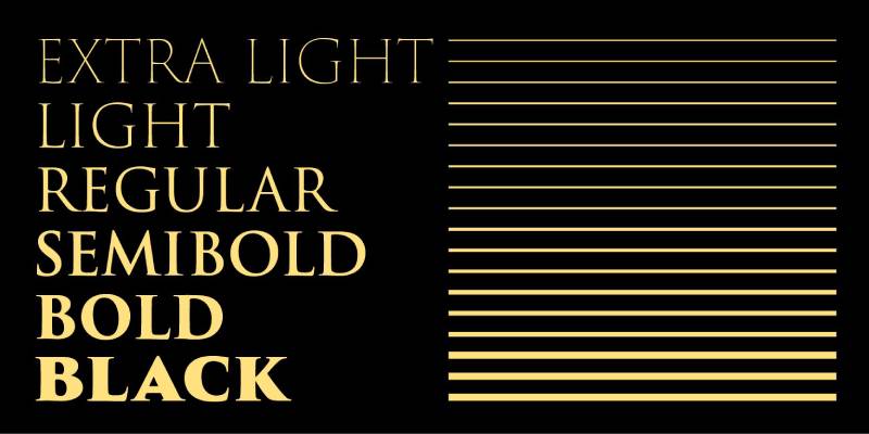
Trajan carries the authority of ancient Rome directly into modern design. This all-capitals typeface works brilliantly for luxury branding, film titles, and formal invitations where a commanding presence matters.
Key Characteristics
- Classification: Serif font, display
- Weights: Six styles (Extra Light through Bold)
- Distinctive features: All capitals with small caps in lowercase slots, crisp triangular serifs, elegant proportions
The letterforms feature refined wedge-shaped serifs. Stroke contrast remains moderate but noticeable. Each character carries substantial visual weight.
Historical or Design Context
Carol Twombly designed Trajan for Adobe in 1989. She based her work on the inscriptions carved at the base of Trajan’s Column in Rome, dating to the first century A.D.
Those Roman stone carvings represent the peak of classical letterforms. The letters were first written with a brush, then carved into stone. This gives Trajan its distinctive brush-influenced structure.
Robert Slimbach later expanded the family in 2012 as Trajan Pro 3, adding four additional weights plus Greek and Cyrillic support.
Best Use Cases
- Film posters and movie titles (it’s sometimes called the “movie font”)
- Luxury brand identities and high-end packaging design
- Certificate headers and formal documents
- Book covers, especially historical fiction
- Large-scale signage and architectural lettering
Trajan shines at display sizes. It’s not intended for body text.
Pairing Suggestions
Pair Trajan with Adobe Garamond or Minion Pro for body copy. The classical proportions complement each other well.
For a more contemporary feel, try it with a clean sans-serif font like Helvetica or Futura.
Technical Specifications
- Formats: OTF, TTF
- Language support: Latin, Greek, Cyrillic (Pro 3 version), Central European
- License: Commercial (Adobe Fonts subscription or individual purchase)
- Foundry: Adobe Originals
Garamond
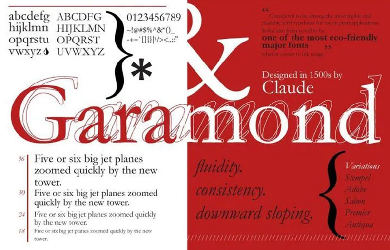
Garamond remains one of the most enduring and readable typefaces in existence. Its organic structure and warm character make it a staple for book publishing, academic texts, and elegant editorial work.
Key Characteristics
- Classification: Old-style serif
- Weights: Varies by version (Adobe Garamond offers Regular, Semibold, Bold with italics)
- Distinctive features: Low stroke contrast, diagonal stress in rounded letters, elegant proportions with relatively small x-height
The capital T features unique semi-parallel angled serifs. Lowercase letters have a slight slant that recalls handwriting.
Historical or Design Context
Claude Garamond created his original typefaces in Paris between 1530 and 1545. He’s considered one of the first independent punchcutters, separating type design from the printing business itself.
His work built on Venetian models by Aldus Manutius and Francesco Griffo. But Garamond was the first to craft letters specifically for the printing medium rather than imitating scribal handwriting.
Many modern “Garamond” fonts are actually based on Jean Jannon’s later designs from the 17th century. Adobe Garamond by Robert Slimbach (1989) returns closer to Garamond’s original work.
The typefaces he produced are considered the typographical highlight of the 16th century.
Best Use Cases
- Book interiors and long-form reading
- Academic and scholarly publications
- Magazine body text
- Elegant stationery and formal correspondence
- Fonts for newsletters requiring extended readability
Works beautifully at text sizes from 9-14 points.
Pairing Suggestions
Garamond pairs naturally with Futura or Gill Sans for visual hierarchy in headings.
For an all-serif approach, combine with Trajan or Didot for display text.
Technical Specifications
- Formats: OTF, TTF, web fonts
- Language support: Latin Extended, Central European
- License: Varies (Adobe Garamond is commercial; EB Garamond is open source)
- Notable versions: Adobe Garamond, EB Garamond, Garamond Premier Pro
Caslon
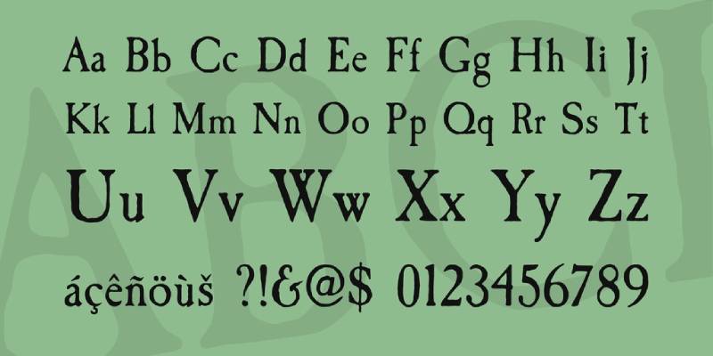
When in doubt, use Caslon. That old printer’s adage still holds weight. This English classic delivers reliability and understated elegance across nearly any project.
Key Characteristics
- Classification: Old-style serif, Baroque
- Weights: Varies by revival (Adobe Caslon offers Regular, Semibold, Bold)
- Distinctive features: Short ascenders and descenders, bracketed serifs, moderate contrast, slightly irregular texture
The capital A has a distinctive concave hollow at the apex. The G lacks a downward spur. The M has straight sides.
Historical or Design Context
William Caslon released his first Latin typefaces in 1722 in London. His work drew on Dutch Baroque types but surpassed them in grace and clarity.
The first printed version of the U.S. Declaration of Independence was set in Caslon. Benjamin Franklin favored it heavily and promoted its use throughout the American colonies.
Caslon’s types fell out of fashion briefly but were revived during the Arts and Crafts movement (1840-80) and have remained popular since.
Carol Twombly created Adobe Caslon in 1990 by studying Caslon’s specimen pages from 1734-1770.
Best Use Cases
- Book design and traditional publishing
- Legal and governmental documents
- Historical or period-accurate designs
- Print design requiring a classic feel
- Editorial layouts and magazines
The font maintains legibility across a wide range of sizes.
Pairing Suggestions
Caslon works with Franklin Gothic for contrast. It also complements Baskerville in all-serif layouts.
For headings, try Bodoni or a clean geometric sans.
Technical Specifications
- Formats: OTF, TTF, web fonts
- Language support: Latin Extended, Central European
- License: Adobe Caslon is commercial; Libre Caslon is open source
- Foundry: Various revivals from Adobe, Monotype, ITC
Didot
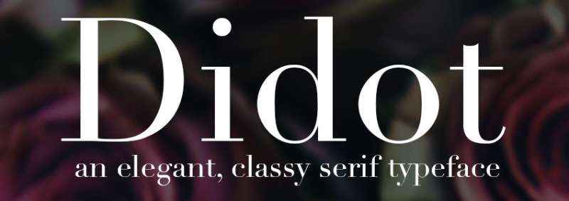
Didot embodies Neoclassical elegance at its finest. The extreme contrast between thick and thin strokes creates dramatic impact, making it a favorite for fashion magazines and luxury branding.
Key Characteristics
- Classification: Modern serif (Didone)
- Weights: Multiple (Linotype Didot offers 6 weights)
- Distinctive features: Extreme stroke contrast, flat unbracketed hairline serifs, vertical stress, condensed structure
The hairline strokes are exceptionally delicate. This demands quality printing or high-resolution screens.
Historical or Design Context
Firmin Didot developed this typeface in Paris between 1784 and 1811. His brother Pierre used the types in his acclaimed printing, including an 1818 edition of Voltaire’s La Henriade.
The design reflects Enlightenment ideals of reason and mathematical precision. Didot took John Baskerville’s experiments with contrast to an extreme conclusion.
The Didot family owned the most important print shop and font foundry in France around 1800. Firmin later became director of the Imperial Foundry under Napoleon.
Giambattista Bodoni developed similar ideas in Italy around the same time.
Best Use Cases
- Fashion magazine mastheads (Vogue has used Didot since 1955)
- Luxury brand logo design
- Editorial headlines and display text
- Poster design at large sizes
- High-end invitations and stationery
Not recommended for body text due to “dazzle” effect from high contrast.
Pairing Suggestions
Didot pairs beautifully with Futura or Avenir for supporting text.
For body copy, use a sturdy text face like Adobe Caslon or Georgia.
Technical Specifications
- Formats: OTF, TTF, web fonts
- Language support: Latin, Greek, Cyrillic (varies by version)
- License: Commercial (Linotype Didot, HTF Didot); Theano Didot is open source
- Notable versions: Linotype Didot (Adrian Frutiger), HTF Didot (Jonathan Hoefler)
Bodoni
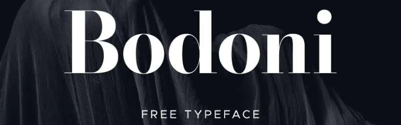
Bodoni represents the pinnacle of Modern serif design. Its geometric precision and dramatic contrast have made it synonymous with sophistication for over two centuries.
Key Characteristics
- Classification: Modern serif (Didone)
- Weights: Many versions offer extensive families (ITC Bodoni has optical sizes for 6, 12, and 72 point)
- Distinctive features: Extreme thick-thin contrast, flat unbracketed serifs, vertical axis, slightly condensed structure
Five identifying characteristics: high contrast between strokes, hairline serifs, vertical axis, horizontal stress, and small x-height.
Historical or Design Context
Giambattista Bodoni created this typeface in 1798 while working as printer to the Duke of Parma in Italy. The patronage allowed him access to the finest materials and processes.
Bodoni was influenced by Baskerville’s work and Firmin Didot’s developments. His 1818 Manuale Tipografico laid out four principles of type design: regularity, cleanness, good taste, and charm.
The extreme contrast was made possible by advances in printing technology, ink, and paper quality. Hairline serifs could finally survive the printing process.
His masterpiece was an edition of Homer’s Iliad.
Best Use Cases
- Fashion and luxury branding (Calvin Klein, Giorgio Armani)
- Magazine titles and editorial headlines
- Fonts for posters and large-format advertising
- Album covers (Nirvana used it)
- Upmarket corporate identity
Use optical sizes appropriate to your application. Display versions at small sizes cause eye strain.
Pairing Suggestions
Bodoni works well with Futura for a sophisticated classic-meets-modern look.
For body text, pair with Garamond or a Scotch Roman design.
Technical Specifications
- Formats: OTF, TTF, web fonts
- Language support: Latin Extended, Cyrillic (varies)
- License: Multiple versions available; some bundled with systems, commercial versions from various foundries
- Notable versions: Bauer Bodoni, ITC Bodoni, Bodoni MT, LTC Bodoni
Baskerville

Baskerville bridges old-style and modern serif design. Its refined elegance and excellent readability have made it a favorite for book publishing and academic work for over 250 years.
Key Characteristics
- Classification: Transitional serif
- Weights: Varies (Libre Baskerville offers Regular, Bold, Italic)
- Distinctive features: Higher contrast than old-style serifs, sharper tapered serifs, more vertical stress, open lowercase g with swashlike ear
The italic features distinctive flourishes on capitals, particularly the J with its center-bar and the ornate N.
Historical or Design Context
John Baskerville designed this typeface in Birmingham, England, in 1757. Punchcutter John Handy cut the metal type.
Baskerville’s goal was to perfect the styles of William Caslon. He increased stroke contrast, sharpened serifs, and shifted rounded letters to a more vertical axis.
He also innovated in printing technology itself. He developed smoother wove paper with James Whatman and created blacker, quicker-drying inks.
His 1763 Bible is considered his masterpiece. Benjamin Franklin admired his work and brought it to America, where it influenced federal government publishing.
Best Use Cases
- Book interiors, especially literature and poetry
- Academic publications and scholarly journals
- Corporate communications requiring dignity
- Web design (Libre Baskerville is optimized for screens)
- Government and institutional documents
Works well from 9-point body text up to display sizes.
Pairing Suggestions
Baskerville complements Helvetica or Trade Gothic for headings in modern layouts.
For an all-serif approach, pair display Baskerville with Caslon body text.
Technical Specifications
- Formats: OTF, TTF, web fonts
- Language support: Latin Extended
- License: Multiple versions; Libre Baskerville is open source (SIL OFL)
- Notable versions: Baskerville MT, Libre Baskerville, Mrs Eaves (Emigre, 1996)
Cinzel
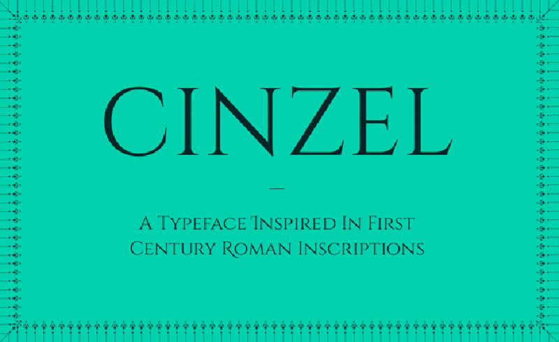
Cinzel brings first-century Roman inscriptions into the digital age. This all-caps typeface balances classical authority with contemporary refinement, making it perfect for titles that demand presence.
Key Characteristics
- Classification: Serif, display
- Weights: Six styles (Regular through Black), plus Decorative version with swashes
- Distinctive features: All capitals with small caps serving lowercase, classical proportions, refined serifs, generous letter spacing
The font includes 523 unique glyphs and 23 ligatures.
Historical or Design Context
Natanael Gama, a Portuguese type designer, created Cinzel in 2012. Google Fonts commissioned the project.
While inspired by ancient Roman inscriptions, Cinzel isn’t a historical revival. Gama merged classical elements with contemporary sensibilities. The result conveys the weight of history while feeling thoroughly modern.
A Decorative version adds elegant swashes for more ornamental applications.
Best Use Cases
- Fonts for wedding invitations and formal event materials
- Book cover design for historical or literary titles
- Luxury brand identities
- Website headers and hero sections
- Certificate and diploma design
Best at larger display sizes where the classical details show clearly.
Pairing Suggestions
Cinzel pairs excellently with clean sans-serifs like Open Sans, Roboto, or Montserrat.
For body text, Crimson Text or EB Garamond provide complementary classical character.
Technical Specifications
- Formats: TTF, OTF, web fonts
- Language support: 88 languages, Latin Extended
- License: SIL Open Font License (free for personal and commercial use)
- Available: Google Fonts, Adobe Fonts, Font Squirrel
Playfair Display
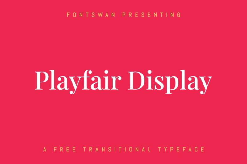
Playfair Display captures the elegance of Enlightenment-era typography for modern screens. Its high contrast and delicate hairlines make it a go-to choice for fashion, editorial, and luxury branding.
Key Characteristics
- Classification: Transitional serif (Didone-influenced)
- Weights: Variable font with Regular through Black, plus italics and small caps
- Distinctive features: High stroke contrast, extra-large x-height, short descenders, delicate hairlines
The design takes influence from Baskerville, William Martin’s Boydell Shakespeare types, and Scotch Roman designs.
Historical or Design Context
Danish type designer Claus Eggers Sørensen created Playfair Display in 2011. He designed it specifically for screen readability while honoring 18th-century aesthetics.
The name references the transitional period when broad-nib quills gave way to pointed steel pens. This technological shift allowed typographers to create increasingly delicate hairlines.
Playfair 2.2 (released 2024) expands the family with three variable axes: width, weight, and optical size.
Best Use Cases
- Fashion magazine headlines
- Fonts for graphic design with editorial flair
- Website hero text and headers
- Wedding stationery and invitations
- Restaurant menus and hospitality branding
Designed primarily for titling and headlines at larger sizes.
Pairing Suggestions
Playfair Display pairs naturally with Lato, Roboto, or Source Sans Pro for body text.
Georgia makes an excellent companion for web body copy since both share transitional roots.
Technical Specifications
- Formats: TTF, OTF, variable font, web fonts
- Language support: Latin, Cyrillic, Vietnamese
- License: SIL Open Font License (free for all uses)
- Available: Google Fonts, Adobe Fonts, Font Squirrel
Cormorant

Cormorant brings Renaissance elegance into the digital age with a fresh perspective. This free display font captures the spirit of Claude Garamond’s work while adding contemporary refinement perfect for wedding materials and luxury branding.
Key Characteristics
- Classification: Old-style serif (Garalde)
- Weights: Five weights (Light through Bold) across 9 visual styles, totaling 45 font files
- Distinctive features: High stroke contrast, sharp defined serifs, generous proportions, classical character shapes
Includes Roman, Italic, Small Caps, Unicase, and Upright Cursive variants. Supports Cyrillic, Latin, and Vietnamese scripts.
Historical or Design Context
Christian Thalmann, a Swiss type designer (also known as “Catharsis Fonts”), created Cormorant in 2015. Google Fonts commissioned the project.
While inspired by 16th-century Garamond designs, Thalmann didn’t simply copy historical sources. He drew all glyphs from scratch, blending Renaissance proportions with modern digital sensibilities.
The result feels both ancient and contemporary. Sharp serifs meet smooth curves in a way that honors tradition while serving current design needs.
Best Use Cases
- Wedding invitations and formal event stationery
- Luxury brand identities
- Book covers and literary publications
- Editorial headlines and pull quotes
- Restaurant menus and hospitality materials
Designed primarily for display use, though lighter weights work at text sizes.
Pairing Suggestions
Cormorant pairs well with geometric sans-serifs like Montserrat or Raleway.
For body text, consider Lora or Source Serif Pro.
Technical Specifications
- Formats: TTF, OTF, web fonts
- Language support: Latin Extended, Cyrillic, Vietnamese (88+ languages)
- License: SIL Open Font License (free for all uses)
- Available: Google Fonts, Adobe Fonts, Font Squirrel
Libre Baskerville
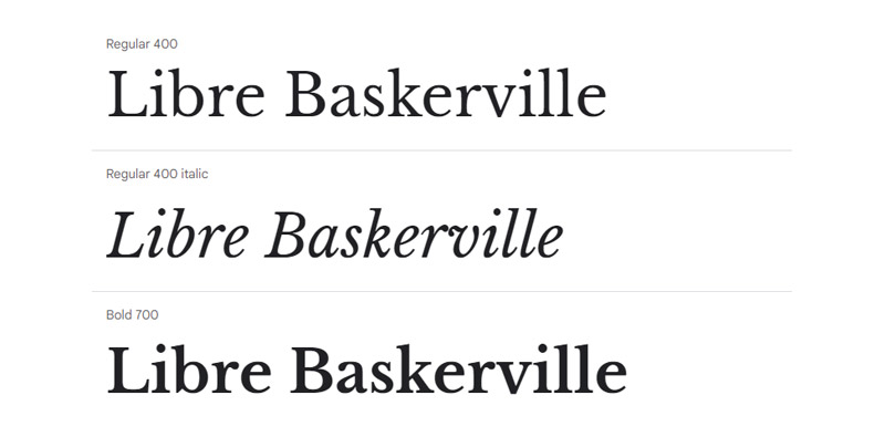
Libre Baskerville optimizes the classic Baskerville design specifically for screen readability. This free web font makes elegant serif typography accessible to any project without sacrificing the refinement expected from this historic style.
Key Characteristics
- Classification: Transitional serif
- Weights: Regular, Italic, Bold
- Distinctive features: Taller x-height than traditional Baskerville, wider counters, reduced stroke contrast for screen clarity
Contains 441 defined characters. Optimized for body text at 16px.
Historical or Design Context
Pablo Impallari and Rodrigo Fuenzalida designed Libre Baskerville in 2012. They based it on American Type Founders’ 1941 Baskerville specimens.
Rather than slavishly copying the original, Impallari made strategic modifications. He increased the x-height and widened counters. He reduced contrast to prevent thin strokes from disappearing on screens.
These changes preserve Baskerville’s dignified character while solving the practical problems of digital rendering.
Best Use Cases
- Website body text and blog content
- Digital publications and ebooks
- Online magazines and editorial sites
- Email newsletters
- Any screen-first reading application
Specifically designed for web typography at typical reading sizes.
Pairing Suggestions
Libre Baskerville works beautifully with Open Sans, Lato, or Roboto for supporting text.
For headlines, consider Playfair Display or Cinzel to maintain classical elegance.
Technical Specifications
- Formats: TTF, OTF, web fonts
- Language support: Western European, Central European, Turkish, Baltic
- License: SIL Open Font License (free for all uses)
- Available: Google Fonts, Font Squirrel, GitHub
Minion Pro
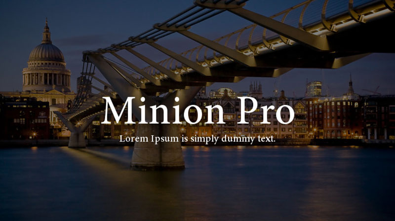
Minion Pro stands as one of the most complete and refined text typefaces ever created. Its combination of Renaissance beauty and digital sophistication makes it a workhorse for serious book design and professional publishing.
Key Characteristics
- Classification: Old-style serif
- Weights: 65 styles including Light, Regular, Medium, Semibold, Bold across multiple widths
- Distinctive features: Moderate x-height, big apertures, slight diagonal stress, symmetrical serifs with mild bracketing
Includes four optical sizes: Caption, Regular, Subhead, and Display. Each optimized for its intended use.
Historical or Design Context
Robert Slimbach designed Minion for Adobe in 1990. Cyrillic additions came in 1992, with the OpenType Pro version released in 2000.
Slimbach drew inspiration from late Renaissance typefaces without reviving any specific design. He described it as “an exercise in restraint” with “a simplified structure and moderate proportions.”
The design is slightly condensed, not for commercial reasons, but to achieve proper balance between letter size and ascender/descender proportions.
Minion 3, released more recently, nearly doubles the Latin glyph count and adds Armenian script support.
Best Use Cases
- Book interiors and long-form publishing
- Academic and scholarly texts
- Newspapers and magazine body copy
- Corporate communications and reports
- Signage and institutional materials
University of Cambridge, Leiden University, and the Smithsonian all use Minion in their branding.
Pairing Suggestions
Minion Pro pairs naturally with Myriad Pro for a cohesive Adobe family approach.
For more contrast, try it with Futura or Univers.
Technical Specifications
- Formats: OTF, TTF, web fonts
- Language support: Latin Extended, Greek, Cyrillic, Vietnamese, Armenian (Minion 3)
- License: Commercial (Adobe Fonts subscription or purchase)
- Foundry: Adobe Originals
Goudy Old Style

Goudy Old Style brings warm humanity to formal design. Its distinctive details and excellent readability have kept it popular for over a century, particularly in publishing and academic contexts.
Key Characteristics
- Classification: Old-style serif (Garalde)
- Weights: Regular, Italic, Bold, Bold Italic (varies by version)
- Distinctive features: Diamond-shaped dots on i, j, and punctuation; upward-curved ear on g; calligraphic Q tail; slightly canted hyphen
The design appears relatively light in color. Round curves and thin strokes give it gentle character.
Historical or Design Context
Frederic W. Goudy created this typeface for American Type Founders in 1915. It was his twenty-fifth typeface design and became an instant bestseller.
Goudy described the italic as influenced by 16th-century models that “had little or no inclination and yet preserved their italic character.”
ATF insisted on short descenders to allow tight leading, which annoyed Goudy. He sold the design for $1500 with no royalties, straining his relationship with the foundry.
The face proved so successful that ATF issued a 124-page specimen book for the series in 1927.
Best Use Cases
- Harper’s Magazine uses it as their text typeface
- Academic publications and university materials
- High-end magazines and literary journals
- Business cards and elegant stationery
- Event programs and formal documents
Several universities (Northwestern, Clemson, Emory) use it as their official typeface.
Pairing Suggestions
Goudy Old Style complements Futura or Gill Sans for headings.
For an all-serif approach, pair with Trajan for display text.
Technical Specifications
- Formats: OTF, TTF, web fonts
- Language support: Latin Extended
- License: Multiple versions available; bundled with Microsoft Office (URW++ version)
- Notable versions: LTC Goudy Oldstyle Pro (includes long/short descender options), Adobe, Monotype
Perpetua
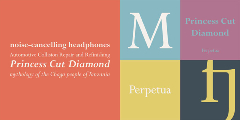
Perpetua brings the precision of stone carving into printed and digital type. Its crisp, sculptural forms create a distinctive presence that’s particularly effective for refined book work and architectural contexts.
Key Characteristics
- Classification: Transitional serif
- Weights: Regular, Italic, Bold, Bold Italic, plus Titling capitals
- Distinctive features: Light overall color, tight apertures, sharp incised quality, italic that resembles sloped roman more than cursive
The italic has flourishes in capitals but flat foot serifs on letters like h, m, and n, giving it an unusual character.
Historical or Design Context
Eric Gill, the English sculptor and stonemason, designed Perpetua for Monotype starting in 1925. Stanley Morison commissioned it.
The design took seven years to complete. Charles Malin cut the original punches in Paris, presenting them to Monotype as proof of quality.
Gill’s experience carving letters for monuments and memorials deeply influenced the design. Perpetua doesn’t follow any specific historical model but captures the crisp quality of incised lettering.
The typeface is named after the Christian martyr Vibia Perpetua.
Best Use Cases
- Fine book printing and limited editions
- Architectural and memorial inscriptions
- Elegant headings and cover design
- Poetry and literary publications
- Religious and ceremonial materials
Particularly popular in Britain for quality book work.
Pairing Suggestions
Perpetua works well with Gill Sans (also by Eric Gill) for a cohesive approach.
For contrast, try it with a sturdy sans like Trade Gothic.
Technical Specifications
- Formats: OTF, TTF, web fonts
- Language support: Latin Extended, Greek (Perpetua Greek)
- License: Commercial (Monotype)
- Foundry: Monotype
Mrs Eaves
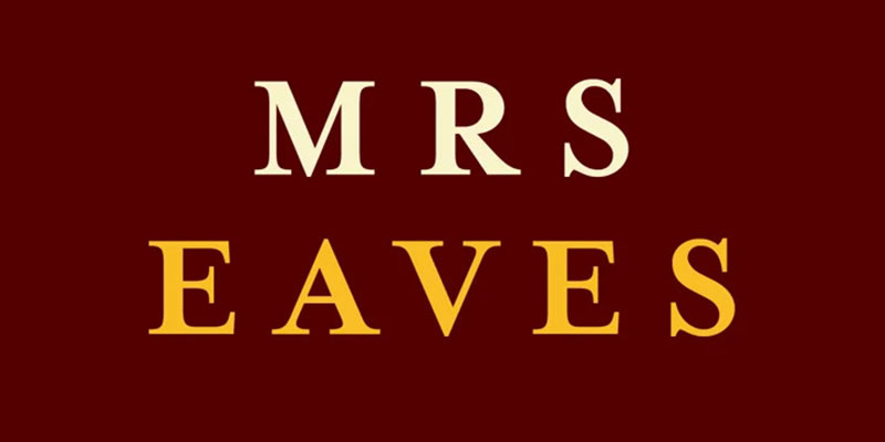
Mrs Eaves takes the stately Baskerville and softens it into something unexpectedly romantic. This modern classic has become one of the most popular display serifs, especially beloved for book covers and literary applications.
Key Characteristics
- Classification: Transitional serif
- Weights: Roman, Italic, Bold, Small Caps, Petite Caps, plus numerous ligature sets
- Distinctive features: Low x-height, heavier stroke weight than typical Baskerville revivals, wide lowercase proportions, generous letter spacing
Individual characters can look awkward in isolation (narrow W, wide L). Together, they create something uniquely appealing.
Historical or Design Context
Zuzana Licko designed Mrs Eaves for Emigre in 1996. It was her first attempt at a traditional typeface.
The name honors Sarah Eaves, John Baskerville’s housekeeper who later became his wife. She continued managing his printing business after his death, uncredited.
Licko studied original Baskerville books at the Bancroft Library in Berkeley. She based her design on printed specimens, not the type itself. This captured the heavier impression of lead type on paper.
Mrs Eaves outsold all other Emigre fonts by a huge margin. On platforms like MyFonts, it competes with classics like Helvetica and Bodoni.
Best Use Cases
- Book covers and dust jacket text
- Literary and poetry publications
- Restaurant menus and hospitality branding
- Wedding invitations and romantic stationery
- Short-form elegant text (not extended body copy)
The loose spacing works against dense text setting. Emigre released Mrs Eaves XL (2009) with tighter spacing for body text needs.
Pairing Suggestions
Mrs Eaves pairs well with its companion Mr Eaves (a sans-serif) for a complete family solution.
Also works with Futura or Avenir for modern contrast.
Technical Specifications
- Formats: OTF, TTF, web fonts
- Language support: Latin Extended, Central European (CE version)
- License: Commercial (Emigre, also available via Adobe Fonts)
- Foundry: Emigre
Adobe Jenson
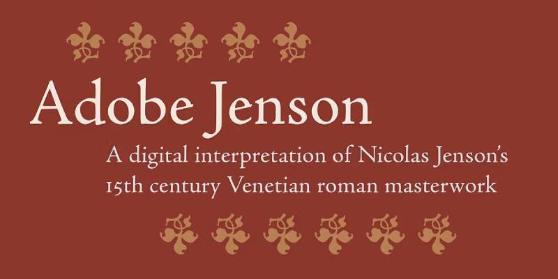
Adobe Jenson captures the very origins of Roman type design. Its organic structure and exceptional readability make it one of the finest choices for extended book text, combining 15th-century craftsmanship with modern digital precision.
Key Characteristics
- Classification: Venetian old-style serif (Humanist)
- Weights: Light, Regular, Semibold, Bold across four optical sizes (Caption, Regular, Subhead, Display)
- Distinctive features: Low x-height, organic letter shapes, calligraphic italic based on Arrighi, visible pen-derived structure
32 styles total. Includes ligatures, oldstyle figures, small caps, swashes (italic only), and extensive OpenType features.
Historical or Design Context
Robert Slimbach designed Adobe Jenson, first released in 1996 as a multiple master font. The OpenType Pro version followed.
Slimbach based the Roman styles on Nicolas Jenson’s typeface cut in Venice around 1470. The italics draw from Ludovico degli Arrighi’s calligraphic designs from fifty years later.
Jenson’s original type represented the first mature Roman typeface, moving away from Gothic blackletter toward the letterforms we recognize today. Slimbach’s revival preserves the organic quality and slight irregularities that make the original so readable.
The design uses sophisticated interpolation to create optical sizes. Caption versions are sturdier, display versions more refined.
Best Use Cases
- Book interiors, especially fiction, memoirs, and essays
- Fine press and limited edition publishing
- Academic and scholarly texts
- Literary journals and literary magazines
- Any extended reading application
Considered one of the most readable typefaces for long-form text.
Pairing Suggestions
Adobe Jenson pairs naturally with other Adobe Originals like Myriad or Cronos.
For headings, try Trajan or Charlemagne to maintain historical resonance.
Technical Specifications
- Formats: OTF, TTF, web fonts
- Language support: ISO-Adobe, Adobe CE (Central European)
- License: Commercial (Adobe Fonts subscription or purchase)
- Foundry: Adobe Originals
FAQ on The Best Royal Fonts
What makes a font look royal?
Royal fonts typically feature elegant serif designs with refined stroke contrast and classical proportions. They draw from historical typography like Roman inscriptions or Renaissance printing. Ornamental details, balanced letterforms, and sophisticated weight distribution create that aristocratic presence.
Which royal fonts are free to use?
Cinzel, Playfair Display, Cormorant, and Libre Baskerville are excellent free options. All are available on Google Fonts under open-source licenses. They work for both personal and commercial projects without licensing fees.
What font do luxury brands use?
Many luxury brands choose Didot or Bodoni for their high contrast and refined elegance. Vogue uses Didot. Giorgio Armani and Calvin Klein use Bodoni. Garamond and Trajan also appear frequently in premium branding.
Is Trajan a good royal font?
Yes. Trajan is based on ancient Roman inscriptions from Trajan’s Column. Its all-capitals design conveys authority and permanence. Film studios use it extensively for movie posters. It works best for headlines and display text.
What font is best for wedding invitations?
Playfair Display, Cormorant, and Mrs Eaves work beautifully for wedding invitations. They balance elegance with readability. Cinzel adds classical formality. Script fonts like Bickham Script complement these serifs for names and flourishes.
Can I use royal fonts for body text?
Some work better than others. Garamond, Baskerville, and Minion Pro excel at extended reading. High-contrast fonts like Didot and Bodoni cause eye strain in long passages. Match optical sizes to your intended use.
What’s the difference between Didot and Bodoni?
Both are modern serifs with extreme stroke contrast. Didot originated in France (1784), Bodoni in Italy (1798). Didot appears slightly lighter with sharper details. Bodoni feels more geometric. Their differences are subtle but noticeable.
Which royal font works best for logos?
Trajan and Cinzel deliver strong logo presence with their classical authority. Didot suits fashion and beauty brands. Garamond works for literary or academic identities. Consider your brand personality and target audience when choosing.
Are royal fonts good for web design?
Yes, with proper implementation. Playfair Display and Libre Baskerville are optimized for screens. Use web font formats and appropriate sizes. Pair display serifs with readable sans-serifs for body text to maintain accessibility.
How do I pair royal fonts with other typefaces?
Contrast creates interest. Pair ornate serifs like Playfair Display with clean sans-serifs like Lato or Roboto. Match historical serifs (Garamond, Caslon) with humanist sans-serifs. Avoid combining two decorative fonts together.
Conclusion
Choosing the best royal fonts comes down to matching historical character with practical needs. Each typeface in this guide brings distinct qualities to your design work.
Free options like Cinzel and Cormorant deliver premium aesthetics without licensing costs. Commercial faces like Minion Pro and Adobe Jenson offer unmatched refinement for professional publishing.
Consider your application carefully. High-contrast modern serifs suit fashion branding and certificates. Old-style designs like Garamond excel at extended reading.
Typography shapes perception. The right noble typeface elevates invitations, logos, and editorial layouts from ordinary to distinguished.
Start with one or two fonts from this collection. Master their characteristics before expanding your library.

Renowned for his expertise in logo design and visual branding, Bogdan has developed a multitude of logos for various clients.
His skills extend to creating posters, vector illustrations, business cards, and brochures. Additionally, Bogdan's UI kits were featured on marketplaces like Visual Hierarchy and UI8.
He also wrote in the past years on sites like Design Your Way, WebDesignerDepot, WPDean, Designmodo, Speckyboy, Slider Revolution, and more.
- The Windsurf Logo History, Colors, Font, And Meaning - 10 October 2026
- How to Remove Background From Product Photos (No Photoshop) - 10 October 2026
- How Designers can Build a Stronger Online Creative Identity - 9 October 2026

Bogdan Sandu is a seasoned designer who has been designing websites since 2008. Renowned for his expertise in logo design and visual branding, Bogdan has developed a multitude of logos for various clients. His skills extend to creating posters, vector illustrations, business cards, and brochures. Additionally, Bogdan's UI kits were featured on marketplaces like Visual Hierarchy and UI8. He also wrote in the past years on sites like Design Your Way, WebDesignerDepot, WPDean, Designmodo, Speckyboy, Slider Revolution, and more.
You Might Also Like