Walk past any vintage cinema and you’ll notice something beyond the glowing marquee. The letters themselves tell a story.
Movie theater fonts shaped how audiences experienced entertainment before they even bought tickets. From Art Deco geometric shapes to bold Victorian wood type, these letterforms weren’t just decoration. They were architecture, advertising, and atmosphere rolled into one visual punch.
This guide explores 15 classic theater fonts that defined cinema signage across generations. You’ll discover the history behind Broadway’s Jazz Age elegance, why Futura became Stanley Kubrick’s favorite, and how condensed grotesques maximized marquee space during Hollywood’s golden age.
Whether you’re designing retro posters or restoring a historic picture palace, understanding these typefaces means understanding cinema typography at its most theatrical.
Movie Theater Fonts
| Font Name | Style Classification | Primary Era | Best Use Case |
|---|---|---|---|
| Broadway | Decorative serif with inline details | 1920s-1930s | Musical theater posters, vintage marquees |
| Showcard Gothic | Bold geometric sans-serif | 1940s-1950s | Action films, attention-grabbing headlines |
| Playbill | Ultra-condensed display serif | 1870s-1890s | Western films, Victorian-era productions |
| Rosewood | Ornate decorative with shadow effects | 1870s-1900s | Western films, saloon scenes, vintage signage |
| Bebas Neue | Tall condensed sans-serif | 2000s-present | Modern action films, contemporary posters |
| Futura Bold | Geometric sans-serif with circular forms | 1927-present | Science fiction, minimalist designs |
| Impact | Ultra-bold condensed sans-serif | 1960s-present | High-impact titles, thriller films |
| Bodoni Poster | High-contrast serif with thick verticals | 1920s-1940s | Classic dramas, elegant film noir |
| Knockout | Condensed sans-serif family with multiple weights | 1990s-present | Sports films, boxing documentaries |
| Copperplate Gothic | Small-cap serif with engraved appearance | 1900s-1920s | Period dramas, prestigious award titles |
| Bank Gothic | Squared geometric sans-serif | 1930s-1950s | Science fiction, futuristic themes |
| Circus | Playful display with curved strokes | 1920s-1940s | Family films, carnival scenes, comedies |
| League Gothic | Condensed sans-serif with athletic feel | 2010s-present | Sports documentaries, team-based films |
| Varsity | Collegiate block lettering style | 1950s-1970s | High school films, sports team stories |
| Americana | Bold slab serif with sturdy construction | 1960s-present | Americana themes, patriotic films, retro designs |
Broadway
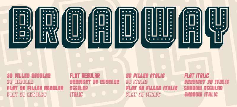
Morris Fuller Benton created this geometric display font in 1927 for ATF, capturing the glittering Jazz Age aesthetic. Sol Hess added lowercase letters in 1929.
Visual Characteristics
High contrast structure: thick vertical strokes meet thin horizontals. Geometric forms use perfect circles and sharp angles. Wide letterforms demand space, making every word feel substantial. Capital letters dominate even when lowercase exists.
Historical Context
Released during peak Art Deco influence when cinema palaces competed for attention on crowded streets. The Roaring Twenties demanded fonts that sparkled. Picture palaces adopted this style for marquee signage where electric lights would trace each bold stroke.
Typical Use Cases
- Theater marquees for billing performers and film titles
- Movie posters from the late 1920s
- Lobby cards and window displays
- Premium event announcements at large sizes
Notable Examples
Radio City Music Hall promotional materials used Broadway extensively. Paramount Theatre chains incorporated it into golden age branding. Broadway show posters borrowed this cinema font, creating visual crossover between film and stage.
Design Impact
Creates instant nostalgia for pre-war entertainment culture. High contrast ensures distance readability, making it practical for large-format signage. The condensed feel allows more text in limited marquee space while communicating sophistication without stuffiness.
Showcard Gothic

Jim Parkinson designed this theatrical powerhouse for Font Bureau, drawing from hand-lettered showcard models that lettering artists used in the 1920s and 1930s.
Visual Characteristics
Bold, compressed letterforms lean slightly forward, creating movement illusion. Sans-serif structure eliminates decorative elements. Tight spacing generates visual density. Every stroke carries substantial weight with uppercase-focused design.
Historical Context
Professional showcard writers hand-painted advertisements for storefronts, theaters, and circus promotions during the early 20th century. The tradition connected directly to carnival midways and vaudeville advertising where bold lettering competed with visual noise in crowded entertainment districts.
Typical Use Cases
- Concession stand menu boards and promotional displays
- Lobby posters for coming attractions
- Theater entrance signage for directional information
- Special event announcements and premiere invitations
Notable Examples
Independent theater chains throughout the Midwest adopted Showcard Gothic for consistent branding. Drive-in movie theaters painted this lettering on concession buildings. Retro-style cinema restorations frequently choose it to recapture authentic period aesthetics.
Design Impact
The cheerfully theatrical character prevents corporate coldness while maintaining professionalism. Condensed proportions make it economical for tight layouts. The forward lean creates kinetic energy that draws eyes across signage without requiring italics or underlining.
Playbill

Robert Harling designed Playbill in 1938, drawing from Victorian-era wood type specimens. This ultra-bold serif font channels Wild West aesthetics alongside theatrical poster traditions.
Visual Characteristics
Extreme vertical stress compresses each letter into narrow columns. Slab serifs create strong horizontal anchors. High contrast between thick verticals and thin horizontals produces distinctive texture. Rectangular letterforms maintain consistent geometry.
Historical Context
Wood type specimens from the 1800s inspired this design, particularly those for circus posters and theatrical handbills. Victorian-era printers carved these letterforms from maple blocks. Western saloons and music halls popularized similar styles that crossed from frontier America to urban entertainment venues by the early 20th century.
Typical Use Cases
- Classic movie theater posters, especially Westerns
- Ticket stubs and program covers
- Theater marquees for themed screenings
- Vintage cinema promotional materials
Notable Examples
Major studio Western films from the 1940s through 1960s frequently employed Playbill in title treatments. Independent theaters screening classic films use it for retrospective programming. The typeface appears in countless vintage poster design reproductions.
Design Impact
Instantly communicates heritage and entertainment tradition. Compressed letterforms maximize information density in small spaces. Distance legibility remains strong despite condensed proportions. Modern applications evoke specific historical periods with single-word usage.
Rosewood
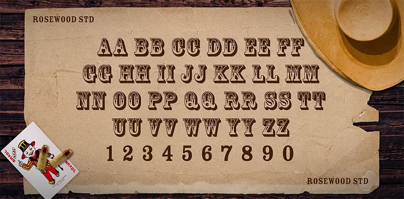
Adobe released their digital version in 1994, based on William Page’s 1859 wood type design called Clarendon Ornamented. Carol Twombly, Carl Crossgrove, and Kim Buker Chansler created the revival.
Visual Characteristics
Inline details create chromatic effects through shadow and highlight. Decorative serifs bracket each letterform with elaborate finishing strokes. The slab serif structure provides robust skeleton beneath ornamental surface with two-color printing potential.
Historical Context
Chromatic wood type reached peak popularity in 1870s American print culture. Printers overprinted multiple blocks in different colors to create flamboyant displays. Western expansion demanded eye-catching typography for saloons and entertainment venues as the Industrial Revolution’s mass production made elaborate type accessible.
Typical Use Cases
- Theater lobby framed announcements for special engagements
- Premium screenings and gala events
- Coming attraction displays for prestige productions
- Souvenir program cover typography
Notable Examples
Historic theater restoration projects favor Rosewood for authenticity in Victorian-era venues. Period film productions use it for title cards requiring 19th-century flavor. Modern cinema chains occasionally employ it for Western-themed or historical film promotions.
Design Impact
The ornamental quality communicates premium entertainment experiences. Chromatic potential allows creative color palette application. Historical specificity makes it valuable for accurate period representation, though decorative nature limits use to short display text only.
Bebas Neue
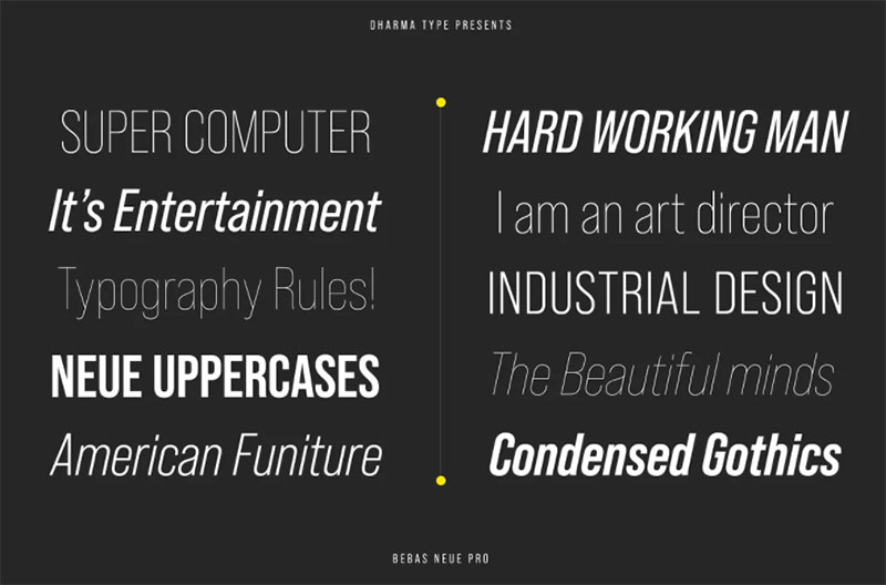
Ryoichi Tsunekawa designed Bebas Neue in 2010 as an evolution of his 2005 Bebas typeface. The open-source font gained massive popularity for its clean, modern impact.
Visual Characteristics
All-caps geometric sans-serif with near-perfect circular elements. Uniform stroke weight creates monolinear appearance. Tall x-height maximizes presence while maintaining compact footprint. Condensed proportions allow efficient horizontal space use with sharp, clean edges.
Historical Context
Draws from 1920s geometric modernism exemplified by Futurism and Bauhaus design. The simplification philosophy echoes early 20th-century functionalism. Digital distribution made it accessible worldwide immediately while social media and web design popularized it rapidly.
Typical Use Cases
- Contemporary cinema signage for modern aesthetics
- Digital lobby displays for showtimes
- Movie websites and social media graphics
- Streaming service interfaces
- Independent film festival branding
Notable Examples
Modern multiplex chains integrate Bebas Neue into wayfinding systems. Arthouse theaters use it to signal contemporary programming alongside classic films. Film festival posters and promotional materials across major events feature this typeface prominently.
Design Impact
Clean geometry reads perfectly on digital screens at any resolution. Minimalist design principles make it versatile across applications. All-caps construction forces hierarchical clarity through size variation only. Contemporary audiences recognize it as current and design-conscious.
Futura Bold
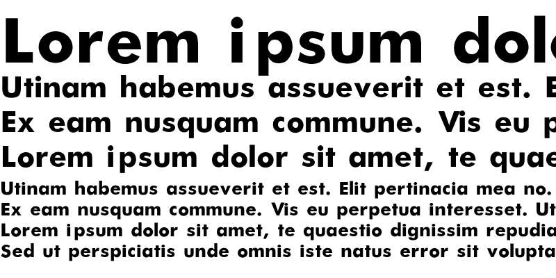
Paul Renner created Futura in 1927 for the Bauer Type Foundry. This geometric sans-serif became synonymous with modernist ideology and forward-thinking design.
Visual Characteristics
Perfect geometric shapes form the foundation through circles, triangles, and squares. Near-uniform stroke weight creates low-contrast, even texture. Tall ascenders reach above cap height. Single-story lowercase ‘a’ and ‘g’ maintain simplicity while capital letters follow classical Roman proportions.
Historical Context
Bauhaus principles influenced Renner’s vision though he wasn’t formally affiliated. Post-WWI modernism demanded typography reflecting progress rather than historical revival. Hollywood adopted Futura extensively from the 1930s onward. Stanley Kubrick used it in 2001: A Space Odyssey. Wes Anderson made it a signature element across multiple productions.
Typical Use Cases
- Movie posters from 1960s through 1980s for title treatments
- Theater marquees paired with Art Deco architecture
- Cinema lobby signage and exit signs
- Film credits in countless productions
Notable Examples
The Royal Tenenbaums uses Futura throughout production design. American Beauty, Gravity, and Interstellar feature it in marketing materials. Major theater chains including AMC incorporated Futura into 1970s-era branding. Independent cinemas continue choosing it for timeless modernist appeal.
Design Impact
Geometric clarity ensures readability across all sizes and applications. Timeless quality prevents dating despite nearly century-old origins. Visual hierarchy builds naturally through extensive weight range. Cultural associations with space exploration and progress align with cinema’s forward-looking nature.
Impact
Geoffrey Lee designed Impact in 1965 for Stephenson Blake foundry. This ultra-bold condensed sans-serif was built explicitly for maximum visual dominance.
Visual Characteristics
Extremely thick vertical strokes contrast with thinner horizontals. Compressed letterforms pack maximum weight into minimal width. High x-height reaches three-quarters up to cap height. Short ascenders and shorter descenders create compact profile with tight spacing and narrow apertures.
Historical Context
Mid-1960s advertising culture demanded increasingly bold typography for competitive visibility. Microsoft included Impact in Core Fonts for the Web package in 1996, installing it on millions of computers. This accessibility later made it the default choice for internet meme culture.
Typical Use Cases
- Theater marquees in 1970s and 1980s for horror and action films
- Newspaper advertisements for movie showtimes
- Promotional flyers and handbills
- Digital cinema advertising requiring aggressive visibility
Notable Examples
Horror film posters throughout the 1970s and 1980s featured Impact prominently. B-movie marketing materials relied heavily on its bold aesthetic. While internet meme culture co-opted Impact extensively, theatrical applications preceded this by decades.
Design Impact
Unmatched visibility ensures it dominates any layout. Compressed width allows lengthy titles in tight spaces. Industrial character communicates urgency and importance effectively. Overuse in certain contexts requires careful consideration of audience perception.
Bodoni Poster
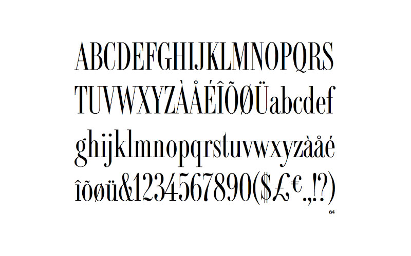
Giambattista Bodoni’s late 18th-century designs inspired numerous display variations. The poster weight maximizes dramatic contrast for large-format applications.
Visual Characteristics
Extreme contrast between hairline thin strokes and thick vertical stems. Geometric serifs create sharp horizontal terminations. Vertical stress maintains classical elegance despite theatrical proportions. Ball terminals on lowercase letters add distinctive decorative elements requiring large sizes for optimal legibility.
Historical Context
Original Bodoni designs from the 1790s influenced centuries of typography. Display weights emerged as printing technology allowed finer detail reproduction. Golden Age Hollywood embraced Bodoni variations for glamorous title treatments with neoclassical elegance communicating sophistication.
Typical Use Cases
- Classic Hollywood film posters for prestige productions
- Title cards in black-and-white cinema
- Theater programs for premiere events
- Romantic comedy and drama marketing materials
Notable Examples
MGM Studios’ classic film posters incorporated Bodoni weights extensively. Theatrical re-releases of vintage films often use Bodoni Poster to maintain period accuracy. Fashion and lifestyle magazines adopted similar aesthetics, creating crossover recognition between print and cinema.
Design Impact
Sophisticated elegance elevates perceived production value. High contrast creates dramatic visual interest even in static compositions. Neoclassical associations communicate artistry and cultural refinement. Modern applications evoke specific glamour era nostalgia effectively.
Knockout

Hoefler&Co. created this extensive sans-serif family in 1994 as a digital revival of headline grotesques. The system includes 32 width and weight combinations.
Visual Characteristics
Compressed proportions maximize information density in tight spaces. Industrial sans-serif character maintains clarity despite condensation. Multiple weight options from featherweight to full provide extraordinary flexibility. Uniform cap height across variations enables seamless mixing with sharp, clean execution.
Historical Context
Digital type design in the 1990s enabled sophisticated multi-weight families previously impractical in metal type. Knockout revived 19th-century condensed gothic traditions with contemporary precision. The comprehensive system served newspaper headline requirements, later expanding into broader design applications.
Typical Use Cases
- Modern theater digital marquee displays
- Wayfinding systems in contemporary multiplexes
- Film festival materials with complex layouts
- Marketing collateral requiring multiple emphasis levels
Notable Examples
Contemporary multiplex chains incorporate Knockout into corporate branding systems. Independent cinema websites use it for clean, modern information architecture. Film industry publications and trade materials frequently employ it for editorial layouts.
Design Impact
Exceptional space efficiency makes it practical for information-dense applications. Comprehensive weight system enables precise typographic hierarchy control. Industrial clarity maintains professionalism without coldness while digital optimization ensures crisp rendering across screens.
Copperplate Gothic
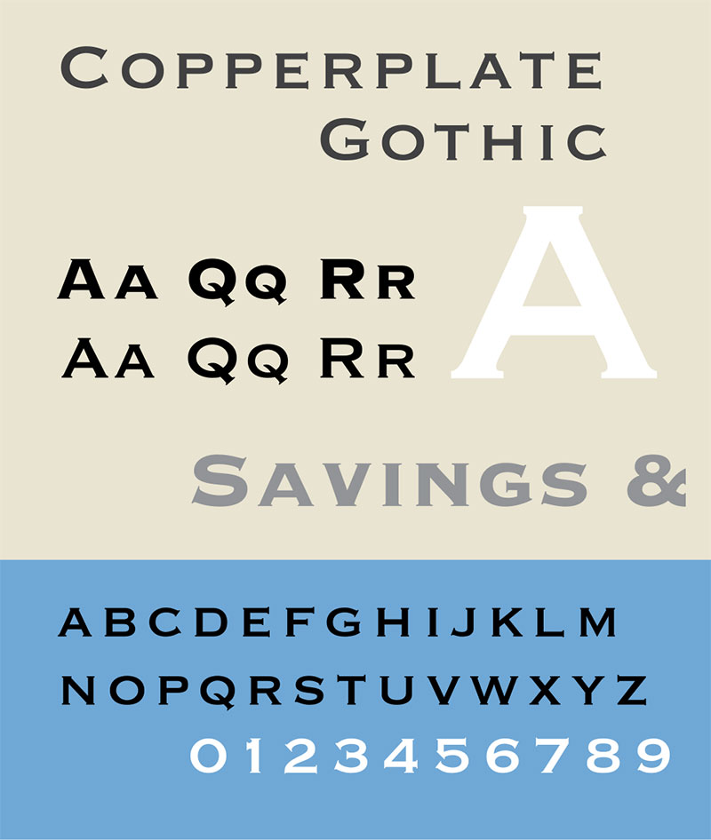
Frederic W. Goudy designed Copperplate Gothic in 1901 for American Type Founders. Despite “Gothic” in its name, it’s actually a flared sans-serif with small caps emphasis.
Visual Characteristics
Small caps structure eliminates traditional lowercase letters entirely. Subtle flaring at stroke terminals adds refinement to simple forms. Wide letterspacing creates dignified, authoritative presence. Proportions remain consistent across all weights with geometric simplicity carrying institutional gravitas.
Historical Context
Turn-of-century engraving practices influenced Copperplate Gothic’s development. Brass nameplates and architectural signage used similar letterforms. Early 20th-century theaters adopted it for permanent entrance signage and architectural inscriptions where formal character suited prestigious picture palace branding.
Typical Use Cases
- Theater building facades in carved stone and brass
- Permanent signage identifying auditoriums
- Membership cards and season ticket holder materials
- Anniversary commemorations and historical markers
Notable Examples
Historic theater buildings across America feature Copperplate Gothic in architectural inscriptions. Restoration projects maintain this typeface for historical accuracy. Upscale cinema chains use it for VIP lounges and premium seating area signage.
Design Impact
Authoritative character communicates establishment credibility and permanence. Small caps construction forces visual equality, creating democratic text hierarchy. Wide spacing ensures excellent distance legibility despite modest stroke weight. Institutional associations make it effective for formal applications.
Bank Gothic

Morris Fuller Benton created Bank Gothic in 1930 for ATF. This geometric sans-serif became iconic in science fiction and technology contexts.
Visual Characteristics
Squared geometric forms create mechanical, technological character. Consistent stroke weights maintain even texture. Tall, narrow proportions generate efficient vertical stacking. Sharp corners eliminate organic softness with uppercase-focused design communicating industrial precision.
Historical Context
Machine Age aesthetics in 1930s America influenced Bank Gothic’s geometric severity. The Depression era valued efficiency and modern streamlining. Science fiction cinema adopted it extensively from the 1950s onward while futuristic set design paired it with technological props and spacecraft environments.
Typical Use Cases
- Drive-in theaters in 1950s for modern branding
- Science fiction film posters
- Contemporary cinema digital interface design
- IMAX and premium large format branding
Notable Examples
Star Trek franchise materials extensively feature Bank Gothic variants. Countless science fiction film posters from the 1970s and 1980s used it for title treatments. Video game and tech company branding created strong cultural associations that cinema applications leverage.
Design Impact
Immediate science fiction and technology genre signaling occurs through Bank Gothic usage. Squared geometry reads clearly on digital displays. Mechanical character prevents warmth, appropriate for technological or futuristic content. Modern audiences instantly recognize its generic associations.
Circus
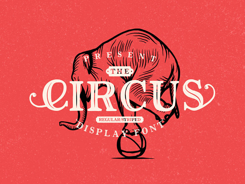
Display fonts labeled “Circus” typically channel Victorian carnival and entertainment poster traditions. Multiple foundries have created variations sharing this theatrical aesthetic.
Visual Characteristics
Decorative exuberance dominates through elaborate serifs and ornamental flourishes. Multiple stroke weights within single letters create visual complexity. Inline details, shadows, and dimensional effects add depth and movement. Capital letters receive maximum decorative treatment with playful character rejecting restraint entirely.
Historical Context
19th-century circus posters and carnival advertising demanded maximum visual excitement. Wood type manufacturers created increasingly elaborate display faces for competitive entertainment markets. Traveling shows needed typography that conveyed spectacle and wonder instantly, influencing permanent theater signage in entertainment districts.
Typical Use Cases
- Children’s film promotions and family entertainment marketing
- Comedy and animated feature posters
- Special event screenings and festival programming
- Concession stand promotional displays for candy and treats
Notable Examples
Classic Disney animation marketing materials frequently featured circus-inspired typography. Independent theaters screening family programming choose it for welcoming, fun branding. Halloween horror marathons and midnight movie series use circus fonts ironically for campy appeal.
Design Impact
Exuberant character immediately communicates fun and entertainment. Decorative complexity limits practical use to short display applications. Nostalgic associations with classic American entertainment culture provide emotional resonance. Modern usage requires careful balance between celebration and kitsch.
League Gothic
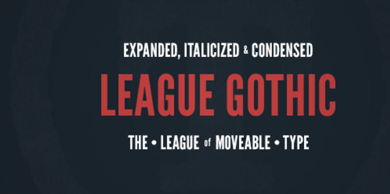
The League of Moveable Type released League Gothic in 2010 as an open-source revival of condensed gothic traditions. Caroline Hadilaksono and Micah Rich led the design.
Visual Characteristics
Tall, narrow proportions compress letterforms vertically. Sans-serif structure maintains clarity despite extreme condensation. Uniform stroke weight creates even texture. Sharp, clean edges ensure crisp rendering at all sizes. Open-source nature encourages widespread adoption and modification.
Historical Context
Digital type design’s open-source movement gained momentum in the late 2000s. League Gothic democratized access to professional-quality condensed display faces. Historical inspirations trace back to 19th-century poster typography while modern implementation suited digital displays and web design constraints.
Typical Use Cases
- Independent cinema websites and digital marketing materials
- Social media graphics for film promotions
- Streaming service interfaces for content tiles
- Mobile application design
- Film festival program listings
Notable Examples
Film festival websites extensively use League Gothic for program listings and event information. Independent theater digital signage systems employ it for compact showtimes displays. Documentary film marketing materials favor its straightforward, informational character.
Design Impact
Space efficiency makes it practical for information-dense layouts. Open-source license eliminates cost barriers for small organizations. Clean condensed proportions read clearly across digital and print applications. Contemporary audiences recognize it as current and accessible.
Varsity
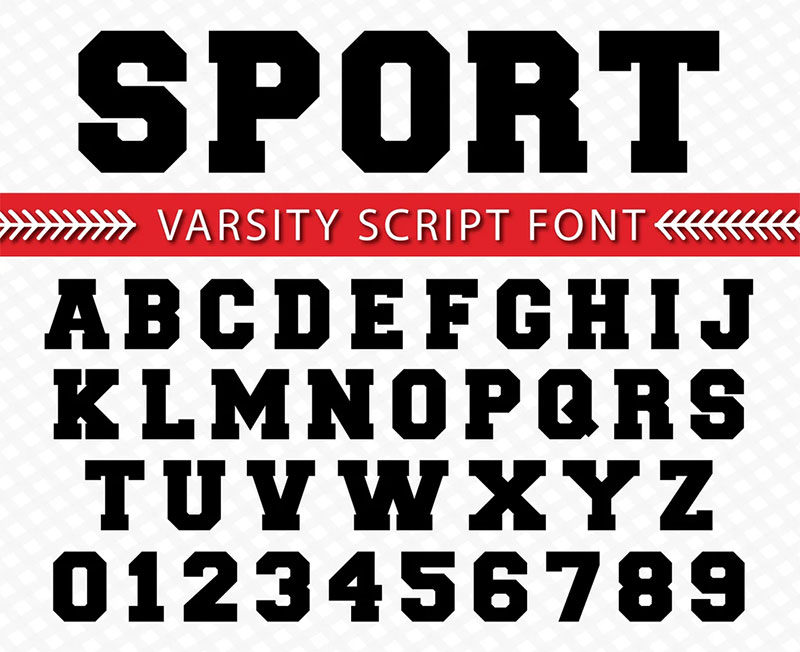
Athletic lettering traditions inspired Varsity-style fonts, channeling American college sports aesthetics. Multiple variations exist across different foundries.
Visual Characteristics
Bold block letters with dimensional shadows create depth and movement. Inline details suggest embroidery or applique construction. Rounded corners soften otherwise geometric forms. Shadow angles typically fall consistently at 45 degrees with cheerful, energetic character projecting youth and activity.
Historical Context
Letterman jackets and team uniforms established varsity lettering conventions in American high schools and colleges. These traditions peaked in mid-20th-century popular culture. Teen-oriented films and youth culture cinema adopted varsity aesthetics for marketing where wholesome, all-American character suited specific genres.
Typical Use Cases
- Coming-of-age film posters and teen comedy marketing
- Sports-themed cinema and biographical athlete films
- Retro-themed screening events and nostalgia programming
- Drive-in theater revival events
Notable Examples
High school reunion films and prom-centered comedies feature varsity-style typography prominently. Sports documentary marketing materials use it for authentic athletic associations. Themed screening events for classic teen films employ varsity fonts in promotional materials.
Design Impact
Energetic character instantly communicates youth and vitality. Athletic associations provide specific genre and demographic signaling. Dimensional construction adds visual interest and playfulness. Nostalgia for mid-century American culture drives modern usage patterns.
Americana

Multiple foundries have created fonts named Americana, typically referencing classic American wood type traditions. Richard Isbell’s 1965 design for ATF represents one prominent version.
Visual Characteristics
Bold slab serifs anchor robust letterforms with strong horizontal emphasis. Geometric construction maintains clarity despite decorative elements. Wide proportions create substantial presence and confident stance. Consistent stroke weight produces even texture throughout with patriotic character suggesting strength and heritage.
Historical Context
American wood type traditions from the 19th century inspired modern Americana designs. These roots connect directly to frontier expansion and emerging entertainment industries. Western genre films adopted Americana for authentic period flavor while associations with American heritage made it valuable for historical and patriotic content.
Typical Use Cases
- Western film posters and genre marketing
- Historical drama promotional materials
- Independence Day screening events
- Documentary films about American history
Notable Examples
Classic Western film title treatments from major studios employed Americana-style typography. Contemporary Western revivals use it to signal genre clearly to audiences. American history museum theaters and educational screenings choose Americana for institutional credibility.
Design Impact
Strong, confident character communicates reliability and heritage. Bold presence ensures visibility in large-format applications. Cultural associations with American identity provide powerful emotional resonance. Modern applications require sensitivity to patriotic symbolism interpretation.
FAQ on Movie Theater Fonts
What fonts were used on classic movie theater marquees?
Classic cinema marquees primarily featured Broadway, Futura Bold, and Impact during different eras. Art Deco theaters in the 1920s-1930s used geometric sans-serifs like Broadway with high contrast for backlit signage.
Mid-century modern theaters adopted Futura for streamlined aesthetics. Drive-in theaters in the 1950s-1960s favored condensed gothics and bold display faces that maximized limited marquee space while maintaining distance readability.
Why do movie posters use bold condensed fonts?
Bold condensed typography maximizes information density in limited poster space while ensuring visibility from considerable distances. Theatrical marketing demands immediate visual impact in crowded environments.
Compressed letterforms like Knockout and League Gothic allow lengthy film titles to fit standard poster dimensions. The aggressive weight ensures posters compete effectively against surrounding visual noise in theater lobbies and street-level displays.
What’s the difference between Broadway and Showcard Gothic?
Broadway features high-contrast geometric construction with perfect circles and sharp angles, reflecting Art Deco sophistication. Showcard Gothic uses hand-painted lettering aesthetics with consistent stroke weight and forward-leaning compression.
Broadway suits elegant theatrical presentations while Showcard Gothic channels carnival and vaudeville energy. Broadway originated from metal type foundries; Showcard Gothic evolved from showcard writers’ hand-lettering practices for store windows and entertainment advertising.
Can I use Futura for modern cinema branding?
Futura remains highly effective for contemporary cinema applications due to its timeless geometric clarity. Major directors including Wes Anderson and Stanley Kubrick established strong cinematic associations that modern audiences recognize.
The extensive weight family enables flexible visual hierarchy across signage, digital displays, and marketing materials. However, verify proper licensing for commercial theater use, as Futura requires purchase from foundries like Bauer Types or licensed font services.
What font does AMC Theatres use?
AMC Theatres has used various proprietary and customized typefaces throughout its branding evolution. Current corporate identity employs a custom sans-serif designed specifically for the chain.
Historical AMC locations from the 1970s-1980s frequently incorporated Futura and similar geometric sans-serifs. Modern multiplexes use branded typography optimized for digital signage and mobile applications, though specific font names remain proprietary corporate assets protected by trademark.
Are movie theater fonts free to download?
Some classic cinema fonts offer free versions while others require commercial licensing. Bebas Neue and League Gothic are open-source options suitable for theater projects.
Broadway, Futura, Impact, and Playbill typically require purchase for commercial use. Font licensing distinguishes between personal projects and commercial applications like actual theater signage or promotional materials. Always verify license terms before implementing fonts in business contexts.
What makes a font readable on marquee signs?
High contrast, bold weight, and condensed proportions ensure marquee readability. Thick strokes remain visible under various lighting conditions including backlit and neon installations.
Condensed letterforms maximize character count in limited horizontal space. Sans-serif designs typically outperform serif fonts for distance viewing, though high-contrast serifs like Bodoni Poster work effectively at large scales. Open apertures and generous x-height improve legibility from street level.
Which font looks most like vintage cinema posters?
Playbill and Rosewood most accurately replicate authentic vintage cinema poster aesthetics. Playbill channels Victorian wood type traditions popular in early 20th-century theatrical advertising.
Rosewood’s ornamental inline details recreate chromatic printing effects from 1870s-1890s entertainment posters. Broadway captures 1920s-1930s Art Deco glamour. For authentic period accuracy, match font selection to specific decade: Playbill for pre-1940s, Broadway for 1920s-1930s, Futura for mid-century modern.
How do I choose fonts for theater signage?
Prioritize distance readability, architectural context, and brand consistency. Modern multiplexes suit clean geometric sans-serifs like Bebas Neue or Knockout for contemporary aesthetics.
Historic theater restorations should match original architectural periods: Art Deco buildings pair with Broadway, Victorian picture palaces suit Playbill or Rosewood. Consider lighting conditions-backlit marquees require different contrast than painted facade lettering. Test font visibility from expected viewing distances before finalizing selections.
What’s the best font for movie poster design?
Impact, Bebas Neue, and Futura Bold dominate contemporary movie poster design for different aesthetic goals. Impact provides aggressive boldness for action and horror genres.
Bebas Neue offers modern minimalist appeal for independent and arthouse films. Futura Bold brings timeless sophistication for prestige productions. Genre conventions influence selection: westerns favor Playbill, science fiction suits Bank Gothic, family entertainment works with circus-style decorative faces. Pairing fonts creates hierarchy-combine bold display faces with clean sans-serif body copy.
Conclusion
Movie theater fonts transformed mere letterforms into powerful storytelling tools that shaped cinema culture for over a century. From Victorian wood type ornaments to streamline moderne geometry, each typeface carried the weight of its era’s aspirations and aesthetics.
The marquee lettering you’ve explored here represents more than historical curiosity. These display fonts continue influencing contemporary poster design, digital signage, and brand identity across entertainment industries.
Broadway’s Art Deco sophistication contrasts sharply with Impact’s industrial dominance. Futura’s geometric modernism stands apart from Playbill’s Western heritage. Understanding these distinctions lets you choose typography that authentically communicates period, genre, and mood.
Whether you’re restoring a picture palace, designing promotional materials, or simply appreciating cinema typography, these classic faces offer endless creative possibilities. The neon-lit marquee traditions live on wherever bold letterforms demand attention and celebrate the theatrical presentation of stories on screen.

Renowned for his expertise in logo design and visual branding, Bogdan has developed a multitude of logos for various clients.
His skills extend to creating posters, vector illustrations, business cards, and brochures. Additionally, Bogdan's UI kits were featured on marketplaces like Visual Hierarchy and UI8.
He also wrote in the past years on sites like Design Your Way, WebDesignerDepot, WPDean, Designmodo, Speckyboy, Slider Revolution, and more.
- Canva vs Photoshop: When Does Each Make Sense? - 12 September 2026
- Briefing 3D Game Animation: Rigs, Clip Lists and Engine Handoffs - 11 September 2026
- The Webflow Logo History, Colors, Font, And Meaning - 10 September 2026

Bogdan Sandu is a seasoned designer who has been designing websites since 2008. Renowned for his expertise in logo design and visual branding, Bogdan has developed a multitude of logos for various clients. His skills extend to creating posters, vector illustrations, business cards, and brochures. Additionally, Bogdan's UI kits were featured on marketplaces like Visual Hierarchy and UI8. He also wrote in the past years on sites like Design Your Way, WebDesignerDepot, WPDean, Designmodo, Speckyboy, Slider Revolution, and more.
You Might Also Like