Must-Try Art Nouveau fonts for Your Design Projects

The moment you lay eyes on Art Nouveau fonts, they cling to your imagination like ivy to an ancient stone wall. With their graceful curves and nature-inspired elegance, these typefaces whisk you back to an era where beauty meshed seamlessly with daily life.
As a connoisseur of typography, exploring the Art Nouveau style is akin to discovering a hidden trove of expressive design – each character dancing with organic lines, hinting at tales of yesteryear.
In this journey through the whirls and whorls of Nouveau typeface history, you’ll unveil a blend of ornamental delight and functional artistry.
Delve into the world where Alphonse Mucha’s artworks breathe life into letters, and graphic design software becomes the modern alchemist’s lair.
You will be equipped, not just with a list of fonts to download but with an understanding of how to pair these sculptural characters to narrate your own digital stories.
Ready for a typography transformation? Let’s sculpt your narratives with Nouveau finesse.
Popular Art Nouveau Fonts for Your Designs
There are numerous Art Nouveau typefaces now accessible online. While some are exact replicas and revivals of typefaces from that era, others, like ITC Benguiat and Virgin Roman, are original works that draw inspiration from the Art Nouveau movement.
Paris Metro Font by Studio K
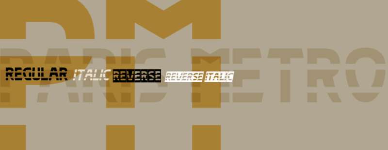
The Studio K-published Paris Metro Font Family was created by Keith Tricker. There are four styles and family package options in the Paris Metro.
The vintage Metro signs that served as the model for this design are among the most recognizable symbols of Paris. From station to station, the signs differ; some have simple block capitals, while others have the most exquisite Art Nouveau. This illustration falls somewhere in the middle. This ought to give any design or publishing endeavor a decidedly gallic flavor.
Pesha Typeface by Valentino Vergan
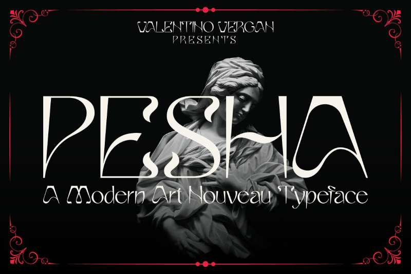
The early art nouveau type designs served as inspiration for the lovely and distinctive sans serif typeface Pesha. Pesha mixes several aesthetics from various time periods to produce a singular fusion of modern and retro. Elegant titles, magazines, logos, wedding invitations, headlines, editorials, and many other things work best with Pesha.
Soria Font by Dani
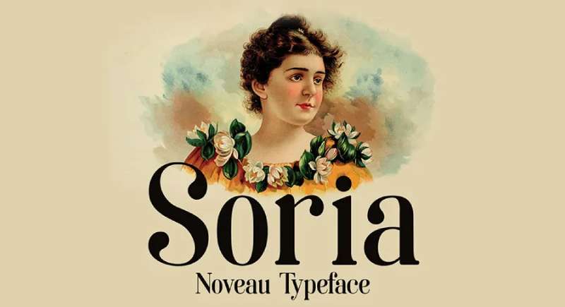
Free beautiful typeface Soria was created by Spanish designer Dani. The typeface draws strongly from both contemporary types like Didot, which has strong stroke contrasts, and the Art Nouveau movement. The font is suitable for books, packaging, editorial, advertising, branding, and display applications like logos, headlines, and titles.
Arnold Boecklin™ by Linotype
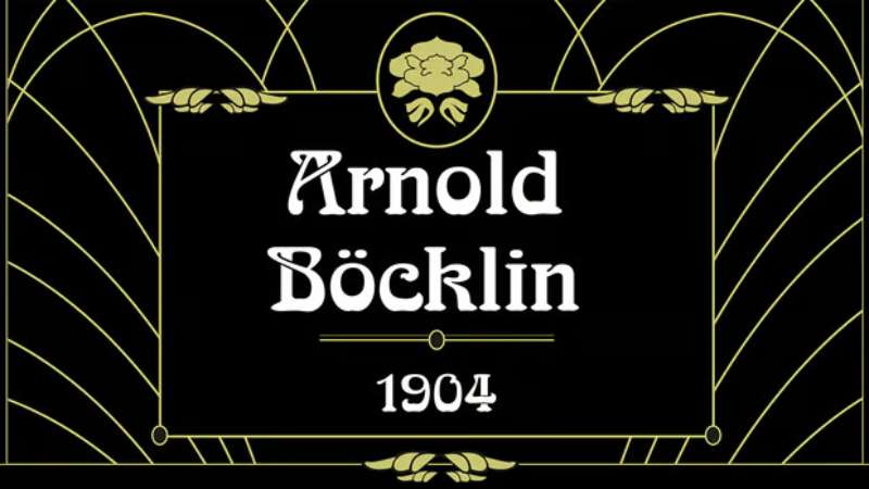
Otto Weisert created the Arnold Boecklin Font Family, which Linotype thereafter disseminated. 1 styles are found in Arnold Boecklin. The Otto Weisert type foundry released the Arnold Boecklin font in 1904. This typeface still bears traces of the Jugendstil’s flowery designs.
This kind of alphabet was primarily intended for greater point sizes, like on posters. Legibility was not as crucial as a decorative feel, and Arnold Boecklin played a significant role in Jugendstil book design. Currently the font is often employed to remind people of ‘the good old days’.
ITC Benguiat Font by Ed Benguiat
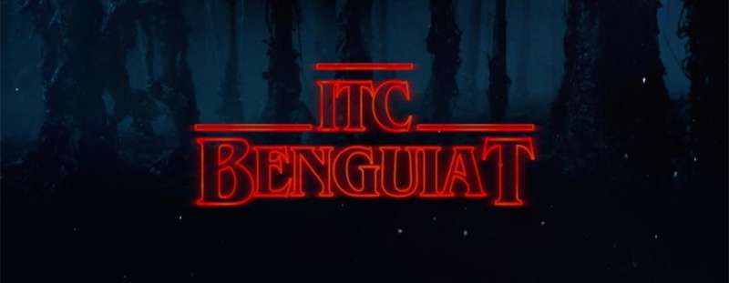
Ed Benguiat, a type designer and letterer from Brooklyn, created the serif typeface ITC Benguiat in 1977. The style, which incorporates high-waisted capitals and a huge x-height, was influenced by the Art Nouveau movement.
Anyone who grew up in the 1980s, like I did, will remember this font fondly because it was used on the book covers of the Choose Your Own Adventure series. Stranger Things, a Netflix series set in the 1980s, uses ITC Benguiat extensively in its branding in 2016. The family is offered in three weights, each with corresponding italics and condensed styles.
Viscamontha by Typealiens Design
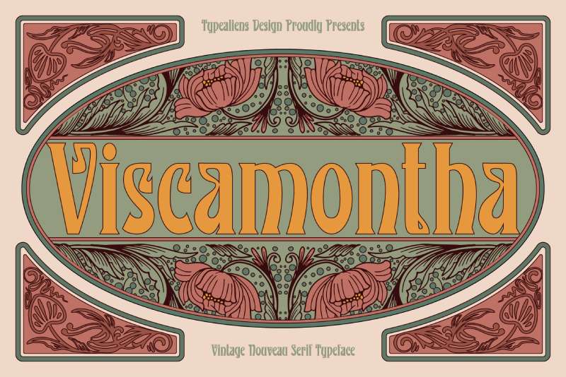
The exquisite serif font Viscamonta captures the spirit of modernist typography from the 1910s and is reminiscent of early Art Nouveau styles. It works great as a headline or as the focus of your projects. The typeface includes multilingual characters for Latin languages as well as upper- and lowercase letters.
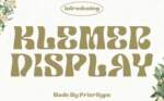
Melvca Font
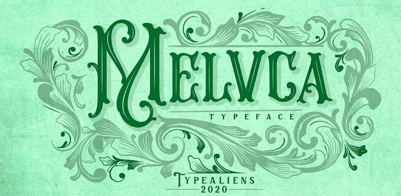
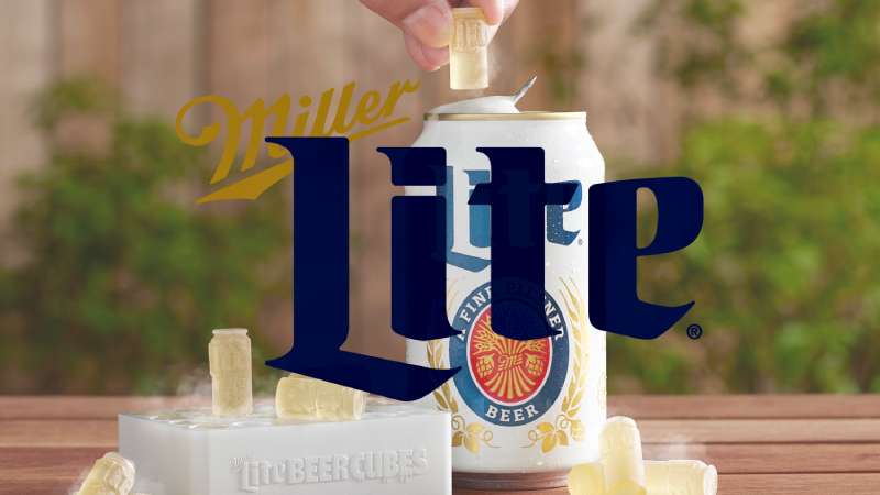
Melvca is a show font ideal for your floral and art nouveau creations. The font itself was influenced by the frequently used tendrils and leaves in nouveau art. For tasks involving branding, such as beer labels, badges, and liquor labels, this typeface would be an excellent option.
Solente Font
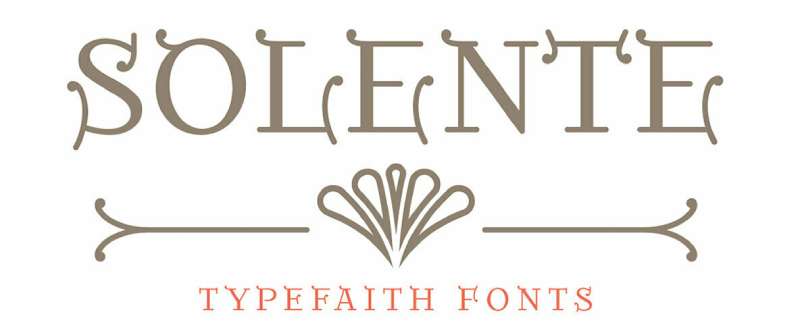
In a wonderful way, Solente blends the qualities of both clear geometry and the curves of Art Nouveau style letters. Solente features stylistic alternates for all capitals and an additional set of ligatures to substitute some combinations, making it a great option when you require a distinct display typeface.
Terra Cotta – Bohemian Display Font
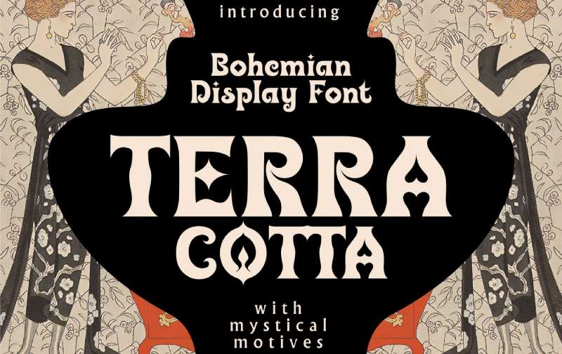
A contemporary display font with ethereal and Art Nouveau themes is called Terra Cotta. The font was designed in a bohemian style and has flourishes and peaks all over it. Tarot, mysticism, spirituality, fortune-telling, and handmade items are all appropriate themes for designs in terra cotta (ceramics, creating candles, soap making ect).
Cocotte Font
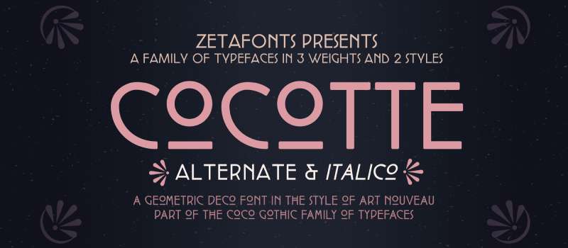
The early art nouveau graphic style served as the inspiration for the tiny caps sans serif display typeface Cocotte. It has a normal style that is influenced by arts and crafts and geometric Jugendstil, as well as an alternate style that is more reminiscent of French and Italian art nouveau.
It is available in three weights with corresponding italics. The 1900 and 1910 versions of the Coco Gothic typeface family are called Cocotte and Cocotte Alternates. Coco Gothic is a modern geometric sans serif typeface with slightly rounded corners that includes historical versions for each decade of the previous century.
It is an encyclopedia of styles that is ready to change and adapt to the mood of your text. With support for over forty European languages, the Greek and Cyrillic alphabets, and an extensive character set, Cocotte is available.
Kenjo Font
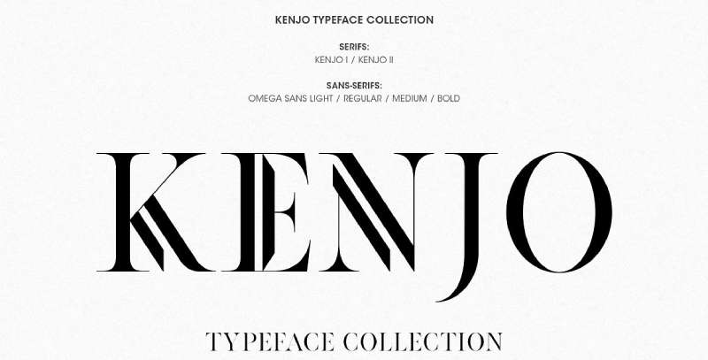
Whiplash lines are a defining design feature of the Art Nouveau style that set it apart from other designs. With adaptable, readable, and well-balanced Art Nouveau writing, Kenjo will give your creations a distinctive and original look. Only uppercase Kenjo fonts in four weights that can be used for Displays/Headings and Sub-Headings/Sub-Text are available in this collection.
Petit Jardin Font
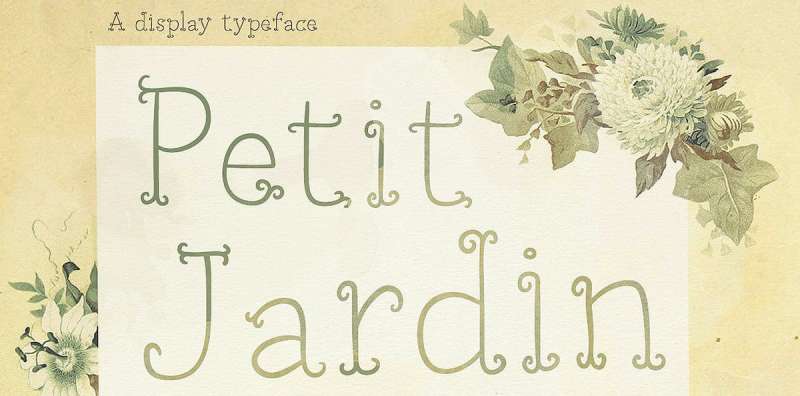
Petit Jardin is a curly serifed typeface that is thin and feminine. It has a cheerful, carefree attitude with a whiff of art nouveau style. Use it for invitations, posters, greeting cards, and pretty much any other design that aims for a quirky and entertaining appearance.
Glassure Typeface
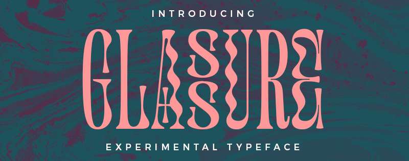
Glassure is an experimental typeface that is inspired by every pull and curl in the process of manufacturing glass sculptures, odd yet beautiful marble pattern, and a small touch of art nouveau and vintage style. To achieve the desired look, combine capital, lowercase, and other features.
This typeface has a special feature that enables you to create two-letter blocks by just choosing an even number of letters and turning on the “titling alternates” in the software you are using.
Pure Psychedelia Font
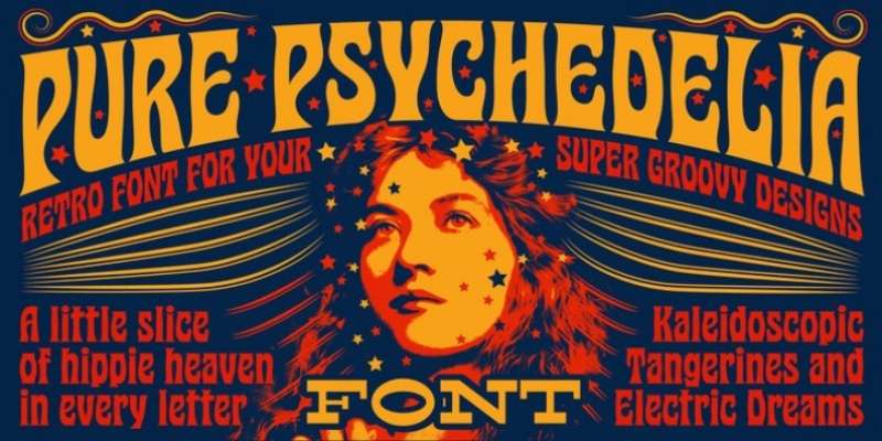
Mysterylab offers Pure Psychedelia for a versatile, timeless appearance that will undoubtedly bring any cool graphic idea to life. Dual strands of updated Art Nouveau and recreated 1960s psych run through this condensed typeface. This time-honored aesthetic mash-up is reduced to a heady blend of hippy-trippy lava lamp blobs and adamantly pointed end tapers, creating a distinctive vibe and a lively linear flow.
Pruistine Art Nouveau Display Typeface
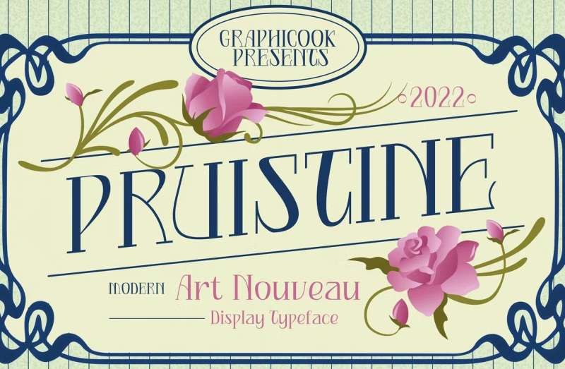
Your audience will undoubtedly be drawn to the delicately curved letterforms of the Pruistine Art Nouveau typeface, which will turn any project you are working on into a classic work of art. This font makes it simple to create lovely logotypes, book covers, or to find a sophisticated layout for your upcoming magazine.
Wallington Pro
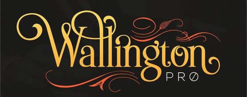
Wallington Pro’s beautiful flourishes and strong lines draw their stylistic cues from both Old English and Art Nouveau. It is attractive and simple to read.
It has more than 700 glyphs, and they are diverse enough to promote creative lettering and typography. This fully featured font has ten stylistic sets, hundreds of ligatures, contextual alternatives, catchphrases, uppercase and lowercase letters, digits, and punctuation.
Oracle Font
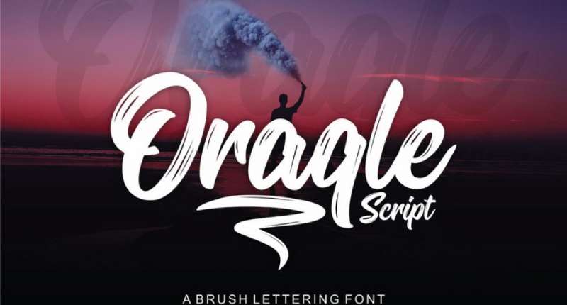
Oracle is a lovely retro font created using Nouveau typefaces as inspiration. In both its inline and regular editions, this typeface has a vintage appearance that resembles bold handwriting. This handcrafted vintage typeface can be used for any project that calls for an exceptional display font, including branding, posters, quotes, logos, music, movies, and invitations. It includes international characters, digits, punctuation, uppercase and lowercase Latin characters.
FAQ On Art Nouveau Fonts
What defines Art Nouveau fonts?
Art Nouveau fonts? Picture fluidity meets symmetry. They’re vintage typefaces, you know, inspired by the Art Nouveau movement. It’s about ornate lines, natural forms like leaves, and a dash of geometry.
A true blend of artistic flavor, wrapped around every glyph—you can spot ’em in old posters and architecture.
Where can I find Art Nouveau fonts for my project?
Look no further than specialized font foundries or digital typography platforms—think Adobe Fonts or Google Fonts. They’ve got collections straight out of the Belle Époque era.
And hey, some incredible indie designers on sites like Behance are crafting custom fonts with that Nouveau zest.
How do I recognize an authentic Art Nouveau typeface?
Authenticity? You’ve gotta keep an eye out for characteristic curves, flowing lines that mimic stems and flower petals—secular yet sophisticated. Also, sharp contrasts in stroke weight and those notorious ornamental details. Mucha’s works? Perfect study material.
Are Art Nouveau fonts free to use?
Here’s the thing—some are, some aren’t. It boils down to licensing. Always check if they’re under Creative Commons or require a license purchase. You don’t wanna get snagged for using a typeface that isn’t free for commercial use, right? A little homework never hurt anybody.
Can Art Nouveau fonts be used for digital design?
Absolutely. They’ve made the leap from print to pixel, gracefully. You can revamp a website or digital poster with them using graphic design software. Even web fonts have Nouveau options. Just make sure they’re readable on-screen—some flourishes can be tricky at small sizes.
What is the best way to pair Art Nouveau fonts in design?
Got an Art Nouveau font picked out? Pair it with something simple—like a sans serif. Let the Nouveau shine without competition, you know? Balance decorative elements with clean lines.
It’s like pairing wine with dinner; the bold flavors shine next to something a bit more understated.
How do I incorporate Art Nouveau fonts without overpowering my design?
Moderation is key—less is more. Use them for headers, brand names, maybe a special callout. Let ’em be the showstopper, while the rest of your text plays backup with simpler fonts. Think of it like seasoning; just the right amount brings the dish to life.
What are the common uses of Art Nouveau fonts today?
Today, Art Nouveau fonts strut their stuff in branding that yearns for elegance and nostalgia. They’re the go-to for packaging, upscale restaurant menus, and wedding invitations. They add that bespoke touch that makes a design feel personal and, dare I say, soulful.
How did the Art Nouveau movement influence typography?
The Art Nouveau movement? It was a revolution—tossed the stuffy corset of traditional design out the window. It brought in natural motifs, sinuous lines. Think typefaces that break the grid, dance off the page. It was a breath of fresh air that forever left its imprint on typography.
What should I consider when using Art Nouveau fonts in logo design?
Branding with Art Nouveau typography? Make sure your logo’s legibility is on point, even when scaled down. The ornate details should complement, not cloud your message.
And harmony—balance those intricate typefaces with simpler design elements to create a logo that’s both memorable and timeless.
Conclusion
And there we have it, the winding paths of Art Nouveau fonts coming to a close. Each swirl, each tendril-like curve, carries with it a scent of the past, don’t you think? But, importantly, they bridge to the now, leaving a mark on today’s digital canvases and print designs alike.
In this trek through the ornate wilderness of Nouveau typography—
- We touched on the historic roots, where Mucha’s legacy began,
- Navigated the practical realms of choosing typography for projects,
- And offered insights to use these vintage typefaces with a modern twist.
Remember, the key’s in the balance. Mix that contemporary vibe with the Nouveau spirit for something truly spectacular. Whether it’s for a branding gig, the headers of an invitation, or even the facelift of a website, let those natural motifs do their dance—subtly, with grace.
Until the next design adventure calls, may your creative choices be as bold and flowing as the Art Nouveau fonts we’ve celebrated. Keep weaving that aesthetic brilliance into the tapestry of your work.
If you liked this article about art nouveau fonts, you should check out this article about rock band fonts.
There are also similar articles discussing spring fonts, cracked fonts, royal fonts, and movie theater fonts.
And let’s not forget about articles on German fonts, travel fonts, movie poster fonts, and textured fonts.
Bogdan Sandu, a seasoned designer with 15 years of diverse experience, has been designing websites since 2008.
Renowned for his expertise in logo design and visual branding, Bogdan has developed a multitude of logos for various clients.
His skills extend to creating posters, vector illustrations, business cards, and brochures. Additionally, Bogdan's UI kits were featured on marketplaces like Visual Hierarchy and UI8.
Latest posts by Bogdan Sandu (see all)
- The Guinness Logo History, Colors, Font, And Meaning - 15 May 2024
- Vibrant Orange Color Palettes for Energetic Designs - 15 May 2024
- Publishing Elegance: What Font Does Time Magazine Use? - 15 May 2024