Pick up a German beer label or glance at a centuries-old manuscript, and you’ll encounter something unmistakable. German fonts carry five hundred years of typographic evolution, from Emperor Maximilian I’s 16th-century commission to today’s sleek industrial standards.
These aren’t just decorative choices.
They shaped how an entire culture communicated, sparked political disputes lasting over a century, and influenced the development of modern typography worldwide. Fraktur dominated German-speaking territories until 1941. DIN 1451 became the blueprint for functional sans-serif design globally.
This guide explores twenty essential German typefaces.
You’ll discover their historical origins, technical characteristics, and practical applications. Whether you’re designing a heritage brand, studying typographic history, or simply curious about blackletter scripts, you’ll understand what makes each font distinct and when to use it effectively.
German Fonts
| Font Name | Classification | Era / Origin | Primary Use Case |
|---|---|---|---|
| Fraktur | Blackletter / Gothic | 16th century | Historical texts, traditional German printing |
| Breitkopf Fraktur | Fraktur variant | 18th century (1793) | Music publishing, classical German literature |
| Schwabacher | Blackletter / Pre-Fraktur | 15th century | Early printed books, medieval documents |
| Tannenberg | Fraktur variant | Early 20th century | Display text, decorative titles |
| DIN 1451 | Sans-serif / Technical | 1931 (standardized) | Road signs, technical documentation, transport |
| Bauhaus | Geometric sans-serif | 1925-1975 (Bauhaus movement) | Modernist design, architectural typography |
| Fette Fraktur | Bold Fraktur | 19th century | Headlines, emphasis in traditional printing |
| Normalfraktur | Standard Fraktur | 19th-20th century | Standard body text in German publications |
| Alte Schwabacher | Historical Schwabacher | 15th-16th century | Incunabula, early Renaissance texts |
| Germania One | Display / Blackletter-inspired | Modern (digital era) | Web typography, retro German branding |
| Berlisch | Sans-serif / Urban | Contemporary | City branding, modern German identity |
| HOCHLAND | Display / Decorative | Contemporary | Branding, alpine/regional themes |
| Gunterz | Display / Gothic-inspired | Modern | Decorative headings, vintage aesthetics |
| BAHN Pro | Corporate sans-serif | 2000s (Deutsche Bahn) | Railway signage, transport infrastructure |
| Hennigar | Display / Handwritten | Contemporary | Casual branding, informal communication |
| Fritz | Geometric sans-serif | Contemporary | Modern branding, digital interfaces |
| Munich | Sans-serif / Urban | Modern | City branding, Bavarian identity |
| Helmswald Post | Serif / Vintage | Historical revival | Postal themes, heritage projects |
| Königreich | Display / Regal | Contemporary | Luxury branding, royal/imperial themes |
| TT Norms Pro | Neo-grotesque sans-serif | 2016 (TypeType foundry) | Corporate identity, user interfaces, multi-language support |
German Font Collection
Fraktur

German blackletter typeface derived from calligraphic handwriting, commissioned by Emperor Maximilian I in 1515.
The letterforms showcase broken, fractured strokes rather than flowing curves.
Key Characteristics
- Broken letterforms: Left side of lowercase ‘o’ features angular stroke, right side maintains rounded form
- Character set: Includes Eszett (ß), long s (ſ), r rotunda variant, and historical ligatures
- Stroke treatment: 45-degree pen angle creates visible breaks between beginning and ending strokes
Context & Relevance
Fraktur dominated German-speaking regions from the 16th century until 1941 when the Nazi government banned it.
The font remained the standard for German texts throughout Scandinavia, Estonia, Latvia, and Central Europe for nearly four centuries.
Modern usage persists primarily in decorative applications like newspaper mastheads and beer advertisements.
Implementation/Usage
Best applied for historical authenticity, traditional branding, or cultural references to German heritage.
Works particularly well for large display sizes where intricate details remain visible.
The typeface requires careful kerning due to complex ligature systems and varying stroke weights.
Related Concepts
- Schwabacher: Earlier blackletter style with rounder forms that Fraktur eventually replaced
- Normalfraktur: Standardized Fraktur variant used widely in early 20th century German printing
- Textura: Medieval blackletter predecessor featuring even denser, more angular letterforms
- Antiqua: Roman-style typeface that competed with Fraktur in the Antiqua-Fraktur dispute
Breitkopf Fraktur

18th-century refinement of traditional Fraktur designed by Johann Gottlob Immanuel Breitkopf in 1750, representing a return to calligraphic roots.
Key Characteristics
- Design origin: Based on Neudörffer-Andreä Fraktur discovered in Dürer’s Unterweysung print
- Stroke angle: Maintains consistent 45-degree pen angle throughout letterforms
- Visual density: Darker and more condensed than earlier Luther-Fraktur designs
Context & Relevance
Became the most widely used Fraktur typeface in German-speaking territories during the 18th and 19th centuries.
Albert Kapr described it as “the font that comes closest to the general conception of Fraktur.”
Revival by Klingspor foundry in 1899 sparked renewed popularity lasting into the 20th century.
Implementation/Usage
Functions exceptionally well for body text in historical reproductions and period-appropriate publications.
Multiple foundries (Klingspor, Berthold, Ludwig & Mayer, Stempel) cast versions with slight variations.
Digital versions from Linotype, URW, and Elsner+Flake maintain historical accuracy while adding modern character support.
Related Concepts
- Neudörffer-Andreä Fraktur: Historical source typeface that inspired Breitkopf’s design
- Luther-Fraktur: Earlier Fraktur variant with lighter weight and wider letter spacing
- Unger Fraktur: Contemporary competitor developed by Johann Friedrich Unger
- Typography: The craft Breitkopf advanced through systematic type design principles
Schwabacher

Blackletter typeface that evolved from Gothic Textualis under Italian Humanist influence during the 15th century.
Named after the German town of Schwabach near Nuremberg.
Key Characteristics
- Rounded letterforms: Both sides of lowercase ‘o’ feature rounded strokes that join at angles
- Distinctive characters: Lowercase ‘g’ and capital ‘H’ possess particularly recognizable forms
- Stroke treatment: More cursive and handwritten appearance compared to angular Textura
Context & Relevance
Served as Germany’s most common typeface from approximately 1472 until Fraktur displaced it around 1530.
Martin Luther used Schwabacher for his 1534 Bible translation.
Continued functioning as emphasis typeface alongside Fraktur, similar to how italic serves roman type.
Implementation/Usage
Works best for secondary text, emphasis, or historical references to early German printing.
The rounded, less formal character suits applications requiring warmth while maintaining Germanic aesthetics.
Pairs effectively with Fraktur for creating typographic hierarchy in traditional German layouts.
Related Concepts
- Textura: Earlier Gothic script that Schwabacher evolved from
- Rotunda: Italian blackletter variant sharing Schwabacher’s rounded qualities
- Bastarda: Related cursive blackletter sometimes considered synonymous with Schwabacher
- Alte Schwabacher: Historical revival version preserving original design characteristics
Tannenberg
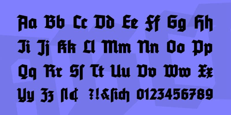
Modernized blackletter typeface developed 1933-1935 by Erich Meyer at D. Stempel AG, following Jan Tschichold’s “New Typography” principles.
Key Characteristics
- Geometric construction: Applied sans serif design methods to traditional blackletter forms
- Weight range: Five styles including schmal (condensed), halbfett (semi-bold), fett (bold), and licht (light)
- Simplified strokes: Stripped decorative elements for cleaner, more industrial appearance
Context & Relevance
Named after the 1914 Battle of Tannenberg where German forces stopped Russian advancement.
Became highly popular in Nazi Germany, used for official stamps, publications, and Deutsche Reichsbahn station signage from 1935-1941.
Part of “Schaftstiefel Grotesk” (jackboot grotesque) movement that modernized traditional blackletter.
Implementation/Usage
Historical significance limits contemporary usage to educational or archival contexts.
The typeface demonstrates tension between traditional German typography and modernist simplification.
Digital revivals by Gerhard Helzel and Delbanco preserve five historical weights plus decorated capitals.
Related Concepts
- Element: Contemporary geometric blackletter with similar modernist approach
- Deutschland: Related “jackboot grotesque” originally proposed as Tannenberg’s name
- National: 1933 geometric blackletter emphasizing nationalist aesthetics
- Graphic design movements: Context for understanding modernist blackletter evolution
DIN 1451

Sans-serif industrial typeface standardized by Deutsches Institut für Normung in 1931 for technical and administrative applications.
Origins trace to 1905 Prussian state railways lettering specifications.
Key Characteristics
- Stroke uniformity: Consistent monoweight strokes throughout all characters
- Geometric construction: Grid-based design enabling precise manual reproduction
- Three widths: Mittelschrift (medium), Engschrift (condensed), Breitschrift (extended, discontinued 1980s)
Context & Relevance
Became Germany’s official typeface for traffic signs, administrative documents, and technical drawings.
The design prioritizes legibility at distance and ease of reproduction over aesthetic refinement.
Ludwig Goller supervised 1931 standardization; Adolf Gropp created 1980 revision with more open numerals.
Implementation/Usage
Essential for German road signage, wayfinding systems, and technical documentation.
Influenced development of iconic fonts like Helvetica through emphasis on clarity and functional design.
Modern interpretations (FF DIN, DIN Next, Bahnschrift) expand original for contemporary digital applications.
Related Concepts
- FF DIN: Albert-Jan Pool’s 1995 expansion adding multiple weights for commercial use
- Bahnschrift: Microsoft’s 2016 variable font revival for Windows interface design
- Futura: Geometric sans serif sharing similar modernist functional philosophy
- Swiss design: Movement valuing DIN’s systematic, objective approach
Bauhaus

Typeface family based on Herbert Bayer’s 1925 Universal typeface proposal, embodying Bauhaus school design philosophy.
Commercialized as ITC Bauhaus by Ed Benguiat and Victor Caruso in 1975.
Key Characteristics
- Geometric shapes: Letters constructed from circles, straight lines, and minimal curves
- Monoweight strokes: Uniform stroke width throughout all letterforms
- Five weights: Light, Medium, Demi, Bold, Heavy in ITC commercial release
Context & Relevance
Herbert Bayer originally designed Universal as single-case alphabet, rejecting capital letters as unnecessary.
The 1975 ITC version added capitals to meet commercial typography needs.
Represents synthesis of art, craft, and industrial production central to Bauhaus design principles.
Implementation/Usage
Functions best in display applications where geometric purity communicates modernist values.
Often misapplied to represent Bauhaus school, which actually used grotesque fonts like Breite Halbfette Grotesk.
Popular for branding requiring clean, functional, forward-thinking aesthetic.
Related Concepts
- Universal Typeface: Herbert Bayer’s original 1925 lowercase-only proposal
- Erbar-Grotesk: 1926 geometric sans serif predating Futura’s market release
- Futura: Paul Renner’s geometric sans influenced by similar design concepts
- Minimalist design: Philosophy eliminating ornament for pure function
Fette Fraktur

Bold weight variant of traditional Fraktur, designed by Johann Christian Bauer’s sons (Alexander and Christian) in early 1870s.
Standard design available from most German foundries in late 19th and early 20th centuries.
Key Characteristics
- Heavy weight: Significantly bolder stroke weight than Normal-Fraktur
- Forked ascenders: Distinctive split endings on lowercase tall letters
- Ornate capitals: Broad letterforms with elegant flourishes and decorative elements
Context & Relevance
Served as “bold face” equivalent for emphasis within Fraktur text settings.
Despite legibility challenges from ornate design, remained prevailing text face in German-speaking territories.
Matrices sold to numerous foundries including Julius Klinkhardt, Reichsdruckerei, and C.E. Weber.
Implementation/Usage
Best suited for headlines, titles, and display applications requiring strong visual hierarchy.
Originally developed for advertising where bold weight attracted attention.
The New York Times commissioned Matthew Carter’s 2005 derivation for Sunday Style magazine masthead.
Related Concepts
- Normal-Fraktur: Standard weight Fraktur serving as base for Fette Fraktur design
- Humboldtfraktur: Contemporary medium-weight Fraktur alternative
- Walbaum-Fraktur: Earlier bold Fraktur design from Theodor Walbaum
- Display font: Category fitting Fette Fraktur’s headline-oriented design
Normalfraktur

Standardized Fraktur variant that became predominant typeface in German-speaking countries during early 20th century.
Represented slight variations on established Fraktur designs rather than single unified typeface.
Key Characteristics
- Standardized proportions: Consistent x-height and stroke weight across foundries
- Complete character set: Full German alphabet including umlauts, Eszett, and long s
- Moderate weight: Neither as light as early Fraktur nor as bold as Fette variants
Context & Relevance
Dominated German typesetting from approximately 1900 until 1941 ban.
Coexisted with related blackletter fonts like Schwabacher but remained most common choice.
Term encompasses family of similar designs rather than single proprietary typeface.
Implementation/Usage
Provided reliable, readable text face for books, newspapers, and general German publications.
Balanced traditional Fraktur aesthetics with improved legibility for extended reading.
Modern digital recreations preserve historical character while adding contemporary language support.
Related Concepts
- Breitkopf Fraktur: Influential 18th-century design informing Normalfraktur proportions
- Schwabacher: Secondary blackletter style used alongside Normalfraktur
- Antiqua-Fraktur dispute: Century-long debate over typeface choice for German texts
- Typeface: Classification system organizing Normalfraktur within blackletter family
Alte Schwabacher

Historical revival of early Schwabacher designs from 15th and 16th centuries.
Preserves original rounded blackletter characteristics developed under Italian Humanist influence.
Key Characteristics
- Historical accuracy: Faithful recreation of Johann Bämler’s 1472 original design
- Rounded forms: Softer, more curved letterforms than angular Fraktur
- Authentic ligatures: Period-appropriate character combinations and abbreviations
Context & Relevance
Represents Schwabacher typography before Fraktur’s 16th-century dominance.
Documents transition from Gothic Textualis to more readable German blackletter forms.
Digital versions by Peter Wiegel and others maintain historical fidelity.
Implementation/Usage
Ideal for historical reproductions, period publications, and projects requiring authentic 15th-century German typography.
Works particularly well when paired with Fraktur to distinguish text levels or languages.
Less formal appearance suits applications bridging medieval and early modern aesthetics.
Related Concepts
- Wittenberg Schwabacher: Related historical revival variant
- Neue Schwabacher: Modernized 20th-century interpretation
- Textualis: Earlier Gothic script Schwabacher evolved from
- Font licensing: Considerations for commercial use of historical revivals
Germania One
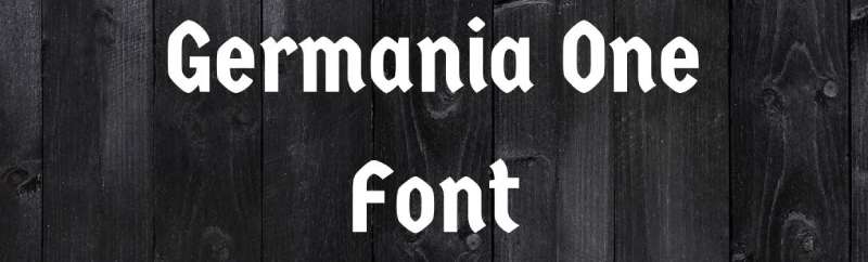
Contemporary hybrid typeface combining traditional Fraktur elements with modernist geometric sans serif forms.
Available through Google Fonts, designed by John Vargas Beltrán.
Key Characteristics
- Hybrid structure: Merges blackletter angularity with Bauhaus geometric simplicity
- Single weight: Currently available only in regular weight
- Simplified strokes: Reduces Fraktur complexity while retaining characteristic broken forms
Context & Relevance
Represents modern reinterpretation of German typographic heritage for digital applications.
Bridges 500-year gap between medieval blackletter and 20th-century functionalism.
Free licensing through Google Fonts enables widespread accessibility.
Implementation/Usage
Functions best for headlines, logos, and display settings requiring Germanic character without historical weight.
Contemporary approach makes traditional German aesthetics approachable for modern audiences.
Single weight limits usage to display applications rather than text setting.
Related Concepts
- Fraktur: Historical blackletter component of Germania One’s hybrid design
- Universal Typeface: Bauhaus geometric influence visible in simplified forms
- Blackletter revival: Movement recontextualizing Gothic scripts for contemporary design
- Pairing fonts: Strategy for combining Germania One with complementary text faces
Berlisch

Decorative blackletter typeface with condensed proportions and ornamental characteristics.
Designed for headlines and display applications requiring compressed Germanic aesthetics.
Key Characteristics
- Condensed width: Narrow letterforms maximizing vertical emphasis
- Decorative elements: Enhanced ornamentation compared to standard Fraktur
- Display orientation: Optimized for large sizes and short text passages
Context & Relevance
Belongs to tradition of ornamental German typefaces developed for advertising and ephemera.
Represents intersection of traditional blackletter craftsmanship with commercial display typography.
Name likely references Berlin, Germany’s capital and major printing center.
Implementation/Usage
Best applied for headlines, posters, and situations requiring strong Germanic visual identity.
Condensed width suits narrow column layouts and space-constrained designs.
Ornamental nature limits readability, restricting use to display purposes.
Related Concepts
- Condensed typefaces: Width classification fitting Berlisch’s proportions
- Decorative Fraktur: Category of ornamental blackletter designs
- Poster design: Application where Berlisch excels
- Emphasis: Design principle Berlisch achieves through bold Germanic character
HOCHLAND

Display typeface inspired by Alpine and traditional German lettering styles.
Features bold, geometric letterforms suitable for signage and branding applications.
Key Characteristics
- Bold weight: Heavy stroke weight ensuring high visibility
- Geometric construction: Simplified forms with consistent stroke widths
- Alpine character: Design elements evoking mountain regions and traditional craftsmanship
Context & Relevance
Represents regional German typography distinct from urban industrial styles.
Connects to tradition of regional German lettering styles varying by geography.
Name translates to “highland” or “upland,” suggesting mountain association.
Implementation/Usage
Ideal for brands, products, or applications emphasizing German regional identity.
Strong presence suits packaging, signage, and outdoor advertising.
Geometric simplicity ensures legibility across scales and reproduction methods.
Related Concepts
- Regional typography: Geographical variations in German lettering traditions
- Alpine design: Visual language of mountain regions informing HOCHLAND character
- Logo: Primary application where bold display faces excel
- Brand guidelines: Framework governing HOCHLAND usage in identity systems
Gunterz

Contemporary blackletter-inspired display typeface with modern proportions.
Balances traditional German letterforms with updated design sensibilities.
Key Characteristics
- Modern proportions: Updated x-height and spacing for contemporary applications
- Blackletter influence: Retains broken strokes and angular character of Gothic scripts
- Display optimization: Designed primarily for large sizes and short text
Context & Relevance
Part of contemporary blackletter revival adapting historical forms for digital media.
Demonstrates continued relevance of German typographic traditions in modern design.
Responds to renewed interest in traditional craftsmanship within contemporary contexts.
Implementation/Usage
Functions best for branding, headlines, and applications requiring distinctive Germanic character.
Modern proportions improve legibility over strict historical reproductions.
Suitable for fashion, music, and lifestyle brands seeking edgy traditional aesthetics.
Related Concepts
- Blackletter revival: Contemporary movement reinterpreting Gothic scripts
- Display typography: Category fitting Gunterz’s large-size optimization
- Font psychology: How blackletter forms communicate tradition, authority, craftsmanship
- Contrast: Design principle Gunterz achieves through thick-thin stroke variation
BAHN Pro

Modern typeface designed for Deutsche Bahn (German Railway) corporate identity.
Evolved from DIN 1451 heritage with refinements for contemporary branding needs.
Key Characteristics
- Corporate customization: Tailored specifically for railway applications and Deutsche Bahn brand
- Improved legibility: Refined letterforms optimizing wayfinding and signage readability
- Extended character set: Comprehensive language support for international railway operations
Context & Relevance
Represents evolution of German transport typography from industrial standard to branded system.
Maintains connection to DIN 1451 roots while addressing contemporary communication needs.
Part of broader trend modernizing institutional typefaces for 21st-century applications.
Implementation/Usage
Primary usage restricted to Deutsche Bahn corporate materials and railway signage.
Demonstrates how industrial typefaces adapt for specific organizational requirements.
Refined details improve performance in digital displays and printed materials.
Related Concepts
- DIN 1451: Historical foundation informing BAHN Pro design
- Corporate typeface: Category of proprietary fonts serving specific organizations
- Wayfinding typography: Specialized application requiring extreme legibility
- Brand style guide: Documentation governing BAHN Pro implementation
Hennigar

Display typeface combining geometric structure with playful, condensed letterforms.
Features unique character suitable for contemporary German design applications.
Key Characteristics
- Condensed proportions: Narrow width maximizing vertical space efficiency
- Geometric base: Underlying structure built on circles and straight lines
- Contemporary aesthetic: Modern interpretation avoiding direct historical reference
Context & Relevance
Represents new generation of German-inspired typography without explicit historical quotation.
Balances functional geometric construction with distinctive personality.
Part of broader movement creating regional identity through type without nostalgia.
Implementation/Usage
Works effectively for headlines, logos, and applications requiring efficient space usage.
Condensed width suits narrow layouts, mobile interfaces, and vertical compositions.
Distinctive character creates memorable brand identities while maintaining professionalism.
Related Concepts
- Condensed fonts: Width classification governing Hennigar’s proportions
- Geometric sans serif: Structural approach underlying Hennigar design
- Contemporary German design: Context for understanding Hennigar’s cultural positioning
- Scale and proportion: Principles governing Hennigar’s vertical emphasis
Fritz
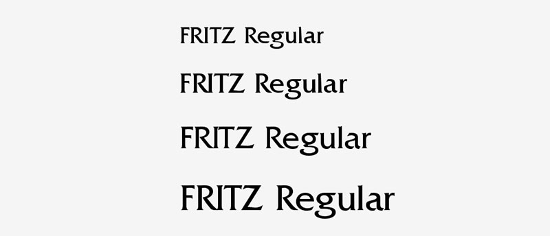
Friendly, approachable typeface with softened geometric forms.
Designed to balance German design precision with welcoming, accessible character.
Key Characteristics
- Rounded terminals: Softened endings replacing harsh geometric terminations
- Humanist proportions: Slightly varied stroke widths adding warmth
- Accessible character: Approachable personality while maintaining technical quality
Context & Relevance
Represents shift in German design toward more human-centered, less austere aesthetics.
Balances engineering precision with emotional accessibility.
Part of movement making modernist design principles more inviting and relatable.
Implementation/Usage
Ideal for brands, institutions, and applications requiring both professionalism and approachability.
Works across scales from text to display, offering versatile family structures.
Particularly effective for educational, civic, and community-focused applications.
Related Concepts
- Humanist sans serif: Classification fitting Fritz’s proportional variation
- Friendly typography: Design approach prioritizing accessibility and warmth
- German modernism: Tradition Fritz updates through softened geometric forms
- Typography: Craft balancing function and expression
Munich

Display typeface referencing Bavarian capital’s cultural and typographic heritage.
Combines traditional German letterforms with contemporary design execution.
Key Characteristics
- Regional character: Design elements specific to Bavarian typographic traditions
- Display optimization: Large-size design with refined details
- Cultural references: Visual connections to Munich’s artistic and commercial history
Context & Relevance
Represents geographic diversity within German typography beyond northern industrial styles.
Connects to Munich’s position as cultural center and design capital.
Reflects distinct Bavarian identity within broader German design landscape.
Implementation/Usage
Best suited for brands, events, and applications emphasizing Munich or Bavarian identity.
Strong regional character creates authentic local flavor.
Works effectively for tourism, hospitality, and cultural institution applications.
Related Concepts
- Regional typography: Geographic variations in German lettering traditions
- Bavarian design: Cultural context informing Munich’s character
- Place branding: Strategy using typography to communicate geographic identity
- Storytelling: How typeface choices communicate cultural narratives
Helmswald Post

Typeface evoking traditional German postal service lettering.
Features sturdy, reliable character appropriate for official and administrative applications.
Key Characteristics
- Postal heritage: Design references historical German postal service typography
- Sturdy construction: Robust letterforms ensuring clarity across reproduction methods
- Institutional character: Formal appearance suitable for official communications
Context & Relevance
Represents intersection of German institutional design and postal service tradition.
Connects to Deutsche Post’s historical role in German communications infrastructure.
Part of broader tradition of specialized typefaces for government services.
Implementation/Usage
Best applied for projects requiring authentic postal or administrative German aesthetics.
Sturdy construction ensures reliability across print and digital applications.
Formal character suits official documents, certificates, and institutional materials.
Related Concepts
- Institutional typography: Specialized fonts serving government and official purposes
- Historical reference: Design strategy evoking specific time periods or organizations
- DIN standards: Related German approach to systematic typographic design
- Print design: Medium where postal typefaces originally functioned
Königreich

Typeface translating to “Kingdom” in German, suggesting royal or imperial associations.
Features formal, authoritative character appropriate for prestigious applications.
Key Characteristics
- Formal structure: Dignified proportions communicating authority and tradition
- Imperial references: Design elements suggesting historical German kingdoms
- Decorative elements: Refined ornamentation enhancing formal character
Context & Relevance
Connects to German imperial history and traditional royal typography.
Represents formal end of German typographic spectrum emphasizing ceremony and authority.
Part of tradition using type to communicate institutional gravitas.
Implementation/Usage
Best suited for luxury brands, formal events, and applications requiring prestigious character.
Formal nature limits usage to contexts where authority and tradition strengthen message.
Works effectively for awards, certificates, and high-end product packaging.
Related Concepts
- Formal typography: Design approach emphasizing ceremony and authority
- Historical reference: Strategy evoking specific periods or institutions
- Luxury branding: Context where formal typefaces communicate prestige
- Symmetry: Compositional principle often paired with formal typefaces
TT Norms Pro
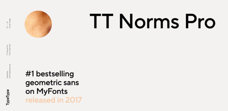
Contemporary sans-serif font family with German design sensibilities.
Offers extensive weight range and comprehensive language support.
Key Characteristics
- Large family: Multiple weights from Thin to Black with matching italics
- Neutral character: Versatile design suitable for diverse applications
- Technical refinement: Precise construction and extensive OpenType features
Context & Relevance
Represents current generation of professional German typography.
Balances Swiss/German rationalist tradition with contemporary digital requirements.
Part of movement creating flexible, systematic font families for complex design systems.
Implementation/Usage
Functions across all applications from body text to display headlines.
Extensive family structure enables sophisticated typographic hierarchy.
Neutral character allows brand personality to emerge through other design elements.
Related Concepts
- Sans serif: Typeface classification without decorative stroke endings
- Font family: Related weights and styles working as unified system
- Swiss typography: Design tradition influencing TT Norms Pro’s systematic approach
- Variable fonts: Technology enabling continuous weight variation within single file
FAQ on German Fonts
What makes German fonts different from other typefaces?
German fonts encompass blackletter scripts like Fraktur and Schwabacher, featuring broken, angular strokes distinct from flowing Roman letterforms. They also include functional industrial designs like DIN 1451, which prioritizes geometric precision and legibility. These typefaces reflect specific cultural and historical developments unique to German-speaking regions.
Why did Germany stop using Fraktur?
The Nazi government banned Fraktur in 1941 through the “Normalschrifterlass” decree, falsely declaring it Jewish in origin. Historians suggest the regime recognized that blackletter typography hindered communication in occupied territories. After World War II, Germany transitioned permanently to Antiqua (Roman) typefaces for most applications.
What is the difference between Fraktur and Schwabacher?
Fraktur features sharper, more angular broken strokes and dominated German printing from the 16th century onward. Schwabacher predates Fraktur, displaying rounder, more cursive letterforms influenced by Italian Humanist design. Schwabacher served as emphasis typeface alongside Fraktur, similar to how italic functions with roman type.
Can I use German fonts for commercial projects?
It depends on the specific font licensing agreement. Many historical revivals like Alte Schwabacher are freely available, while commercial releases from foundries like Linotype require purchased licenses. Always verify licensing terms before using any typeface in commercial work to avoid copyright violations.
What is DIN 1451 used for?
DIN 1451 serves as Germany’s official typeface for traffic signs, road signage, administrative documents, and technical drawings since 1931. The Deutsches Institut für Normung standardized it for industrial applications requiring extreme legibility. Deutsche Bahn and numerous German institutions continue using DIN-based fonts for wayfinding and corporate communications.
Are German fonts readable for body text?
Traditional blackletter fonts like Fraktur work poorly for extended body text due to complex letterforms and dense appearance. Modern German sans-serif fonts like TT Norms Pro or adaptations like FF DIN excel at text setting. Historical German typefaces function best for display purposes, headlines, or short passages.
What is the long s character in German typography?
The long s (ſ) appears in middle and initial positions within words in traditional German fonts, while the round s appears at word endings. This calligraphic convention persisted in Fraktur and Schwabacher until the 20th century. Modern digital blackletter revivals often include both forms for historical accuracy.
How do I pair German fonts with other typefaces?
Pair traditional blackletter with clean sans-serif fonts like Helvetica for contrast. Use geometric sans serifs alongside modern German industrial faces like DIN. Avoid combining multiple blackletter styles, which creates visual chaos. Strong typographic hierarchy requires contrasting weights, not competing decorative elements.
What software supports German font features?
Modern design software like Adobe Creative Suite, Sketch, and Figma support OpenType features necessary for proper German typography. These include ligatures, long s variants, and historical alternates. Ensure your software enables advanced typography features to access complete character sets and proper kerning pairs.
Where can I download authentic German fonts?
Google Fonts offers free options like Germania One. Professional foundries including Linotype, URW, and MyFonts provide commercial-quality historical revivals. Peter Wiegel’s extensive collection of free German blackletter fonts preserves authentic historical designs. Always verify licensing before use and prioritize foundries maintaining historical authenticity over generic recreations.
Conclusion
German fonts represent more than decorative choices. They document five centuries of cultural identity, political tension, and design innovation across Central Europe.
From Schwabacher’s rounded medieval forms to DIN 1451’s industrial precision, each typeface solves specific communication challenges.
Understanding these distinctions transforms how you approach heritage branding, historical reproduction, or contemporary projects requiring authentic Germanic character. Fraktur’s broken strokes tell different stories than Bauhaus geometry.
The Antiqua-Fraktur dispute wasn’t just about letterforms.
It reflected deeper questions about national identity, modernization, and cultural expression through typography. Those tensions shaped typefaces we still use today, from traffic signage to newspaper mastheads.
Choose carefully. Each font carries historical weight and specific applications where it excels. Your selection communicates whether you’re evoking tradition, emphasizing function, or bridging past and present through thoughtful typographic hierarchy.
If you liked this article about German fonts, you should check out this article about art nouveau fonts.
There are also similar articles discussing rock band fonts, spring fonts, cracked fonts, and royal fonts.
And let’s not forget about articles on movie theater fonts, travel fonts, movie poster fonts, and textured fonts.

Renowned for his expertise in logo design and visual branding, Bogdan has developed a multitude of logos for various clients.
His skills extend to creating posters, vector illustrations, business cards, and brochures. Additionally, Bogdan's UI kits were featured on marketplaces like Visual Hierarchy and UI8.
He also wrote in the past years on sites like Design Your Way, WebDesignerDepot, WPDean, Designmodo, Speckyboy, Slider Revolution, and more.
- The Windsurf Logo History, Colors, Font, And Meaning - 10 October 2026
- How to Remove Background From Product Photos (No Photoshop) - 10 October 2026
- How Designers can Build a Stronger Online Creative Identity - 9 October 2026

Bogdan Sandu is a seasoned designer who has been designing websites since 2008. Renowned for his expertise in logo design and visual branding, Bogdan has developed a multitude of logos for various clients. His skills extend to creating posters, vector illustrations, business cards, and brochures. Additionally, Bogdan's UI kits were featured on marketplaces like Visual Hierarchy and UI8. He also wrote in the past years on sites like Design Your Way, WebDesignerDepot, WPDean, Designmodo, Speckyboy, Slider Revolution, and more.
You Might Also Like