Condensed fonts are everywhere, from newspaper headlines to sports jerseys to app interfaces. But most people couldn’t tell you what actually makes a font “condensed” versus just… narrow-looking.
So, what is a condensed font? It’s a typeface variant where the characters are specifically redrawn to be narrower than the regular width, without changing the vertical height. Not squished. Not stretched. Intentionally redesigned.
This guide breaks down how condensed fonts work, where they’re used, how they differ from compressed and narrow variants, and which popular families (like Roboto Condensed, Oswald, and Helvetica Condensed) are worth knowing. You’ll also learn when to use them, when to avoid them, and how to spot a fake condensed cut from a mile away.
What Is a Condensed Font

A condensed font is a typeface where the characters are narrower than the standard-width version of that same family. The vertical height stays the same. Only the horizontal width gets compressed.
Think of it like squeezing each letter from the sides without making it shorter. The strokes, the counters (those enclosed spaces inside letters like “o” and “e”), and the sidebearings all get tighter. But the cap height and x-height remain untouched.
This distinction matters because condensed fonts are not just “skinnier” versions of regular fonts. They are redrawn. A well-made condensed cut involves optical adjustments to stroke weight, curve tension, and spacing so the narrower proportions still look balanced.
Condensed sits on a width spectrum that type designers use to classify how narrow or wide a font is:
- Ultra-condensed: the narrowest option, often reserved for large display settings
- Condensed: noticeably narrower than regular, the most common narrow variant
- Semi-condensed: a subtle narrowing, sometimes barely perceptible at body sizes
- Regular: the default width of any given type family
- Extended: wider than regular, stretching glyphs in the opposite direction
The global font and typeface market was valued at $1.14 billion in 2024, according to Global Growth Insights. Much of that growth comes from the demand for width variants and variable fonts that let designers adjust character width on a sliding scale.
You’ll also hear condensed fonts called “narrow” or “compact” depending on the foundry. There’s no universal naming convention. Helvetica uses “Condensed.” Univers uses numbered width designations. Roboto just calls it “Roboto Condensed.” It all means roughly the same thing, though the exact degree of narrowing can vary between families.
How Condensed Fonts Differ from Regular and Extended Widths
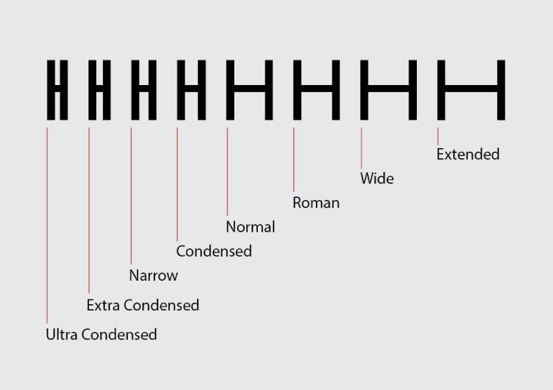
Every typeface family that offers width variants is built around a width axis. This axis runs from the narrowest possible cut (ultra-condensed) all the way to the widest (ultra-extended), with the regular width sitting somewhere in the middle.
The difference is structural, not cosmetic. A condensed font has letterforms that were specifically designed to be narrow. An extended font goes the other direction, spreading each character wider.
Width Variants Across Type Families
Some families handle this better than others. Roboto offers a full Condensed subfamily with its own weight range. PT Sans has PT Sans Narrow. Barlow goes further and includes Barlow Condensed and Barlow Semi Condensed as distinct sub-families.
| Font family | Condensed variant | Available weights |
|---|---|---|
| Roboto | Roboto Condensed | Light Regular Bold |
| Barlow | Barlow Condensed | Thin through Black (9 weights) |
| PT Sans | PT Sans Narrow | Regular Bold |
| Open Sans | Open Sans Condensed | Light Regular Bold |
Roboto Condensed ranks as the 6th most popular font on Google Fonts, according to Kinsta. That tells you something about how much demand there is for condensed options specifically.
Why Horizontal Scaling Is Not the Same
Look, I’ve seen too many people grab the horizontal scale tool in Illustrator or Figma and just squish a regular font to 70% width. That’s not a condensed font. That’s a distorted font.
When you horizontally scale a regular typeface, the vertical strokes get thinner while the horizontal strokes stay the same thickness. The result looks weird. Uneven stroke weights, cramped counters, awkward curves. You can spot it immediately if you know what to look for.
A true condensed cut is redrawn from scratch. The type designer adjusts stroke contrast, counter shapes, and kerning so everything looks intentional and proportional at the narrower width.
Variable Fonts and the Width Axis
The HTTP Archive’s 2024 Web Almanac found that 33% of websites now use variable fonts, up from 29% in 2023. Variable fonts with a wdth axis let you set the exact width you want through CSS, anywhere between condensed and extended, without loading separate font files.
That’s a meaningful shift. Instead of shipping a separate condensed font file, a single variable font file can give you condensed, semi-condensed, regular, and extended variants through the font-stretch property or the font-variation-settings rule.
Google Fonts served 92% of all variable fonts in 2024, down slightly from 97% in 2022, per the same HTTP Archive report. The width axis is one of the most commonly used variable font axes alongside weight and optical size.
Common Characteristics of Condensed Typefaces

Condensed fonts share a set of structural traits that make them visually distinct from their regular-width counterparts. These aren’t just “narrow letters.” The proportions change the entire feel of how text sits on a page or screen.
Structural Traits
Tighter letter proportions: the horizontal measure of each character gets reduced while the stroke weight is carefully preserved. This keeps the font from looking anemic at narrow widths.
Reduced counter spaces: the enclosed areas inside letters like “a,” “e,” and “g” become smaller. This is one of the biggest readability tradeoffs with condensed type, especially at small sizes.
Compressed sidebearings: the spacing on either side of each glyph gets tighter, which means lines of condensed text naturally pack more characters per line.
An MIT Agelab study covered by the Nielsen Norman Group found that regular-width text outperformed condensed text in glanceable reading tasks. Participants identified words faster in regular widths compared to condensed versions of the same typeface. The effect was statistically significant at the p<0.01 level.
Condensed Serifs vs. Condensed Sans-Serifs
Condensed sans-serif fonts tend to hold up better at narrow widths. Without serifs competing for horizontal space, the letterforms stay cleaner and more readable when compressed.
Condensed serif fonts present a trickier design challenge. The serifs themselves eat into the already reduced horizontal space, and the stroke contrast can make thin strokes nearly invisible at small sizes. Fonts like Sabon Next Condensed or Times New Roman Condensed handle this through careful optical compensation.
Monotype’s 2024 Font Use & Forecasting Survey found that 76% of designers prioritize readability and accessibility when selecting typefaces. That helps explain why condensed sans-serif options like Oswald and Roboto Condensed dominate Google Fonts downloads, while condensed serifs remain more niche.
Where Condensed Fonts Are Used
 Condensed typefaces show up anywhere space is limited but text still needs to make an impression. That covers a lot of ground.
Headlines and poster design: condensed fonts let you set big, punchy headlines that fit into tight horizontal spaces. Movie posters, event flyers, and billboards lean on condensed type heavily for this reason.
Newspaper and magazine layouts: publications have used condensed type for decades. When you’re fitting multiple columns of editorial text into narrow column widths, a condensed face gives you more words per line without shrinking the point size.
Sports branding: if you’ve looked at jersey lettering or athletic logos, you’ve seen condensed fonts everywhere. The tall, narrow proportions project strength and speed. It’s become so standard that condensed sans-serifs are basically the default for sports logos and team merchandise.
Signage and wayfinding: airports, transit systems, and hospital wayfinding systems use condensed type when they need to display long location names or directions in a fixed physical space.
Data-dense interfaces: dashboards, data tables, and navigation bars in software UIs sometimes use condensed or semi-condensed type to keep layouts compact without cutting content.
Condensed Fonts in Web and Digital Design
On the web, condensed fonts serve a more specific purpose than in print. Screen real estate is a constant constraint, especially on mobile devices.
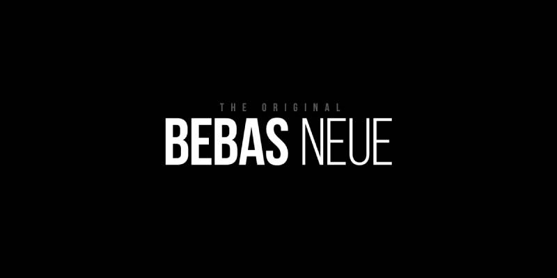
Google Fonts is the main source for free condensed web fonts. Roboto Condensed, Oswald, and Barlow Condensed are among the most widely used. Bebas Neue, which is a display font with condensed proportions, has become extremely popular for bold headlines since it was added to Google Fonts.
The CSS font-stretch property controls how browsers handle condensed variants. You can set values like condensed, semi-condensed, or percentage values between 50% and 200% to specify exactly how narrow you want the type to render.
Web fonts currently appear on 87% of web pages, according to the HTTP Archive’s 2024 data. That’s up from near zero in 2010. Google Fonts alone powers fonts on nearly 12 million websites across more than 8 million unique domains, per Toner Buzz research.
Performance is worth considering. Loading a separate condensed font file adds to page weight. If you’re already using the regular weight of a font family, adding the condensed variant means another HTTP request and more bytes to download. Variable fonts solve this by bundling width variants into a single file.
Popular Condensed Font Families
 The condensed font category splits roughly into free and licensed options. Your choice usually depends on budget, project type, and whether you need advanced OpenType features or extensive language support.
Free Condensed Fonts (Google Fonts)
Roboto Condensed sits at number 6 on the Google Fonts popularity rankings with over 4 billion users, according to WPKube. It works well for both headlines and body text, which is unusual for a condensed face.
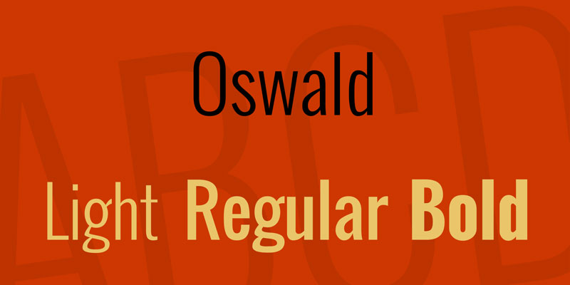
Oswald was designed by Vernon Adams as a reworking of classic “Alternate Gothic” style typefaces. It’s bolder and more assertive than Roboto Condensed, making it a better fit for headers than long-form reading.
Bebas Neue is technically a display font, but its condensed proportions are what give it that tall, dramatic character. It comes in a single all-caps style, which limits its use cases but makes it instantly recognizable.
Barlow Condensed offers nine weights from Thin to Black, making it one of the most versatile condensed families on Google Fonts. Good for UI work where you need multiple weights from the same family.
Licensed Condensed Fonts
Helvetica Condensed remains an industry standard despite being decades old. It ships with most Apple devices but requires a font license for commercial web use through Monotype.
Knockout by Hoefler&Co is a large family with nine widths, each in seven weights. It was designed specifically for editorial and display use. You’ll see it in newspapers, magazines, and ad campaigns because its condensed cuts can fit a lot of text into a headline without looking cramped.
Trade Gothic Condensed has a rougher, more industrial personality. It’s less polished than Helvetica Condensed, and some designers pick it for exactly that reason.
| Category | Top picks | Best for |
|---|---|---|
| Free sans-serif | Roboto Condensed Oswald Barlow Condensed |
Web UI Headlines |
| Free display | Bebas Neue Anton League Gothic |
Posters Banners Large type |
| Licensed sans-serif | Helvetica Condensed Trade Gothic Condensed |
Branding Editorial |
| Licensed editorial | Knockout Druk Condensed |
Magazines Advertising |
A Scientific Reports study from 2024 found that Futura-Futura Condensed was the most frequently used font pair across 15 different media types analyzed. That pairing, mixing a regular width with its condensed sibling, is a common trick for creating typographic hierarchy without switching font families entirely.
When to Use a Condensed Font (and When Not To)
Condensed fonts are a specific tool for specific situations. They’re not a default choice. Knowing when they help and when they hurt is the difference between a layout that works and one that just looks cramped.
When Condensed Fonts Work Well
Space-constrained layouts. This is the obvious one. When you need to fit more characters per line in a narrow column, a navigation bar, or a table cell, condensed type gets the job done without reducing font size.
Large display text. At headline sizes (roughly 24px and above on screen), the reduced counters and tighter proportions of condensed fonts actually look sharp and intentional. The letterforms have enough room to breathe at those sizes.
High-density information. Dashboards, timetables, scoreboard displays. Anywhere you’re packing a lot of data into a fixed area, condensed type helps keep things readable without line wrapping or overflow.
Three-quarters of Fortune 500 companies use sans-serif type in their logos, according to Toner Buzz. Many of those logos use condensed or semi-condensed cuts to fit longer company names into compact wordmarks.
When Condensed Fonts Don’t Work
Long body text. Reading paragraphs of condensed type is tiring. The narrow counters make it harder for your eye to distinguish letterforms at body sizes, which slows reading speed. The MIT Agelab research backs this up.
Small text on mobile screens. At 14px or below on a phone, a condensed font starts losing clarity fast. The reduced spacing between characters increases crowding, a known factor in decreased legibility.
Accessibility-sensitive contexts. If your audience includes people with low vision, cognitive disabilities, or dyslexia, condensed fonts create unnecessary friction. Standard-width or even slightly extended typefaces with open counters work better for these readers.
Pairing Condensed Fonts with Regular-Width Type
Pairing fonts from different width categories creates immediate contrast. A condensed sans-serif headline above a regular-width serif body text is one of the most reliable layout combinations you’ll find.
The width difference alone creates clear visual hierarchy between heading and body levels. You don’t even need a dramatic weight change to make it work.
One thing to watch: leading (line spacing) and tracking both need adjustment when working with condensed type. Default line spacing that looks fine on a regular-width font will feel too loose on a condensed face. You’ll usually want to tighten it a couple of points. And tracking at body sizes sometimes benefits from a slight increase to keep letters from feeling jammed together.
Condensed vs. Compressed vs. Narrow Fonts
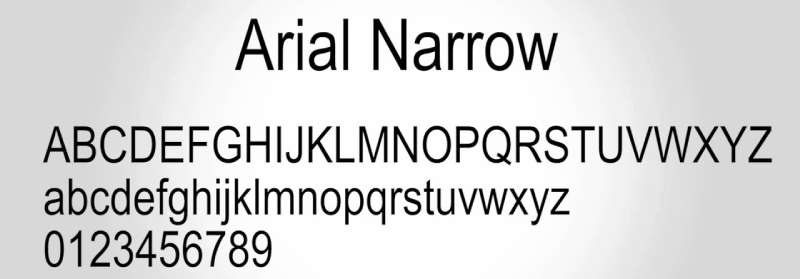
These three terms get used interchangeably all the time. And honestly, there’s no universal standard that locks them into strict definitions. But there are general conventions that most type foundries follow.
Compressed is typically the narrowest option. It pushes character width to the extreme, reducing horizontal proportions as far as they can go before readability breaks down completely.
Condensed sits in the middle of the narrow spectrum. It’s the most commonly used width variant in professional design work. When someone says “narrow font,” they usually mean something in the condensed range.
Narrow is often used interchangeably with condensed by certain foundries. Google Fonts, for instance, uses “Narrow” for PT Sans Narrow, while calling Roboto’s variant “Roboto Condensed.” Same concept, different label.
How Type Families Handle Width Naming
TypeType’s documentation lays out a useful hierarchy. Among their narrow font styles, Compressed is the narrowest, Condensed is the middle, and Compact is the widest (closest to regular).
Univers, designed by Adrian Frutiger, uses a numbered system instead of names. Each variant gets a two-digit code where the first digit indicates weight and the second indicates width. So Univers 57 is condensed, while Univers 59 is ultra-condensed.
| Term | Relative width | Example font |
|---|---|---|
| Compressed | Narrowest | Druk Compressed TT Lakes Neue Compressed |
| Condensed | Moderately narrow | Roboto Condensed Helvetica Condensed |
| Narrow | Similar to condensed | PT Sans Narrow Arial Narrow |
| Compact / Semi-condensed | Slightly narrow | TT Norms Pro Compact Encode Sans Semi Condensed |
Why the Naming Confusion Exists
There’s no governing body that standardizes width labels across foundries. OpenType defines a usWidthClass value in font metadata, which uses a 1-9 scale from Ultra-Condensed to Ultra-Expanded. But foundries can name their fonts whatever they want.
The practical takeaway: always check the actual character width, not just the name. A font labeled “Narrow” by one foundry might be wider than a font labeled “Condensed” by another.
How to Identify a Condensed Font

You can usually spot a condensed font by looking at the overall letter proportions. If the characters look noticeably taller than they are wide, and the spacing between letters feels tighter than a standard typeface, you’re probably looking at a condensed cut.
Visual Cues to Look For
- Letters have a strong vertical emphasis, with reduced horizontal measure
- Round characters like “o” and “e” appear more oval than circular
- Counter spaces (the enclosed areas inside letters) are visibly smaller
- Overall text blocks look denser and more tightly packed per line
Compare the lowercase “n” in a suspected condensed font against a known regular-width font at the same point size. If the condensed version is significantly narrower but the same height, that confirms it.
Font Identification Tools
WhatTheFont by MyFonts searches a database of over 133,000 fonts and uses AI to match uploaded images against known typefaces. It works well for identifying commercially available condensed fonts, though it tends to suggest paid options over free alternatives.
WhatFontIs takes a different approach, with a database of over 900,000 fonts including both free and commercial options. For condensed fonts specifically, the wider database helps when you’re trying to identify a free Google Fonts alternative to a licensed condensed typeface.
Fontspring Matcherator focuses on premium and commercial fonts, which makes it better for identifying licensed condensed families like Knockout or Trade Gothic Condensed.
For web design specifically, browser developer tools remain the fastest option. Right-click any text, inspect it, and check the font-family property. If it shows something like “Roboto Condensed” or the font-stretch value is set below 100%, you’ve found your answer.
Spotting a Fake Condensed Font
The giveaway: uneven stroke weights. When someone horizontally scales a regular font in Photoshop or Illustrator instead of using a true condensed cut, the vertical strokes get thinner while horizontal strokes stay the same thickness.
A true condensed font, designed by a type designer from scratch, maintains consistent stroke contrast across all letterforms. The narrowing is optical and intentional, not mechanical.
You can check font metadata in tools like FontForge or Adobe Illustrator‘s character panel. A real condensed font will have width classification data baked into its file. A horizontally scaled regular font will still report itself as “Normal” width in its metadata.
How Condensed Fonts Are Designed
Condensed fonts aren’t made by running a regular font through a “squeeze” filter. At least, not the good ones. The process involves redrawing every single letterform with narrower proportions while making optical adjustments so the font still looks balanced.
The Design Process
A type designer starts with a regular-width master and a condensed master. These two “extremes” define the width range for the entire family.
Each master gets drawn separately. The condensed master isn’t just a narrower copy. The designer adjusts:
- Stroke weight: compensating so thin strokes don’t disappear at narrow widths
- Curve tension: tightening the curves in round characters like “o,” “b,” and “d”
- Counter shapes: reshaping the enclosed spaces to stay open enough for readability
Fontfabric describes their approach as designing “from the inside out,” making sure every intermediate step between the regular and condensed masters works as a standalone style.
Variable Font Technology and Width Interpolation
The OpenType Variations specification, introduced in 2016 by Adobe, Apple, Google, and Microsoft, changed how condensed fonts are produced. Instead of shipping separate font files for each width, designers can now bundle everything into a single variable font with a wdth axis.
The variable font approach works through interpolation between masters. The type design software (typically Glyphs, FontLab, or RoboFont) calculates the in-between shapes mathematically. If you have a regular master and a condensed master, the software generates every width between those two extremes by blending the outlines proportionally.
This only works if the masters have compatible outlines, meaning each glyph must have the same number of nodes, handles, and paths in both the regular and condensed drawings. That compatibility requirement is one reason why variable fonts take more planning upfront.
Blaze Type notes that Adrian Frutiger’s Univers was one of the earliest type families designed with width variation in mind. The original Univers had 21 styles across different weights and widths. With today’s variable font technology, those 21 separate files could theoretically live inside a single variable font file.
Why Auto-Condensing Falls Short
Design software like Adobe Illustrator and Figma let you horizontally scale any font to make it narrower. This produces results that look condensed at first glance but fall apart on closer inspection.
Stroke distortion is the main problem. Horizontal scaling reduces the width of vertical strokes without touching horizontal ones. The result is a font where the “pillars” of letters like “H” and “M” look thinner than the crossbars, which breaks the visual logic of the typeface.
Professional type designers spend significant time on optical corrections that software can’t automate. Round characters need different narrowing ratios than straight ones. Diagonal strokes in letters like “V” and “W” need manual adjustment. Glyph sidebearings (the spacing on each side of a character) must be recalculated for the narrower proportions. None of this happens when you just drag a scaling handle.
FAQ on What Is A Condensed Font
What is a condensed font?
A condensed font is a typeface variant where characters are narrower than the regular width version. The height stays the same, only the horizontal proportions get reduced. These fonts are specifically redrawn, not just digitally squeezed.
What is the difference between condensed and compressed fonts?
Compressed fonts are narrower than condensed fonts. Condensed sits in the middle of the narrow spectrum, while compressed pushes character width to the extreme. Some foundries also use “narrow” interchangeably with condensed.
Are condensed fonts good for body text?
Generally, no. The reduced counter spaces and tighter letter proportions make condensed fonts harder to read in long paragraphs. They work best for headlines, signage, and display settings where text is large.
What are the most popular condensed fonts?
Roboto Condensed, Oswald, and Bebas Neue are top picks on Google Fonts. For licensed options, Helvetica Condensed, Knockout, and Trade Gothic Condensed remain industry standards across print and digital design.
Can I just scale a regular font horizontally to make it condensed?
You can, but you shouldn’t. Horizontal scaling distorts stroke weights, making vertical strokes thinner while horizontal ones stay thick. A true condensed font is redrawn with proper optical corrections to maintain balanced proportions.
How do condensed fonts work in CSS?
The font-stretch CSS property controls condensed rendering. You can set values like condensed, semi-condensed, or percentage values. With variable fonts, the wdth axis allows continuous width adjustment from a single file.
Are condensed fonts accessible?
They can be tricky for accessibility. The narrow proportions reduce readability for users with low vision or dyslexia. At large sizes they’re fine, but for body text, regular-width fonts with open counters work better.
What is a variable font width axis?
The width axis (wdth) in a variable font lets you adjust character width on a sliding scale. Instead of loading separate condensed and regular font files, one variable font file handles every width between those extremes.
Where are condensed fonts used most often?
Newspaper layouts, poster headlines, sports branding, and data-heavy UI elements like dashboards and tables. Anywhere space is limited but text still needs to read clearly and carry visual weight.
How do I identify a condensed font in an image?
Upload the image to font identification tools like WhatTheFont or WhatFontIs. Look for tall, narrow letterforms with tight spacing and oval-shaped round characters as visual clues before searching.
Conclusion
Understanding what is a condensed font comes down to one thing: it’s a purposefully redrawn narrow variant of a type family, not a shortcut made by dragging a scale handle. That distinction matters more than most people realize.
Pick condensed type for headlines, banners, data tables, and tight layouts where space is limited. Skip it for long-form body text or small mobile screens where readability suffers.
Families like Roboto Condensed and Barlow Condensed on Google Fonts give you solid free options. If budget allows, licensed families like Knockout offer deeper weight and width ranges for serious brand typography work.
Variable fonts with a width axis are changing how designers handle condensed type entirely. One file, infinite widths, no extra HTTP requests. If your project supports it, that’s the direction to go.
The right condensed font, used in the right context, makes layouts tighter without sacrificing clarity. The wrong one just makes text hard to read. Know the difference and your design choices get sharper.

Renowned for his expertise in logo design and visual branding, Bogdan has developed a multitude of logos for various clients.
His skills extend to creating posters, vector illustrations, business cards, and brochures. Additionally, Bogdan's UI kits were featured on marketplaces like Visual Hierarchy and UI8.
He also wrote in the past years on sites like Design Your Way, WebDesignerDepot, WPDean, Designmodo, Speckyboy, Slider Revolution, and more.
- The Beehiiv Logo History, Colors, Font, And Meaning - 18 September 2026
- Versatile Work Sans Font Pairing for Every Project - 16 September 2026
- Organize Digital Files Like a Pro Before Your Next Client Handoff - 16 September 2026

Bogdan Sandu is a seasoned designer who has been designing websites since 2008. Renowned for his expertise in logo design and visual branding, Bogdan has developed a multitude of logos for various clients. His skills extend to creating posters, vector illustrations, business cards, and brochures. Additionally, Bogdan's UI kits were featured on marketplaces like Visual Hierarchy and UI8. He also wrote in the past years on sites like Design Your Way, WebDesignerDepot, WPDean, Designmodo, Speckyboy, Slider Revolution, and more.
You Might Also Like