You’ve probably used an oblique font today without knowing it. Every time you hit Ctrl+I on a sans-serif typeface like Helvetica or Arial, there’s a good chance the browser is slanting your text rather than switching to a true italic. So, what is an oblique font, and why does the difference matter?
An oblique font is a slanted version of an upright design where the letterforms stay the same. No redrawing, no cursive shapes. Just a geometric tilt. It sounds simple, but the distinction between oblique and italic affects everything from CSS rendering to brand consistency to readability.
This article covers how oblique fonts work in CSS, where they came from historically, which typefaces use them, and how to avoid the ugly faux-oblique problems that show up when browsers fake the slant.
What Is an Oblique Font
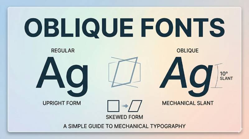
An oblique font is a slanted version of an upright (roman) typeface where the original letterforms stay intact. No characters get redrawn. The letters are simply tilted, usually between 8 and 12 degrees.
That’s the whole trick. Take the regular font, apply a geometric skew, and you’ve got an oblique.
Most sans-serif fonts use oblique variants rather than true italics. Futura, Univers, Helvetica. These families ship with oblique cuts because their geometric letter structures don’t lend themselves to the kind of cursive redrawing that italic fonts require.
When a browser encounters font-style: oblique in CSS and can’t find a proper oblique font file, it does the next best thing. It applies a mechanical slant transformation to the normal glyphs. The default angle, according to MDN, is 14 degrees.
The HTTP Archive’s 2024 Web Almanac found that 87% of websites now use web fonts. And about 85% of those websites prefer sans-serif typefaces, according to Toner Buzz research. That means oblique fonts show up everywhere, even when most people don’t realize they’re looking at one instead of an italic.
Oblique vs. Italic: What Actually Changes
This is where most people get confused. And honestly, I don’t blame them.
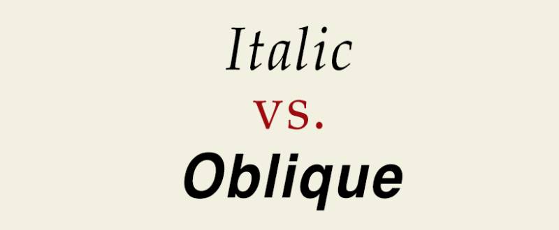
Italic fonts use completely redesigned letterforms. The lowercase “a” might shift from a double-story to a single-story shape. The “f” gets a descending tail. The “g” transforms into something that looks closer to handwriting. A type designer sits down and redraws every single character for the italic cut.
Oblique fonts skip all of that. The upright design gets tilted mechanically. Same letter shapes, different angle.
| Feature | Oblique | True Italic |
| Letter shapes | Unchanged from roman | Redesigned, often cursive |
| Creation method | Geometric slant applied | Hand-drawn by type designer |
| Common in | Sans-serif families | Serif families |
| CSS property | font-style: oblique |
font-style: italic |
Took me a while to internalize this. You can stare at Helvetica’s “italic” for hours and think it’s a true italic. It’s not. It’s an oblique wearing an italic label.
When Italic and Oblique Look Identical
Here’s the tricky part. With sans-serif typefaces, the difference between italic and oblique often vanishes completely.
Helvetica is the classic example. Its “italic” is really just a slanted version of the roman design. The letterforms don’t change shape at all. Monotype and other foundries label it “italic” in the font metadata, but structurally, it behaves like an oblique.
Same story with Arial, Roboto in certain weights, and plenty of other sans-serif families. Around 75% of Fortune 500 companies use sans-serif fonts in their logos, according to Toner Buzz data. Most of those typeface families ship with obliques disguised as italics.
The labeling inconsistency drives type nerds (and front-end developers) a little crazy. But it exists for a reason. “Italic” is what regular users expect to see when they hit Ctrl+I. So foundries go with the familiar term even when the font technically qualifies as oblique.
Why Oblique Fonts Exist
Oblique variants didn’t happen by accident. They came out of a specific design philosophy.
In the 1920s and 1930s, designers at the Bauhaus and within the broader Swiss design movement pushed hard for consistency of form over decorative variation. Paul Renner designed Futura in 1927 as a geometric sans-serif built on near-perfect circles, triangles, and squares. Redesigning those shapes into cursive italics would have broken the entire geometric logic of the typeface.
So Renner gave Futura obliques instead. The geometry stays intact. The letters just lean.
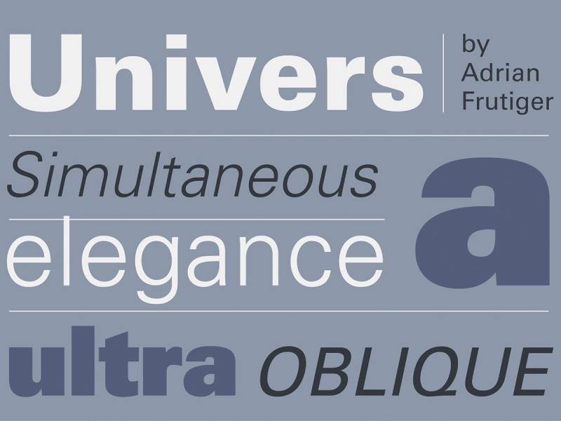
Adrian Frutiger took a similar approach with Univers in 1957. He designed 21 variations from the start, including obliques at each weight and width. Frutiger’s numbering system encoded obliques directly: even second digits (like Univers 56) meant oblique, odd digits (Univers 55) meant roman. Wikipedia notes that Frutiger originally chose an aggressive slant of sixteen degrees for Univers obliques, which was later reduced to twelve in some digital releases.
Phototypesetting also played a role. When type production moved from metal to light-based systems in the 1950s and 1960s, generating a slanted variant from an existing design was mechanically simple. Drawing a completely new italic cut cost more time and money. Obliques were the pragmatic choice.
The Modernist Connection
The whole Bauhaus design ethos was about function driving form. Unnecessary ornamentation got stripped away. Italic letterforms, with their calligraphic roots and cursive gestures, felt decorative to modernist designers.
Obliques fit the modernist program. They add emphasis without introducing new visual elements. The text slants, the eye catches it, the reader moves on. Nothing extra.
This thinking directly shaped how entire graphic design movements approached typography for decades. And it’s still the default philosophy behind most sans-serif type design today.
How Oblique Fonts Work in CSS

Two CSS properties matter here: font-style and font-variation-settings.
Setting font-style: oblique tells the browser to look for an oblique face in the loaded font family. If one exists, great. If not, the browser synthesizes one by applying a slant to the normal glyphs.
That fallback behavior is where things get ugly. More on that in a minute.
The key difference from italic in CSS:
font-style: italicasks for a true italic face first, falls back to oblique, then synthesizesfont-style: obliqueasks for an oblique face first, falls back to synthetic slantfont-style: oblique 12degspecifies an exact slant angle (CSS Fonts Level 4 syntax)
The angle syntax is the newer addition. MDN documents that valid values range from -90deg to 90deg, with 14 degrees used as the default when no angle is specified. But real-world oblique fonts typically sit between 8 and 12 degrees, based on analysis of actual italic angle values in font metadata.
A W3C discussion from 2018 revealed that Firefox internally used platform-specific angles between 11.3 and 16.7 degrees for synthetic oblique rendering, rather than the spec’s original 20-degree default. The spec was later revised to 14 degrees.
Variable Fonts and the Slant Axis
Variable fonts changed the game for oblique styling.
Instead of shipping separate font files for roman and oblique, a variable font includes a slnt (slant) axis. You set the angle anywhere within the font’s defined range. Inter, Recursive, Roboto Variable, Source Sans. They all support this.
The HTTP Archive’s 2024 data shows that 33% of websites now use variable fonts, up from 29% in 2023. Google Fonts serves around 92% of all variable fonts on the web.
In CSS, you access the slant axis two ways:
font-style: oblique 12deg(the preferred, higher-level approach)font-variation-settings: "slnt" 12(the lower-level fallback)
One thing to watch: the slnt axis uses negative values for forward slant in font-variation-settings, which is the opposite of what font-style: oblique expects. Roboto Variable’s slant axis ranges from 0 to -12 degrees. Always check the font’s axis range before writing your CSS, or your text might lean the wrong way.
Common Typefaces with Oblique Variants

Futura Oblique is probably the most recognized example. Barbara Kruger’s artwork famously uses Futura Bold Oblique, white text on red backgrounds. The font’s geometric precision stays completely intact in its oblique cuts.
Univers Oblique set the template for systematic oblique families. Frutiger designed obliques across all 21 original variants. Swiss International Air Lines, Deutsche Bank, and General Electric all used Univers (including its oblique variants) for corporate identity at various points.
Roboto ships as both a static font family and a variable font. The variable version includes a slant axis ranging from 0 to 12 degrees, giving fine-grained control over oblique styling. It’s one of the most popular fonts on the web.
Here are some other well-known families with oblique cuts:
- Frutiger: Frutiger regretted when Linotype added a true italic to Frutiger Next, preferring the sharper oblique he originally designed
- San Francisco: Apple’s system font uses oblique variants across its weight range
- Inter: Open-source variable font with a slant axis, popular in UI design
- Source Sans: Adobe’s open-source family with variable oblique support
Then there are fonts that claim to be italic but are structurally oblique. Arial’s italic is one of them. Helvetica’s too. Look at the lowercase “a” in Helvetica Italic. It’s the same double-story “a” as the roman, just tilted. No cursive redrawing happened. If you compare that to, say, Garamond Italic (where the “a” becomes a completely different single-story character), the difference is obvious.
Monotype’s 2024 Font Use & Forecasting Survey found that 83% of designers consider typography a key part of brand identity. Knowing which of your brand fonts use true italics versus obliques matters when you’re building a typographic hierarchy across different media.
When to Use Oblique Instead of Italic
Short answer: it depends on the context and the typeface you’re working with.
Oblique works better for UI text, button labels, navigation items, and short callouts. You want subtle emphasis that doesn’t disrupt the visual rhythm of the interface. An oblique tilts the text just enough to catch the eye without introducing new letter shapes that might feel out of place in a compact layout.
Italic is better for body text emphasis, book titles, foreign phrases, citations, and editorial content. The redesigned letterforms in a true italic create a clearer visual break from the surrounding roman text, which is exactly what you want when someone’s reading a long paragraph.
The practical breakdown:
- UI/product design: Oblique for labels, captions, secondary text
- Editorial/publishing: Italic for emphasis within body copy
- Signage: Oblique, because consistency matters more than style variation when someone’s reading from a distance
Accessibility matters here too. MDN’s documentation on the font-style property notes that heavily slanted text at small sizes can reduce readability, particularly for people with cognitive concerns like dyslexia. If your oblique angle pushes past 12 degrees on body text, you’re probably hurting legibility. Monotype’s survey confirms that 76% of designers prioritize readability and accessibility when choosing fonts.
A brand style guide should specify whether your chosen typeface uses a true italic or an oblique, and define when each gets used. Mixing them inconsistently across web, print, and packaging creates the kind of subtle typographic inconsistency that erodes visual identity over time.
How Font Editors and Design Tools Handle Oblique Styles
The way oblique gets created depends entirely on whether a type designer draws it by hand or a tool generates it through math.
In font editors like Glyphs, FontForge, and Robofont, creating an oblique variant starts with the upright roman master. The designer selects all glyphs and applies a skew transformation at a specific angle. FontForge’s documentation describes this directly: the Element > Transform > Skew command “can turn a plain font into an Oblique one.”
That’s the simple version. A good type designer doesn’t stop there.
Software-Generated vs. Designer-Drawn Obliques
Software-generated oblique: Apply a skew transform, adjust spacing, fix any curves that look distorted after the slant, and ship it. Fast, but imperfect.
Designer-drawn oblique: Start with the skew, then manually correct stroke weights, optical curves, and kerning pairs that the transformation broke. This takes much longer but produces cleaner results.
FontForge’s own documentation warns that “none of these transformations is perfect” and recommends checking results after every skew operation. The tool also distinguishes between the oblique transformation (simple, mathematical) and the italic transformation, which FontForge describes as containing “at least five parts” including letterform changes, x-height adjustments, skew, condensation, and stem narrowing.
How Figma, Sketch, and Illustrator Show Oblique Fonts
Design tools handle oblique and italic very differently from font editors, and this trips people up constantly.
| Tool | Oblique/Italic Handling | Faux Slant Support | |——|————————|——————-| | Figma | Only shows styles that exist in the font file | No built-in faux italic | | Adobe Illustrator | Shows available styles, can apply faux italic | Yes, via Character panel | | Sketch | Lists available font styles from installed files | Limited |
Figma is the strictest. If your font doesn’t include an oblique or italic variant, you simply can’t apply one. There’s no faux italic button. A Figma forum thread from 2024 confirmed this: users complained that fonts like Blinker (which has no italic on Google Fonts) could be italicized in Microsoft Office and browsers but not in Figma.
Adobe Illustrator takes the opposite approach. Its Character panel includes a “Faux Italic” button that applies a mechanical skew of about 12 degrees to any font, whether it has a real oblique cut or not. Convenient. But the result looks worse than a properly designed oblique, because the transformation distorts curves and spacing.
The HTTP Archive’s 2025 Web Almanac reports that roughly 61% of web font files now include at least one OpenType feature table, up from 54% in 2024. More features in font files means design tools have more styles to show, which should reduce the need for faux obliques over time.
Problems with Fake Oblique Text
Fake oblique (also called “faux oblique” or “synthetic oblique”) happens when a browser or application slants text without using a proper oblique font file. The software takes the upright glyphs and applies a basic skew transform.
The result almost always looks bad.
What Goes Wrong with Synthetic Slanting
A List Apart covered this problem years ago, and it hasn’t gotten better. When a browser synthesizes an oblique, several things break at once:
- Vertical strokes get thinner on one side because the skew stretches them unevenly
- Curves distort, especially on round characters like “o,” “e,” and “c”
- Line spacing can shift because bounding boxes change after the slant
- Character tracking gets inconsistent
CSS-Tricks notes that faux styling “sometimes makes text less legible” and that “in the mildest of cases, we may see characters overlap.” The problem compounds with bold text. Synthetic bold plus synthetic oblique on the same text produces something truly ugly.
Dataprovider research from 2024 found that nearly 96% of websites fail basic accessibility standards. Faux oblique text contributes to this. MDN’s documentation on the font-style property specifically warns that heavily slanted italic or oblique text “may be difficult for people with cognitive concerns such as Dyslexia to read.”
How to Detect Faux Oblique in Your Browser
Chrome DevTools method: Open DevTools (F12), select the text element, go to the Computed tab, and look under “Rendered Fonts.” If the browser is synthesizing a style, it will show labels like “synthesized-italic” or “synthesized-oblique.”
Network tab method: If your CSS requests font-style: oblique but your Network tab shows no oblique font file was loaded, the browser is faking it.
The Section 508 accessibility standards for U.S. government signage explicitly prohibit “italic, oblique, script, highly decorative, or unusually shaped” characters on certain displays, which tells you something about how seriously readability professionals take slanted text quality.
The Fix: Load the Right Font File
The solution is straightforward. Load the correct font file for the oblique variant you want, or use a variable font with a slant axis.
Add font-synthesis: none to your CSS. This tells the browser to stop generating faux bold and faux oblique styles. If the proper font file isn’t available, the text just stays upright instead of getting a bad-looking synthetic slant.
Here is how the declaration works:
font-synthesis: noneblocks all synthesis (bold and italic)font-synthesis: styleallows only style synthesisfont-synthesis: weightallows only weight synthesis
The 2024 HTTP Archive data shows that 33% of websites already use variable fonts. If your chosen typeface family offers a variable version with a slnt axis, that’s the cleanest way to get oblique styling without any synthesis at all. One font file. Full control over the slant angle. No faux anything.
Google Fonts alone served 92% of all variable fonts on the web in 2024, according to HTTP Archive data. Fonts like Inter, Roboto Flex, and Source Sans 3 all include slant axes. If you’re starting a new project, there’s really no reason to rely on synthetic oblique rendering anymore. Pick a variable font, set your letter spacing properly, and let the font do the work.
FAQ on Oblique Fonts
What is an oblique font?
An oblique font is a slanted version of a roman typeface where the letter shapes remain unchanged. Unlike italic fonts, which use redesigned letterforms, oblique styles apply a geometric skew to the upright design, typically between 8 and 12 degrees.
What is the difference between oblique and italic?
Italic fonts feature completely redrawn characters, often with cursive traits. Oblique fonts just tilt the existing roman letters. The distinction shows most clearly in serif families, where the italic lowercase “a” and “g” change shape entirely.
When should I use an oblique font?
Oblique works best for UI labels, captions, and short callouts in sans-serif typefaces. Use italic instead for body text emphasis, citations, and editorial content where a stronger visual break from the surrounding text is needed.
How do I apply an oblique style in CSS?
Use the CSS property font-style: oblique. You can also specify an angle with font-style: oblique 12deg for variable fonts that include a slant axis. The default browser angle is 14 degrees.
What is faux oblique text?
Faux oblique happens when a browser synthesizes a slant because no oblique font file is loaded. The browser applies a skew transform to the upright glyphs, which distorts curves, stroke weights, and spacing. Add font-synthesis: none to prevent it.
Which fonts use oblique instead of italic?
Most sans-serif families use oblique variants. Futura, Univers, Helvetica, and Arial all ship with obliques. Even fonts labeled “italic” in these families are often structurally oblique, with no actual letterform changes from the roman.
Do variable fonts support oblique styles?
Yes. Variable fonts can include a slant axis (slnt) that lets you set any oblique angle within the font’s defined range. Fonts like Inter, Roboto Flex, and Recursive all support this. About 33% of websites now use variable fonts.
Does an oblique font affect readability?
At moderate angles (8 to 12 degrees), oblique text reads fine for short passages. Heavy slants above 14 degrees at small sizes can reduce legibility, especially for readers with dyslexia or cognitive concerns, according to MDN accessibility documentation.
Can Figma apply an oblique style to any font?
No. Figma only shows font styles that actually exist in the font file. If a typeface lacks an oblique or italic variant, Figma won’t fake one. Adobe Illustrator and most browsers will synthesize a faux oblique instead.
Why did designers create oblique fonts instead of italics?
Modernist type designers like Paul Renner and Adrian Frutiger built geometric sans-serif typefaces where cursive italic redesigns would break the visual logic. Oblique variants preserved the original letter structures while still providing slanted emphasis.
Conclusion
Understanding what an oblique font is comes down to one core idea: it’s a mechanically slanted version of an upright design, with no letterform changes. That single distinction separates it from true italics and shapes how you handle CSS font-style properties, choose typeface families, and build consistent design systems.
The practical takeaway is clear. Load the right font files. Use the slant axis on variable fonts when available. Block synthetic rendering with font-synthesis: none`.
Oblique variants power most of the sans-serif typography you see across the web, from Futura to Roboto to Univers. Knowing when they work best (short UI text, labels, captions) versus when a proper serif font’s true italic serves better gives you sharper control over visual hierarchy and reading legibility.
Small typographic decisions add up. Getting oblique right is one of them.

Renowned for his expertise in logo design and visual branding, Bogdan has developed a multitude of logos for various clients.
His skills extend to creating posters, vector illustrations, business cards, and brochures. Additionally, Bogdan's UI kits were featured on marketplaces like Visual Hierarchy and UI8.
He also wrote in the past years on sites like Design Your Way, WebDesignerDepot, WPDean, Designmodo, Speckyboy, Slider Revolution, and more.
- The Windsurf Logo History, Colors, Font, And Meaning - 10 October 2026
- How to Remove Background From Product Photos (No Photoshop) - 10 October 2026
- How Designers can Build a Stronger Online Creative Identity - 9 October 2026

Bogdan Sandu is a seasoned designer who has been designing websites since 2008. Renowned for his expertise in logo design and visual branding, Bogdan has developed a multitude of logos for various clients. His skills extend to creating posters, vector illustrations, business cards, and brochures. Additionally, Bogdan's UI kits were featured on marketplaces like Visual Hierarchy and UI8. He also wrote in the past years on sites like Design Your Way, WebDesignerDepot, WPDean, Designmodo, Speckyboy, Slider Revolution, and more.
You Might Also Like