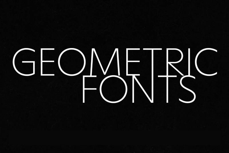
Every time you see a brand logo with perfectly circular letters and clean, uniform strokes, you’re looking at a geometric font in action. But what is a geometric font, exactly, and why does it keep showing up in everything from tech startups to luxury fashion?
Geometric typefaces are built on basic shapes (circles, squares, triangles) rather than handwriting traditions. That mathematical foundation gives them a distinct modern feel that serif and humanist designs just can’t replicate.
This guide breaks down how geometric sans-serif fonts are constructed, where they come from historically, and when they actually work well in real projects. You’ll also learn how to identify them, pair them, and pick the right one for your next design.
What Is a Geometric Font
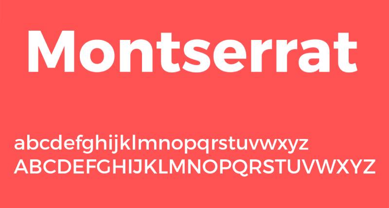
A geometric font is a typeface built on basic geometric shapes. Circles, squares, and triangles form the foundation of every letterform.
Look at the lowercase “o” in Futura or Montserrat. It’s nearly a perfect circle. That single detail tells you more about geometric type design than any textbook definition could.
The category falls under the broader sans-serif font classification, but it’s a specific branch with its own DNA. Where grotesque and humanist sans-serifs still carry traces of hand-drawn lettering, geometric typefaces strip all of that away. What’s left is pure mathematical construction.
Paul Renner’s Futura, released in 1927 by the Bauer Type Foundry, is the archetype. Renner based his letterforms on elemental circles, squares, and triangles, aiming for a modern look suited to the machine age. He wasn’t technically part of the Bauhaus design movement, but he shared its ideology of stripping forms down to their essence.
The Monotype 2024 Global Font Use Survey, which gathered responses from 4,777 participants across 13 countries, found that 83% of designers rank font selection among their top three creative decisions. Sans-serif fonts remain the top choice, and geometric styles dominate within that category for branding and display work.
Geometric fonts communicate precision, modernity, and clarity. They don’t try to mimic handwriting or calligraphy. They say: “this was designed with intention.”
Core Characteristics of Geometric Typefaces
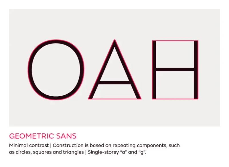
Geometric typefaces share a set of structural traits that separate them from every other sans-serif category. Once you know what to look for, you’ll spot them everywhere.
Stroke and Shape Construction
Uniform stroke width is the first thing you’ll notice. The thickness stays consistent across nearly every character, whether you’re looking at the vertical stem of an “l” or the curve of a “c.”
Letterforms are derived from simple shapes:
- The “o” is built on a circle (or very close to one)
- The “M” and “N” use sharp, angular, triangular construction
- The “a” frequently appears as a single-story form rather than the double-story version common in humanist designs
There’s minimal stroke contrast between thick and thin parts of each letter. Compare that with a serif font like Bodoni, where the difference between thick and thin strokes is dramatic.
Terminals are clean and simple. No flared endings, no calligraphic flourishes. Just cut.
Optical Corrections in Geometric Fonts
Here’s something that took me a while to appreciate. Geometric fonts aren’t actually as geometrically “perfect” as they appear.
Type designers make subtle optical corrections so the letters look right to the human eye. A mathematically perfect circle for the “o” would actually look slightly squashed when set alongside straight vertical strokes. So designers adjust it.
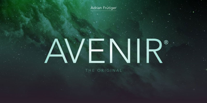
Monotype’s legibility guide notes that in geometric sans-serifs like ITC Avant Garde, a single-story “a” can be confused with an “o” at small sizes. These visual traps are part of why refined geometric fonts (Avenir, Proxima Nova) soften certain details without abandoning the geometric framework.
The psychology of shapes plays into this too. Circular forms read as friendly and approachable. Angular construction reads as stable and precise. Geometric fonts walk a line between both.
Geometric vs. Humanist vs. Grotesque Sans-Serifs

Not all sans-serif fonts are the same. The differences between geometric, humanist, and grotesque categories affect readability, tone, and where each type works best.
| Feature | Geometric | Humanist | Grotesque |
|---|---|---|---|
| Shape basis | Circles, squares, triangles | Calligraphic strokes | Sign painting, 19th-century models |
| Stroke contrast | Very low, near uniform | Moderate variation | Low to moderate |
| Personality | Clean Modern Precise |
Warm Organic Readable |
Neutral Industrial |
| Best examples | Futura Montserrat Avenir |
Gill Sans Frutiger Proxima Nova |
Helvetica Akzidenz-Grotesk |
Geometric sans-serifs prioritize mathematical consistency. Every curve relates back to a basic shape. The result looks polished but can struggle with readability in long paragraphs.
Humanist sans-serifs are rooted in calligraphic tradition. Monotype’s legibility research points out that a humanist typeface like Proxima Nova has a subtly oval “o” rather than a circular one, and its stroke weights vary in ways that signal each letter’s identity to the brain more quickly.
Grotesque and neo-grotesque designs sit somewhere in the middle. Helvetica is the classic example. Functional, almost invisible.
An analysis of 1,000 websites by Dribbble found that 85% of web fonts used are sans-serif. But the specific sub-category matters. Geometric faces tend to dominate headers and branding, while humanist options handle body text more often.
The Vox-ATypI classification system formalizes these distinctions. If you’re building a typographic hierarchy, understanding where your chosen font falls in this system tells you a lot about how it’ll behave at different sizes and in different contexts.
Notable Geometric Fonts and Their History

Futura is where it all starts. Paul Renner designed it between 1924 and 1926, and the Bauer Type Foundry released it commercially in 1927. It was marketed as “die Schrift unserer Zeit” (the typeface of our time).
The font went on the Apollo 11 lunar plaque in 1969. It’s been used in films by Stanley Kubrick and Wes Anderson. Brands like Crayola, Best Buy, and Volkswagen have all used it. In 2022, Futura was reportedly the most profitable font, generating over $7 million in revenue (WhatFontIs).
But Futura was just the beginning. Its commercial success sparked a wave of geometric competitors from other foundries.
Mid-Century and Modern Geometric Typefaces
Century Gothic (1991): Monotype’s response, designed for digital screens. Wider proportions, better screen rendering. Still purely geometric.
Avenir (1988): Adrian Frutiger’s take. He deliberately softened some of the strict geometric rules, making the “o” slightly less circular and varying stroke weights just enough to improve readability. It sits between geometric and humanist.
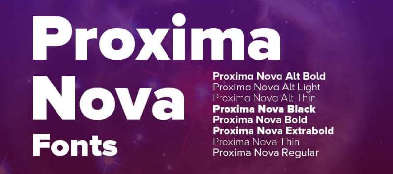
Proxima Nova: Mark Simonson’s popular hybrid that blends geometric structure with humanist warmth. One of the most used commercial fonts on the web, ranking in the top 10 on Adobe Fonts according to the 2024 HTTP Archive Web Almanac.
Free Geometric Options on Google Fonts
Google Fonts changed the game for accessibility. Several geometric options have massive adoption:
- Montserrat: Over 11 billion views and 3.6 billion downloads. Inspired by signage from early 20th-century Buenos Aires
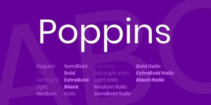
- Poppins: Over 7 billion views. A geometric face with a friendly, rounded feel. Popular in UI and app design
- Raleway: Over 6 billion views. Originally an ultra-thin display font, now expanded into a full family
The 2025 HTTP Archive Fonts chapter found that web fonts now appear on roughly 88% of all websites, up from 87% in 2024. Google Fonts was detected on about 54% of desktop sites, with Montserrat and Open Sans among the most popular variable font implementations.
Looka’s 2024 logo maker data showed that 80% of the top 10 fonts used for logos and branding were sans-serif, with geometric styles like Montserrat consistently ranking high.
When to Use Geometric Fonts

Geometric typefaces do specific jobs really well. But they’re not for everything.
Branding and Logo Design
This is where geometric fonts shine. The clean, mathematical structure reads as modern and intentional, which is exactly what tech companies, fashion labels, and startups want.
Supreme uses Futura Bold Oblique. Spotify’s custom typeface draws from geometric principles. Google developed Product Sans (now Google Sans) as a geometric face for its branding. Toner Buzz research found that three-quarters of Fortune 500 companies choose sans-serif fonts for their logos, and geometric styles make up a significant portion of that group.
Monotype’s 2024 survey confirmed that 75% of respondents view choosing a distinctive typeface as critical to brand identity. Geometric fonts work here because their clean shapes translate well across sizes, from app icons to billboards.
Headlines and Display Use
At large sizes, geometric letter shapes are beautiful. The circular bowls, angular vertices, and uniform strokes all become visible and create strong emphasis on the page.
Poster design, hero sections on websites, event branding, packaging design. Anywhere the type needs to catch your eye first, a geometric face can do the job.
Pairing With Other Font Categories
The best geometric font usage usually involves pairing fonts from different categories.
Geometric headings + humanist body text is a popular formula. You get the visual punch of geometry up top, then the warmth and readability of a humanist face (like Frutiger or Source Sans Pro) for paragraphs.
Geometric + serif combinations also work. A Montserrat font pairing with a transitional serif like Georgia or Merriweather creates strong contrast between the heading and body, which makes scanning easier.
Readability Limitations of Geometric Fonts
Let’s be honest about the tradeoffs. Geometric fonts have real problems at small sizes and in long-form reading.
Character Similarity Issues
The same uniformity that makes geometric fonts look clean creates a readability problem. When every letter shares the same stroke width and circular base, similar characters start blending together.
The lowercase “a,” “d,” “g,” and “q” can look too alike. A strict single-story “a” and a geometric “o” differ by just one small stroke. Monotype’s research specifically calls out ITC Avant Garde and Futura for this issue, noting that humanist typefaces deliver better character distinction because their calligraphic roots give each letter a more unique shape.
A 2013 study by French and others found that reading comprehension scores were 12.8% higher with harder-to-read fonts compared to simple ones, which is an interesting wrinkle. But for everyday body text, you want readers to move through content quickly, not puzzle over individual characters.
Long-Form Reading Performance
Most geometric fonts were designed as display faces first. Futura was an exception (Renner intended it for text), but its low x-height and strict geometry make it harder to read in long paragraphs than something like Frutiger or even Helvetica.
That said, modern geometric fonts have addressed some of these problems:
- Avenir adds subtle humanist adjustments to improve text readability
- Proxima Nova blends geometric structure with enough variation to stay comfortable at body sizes
- Poppins uses generous spacing and slightly rounded terminals
The Monotype 2024 survey found that 76% of designers prioritize readability and accessibility when selecting fonts. For accessibility testing, geometric fonts need more careful evaluation than humanist alternatives, especially at smaller sizes and for users with visual impairments or conditions like dyslexia.
The practical takeaway: use geometric fonts for branding, headings, and short text blocks. For body copy, test carefully or choose a geometric-humanist hybrid.
How to Identify a Geometric Font

You don’t need to be a type designer to spot a geometric typeface. A few quick checks will tell you what you’re looking at.
The Lowercase “o” Test
Start here. Always.
If the lowercase “o” is circular or very close to a perfect circle, you’re probably dealing with a geometric font. In a humanist typeface, that same “o” would be a subtle oval with visible stroke variation.
Futura’s “o” is the textbook example. Montserrat, Poppins, and Raleway all show the same tendency toward circular construction, though each softens it slightly in different ways.
Character Shape Clues
Single-story “a”: Geometric fonts often use this simpler form (a circle with a stem) rather than the double-story “a” found in most serif and humanist designs.
Angular “M” and “N”: Look at the vertices. In geometric faces, these letters use sharp, triangular angles that trace back to basic geometric construction.
Uniform stroke width: Run your eye along any letter. If the thickness barely changes between curves and straight segments, that’s a geometric trait.
Understanding basic typography elements like bowls, counters, and terminals makes this process faster. The more letterforms you examine, the quicker you’ll pick up on the patterns.
Font Identification Tools
Sometimes you just need to know the name. These font finders can help:
| Tool | Method | Best for |
|---|---|---|
| WhatTheFont | Image upload AI matching |
Commercial fonts (130K+ library) |
| WhatFontIs | Image upload Visual matching |
Free and paid fonts (900K+) |
| Identifont | Q&A about letter characteristics | When you have no image, just memory |
| Font Squirrel Matcherator | Image upload OpenType detection |
Finding free alternatives |
WhatFontIs has built a database of over 900,000 fonts for its visual matching engine. If you’re trying to identify a geometric face you spotted on a website or in a logo, these tools will get you close.
Geometric Fonts in Web and Digital Design
The 2025 HTTP Archive Web Almanac found that web fonts now appear on 88% of all websites. Geometric typefaces make up a big slice of that number, especially in headers and branding elements.
Google Fonts and Adobe Fonts as Primary Sources
Two platforms dominate how designers access geometric typefaces online.
Google Fonts hosts over 1,500 font families, all under the SIL Open Font License. Free for personal and commercial use, no strings attached. The 2024 HTTP Archive data shows Google Fonts appeared on about 54% of desktop sites and 47% of mobile sites.
Adobe Fonts includes thousands of typefaces from over 150 foundries, including premium geometric options like Proxima Nova and Futura PT. Access requires an active Creative Cloud subscription. The 2024 Web Almanac notes that Proxima Nova holds one of the top positions on Adobe Fonts, which makes sense given its geometric-humanist hybrid design.
For a deeper comparison of these platforms, the breakdown of Google Fonts vs Adobe Fonts covers licensing, library size, and practical differences.
Variable Fonts and Performance
The 2024 HTTP Archive data shows variable fonts are now used on 34% of mobile pages, up from 29% in 2022. That growth rate is significant.
A variable font packs multiple weights and styles into a single file. For a geometric family like Montserrat (which supports variable axes), this means loading one file instead of eight separate static font files.
The performance math is straightforward. Using Raleway as an example, eight static font files total roughly 500KB. A single variable font file covering the same range drops that to around 150-200KB. Fewer HTTP requests, smaller total payload, faster web design load times.
Screen Rendering and CSS Strategies
WOFF2 is the standard format for geometric web fonts. The 2024 HTTP Archive reports it’s used on 81% of desktop and 78% of mobile sites serving web fonts.
Two CSS properties matter most for geometric font delivery:
- font-display: swap shows fallback text immediately, then swaps in the geometric font once loaded. About half of all websites use this approach
- Preloading with
<link rel="preload">prioritizes critical font files to reduce time to first render
Subpixel antialiasing and ClearType rendering affect how geometric fonts look across different operating systems. The uniform stroke widths that define geometric typefaces actually render well on modern screens because there’s less variation for the rendering engine to interpret. That’s one reason geometric faces became so popular for UI and mobile app design.
Choosing Between Geometric Fonts for a Project
You’ve decided on a geometric font. But which one? The category includes dozens of options and they’re not interchangeable.
Weight Range and Family Completeness
A geometric font with only two or three weights limits what you can do with visual hierarchy. The best families give you room to work.
Montserrat: 18 styles (9 weights + italics). Full range from Thin to Black.
Poppins: 18 styles. Similar coverage, with a rounder, friendlier character.
Futura: Varies by version. Monotype’s Futura Now includes 102 styles across the full family, released in 2020.
If your project needs a brand style guide with clear heading, subheading, body, and caption weights, pick a family with at least 6 weights. Less than that and you’ll run into situations where nothing feels quite right.
Licensing: Open-Source vs. Commercial
This is where budgets meet reality.
| Font | License type | Cost |
|---|---|---|
| Montserrat | SIL Open Font License (Google Fonts) | Free |
| Poppins | SIL Open Font License (Google Fonts) | Free |
| Raleway | SIL Open Font License (Google Fonts) | Free |
| Futura | Commercial (various foundries) | $20–$200+ per license |
| Proxima Nova | Commercial (Mark Simonson Studio) | Varies by use type |
| Avenir | Commercial (Monotype) | Varies by use type |
All Google Fonts use the SIL Open Font License, which allows free commercial use, modification, and redistribution. The Google Fonts library now includes over 1,500 families under this license.
Commercial fonts like Futura typically cost between $20 and $200 for a basic desktop or web license. Extended or enterprise licenses run higher. Understanding font licensing before starting a project saves headaches later.
Monotype’s 2024 survey found that 42% of respondents said their brand was hindered by limited font choices on social media platforms. Licensing restrictions are often the culprit.
Language Support and Special Characters
Not all geometric fonts cover the same ground when it comes to glyphs and language support.
Google’s Noto family (which includes geometric-leaning variants) covers over 1,000 languages and 150 writing systems. The 2024 HTTP Archive found Noto’s CJK variants account for about 42% of all sites using variable fonts.
If your project targets a global audience, check the character set before committing. Montserrat supports Latin, Cyrillic, and Vietnamese. Poppins covers Latin and Devanagari. Futura’s coverage depends entirely on which version you buy.
Matching Font Personality to Project Tone
Geometric fonts aren’t a monolith. Each one carries a slightly different mood.
- Futura: Precise, authoritative, almost industrial. Works for fashion (Supreme) and tech
- Montserrat: Clean but approachable. Popular for startups and web design
- Avenir: Refined and balanced. Sits between strict geometry and warmth
- Poppins: Friendly, rounded, modern. Strong choice for apps and UI
The font psychology behind these differences is real. Circular shapes read as warmer and more inviting (Poppins), while sharp geometric precision reads as serious and premium (Futura). Your audience and brand tone should drive the final pick.
A font pairing generator can help you test combinations quickly, but trust your eyes over any algorithm. Set your chosen geometric font at actual production sizes, in your actual layout, and read it. That five-minute test tells you more than any spec sheet.
FAQ on What Is A Geometric Font
What defines a geometric font?
A geometric font is a sans-serif typeface built on basic shapes like circles, squares, and triangles. These fonts feature uniform stroke width, minimal contrast, and clean letterforms derived from mathematical construction rather than handwriting.
What is the most famous geometric typeface?
Futura, designed by Paul Renner in 1927, is the most recognized geometric typeface. It was released by the Bauer Type Foundry and became an iconic font used in everything from the Apollo 11 lunar plaque to Supreme’s branding.
Are geometric fonts good for body text?
Generally, no. Their uniform character shapes reduce letter distinction at small sizes, making long paragraphs harder to read. Modern hybrids like Avenir and Proxima Nova address this by adding subtle humanist adjustments for better readability.
What is the difference between geometric and grotesque fonts?
Geometric fonts derive letterforms from pure shapes like circles and triangles. Grotesque fonts evolved from 19th-century sign painting and have more irregular, less mathematically rigid construction. Helvetica is grotesque. Futura is geometric.
Is Montserrat a geometric font?
Yes. Montserrat is a geometric sans-serif inspired by early 20th-century signage from Buenos Aires. It’s free on Google Fonts, supports Latin and Cyrillic scripts, and has over 11 billion views on the platform.
What are the best free geometric fonts?
Google Fonts offers several strong options. Montserrat, Poppins, Raleway, Josefin Sans, and Nunito are all free under the SIL Open Font License. Each works for commercial and personal projects without licensing fees.
When should I use a geometric font?
Geometric fonts work best for logos, headlines, branding, and short display text. Their clean shapes create strong visual impact at large sizes. Pair them with a humanist or serif face for body copy.
How do I identify a geometric font?
Check the lowercase “o” first. If it’s nearly a perfect circle, that’s a strong indicator. Also look for a single-story “a,” consistent stroke width across characters, and sharp angular construction in letters like “M” and “N.”
What design movement inspired geometric fonts?
The Bauhaus movement of the 1920s-1930s heavily influenced geometric type design. Its philosophy of reducing forms to functional essentials aligned with the mathematical approach Paul Renner used when creating Futura.
Can I pair a geometric font with a serif font?
Absolutely. Geometric headings paired with a serif body font creates effective contrast. A common combination is Montserrat for headings with Georgia or Merriweather for paragraphs. The difference in structure improves scanning.
Conclusion
Understanding what is a geometric font gives you a real advantage when making brand typography decisions. These typefaces, rooted in circles, squares, and triangles, carry nearly a century of design history from Paul Renner’s Futura to today’s popular options like Poppins and Montserrat.
The strength of geometric sans-serif fonts lies in their clarity and precision. They work for signage, poster design, app interfaces, and corporate identity systems where a clean, modern tone matters.
But they’re not a universal solution. Long-form body text, small screen sizes, and reading-heavy contexts often call for humanist or serif alternatives.
Pick the right geometric typeface for the right job. Test it at real sizes, check the glyph coverage, confirm the license, and pair it thoughtfully. Your type choices shape how people experience your work.

Renowned for his expertise in logo design and visual branding, Bogdan has developed a multitude of logos for various clients.
His skills extend to creating posters, vector illustrations, business cards, and brochures. Additionally, Bogdan's UI kits were featured on marketplaces like Visual Hierarchy and UI8.
He also wrote in the past years on sites like Design Your Way, WebDesignerDepot, WPDean, Designmodo, Speckyboy, Slider Revolution, and more.
- The Windsurf Logo History, Colors, Font, And Meaning - 10 October 2026
- How Designers can Build a Stronger Online Creative Identity - 9 October 2026
- Minecraft Font Generator - 8 October 2026

Bogdan Sandu is a seasoned designer who has been designing websites since 2008. Renowned for his expertise in logo design and visual branding, Bogdan has developed a multitude of logos for various clients. His skills extend to creating posters, vector illustrations, business cards, and brochures. Additionally, Bogdan's UI kits were featured on marketplaces like Visual Hierarchy and UI8. He also wrote in the past years on sites like Design Your Way, WebDesignerDepot, WPDean, Designmodo, Speckyboy, Slider Revolution, and more.
You Might Also Like