Your font choice can make or break a logo before anyone reads a single word.
The typeface you pick shapes how people feel about a brand at first glance. It signals personality, builds trust, and affects whether a logo looks polished or cheap.
Finding the best fonts for logos is not about picking what looks good on screen today. It is about choosing a typeface that scales across formats, holds up over time, and fits the brand it represents.
This guide covers 10 of the strongest options across categories: geometric sans-serifs, classic serifs, display fonts, and humanist typefaces. For each one, you will find out what it is, why it works for logo design, which brand style it fits, and where to get it.
Whether you are building a wordmark from scratch or refining an existing visual identity, this list gives you a clear starting point.
The Best Fonts for Logos
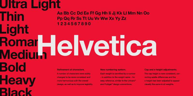
Helvetica
What It Is
A sans-serif font designed by Max Miedinger and Eduard Hoffmann at the Haas type foundry in Switzerland in 1957. Originally called Neue Haas Grotesk.
Why It Works for Logos
Clean, neutral letterforms that carry no personality of their own. That neutrality is exactly why it works so well for brand identity. It gets out of the way and lets the brand speak.
Stroke contrast is nearly uniform, which makes it readable at any size. From a tiny favicon to a billboard, it holds up without losing legibility.
Brand Style Fit
- Corporate, financial, and tech brands
- Any brand that wants to project confidence and clarity
- Real-world users: American Airlines, BMW, Jeep, Panasonic, Target
Versatility and Scalability
Works across print, digital, signage, and embroidery. As a vector graphic, it scales without any quality loss. One of the most format-agnostic typefaces in existence.
Font Pairing
Pairs well with Garamond or Bodoni for contrast. Use Helvetica for the wordmark and a serif for any tagline below it.
Licensing and Access
Commercial license required. Available through Monotype. Not free. A free alternative with similar structure is Inter or Neue Haas Grotesk Text Pro.
Futura

What It Is
A geometric sans-serif designed by Paul Renner and released by Bauer Type Foundry in 1927. Built entirely from circles, triangles, and straight lines.
Why It Works for Logos
Its geometric construction gives it a timeless, forward-looking feel. The letterforms are precise and mathematical. Nothing feels accidental.
Optical consistency across weights makes it adaptable, and the wide range from light to extra bold gives designers serious flexibility for logo lockups.
Brand Style Fit
- Fashion, streetwear, sports, and entertainment brands
- Brands that want modern and geometric without feeling cold
- Real-world users: Calvin Klein, Supreme, Volkswagen, Absolut Vodka
Versatility and Scalability
Scales cleanly at any size. Works well in all-caps for wordmarks. Less ideal for long taglines due to tight optical spacing at small sizes, but for a primary logo mark it is close to perfect.
Font Pairing
Pair with a transitional serif like Garamond for warmth, or with Bodoni for high fashion contrast. Check out the Futura font pairing guide for more combinations.
Licensing and Access
Licensed through Adobe Fonts and Monotype. Not free. A solid free alternative is Jost or Century Gothic.
Garamond

What It Is
An old-style serif font tracing back to Claude Garamond’s typefaces from the mid-16th century. Multiple revisions exist, including Adobe Garamond Pro and EB Garamond.
Why It Works for Logos
Garamond brings warmth and history that few fonts can match. It is elegant without being stiff. The moderate stroke contrast and humanist proportions give it organic, hand-drawn quality that modern geometric fonts lack.
For brands that want to signal heritage, craft, or refinement, Garamond’s Old Style character does that work instantly.
Brand Style Fit
- Publishing houses, law firms, academic institutions
- Luxury goods, wine labels, heritage food brands
- Real-world users: Abercrombie and Fitch, Burberry (earlier versions)
Versatility and Scalability
Performs best at medium to large sizes. The thin strokes can disappear at very small scales, so it is not the best choice for a logo that will regularly appear below 12pt or in embroidery. Works beautifully in print and on screen at display sizes.
Font Pairing
Pair with a clean geometric sans like Futura or Gill Sans. Explore the Garamond font pairing options for wordmark and tagline combinations.
Licensing and Access
EB Garamond is free on Google Fonts. Adobe Garamond Pro requires an Adobe Fonts subscription. ITC Garamond is available through Monotype.
Gotham
What It Is
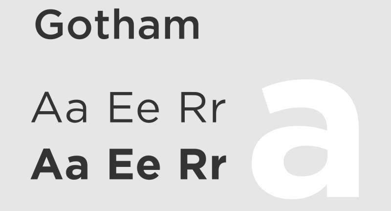
A geometric sans-serif designed by Tobias Frere-Jones in 2000, originally commissioned by GQ magazine. Inspired by mid-20th century signage found across New York City.
Why It Works for Logos
Gotham sits between geometric and humanist. It has the clean structure of Futura with a slightly warmer, more approachable feel. The near-circular curves and uniform strokes make it feel both modern and confident.
It became a cultural touchstone after Barack Obama’s 2008 campaign used it as the primary brand typography, showing just how much weight a good typeface can carry.
Brand Style Fit
- Tech companies, political campaigns, media brands
- Startups that want credibility without corporate stuffiness
- Real-world users: Saturday Night Live, Spotify (early branding), Saks Fifth Avenue
Versatility and Scalability
Excellent across all formats. Strong x-height keeps it readable at small sizes. Works well in condensed versions for logos with limited horizontal space.
Font Pairing
Pairs naturally with Archer or Sentinel for contrast. See the Gotham font pairing guide for practical wordmark and lockup ideas.
Licensing and Access
Available through Hoefler&Co. Paid license required. Montserrat is the most widely used free alternative and shares Gotham’s geometric structure.
Proxima Nova
What It Is
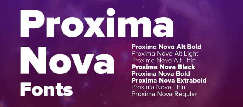
Designed by Mark Simonson in 2005 as a full redesign of his earlier Proxima Sans (1994). Sits at the intersection of geometric and humanist sans-serif design.
Why It Works for Logos
Proxima Nova blends the geometry of Futura with the warmth of Gill Sans. The result is a font that feels modern but not cold. It has 48 styles, which gives brand designers an enormous range of weight and width options within a single typeface family.
That weight range matters a lot in logo design, especially for brands that use different font weights across their identity system.
Brand Style Fit
- Tech brands, media companies, e-commerce
- Brands that want a clean, digital-first identity
- Real-world users: BuzzFeed, Mashable, Trivago, Hulu
Versatility and Scalability
Performs well at all sizes and across all formats. One of the most screen-optimized typefaces available. Works for both logo wordmarks and interface typography within the same brand system.
Font Pairing
Pairs well with Playfair Display or Georgia for editorial contrast. Check fonts similar to Proxima Nova if you need a free alternative with the same character.
Licensing and Access
Available through Adobe Fonts (subscription) and Mark Simonson Studio. Paid. Nunito or Raleway are free alternatives with a similar feel.
Bebas Neue
What It Is
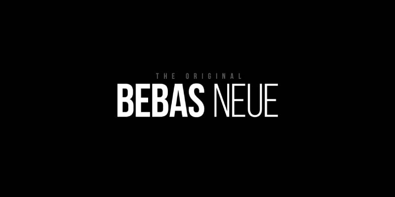
A free display font designed by Ryoichi Tsunekawa of Dharma Type. Originally released in 2005 as Bebas, then redesigned and rereleased in 2010 as Bebas Neue. Uppercase only.
Why It Works for Logos
Tall, condensed letterforms with clean geometric lines. It creates immediate impact at any size. The all-caps constraint is a feature, not a bug: it forces a strong, consistent wordmark with no lowercase inconsistency to manage.
Bebas Neue is the go-to for brands that want bold visual impact without spending anything on licensing.
Brand Style Fit
- Sports brands, fitness companies, streetwear, gaming
- Content creators and YouTube channels
- Brands that want a strong, no-nonsense identity
Versatility and Scalability
Excellent at large sizes. Works well on banners, signage, and apparel. Less ideal for very small applications due to tight spacing in condensed letterforms. Uppercase-only means it is not suitable for mixed-case wordmarks.
Font Pairing
Pair with a lightweight sans-serif like Montserrat Light or Roboto Thin for taglines. The contrast between heavy condensed caps and a thin secondary font is a reliable combination.
Licensing and Access
Free on Google Fonts and the official Bebas Neue website under the SIL Open Font License. Commercial use is permitted.
Playfair Display

What It Is
A transitional serif designed by Claus Eggers Sorensen in 2011. Inspired by 18th-century letterforms, specifically the shift from quill to steel pen in typography. Available on Google Fonts.
Why It Works for Logos
High contrast between thick vertical strokes and thin hairlines creates immediate drama. It carries elegance and authority without feeling stiff. The slightly shorter capitals versus the tall lowercase give it an unusual, refined proportion.
Editorial drama is Playfair’s biggest strength. Luxury brands and fashion publications reach for it when they need a serif with character.
Brand Style Fit
- Luxury brands, fashion, beauty, hospitality
- Editorial and publishing identities
- Wedding and lifestyle brands
Versatility and Scalability
Best at display sizes. The fine hairlines can break down at small sizes or on low-resolution screens, so test it carefully at small scale before committing. Works beautifully in print and at large digital sizes.
Font Pairing
Pair with Montserrat, Work Sans, or Raleway for a strong contrast between a classic serif wordmark and a clean sans-serif tagline. See the Playfair Display font pairing guide for full examples.
Licensing and Access
Free on Google Fonts. Commercial use is permitted. One of the most accessible premium-looking typefaces available at no cost.
Montserrat

What It Is
A geometric sans-serif designed by Julieta Ulanovsky, inspired by the urban typography and signage of the Montserrat neighborhood in Buenos Aires. Released on Google Fonts and available in 18 weights.
Why It Works for Logos
Montserrat strikes a balance between geometric precision and warmth. Its wide range of weights makes it flexible for both primary wordmarks and supporting text within a brand system.
It is one of the most used fonts on the web for good reason. Clean, versatile, and free. The 18-weight range is unusual for a free font and gives designers real flexibility.
Brand Style Fit
- Tech startups, e-commerce, creative agencies
- Brands that need a clean, modern identity on a tight budget
- Works across almost every industry without looking out of place
Versatility and Scalability
Highly versatile. Holds up well at small sizes and in all-caps. Works in print, digital, signage, and on screen. One of the safest choices for a logo that needs to appear across many formats.
Font Pairing
Pairs with almost everything. Merriweather, Lora, and Playfair Display all work well alongside it. The Montserrat font pairing guide covers the best combinations in detail.
Licensing and Access
Free on Google Fonts. Commercial use is permitted under the SIL Open Font License.
Bodoni
What It Is
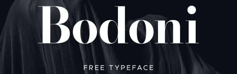
A modern serif developed by Giambattista Bodoni in the late 18th century. Defined by extreme contrast between thick and thin strokes, flat unbracketed serifs, and vertical stress. Several versions exist, including Bodoni MT and ITC Bodoni.
Why It Works for Logos
No other typeface signals luxury quite like Bodoni. The dramatic stroke contrast creates a visually striking wordmark. It is the typographic equivalent of a tailored suit: precise, formal, and unmistakably high-end.
High contrast serifs communicate exclusivity. That is why fashion houses keep returning to it decade after decade.
Brand Style Fit
- Luxury fashion, beauty, and cosmetics brands
- High-end hospitality, jewelry, and fragrance
- Real-world users: Vogue, Giorgio Armani, Calvin Klein, Nieman Marcus
Versatility and Scalability
Best at large display sizes. The thin hairlines are fragile at small sizes, in embroidery, or on low-quality print surfaces. Use it for a logotype where the full drama of the letterforms can be appreciated. Pair it with a more robust secondary font for smaller applications.
Font Pairing
Pairs well with Futura or Helvetica Light for a sharp high-fashion contrast. See the Bodoni font pairing guide for logo lockup ideas.
Licensing and Access
Bodoni MT is a Windows system font. ITC Bodoni is available through Adobe Fonts. A free alternative is Libre Bodoni on Google Fonts.
Gill Sans
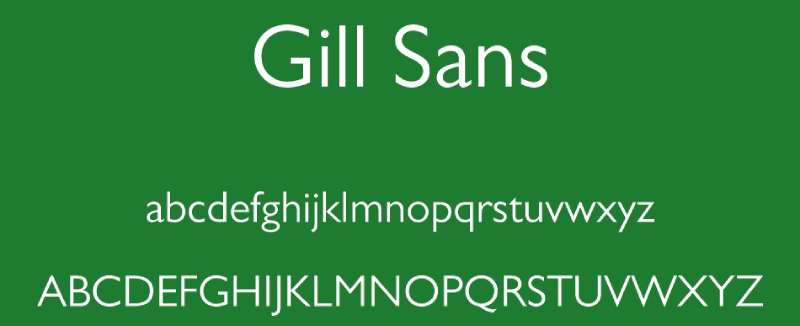
What It Is
A humanist sans-serif designed by Eric Gill and released by Monotype in 1928. It bridges the gap between serif warmth and sans-serif clarity, combining calligraphic proportions with clean, modern strokes.
Why It Works for Logos
Gill Sans has a personality that purely geometric sans-serifs lack. The humanist construction makes it feel approachable and trustworthy. It is readable at almost any size and holds its character across a wide range of weights.
It is a font that communicates British institutional confidence: serious but not cold, classic but not stuffy.
Brand Style Fit
- Educational institutions, media organizations, public services
- Publishing, heritage brands, and cultural institutions
- Real-world users: BBC, Penguin Books, Tommy Hilfiger, the British Railways corporate identity
Versatility and Scalability
Strong across formats. Works well at small and large sizes. The humanist proportions make it comfortable in both wordmark logos and supporting brand text. A reliable choice for institutions that need longevity in their visual identity.
Font Pairing
Pairs well with Garamond or Bodoni for editorial contrast, or with a modern sans like Proxima Nova for a clean, layered brand system. Check fonts similar to Gill Sans for free alternatives with the same humanist character.
Licensing and Access
Available through Adobe Fonts and Monotype. Paid license required. Cabin or Myriad Pro are commonly used free alternatives with a similar humanist feel.
What Makes a Font Work for a Logo?
Not every typeface belongs in a logo. Most don’t, actually.
A logo font has to survive conditions that body copy never faces: tiny sizes, embroidery, signage at 10 feet, a favicon at 16px. The rules that apply to fonts for websites or fonts for branding overlap here, but logos demand more.
Scalability is the first filter. A letterform that looks elegant at 300px can completely fall apart at 32px. Thin strokes disappear. Tight spacing fills in. The font has to hold its structure across every size it will ever appear.
Legibility at a glance is the second. Logos are seen fast, often in motion, on a screen, on a package, on the side of a van. If someone needs more than a second to read the name, the typeface is doing damage.
The third factor is less obvious: overuse kills distinctiveness. A font used by hundreds of brands loses its identity value fast. Choosing a typeface that appears in half the logos on Behance is a real problem, not just an aesthetic one.
Font spacing also matters more than most people think. Tight tracking gives a wordmark authority. Loose tracking signals openness or luxury. Both can work. Ignoring it entirely never does.
Finally, font psychology shapes how a logo is felt before it’s even read. Geometric forms suggest precision and technology. Humanist letterforms signal warmth and accessibility. The US Chamber of Commerce reports that 55% of first brand impressions are visual, and typography is a core part of that.
Serif, Sans-Serif, Script, Slab, or Display: Which Font Category Fits Your Brand?
The font category you choose is a positioning decision as much as a design one.
| Category | Personality | Best For |
|---|---|---|
| Serif | Authority, heritage, tradition | Law, finance, luxury, publishing |
| Sans-serif | Clean, modern, approachable | Tech, SaaS, health, consumer apps |
| Script | Personal, expressive, handcrafted | Beauty, food, creative studios |
| Slab serif | Bold, rugged, dependable | Outdoor, industrial, food brands |
| Display | Distinctive, niche, high-personality | Gaming, entertainment, streetwear |
Custom Neon research shows 71.6% of the world’s top 250 companies use sans-serif fonts in their logos, while 22.4% use serif fonts (including brands like Rolex and Prada).
That said, the majority doesn’t dictate the right answer for every brand.
Serif Fonts for Logos
Classic choice for brands that want to project trust and longevity.
Garamond, Bodoni, and Playfair Display are the most used in logo contexts. Bodoni’s high-contrast strokes work at large sizes but can break down at small ones, so test it before committing.
Serif typefaces have returned in force since 2023. Burberry famously reversed course and moved back to a heritage serif after a brief sans-serif rebrand, recognizing that its history was a differentiator, not a liability.
Sans-Serif Fonts for Logos
The dominant category in modern logo design.
- Helvetica: neutral, corporate, trusted by American Airlines, Target, and Toyota
- Futura: geometric precision, used by Louis Vuitton, Volkswagen, and Supreme
- Gotham: strong American signage influence, institutional and bold
- Proxima Nova: widely used in digital-first branding for its clean proportions
Geometric sans-serifs (Futura, Gotham) lead logo design, followed by neo-grotesque styles like Helvetica and Univers, according to fontinlogo.com research across 100 major brands.
Script Fonts for Logos
Script fonts carry the highest risk of misjudgment in logo work.
Done well, a script font signals authenticity and personality. Done poorly, it reads as generic or unreadable at small sizes. The Coca-Cola wordmark is the famous exception that proves how powerful the right script can be. Most brands attempting the same thing land nowhere near that result.
Use script in logos only when the brand’s personality genuinely calls for it and only after testing legibility at every size the logo will appear.
Slab Serif Fonts for Logos
Built for impact. Hard to ignore.
A slab serif font combines the structure of a serif with heavy stroke weights that work well in rugged, industrial, or bold consumer contexts. Brands like Volvo, Sony, and Harley-Davidson have used slab serifs to project durability and strength.
The tradeoff: they can feel heavy in delicate or premium positioning. Match the weight to the brand’s actual personality.
Display Fonts for Logos
A display font works when personality beats neutrality.
Gaming brands, streetwear labels, and entertainment companies regularly use display typefaces to communicate something immediately about the brand’s world. Fortnite, League of Legends, and Adult Swim all use display-oriented lettering that would be completely wrong for a B2B software company.
The risk is shelf life. Stylized display fonts date faster than any other category.
How Famous Brands Choose Their Logo Fonts
Most top brands don’t use fonts off the shelf. They modify them.
According to research across 100 major brands by fontinlogo.com, Helvetica and Futura are the two most widely used typeface families in global logo design. But in nearly every major case, the brand has adjusted the spacing, weight, or individual letterforms to create something that feels proprietary.
Nike uses a modified version of Futura Bold for its wordmark. The geometric confidence of the original font reflects the brand’s athletic positioning, but the letterforms have been tuned to feel distinctly Nike.
Louis Vuitton relies on Futura for its wordmark with all-caps lettering and tight tracking. The result communicates minimalist luxury without depending on ornamental details.
Amazon went in a completely different direction with its custom Ember typeface, built specifically to feel approachable and informal at scale.
Coca-Cola commissioned a custom script in the 1880s that has survived more than 140 years of brand evolution. That’s the extreme version of “custom lettering.” Most brands don’t need it, but the longevity demonstrates what a truly ownable wordmark can achieve.
The pattern across major brands:
- Start from a proven geometric or humanist typeface
- Modify spacing, weight, or specific letterforms
- Build enough visual difference to establish ownership without sacrificing legibility
Spotify takes this further each year, introducing custom retro-inspired typefaces for its Wrapped campaigns while keeping the core wordmark clean and neutral year-round. That kind of typographic range shows how brands can use custom lettering for emotional campaigns while protecting the primary identity.
Free vs. Premium Fonts for Logo Design
Free fonts can absolutely work in logos. But the traps are real.
The most usable free options for logo work come from Google Fonts. Montserrat, Raleway, Bebas Neue, and Playfair Display all hold up well in wordmark contexts. They have enough weight variety, clean construction, and wide character sets to serve most logo needs at the prototype stage.
Where free fonts fall short:
- Overuse: Montserrat appears in hundreds of thousands of logos. It’s not distinctive anymore.
- Limited weights: Many free fonts ship with 2-3 weights. Premium families often include 10 or more.
- Missing characters: Small or free foundries may have incomplete glyph sets, a real problem for international brands.
Premium sources worth knowing:
- Adobe Fonts: strong catalog, included in Creative Cloud subscriptions
- MyFonts: the largest font marketplace, good for finding niche typefaces
- Fontspring: known for perpetual licensing with no annual renewal
The font licensing question is where most smaller brands make expensive mistakes. “Free for personal use” has no legal meaning for a commercial logo. FontReport documents real cases of licensing violations costing companies thousands, including NBCUniversal and Hasbro facing legal action over font usage that wasn’t correctly licensed.
Before finalizing any logo, confirm the typeface has a commercial license that covers the intended use. If you plan to trademark the logo, check with a trademark attorney too. The font itself isn’t trademarked, but the complete logo treatment may be.
Recommended workflow:
- Use Google Fonts or similar to prototype and test brand personality
- Shortlist 2-3 options that genuinely fit the brief
- Evaluate premium alternatives in the same style category
- Purchase the appropriate commercial license before launch
Common Font Mistakes in Logo Design
These show up constantly, even in professional work.
Using system fonts without modification. Arial and Times New Roman appear in more logos than anyone admits. They’re not terrible typefaces, but they carry zero distinctiveness. A logo using an unmodified system font is essentially wearing someone else’s clothes.
Chasing trends with display fonts. A display font that defines 2024’s aesthetic will define 2024’s aesthetic specifically. Stylized, trendy typefaces date faster than any other category. According to branding research, 74% of S&P 100 companies have rebranded within the first seven years, and in most cases, typography is part of what gets replaced.
Ignoring small-size rendering. A font that looks great at 500px can become unreadable at the size it appears on a business card, a pen, or an app icon. Always test the final logo at the smallest size it will realistically appear.
Forcing font pairing into a logo. Pairing fonts is a skill that applies beautifully to editorial design, web layouts, and marketing materials. In logos, it often creates visual noise. Most strong wordmarks use one typeface, sometimes one weight of one typeface, and nothing else.
Skipping the licensing check. This one is straightforward but ignored constantly. “Free for personal use” does not cover commercial logo use. Using a font without the right commercial license in a logo exposes the brand to legal risk and can complicate trademark registration later.
The iconic fonts that have survived decades, Helvetica, Futura, Garamond, Gill Sans, all share one quality: they work without relying on stylistic novelty. That’s the standard worth aiming for.
FAQ on The Best Fonts For Logos
What makes a font good for a logo?
A good logo font is legible at any size, works across print and digital formats, and fits the brand’s personality. Scalability and distinctiveness matter most. The typeface should look just as sharp on a business card as on a billboard.
Should I use a serif or sans-serif font for my logo?
It depends on your brand. Serif fonts communicate tradition and authority. Sans-serif fonts feel modern and clean. There is no universal right answer, only what fits your brand identity.
What are the most popular fonts used in famous logos?
Helvetica, Futura, and Gotham appear in some of the most recognized logos in the world. Bodoni is common in luxury fashion. Garamond shows up in publishing and heritage brands. Font choice consistently reflects brand positioning.
Can I use Google Fonts for a commercial logo?
Yes. Most Google Fonts are released under the SIL Open Font License, which permits commercial use. Montserrat, Playfair Display, and Bebas Neue are all free and commercially licensed. Always verify the license before using any typeface.
What font works best for a luxury brand logo?
Bodoni and Garamond are the strongest choices for luxury brand typography. Both communicate elegance and craftsmanship. Playfair Display is a free alternative with similar editorial drama at display sizes.
How many fonts should a logo use?
One, sometimes two. A single typeface in different weights is usually enough. If you use two, keep strong contrast between them, such as a serif wordmark paired with a minimal sans-serif tagline. More than two creates visual noise.
What font is best for a tech company logo?
Geometric sans-serifs work best for tech. Proxima Nova, Gotham, and Helvetica are all reliable. They read as modern, approachable, and credible. Montserrat is a free option that carries the same geometric clarity without licensing costs.
Does font psychology affect how people perceive a logo?
Yes, significantly. Font psychology shows that serif fonts trigger trust and authority, while rounded sans-serifs feel friendly. Sharp geometric fonts suggest precision. Every typeface carries emotional weight that affects how a brand is perceived.
What is the difference between a font and a typeface in logo design?
A typeface is the overall design family, like Helvetica. A font is a specific weight or style within that family, like Helvetica Bold. In logo design, you choose a typeface, then select the font variant that fits the visual tone.
Do I need to license a font used in a logo?
Yes, in most cases. Free fonts on Google Fonts are safe for commercial use. Premium fonts from Monotype or Adobe Fonts require a paid font license. Always check commercial use terms before finalizing any logo typeface.
Conclusion
This conclusion is for an article presenting the best fonts for logos, and the core takeaway is simple: typeface selection is one of the most consequential decisions in brand identity design.
The right choice builds recognition. The wrong one undermines everything else in the design.
Whether you go with the timeless neutrality of Helvetica, the luxury signal of Bodoni, or the accessible geometry of Montserrat, each font communicates something specific about the brand before a single word registers.
Pay attention to font licensing, scalability across formats, and how the typeface holds up at small sizes.
Good logo design principles always start with typographic hierarchy and a clear understanding of what the brand needs to say.
The fonts covered here are a solid starting point. Test a few, compare them in context, and trust what works at every scale.

Renowned for his expertise in logo design and visual branding, Bogdan has developed a multitude of logos for various clients.
His skills extend to creating posters, vector illustrations, business cards, and brochures. Additionally, Bogdan's UI kits were featured on marketplaces like Visual Hierarchy and UI8.
He also wrote in the past years on sites like Design Your Way, WebDesignerDepot, WPDean, Designmodo, Speckyboy, Slider Revolution, and more.
- The Windsurf Logo History, Colors, Font, And Meaning - 10 October 2026
- How to Remove Background From Product Photos (No Photoshop) - 10 October 2026
- How Designers can Build a Stronger Online Creative Identity - 9 October 2026

Bogdan Sandu is a seasoned designer who has been designing websites since 2008. Renowned for his expertise in logo design and visual branding, Bogdan has developed a multitude of logos for various clients. His skills extend to creating posters, vector illustrations, business cards, and brochures. Additionally, Bogdan's UI kits were featured on marketplaces like Visual Hierarchy and UI8. He also wrote in the past years on sites like Design Your Way, WebDesignerDepot, WPDean, Designmodo, Speckyboy, Slider Revolution, and more.
You Might Also Like