Gill Sans defined British typography for nearly a century, but licensing costs and overuse pushed designers toward alternatives. Finding fonts similar to Gill Sans means understanding what made Eric Gill’s 1928 design work: humanist proportions, calligraphic warmth, and versatility across both display and text settings.
This guide examines 20 alternatives spanning geometric sans serifs, humanist typefaces, and contemporary options.
You’ll discover which fonts match Gill Sans’s elegant readability, where each alternative excels, and how to choose based on budget, licensing needs, and brand personality. Some options like Johnston inspired Gill Sans directly. Others like Avenir and Frutiger evolved from similar design philosophies.
Whether you need a free Google Font or a refined commercial typeface, the right alternative depends on your specific context and design goals.
Fonts Similar To Gill Sans
| Font Name | Key Characteristics | Best Use Cases | Similarity to Gill Sans |
|---|---|---|---|
| Futura | Geometric sans-serif with perfect circles, clean lines, and modernist aesthetic | Headlines, luxury brands, minimalist designs | Similar humanist warmth but more geometric |
| Avenir | Refined geometric forms with organic warmth, excellent readability | Body text, corporate communications, web interfaces | Very close alternative with modern refinement |
| Johnston | Humanist design by Edward Johnston, influenced Gill Sans directly | Transit signage, wayfinding, public information | Closest relative – Gill Sans was based on it |
| Calibri | Warm, soft curves designed for screen readability | Office documents, emails, presentations | Similar approachability but optimized for digital |
| Frutiger | Humanist sans with exceptional clarity, designed for distance reading | Signage, airports, corporate identity | Shares humanist proportions and clarity |
| Myriad Pro | Versatile humanist with multiple weights, neutral character | Branding, editorial design, web and print | Similar versatility and humanist structure |
| Gotham | Geometric inspired by architectural lettering, sturdy and confident | Editorial headlines, political campaigns, advertising | More geometric but shares British influence |
| Optima | Flared stems bridging serif and sans-serif, classical elegance | Formal documents, luxury branding, certificates | Similar classical proportions with humanist feel |
| Alegreya Sans | Humanist with calligraphic touches, dynamic rhythm | Editorial design, books, extended reading | Shares humanist origins with more personality |
| Noto Sans | Pan-language support, neutral and harmonious across scripts | Multilingual projects, internationalization, web apps | Similar neutrality and approachability |
| Lato | Semi-rounded humanist, warm and stable with strong structure | Web typography, user interfaces, corporate sites | Similar warmth and professional versatility |
| Cabin | Humanist inspired by Johnston and Gill, optimized for web | Display text, headers, screen reading | Direct descendant influence, highly similar |
| Montserrat | Geometric with urban character, inspired by Buenos Aires signage | Modern web design, branding, headlines | More geometric but shares clean aesthetic |
| Brandon Grotesque | Geometric with personality, quirky details in alternate characters | Fashion branding, lifestyle magazines, creative projects | Similar friendliness but more contemporary |
| FF Yoga Sans | Organic humanist with soft terminals, relaxed appearance | Wellness brands, lifestyle content, informal text | Similar humanist warmth with softer character |
| ITC Johnston | Commercial version of Edward Johnston’s original design | Transport systems, heritage branding, British contexts | Nearly identical – same design lineage |
| Mundo Sans | Humanist with subtle stroke contrast, friendly and approachable | Editorial design, children’s content, accessibility | Shares approachability and humanist features |
| Antique Olive | Distinctive rounded terminals, European modernist character | Retro branding, distinctive headlines, French contexts | Similar era and European character |
| Ubuntu | Humanist optimized for clarity on screens, open-source | Software interfaces, tech branding, web applications | Similar clarity and humanist proportions |
| Biryani | Contemporary Indian-influenced grotesque with unique character | Multilingual design, cultural projects, display text | Shares grotesque structure with distinct flavor |
Futura

Paul Renner created Futura in 1927 as a contribution to the New Frankfurt project. This geometric sans serif rejected the Victorian grotesque models in favor of near-perfect circles, triangles, and squares.
What Makes It Geometrically Pure
Futura strips letterforms down to their geometric essence.
The typeface uses near-perfect circles for the letter O, unlike Gill Sans which has more humanist proportions. Stroke weight remains almost uniform throughout, except in letters like the lowercase a. Long ascenders and classical Roman capitals give it stylish elegance that differentiates it from other geometric sans serifs.
Core Function
Built for both display and text use, Futura works across all sizes.
The design aimed to capture modernity without ornamentation. Many designers consider it the defining typeface of geometric sans serifs. Stanley Kubrick said it was his favorite typeface of all time.
Technical Specifications
Released by Bauer Type Foundry with three original weights in 1927 (Light, Regular, Bold).
The family expanded to include condensed versions, display variants, and Futura Black. Digital versions from various foundries offer different interpretations. Renner designed it for books, not just advertising or display use (a radical concept for sans serifs in the 1920s).
Use Cases
NASA used Futura on the Apollo 11 plaque left on the moon.
Major brands like Volkswagen, IKEA (until 2010), Supreme, and Absolut vodka relied on it for corporate identity. Film posters and fashion houses (Calvin Klein, Louis Vuitton, Dolce & Gabbana) continue using Futura for its timeless modernist appeal.
Common Challenges
The strict geometry can feel cold or mechanical in long-form reading.
Digital revivals vary significantly in quality and character sets. Some versions lose the subtlety of the original metal type. The perfect circles can create spacing challenges in certain letter combinations.
Related Concepts
Compare with Avenir (warmer geometric alternative), Proxima Nova (contemporary take), Century Gothic (less refined geometric), and Brandon Grotesque.
Inspired by Erbar (1922), the first geometric sans serif. Influenced countless typefaces including TeX Gyre Adventor.
Avenir
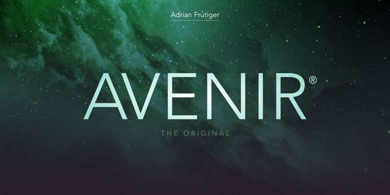
Adrian Frutiger designed Avenir in 1987 and released it through Linotype in 1988. The name means “future” in French, nodding to its Futura inspiration while delivering a more humanist interpretation.
What Makes It Humanistically Geometric
Avenir balances geometric structure with organic warmth.
The O isn’t perfectly circular. Vertical strokes are thicker than horizontal ones. Shortened ascenders improve legibility while maintaining elegant proportions. Frutiger described Avenir as his masterpiece because of the draftsmanship quality rather than the intellectual concept behind it.
Core Function
Created as a “geometric sans serif with a human touch” unlike Futura’s mechanical coldness.
It provides versatility for both text blocks and display work. The careful optical corrections make letters feel natural despite geometric foundations. Works exceptionally well at extended text lengths where pure geometric forms would tire readers.
Technical Specifications
Originally released with three weights, each with roman and oblique versions.
Later expanded to six weights using Frutiger’s numbering system. Avenir Next (2004) reworked by Frutiger and Akira Kobayashi added 24 fonts initially, eventually expanding to 32. Includes small caps, text figures, subscript, superscript, and ligatures in OpenType versions.
Use Cases
Became a system font in iOS and macOS from Mountain Lion onwards.
Amsterdam uses it as principal typeface in city branding. The University of Warwick, Bloomberg, Snapchat, and The Co-operative Group all adopted Avenir for corporate typography. Best Buy commissioned a custom version with 12 weights.
Common Challenges
Widespread use can make designs feel generic if not carefully implemented.
Some designers find the shortened ascenders too compact. The obliques are slanted romans rather than true italics. Regular weight sometimes appears too light for body text on screens.
Related Concepts
Directly inspired by Futura and Erbar.
Similar humanist approaches: Frutiger, Myriad Pro, Proxima Nova. Geometric cousins include Circular, Sofia Pro. Study typography principles and font psychology for effective pairing.
Johnston
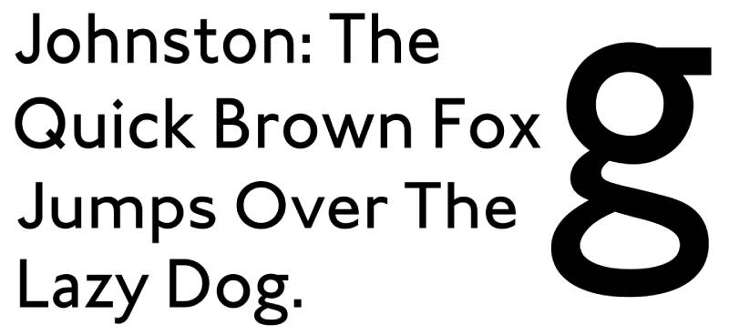
Edward Johnston created this humanist sans serif in 1916 for London Underground. Frank Pick commissioned it to strengthen corporate identity across the Underground Group’s lines.
What Makes It Distinctively British
Johnston pioneered modern sans serif design as the first typeface designed for day-to-day use by a leading artist-craftsman.
The diamond-shaped tittles (dots on i and j) set it apart. Calligraphic influences show in letter construction. Some characters feature subtle pen-made variations. The lowercase g originally had a diagonal bowl. Pick wanted “the bold simplicity of the authentic lettering of the finest periods” that would “unmistakably belong to the twentieth century.”
Core Function
Designed for maximum legibility on enamel station signs and posters.
Must work at various sizes, from large signage to small print. Creates unmistakable identity for London’s transport system. Originally made for 1-inch printing height. Quickly became iconic branding that represented London itself, not just transport.
Technical Specifications
Originally printed using wood type for large signs and metal type for print.
Eiichi Kono revised it in 1979 as New Johnston, adding bold and italic fonts with adjusted proportions. Johnston 100 (2016) by Monotype added Hairline and Thin weights for digital use, plus modern characters like hashtag and @. P22 Type Foundry licensed the original Johnston commercially.
Use Cases
Every London Underground station, bus stop, and transport document since 1916.
Transport for London maintains exclusive control. The roundel logo pairs with Johnston for instant recognition worldwide. Eric Gill studied under Johnston and later created Gill Sans based on these forms. Referenced in logo design principles courses.
Common Challenges
Limited character set in original versions required multiple updates.
Hand-setting skills became rare and costly. Characters set too widely in early digital versions. Not all weights include lowercase letters (Heavy lacks them entirely). Complex licensing for use outside TfL.
Related Concepts
Directly inspired Gill Sans (Johnston’s student Eric Gill expanded the concept).
Related to other British transport types and humanist sans serifs like Syntax. Compare with Frutiger for humanist characteristics. Study within context of graphic design movements.
Calibri
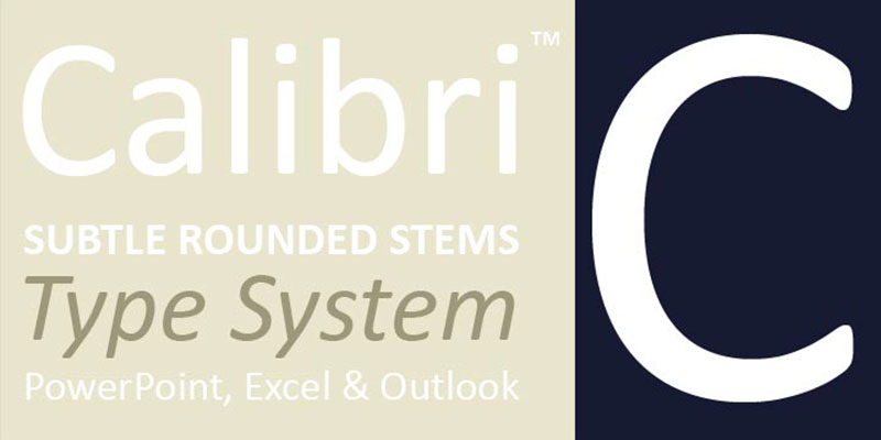
Lucas de Groot designed Calibri from 2002-2004 for Microsoft’s ClearType Font Collection. Released publicly in 2006 with Windows Vista, it became Office’s default font in 2007.
What Makes It Screen-Optimized
Calibri’s subtle roundings on stems and corners create warmth while maintaining digital clarity.
The design originally had sharp corners, but de Groot submitted a rounded version thinking Microsoft would reject it. The improved ClearType rasterizer handled rounded terminals smoothly. Letter forms follow traditional serif patterns but without the serifs themselves. Rounded stroke endings provide comfortable, friendly feel for extended reading.
Core Function
Built specifically for on-screen reading with ClearType technology.
Works as general workhorse for everything from headlines to small body text. Replaced Times New Roman as default in Word and Arial in PowerPoint, Excel, and Outlook. De Groot created it to be more readable on LCD monitors than previous defaults.
Technical Specifications
Based on de Groot’s TheSans family with added optical refinements.
Includes three base weights (Light, Regular, Bold) with italics. Light weight added in Windows 8. Supports Latin, Greek, Cyrillic character sets. Contains small capitals, directional arrows, multiple numeral styles. OpenType features include ligatures, old-style figures. Replaced by Aptos in 2024.
Use Cases
Default Microsoft Office font for 17 years (2007-2024).
Became one of the most-used fonts globally through Office ubiquity. Common in resumes, business documents, corporate communications. Also exposed forgeries (documents dated before 2006 couldn’t contain Calibri).
Common Challenges
Ubiquity makes documents feel generic and corporate.
Narrow proportions can feel cramped. The rounded terminals sometimes blur at very small sizes in print. Overuse in professional settings created “boring business document” associations. Some designers criticize it as too plain.
Related Concepts
Metric-compatible alternative: Carlito (based on Lato, free).
Similar screen-optimized fonts: Segoe UI, Corbel (also ClearType Collection members). Related to TheSans. Compare with Georgia for serif font pairing. Learn about font licensing for proper use.
Frutiger
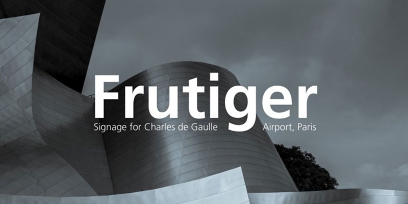
Adrian Frutiger created this humanist sans serif in 1975 for Charles de Gaulle Airport signage. Originally called Roissy, Linotype released it publicly in 1976 as Frutiger.
What Makes It Supremely Legible
Frutiger balances geometric precision with humanist warmth for exceptional readability at all distances.
Square dots on i and j increase clarity. Double-story lowercase a and single-story g. Wide, open apertures on a, c, e, s help distinguish letters. Very high x-height improves clarity. Prominent ascenders and descenders. Steve Matteson called it “the best choice for legibility in pretty much any situation” at small text sizes. Erik Spiekermann named it “the best general typeface ever.”
Core Function
Designed for wayfinding signage requiring legibility from various angles, distances, and lighting conditions.
The commission brief demanded clear reading from afar and at angles. Frutiger adapted his earlier Concorde design using legibility research. Modern appearance without coldness. Works for both signage and extended text.
Technical Specifications
Originally released by Stempel in conjunction with Linotype.
Includes normal and condensed widths. Multiple weights from Light to Black. Obliques rather than true italics. Neue Frutiger (2009) expanded the family with refined spacing and additional weights. Neue Frutiger World (2018) added 150+ language support including Greek, Cyrillic, Arabic, Thai, Vietnamese, and CJK.
Use Cases
Charles de Gaulle Airport (original purpose), Paris Métro adaptations.
NHS in UK healthcare, numerous corporate identities. Signage systems in hospitals, universities, public transport worldwide. Adobe’s Myriad and Microsoft’s Segoe UI both drew heavy inspiration (Frutiger said Myriad went “a little too far” in similarities).
Common Challenges
Original character set limited compared to modern needs.
Obliques lack true italic feel. Wide availability created overuse in certain sectors. Some find the square dots on i and j too distinctive. Not ideal for very long-form reading despite legibility.
Related Concepts
Based on earlier Concorde typeface.
Inspired Myriad Pro, Segoe UI (controversially). Compare with Avenir (same designer), Gill Sans, Syntax, Optima. Evolved from Univers concepts. Study typographic hierarchy for effective implementation.
Myriad Pro
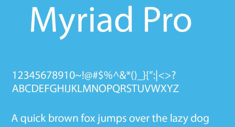
Robert Slimbach and Carol Twombly designed Myriad for Adobe in 1992. The Pro version expanded the family with OpenType features, Greek, and Cyrillic glyphs.
What Makes It Humanistically Versatile
Myriad blends humanist letter proportions with geometric clarity.
Warmth and readability result from humanistic treatment of proportions and design details. Clean open shapes provide comfortable reading. Extensive kerning pairs create precise letter fit. Multiple widths (condensed, normal, extended) with full weight ranges offer creative flexibility.
Core Function
Created as versatile sans serif for both text and display composition.
Apple used it as corporate typeface from 2002-2017. Works equally well for body text and headlines. The unified family of romans and italics provides typographic consistency across applications.
Technical Specifications
Adobe Originals design expanded through multiple releases.
Condensed, normal, and extended widths. Full range of weights from Light to Black. Includes small caps, old-style figures, subscript/superscript, ligatures. Supports Latin Extended, Greek, Cyrillic. OpenType features extensive.
Use Cases
Apple’s corporate font for 15 years (until San Francisco replaced it).
LinkedIn, Walmart, Wells Fargo adopted Myriad. Common in print publications, web design, mobile apps. Often chosen for professional yet approachable branding.
Common Challenges
Apple association makes it feel dated or overused for some designers.
Similarities to Frutiger sparked controversy (Frutiger said it was “not badly done” but went “a little too far”). Can feel generic due to widespread use. Regular weight sometimes needs adjustment for optimal screen rendering.
Related Concepts
Heavily influenced by Frutiger.
Compare with Segoe UI (Microsoft equivalent), Avenir, Trebuchet MS. Adobe font family. Study pairing fonts strategies for effective combinations.
Gotham
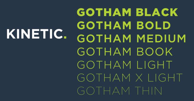
Tobias Frere-Jones designed Gotham in 2000 for GQ magazine. It gained massive popularity after Barack Obama’s 2008 presidential campaign used it extensively.
What Makes It Architecturally Solid
Gotham draws inspiration from American architectural lettering and signage.
Low crossbars on A, R, P create distinctive stocky appearance. Wide letter proportions feel sturdy and confident. Geometric construction with squared-off characters. Even stroke weight throughout. Based on Port Authority Bus Terminal lettering and similar mid-century American signage.
Core Function
Built for strong headlines and display work with authority and approachability.
Conveys strength without aggression. The architectural inspiration gives it grounded, trustworthy character. Works for brands wanting to project confidence and accessibility simultaneously. Obama campaign made it synonymous with hope and change messaging.
Technical Specifications
Originally designed for Hoefler & Co (formerly Hoefler & Frere-Jones).
Eight weights from Thin to Ultra. Multiple widths including Narrow, Condensed, Extra Condensed. Includes small caps, alternates, old-style figures. OpenType features extensive. Screen versions optimized separately from print.
Use Cases
Obama 2008 campaign (iconic usage), Spotify, Cartoon Network, The Daily Show.
Netflix used it before custom font development. NYU, University of South Carolina in academic branding. Fashion brands, tech startups, editorial design.
Common Challenges
Extreme popularity led to overuse and became design cliché.
High licensing cost pushes designers to free alternatives like Montserrat. Distinctive characteristics make it immediately recognizable (can be pro or con). Not ideal for long-form text despite multiple weights.
Related Concepts
Free alternatives: Montserrat (closest), Metropolis, Geomanist.
Compare with Proxima Nova (similar geometric approach), Avenir (warmer), Helvetica (more neutral). Influenced by American vernacular signage. Related to Swiss design principles.
Optima
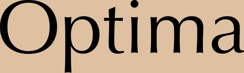
Hermann Zapf designed Optima in 1952-1955. Released by D. Stempel AG in 1958, it straddles the line between serif and sans serif.
What Makes It Glyphically Refined
Optima’s terminals flare subtly, suggesting serif influence without actual serifs.
Stroke weight varies throughout letters (not monoline like most sans serifs). The flaring creates elegant classical proportions. Organic forms feel more humanist than geometric. Zapf based it on Roman capitals and Renaissance letterforms. Often called a “serifless roman” or “flared sans.”
Core Function
Provides elegance and readability for situations requiring sophistication without formality of serifs.
Works exceptionally well for upscale branding, memorials, and institutional applications. The subtle stroke variation adds warmth absent in pure geometric sans serifs. Readable at text sizes while distinctive in display.
Technical Specifications
Multiple weights from Light to ExtraBlack.
Extended character sets include Latin, Greek, Cyrillic. OpenType versions add old-style figures, small caps, ligatures. Optima nova (2002) expanded and refined the family. Narrow and wide variants available.
Use Cases
Vietnam Veterans Memorial, Estée Lauder corporate identity, Aston Martin.
Common in luxury goods packaging, fashion branding, architectural signage. Museum exhibition text, high-end publishing, cosmetics industry. Yahoo used Optima for years.
Common Challenges
The flared strokes can feel dated in some contexts (1950s aesthetic).
Not distinctive enough for some display needs, too distinctive for pure text work. Spacing requires careful attention due to varying stroke widths. Some digital versions lost subtlety of original metal type.
Related Concepts
Influenced by classical Roman inscriptions.
Compare with Pascal (geometric interpretation), Syntax (pure humanist sans), Bembo (serif inspiration). Zapf also designed Palatino, Zapfino. Study contrast principles for effective use.
Alegreya Sans
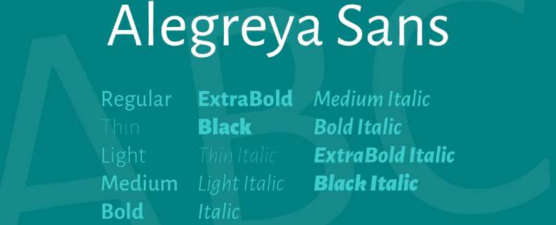
Juan Pablo del Peral designed Alegreya Sans as the sans serif companion to Alegreya (2011). Released through Huerta Tipográfica with Google Fonts support.
What Makes It Calligraphically Informed
Alegreya Sans maintains rhythmic qualities from its serif companion while shedding the serifs.
Lowercase g uses calligraphic single-story form. Dynamic character variations create visual rhythm. Subtle calligraphic influences in stroke modulation. Open counters improve legibility. Humanist proportions feel warm and approachable.
Core Function
Designed for both body text and headlines with expressive character.
Works well in multilingual contexts (extensive language support). Provides warmth for editorial design, branding, and web typography. The calligraphic influence prevents the coldness common in geometric sans serifs.
Technical Specifications
Available in five weights from Thin to Black.
Includes italics for all weights. Small caps across the family. Old-style and lining figures. Extensive Latin character support. Free through Google Fonts. OpenType features include ligatures, alternates, proportional/tabular figures.
Use Cases
Editorial design requiring warm sans serif.
Web projects needing expressive yet readable typeface. Branding for cultural organizations, NGOs, educational institutions. Pairs well with Alegreya serif family for typographic systems.
Common Challenges
Distinctive character might not suit conservative corporate contexts.
The calligraphic influences can clash with purely geometric design systems. Not as immediately neutral as Helvetica-style grotesques. May feel too expressive for technical documentation.
Related Concepts
Companion to Alegreya serif family.
Compare with Freight Sans, Proza, FF Yoga Sans for similar humanist warmth. Study font spacing and leading for optimal implementation.
Noto Sans
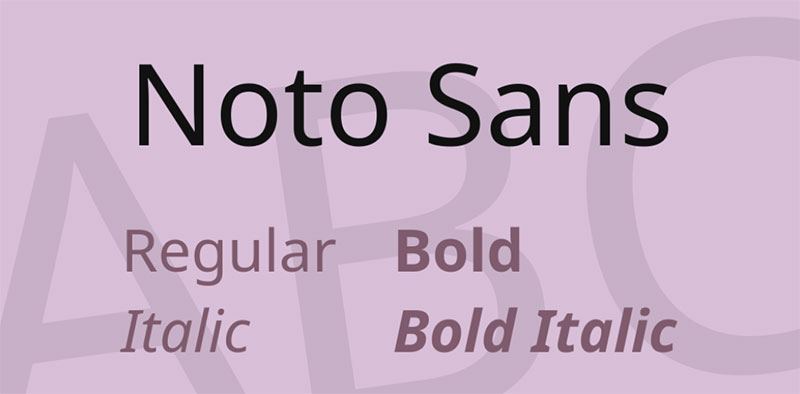
Google commissioned Noto Sans as part of the Noto font family. Designed to support all Unicode characters without “tofu” (missing character boxes).
What Makes It Universally Compatible
Noto Sans covers every writing system in Unicode.
Harmonized design across all scripts. Same weights and widths available for Latin, Greek, Cyrillic, Arabic, Chinese, Japanese, Korean, Thai, Devanagari, and 100+ more scripts. Neo-grotesque structure provides neutrality across cultures. Extensive hinting for screen rendering.
Core Function
Created to eliminate missing character boxes (“tofu”) in digital typography.
Provides consistent design language across all world writing systems. Enables multilingual layouts without switching typefaces. Open-source availability removes licensing barriers. The “Noto” name derives from “no tofu.”
Technical Specifications
Massive family with thousands of font files.
Seven weights for each supported script. Condensed variants for Latin, Greek, Cyrillic. Monospace versions available. OpenType and TrueType formats. Variable font versions for Latin. Regular updates add newly encoded Unicode characters.
Use Cases
Google products and Android system font.
Multilingual publications, international organizations, academic linguistics. Websites serving global audiences. App development requiring universal script support. Documentation needing technical symbol coverage.
Common Challenges
Enormous file sizes if using full family.
Variable design quality across different scripts. Some scripts feel more refined than others. Neutral design can feel bland. Subset creation necessary for web use.
Related Concepts
Part of Google Fonts ecosystem.
Compare with Roboto (Google’s interface sans), Source Sans (Adobe equivalent). Related to Arial Unicode MS, Lucida Sans Unicode. Study variable fonts technology.
Lato

Łukasz Dziedzic designed Lato in 2010. The name means “summer” in Polish, reflecting the typeface’s warm yet stable character.
What Makes It Warmly Corporate
Lato balances warmth with stability through semi-rounded letterforms.
Classical proportions in uppercase, contemporary feel in lowercase. Strong structure with rounded details. Slightly concave curves on sides create subtle warmth. Generous x-height aids legibility. Transparent and readable in body text.
Core Function
Designed as workhorse sans serif combining warmth with seriousness.
Works equally well for corporate branding and friendly editorial design. The semi-rounded details prevent coldness without feeling casual. Extensive weight range offers flexibility. Free availability makes it accessible for all budgets.
Technical Specifications
Free through Google Fonts with open license.
Nine weights from Hairline to Black with matching italics. Extensive Latin character support including Eastern European. Good hinting for screen rendering. WebFont optimized versions. Carlito (Calibri alternative) uses Lato as base design.
Use Cases
Extremely popular on websites (used on millions of sites).
Corporate communications, web interfaces, mobile apps. Common Calibri replacement in open-source contexts. Presentation design, digital marketing, editorial layouts.
Common Challenges
Massive popularity creates generic associations.
Can feel too similar to other humanist sans serifs without careful styling. Regular weight sometimes needs bolding for emphasis. Not distinctive enough for unique brand identities.
Related Concepts
Often compared to Proxima Nova, Open Sans, Roboto.
Free alternative to Brandon Text and Montserrat. Related to Source Sans Pro, Raleway. Study fonts for websites best practices.
Cabin
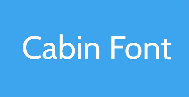
Pablo Impallari designed Cabin in 2009-2011. Inspired by Edward Johnston’s and Eric Gill’s typefaces with added warmth.
What Makes It Humanistically Approachable
Cabin combines traditional humanist proportions with contemporary refinement.
Based on Johnston/Gill Sans traditions but with smoother curves. Square dots on i and j reference Johnston. Open apertures improve legibility. Slightly condensed proportions create efficient use of space. Warm character prevents mechanical feel.
Core Function
Built for screen and print with emphasis on readability at small sizes.
Provides friendly yet professional tone. Works well for interfaces, web content, and mobile applications. The Johnston/Gill Sans lineage gives it British design sensibility without licensing restrictions.
Technical Specifications
Free through Google Fonts with open license.
Four weights (Regular, Medium, SemiBold, Bold) with italics. Condensed version available separately. Extensive Latin character coverage. Optimized for web with good hinting. Sketch and variable font versions available.
Use Cases
Web interfaces requiring approachable sans serif.
App design, educational materials, editorial projects. Popular among independent designers and startups. Body text for blogs, documentation, product interfaces.
Common Challenges
Limited weight range compared to commercial alternatives.
Not as distinctive or refined as Johnston or Gill Sans. Can feel generic without careful implementation. May not suit all brand personalities.
Related Concepts
Inspired by Johnston and Gill Sans.
Compare with Gudea, Hind, Karla for similar approachability. Free alternatives in similar space. Study typography elements for better application.
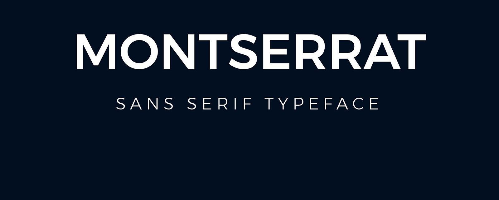
Montserrat

Julieta Ulanovsky designed Montserrat starting in 2010. Released through Google Fonts in 2011, inspired by Buenos Aires neighborhood signage.
What Makes It Argentinian Modern
Montserrat rescues the urban typography of 1920s-1950s Buenos Aires.
Based on posters, signs, painted windows from Montserrat neighborhood. Geometric structure with subtle humanist touches. Large x-height with short descenders. Wide apertures boost legibility. Nine weights from Thin to Black provide comprehensive range. Alternates available for different styles.
Core Function
Created to preserve disappearing urban letterforms through functional digital typeface.
Free Gotham alternative became its primary use case. Works for both display headlines and body text. The historical inspiration gives it character while maintaining contemporary utility. Named Fiverr’s Font of the Year 2024.
Technical Specifications
Free through Google Fonts with SIL Open Font License.
Nine weights with matching italics (18 fonts total). Montserrat Alternates subfamily for stylistic variations. Montserrat Subrayada (underlined variant). Cyrillic support added 2017. Redrawn by Jacques Le Bailly 2017 for better text use. Over 250 glyphs with extensive diacritics.
Use Cases
Used on over 19 million websites.
Popular Gotham replacement for budget-conscious designers. Tech startups, creative agencies, editorial projects. Film posters, mobile apps, presentations. Corporate branding requiring geometric sans serif.
Common Challenges
Extreme popularity makes it feel overused.
Very similar to Gotham (some call it too similar). May feel generic without thoughtful implementation. Regular weight can appear too light for some applications.
Related Concepts
Created as historical preservation, became Gotham alternative.
Compare with Gotham, Proxima Nova, Raleway, Metropolis. Study geometric sans characteristics.
Brandon Grotesque
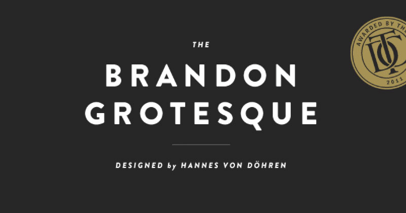
Hannes von Döhren designed Brandon Grotesque in 2009-2010. Published through HVD Fonts as geometric sans serif with humanist touches.
What Makes It Geometrically Warm
Brandon Grotesque softens pure geometric forms with organic details.
Rounded geometric construction (circular O). Subtle humanist warmth in details. Distinctive characters: straight-sided A, geometric C and G, circular punctuation. Wide range of weights from Thin to Black. Lowercase has friendly, approachable character.
Core Function
Designed for display work requiring geometric precision with personality.
Works for branding, headlines, editorial display. The geometric structure gives it modern tech feel. Humanist touches prevent coldness. Became popular in startup and tech company branding.
Technical Specifications
Commercial font through HVD Fonts.
Six weights with matching italics. Small caps available. Multiple figure styles (lining, old-style). Extensive language support. OpenType features include fractions, superscript, subscript. Brandon Text variant designed for body copy.
Use Cases
Comedy Central, Lonely Planet, Medium (formerly).
Tech startups, creative studios, fashion brands. Magazine headlines, packaging design, app interfaces. Popular in contemporary web design.
Common Challenges
High cost compared to free alternatives like Montserrat.
Distinctive details can limit versatility. Not ideal for long-form reading (despite Brandon Text variant). Can feel trendy or dated as design fashions shift.
Related Concepts
Lato serves as free alternative for body text needs.
Compare with Circular, Avenir, Gotham, Montserrat. Study display font principles.
FF Yoga Sans
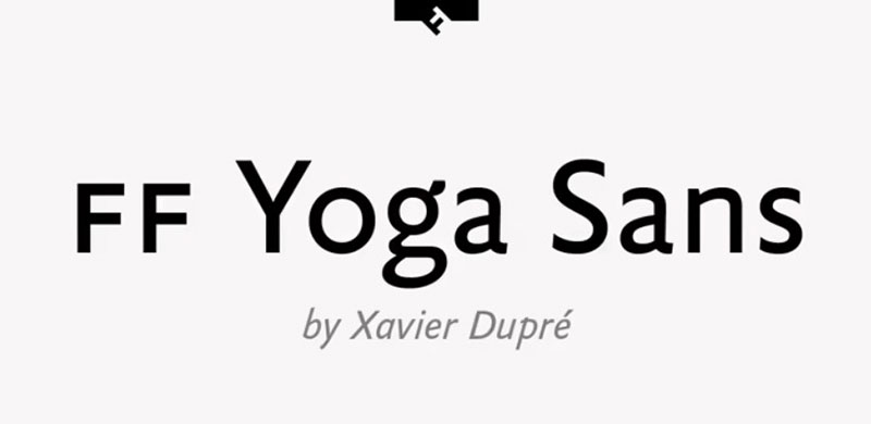
Xavier Dupré designed FF Yoga Sans in 2008. Part of the FontFont library as interpretation of classical proportions.
What Makes It Subtly Distinctive
FF Yoga Sans combines precise geometry with optical refinements for even color.
Based on classical proportions updated for modern contexts. High x-height improves small-size legibility. Slightly condensed letterforms create space efficiency. Subtle variations in stroke terminals add warmth. Clean, professional appearance without coldness.
Core Function
Built for corporate identity and editorial work requiring quiet distinction.
Provides sophistication without drawing attention to itself. Works across all media from screen to print. The balanced proportions suit extended reading. Comprehensive weights enable complete typographic systems.
Technical Specifications
Commercial font through FontFont (Monotype).
Seven weights from Thin to Black with italics. Small caps, multiple figure sets, fractions. Extensive Latin character coverage. Professional OpenType features. Part of larger font subscription services.
Use Cases
Corporate annual reports, magazine design, brand identity systems.
Professional services, financial industry, cultural institutions. Situations requiring subtle sophistication over personality. Multi-page documents needing typographic hierarchy.
Common Challenges
Less distinctive than competitors can be advantage or drawback.
Higher cost limits accessibility. Name recognition lower than major alternatives. May feel too neutral for brands needing strong personality.
Related Concepts
Compare with FF Meta, FF Dax, FF Clan within FontFont catalog.
Similar refinement: Freight Sans, Proxima Nova, Brown. Study brand guidelines development.
ITC Johnston
Dave Farey and Richard Dawson redesigned Johnston as ITC Johnston in the late 1990s. Provides commercial alternative to Transport for London’s exclusive typeface.
What Makes It Johnston Without London
ITC Johnston adapts Edward Johnston’s London Underground typeface for general use.
Retains characteristic diamond-shaped dots on i and j. Maintains calligraphic letter construction. Adds italics throughout (true italics, not just obliques). More weights than original Johnston. Refined spacing and proportions for digital use.
Core Function
Offers Johnston character without TfL licensing restrictions.
Enables designers to use Johnston-style typography in any context. The italic additions make it more versatile than New Johnston. Commercial availability through ITC makes it accessible.
Technical Specifications
Published by International Typeface Corporation (ITC).
Multiple weights with true italics. Extended character sets beyond original Johnston. Optimized for digital typesetting. Professional spacing and kerning. Less extensive than P22 Underground family but more accessible.
Use Cases
Editorial design referencing British typography.
Branding projects wanting Johnston associations without legal issues. Publications about London, British culture, or transport history. Educational materials on type design history.
Common Challenges
Can’t match authentic Johnston’s Transport for London exclusivity.
May feel like imitation to purists. Less historical accuracy than P22 Underground. Still requires commercial license.
Related Concepts
Based on Edward Johnston’s 1916 design.
Compare with P22 Underground (more authentic), Johnston 100 (TfL exclusive), Gill Sans (Johnston’s student). Study iconic fonts history.
Mundo Sans
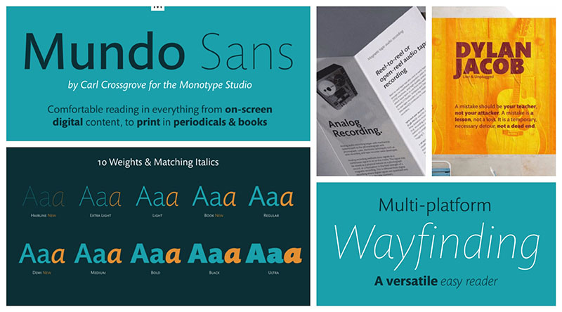
Carl Crossgrove designed Mundo Sans in 2010 for Monotype. Humanist sans serif combining clarity with warmth.
What Makes It Globally Functional
Mundo Sans balances functionality with friendly character for international contexts.
Humanist structure provides readability. Open counters and generous spacing. Slightly geometric construction with organic touches. Wide language support across Latin scripts. Professional appearance without corporate coldness.
Core Function
Designed as workhorse sans serif for global communications.
Works for both text and display. Suitable for corporate, editorial, and digital applications. The balance between warmth and professionalism makes it versatile. Can function across varied brand personalities.
Technical Specifications
Commercial font through Monotype.
Eight weights from Thin to Black with italics. Extensive language coverage including Latin Extended. Small caps, multiple figure styles. Professional OpenType features. Good hinting for screen use.
Use Cases
Corporate communications, digital products, editorial design.
Multilingual publications, international organizations. Web interfaces, mobile apps. Professional services requiring approachable typography.
Common Challenges
Lower name recognition than major competitors.
Can feel generic without strong styling. Middle-of-the-road character limits distinctive brand building. Price point competes with free alternatives.
Related Concepts
Compare with Freight Sans, Whitney, TheSans for similar approach.
Related Monotype designs: Helvetica Now, Neue Frutiger. Study graphic design principles.
Antique Olive
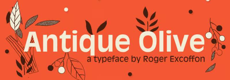
Roger Excoffon designed Antique Olive between 1962-1966. Distinctive French humanist sans serif with idiosyncratic character.
What Makes It Unmistakably French
Antique Olive has quirky, organic personality unlike Swiss rationalism.
Unconventional letter proportions create visual interest. Some letters exceptionally wide (M, W), others narrow. Slightly mechanical yet warm character. High stroke contrast unusual for sans serif. Olive name references organic, Mediterranean warmth.
Core Function
Built for display work and advertising requiring distinctive voice.
The unusual proportions demand attention in headlines. Not designed for long-form reading. Character and personality prioritized over pure legibility. Excoffon created it to break sans serif conventions.
Technical Specifications
Originally from Fonderie Olive, now available through Monotype and others.
Multiple weights though not as extensive as contemporary families. Various widths including Compact and Nord (condensed). Different versions exist with varying character sets. Digital versions vary in quality and completeness.
Use Cases
French advertising and editorial design in 1960s-1970s.
Retro design projects referencing mid-century modernism. Fashion, cosmetics, luxury goods. Situations requiring distinctly European character. Often seen in vintage ski posters.
Common Challenges
Unconventional proportions limit versatility.
Strongly dated to 1960s aesthetic. Not suitable for body text. Can overpower layouts. Different digitizations vary significantly in quality.
Related Concepts
Excoffon also designed Mistral, Banco, Choc.
Compare with other display sans: Futura Display, Avant Garde Gothic. Study Art Deco and French modernism.
Ubuntu

Dalton Maag designed Ubuntu family in 2010-2011 for Canonical’s Ubuntu operating system. Free and open-source humanist sans serif.
What Makes It Ubuntu Philosophy
Ubuntu means “humanity towards others” in Nguni Bantu, reflected in the typeface’s warm approachability.
Rounded terminals create friendly character. Unique lowercase u with curved bottom left corner. Open apertures aid legibility. Contemporary forms with personality. Design aims to convey software’s human-centered philosophy.
Core Function
Created as system font for Ubuntu Linux distribution.
Provides consistent branding across operating system, documentation, marketing. Works for both UI and content. The free license enables community adoption. Humanist warmth counters tech coldness.
Technical Specifications
Free and open-source under Ubuntu Font License.
Eight weights from Light to Bold (Regular, Italic, Medium, Bold and their counterparts). Ubuntu Condensed subfamily. Ubuntu Mono for code. Extensive Latin character support. Hinted for screen clarity.
Use Cases
Ubuntu Linux default system font.
Linux applications, open-source projects, tech documentation. Web projects wanting approachable sans serif. Presentations, diagrams, educational materials. Common in developer communities.
Common Challenges
Strong Ubuntu operating system association.
Distinctive u can be polarizing. Not as refined as commercial alternatives. May feel too casual for formal contexts. Limited weights compared to enterprise fonts.
Related Concepts
Part of Ubuntu design language.
Compare with other system fonts: Roboto (Android), San Francisco (Apple), Segoe (Windows). Study minimalist design principles.
Biryani
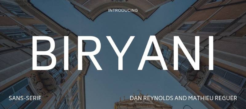
Dan Reynolds designed Biryani in 2015. Clean, modular geometric sans serif with multiple weights and extensive language support.
What Makes It Efficiently Geometric
Biryani uses simple geometric shapes with optical corrections for evenness.
Modular construction reduces file size. Circular forms for O, C, G. Straight stems and clean joints. Slightly squared corners on rounded letters. Designed specifically for web performance.
Core Function
Built for web with focus on loading speed and screen rendering.
Provides geometric aesthetic without large file sizes. Works across devices and screen resolutions. Simple construction aids browser rendering. Suitable for high-traffic websites needing performance.
Technical Specifications
Free through Google Fonts with open license.
Nine weights from ExtraLight to Black. No italics initially. Latin, Devanagari character sets. Optimized file sizes. Variable font versions available. Good hinting for screen display.
Use Cases
Web projects prioritizing load times.
Mobile applications, responsive websites. Editorial web design, portfolios. Projects needing both Latin and Devanagari support. Performance-critical interfaces.
Common Challenges
Lack of italics limits typographic flexibility.
Geometric simplicity can feel cold. Not distinctive enough for strong brand identity. Character set more limited than comprehensive families. Name recognition lower than major alternatives.
Related Concepts
Inspired by geometric sans serifs like Futura, Gotham.
Compare with Montserrat, Josefin Sans, Work Sans. Study web design typography optimization.
FAQ on Fonts Similar To Gill Sans
What’s the closest free alternative to Gill Sans?
Cabin offers the closest free match with its Johnston-inspired design, humanist proportions, and similar warmth. Alternatively, Alegreya Sans provides calligraphic touches resembling Gill Sans’s character. Both available through Google Fonts with open licensing.
Why do designers look for Gill Sans alternatives?
Licensing costs make Gill Sans expensive for commercial projects. Overuse in certain industries creates generic associations. Some designers want similar humanist warmth without the British design heritage baggage that Gill Sans carries.
Is Avenir a good Gill Sans substitute?
Avenir shares humanist warmth but leans more geometric. Adrian Frutiger designed it as his interpretation of Futura, creating softer proportions than Gill Sans. Works well for similar applications though character shapes differ noticeably in lowercase g and a.
What font did Gill Sans inspire?
Eric Gill studied under Edward Johnston, whose London Underground typeface directly inspired Gill Sans. Gill essentially commercialized and expanded Johnston’s concepts. The two typefaces share DNA, with Gill Sans featuring more refined letter spacing and additional weights.
Can I use Johnston instead of Gill Sans?
Johnston works if you want authentic British transport typography. However, Transport for London controls licensing for New Johnston. P22 Underground offers commercial Johnston variants. ITC Johnston provides another licensed alternative with expanded character sets and true italics.
Which font pairs well with Gill Sans alternatives?
Pair humanist sans serifs like Avenir with serif fonts such as Minion, Garamond, or Caslon. Geometric alternatives like Futura work with Didone serifs (Bodoni, Didot). Consider contrast in stroke weight and historical period when pairing fonts for optimal visual hierarchy.
Is Calibri similar to Gill Sans?
Calibri shares humanist characteristics and warmth but differs significantly in structure. Lucas de Groot designed Calibri specifically for screen rendering with ClearType. Gill Sans has more calligraphic influence and classical proportions. Both work for body text but serve different aesthetic purposes.
What makes Frutiger different from Gill Sans?
Frutiger prioritizes legibility at distance with wider apertures and higher x-height. Designed for airport signage versus Gill Sans’s print origins. Frutiger feels more Swiss and systematic, while Gill Sans retains British calligraphic elegance and slightly narrower proportions.
Are there condensed versions of Gill Sans alternatives?
Futura, Avenir Next, Gotham, and Univers all offer condensed variants. Ubuntu Condensed provides free option. Condensed versions work for space-constrained layouts like magazines, posters, and packaging design where horizontal space is limited but readability must remain high.
Which alternative works best for branding?
Brandon Grotesque and Gotham excel in contemporary branding with geometric warmth. Optima suits luxury brands needing sophistication. Avenir provides versatility across industries. Choice depends on brand personality: geometric for modern tech, humanist for approachable services, or glyphic for premium positioning.
Conclusion
Finding fonts similar to Gill Sans requires balancing humanist warmth with practical considerations like licensing, technical specifications, and brand personality.
Futura and Avenir deliver geometric precision with organic touches. Frutiger and Lato prioritize legibility across contexts. Johnston connects directly to Gill Sans’s historical roots through Edward Johnston’s original design work.
Free alternatives like Cabin, Montserrat, and Ubuntu democratize access to quality typography.
Commercial options including Gotham, Optima, and Brandon Grotesque offer refined details worth the investment for professional branding projects.
Test candidates in actual layouts before committing. Evaluate kerning, tracking, and visual hierarchy within your specific design system. The best alternative depends on whether you need display impact, text readability, or versatile performance across both applications in print and digital media.
If you enjoyed reading this article on fonts similar to Gill Sans, you should check out these articles with fonts similar to Proxima Nova, Avenir, Lato, Papyrus, Old English, Century Gothic, Minion Pro, Comic Sans, and Eurostile.

Renowned for his expertise in logo design and visual branding, Bogdan has developed a multitude of logos for various clients.
His skills extend to creating posters, vector illustrations, business cards, and brochures. Additionally, Bogdan's UI kits were featured on marketplaces like Visual Hierarchy and UI8.
He also wrote in the past years on sites like Design Your Way, WebDesignerDepot, WPDean, Designmodo, Speckyboy, Slider Revolution, and more.
- The Windsurf Logo History, Colors, Font, And Meaning - 10 October 2026
- How to Remove Background From Product Photos (No Photoshop) - 10 October 2026
- How Designers can Build a Stronger Online Creative Identity - 9 October 2026

Bogdan Sandu is a seasoned designer who has been designing websites since 2008. Renowned for his expertise in logo design and visual branding, Bogdan has developed a multitude of logos for various clients. His skills extend to creating posters, vector illustrations, business cards, and brochures. Additionally, Bogdan's UI kits were featured on marketplaces like Visual Hierarchy and UI8. He also wrote in the past years on sites like Design Your Way, WebDesignerDepot, WPDean, Designmodo, Speckyboy, Slider Revolution, and more.
You Might Also Like