Fonts don’t just display words. They weaponize them.
Finding the best propaganda fonts means understanding how typefaces shaped political movements, toppled regimes, and rallied millions. From Soviet constructivist posters to Nazi blackletter decrees, typography has always served power.
These aren’t ordinary display typefaces. They’re designed to command attention, project authority, and bypass rational thought.
This guide covers 20 propaganda fonts spanning historical classics and modern revivals. You’ll learn their origins, design characteristics, and psychological impact.
Whether you’re creating period-accurate designs or channeling authoritarian aesthetics for creative projects, these bold typefaces deliver the visual weight your work demands.
The Best Propaganda Fonts
| Font Name | Historical Context | Visual Attributes | Primary Use Case |
|---|---|---|---|
| Futura | Geometric sans-serif from 1927 Germany, adopted by Nazi propaganda | Clean geometric forms, near-perfect circles, sharp angles | Modernist posters, political messaging |
| Agitaciya | Soviet constructivist era, directly inspired by agitprop movement | Bold, angular letterforms with revolutionary aesthetics | Communist propaganda, agitation posters |
| Constructivist | 1920s Soviet design movement emphasizing industrial aesthetics | Geometric precision, industrial character, diagonal emphasis | Revolutionary graphics, architectural signage |
| Commissar | Modern interpretation of Stalinist-era military typography | Bold slab serifs, authoritarian weight, military precision | Soviet military posters, command announcements |
| TF-Revolucion | Cuban Revolution inspired, 1960s Latin American movements | Energetic brushstrokes, guerrilla aesthetic, raw edges | Revolutionary manifestos, protest graphics |
| Kooperativ | Soviet cooperative movement, collective agriculture branding | Utilitarian structure, worker-friendly legibility | Collective farm signage, state enterprise labels |
| Helvetica | 1957 Swiss design, neutral modernism used by various regimes | Neutral, highly legible, systematic proportions | Government signage, institutional messaging |
| Impact | 1965 headline font, became ubiquitous in political campaigns | Extremely condensed, maximum visual weight, commanding | Bold political statements, mass rally banners |
| Fraktur | Medieval German blackletter, Nazi adoption then rejection | Gothic ornamental strokes, Germanic tradition markers | Early Nazi documents, nationalist publications |
| Cocosignum | Art Deco period, totalitarian regimes of 1930s-1940s | Decorative yet authoritative, stylized serifs | State ceremonies, official proclamations |
| PAG Sottoterra | Italian Futurist movement, fascist modernization campaigns | Mechanized letterforms, industrial brutalism | Infrastructure projects, fascist public works |
| Supremaganda | Russian Suprematist art movement meets state messaging | Abstract geometric forms, avant-garde simplification | Experimental propaganda, artistic manifestos |
| Pillars | Monumental architecture typography, classical totalitarianism | Column-like vertical emphasis, architectural stability | Monument inscriptions, state building facades |
| Evil Empire | Cold War aesthetic, Reagan-era Soviet characterization | Aggressive angles, militaristic sharpness, threat perception | Western anti-Soviet campaigns, dystopian branding |
| Red October | Bolshevik Revolution commemoration, October 1917 legacy | Revolutionary urgency, dramatic contrast, historical gravitas | Anniversary posters, revolutionary celebrations |
| Konstruktor | Soviet industrial design, construction brigade aesthetics | Modular assembly, engineering precision, blueprint quality | Industrial campaigns, construction propaganda |
| Avant Garde Gothic | 1970s geometric design, adopted by progressive movements | Perfect circles, precise geometry, futuristic minimalism | Progressive political campaigns, youth movements |
| Lubalin Graph | 1970s American design, corporate-political crossover | Slab serifs, mechanical uniformity, systematic structure | Data-driven messaging, statistical propaganda |
| Univers | 1957 Swiss rationalism, adopted by technocratic regimes | Systematic weight variations, clinical precision | Bureaucratic communications, institutional authority |
| Neubahn | German DIN standard revival, transportation authority | Industrial legibility, standardized conformity, engineering exactness | State infrastructure, regulation signage |
Futura

Paul Renner’s 1927 masterpiece became the quintessential geometric sans-serif font for political messaging across the spectrum. Despite its creator’s anti-Nazi stance, this modernist typeface found itself on propaganda materials from multiple regimes.
Historical Context
Renner designed Futura between 1924 and 1927 at the Bauer Type Foundry in Frankfurt, Germany. The font embodied Bauhaus design ideals despite Renner never officially joining the movement.
Things got complicated fast. The Nazi regime initially rejected Futura as “degenerate” modern art, favoring blackletter fonts instead. Then in 1941, Hitler suddenly banned Gothic typefaces, declaring them “Jewish letters.” Futura came roaring back into Nazi communications.
The irony? Renner was arrested in 1933 for his anti-Nazi writings and eventually fled to Switzerland.
Design Characteristics
- Strictly geometric construction based on circles, triangles, and straight lines
- Near-uniform stroke width throughout
- Single-story lowercase “a” and double-story “g”
- High x-height for improved legibility
- Minimal kerning adjustments needed
The original version was almost mathematically pure. Renner later refined it for optical balance because pure geometry doesn’t always read well.
Psychological Impact
Futura screams modernity and progress. Its clean lines suggest efficiency, technological advancement, forward momentum.
That’s exactly why it worked for propaganda. Both left-wing movements and corporate entities adopted it. The font psychology here is straightforward: geometric precision equals authority and competence.
Large-scale readability? Excellent. The bold weights punch through visual clutter on poster design applications.
Notable Examples
- Various Nazi-era German communications (post-1941)
- US Army recruitment materials during WWII
- American political campaigns across decades
- Apollo 11 lunar plaque (yes, really)
- Japanese internment camp proclamations
Modern Usage
Futura remains everywhere. Supreme’s box logo. Volkswagen branding. Countless film posters. Every major type company offers a licensed version.
Available through Adobe Fonts, Google Fonts (as alternatives), and virtually every digital foundry. The font licensing varies between distributors.
Agitaciya

A modern revival typeface specifically designed to capture Soviet-era agitprop aesthetics. Created by Alexander Shimanov of Shimanov Types, this font pulls directly from historical Russian poster lettering.
Historical Context
“Agitaciya” translates to “Agitation” in Russian. The term connects to the Soviet Union’s agitprop movement, which combined agitation with propaganda to mobilize the masses during the early Communist period.
Shimanov developed this font by studying authentic lettering from Soviet posters, movie titles, and book covers. It’s a contemporary interpretation rather than a direct historical revival.
Design Characteristics
- Condensed letterforms with straight, rigid construction
- Two styles available: uppercase and small caps alternatives
- Extended Cyrillic and Latin character support
- Supports 40+ languages including Russian, Ukrainian, and Belarusian
- No true lowercase, maintaining display-only purpose
The typography here prioritizes impact over versatility. This is a headline font, pure and simple.
Psychological Impact
Narrow, tall letters create visual urgency. The condensed display font style commands attention through its imposing vertical presence.
Works best at large sizes where the rigid geometry creates strong visual hierarchy. Small applications lose the authoritative character.
Modern Usage
Available through Creative Market, GraphicRiver, and Deeezy. Primarily used for:
- Retro Soviet-themed designs
- Film and game graphics
- Editorial illustrations
- Packaging with historical references
Commercial license required for professional projects.
Constructivist

The Constructivism movement spawned an entire typographic philosophy rather than a single font. This style emerged from revolutionary Russia in the 1910s-1920s.
Historical Context
Russian Constructivism emerged around 1915, championed by artists like El Lissitzky, Alexander Rodchenko, and Vladimir Tatlin. The movement rejected traditional artistic conventions for functional, industrial aesthetics.
Typography became a propaganda tool. El Lissitzky’s 1919 poster “Beat the Whites with the Red Wedge” exemplifies the approach: geometric shapes as political symbols, combined with bold type.
Stalin eventually suppressed Constructivist design in the mid-1920s, favoring Socialist Realism instead.
Design Characteristics
Constructivist typography featured:
- Bold sans-serif and slab-serif letterforms
- Diagonal arrangements and asymmetrical layouts
- Red and black color palette dominance
- Mixed typeface sizes within single words or sentences
- Geometric shapes integrated with text
- Strong contrast between type weights
This wasn’t about single fonts. It was about typographic composition as visual revolution.
Psychological Impact
The diagonal energy creates movement and dynamism. Readers feel urgency, progress, forward motion.
Constructivist layouts break conventional reading patterns deliberately. They demand engagement rather than passive consumption.
Notable Examples
- El Lissitzky’s propaganda posters
- Alexander Rodchenko’s LENGIZ advertisements
- Stenberg Brothers’ film posters
- USSR in Construction magazine (1930-1941)
Modern Usage
Many contemporary fonts emulate the Constructivist aesthetic:
- Molot by Jovanny Lemonad
- Bahn Pro
- TF-Russian Constructivism
- Various “Soviet-style” display faces
The style heavily influences modern graphic design, from coffee shop signage to album covers.
Commissar

A decorative display font designed to evoke Communist bureaucratic authority. This contemporary typeface plays on Western perceptions of Soviet officialdom.
Historical Context
Not a historical font per se. “Commissar” references the Soviet political commissars who served as Communist Party representatives in military units and government offices.
The font captures the stern, authoritarian aesthetic associated with Soviet governmental communications.
Design Characteristics
- Blocky, geometric construction
- Heavy stroke weight throughout
- Extended Latin and Cyrillic character support
- Angular terminals suggesting military precision
- Limited character set focused on display purposes
Falls into the “faux-Russian” category. Uses design cues that Western audiences associate with Soviet aesthetics.
Psychological Impact
Conveys authority, rigidity, institutional power. The heavy weight suggests immovability and state permanence.
Works through cultural associations rather than inherent letter geometry. Western audiences read “Soviet” into the shapes.
Modern Usage
Commonly appears in:
- Video games with Cold War themes
- Film titles and credits
- Themed restaurant branding
- Ironic political merchandise
Commercial licenses typically required for professional applications.
TF-Revolucion
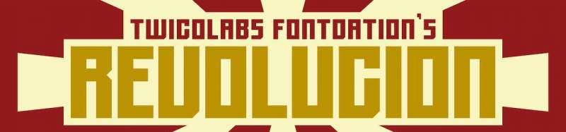
A bold, blocky display font directly influenced by Soviet propaganda media. Created by Twicolabs, it’s purpose-built for maximum visual impact.
Historical Context
TF-Revolucion represents contemporary designers’ fascination with Soviet visual culture. The name references revolutionary movements, though the font itself is a modern creation.
Draws inspiration from actual lettering found on Soviet-era posters, particularly those emphasizing industrial and political themes.
Design Characteristics
- Extremely bold weight with minimal stroke variation
- Blocky, almost brutalist letter construction
- Tight letter spacing for dense visual mass
- Limited to uppercase characters
- Sharp corners without curve softening
This font prioritizes punch over refinement. Subtlety isn’t the point.
Psychological Impact
Hits viewers immediately. The heavy weight and compressed spacing create a wall of text that demands attention.
Perfect for designs requiring “first sight” impact. The emphasis is built into the letterforms themselves.
Modern Usage
Available through Envato Elements and other digital marketplaces. Used for:
- Poster and banner design
- T-shirt graphics
- Signage with retro themes
- Label and packaging design
- Esports branding
The font works best at large scales. Body text applications would be illegible.
Kooperativ

Alexander Shimanov’s reproduction of classic Soviet poster lettering. “Kooperativ” (Cooperative) captures the bold, direct communication style of USSR public messaging.
Historical Context
Soviet cooperatives were collective economic organizations promoted heavily through state propaganda. The visual language of cooperative promotion used bold, accessible typography for mass communication.
Shimanov restored these letterforms from original Soviet posters, bringing authentic historical type into the digital era.
Design Characteristics
- Straight, bold letterforms with geometric precision
- Two styles: regular clean and scratched (distressed)
- Extended Eastern European Cyrillic support
- Some extended Latin characters
- Uppercase only with numbers and punctuation
The scratched variant adds weathered authenticity. Useful for vintage effects without additional processing.
Psychological Impact
Bold weight conveys certainty and official authority. The geometric construction suggests state-approved messaging.
Clean lines read as efficient, no-nonsense communication. Exactly what propaganda aims for.
Modern Usage
Available through Creative Market, GraphicRiver, and other platforms. Applications include:
- Retro poster recreation
- Branding with Soviet references
- Editorial design
- Web design headers
- Packaging with historical themes
Supports over 40 languages. Commercial license required for professional use.
Helvetica
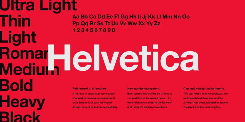
The world’s most recognizable sans-serif font. Created in Switzerland in 1957, Helvetica became synonymous with corporate communication and, by extension, institutional authority.
Historical Context
Max Miedinger designed Helvetica (originally Neue Haas Grotesk) for the Haas Type Foundry in Switzerland. Eduard Hoffmann commissioned it as an update to Akzidenz-Grotesk.
The name “Helvetica” (meaning “Swiss” in Latin) was chosen to avoid nationalist associations during the Cold War. Smart move.
Paula Scher, in the 2007 documentary “Helvetica,” called it “the typeface of the Vietnam War.” She associated it with corporate fascism and the visual language of authority.
Design Characteristics
- Neo-grotesque sans-serif classification
- Neutral, “invisible” design intent
- Large x-height for readability
- Tight apertures on letters like “a,” “c,” “e”
- Horizontal stroke terminals
- Available in extensive weight and width variations
Helvetica’s neutrality is both strength and criticism. It communicates nothing while communicating everything about institutional power.
Psychological Impact
Helvetica reads as authority without personality. That’s precisely why corporations, governments, and transit systems adopted it.
The font disappears into the message. You don’t notice Helvetica; you notice what it says. Perfect for propaganda that shouldn’t look like propaganda.
Notable Examples
- NYC Subway signage
- American Airlines logo
- BMW, Panasonic, Target, Nestlé branding
- US tax forms
- Countless government documents
The Star Wars logo designer Suzy Rice initially chose Helvetica Black for its “fascist” visual impact, though the final version was modified.
Modern Usage
Helvetica remains ubiquitous. It was the default iPhone font until 2015. Microsoft created Arial as a near-clone to avoid licensing fees.
Available through virtually all major foundries. Helvetica Neue and Helvetica Now represent updated versions with expanded character sets and improved font spacing.
Impact

Geoffrey Lee’s 1965 creation became the internet meme font by accident. Originally designed for headlines and advertising, Impact found its true calling in digital culture.
Historical Context
Lee designed Impact at Pembertons in London for the British foundry Stephenson Blake. The design followed 1960s trends toward bold, condensed industrial sans-serif faces.
The font saw limited use initially, overshadowed by competitors like Helvetica and Univers. Stephenson Blake sold the digital rights when they closed their foundry operations.
Microsoft’s decision to include Impact in Windows 98 and the Core Fonts for the Web changed everything. Suddenly, everyone had access to it.
Design Characteristics
- Extremely thick strokes with minimal counterforms
- Ultra-compressed letter spacing
- High x-height (nearly three-quarters of cap height)
- Very short ascenders and descenders
- Narrow apertures creating dense visual weight
Lee wanted “as much ink on paper as possible in a given size.” Mission accomplished.
Psychological Impact
Impact shouts. There’s no other way to describe it.
The compressed, heavy letterforms create immediate visual dominance. Text becomes impossible to ignore, which is why meme creators gravitated toward it.
The font works through sheer visual weight rather than sophistication. Perfect for short messages requiring immediate comprehension.
Notable Examples
- “I Can Has Cheezburger” (2007) launched Impact into meme history
- Countless image macros and reaction images
- LOLcat culture
- Advice Animal memes
- Protest signage and political memes
The font became so associated with memes that using anything else looks wrong to internet-native audiences.
Modern Usage
Impact comes pre-installed on most operating systems. No purchase necessary for basic use.
The font remains standard in meme generators like Imgflip, Meme Generator, and the former Cheezburger network. White text with black outline on photographs? That’s Impact’s signature look.
Modern designers sometimes avoid Impact because of its meme associations. Others embrace it deliberately for internet culture references.
Fraktur

The definitive German blackletter typeface carries an ironic burden. The Nazis championed it as “true German script,” then banned it as “Jewish letters.” That contradiction defines Fraktur’s complicated legacy.
Historical Context
Fraktur emerged in early 16th-century Germany. Emperor Maximilian I commissioned the style around 1513, basing it on chancery handwriting. Albrecht Dürer popularized it through his printed works, including “Unterweysung der Messung” (Treatise on Measurement).
The name comes from Latin “fractus” (broken), describing the angular, fractured strokes that define the style.
Germany held onto Fraktur long after other European nations adopted Roman typefaces. Martin Luther intentionally used blackletter to distinguish German religious texts from Catholic Latin publications.
The Nazi period brought peak irony. The regime initially celebrated Fraktur as embodying “true German spirit.” Official documents, Mein Kampf’s cover, party letterheads. Then on January 3, 1941, Martin Bormann issued an edict declaring Fraktur “Judenlettern” (Jewish letters) and banning it outright.
The real reason? Practicality. Occupied territories couldn’t read German propaganda in blackletter.
Design Characteristics
- Broken strokes that don’t connect smoothly
- Heavy vertical emphasis with thin connecting strokes
- Distinctive “elephant trunk” flourishes on capitals
- Long s (ſ) used within words
- Highly decorative capitals requiring substantial leading
- Complex ligatures throughout
Reading Fraktur requires training. Modern Germans often struggle with their grandparents’ handwriting because of this typographic break.
Psychological Impact
Fraktur reads as authority, tradition, Germanic heritage. The dense black texture creates imposing text blocks.
For contemporary audiences, the associations are darker. Neo-Nazi groups still use Fraktur, cementing connections most Germans would prefer forgotten.
The typographic hierarchy implications are significant. Fraktur headlines signal either historical authenticity or ideological danger, depending on context.
Notable Examples
- Mein Kampf cover (hand-drawn version)
- Nazi-era official documents (pre-1941)
- German newspaper mastheads historically
- Beer branding and “traditional” German marketing
- Heavy metal album art globally
Modern Usage
Fraktur persists in specific contexts:
- Newspaper nameplates (New York Times, Washington Post use blackletter-influenced logos)
- Beer and beverage branding
- Tattoo culture
- Metal and punk aesthetics
- Historical reproductions
The Walden Font Co. and other foundries offer authentic digital Fraktur revivals. Most designers approach it cautiously, aware of its loaded associations.
Cocosignum

Zetafonts’ Italian propaganda revival captures the typography of Mussolini-era Italy. Designer Cosimo Lorenzo Pancini created this Art Deco-influenced family to blend imperial authority with geometric elegance.
Historical Context
Italian Fascism developed its own visual language, distinct from Nazi Germany’s blackletter preferences. The 1930s saw bold, imperial typefaces used across government communications, public monuments, and propaganda materials.
Cocosignum draws from this specific visual heritage, capturing what Zetafonts describes as “imperial uppercase with propaganda deco overtones.”
Design Characteristics
- Two styles: Maiuscoletto (small caps) and Corsivo Italico (cursive italic)
- Five weights per style: Ultralight through Heavy
- Geometric sans-serif construction
- Art Deco-influenced letterforms
- Extended language support: Latin, Greek, and Cyrillic
- Over 40 language coverage
The Corsivo Italico version softens the imperial uppercase with a cursive lowercase geometric script. Unusual combination that works.
Psychological Impact
Cocosignum communicates governmental authority through geometric precision. The Art Deco influence adds elegance that pure propaganda fonts lack.
The balance between severity and sophistication makes this font versatile for historical references without overwhelming modern designs.
Modern Usage
Available through Zetafonts, MyFonts, and Font Squirrel (trial version). Applications include:
- Editorial design with historical themes
- Branding requiring vintage Italian aesthetics
- Film and television period pieces
- Packaging design
- Exhibition graphics
Commercial license required for professional use. Trial versions available for testing.
PAG Sottoterra
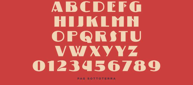
An underground-inspired display typeface designed for high-impact headlines. Part of the broader propaganda font category, though with a more contemporary edge.
Design Characteristics
- Bold, condensed letterforms
- Industrial aesthetic
- Display-only application
- Strong vertical emphasis
- Minimal character set focused on impact
The “Sottoterra” (underground) name suggests subway system influences merged with propaganda visual language.
Modern Usage
Primarily used for:
- Editorial headlines
- Poster design
- Band merchandise
- Urban-themed projects
- Alternative media branding
Supremaganda

A contemporary font blending Suprematist art movement aesthetics with propaganda typography. The name fuses “Suprematism” (Kazimir Malevich’s geometric abstraction movement) with “propaganda.”
Design Characteristics
- Geometric construction echoing Suprematist principles
- Bold display weights
- Angular letterforms
- Limited decorative elements
- High-contrast presentation
The design philosophy connects Russian avant-garde art history with political messaging typography.
Psychological Impact
Combines artistic credibility with authoritative presence. The Suprematist reference adds intellectual weight beyond standard propaganda fonts.
Pillars
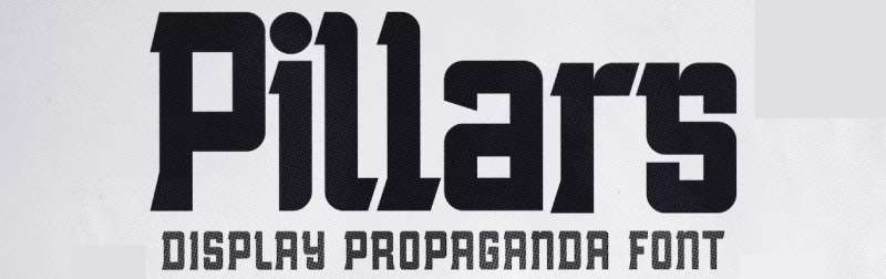
A strong-striking display font with boxy, sharp characteristics. Created by roompoetliar, Pillars captures Soviet propaganda aesthetics for contemporary applications.
Design Characteristics
- Sharp, angular terminals
- Blocky construction
- Both uppercase and lowercase characters
- Numbers and punctuation included
- Multilingual support
The boxy feel references Brutalist design principles while maintaining readability at large sizes.
Psychological Impact
Projects strength and solidarity. The architectural name (“Pillars”) reinforces structural stability and foundational authority.
Works well for resistance, solidarity, and movement-themed designs. E-sports logos and sports jersey applications also suit its aggressive character.
Modern Usage
Available through Envato Elements and GraphicRiver. Applications include:
- Poster headlines
- Religious event graphics
- E-sport team branding
- Sports jersey lettering
- Construction industry marketing
- Political campaign materials
Evil Empire
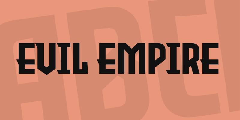
Tup Wanders’ 2019 creation channels 1930s authoritarian aesthetics with a contemporary edge. The name references Ronald Reagan’s 1983 Cold War description of the Soviet Union.
Historical Context
Reagan’s “Evil Empire” speech to the National Association of Evangelicals marked a turning point in Cold War rhetoric. The font draws from that era’s visual tension while incorporating Art Deco influences from the decade prior.
Design Characteristics
- Heavy weight with Art Deco influence
- Distinctive “R” with aggressive angular construction
- All-caps display design
- 1930s/1940s period aesthetic
- Heavy metal-influenced edge
Wanders described starting with the “R” because it had an “evil 30’s look,” then building the complete character set around that foundation.
Psychological Impact
Projects menace and authority simultaneously. The Art Deco foundation provides sophistication while the overall heaviness suggests threat.
Works for designs requiring intimidation without losing period authenticity. Games, film titles, and band graphics benefit from this tension.
Modern Usage
Free for personal and commercial use under Creative Commons Attribution License. Available through DaFont, FontSpace, and 1001 Fonts. Applications include:
- Video game graphics
- Album artwork
- Film titles
- Poster design
- Heavy metal merchandise
- Historical fiction projects
Red October
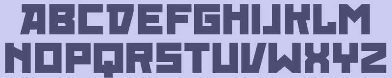
Ivan Filipov (Neogrey Creative) designed this constructivist typeface directly from WWII Russian propaganda posters. It became unexpectedly popular in Hollywood productions.
Historical Context
Named for the October Revolution of 1917, the font captures the bold, direct visual communication of Soviet wartime messaging. Filipov restored these letterforms from original sources.
The font gained mainstream visibility through American films including R.E.D., Die Hard 5, and Repo: The Genetic Opera. Rihanna’s “Russian Roulette” single cover also used Red October. Puerto Rican band Calle 13 adopted it for their logo.
Design Characteristics
- Blocky, unicase construction
- Three weights: Light, Regular, and Fat
- Full Cyrillic character support
- OpenType format
- Stencil variants available (Red October Stencil, Red October Eroded)
The unicase design (same letterforms for upper and lowercase) reinforces the propaganda poster heritage.
Psychological Impact
Immediately reads as “Soviet” to Western audiences. The angular construction and heavy weights project industrial strength and collective purpose.
Effective for designs requiring instant Russian identification without resorting to backwards “R” clichés.
Modern Usage
Free for personal use; commercial license required for professional applications. Available through Neogrey’s website, DaFont, and FontSpace.
Filipov explicitly prohibits use by organizations promoting Communist ideology, an interesting stance given the font’s heritage.
Konstruktor
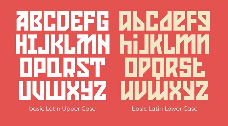
Neogrey Creative’s condensed cousin to Red October. Ivan Filipov created this narrow typeface after noticing designers horizontally squishing Red October to achieve condensed effects.
Historical Context
Filipov developed Konstruktor specifically to complement Red October, providing a legitimate narrow alternative. The name references the Soviet emphasis on construction and industrial progress.
Design Characteristics
- Condensed proportions (narrower than Red October)
- Heavy display weight
- Blocky, geometric construction
- Alternate glyphs for several characters
- 1920s vintage feel
- Cyrillic character support
The condensed design allows more text in tight spaces without compromising the propaganda aesthetic.
Psychological Impact
Projects urgency through compressed letterforms. The industrial name reinforces associations with Soviet construction campaigns and five-year plans.
Works effectively for headlines where space is limited but impact remains critical.
Modern Usage
Free for personal use through DaFont, FontSpace, and Neogrey’s website. Commercial license required for professional applications.
Like Red October, Filipov explicitly prohibits use by Communist-affiliated organizations. Applications include:
- Poster headlines
- Band logos
- Film titles
- Game graphics
- Editorial design with Soviet themes
Avant Garde Gothic
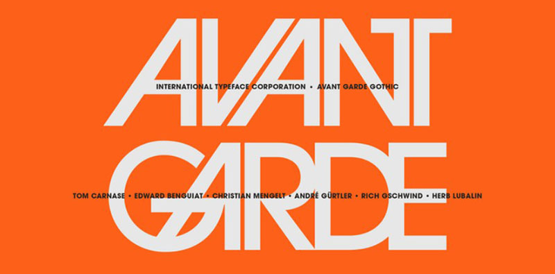
Herb Lubalin and Tom Carnase transformed a magazine logo into one of the most influential geometric sans-serifs of the 1970s. ITC released it in 1970 as their first typeface.
Historical Context
Avant Garde magazine (1968-1971) needed a logo that matched its countercultural content. Lubalin created tightly-fit geometric letterforms that screamed modernity. Demand from designers forced expansion into a complete typeface.
The magazine itself pushed boundaries. Editor Ralph Ginzburg eventually went to prison for obscenity-related charges. The visual identity outlived the publication significantly.
Design Characteristics
- Pure geometric construction from circles and straight lines
- Extremely tight letter fitting
- Tall x-height with large open counters
- Single-story lowercase “a”
- Short descenders
- Original included 33 alternate characters and ligatures
- Sloped apexes on A and V
The ligatures defined 1970s design. Unfortunately, early digital versions omitted them. OpenType releases restored this functionality.
Ed Benguiat added condensed weights in 1974. André Gürtler, Erich Gschwind, and Christian Mengelt designed obliques in 1977.
Psychological Impact
Communicates futuristic optimism and experimental spirit. The geometric precision suggests rational thinking while the tight fit projects confidence.
Designer Steven Heller noted the ligatures were “misused by designers who had no understanding of how to employ these typographic forms.” In Lubalin’s hands, the font had character; others turned it into “a flawed Futura-esque face.”
Notable Examples
- Avant Garde magazine identity
- Adidas logo (1972 onwards)
- 1970s corporate identity systems
- Countless album covers from the era
Modern Usage
Available through ITC/Monotype. The OpenType version includes all original alternates and ligatures. Used for:
- Retro 1970s-themed designs
- Logo development
- Editorial headlines
- Pairing fonts with more neutral body text
Lubalin Graph

Herb Lubalin’s slab serif font version of Avant Garde Gothic. Tony DiSpigna and Joe Sundwall drew it to Lubalin’s specifications in 1974.
Historical Context
PBS commissioned the bold weight for their 1974-1975 promotional campaign. Lubalin maintained Avant Garde’s geometric skeleton while adding substantial rectangular serifs.
Ed Benguiat added obliques in 1981. Helga Jörgenson and Sigrid Engelmann created condensed versions in 1992 through URW.
Design Characteristics
- Identical underlying forms to Avant Garde Gothic
- Large square and rectangular slab serifs
- Extremely tight letter fitting (serifs nearly touch)
- Generous x-height
- Five weights in regular width
- Four condensed weights
- Small caps and oldstyle figures in condensed versions
The tight fit creates a distinctive look. Letters crowd each other intentionally, creating visual density.
Psychological Impact
Combines Avant Garde’s futurism with the authority of serif typography. The heavy serifs ground the design while geometric construction maintains modernity.
Represents American graphic design of the 1970s more than almost any other typeface. Instant period signifier.
Modern Usage
Available through ITC/Monotype. Letraset adopted it during the dry transfer era. Applications include:
- Mid-century modern design projects
- Editorial design
- Corporate identity with retro sensibilities
- Display headlines
- Logo development
Pairs well with spare sans-serifs or traditional text faces from the period.
Univers
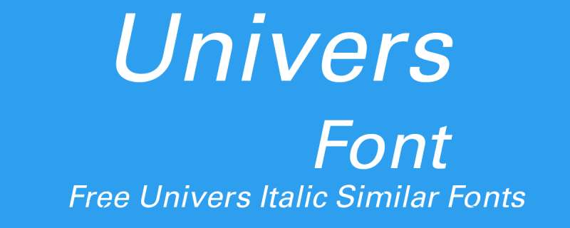
Adrian Frutiger’s 1957 masterpiece introduced systematic font family design. Released by Deberny & Peignot, it became one of the first typefaces available simultaneously in metal, phototype, and hot metal formats.
Historical Context
Swiss type designer Frutiger created Univers at the cusp of the phototypesetting revolution. Charles Peignot wanted a comprehensive font family that could compete with Futura while embracing new technology.
Frutiger rejected geometric rigidity. He based Univers on the neo-grotesque model, specifically referencing Akzidenz-Grotesk from 1898. The result balanced precision with subtle humanist touches.
The original launch included 21 variations. Frutiger introduced a two-digit numbering system (still used today) to classify weights and widths. Marketing referenced the periodic table to emphasize the family’s scope.
Design Characteristics
- Neo-grotesque sans-serif classification
- Subtle stroke modulation (unlike purely geometric designs)
- Large x-height for readability
- Consistent proportions across all weights and widths
- Two-digit classification: first digit = weight (3-8), second = width/stance
- Arms of “K” join at stem (distinctive from Helvetica)
- No arrow spur on uppercase “G”
Frutiger himself distinguished it from Helvetica: “Helvetica is the jeans, and Univers the dinner jacket.”
Psychological Impact
Projects professional authority without Helvetica’s corporate ubiquity. The systematic design suggests organizational competence.
The refined proportions work better for extended text than many competitors. Walter Tracy described it as “better proportioned for text than Helvetica.”
Notable Examples
- Deutsche Bank identity
- General Electric logo
- Lufthansa branding
- 1972 Munich Olympic Games promotional materials
- Swiss International Air Lines (modified version)
- Apple keyboard lettering (until 2007)
Modern Usage
Available through Linotype/Monotype. Univers Next offers expanded character sets and additional weights. Applications include:
- Corporate identity systems
- Signage and wayfinding
- Editorial design
- Transportation graphics
- Government communications
Neubahn
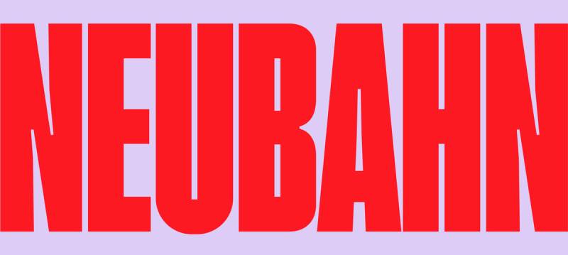
A super-condensed display typeface with tight tracking. Designed for branding and editorial headlines, Neubahn captures Russian Constructivism’s industrial aesthetic in a contemporary package.
Historical Context
The name combines German “Neu” (new) and “Bahn” (railway/path), suggesting transportation infrastructure. This connects to Constructivism’s celebration of industrial progress and modern infrastructure.
Design Characteristics
- Super condensed proportions
- Tight kerning by default
- Both uppercase and lowercase characters
- Numbers and punctuation
- Ligatures included
- Available in OTF, TTF, WOFF, and WOFF2 formats
The condensed design maximizes text density while maintaining legibility at display sizes.
Psychological Impact
Projects industrial efficiency and forward momentum. The narrow proportions create urgency, while the clean construction suggests organized progress.
Works effectively for propaganda-themed designs requiring contemporary polish rather than direct historical reference.
Modern Usage
Available through Envato Elements and GraphicRiver. Applications include:
- Branding projects
- Editorial headlines
- Poster design
- Transportation and infrastructure graphics
- Soviet-themed contemporary design
- Fashion and lifestyle editorial
The tight kerning means Neubahn works best at larger sizes where individual letterforms remain distinct.
FAQ on The Best Propaganda Fonts
What makes a font a “propaganda font”?
Propaganda fonts share specific traits: bold weight, condensed letterforms, and geometric construction. They prioritize instant readability at large scales and project authority. Historical associations with political movements also define the category.
Which font did the Nazis actually use?
It’s complicated. The regime initially championed Fraktur blackletter as “true German script.” In 1941, they banned it, switching to Futura and other sans-serif fonts. Both served Nazi propaganda at different times.
Are Soviet propaganda fonts free to use?
Many are. Red October, Konstruktor, and Molot offer free personal licenses. Commercial use typically requires purchasing. Always check individual font licensing terms before professional projects.
What’s the difference between Futura and Helvetica for propaganda?
Futura projects futuristic optimism through geometric precision. Helvetica communicates neutral authority through invisible design. Both served political messaging, but Futura feels ideological while Helvetica feels institutional.
Can I use propaganda fonts for commercial projects?
Yes, with proper licensing. Many historical typefaces like Futura are commercially available. Modern revivals like Red October require commercial licenses. Check brand guidelines compatibility before implementation.
Why does Impact look like a propaganda font?
Geoffrey Lee designed Impact in 1965 for maximum visual weight. Thick strokes, compressed spacing, and high x-height create aggressive presence. Internet meme culture accidentally revealed its propaganda potential.
What colors work best with propaganda fonts?
Red and black dominate historically. Soviet Constructivism established this palette. Monochrome colors with high contrast maximize readability. Limited palettes reinforce the authoritative message.
Are there propaganda fonts with Cyrillic support?
Yes. Red October, Konstruktor, Agitaciya, and Kooperativ include full Cyrillic character sets. These fonts were specifically designed for authentic Soviet aesthetic reproduction across multiple languages.
What modern brands use propaganda-style fonts?
Sports brands, energy drinks, and streetwear labels frequently adopt the aesthetic. The bold, aggressive characteristics translate well to logo design requiring instant recognition and authority.
How do I avoid making my design look like actual propaganda?
Context matters. Pair propaganda fonts with modern design elements, avoid period-accurate color schemes, and use them ironically or sparingly. Self-awareness in application prevents uncomfortable associations.
Conclusion
The best propaganda fonts share a common purpose: commanding attention and projecting authority through deliberate design choices. From Paul Renner’s geometric Futura to Ivan Filipov’s constructivist Red October, these typefaces carry historical weight alongside visual impact.
Understanding their origins matters. Wartime lettering, political poster design, and mass communication shaped how these bold typefaces evolved.
Use them thoughtfully. The same characteristics that made them effective for persuasive design can backfire without proper context.
Whether you’re referencing World War II aesthetics or creating contemporary graphics with vintage flair, these heavy weight display fonts deliver. Just remember: powerful typefaces demand responsible application.
Choose wisely. Design deliberately.

Renowned for his expertise in logo design and visual branding, Bogdan has developed a multitude of logos for various clients.
His skills extend to creating posters, vector illustrations, business cards, and brochures. Additionally, Bogdan's UI kits were featured on marketplaces like Visual Hierarchy and UI8.
He also wrote in the past years on sites like Design Your Way, WebDesignerDepot, WPDean, Designmodo, Speckyboy, Slider Revolution, and more.
- The Windsurf Logo History, Colors, Font, And Meaning - 10 October 2026
- How to Remove Background From Product Photos (No Photoshop) - 10 October 2026
- How Designers can Build a Stronger Online Creative Identity - 9 October 2026

Bogdan Sandu is a seasoned designer who has been designing websites since 2008. Renowned for his expertise in logo design and visual branding, Bogdan has developed a multitude of logos for various clients. His skills extend to creating posters, vector illustrations, business cards, and brochures. Additionally, Bogdan's UI kits were featured on marketplaces like Visual Hierarchy and UI8. He also wrote in the past years on sites like Design Your Way, WebDesignerDepot, WPDean, Designmodo, Speckyboy, Slider Revolution, and more.
You Might Also Like