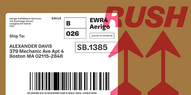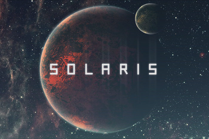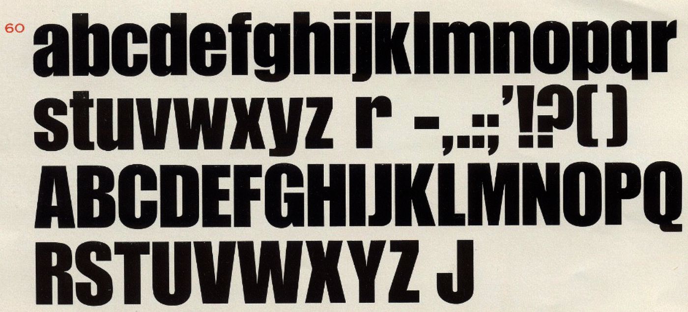
Fonts similar to Impact
Rama Gothic E
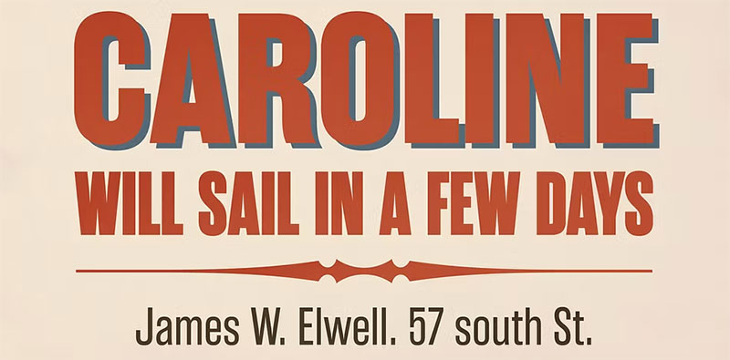
Rama Gothic draws inspiration from the sans serif designs of 1800s wood type. Each glyph is meticulously crafted to evoke the retro charm of yesteryears, imbued with a sense of nostalgia.
With its 18 distinct styles, this condensed font family is ideal for posters, headlines, and any setting where a strong impact is desired.
August Typeface

A powerful and beautiful condensed sans serif display typeface. It brings charming curves and satisfying patterns to traditional condensed fonts.
It’s designed for impact, without sacrificing style or legibility. It looks especially stunning in large scale, although it still carries a punch at smaller point sizes. It’s born to be a blessing for designers and viewers alike!
The August typeface includes four fonts – bold, bold italic, thin & thin italic. All offer wide language support, upper and lower cases, numerals and extended punctuation.
Specifically suited to: Posters, Blockbusters, movies, trailers, headlines, titles, logos, branding, scripts, display & bold fancy ‘stuff’
Big Impact Branding Font Bundle

Make your small business shine with distinct typefaces included in the Big Impact Branding Font Bundle! This bundle was put together to give you the flexibility to stand out with multiple highly-stylized typefaces from Parker Creative for one low price.
Create a massive array of high-end looks for anything from individual brands (dog walkers, photographers, social media influencers), to multi-store businesses (restaurants, auto repair shops, cleaning services) with ease.
Bebas Neue Pro – Normal Width Family
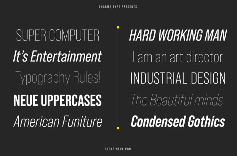
Bebas Neue is a world wide, the most popular font family with all caps released in 2010. Bebas Neue has been used from by big companies to by startup designers for many projects. In spite of the fact that Bebas Neue has only Uppercases, it became a very popular font for these 10 years.
At the same time, we received many requests for adding lowercases. To be honest, we had been developing whole new Bebas Neue with lowercases secretly for long time.
Thinner Uppercase from thin to regular weights were redesigned for Pro. New lowercases were designed to match the Uppercases very carefully. You can access Tabular figures by using OpenType tnum features. Almost all European languages and some Cyrillic are supported by Pro.
Compacta
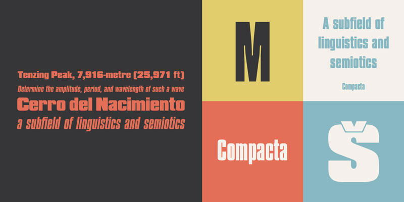
Compact is the ideal typeface for those looking to make the most of horizontal writing space. The characters in the set are immense, and its Sans Serif style presents unique characteristics due to the thick strokes.
Another noteworthy aspect is the size of the lower case letters, which are almost at the same level as the upper case letters, making them easily identifiable.
Bw Stretch
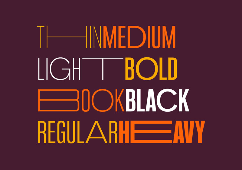
Although it is a similar font to impact, Bw Stretch has a unique aspect that makes it special among fonts: a series of characters that break with all the schemes and are absurdly stretched. This is a curious way of giving personality to a letter that would otherwise be sober.
Additionally, the set includes 8 different styles with which you can create both headlines and text bodies. The set includes disruptive characters, fractions, and everything you need from the Latin alphabet.
Oswald Font
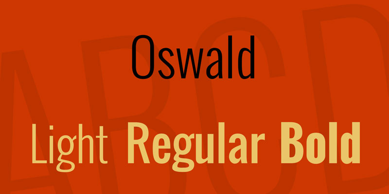
Available in standard and bold versions, Oswald is a classic typeface that adapts to modern times. Based on grotesque and gothic designs, the Sans Serif characters included in Oswald have straight lines, many angles, and wide separations, making it perfect for user interfaces.
Anton Font
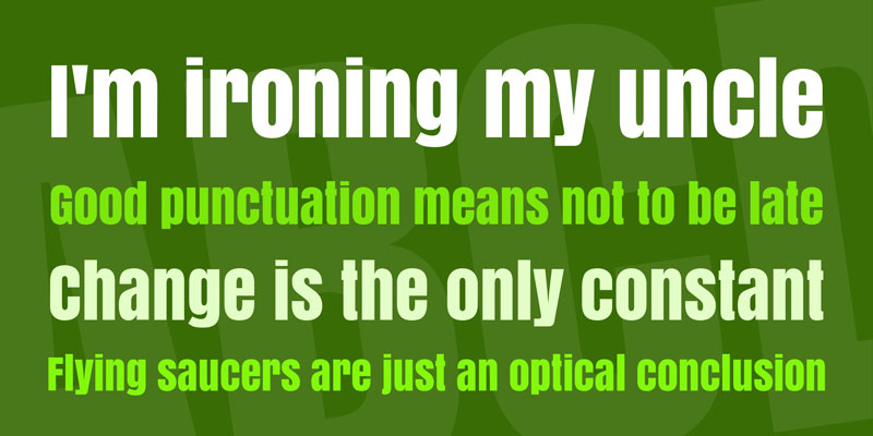
Despite its free character, Anton is a font similar to Oswald that can be used in personal and commercial projects. It has also been designed based on its use on websites, but it has the difference that lowercase letters are practically the same size as uppercase, being only differentiable by their shapes.
Neographik
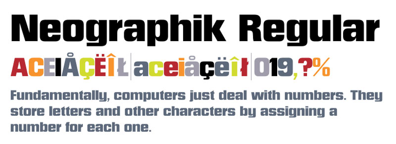
When it comes to maintaining a neat design, Neographik is one of the best alternatives. This font retains some similar features with Impact, such as higher than wide proportions, but each letter has been framed within a box so that they have straight sides. Even the O looks like a square with beveled corners.
Tungsten
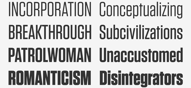
Tungsten was designed with eye-catching billboards in mind during the 20th century. For this to be possible, it needed to be able to compress as much information as possible in tight spaces, resulting in letters with straight sides that could work without large spacing.
Currently, this Hoefler & Frere-Jones creation has four variants, each thinner than the previous one, which also has 8 thicknesses.
Bebas Neue
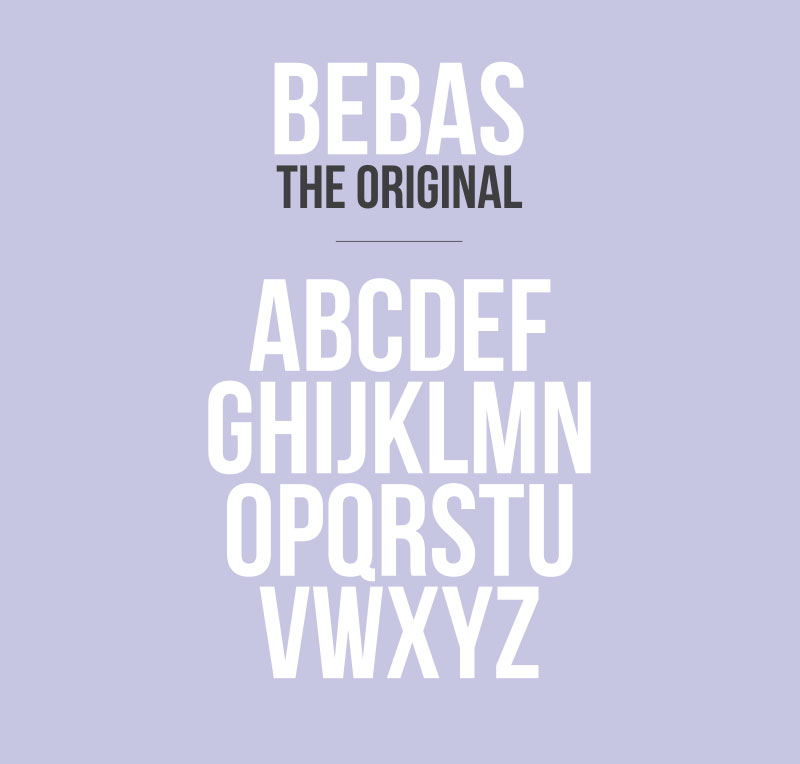
In the past, the use of free fonts was associated with poor quality, but that is history. Fonts like Bebas Neue will even surpass payment options by offering ideal alternatives for any project.
This font similar to Impact has 5 different thicknesses so you can choose the one that best suits your project.
Schmalfette
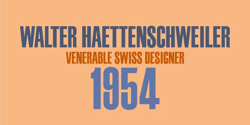
When it comes to making an impact, there is nothing better than a large, thick font full of capital letters. That’s what this font like Impact offers, only it does it more drastically as it is a collection of capital letters.
It has the typical characters of the Latin alphabet, in addition to some special characters for Eastern European language, making it a complete option.
MVB Solano Gothic
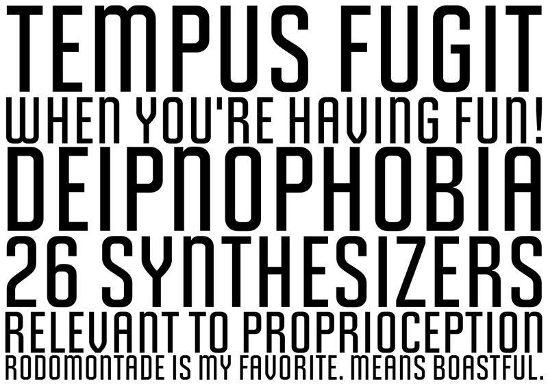
Not all Impact font alternatives have to have thick strokes to have a similar design. MVB Solano Gothic is just the opposite, having slim lines that work excellently to contrast letter shapes.
The set includes 329 uppercase and lowercase characters, symbols, fractions, punctuation, and even a single character with the MVB logo.
Mortadella
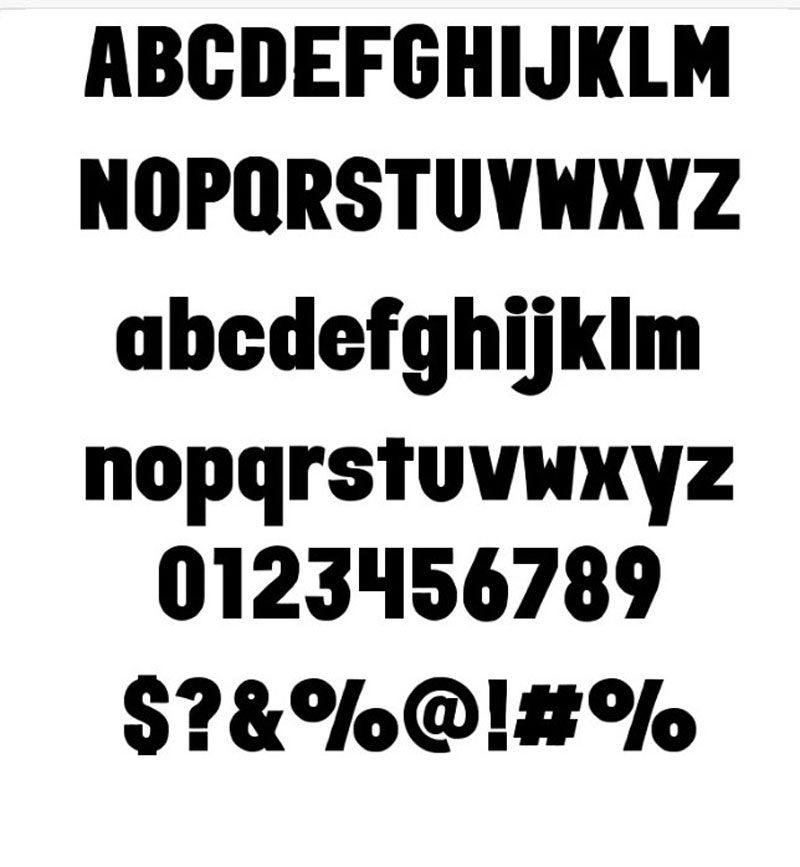
Made by hand beforehand and then digitized, Mortadella is a much thicker, more proportioned variant of Impact. Its filled geometric shapes are ideal for headlines in both digital and physical media.
Quist Headline
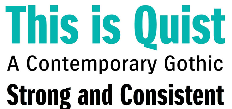
Do you know the Harry Mulish novel titled “The Discovery of Heaven”? If this is the case, then you will enjoy this collection of 4 fonts that represent the book’s protagonists. From slim designs to heavy characters, you can write whatever you want with this contemporary Gothic style.
Press Gothic
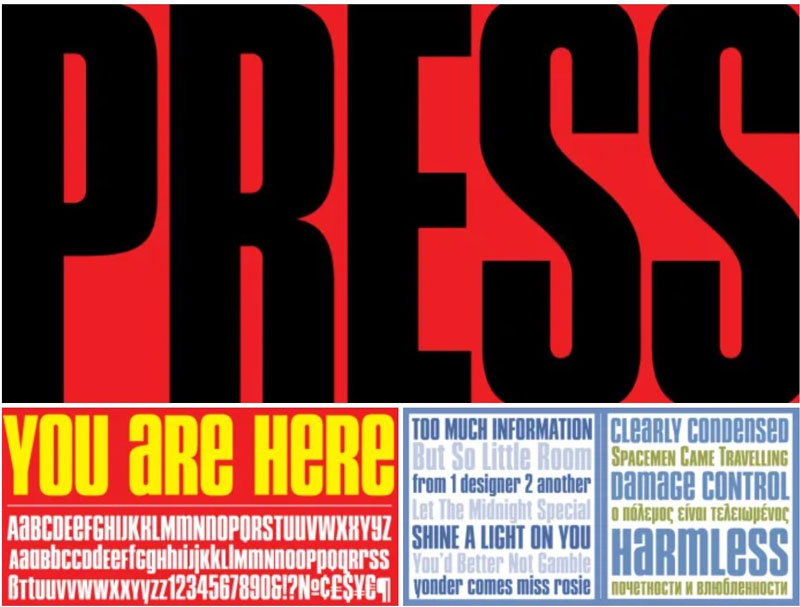
Originally known as Metropol, this font similar to Impact perished before it when computers became a standard in the world. However, reconstitution work has been done to adapt it to modern times, only this time known by the name of Press Gothic.
This redesigned typography offers letters with widely vertically marked ends, and all the details are straight, making it perfect for computer monitors. It includes lowercase characters, although these are similar in height to uppercase, so all texts will be bold.
Soft Press

This typeface is more of a variation of the previous Press Gothic, which uses the same shapes and thickness, but instead of finishing each corner straight, they have been slightly rounded to make them more pleasing to the eye.
This alternative to Impact also has upper and lower case characters, as well as Cyrillic characters to cover more languages.
Loft
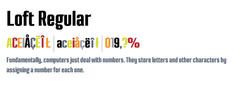
Perhaps the most radical option when it comes to a font similar to Impact is Loft. This takes all of Impact’s popular qualities to the extreme, using lines, slimline, tight spacing, and small curves.
Although it can be downloaded with seven different options, all of them have the same thickness, which means that it never loses the style. Support for cursive letters is also included, although these may not be the most readable on low-resolution screens.
ArTarumianMHarvats
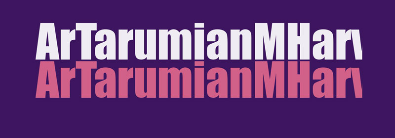
We finish this list with a font similar to Impact that offers an excellent symmetrical design, with strong corners and uniform thicknesses in all the strokes. The package includes 193 glyphs.
FAQ On Fonts Similar To Impact
What are the best free fonts similar to Impact?
Looking for free fonts with the same bold presence as Impact? Try Bebas Neue, League Gothic, or Oswald.
These typefaces offer the same strong typography feel without the price tag. Perfect for web design and print design, they ensure your graphic design projects stand out.
How can I find fonts similar to Impact for commercial use?
When you need fonts for commercial use, licensing is key. Explore font libraries like Adobe Fonts or Google Fonts .
Fonts such as Nexa Bold and Proxima Nova Bold provide robust, bold fonts ideal for any advertising or branding project. Always check the font licensing terms.
Are there fonts similar to Impact for logo design?
For logo design, bold sans-serif fonts are essential. Fonts like Helvetica Bold, Anton, and Futura Bold offer the same sturdy appeal as Impact.
These fonts ensure your logo designs are clear, memorable, and versatile across various digital media and print design applications.
What are the best fonts similar to Impact for web design?
In web design, readability and impact are crucial. Roboto Condensed, Teko, and Bangers are excellent choices.
These headline fonts are not only visually striking but also enhance user experience with their clarity and boldness, perfect for any visual communication needs.
Can I use fonts similar to Impact in print design?
Absolutely! For print design, consider Franklin Gothic, Trade Gothic, and Univers Bold. These strong typography options offer the weight and presence needed for posters, flyers, and other print media. They ensure your message is loud and clear on any medium.
How do I pair fonts similar to Impact with other fonts?
Pairing bold fonts like Impact requires balance. Combine with lighter sans-serif fonts such as Raleway or Avenir Next.
This contrast highlights the boldness of your main typeface while maintaining a clean, cohesive look. Ideal for web design, branding, and advertising.
What are the key characteristics of fonts similar to Impact?
Fonts similar to Impact share key traits: boldness, thickness, and sturdiness. They are typically sans-serif with a strong visual presence, making them ideal for headline fonts and graphic design.
These typefaces ensure your text stands out and grabs attention immediately.
How do I download fonts similar to Impact?
To download these fonts, visit reputable font libraries like Google Fonts, Adobe Fonts, or DaFont. Simply search for fonts like Oswald, Nexa Bold, or Bebas Neue.
Always ensure you review the font licensing to comply with usage rights, especially for commercial projects.
What are some unique alternatives to Impact for creative projects?
For creative projects, consider fonts like ChunkFive, Eurostile, or Gotham Bold. These creative fonts offer a unique twist while maintaining the bold, impactful style.
They are perfect for visual communication, branding, and adding a distinctive touch to your graphic design work.
Why should I consider fonts similar to Impact for my design projects?
Using fonts similar to Impact ensures your designs have a strong typography presence.
These fonts enhance visual communication, making your text stand out in advertising, branding, and web design. Their bold, clear lines are essential for effective, memorable designs.
Conclusion
If you enjoyed reading this article about fonts similar to Impact, you should read these as well:
- Wedding fonts to create awesome print materials for the party
- The most popular newspaper fonts and alternatives you can use
- Fantasy font options to download with a click to your computer

Renowned for his expertise in logo design and visual branding, Bogdan has developed a multitude of logos for various clients.
His skills extend to creating posters, vector illustrations, business cards, and brochures. Additionally, Bogdan's UI kits were featured on marketplaces like Visual Hierarchy and UI8.
He also wrote in the past years on sites like Design Your Way, WebDesignerDepot, WPDean, Designmodo, Speckyboy, Slider Revolution, and more.
- Free Browser 3D Tools for Designers Who Refuse to Install Anything - 9 September 2026
- Clean DM Sans Font Pairing Ideas for Minimal Design - 8 September 2026
- How to Prepare Before Applying for Graphic Design Jobs - 7 September 2026

Bogdan Sandu is a seasoned designer who has been designing websites since 2008. Renowned for his expertise in logo design and visual branding, Bogdan has developed a multitude of logos for various clients. His skills extend to creating posters, vector illustrations, business cards, and brochures. Additionally, Bogdan's UI kits were featured on marketplaces like Visual Hierarchy and UI8. He also wrote in the past years on sites like Design Your Way, WebDesignerDepot, WPDean, Designmodo, Speckyboy, Slider Revolution, and more.
You Might Also Like