The right typeface can transport readers to another world before they read a single word. Finding the best fantasy fonts matters whether you’re designing book covers, game titles, or movie posters.
Medieval lettering, gothic blackletter, elvish scripts, mystical calligraphy. Each style carries its own magic.
But not every decorative font works for every project. Some shine as display headlines. Others fall apart at smaller sizes or lack proper font licensing for commercial work.
This guide covers free and premium fantasy typefaces across multiple categories. You’ll learn visual characteristics, best use cases, pairing recommendations, and technical specifications for each font.
Pick the right one. Make your designs unforgettable.
The Best Fantasy Fonts
| Font Name | Primary Fantasy Style | Best Use Case | Character Type |
|---|---|---|---|
| Lepharto | Gothic Medieval | Dark fantasy titles, vampire themes | Decorative serif |
| Dragon Fire | Epic Adventure | Dragon-themed content, epic headers | Sharp display |
| Ringbearer | Tolkienesque | Quest narratives, elven themes | Elegant script |
| Metamorphous | Transformation Magic | Shapeshifter stories, mystical text | Fluid sans-serif |
| Press Jobs | Victorian Steampunk | Industrial fantasy, newspaper headers | Mechanical serif |
| Great Victorian | Classic Period | Historical fantasy, formal invitations | Ornate serif |
| Qene-G | Ancient Script | Archaeological themes, ancient magic | Runic display |
| Prida | Romantic Fantasy | Fairy tale titles, princess stories | Delicate serif |
| Endor | Forest Realm | Nature magic, woodland creatures | Organic sans-serif |
| Lost | Mysterious Exploration | Adventure maps, mystery headers | Weathered display |
| Bantem Unfamous | Underground Realm | Dark fantasy, underground cities | Bold condensed |
| Caudex | Ancient Manuscript | Spell books, historical documents | Classical serif |
| Belda | Heroic Legend | Warrior tales, epic poetry | Strong serif |
| Yellow Magician | Wizardry | Sorcerer content, magic schools | Mystical display |
| Awery | Light Fantasy | Whimsical stories, children’s books | Playful sans-serif |
| Ferrum | Iron Age | Weapon forging, blacksmith tales | Metallic display |
| Elodie | Enchanted Romance | Love stories, enchantress narratives | Flowing script |
| Wisp | Ethereal Spirit | Ghost stories, spirit guides | Thin delicate |
| Gotika Ornament | Gothic Architecture | Cathedral settings, religious fantasy | Decorated blackletter |
| Wizard | Classic Sorcery | Magic spells, wizard towers | Arcane display |
| Mystic Root | Druidic Nature | Druid lore, plant magic | Natural organic |
| Blue North | Nordic Ice | Viking sagas, frost giants | Bold runic |
| Neverland | Peter Pan Fantasy | Youth adventures, pirate stories | Playful display |
| The Crow | Dark Omen | Dark prophecies, raven symbolism | Sharp gothic |
| CageWorld | Dystopian Fantasy | Trapped realm narratives, cage motifs | Confined display |
| Squadez | Team Adventure | Group quests, party-based stories | Modern sans-serif |
| Stella | Celestial Magic | Star magic, astronomy themes | Elegant serif |
| Flamingo | Tropical Fantasy | Exotic islands, vibrant settings | Tropical display |
| Whimsy | Lighthearted Magic | Comedic fantasy, quirky tales | Casual script |
| Jimny | Compact Adventure | Short stories, compact headers | Condensed sans-serif |
Lepharto
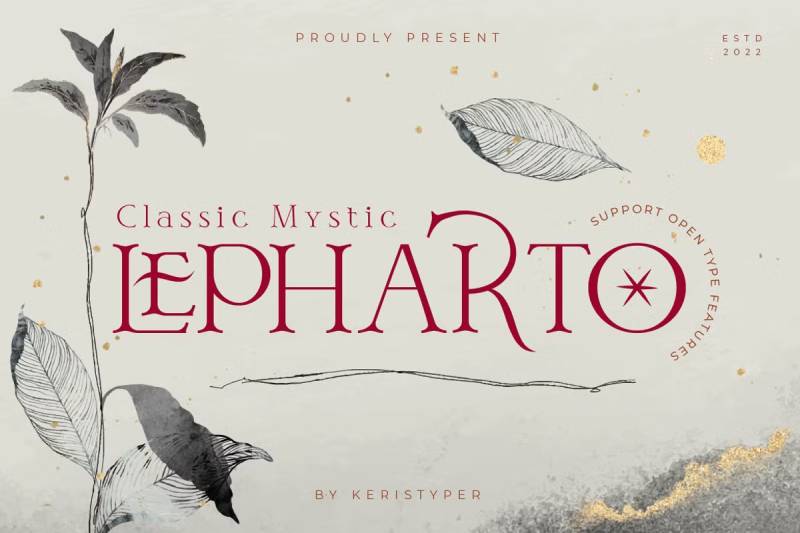
A modern mystic serif that walks the line between vintage elegance and fantasy mystery. Created by Tezar Tantular of Keristyper Studio (based in Bali, Indonesia), this typeface works surprisingly well for both headline and body text applications.
The letterforms feature classic serif construction with subtle decorative touches. There’s something about those curves. They whisper old libraries and ancient manuscripts without screaming “look at me, I’m fantasy.”
Visual Characteristics
- Medium-contrast strokes with refined serif terminals
- Decorated uppercase letters with elegant lowercase counterparts
- Gothic undertones blended with romantic aesthetics
- Clean enough for extended reading, ornate enough for titles
Best Use Cases
Movie titles, book covers, social media graphics, logo design. Works as secondary text paired with sans-serif fonts.
Actually performs well at smaller sizes, which is rare for fantasy-leaning typefaces.
Character Set & Features
- Full uppercase and lowercase
- Numerals and punctuation
- Multilingual support (German characters included: ä, ö, ü, ß)
- Alternates and ligatures accessible via OpenType
- PUA encoded for easy glyph access
Pairing Recommendations
Pair with clean sans-serifs for body text. The contrast creates visual hierarchy without competing elements.
Technical Specifications
Formats: OTF, TTF, WOFF (web fonts included)
Licensing: Commercial license required for business use. Available through Creative Market and Envato Elements.
Dragon Fire

Sharp edges. Bold presence. This serif display font screams medieval adventure the moment you see it.
Released in 2020 by Indonesian designer Girinesia, Dragon Fire draws obvious inspiration from Game of Thrones-era fantasy aesthetics. Those pointed terminals and aggressive serifs make it instantly recognizable.
Visual Characteristics
- Bold, heavy strokes with sharp, angular edges
- Pronounced serifs with pointed flares
- Strong vertical emphasis in letterforms
- Medieval signage influence throughout
Best Use Cases
E-sport logos, film posters, video game titles, sport branding. Anything that needs to feel powerful and fantastical.
Not great for body text. Stick to headlines and display applications.
Character Set & Features
- Complete uppercase and lowercase alphabets
- Full numeral set with symbols
- Extended Latin character support
- Multilingual: Afrikaans, Albanian, Catalan, Danish, Dutch, English, German, Icelandic, Indonesian, Italian, Norwegian, Polish, Portuguese, Spanish, Swedish, Zulu
Pairing Recommendations
Works best with neutral body fonts. Let Dragon Fire do the heavy lifting for titles while a simple serif font handles readability.
Technical Specifications
Formats: TTF, OTF
Licensing: Free for personal use. Commercial license available through Creative Fabrica.
Ringbearer
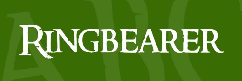
The Lord of the Rings font. Well, not officially. But close enough.
Pete Klassen spent about six months trying to find the original typeface used in Peter Jackson’s trilogy logo. No luck. So he recreated it himself in 2002, using international promotional materials as reference.
The result? A near-perfect replica that’s been downloaded over 327,000 times.
Visual Characteristics
- Eroded, weathered edges suggesting ancient origins
- Elongated letterforms with delicate curves
- Mystical quality with subtle medieval influence
- Narrow proportions ideal for title treatments
Best Use Cases
Fantasy book covers, movie titles, fan projects, themed event materials. Perfect for anything Tolkien-inspired.
This is a display font through and through. Headlines only.
Character Set & Features
- 147 defined characters and glyphs
- Basic Latin coverage (66 characters)
- Latin-1 Supplement (64 characters)
- Latin Extended-A (19 characters)
- Accented character support
- Small caps available
Pairing Recommendations
Combine with elegant script fonts for subtitles. Aniron (also by Klassen) works beautifully as a companion for Elvish-style text elements.
Technical Specifications
Formats: TTF
Licensing: Free for personal use. Contact designer for commercial licensing.
Designer: Pete Klassen, 2002
Metamorphous

Here’s a Google Font that actually feels fantasy-appropriate. Free. Commercial use allowed. No strings attached.
James Grieshaber of Sorkin Type Co designed Metamorphous in 2011. It blends Romanesque, Gothic, and Renaissance letter shapes into something genuinely unique. Originally inspired by Kiwi Media’s Morpheous font and Jonathan Barnbrook’s work.
Visual Characteristics
- Medium contrast between thick and thin strokes
- Antiquated, medieval edge to character forms
- Gothic influence balanced with classical proportions
- Readable at small sizes despite decorative nature
Best Use Cases
Epic fantasy and high fantasy book cover design, game interfaces, period-appropriate branding, website headings.
Actually works for body text in short passages. Unusual for this category.
Character Set & Features
- 410 defined characters
- 290 unique glyphs
- Basic Latin, Latin Extended-A and B
- Greek and Coptic characters
- Currency symbols
- Mathematical operators
Pairing Recommendations
Pairs naturally with other Google Fonts. Try Lora or Source Serif Pro for body text to maintain the period aesthetic.
Technical Specifications
Formats: TTF, OTF, WOFF (via Google Fonts)
Licensing: SIL Open Font License. Free for personal and commercial use.
Designer: James Grieshaber, Sorkin Type Co, 2011
Press Jobs
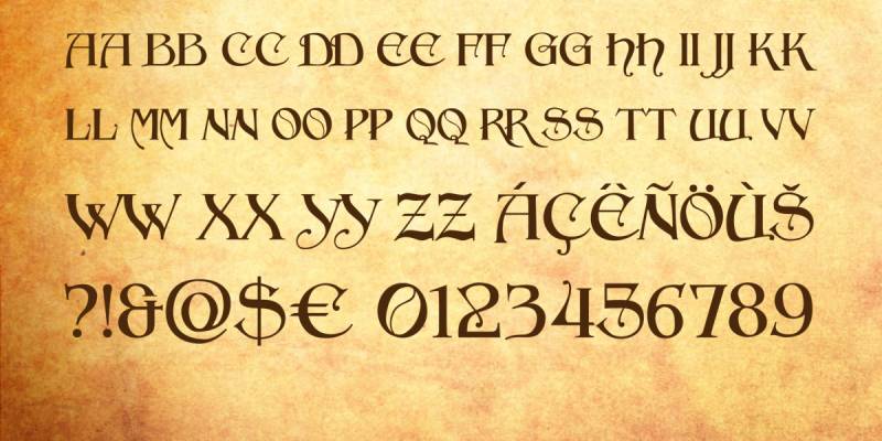
Celtic letterforms meet Art Nouveau swirls. This blackletter-inspired decorative font by Vladimir Nikolic (released 2021/2022) has a historical and artistic appearance that feels genuinely handcrafted.
Those elaborate curves and flourishes. The pronounced serifs. There’s drama here.
Visual Characteristics
- Ornate blackletter influence with bold strokes
- Decorative curves and dramatic flourishes
- Traditional Gothic aesthetic with artistic flair
- Historical elegance in every character
Best Use Cases
Historical fantasy covers, epic/high fantasy titles, vintage-themed poster design, period branding, decorative signage.
Headlines only. This font demands attention.
Character Set & Features
- Complete uppercase and lowercase
- Numbers and basic punctuation
- Latin character support
- Gothic styling throughout
Pairing Recommendations
Balance with clean, readable body fonts. The ornate nature of Press Jobs needs white space and simple companions.
Technical Specifications
Formats: TTF, OTF
Licensing: Free for personal use. Commercial license required for business projects (available through Creative Fabrica).
Designer: Vladimir Nikolic, 2021
Great Victorian
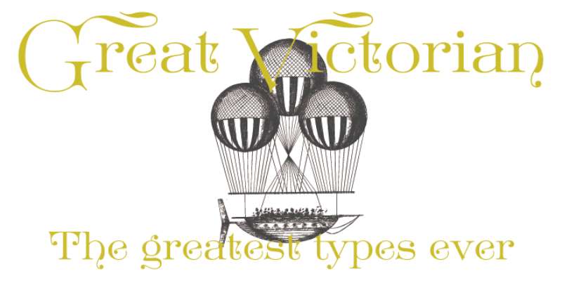
Based on Euclid and Euclid Initials from the Cleveland Type Foundry, late 19th century. This is actual historical typography revival.
Decorative, historical, elegant, regal. The name fits perfectly.
Dharma Type brought this ornate Victorian-era design back to life for modern use.
Visual Characteristics
- Ornate Victorian-era decorative elements
- Elegant serif construction with historical accuracy
- Regal, authoritative presence
- Period-appropriate flourishes and details
Best Use Cases
Fantasy and historical book covers, period-piece branding, formal invitations, elegant signage, antique-themed projects.
Perfect when you need something that feels genuinely old, not just “fantasy old.”
Character Set & Features
- Decorative uppercase with ornate details
- Matching lowercase characters
- Period-accurate numeral designs
- Standard punctuation set
Pairing Recommendations
Match with simpler serif fonts for body text. The decorative nature requires restraint elsewhere in your typography elements.
Technical Specifications
Formats: TTF, OTF
Licensing: Varies by distributor. Check specific source for usage terms.
Origin: Based on Cleveland Type Foundry designs, late 1800s
Qene-G
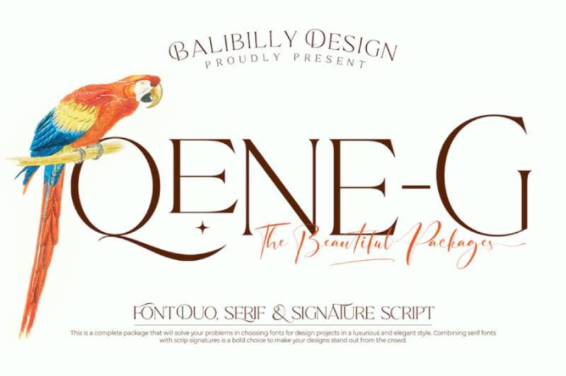
Sophisticated. Luxurious. This serif family by I Wayan Bill Natih of Balibilly Design (Canggu, Bali) solves a real problem: combining typefaces in typographic art.
The complete package includes both serif fonts and signature scripts. Smooth curves, flowy terminals, flirty tails.
Visual Characteristics
- Elegant thin strokes with refined proportions
- Smooth curves and sophisticated terminals
- Luxurious aesthetic without overwhelming decoration
- All-caps design with dual style access
Best Use Cases
Urban fantasy, dark fantasy, YA and adult fantasy novels, fashion magazines, branding projects, social media overlays, website headers.
Versatile enough for display font work and shorter text passages.
Character Set & Features
Five font families included:
- Qene-G Regular
- Qene-G Regular Italic
- Qene-G Outline
- Qene-G Outline Italic
- Qene-G Script
Features extensive ligatures and stylistic alternates. PUA and Unicode encoded.
Pairing Recommendations
The script version pairs naturally with the serif versions. Use the outline variants for layering effects.
Technical Specifications
Formats: OTF
Licensing: Free demo version available. Full commercial license through Balibilly Design or MyFonts.
Designer: I Wayan Bill Natih, Balibilly Design
Prida

Gluk Fonts created the Prida family with decorative swashes and daring curves. Multiple versions exist: Prida01, Prida36, Prida61, Prida65.
Decorative lowercase and uppercase letters that work for fantasy and romance covers alike.
Visual Characteristics
- Bracket serif construction
- Vintage, decorative styling
- Delicate to bold weight range
- Stylish swash elements
Best Use Cases
Fantasy book covers, romance titles, decorative headings, invitations, elegant branding. Works for both fairy tale fantasy and more mature themes.
Multiple weights allow flexibility across applications.
Character Set & Features
Prida01 alone includes:
- 621+ glyphs
- Light, Regular, Bold, and Black weights
- Decorative alternates
- Full Latin character support
Prida61 contains 932 glyphs with additional stylistic options.
Pairing Recommendations
Use lighter weights for body text, heavier weights for headlines. The family works well together or paired with clean sans-serif fonts.
Technical Specifications
Formats: OTF
Licensing: Public domain / GPL / SIL Open Font License. Free for personal and commercial use.
Designer: Gluk Fonts
Endor

Endor pulls you straight into dark fantasy territory with its angular, gothic letterforms. Designed by Graham Meade and Apostrophic Labs back in the early 2000s, this typeface has racked up over 200,000 downloads for good reason.
The medieval aesthetic here is unmistakable.
Visual Characteristics
Sharp, angular lines define every letter. The uppercase characters carry intricate ornamentation that screams historical elegance, while the lowercase stays more restrained for balance.
Gothic serifs. Pointed terminals. A brooding personality throughout.
The stroke contrast is moderate, keeping things readable even at smaller sizes. Your typography choices matter here, and Endor delivers that dramatic weight.
Best Use Cases
- Dark fantasy and urban fantasy book covers
- High fantasy title designs
- Event invitations with a historical twist
- Movie posters needing gothic appeal
Not ideal for body text. Save it for headlines and display purposes where that medieval flair can breathe.
Character Set & Features
172 glyphs total across two font files: Endor Regular and Endor Alt. The alternate version gives you options when certain letterforms feel too heavy for your design.
Basic Latin coverage is solid. Numbers and punctuation maintain the gothic theme.
Pairing Recommendations
Pair with a clean serif font like Garamond for body text. The high drama of Endor needs something quieter underneath it.
A simple sans-serif font can work too, depending on the mood you’re after.
Technical Specifications
- Format: TTF
- License: 100% free (personal and commercial)
- Best sizes: 24pt and above for optimal detail
- Available on DaFont, Font Squirrel, 1001 Fonts
Banten Unfamous
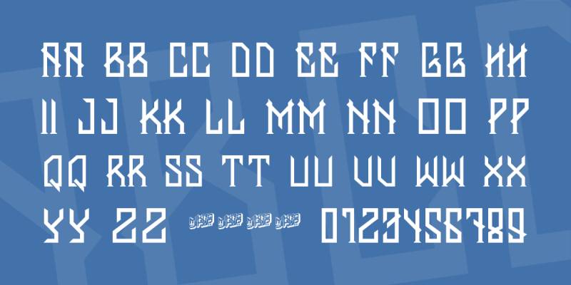
Yes, it’s spelled “Banten” in the actual font files. Mikrojihad Typography created this edgy gothic display font that sits perfectly in dark fantasy territory.
The vibe here is niche. But that’s exactly what some projects need.
Visual Characteristics
Modern gothic meets paranormal energy. The letterforms carry an urban edge that separates them from traditional blackletter styles.
Thick strokes with deliberate roughness. Each character feels slightly dangerous, which is the whole point.
The overall aesthetic leans toward dark, high fantasy, or supernatural themes. If your project involves vampires or haunted kingdoms, this might be your typeface.
Best Use Cases
- Dark fantasy novel covers
- Urban fantasy and paranormal romance titles
- Horror game branding
- Band logos with supernatural themes
It’s niche. Your mileage will vary depending on the subgenre.
Character Set & Features
Single weight only. Standard Latin character support with numbers and basic punctuation.
No fancy ligatures or stylistic alternates here. What you see is what you get.
Pairing Recommendations
Keep body text simple. A neutral serif works well to balance the intensity of those gothic headlines.
The contrast between decorative headers and clean body copy creates good visual hierarchy.
Technical Specifications
- Format: TTF
- License: Free for personal use (commercial license required for business)
- Designer: Mikrojihad Typography
- Best for: Display sizes, headlines
Caudex
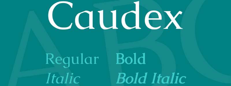
Here’s something different. Caudex isn’t flashy fantasy lettering. It’s a scholarly serif that brings medieval manuscript energy to modern screens.
Available on Google Fonts. That alone makes it worth knowing about.
Visual Characteristics
Classical calligraphy roots show in every letterform. Flared serifs nod toward historical scripts without going full blackletter.
The x-height is moderate, creating balanced proportions for extended reading. Stroke contrast exists but stays subtle.
Hjort Nidudsson designed this typeface with the Medieval Unicode Font Initiative in mind. It includes most MUFI 3.0 character recommendations.
Best Use Cases
- Fantasy and epic fantasy book cover design
- Historical fiction titles
- Academic projects with medieval themes
- Body text in print materials (yes, actually readable)
Unlike most fantasy fonts, Caudex works for extended text. Not just headlines.
Character Set & Features
Massive glyph coverage: over 2,000 characters. Four styles available:
- Regular
- Italic
- Bold
- Bold Italic
Greek alphabet included. Extensive multilingual support. Ligatures that create smooth reading flow.
Pairing Recommendations
Try Josefin Sans for a modern complement. Prata or Kotta One work if you want to stay within serif territory.
Pairing fonts properly takes practice. Caudex plays nice with most neutral options.
Technical Specifications
- Format: TTF (Google Fonts, Font Squirrel)
- License: SIL Open Font License (free for everything)
- Designer: Hjort Nidudsson
- Best sizes: Works at both display and text sizes
Belda
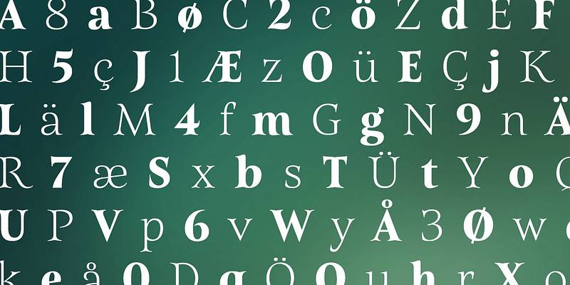
Jeremy Dooley of Insigne Design created Belda, and it shows. This font family carries serious production value.
54 styles. That’s not a typo.
Visual Characteristics
Roman capital calligraphy meets modern type design. Think Trajan’s Column, but evolved for contemporary use.
Sharp serifs with delicate curves create visual tension. The lighter weights stay elegant while bolder versions grab attention hard.
Strong stroke contrast throughout. The thicks and thins really dance together here.
Best Use Cases
- Fairy tale and whimsical fantasy covers
- Movie title sequences
- Premium packaging
- Poster design requiring classical elegance
- Logo work for upscale brands
The family’s depth means you can use it across an entire project. Title, subtitles, and supporting text.
Character Set & Features
OpenType features include:
- Small capitals
- Titling capitals
- Stylistic alternates
Multiple widths: normal, condensed, extended. Nine weights from Thin to Black, each with italic variants.
Pairing Recommendations
The family is large enough to pair with itself. Use condensed weights for subheadings, regular for body text.
If going outside the family, clean sans-serifs provide breathing room.
Technical Specifications
- Format: OTF, TTF
- License: Demo version free for personal use; commercial license required for business
- Designer: Jeremy Dooley (Insigne Design)
- Available: Adobe Fonts, MyFonts, Font Squirrel (demo)
Yellow Magician
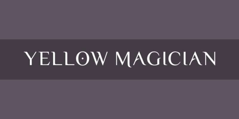
Érico Lebedenco designed Yellow Magician in 2008 for the MAGUS LUDENS logotype. The name tells you everything: whimsy and magic baked right in.
It’s unlike most fantasy fonts you’ll encounter.
Visual Characteristics
Playful and unpredictable. The baseline varies slightly between characters, creating a dancing effect.
Exaggerated serifs curl and twist unexpectedly. Some letters carry vintage storybook energy. Others feel almost hand-drawn.
The overall mood is enchanted without being childish. There’s sophistication hiding in that whimsy.
Best Use Cases
- Fantasy-themed projects needing unique personality
- Book covers for lighter fantasy tones
- Magical event invitations
- Whimsical branding projects
- Game titles with mystical themes
Not for dark fantasy. This typeface smiles at you.
Character Set & Features
411 glyphs total. Single weight (Regular only).
Extended Latin support including accented characters for multiple languages. Numbers maintain that magical aesthetic.
Pairing Recommendations
Balance with something grounded. A neutral serif or clean sans-serif keeps the overall design from floating away.
The whimsy needs an anchor.
Technical Specifications
- Format: TTF
- License: Creative Commons Attribution Share Alike (free for personal and commercial)
- Designer: Érico Lebedenco
- Available: Font Squirrel, Abstract Fonts, 1001 Fonts
Awery
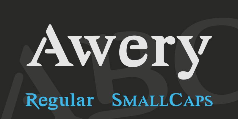
Typesgal created Awery as a hybrid: classic serif meets stencil design. The result feels serious yet accessible.
Two distinct styles in one family give you flexibility.
Visual Characteristics
Those stencil-like cuts running through characters create immediate visual interest. The strokes are thick and confident.
Serif font bones with modern disruption. Each letterform carries momentum.
Small caps styling throughout maintains consistency. The vertical emphasis commands attention on headlines.
Best Use Cases
- Adventure and fantasy book covers
- High fantasy and epic fantasy titles
- Branding projects needing bold personality
- Social media posts requiring impact
- Packaging with heroic themes
The stencil aspect adds character without screaming “military.”
Character Set & Features
Two styles available. Full uppercase and lowercase with numbers and punctuation.
The small caps structure means upper and lowercase share similar proportions.
Pairing Recommendations
Works well with clean sans-serifs for body text. The boldness of Awery headlines needs quiet support underneath.
Avoid pairing with other decorative faces. Too much competition.
Technical Specifications
- Format: TTF
- License: Free for personal and commercial use
- Designer: Typesgal
- Available: 1001 Fonts, various free font sites
Ferrum
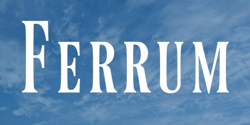
Sora Sagano designed Ferrum with one inspiration: the Final Fantasy video game series logo. That DNA shows clearly.
Narrow. Elegant. Unmistakably fantasy.
Visual Characteristics
Extra-condensed proportions create a towering effect. High contrast between thick and thin strokes adds drama.
Sharp, pronounced serifs contribute to that prestigious feel. The tall letterforms command vertical space efficiently.
Small caps design throughout. This creates unity whether you’re typing upper or lowercase.
Understanding font spacing matters here. The narrow forms need proper tracking adjustments.
Best Use Cases
- Dark fantasy and urban fantasy covers
- Video game title screens
- Editorial design with sophistication
- Luxury branding
- Formal invitations needing gravitas
The Final Fantasy connection makes it natural for gaming projects. But don’t limit yourself there.
Character Set & Features
101 characters covering:
- Basic Latin alphabet
- Numbers
- Essential punctuation
Single weight. No italics or alternates.
Limited multilingual support: Basic Latin, Cebuano, Swahili.
Pairing Recommendations
The narrow structure pairs well with wider serif faces for body text. Creates nice contrast without conflict.
Clean sans-serifs work for modern applications.
Technical Specifications
- Format: TTF
- License: Public Domain / CC-0 (no restrictions)
- Designer: Sora Sagano (dot colon foundry)
- Available: Font Library, FontSpace, Font Squirrel
Elodie
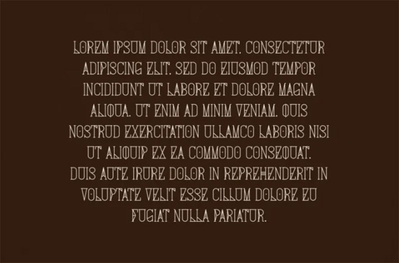
Art Nouveau meets fantasy in this hand-drawn display font. Franzi Paetzold created Elodie with a brush pen, giving it that authentic handcrafted feel most digital fonts lack.
The all-caps design carries elvish undertones. Every letterform has decorative quirks that set it apart.
Visual Characteristics
Hand-sketched letterforms with brush pen strokes visible throughout. The uppercase section contains extra quirky characters for adding personality.
Lowercase letters work for regular text. Uppercase adds the decorative punch when you need impact.
The Art Nouveau influence shows in flowing curves and organic ornamentation. There’s something fairy-tale about the whole thing.
Best Use Cases
- Movie posters needing elvish aesthetics
- Packaging design for fashion brands
- Titles and short quotes
- Product naming with fantasy themes
Not for body text. Keep it to headlines and display purposes.
Character Set & Features
Single weight available. Multilingual support covers Western, Central, and Eastern European languages.
The lowercase and uppercase serve different functions. Smart designers use both strategically.
Pairing Recommendations
Clean body text fonts let Elodie breathe. A simple serif or sans-serif handles the reading duties while Elodie grabs attention up top.
Keep supporting fonts quiet.
Technical Specifications
- Format: OTF, TTF
- License: Free for personal use; commercial license required
- Designer: Franzi Paetzold (Franzi draws)
- Available: MyFonts, 1001 Fonts, Linotype
Wisp
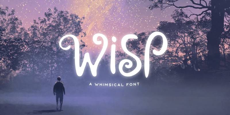
Mehmet Reha Tugcu of Tugcu Design Co. created Wisp as a display font with genuine magical energy. The curves here feel alive.
Almost every letter has an alternate version. Toggle with Caps Lock.
Visual Characteristics
Magical curves define the aesthetic. Playful swirls extend from letterforms like wisps of enchanted smoke.
The curly, romantic style works for fairy-tale projects without being overly childish. There’s sophistication in the whimsy.
Mystical decorative elements come in a separate font file. These extras give you significant design flexibility.
Best Use Cases
- Children’s book covers and titles
- Animated movie typography
- Greeting cards with magical themes
- Fantasy-themed invitations
- Whimsical branding projects
The cute, fun quality makes it ideal for lighter fantasy tones.
Character Set & Features
Included in the package:
- Multilingual uppercase letters
- Numbers and punctuation
- Extra decorative elements (separate font file)
- Stylistic alternates (Caps Lock toggle)
Pairing Recommendations
This font carries enough personality on its own. Pair with something extremely clean.
Simple sans-serifs or basic serifs work best underneath.
Technical Specifications
- Format: OTF, TTF
- License: Commercial (Envato Elements, Creative Market, Font Bundles)
- Designer: Mehmet Reha Tugcu (Tugcu Design Co.)
- Price: Premium font
Gotika Ornament
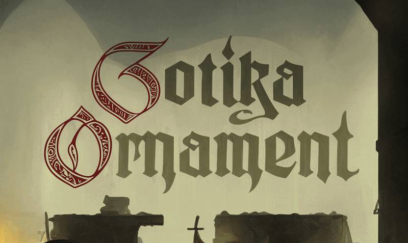
Måns Grebäck designed the Gotika family as a masterclass in modern blackletter. Gotika Ornament is the decorative sibling, loaded with Middle Ages-inspired floral patterns.
Medieval meets modern here.
Visual Characteristics
Intricate gothic letterforms with floral ornamentation throughout. The uppercase characters are highly decorative, while lowercase maintains bold blackletter structure.
Pointed arches and detailed filigree echo gothic architecture. Every letter feels like it belongs in an illuminated manuscript.
The stylistic and contextual alternates give you customization options rarely found in free fonts.
Best Use Cases
- Historical fantasy projects
- Formal invitations with medieval themes
- Vintage poster design work
- Branding requiring old-world authenticity
- Book covers for dark fantasy
The ornamental details shine at larger display sizes.
Character Set & Features
Advanced OpenType functionality includes:
- Stylistic alternates
- Contextual alternates
- Ligatures
Extensive language support covering all Latin-based languages. Full punctuation and number sets.
Part of a larger family including Gotika Black and Gotika Strict.
Pairing Recommendations
Understanding typographic hierarchy matters here. Gotika Ornament demands a supporting role from body text fonts.
Use clean serifs for readability contrast.
Technical Specifications
- Format: OTF, TTF
- License: Free for personal use; commercial license available
- Designer: Måns Grebäck
- Available: DaFont, MyFonts
Wizard
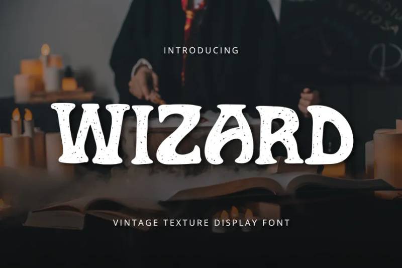
Graphiqa designed Wizard as a magic-themed display font suited for mystical projects. The name delivers on its promise.
Think movie titles, game branding, warlock aesthetics.
Visual Characteristics
Bold strokes with horror undertones blending into fantasy territory. The letterforms suggest magical power without going cartoonish.
Mythical energy runs through the design. Sharp edges meet mysterious curves.
The display proportions command attention at larger sizes. This font wants to be seen, not read at length.
Best Use Cases
- Movie title sequences
- Web headers for fantasy content
- Logotypes for magical brands
- Advertising with supernatural themes
- Game branding
Works especially well for horror-fantasy hybrids.
Character Set & Features
TTF and OTF formats included. Standard character set with uppercase, lowercase, numbers, and punctuation.
Accessible in Adobe applications, Microsoft products, and most design software.
Pairing Recommendations
The display weight needs contrast. Lighter body fonts keep things readable.
Neutral serifs or modern sans-serifs balance the drama effectively.
Technical Specifications
- Format: TTF, OTF
- License: Commercial (Envato Elements)
- Designer: Graphiqa
- Price: Premium font
Mystic Root
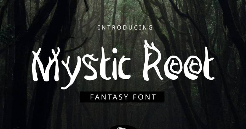
YandiDesigns created Mystic Root as a handmade fantasy font with organic, root-like character. The name tells you everything about the aesthetic.
Whimsical and slightly scary. Natural and supernatural combined.
Visual Characteristics
Hand-drawn letterforms with uneven strokes. Each character looks like it grew from enchanted soil.
Organic shapes throughout. The letters twist and curve like ancient tree roots or mystical vines.
The horror-adjacent quality makes it suitable for darker fantasy without being overtly scary.
Best Use Cases
- Children’s book covers
- Logo and heading designs
- Quote graphics
- Title design for nature-themed fantasy
- Print design with mystical themes
Versatile enough for both light and dark fantasy projects.
Character Set & Features
Available formats: OTF, TTF, EOT
Character coverage:
- Basic Latin (English characters, numbers, symbols)
- Multilingual support (French, Spanish, German, Italian, Indonesian, Malay)
Pairing Recommendations
The organic style pairs well with cleaner geometric fonts. Creates interesting tension between natural and structured.
Simple body text fonts prevent visual overload.
Technical Specifications
- Format: OTF, TTF, EOT
- License: Commercial (various marketplaces)
- Designer: YandiDesigns
- Available: Font Bundles, Creative Market, Envato
Blue North
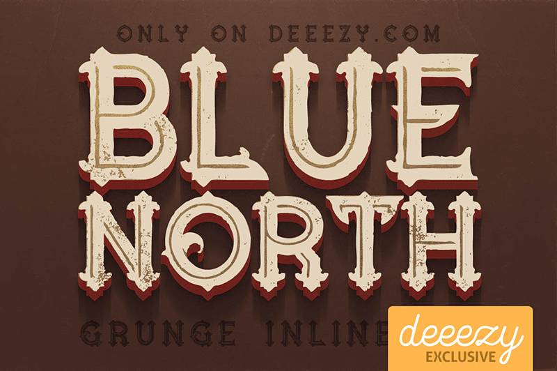
Peter Olexa and the JumboDesign/Cruzine team created Blue North as a vintage-fantasy hybrid. The grunge variations give it that worn, aged quality many fantasy projects need.
Four styles. Plenty of options.
Visual Characteristics
Vintage aesthetic with fantasy undertones. The letterforms carry weight and history.
Four style variations:
- Regular
- Grunge
- Inline
- Inline Grunge
The dirty texture options add authenticity. Perfect for projects needing weathered, ancient feelings.
Best Use Cases
- Fantasy book covers
- Vintage movie title designs
- Signage with aged appearance
- Branding requiring historical gravitas
- Music-related fantasy projects
The grunge options work particularly well for occult or dark fantasy themes.
Character Set & Features
Standard character set with uppercase focus. Numbers and punctuation included.
Each of the four styles functions as a separate font file.
Pairing Recommendations
The vintage quality pairs naturally with other aged-looking typefaces. Or contrast with something modern for interesting tension.
Clean body text prevents the grunge from overwhelming readers.
Technical Specifications
- Format: TTF, OTF
- License: Free for personal use; commercial license available
- Designer: Peter Olexa (JumboDesign/Cruzine)
- Available: DaFont, Creative Market, Envato Elements
Neverland
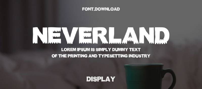
TSV Creative designed AXR Neverland with vintage fantasy movie posters in mind. The influence shows clearly. Think Alice in Wonderland, Wizard of Oz, Narnia.
Handmade quality. Epic display presence.
Visual Characteristics
Hand-lettered display serif with Victorian ornamentation. Sign painter influences mix with fantasy flair.
Two versions available: regular and shadowed. The shadow variant adds depth for dimensional title designs.
Ornamental quality throughout. Elegant letterhead styling meets circus poster energy.
Best Use Cases
- Fantasy book covers
- Movie title sequences
- Graphic novel covers
- Branding with vintage-fantasy crossover
- Event materials needing storybook vibes
The vintage circus feel works surprisingly well for fantasy contexts.
Character Set & Features
Built-in ligatures (toggle via Caps Lock):
- The, Of, In, At, And, To, On, By, For, With
File formats: TTF, OTF
Bonus: Ornaments in AI and EPS format
Pairing Recommendations
The decorative uppercase needs simple supporting fonts. Clean serifs maintain the vintage feel without competing.
Save the ornamental ligatures for key moments.
Technical Specifications
- Format: TTF, OTF
- License: Commercial (Creative Market, Font Bundles, Envato)
- Designer: TSV Creative
- Price: Premium font
The Crow
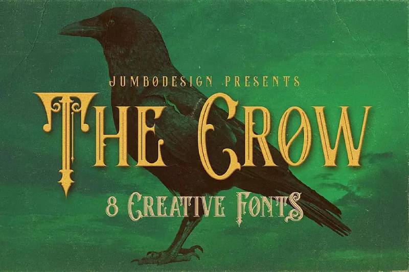
JumboDesign/Cruzine created The Crow as a darker vintage fantasy option. Eight style variations make this one of the most versatile fantasy display fonts available.
Horror meets fantasy here. Gothic energy throughout.
Visual Characteristics
Vintage serif foundation with gothic ornamentation. Swirls and decorative elements add drama without going overboard.
Eight styles:
- Regular
- Grunge
- Inline
- Inline Grunge
- Shadow
- Shadow Grunge
- Inline Shadow
- Inline Shadow Grunge
The layerable styles let you create custom dimensional effects.
Best Use Cases
- Fantasy book covers (especially dark fantasy)
- Horror-fantasy hybrid projects
- Movie title design
- Gothic branding
- Halloween-themed materials
The multiple variations handle diverse project needs.
Character Set & Features
Standard uppercase and lowercase. Numbers and punctuation included.
Each of the eight styles comes as a separate font file. Mix them for layered typography effects.
Pairing Recommendations
Understanding font psychology helps here. The Crow suggests darkness, mystery, gothic romance.
Pair with clean serifs for body text. Maintain the mood without sacrificing readability.
Technical Specifications
- Format: TTF, OTF
- License: Demo free for personal use; commercial license required
- Designer: JumboDesign/Cruzine
- Available: Creative Market, Envato Elements, Font Bundles
CageWorld
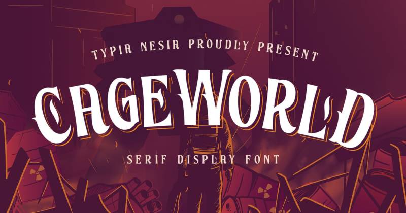
Typia Nesia created CageWorld as a handcrafted vintage display serif. The retro quality makes it versatile across fantasy and non-fantasy projects alike.
Video game titles to liquor labels. This font handles both.
Visual Characteristics
Vintage serif foundation with handcrafted texture. The letterforms feel manually drawn rather than digitally precise.
Bold strokes with classic proportions. The overall aesthetic suggests old adventure maps and antique signage.
Stylistic alternates through OpenType features add customization options. PUA encoded characters remain accessible without specialized software.
Best Use Cases
- Fantasy book projects and branding materials
- Video game title design
- Lettering and logotype work
- Product packaging with vintage themes
- Label design for craft products
- Fonts for t-shirts
The flexible vintage quality crosses genre boundaries easily.
Character Set & Features
- Upper and lowercase characters
- Full numerals
- Complete punctuation
- Stylistic alternates (OpenType)
- PUA encoded characters
- Multilingual support
Pairing Recommendations
The vintage serif style pairs naturally with clean sans-serifs for body text. Creates nice old-meets-new tension.
Other handcrafted fonts can complement for themed projects.
Technical Specifications
- Format: TTF, OTF
- License: Commercial (Envato Elements, Font Bundles, Creative Fabrica)
- Designer: Typia Nesia (yipianesia)
- Price: Premium font
Squadez
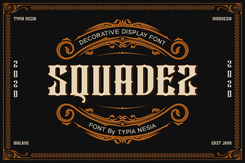
Gothic inspiration runs through Squadez, created by yipianesia. The bold display quality brings mystery and extraordinary presence to any project.
Modern meets medieval here.
Visual Characteristics
Bold letterforms with gothic undertones. The strokes carry weight and authority.
Contemporary execution of traditional blackletter influence. Clean enough for modern design while maintaining old-world character.
The display proportions command attention at large sizes. Not subtle typography.
Best Use Cases
- Fantasy novel covers
- Movie title sequences
- Editorial design with gothic themes
- Stationery and card invitations
- Sport-related fantasy branding
- Logotype design for games and entertainment
The gothic quality works for both light and dark fantasy projects.
Character Set & Features
Standard character set with uppercase and lowercase. Numbers and punctuation included.
Works in logo branding, stationery design, and modern advertising contexts.
Pairing Recommendations
Clean body text fonts let the gothic headlines breathe. Understanding kerning matters here given the bold display nature.
Simple serifs or sans-serifs maintain readability while Squadez handles impact.
Technical Specifications
- Format: TTF, OTF
- License: Commercial (Envato Elements)
- Designer: yipianesia
- Best for: Display and headline use
Stella
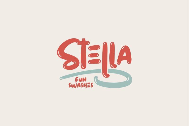
Cruzine designed Stella as part of their vintage fantasy font collection. Six styles give you serious flexibility for layered typographic effects.
Ornate serifs with intricate flourishes throughout.
Visual Characteristics
Decorative serif foundation with artistic embellishments. The flourishes extend from characters without overwhelming readability.
Classic serif bones meet ornamental detailing. Every letter carries extra visual interest.
Six style variations:
- Regular
- Grunge
- Inline
- Inline Grunge
- Shadow
- Shadow Grunge
Best Use Cases
- Fantasy book and movie titles
- Artistic poster work
- Branding requiring elegant flourishes
- Decorative headings
- Invitation design
- T-shirt graphics
The grunge options add aged authenticity when needed.
Character Set & Features
Full uppercase and lowercase coverage. Numbers and punctuation included across all six styles.
Each style functions as a separate font file for layering possibilities.
Pairing Recommendations
The decorative nature needs quiet supporting fonts. Clean body text prevents visual overload.
Use the regular version for subtitles and grunge/shadow versions for main titles.
Technical Specifications
- Format: TTF, OTF
- License: Demo free for personal use; commercial license required
- Designer: Cruzine (JumboDesign)
- Available: Envato Elements, DaFont
Flamingo
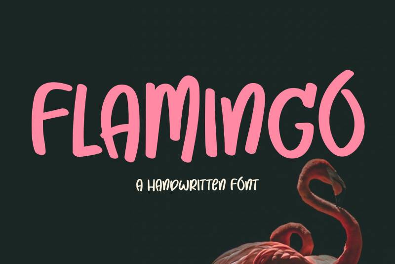
Another Cruzine creation, Flamingo delivers vintage fantasy styling with six variations. The flourishes here lean elegant rather than heavy.
Stylish and ornamental throughout.
Visual Characteristics
Vintage serif design with decorative swirls. The letterforms suggest old-world craftsmanship and sign painter influence.
Six style variations mirror the Stella structure:
- Regular
- Grunge
- Inline
- Inline Grunge
- Shadow
- Shadow Grunge
The ornamental quality suits romantic fantasy or fairy-tale aesthetics particularly well.
Best Use Cases
- Fantasy projects needing elegant touch
- Signage with vintage appeal
- Display and headline typography
- Branding with retro personality
- Music and creative industry projects
Understanding leading helps when working with these decorative letterforms.
Character Set & Features
Standard character set across all six styles. Numbers and punctuation maintain the ornamental aesthetic.
Layerable styles enable dimensional typography effects.
Pairing Recommendations
The decorative flourishes need breathing room. Pair with clean, simple fonts for body text.
Works well alongside other vintage-inspired typefaces in themed projects.
Technical Specifications
- Format: TTF, OTF
- License: Commercial (Envato Elements, Creative Market, Deeezy)
- Designer: Cruzine (JumboDesign)
- Released: August 2017
Whimsy

yipianesia designed Whimsy as a handmade fantasy display font. Uppercase characters only, but that’s intentional.
Bold, quirky, unmistakably fantasy.
Visual Characteristics
Hand-drawn letterforms with whimsical personality. The strokes feel authentic rather than digitally sterile.
Playful proportions throughout. The letters don’t march in perfect rows, they dance.
Fantasy and storybook energy radiates from every character. Good storytelling starts with typography like this.
Best Use Cases
- Book covers for fantasy and children’s literature
- Movie title design
- Poster typography
- Quote graphics and social media
- Packaging with handmade aesthetic
- Card and invitation design
The handmade quality suits craft-oriented projects especially well.
Character Set & Features
Uppercase characters only. Numbers and punctuation included.
The all-caps design limits use cases but strengthens display impact.
Pairing Recommendations
Handmade display fonts need structured support. Clean serifs or sans-serifs handle body text duties.
The whimsical energy should lead, not compete.
Technical Specifications
- Format: TTF, OTF
- License: Commercial (Envato Elements, GraphicRiver, Font Bundles)
- Designer: yipianesia
- Price: Premium font
Jimny
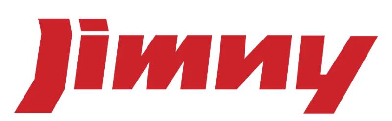
Cruzine Design created Jimny as a unique display font spanning fairy-tale to hipster aesthetics. Four styles provide creative flexibility.
Smooth fantasy with varied applications.
Visual Characteristics
Clean display letterforms with creative flair. The design bridges fantasy and contemporary design sensibilities.
Four style variations:
- Regular
- Grunge
- Inline
- Inline Grunge
The smooth quality sets it apart from rougher fantasy fonts. Professional finish throughout.
Best Use Cases
- Fantasy book covers and movie titles
- Hipster-oriented branding
- Display headlines requiring unique personality
- Logo design across genres
- Vintage-modern hybrid projects
The versatility extends beyond pure fantasy applications.
Character Set & Features
Standard character set with uppercase and lowercase. Numbers and punctuation included.
Each style comes as a separate font file for layering effects.
Pairing Recommendations
The creative styling pairs well with both vintage and modern supporting fonts.
Variable fonts or clean static options both work for body text.
Technical Specifications
- Format: TTF, OTF
- License: Commercial (Envato Elements, Font Bundles, TheHungryJPEG)
- Designer: Cruzine Design
- Price: Premium font (around $12 full price)
FAQ on The Best Fantasy Fonts
What exactly are fantasy fonts?
Fantasy fonts are decorative typefaces designed to evoke magical, medieval, or mythical aesthetics. Think Tolkien-inspired lettering, Celtic calligraphy, or gothic letterforms.
They’re built for headlines and titles. Not body text.
Where can I download free fantasy fonts?
Sites like Dafont, Font Squirrel, and 1001 Fonts offer hundreds of free options. Google Fonts has a few too, like Cinzel and Luminari.
Always check the license before using them commercially.
Which fantasy fonts work best for logos?
Bold blackletter fonts and ornamental serif styles tend to perform well for logo work. Ringbearer and Enchanted Land are popular picks.
You want something readable at small sizes. Overly decorative script fonts can get messy.
Can I use fantasy fonts for commercial projects?
Depends entirely on the license. Free doesn’t always mean free for commercial use.
Check font licensing terms carefully. Sites like Creative Market and MyFonts sell premium fantasy typefaces with clear commercial rights.
What fantasy fonts are best for book covers?
Book cover design often calls for serif fonts with a medieval or gothic feel. Cinzel works great for epic fantasy.
Pair it with something clean for subtitles. Readability matters on thumbnails.
How do I pair fantasy fonts with other typefaces?
Pairing fonts requires contrast. Use your decorative fantasy font for headlines only.
Pair it with a simple sans-serif or classic serif for body copy. Too many ornamental styles competing will wreck your layout.
What’s the difference between gothic and medieval fonts?
Gothic fonts (blackletter) have sharp, angular strokes with dense vertical lines. Medieval fonts are broader, often inspired by manuscript calligraphy.
Both work for fantasy projects. Gothic feels darker. Medieval feels more storybook.
Does Google Fonts have good fantasy options?
Google Fonts offers a few solid choices. Cinzel, Uncial Antiqua, and IM Fell English are worth checking out.
The selection is limited compared to Dafont or Envato Elements. But they’re free and web-ready.
What fantasy fonts do game designers use?
RPG branding often uses custom display fonts or modified blackletter styles. Dungeons & Dragons and World of Warcraft inspired countless fantasy game typography trends.
Tabletop game design frequently pulls from runic and elvish writing aesthetics.
How do I install fantasy fonts on my computer?
Download the TTF or OTF file. On Windows, right-click and select “Install.” On Mac, double-click and hit “Install Font.”
The font appears in Photoshop, Illustrator, Canva, and other apps immediately. Sometimes you need to restart the software.
Conclusion
Finding the best fantasy fonts comes down to your project’s needs. A poster design demands something bold and eye-catching. Wedding invitations call for elegant whimsical typography.
Free resources like Fontspace and Behance offer solid starting points. Premium options from Adobe Fonts give you more polish and OpenType features.
Download in TTF or OTF format for desktop work. WOFF handles web design projects better.
Don’t overthink it. Grab a few hand-drawn typefaces, test them against your layout, and trust your instincts.
The right fantasy typeface transforms ordinary text into something that feels like it belongs in another world. That’s the whole point, really.

Renowned for his expertise in logo design and visual branding, Bogdan has developed a multitude of logos for various clients.
His skills extend to creating posters, vector illustrations, business cards, and brochures. Additionally, Bogdan's UI kits were featured on marketplaces like Visual Hierarchy and UI8.
He also wrote in the past years on sites like Design Your Way, WebDesignerDepot, WPDean, Designmodo, Speckyboy, Slider Revolution, and more.
- Stussy Font Generator - 16 October 2026
- What B2B Buyers Check on a Website Before They Ever Talk to Sales - 16 October 2026
- 10 Best Shopify Plus Agencies for Ecommerce Design and Development - 15 October 2026

Bogdan Sandu is a seasoned designer who has been designing websites since 2008. Renowned for his expertise in logo design and visual branding, Bogdan has developed a multitude of logos for various clients. His skills extend to creating posters, vector illustrations, business cards, and brochures. Additionally, Bogdan's UI kits were featured on marketplaces like Visual Hierarchy and UI8. He also wrote in the past years on sites like Design Your Way, WebDesignerDepot, WPDean, Designmodo, Speckyboy, Slider Revolution, and more.
You Might Also Like