Your guests will judge the wedding before they read a single word.
The typography on a wedding invitation communicates formality, style, and tone the moment someone picks it up. Choosing the best fonts for wedding invitations isn’t a minor detail — it’s the first design decision that sets expectations for the entire event.
Most couples spend hours on florals and venues, then pick a font in ten minutes. That mismatch shows.
This guide covers the top 10 fonts for wedding stationery, from calligraphic script fonts built for couple name display to refined serif typefaces that keep venue details and RSVP instructions legible in print. You’ll know exactly which font suits your wedding style, which pairings work, and what to avoid before you send anything to a printer.
The Best Fonts for Wedding Invitations
The font you pick for a wedding invitation sets the tone before anyone reads a single word. Guests notice the typography first, and it signals whether they’re heading to a black-tie ceremony or a relaxed garden party.
Most well-designed invitations use two typefaces: one expressive font for the couple’s names, and one neutral font for the event details. This two-font system creates a clear visual hierarchy without turning the invitation into a typography experiment.
The 10 fonts below cover every major wedding style, from formal calligraphic script fonts to refined serif fonts built for body copy legibility.
| Font | Classification | Best Role on Invitation | Wedding Style |
| Playfair Display | Transitional serif | Names, headline | Formal, classic |
| Cormorant Garamond | Display serif | Names, headline | Luxury, editorial |
| Great Vibes | Calligraphic script | Names, accent | Romantic, formal |
| Pinyon Script | Connected script | Names, headline | Upscale, romantic |
| Cinzel | Classical serif | Section headers, venue | Black-tie, ceremonial |
| Sacramento | Monoline script | Names, accent words | Modern, minimalist |
| Lora | Contemporary serif | Body copy, details | Classic, versatile |
| EB Garamond | Old-style serif | Body copy, formal text | Traditional, literary |
| Allura | Calligraphic script | Names, short accents | Romantic, elegant |
| Alex Brush | Brush script | Names, short phrases | Classic, refined |
—
Playfair Display

Playfair Display is a transitional serif typeface designed by Claus Eggers Sørensen in 2011, released via Google Fonts under the SIL Open Font License. It displays couple names and headings on wedding invitations with high stroke contrast and strong visual weight.
Playfair Display suits formal wedding invitation headings because its high-contrast strokes (thick downstrokes, hairline serifs) read with strong visual presence at 36pt and above. The italic variant is especially well-suited for names, adding personality without switching to a script font.
What makes Playfair Display suitable for wedding invitations?
Playfair Display has pronounced stroke contrast inherited from late 18th-century typefaces like Baskerville, with a large x-height that keeps letterforms legible even at display sizes. The font includes 6 styles (Regular, Italic, Bold, Bold Italic, Black, Black Italic), giving designers weight options for layered type hierarchy. Its variable font version (Playfair 2.0, released 2022) adds Width and Optical Size axes for finer control.
Key attributes:
| Attribute | Value |
| Classification | Transitional serif |
| Designer | Claus Eggers Sørensen, 2011 |
| Weight range | Regular 400, Bold 700, Black 900 (+ italics) |
| Variable font | Yes (Weight, Width, Optical Size axes) |
| Optical sizes | Needlepoint, Hairline, Titling, Display, Headline, Trumpet |
| Recommended sizes | 28pt+ for names; 18pt+ for section headers |
| License | OFL (Free for personal and commercial use) |
| Available on | Google Fonts, Adobe Fonts, Font Squirrel |
| Price | Free |
How does Playfair Display perform on wedding invitations?
Playfair Display renders clearly at 28pt and above in print, where its fine hairline serifs hold up without breaking. Below 14pt in print, the high stroke contrast causes hairlines to thin out, reducing legibility for detail text like addresses or RSVP instructions. For digital invitations, it renders well on retina screens but loses definition on low-DPI displays at small sizes.
What are the best pairings for Playfair Display in wedding invitations?
Playfair Display pairs with Montserrat for a modern contrast between high-contrast serif and clean geometric sans-serif, and with Lora when warmer, calligraphically influenced body text is needed. Pairing with a script font like Great Vibes on names alongside Playfair Display on section headers is standard practice in formal invitation design.
See all options in our Playfair Display font pairing guide.
What are the limitations of Playfair Display for wedding invitations?
Playfair Display is not suitable as a body text font at sizes below 14pt in print — the high stroke contrast causes hairline serifs to thin out or disappear entirely. It also comes in a single width, so condensed or extended layout variants are only available in the variable font format.
Playfair Display — Recommended Use Cases Within Wedding Invitations
- Best for: Couple names at 36pt–60pt; venue and section headers at 18pt–24pt
- Avoid for: Body copy below 14pt; reversed-out text on textured or dark paper stock
- Optimal weight: Regular 400 or Bold 700 for headlines; Black 900 for monogram-style treatments
- Optimal size range: 28pt–60pt for display use on invitations
—
Cormorant Garamond
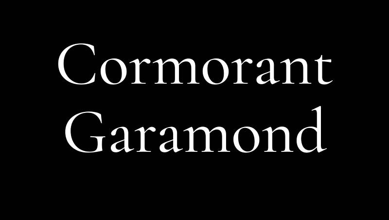
Cormorant Garamond is a display serif typeface designed by Christian Thalmann (Catharsis Fonts) in 2014–2017, available on Google Fonts and Adobe Fonts under the SIL Open Font License. It reproduces the high-contrast stroke structure of Claude Garamond’s 16th-century typefaces in a digital display format.
Cormorant Garamond suits luxury wedding invitation design because its extreme stroke contrast (one of the highest of any free serif) reads as visually dramatic at display sizes, signaling formality and refinement. Designers at Tiffany & Co. use Libre Baskerville for similar reasons — Cormorant Garamond occupies the same formal register but with more ornamental detail.
What makes Cormorant Garamond suitable for wedding invitations?
Cormorant Garamond has tall ascenders and descenders with a moderate x-height, giving letterforms a stately, elongated silhouette that reads as high-end at display sizes. The family spans 45 font files across 9 styles and 5 weights (Light to Bold), including Small Caps and Upright Cursive variants. Its small caps variant works particularly well for location text and date lines on formal invitations.
Key attributes:
| Attribute | Value |
| Classification | Display serif |
| Designer | Christian Thalmann, 2014–2017 |
| Weight range | Light 300 – Bold 700 (5 weights, 9 styles) |
| Variable font | Yes |
| Recommended sizes | 18pt+ for all uses; 36pt+ for couple names |
| License | OFL — free for personal and commercial use |
| Available on | Google Fonts, Adobe Fonts |
| Price | Free |
How does Cormorant Garamond perform on wedding invitations?
At 24pt and above in print, Cormorant Garamond delivers strong visual impact — the extreme hairline strokes and sharp serifs are a deliberate design choice for display use, not a limitation. Below 14pt, those hairlines disappear in standard print conditions, making it unsuitable for body copy or fine-detail text. Digital use at small sizes on standard screens loses the stroke contrast that defines the font’s character.
What are the best pairings for Cormorant Garamond in wedding invitations?
Cormorant Garamond pairs with Lora for body text when a calligraphically consistent serif tone is needed across the full invitation suite, and with Josefin Sans when a clean geometric contrast is the goal. See our dedicated Cormorant Garamond font pairing guide for more combinations.
What are the limitations of Cormorant Garamond for wedding invitations?
Cormorant Garamond is a display-only font — it fails below 14pt in print due to hairline stroke collapse. It also lacks the weight range needed for bold call-to-action text like RSVP deadlines or contact details, where a heavier paired font is necessary.
Cormorant Garamond — Recommended Use Cases Within Wedding Invitations
- Best for: Couple names at 36pt–60pt; formal headers and event title text at 24pt–36pt
- Avoid for: Body copy and detail text below 14pt; invitations printed on rough or uncoated stock where hairlines may not hold
- Optimal weight: Light 300 for names; Regular 400 for headers
- Optimal size range: 24pt–60pt
—
Great Vibes
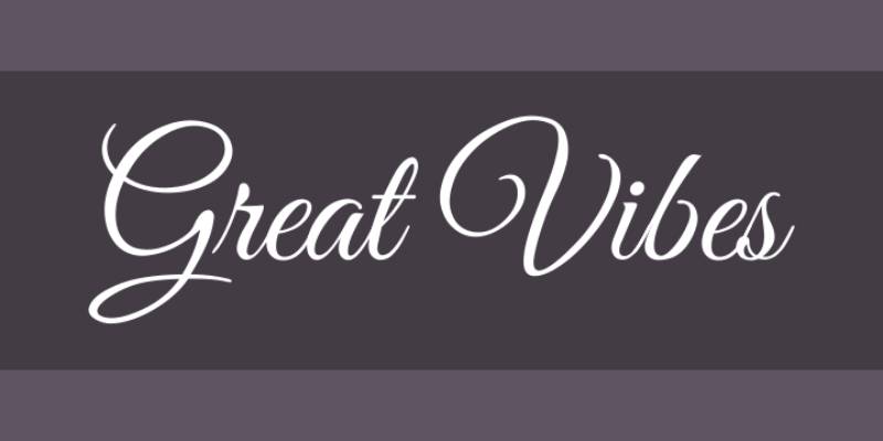
Great Vibes is a calligraphic script typeface designed by Robert E. Leuschke (TypeSETit) in 2012, released under the SIL Open Font License via Google Fonts. It reproduces the thick-to-thin stroke variation of a nib pen in a flowing, connected letterform system suited for display text.
Great Vibes suits couple name typography on wedding invitations because its high stroke contrast and flowing connections signal formal calligraphy without requiring hand-lettering. It is one of the most-used script fonts across wedding stationery platforms including Zola and Minted.
What makes Great Vibes suitable for wedding invitations?
Great Vibes contains over 2,000 glyphs with smooth letter connections and swash uppercase forms. The stroke structure replicates nib-pen calligraphy with thick downstrokes and hairline upstrokes. Its casual uppercase letterforms pair with more formal lowercase shapes, creating visual balance at large display sizes.
Key attributes:
| Attribute | Value |
| Classification | Calligraphic script |
| Designer | Robert E. Leuschke (TypeSETit), 2012 |
| Weight range | Regular 400 only |
| Variable font | No |
| Recommended sizes | 36pt+ for names; not suitable for body copy |
| License | OFL — free for personal and commercial use |
| Available on | Google Fonts, Adobe Fonts |
| Price | Free |
How does Great Vibes perform on wedding invitations?
Great Vibes reads clearly at 36pt and above in both print and digital formats. Below 24pt, the hairline upstrokes lose definition in print, and letter connections become ambiguous on screen. The single-weight limitation means it cannot be bolded, so it relies entirely on size for visual prominence.
What are the best pairings for Great Vibes in wedding invitations?
Great Vibes pairs with Lora for body text — the calligraphic serif shares stroke contrast language with the script without competing for attention. It also works with Libre Baskerville when a more structured, neutral serif is needed for detail copy.
What are the limitations of Great Vibes for wedding invitations?
Great Vibes is available in a single weight only, making it unsuitable for any text role requiring weight variation. Extended use in body copy is not viable at any size — it is a headline-only font designed for 2–4 words maximum at large display sizes.
Great Vibes — Recommended Use Cases Within Wedding Invitations
- Best for: Couple names at 48pt–72pt; short accent phrases like “and,” “you are invited”
- Avoid for: Date, venue, or RSVP detail text at any size; reversed-out applications on dark backgrounds
- Optimal weight: Regular 400 (only option)
- Optimal size range: 36pt–72pt
—
Pinyon Script
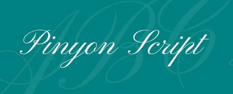
Pinyon Script is a round hand connected script typeface designed by Nicole Fally in 2010, available via Google Fonts under the SIL Open Font License. It replicates copperplate-style penmanship with confident swash capitals and a formal letterform structure.
Pinyon Script suits upscale wedding invitation name typography because its round hand proportions and swash capitals read as formal penmanship at display sizes. The swash letterforms add visual confidence without the irregularity of a handwritten style.
What makes Pinyon Script suitable for wedding invitations?
Pinyon Script uses confident, full-bodied strokes with extended swash capitals, giving it more visual weight than thinner calligraphic scripts like Great Vibes or Allura. Its round hand construction means letterforms remain connected and legible at 36pt and above. The swash capitals are particularly effective for typesetting surname initials or event titles.
Key attributes:
| Attribute | Value |
| Classification | Round hand connected script |
| Designer | Nicole Fally, 2010 |
| Weight range | Regular 400 only |
| Variable font | No |
| Recommended sizes | 36pt+ for names; 24pt+ for short accent phrases |
| License | OFL — free for personal and commercial use |
| Available on | Google Fonts |
| Price | Free |
How does Pinyon Script perform on wedding invitations?
Pinyon Script holds its letter connections well in print at 36pt and above. Its strokes are fuller than hairline scripts, so it survives standard offset printing on uncoated stock better than Cormorant Garamond or Great Vibes. Below 20pt, letter connections become indistinct and the script loses legibility quickly.
What are the best pairings for Pinyon Script in wedding invitations?
Pinyon Script pairs with Spectral for body text, where the serif’s readability balances the script’s expressiveness. It also pairs well with EB Garamond when a more traditional, old-style serif tone is needed for the detail copy.
What are the limitations of Pinyon Script for wedding invitations?
Pinyon Script is a single-weight font with no bold or light variants, limiting its use to display-only roles. The swash capitals can create awkward spacing in all-caps settings, so sentence-case name typesetting is strongly recommended.
Pinyon Script — Recommended Use Cases Within Wedding Invitations
- Best for: Couple names and event title at 36pt–60pt; monogram initials
- Avoid for: Body copy; all-caps settings where swash capitals create spacing conflicts
- Optimal weight: Regular 400
- Optimal size range: 36pt–60pt
—
Cinzel
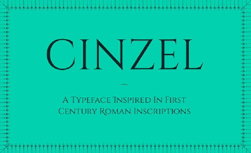
Cinzel is a classical serif typeface designed by Natanael Gama (Ndiscovered) in 2012, available on Google Fonts under the OFL. It draws from first-century Roman inscription letterforms and uses classical proportions to set venue names, event titles, and formal headings on wedding stationery.
Cinzel suits black-tie wedding invitation section headers because its Roman-inscription origins give it ceremonial weight that few other free serif fonts match. It reads as monumental and formal — precisely the visual signal needed for event names and venue labels on high-end stationery.
What makes Cinzel suitable for wedding invitations?
Cinzel uses uppercase-only letterforms based on classical Roman proportions, with 351 glyphs and support for a wide range of Latin-based languages. It comes in 3 weights (Regular, Bold, Black), making it one of the more versatile display serifs on this list for creating hierarchy within section headers. Its stroke contrast is moderate compared to Cormorant Garamond, so it holds up better at smaller display sizes (18pt–24pt).
Key attributes:
| Attribute | Value |
| Classification | Classical serif (Roman inscription style) |
| Designer | Natanael Gama, 2012 |
| Weight range | Regular 400, Bold 700, Black 900 |
| Variable font | Yes |
| Recommended sizes | 18pt–36pt for section headers; 36pt+ for event titles |
| License | OFL — free for personal and commercial use |
| Available on | Google Fonts |
| Price | Free |
How does Cinzel perform on wedding invitations?
Cinzel performs consistently at 18pt and above in print, where its moderate stroke contrast and open letterforms remain readable. Its uppercase-only design makes it unsuitable for any mixed-case setting, including couple names in sentence case. At large sizes (36pt+), the Black weight creates strong typographic anchors for event titles or venue names.
What are the best pairings for Cinzel in wedding invitations?
Cinzel pairs with Great Vibes or Allura for couple names — the contrast between Roman inscription caps and flowing calligraphic script is high and visually intentional. It also works with Raleway or Lora for body text when a more neutral, readable body font is needed beneath the ceremonial headers.
What are the limitations of Cinzel for wedding invitations?
Cinzel is uppercase-only and cannot be used for sentence-case name typesetting without looking like all-caps, which reads as aggressive rather than formal in a wedding context. It has no italic variant, limiting hierarchy options to weight changes alone.
Cinzel — Recommended Use Cases Within Wedding Invitations
- Best for: Venue names, event titles, and section headers in all-caps at 18pt–36pt
- Avoid for: Couple names in sentence case; body copy; any setting requiring mixed case
- Optimal weight: Regular 400 for venue/date lines; Bold 700 for event title
- Optimal size range: 18pt–36pt
—
Sacramento
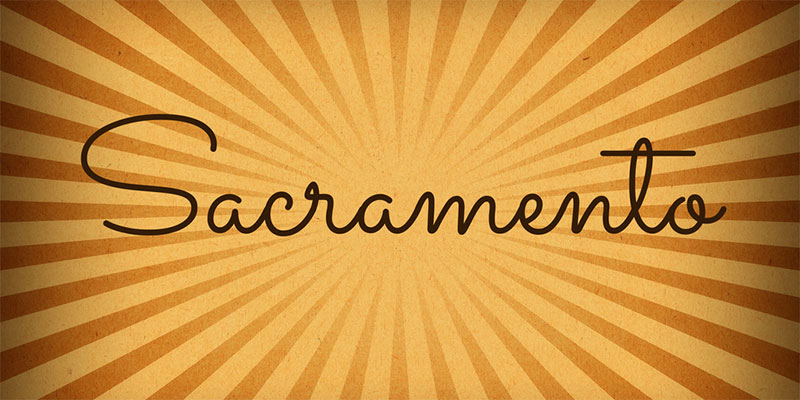
Sacramento is a monoline script typeface designed by Astigmatic (John Vargas Vargas), released via Google Fonts under the OFL. It replicates mid-century handwriting with even stroke weights and clean letter connections, suited for modern minimalist wedding stationery.
Sacramento suits contemporary wedding invitation design because its monoline construction (uniform stroke width throughout) creates a lighter, airier feel than high-contrast calligraphic scripts. This makes it the better choice for minimalist or Scandinavian-influenced wedding aesthetics where drama in the typography would clash with the overall design.
What makes Sacramento suitable for wedding invitations?
Sacramento’s monoline stroke structure means it lacks the thick-thin contrast of Great Vibes or Pinyon Script, which gives it a more modern, understated character. Its long descenders and clean ascenders create strong vertical rhythm on the invitation. The font supports multiple Latin-based languages, making it a practical option for multilingual stationery.
Key attributes:
| Attribute | Value |
| Classification | Monoline script |
| Designer | John Vargas Vargas (Astigmatic) |
| Weight range | Regular 400 only |
| Variable font | No |
| Recommended sizes | 36pt+ for names; 24pt+ for short accent phrases |
| License | OFL — free for personal and commercial use |
| Available on | Google Fonts, Canva |
| Price | Free |
How does Sacramento perform on wedding invitations?
Sacramento’s even stroke weight means it renders consistently across both digital and print formats without the hairline collapse risk of high-contrast scripts. Its lighter visual weight suits digital invitations sent via email or WhatsApp, where it reads cleanly on both high and standard-DPI screens. In print, it works on both coated and uncoated stock without stroke loss.
What are the best pairings for Sacramento in wedding invitations?
Sacramento pairs with Josefin Sans for a clean, modern contrast between the script name and geometric sans body text, and with Lora when a warmer serif tone is needed for the detail copy.
What are the limitations of Sacramento for wedding invitations?
Sacramento’s monoline stroke structure gives it less visual impact at large sizes compared to high-contrast calligraphic scripts — it can look thin or underpowered on invitations where the couple’s names need strong prominence. Single-weight only, with no bold variant.
Sacramento — Recommended Use Cases Within Wedding Invitations
- Best for: Couple names on minimalist or modern wedding invitations at 36pt–60pt; short accent phrases
- Avoid for: Formal black-tie invitations where more visual weight is required; body copy
- Optimal weight: Regular 400
- Optimal size range: 36pt–60pt
—
Lora
Lora is a contemporary serif typeface designed by Olga Karpushina and Alexei Vanyashin (Cyreal foundry) in 2011, available via Google Fonts and Adobe Fonts under the OFL. It handles body text on wedding invitations — dates, venue details, RSVP instructions — at 11pt–14pt in print with moderate stroke contrast and strong legibility.
Lora suits invitation body copy because its calligraphic roots give it warmth that pairs naturally with script headline fonts, while its moderate x-height and open counters keep the text readable at the small sizes used for event details.
What makes Lora suitable for wedding invitations?
Lora has a moderate x-height and calligraphic-influenced stroke structure, giving it more character than a neutral serif like Georgia while remaining more legible than high-contrast display faces. It supports 4 weights (Regular, Regular Italic, Bold, Bold Italic) plus a variable font version, covering all body text hierarchy needs on an invitation suite. Its variable font file is 37% lighter than EB Garamond in WOFF2 format, making it the more practical choice for digital invitation loading.
Key attributes:
| Attribute | Value |
| Classification | Contemporary serif |
| Designer | Olga Karpushina, Alexei Vanyashin (Cyreal), 2011 |
| Weight range | Regular 400, Bold 700 (+ italics) |
| Variable font | Yes |
| Recommended sizes | 11pt–14pt for body copy; 16pt–22pt for section subheads |
| License | OFL — free for personal and commercial use |
| Available on | Google Fonts, Adobe Fonts |
| Price | Free |
How does Lora perform on wedding invitations?
Lora renders clearly in print at 11pt and above, where its open counters and moderate contrast maintain readability for multi-line venue addresses and timing details. On digital screens, it performs equally well at standard and retina resolutions. It handles long paragraphs of invitation details — multiple event timings, family listings, directions — without visual fatigue.
What are the best pairings for Lora in wedding invitations?
Lora pairs with Great Vibes or Cormorant Garamond for couple name display typography, where the calligraphic language of all three fonts creates a consistent tonal register. It pairs with Montserrat when a cleaner modern contrast is preferred for sub-headers. See our full Lora font pairing breakdown for more options.
What are the limitations of Lora for wedding invitations?
Lora supports only 2 weights (Regular and Bold), which limits hierarchy options compared to families with 5–7 weights. It has no Light or Thin weight, so it cannot be used for the delicate, understated body text style that some minimalist invitation designs require.
Lora — Recommended Use Cases Within Wedding Invitations
- Best for: All body copy — venue address, date/time details, RSVP instructions, reception information
- Avoid for: Couple names or headline display text where script or high-contrast serif fonts are more appropriate
- Optimal weight: Regular 400 for body copy; Bold 700 for subheads
- Optimal size range: 11pt–14pt for body; 16pt–22pt for subheadings
—
EB Garamond

EB Garamond (Egenolff-Berner Garamond) is an old-style serif typeface digitized by Georg Duffner beginning in 2011, available on Google Fonts under the OFL. It is a revival of Claude Garamond’s 16th-century typefaces, optimized for both display and body text on formal printed stationery.
EB Garamond suits traditional wedding invitation body copy because its old-style proportions and generous optical spacing handle long paragraphs of event details — multiple ceremony timings, family listings, venue directions — with minimal visual fatigue.
What makes EB Garamond suitable for wedding invitations?
EB Garamond’s old-style construction gives it a lower stroke contrast than transitional serifs like Playfair Display, which means hairlines remain visible in print at smaller sizes (10pt–12pt). Its beautiful italic variant is one of the most readable calligraphically influenced italics available at no cost, commonly used for “reception to follow” and accent phrases on formal invitations. The font serves as a free substitute for approximately 40 premium serif typefaces.
Key attributes:
| Attribute | Value |
| Classification | Old-style serif |
| Designer | Georg Duffner (digitization), 2011 |
| Weight range | Regular 400, Medium 500, SemiBold 600, Bold 700, ExtraBold 800 |
| Variable font | Yes |
| Recommended sizes | 10pt–14pt for body copy; 18pt–24pt for secondary headers |
| License | OFL — free for personal and commercial use |
| Available on | Google Fonts, Adobe Fonts |
| Price | Free |
How does EB Garamond perform on wedding invitations?
EB Garamond performs best in high-resolution print environments where its refined details hold up. Its WOFF2 file weight (95 KB for Regular, Bold, and Italic subsets) is heavier than Lora’s equivalent, which matters for digital invitation performance. In print at 10pt–14pt, it handles multi-line text blocks better than higher-contrast serifs.
What are the best pairings for EB Garamond in wedding invitations?
EB Garamond pairs with Cinzel for section headers — the Roman inscription formality of Cinzel and the old-style elegance of EB Garamond share the same historical register. It also works with Pinyon Script or Great Vibes on the name display line for the same reason. See our Garamond font pairing guide for full combinations.
What are the limitations of EB Garamond for wedding invitations?
EB Garamond’s display-level refinement is best appreciated in high-resolution print (300 DPI+). On screen at standard DPI, fine details soften noticeably. Its WOFF2 weight is also the heaviest on this list, which can slow digital invitation load times on compressed channels like WhatsApp.
EB Garamond — Recommended Use Cases Within Wedding Invitations
- Best for: Body copy and event detail text on printed invitations at 10pt–14pt; italic accent phrases
- Avoid for: Digital invitations where file size and screen rendering are priorities; reversed-out text on dark backgrounds
- Optimal weight: Regular 400 for body; Italic for accent lines
- Optimal size range: 10pt–14pt for body; 18pt–24pt for subheadings
—
Allura
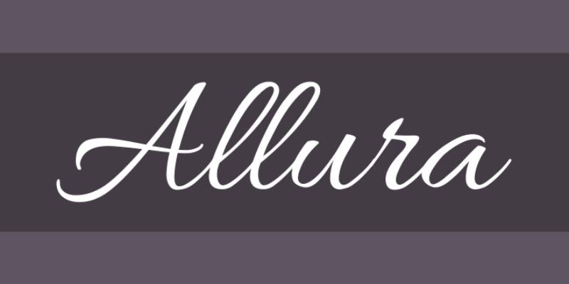
Allura is a calligraphic script typeface designed by Rob Leuschke (TypeSETit), available on Google Fonts and Canva under the OFL. It replicates nib-pen calligraphy with sweeping strokes and varied weights, suited for couple name display on romantic or formal wedding invitations.
Allura suits wedding invitation name typography because its sweeping calligraphic strokes and clean letter connections keep legibility high enough for both print headers and short body text accents — a structural balance that thinner scripts like Sacramento do not achieve.
What makes Allura suitable for wedding invitations?
Allura uses calligraphic stroke variation with smooth upper and lower case connections, keeping legibility higher than some competing calligraphic scripts at 24pt–36pt. Its open letterforms and flowing connection points avoid the ambiguity that affects denser script fonts at display sizes. It has supported multiple Latin-based languages, making it a usable option for bilingual invitations.
Key attributes:
| Attribute | Value |
| Classification | Calligraphic script |
| Designer | Rob Leuschke (TypeSETit) |
| Weight range | Regular 400 only |
| Variable font | No |
| Recommended sizes | 30pt+ for names; 20pt+ for short accent lines |
| License | OFL — free for personal and commercial use |
| Available on | Google Fonts, Canva, Adobe Fonts |
| Price | Free |
How does Allura perform on wedding invitations?
Allura holds legibility at 30pt and above in print, where its varied stroke weight creates a formal calligraphic tone without the extreme hairline risk of Great Vibes or Cormorant Garamond. Its performance on digital invitations (WhatsApp, email) is strong at 30pt+, where open letterforms remain clear even on compressed image formats. Below 20pt, letter connections become unclear.
What are the best pairings for Allura in wedding invitations?
Allura pairs with Lora for body text — both share calligraphic roots, creating tonal consistency across the full invitation. It also pairs with Cinzel for venue and section headers, where the contrast between Roman caps and flowing script is visually intentional.
What are the limitations of Allura for wedding invitations?
Allura is single-weight only, which limits its use to display-only roles. Its lighter stroke weight compared to Pinyon Script means it can look underpowered on invitations printed on textured or cream card stock that absorbs ink.
Allura — Recommended Use Cases Within Wedding Invitations
- Best for: Couple names at 36pt–60pt; short accent phrases on romantic or formal invitations
- Avoid for: Invitations printed on heavily textured stock where thinner strokes absorb into the paper; body copy
- Optimal weight: Regular 400
- Optimal size range: 30pt–60pt
—
Alex Brush

Alex Brush is a brush script typeface designed by Robert E. Leuschke (TypeSETit), first released in December 2011, available on Google Fonts and Adobe Fonts under the OFL. It delivers flowing brush script letterforms with short ascenders and descenders that maintain legibility at sizes where other brush scripts lose readability.
Alex Brush suits wedding invitation name display because its intentionally shortened ascenders and descenders — a deliberate structural choice by the designer — allow tighter line spacing without overlapping strokes, keeping couple names legible in compact name-plus-date layouts.
What makes Alex Brush suitable for wedding invitations?
Alex Brush uses reduced ascender and descender lengths compared to standard brush scripts, which increases legibility without sacrificing the flowing, connected script feel expected on wedding stationery. The typeface contains 258 glyphs and supports Latin-1 Unicode ranges. Its brush construction gives it more visual weight than hairline calligraphic scripts like Allura, making it more resistant to ink absorption on textured invitation stock.
Key attributes:
| Attribute | Value |
| Classification | Flowing Brush Script |
| Designer | Robert E. Leuschke (TypeSETit) |
| Weight range | Regular 400 (Over 2000 glyphs) |
| Variable font | No |
| Recommended sizes | 30pt+ for names; 20pt+ for short phrases |
| License | OFL (Free for personal and commercial use) |
| Available on | Google Fonts, Adobe Fonts, Creative Fabrica |
| Price | Free |
How does Alex Brush perform on wedding invitations?
Alex Brush’s heavier brush construction means it holds stroke integrity on uncoated, textured, and recycled card stocks better than hairline calligraphic scripts. It renders clearly on both digital and print formats at 30pt and above. Its shorter ascender/descender structure makes it the most space-efficient script font on this list for compact multi-line name layouts.
What are the best pairings for Alex Brush in wedding invitations?
Alex Brush pairs with Lora for body copy and with Cinzel for formal event title headers. The contrast between brush script names and Roman-inspired Cinzel caps follows the same formal pairing logic used by high-end stationery brands. It also works with Libre Baskerville when body text needs more visual weight than Lora provides.
For a full overview of how pairing fonts works in practice, our guide covers the structural logic behind effective typeface combinations.
What are the limitations of Alex Brush for wedding invitations?
Alex Brush supports Latin-1 only, making it unsuitable for invitations requiring extended Latin, Cyrillic, or other script character sets. Single-weight only with no bold variant, limiting its use to display roles where size alone provides prominence.
Alex Brush — Recommended Use Cases Within Wedding Invitations
- Best for: Couple names at 36pt–60pt on textured or uncoated stock; invitations where a brush script is preferred over fine calligraphic scripts
- Avoid for: Multilingual invitations requiring extended character sets; body copy
- Optimal weight: Regular 400
- Optimal size range: 30pt–60pt
—
How to Choose Between These Fonts
The font choice should match the wedding’s visual register first. Formal black-tie events call for high-contrast serifs or calligraphic scripts. Minimalist modern weddings work better with monoline scripts and clean serifs.
A useful decision framework:
| Wedding Style | Name/Headline Font | Body Copy Font |
| Black-tie formal | Cinzel + Great Vibes | EB Garamond |
| Classic romantic | Playfair Display (italic) | Lora |
| Luxury editorial | Cormorant Garamond | Lora or EB Garamond |
| Modern minimalist | Sacramento | Josefin Sans or Lora |
| Rustic or outdoor | Alex Brush or Pinyon Script | Lora |
One practical note: if you plan on using font licensing for commercial printing or printed goods sold through a platform like Etsy, verify the OFL terms. All 10 fonts on this list are free for commercial use, but third-party printing platforms may have additional usage requirements.
If you want to test combinations before committing, the font pairing generator lets you preview typeface combinations side by side. Worth spending 10 minutes there before locking in the final invitation layout.
For a broader look at fonts for invitations beyond weddings, that guide covers birthday, formal event, and corporate invitation typography with the same structural approach.
What Determines a Good Font for Wedding Invitations?
More than 75% of couples in the US, UK, Canada, and Italy use printed invitations, according to The Knot’s 2023 Global Wedding Report.
That’s a large number of first impressions riding on a single piece of paper. The font on that paper communicates formality, style, and tone before a guest reads a single word.
Most well-designed wedding stationery uses exactly two typefaces. One expressive display font handles the couple’s names and the headline. One neutral body font handles the dates, venue details, and RSVP instructions.
Adding a third font rarely improves the result.
What font classification works best for wedding stationery?
Display role vs. body role — these are two structurally different jobs, and no single typeface handles both well at wedding invitation sizes.
The four classifications that appear most on formal stationery:
- Calligraphic script: best for name display at 36pt+, replicates nib-pen stroke variation
- Brush script: heavier stroke construction, survives textured card stock better than hairline scripts
- Transitional serif: high stroke contrast, works at 18pt+ for headers, unsuitable for body copy below 14pt
- Old-style serif: lower stroke contrast, holds hairlines at 10pt–12pt, the reliable choice for invitation body copy
Font psychology research shows that formal calligraphic scripts signal occasion and emotional weight before content is processed.
How does print method affect font choice?
Letterpress printing requires a minimum stroke weight of 0.25–0.35 points for any line to hold on the photopolymer plate, according to technical guidance from Hubbub Paper Co. and Lickety Split Press.
High-contrast hairline scripts (Great Vibes, Cormorant Garamond) will lose their thinnest strokes under letterpress pressure unless the stroke is manually thickened in the design file.
Digital offset printing handles hairlines cleanly at 300 DPI. Foil stamping works best with bold weights — fine hairlines at 9pt or below can fail to transfer cleanly from the die.
| Print Method | Minimum Font Size | Stroke Risk | Best Font Style |
| Letterpress | 9pt (body), 12pt+ (reversed) | Hairlines wash off plate | Heavier brush scripts, bold serifs |
| Digital offset | 8pt+ | Low risk at 300 DPI | Any classification |
| Foil stamping | 10pt+ recommended | Fine hairlines fail transfer | Bold weight scripts and serifs |
—
What Are the Best Script Fonts for Wedding Invitations?
Script fonts handle the single most visible element on any invitation: the couple’s names.
The choice between calligraphic and brush construction changes how the invitation reads across different print methods and paper stocks. This section covers five options and the structural differences that matter for print.
What is the difference between a calligraphic script and a brush script on printed invitations?
Calligraphic scripts replicate the thick-thin stroke variation of a nib pen. Brush scripts use a fuller, more even stroke. The difference shows up most on textured card stock, where calligraphic hairlines absorb into the fiber and brush strokes do not.
| Font | Type | Stroke Style | Min. Print Size |
| Great Vibes | Calligraphic | High contrast, hairline upstrokes | 36pt+ |
| Allura | Calligraphic | Moderate contrast, open letterforms | 30pt+ |
| Pinyon Script | Round hand | Full body, confident swash caps | 36pt+ |
| Alex Brush | Brush script | Heavier, shortened ascenders | 30pt+ |
| Sacramento | Monoline | Uniform stroke, no contrast | 36pt+ |
Great Vibes (designed by Robert E. Leuschke, 2012) contains over 2,000 glyphs and is the most widely deployed script font across major wedding stationery platforms including Zola and Minted. Its high stroke contrast reads as formal calligraphy at 48pt but loses hairline definition below 24pt in print.
Sacramento, designed by Astigmatic, uses a monoline construction with zero stroke contrast — making it the only script on this list that survives both coated and uncoated digital print equally well, at all sizes above 36pt.
Which script fonts work on textured or uncoated invitation card stock?
Uncoated and cotton stocks absorb ink into the fiber. Hairline strokes thin by as much as 30% during absorption, according to letterpress printing guidance from Hubbub Paper Co.
Best on textured stock: Alex Brush and Pinyon Script. Both use fuller strokes that retain integrity after ink spread.
Risky on textured stock: Great Vibes and Allura. Their hairline upstrokes absorb and can disappear entirely on uncoated cotton stock at sizes below 36pt.
Allura (Rob Leuschke, TypeSETit) sits between the two extremes — moderate stroke contrast with open letterforms that hold legibility better than Great Vibes at 30pt, but still require coated stock for reliable results below that size.
—
What Are the Best Serif Fonts for Wedding Invitation Body Text?
Script and display fonts break down below 14pt in print. That’s where serifs take over — handling dates, venue addresses, RSVP instructions, and all the small-text details that guests actually need to act on.
The five serifs below cover every formal wedding style from black-tie ceremonial to luxury editorial.
What is the difference between a display serif and a text serif on invitation body copy?
A display serif is optimized for large sizes (18pt+) where high stroke contrast creates visual drama. A text serif is optimized for small sizes (10pt–14pt) where lower stroke contrast keeps hairlines visible on paper.
Using a display serif for body copy is one of the most common DIY invitation errors. The hairlines collapse at 10pt–12pt, making venue addresses and RSVP dates difficult to read.
The five options, by classification:
- Playfair Display — transitional serif, display-only, 6 styles, Playfair 2.0 variable font (2022) with Width + Optical Size axes
- Cormorant Garamond — display serif, 45 font files across 9 styles, extreme stroke contrast, fails below 14pt in print
- Cinzel — Roman inscription proportions, uppercase-only, 3 weights, best for venue names and event title headers
- Lora — contemporary text serif with calligraphic roots, 2 weights + variable font, handles body copy at 11pt–14pt
- EB Garamond — old-style serif revival, lower stroke contrast than transitional serifs, holds hairlines at 10pt in print
Playfair Display, designed by Claus Eggers Sørensen in 2011, is the most commonly used wedding invitation header font after calligraphic scripts. Its high stroke contrast and italic variant suit couple name display at 28pt–60pt. Below 14pt, hairlines thin out and body copy becomes unreliable.
Which serif fonts hold legibility below 12pt on printed invitation stock?
EB Garamond (digitized by Georg Duffner, 2011) is the strongest performer at body-text sizes in print.
Its old-style proportions carry lower stroke contrast than Playfair Display or Cormorant Garamond. That lower contrast means hairlines remain visible at 10pt on standard offset-printed card stock — the key requirement for multi-line venue addresses and timing details.
Lora (Olga Karpushina and Alexei Vanyashin, Cyreal, 2011) is the practical alternative. Its WOFF2 file is 37% lighter than EB Garamond’s equivalent subset, making it the better choice for digital invitation formats sent via email or WhatsApp where file size affects load and compression quality.
Cinzel (Natanael Gama, 2012) is the exception in this group. It handles 18pt–36pt ceremonial headers with Roman inscription authority, but its uppercase-only construction means it cannot be used for sentence-case body copy at any size.
—
How Do Font Pairings Work on Wedding Invitations?
The two-font system is the standard across professional wedding stationery design. One expressive display font for names. One neutral font for everything else.
Adding a third font almost always creates visual noise rather than hierarchy. The exception is using an italic variant of the body font for accent phrases like “and” or “reception to follow” — which reads as a third level of hierarchy without introducing a new typeface.
Pairing logic follows contrast type. The most reliable combinations contrast a flowing script with a structured serif, or a display serif with a clean sans-serif. Two scripts together rarely works. Two heavy display serifs create competition rather than hierarchy.
Named pairings by wedding style:
- Formal romantic: Great Vibes (names) + Lora (body) — calligraphic language shared across both fonts creates tonal consistency
- Black-tie ceremonial: Cinzel (headers) + EB Garamond (body) — Roman inscription formality paired with old-style text legibility
- Modern minimalist: Sacramento (names) + Josefin Sans (body) — monoline script contrasted with geometric sans-serif for a clean contemporary register
- Luxury editorial: Cormorant Garamond (names at 40pt+) + Lora (body) — extreme display contrast paired with calligraphic text serif
- Rustic / outdoor: Alex Brush (names) + Libre Baskerville (body) — brush weight script paired with a bolder text serif that survives textured stock
The italic variant of any serif used in the body creates a third hierarchy level at no cost. Cormorant Garamond italic and EB Garamond italic are particularly well-suited for the “reception to follow” line — they read as distinct from the roman body text without needing a new font.
Stationery platforms like Minted and Zola pre-pair their invitation typefaces specifically to avoid the two-script and two-display-serif combinations that create the most common amateur errors.
Use a font pairing generator to preview combinations before committing to a print run. Seeing a pairing at actual invitation size — not browser preview size — often reveals spacing and weight issues that aren’t visible at small scale. You can read our full guide on pairing fonts for a deeper breakdown of contrast logic.
—
What Font Licensing Rules Apply to Wedding Invitation Printing?
All 10 fonts covered in this article use the SIL Open Font License (OFL).
The OFL explicitly permits use in printed stationery, digital publications, commercial products, and commercial printing runs — with no additional permission required from the type designer. The SIL OFL FAQ directly names business cards and stationery as permitted uses.
What OFL does not permit:
- Selling the font files themselves as a standalone product
- Distributing modified versions of the font under the original Reserved Font Name
- Bundling the font as a downloadable file within a digital product sold on platforms like Etsy
The distinction matters for Etsy sellers. Selling a printed invitation that uses Great Vibes is fully OFL-compliant. Selling a digital invitation template file that includes the Great Vibes font file as a downloadable asset is not — the font file itself cannot be redistributed for a fee.
Third-party design platforms (Canva, Adobe Express) layer their own Terms of Service on top of OFL. A font available on Canva under OFL terms is still subject to Canva’s platform-specific usage restrictions for commercial resale. Always check the platform EULA in addition to the font’s own license.
Where to verify current license terms: Google Fonts license tab for each typeface, the official SIL OFL FAQ at openfontlicense.org, and the individual font page on Adobe Fonts. License terms can update between font versions, so check at the point of use rather than relying on cached information.
—
How Do You Choose the Right Font Based on Wedding Style?
Font choice should follow the event’s aesthetic, not personal preference alone.
The invitation is the first physical signal guests receive about the tone of the day. A hairline calligraphic script on a rustic outdoor invitation creates a mismatch. A bold brush script on a black-tie formal invitation reads as casual. The typography needs to match what guests will actually experience.
Paper stock affects font survival as much as aesthetic. Letterpress on cotton stock requires stroke weights above 0.25pt — ruling out hairline scripts at body copy sizes. Digital printing on coated gloss stock preserves any stroke weight cleanly at 300 DPI. Foil stamping on uncoated card works best with heavier weights, where the die transfers cleanly to the fiber.
| Wedding Style | Name / Headline Font | Body Font | Avoid |
| Black-tie formal | Cinzel + Great Vibes | EB Garamond | Monoline scripts, sans-serif body |
| Classic romantic | Playfair Display italic | Lora | Brush scripts, uppercase-only serifs |
| Luxury editorial | Cormorant Garamond | Lora or EB Garamond | Body copy below 14pt |
| Modern minimalist | Sacramento | Josefin Sans or Lora | High-contrast calligraphic scripts |
| Rustic / outdoor | Alex Brush or Pinyon Script | Lora | Hairline scripts on textured stock |
Envelope addressing typography follows different rules from the invitation body. Addressing typically runs at 10pt–12pt on an envelope surface that isn’t perfectly flat. A single clean serif or monoline script at 11pt–12pt is the standard — Lora at Regular weight or Sacramento at 40pt for the name line above a block-style address in Lora Regular.
One practical consideration: the global wedding services market was valued at $201.2 billion in 2023 (Market.us), and the professional stationery segment within it is growing. More couples are ordering from professional print vendors rather than DIY printing at home, which means font choices are increasingly filtered through vendor-specific print requirements. Always confirm stroke minimums, reversed-type rules, and font outlining requirements with your printer before finalizing any typographic choice.
For a broader look at fonts for invitations across event types, that guide applies the same structural logic to birthday, corporate, and formal event stationery. If you are working on a complete invitation suite (save the date, invitation, RSVP card, program), use the same two-font system across all pieces to keep the suite visually coherent. Changing typefaces between the invite and the RSVP card is one of the most common ways DIY suites lose the professional finish that makes printed stationery worth the cost.
FAQ on The Best Fonts For Wedding Invitations
What is the best font for wedding invitations?
There is no single best option. Playfair Display works for classic formal invitations, Great Vibes suits romantic calligraphic styles, and Sacramento fits modern minimalist designs. The right choice depends on your wedding aesthetic, print method, and how the font pairs with your body text.
How many fonts should a wedding invitation use?
Two. One display font for the couple’s names and headline, one serif for dates and venue details. Adding a third font rarely improves the design. Using an italic variant of your body font creates hierarchy without introducing a new typeface.
What is the difference between a script font and a calligraphy font on invitations?
Calligraphic fonts replicate nib-pen stroke variation — thick downstrokes, hairline upstrokes. General script fonts include brush styles with heavier, more even strokes. The distinction matters for print: calligraphic hairlines can disappear on uncoated or textured card stock.
Are Google Fonts free to use for printed wedding invitations?
Yes. Fonts like Cormorant Garamond, Lora, and Pinyon Script are released under the SIL Open Font License, which explicitly permits commercial printing and stationery use. You cannot, however, sell the font files themselves as standalone downloadable assets.
What font size should couple names be on a wedding invitation?
pt to 60pt is the standard range for couple names, depending on name length and invitation dimensions. Script fonts like Great Vibes and Allura need at least 36pt to maintain stroke legibility in print. Body copy should sit at 11pt–14pt.
What serif font works best for wedding invitation body copy?
Lora and EB Garamond are the two strongest options. Both are free via Google Fonts. Lora handles 11pt–14pt body text cleanly across digital and print formats. EB Garamond has a stronger italic for accent phrases like “reception to follow.”
Can I use the same font for both the names and the details?
Technically yes, but it removes visual hierarchy. A script font used at 48pt for names and 12pt for details will lose legibility at the smaller size. Using two different font classifications creates the contrast needed to guide the reader’s eye across the invitation.
What fonts work for rustic or outdoor wedding invitations?
Alex Brush and Pinyon Script are the most reliable choices. Both use fuller stroke weights that survive textured and uncoated card stock without hairline loss. Pair either with Lora for body copy. Avoid hairline calligraphic scripts like Great Vibes on uncoated cotton stock.
What is a good font pairing for a minimalist wedding invitation?
Sacramento paired with Josefin Sans is a widely used combination for modern minimalist stationery. Sacramento’s monoline script provides elegance without high stroke contrast, and Josefin Sans adds geometric structure to the detail text without competing for attention.
Does the font choice change for digital versus printed wedding invitations?
Yes. Digital invitations sent via email or WhatsApp compress image files, which softens fine hairlines. Sacramento and Lora hold better in compressed formats than high-contrast options like Cormorant Garamond. For print, the choice depends on stock type and print method rather than screen resolution.
Conclusion
This conclusion is for an article presenting the best fonts for wedding invitations, and the core takeaway is simple: typography is not decoration. It’s structure.
The right font pairing creates visual hierarchy, signals the wedding’s tone, and keeps every detail from couple names down to venue addresses legible in print.
Playfair Display, Cormorant Garamond, and Great Vibes handle display roles well. Lora and EB Garamond carry body copy reliably at small sizes. Sacramento and Alex Brush fill the gap for modern and rustic aesthetics.
All ten options use the SIL Open Font License. Free to use, commercially and in print.
Pick two typefaces. Match them to your print method and paper stock. Everything else follows from there.

Renowned for his expertise in logo design and visual branding, Bogdan has developed a multitude of logos for various clients.
His skills extend to creating posters, vector illustrations, business cards, and brochures. Additionally, Bogdan's UI kits were featured on marketplaces like Visual Hierarchy and UI8.
He also wrote in the past years on sites like Design Your Way, WebDesignerDepot, WPDean, Designmodo, Speckyboy, Slider Revolution, and more.
- The Windsurf Logo History, Colors, Font, And Meaning - 10 October 2026
- How to Remove Background From Product Photos (No Photoshop) - 10 October 2026
- How Designers can Build a Stronger Online Creative Identity - 9 October 2026

Bogdan Sandu is a seasoned designer who has been designing websites since 2008. Renowned for his expertise in logo design and visual branding, Bogdan has developed a multitude of logos for various clients. His skills extend to creating posters, vector illustrations, business cards, and brochures. Additionally, Bogdan's UI kits were featured on marketplaces like Visual Hierarchy and UI8. He also wrote in the past years on sites like Design Your Way, WebDesignerDepot, WPDean, Designmodo, Speckyboy, Slider Revolution, and more.
You Might Also Like