Most readers decide whether to keep reading a newsletter within the first two seconds of opening it — and email typography is doing more of that work than most senders realize.
The font you pick affects readability, rendering across Gmail and Outlook, and how your newsletter feels on a mobile screen at 14px.
Choosing the best fonts for newsletters isn’t about finding something beautiful. It’s about finding what actually works — across email clients, devices, and audience types.
This guide covers the top 10 options, the structural attributes that make each one suitable for newsletter body copy or headings, how they pair together, and where each one falls short.
body { font-family: Georgia, ‘Times New Roman’, serif; color: #1a1a1a; line-height: 1.75; max-width: 800px; margin: 0 auto; padding: 2rem 1.5rem; font-size: 16px; } p { margin: 0 0 1.1rem; } strong { font-weight: 700; }
The Best Fonts For Newsletters
Choosing a font for a newsletter is not just a style decision. It affects whether people actually read past the first line. Email rendering across Gmail, Outlook, and Apple Mail is inconsistent — so font choice directly impacts how your newsletter looks for most of your list.
The fonts below cover both web-safe options (pre-installed on virtually every device) and free web fonts that render well across modern email clients. Each entry includes real specs, pairing suggestions, and honest limitations.
—
Georgia
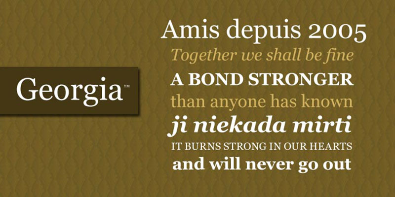
Georgia is a transitional serif font designed by Matthew Carter in 1993, released by Microsoft in 1996 as part of the Core Fonts for the Web collection. It delivers clear, legible body text on low-resolution screens at small sizes.
Georgia works best for newsletter body copy because its x-height is significantly larger than Times New Roman’s, which keeps lowercase characters readable at 14px–16px on mobile screens. Major publications including The Washington Post and The Guardian adopted Georgia for their digital platforms — evidence of its long-term reliability in text-heavy layouts.
—
What makes Georgia suitable for newsletters?
Georgia has a high x-height relative to its cap height, which improves lowercase legibility at small email body sizes. Its stroke contrast — alternating thick and thin strokes derived from Scotch Roman tradition — remains visible at 14px on standard 96 DPI screens. The font was hand-hinted by Tom Rickner, which means it renders predictably across Windows, macOS, and Android email clients without fallback issues.
Key attributes:
| Attribute | Value |
| Classification | Transitional serif (Scotch Roman) |
| Designer | Matthew Carter, 1993 |
| Weight range | Regular 400, Bold 700 (Georgia Pro adds Light, SemiBold, Black) |
| Variable font | No |
| Recommended sizes | 14px–16px body; 22px+ headings |
| Letter-spacing default | Loose (optimized for screen separation) |
| License | Microsoft proprietary — free for personal use; commercial redistribution restricted |
| Available on | Pre-installed on Windows, macOS; Adobe Fonts |
| Price | Free (pre-installed) |
—
How does Georgia perform in newsletter body text?
Georgia renders cleanly at 14px–18px across Gmail, Outlook, and Apple Mail without requiring @font-face declarations. Its open apertures in letters like “e” and “c” reduce character confusion at small sizes on mobile. The bold weight is darker than most serif bolds, which creates a clear visual hierarchy between body text and subheadings.
—
What are the best pairings for Georgia in newsletters?
Georgia pairs with Arial for maximum email-client compatibility, using Georgia for body and Arial for headings to establish clear hierarchy. It pairs with Verdana when the newsletter targets older demographics or accessibility-sensitive audiences, since both fonts share a large x-height and wide spacing. The Georgia + Arial combination is the most common web-safe pairing in HTML email design.
—
What are the limitations of Georgia for newsletters?
The standard Georgia family offers only two weights — Regular and Bold — which limits typographic hierarchy options without upgrading to the paid Georgia Pro. Its condensed proportions at display sizes above 36px can appear tight compared to modern serif options like Merriweather.
—
Georgia — Recommended Use Cases Within Newsletter Design
- Best for: Long-form newsletter body copy, editorial-style content, news digests
- Avoid for: Short transactional emails where a clean sans-serif reads faster
- Optimal weight: Regular 400 for body; Bold 700 for pull quotes and subheadings
- Optimal size range: 15px–17px for body text; 24px–32px for headings
—
Arial
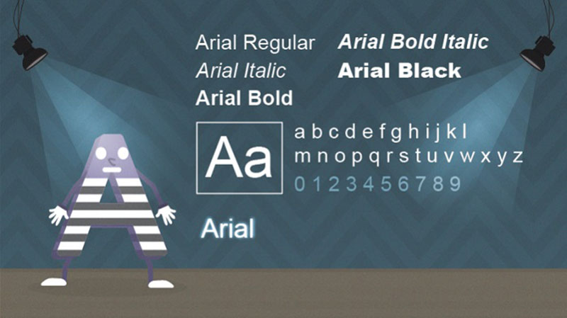
Arial is a neo-grotesque sans-serif font designed by Robin Nicholas and Patricia Saunders in 1982, released by Monotype Typography and licensed by Microsoft as a core Windows font. It delivers neutral, cross-client body text with zero rendering risk.
Arial suits newsletter body copy because it is pre-installed on 100% of Windows and macOS devices, meaning no fallback substitution occurs in any major email client. It is Gmail’s default typeface, which alone makes it the most universally compatible choice available.
—
What makes Arial suitable for newsletters?
Arial’s diagonal stroke terminals — the cut angle on letters like “c”, “e”, “g”, and “s” — give it slightly open apertures compared to Helvetica, which improves readability at 14px on mobile screens. It supports Regular, Bold, Black, Narrow, and Italic variants across the standard system install. The proportions are slightly wider than Helvetica, which contributes to better character separation at small body text sizes common in HTML email.
Key attributes:
| Attribute | Value |
| Classification | Neo-grotesque sans-serif |
| Designer | Robin Nicholas & Patricia Saunders, 1982 |
| Weight range | Regular 400, Bold 700, Black 900 (standard install) |
| Variable font | No |
| Recommended sizes | 14px–16px body; 20px+ headings |
| Letter-spacing default | 0 (standard) |
| License | Microsoft proprietary — bundled with Windows/macOS |
| Available on | Pre-installed on Windows, macOS, iOS, Android |
| Price | Free (pre-installed system font) |
—
How does Arial perform in newsletter email rendering?
Arial renders identically across Gmail, Outlook 2019+, Apple Mail, and Android mail clients because it is a core system font on all platforms. It loads instantly with no external HTTP request, which removes a common cause of font fallback in promotional emails. At 14px with 1.5x line height, it maintains adequate character separation for mobile-first newsletter layouts.
—
What are the best pairings for Arial in newsletters?
Arial pairs with Georgia to create the most common and reliable web-safe serif/sans-serif combination in email design — Arial for headings and UI elements, Georgia for body text. It also pairs with Times New Roman when a formal tone is needed, though this combination reads as conservative rather than modern. The Arial + Georgia pairing requires no web font loading and renders correctly on every device.
—
What are the limitations of Arial for newsletters?
Arial’s ubiquity works against brand differentiation — it carries no distinctive personality and reads as generic in competitive newsletter inboxes. The standard system install provides only three true weights (Regular, Bold, Black), which limits typographic range compared to web fonts like Open Sans or Lato.
—
Arial — Recommended Use Cases Within Newsletter Design
- Best for: Transactional emails, system notifications, newsletters where compatibility matters more than branding
- Avoid for: Brand-forward creative newsletters where visual identity is a priority
- Optimal weight: Regular 400 for body; Bold 700 for headings and CTAs
- Optimal size range: 15px–16px body; 22px–28px headings
—
Verdana
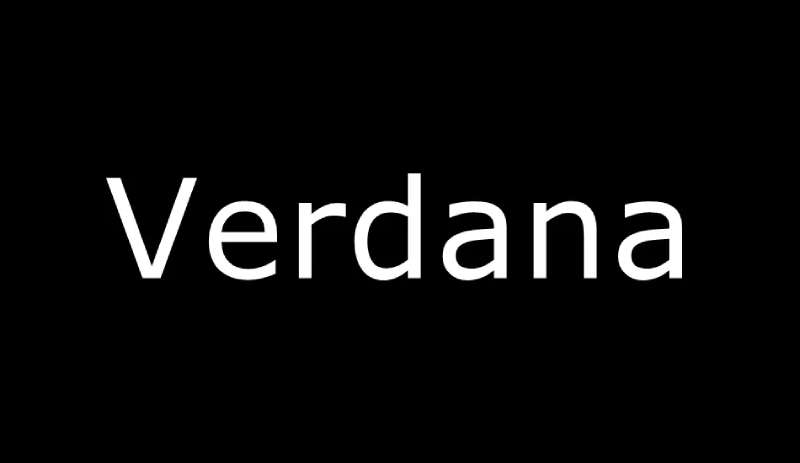
Verdana is a humanist sans-serif typeface designed by Matthew Carter in 1996, released by Microsoft as part of the Core Fonts for the Web initiative. It delivers maximum character distinction at small sizes on low-resolution screens.
Verdana works best for newsletter body text targeting mobile-heavy audiences because its wide letter-spacing and large x-height prevent character-level confusion at 14px — a specific problem on screens below 200 DPI. Email marketers consistently report higher engagement when switching from Arial to Verdana for older demographic audiences (Proofy, 2025).
—
What makes Verdana suitable for newsletters?
Verdana’s x-height is proportionally larger than any comparable web-safe font, and its generous letter-spacing was specifically calibrated to prevent “rn” rendering as “m” on low-resolution bitmaps. Characters like lowercase “i”, “j”, “l” and the numeral “1” were drawn with maximum distinctiveness to reduce misreads in body text. The wide counters and apertures keep strokes visually separated even when email clients apply their own line-height overrides.
Key attributes:
| Attribute | Value |
| Classification | Humanist sans-serif |
| Designer | Matthew Carter, 1996 |
| Weight range | Regular 400, Bold 700 (Verdana Pro adds Light, SemiBold, Black + Condensed) |
| Variable font | No |
| Recommended sizes | 13px–15px body; 20px+ headings |
| Letter-spacing default | Wide (wider than Arial or Georgia) |
| License | Microsoft proprietary — free for personal use; pre-installed on Windows/macOS |
| Available on | Pre-installed on Windows and macOS; Adobe Fonts (Verdana Pro) |
| Price | Free (pre-installed); Verdana Pro — paid |
—
How does Verdana perform in newsletter body text?
Verdana’s wide character spacing makes it the most legible web-safe sans-serif at 13px–15px — the typical size range for newsletter body text on mobile. The tradeoff is spatial efficiency: Verdana takes up roughly 15%–20% more horizontal space than Arial at equivalent sizes, which can force awkward line breaks in narrow single-column email templates. It renders cleanly across all major email clients with no fallback risk.
—
What are the best pairings for Verdana in newsletters?
Verdana pairs with Tahoma for heading text — both share a similar humanist structure and spacing logic, so the visual relationship is coherent without being repetitive. It also works with Georgia for a classic screen-optimized serif/sans-serif combination, using Verdana at body sizes and Georgia for pull quotes or subheadings.
—
What are the limitations of Verdana for newsletters?
Verdana’s wide spacing makes it a poor fit for content-dense newsletters with multiple columns or compact layouts — text runs long and forces awkward wrapping. It is also not recommended for newsletters sent to German-language audiences using the standard version, as closing quotation marks display incorrectly (fixed only in Verdana Pro).
—
Verdana — Recommended Use Cases Within Newsletter Design
- Best for: Accessibility-focused newsletters, senior audiences, single-column mobile-first email layouts
- Avoid for: Dense multi-column layouts, German-language emails using the standard version
- Optimal weight: Regular 400 for body text
- Optimal size range: 13px–15px body; 20px–26px headings
—
Merriweather
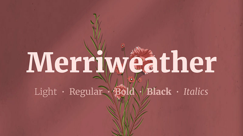
Merriweather is a humanist serif typeface designed by Eben Sorkin in 2010, released through Google Fonts under the SIL Open Font License. It delivers high on-screen legibility for text-heavy newsletter body copy at 16px–20px.
Merriweather works best for editorial newsletters with long reading sessions because its tall x-height and slightly condensed proportions maintain character spacing without consuming as much horizontal space as Georgia. It supports 4 weights with italics, giving newsletter designers more hierarchy options than most web-safe serifs.
—
What makes Merriweather suitable for newsletters?
Merriweather uses heavy serifs and a tall x-height that keep letterforms distinct at small sizes on screen. Its slightly condensed proportions mean it fits more characters per line than Georgia at the same point size, which is useful in single-column newsletters with word-count constraints. The 4-weight range (Light, Regular, Bold, UltraBold) provides sufficient contrast for a three-level heading hierarchy without requiring a second typeface.
Key attributes:
| Attribute | Value |
| Classification | Humanist serif |
| Designer | Eben Sorkin, 2010 |
| Weight range | Light 300, Regular 400, Bold 700, UltraBold 900 |
| Variable font | No |
| Optical sizes | No |
| Recommended sizes | 16px–18px body; 28px–36px headings |
| Letter-spacing default | 0 (standard) |
| License | SIL Open Font License — free for commercial use |
| Available on | Google Fonts, Adobe Fonts, Font Squirrel |
| Price | Free |
—
How does Merriweather perform in newsletter body text?
Merriweather renders through @font-face in Apple Mail and some versions of Outlook, but falls back to Georgia or Times New Roman in Gmail desktop and Outlook 2016. This means the newsletter must declare Georgia as a fallback to maintain visual consistency. At 16px with 1.6x line height, the UltraBold weight creates a strong heading contrast against Regular body text without needing a separate sans-serif.
—
What are the best pairings for Merriweather in newsletters?
Merriweather pairs with Open Sans for the most common editorial web font combination — Merriweather handles body text, Open Sans handles navigation labels and CTAs. It pairs with Lato for a warmer, slightly more informal tone in the heading hierarchy. The Merriweather + Open Sans combination is standard practice in editorial and media newsletter templates.
—
What are the limitations of Merriweather for newsletters?
Merriweather is not a web-safe font — Gmail desktop and Outlook 2016/2019 do not support @font-face and will substitute it with a system serif. Newsletters relying on Merriweather for brand consistency must set Georgia or Times New Roman as fallback fonts in the CSS font stack.
—
Merriweather — Recommended Use Cases Within Newsletter Design
- Best for: Editorial newsletters, long-form content digests, Apple Mail-heavy audiences
- Avoid for: Newsletters with Gmail as the primary client without an acceptable Georgia fallback
- Optimal weight: Regular 400 for body; Bold 700 or UltraBold 900 for headings
- Optimal size range: 16px–18px body; 28px–36px headings
—
Open Sans
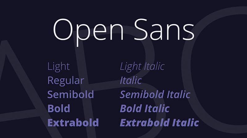
Open Sans is a humanist sans-serif typeface designed by Steve Matteson, released by Google Fonts in 2011 under the Apache License 2.0. It delivers neutral, legible body text across screen sizes with a 10-weight family that covers most newsletter hierarchy needs.
Open Sans suits newsletter body copy because its open apertures and upright stroke angle produce consistent character rendering across Gmail (web), Apple Mail, and Android email clients. As of 2023, Open Sans is among the three most-served fonts on Google Fonts — evidence of its reliability in production environments.
—
What makes Open Sans suitable for newsletters?
Open Sans uses wide apertures in letters like “c”, “e”, and “a” that reduce misread characters at small body text sizes. It supports 10 weights from Light 300 to ExtraBold 800, allowing a full newsletter hierarchy — body, subheading, heading, and display — from a single font family. The variable font version covers the entire weight range in one file, which cuts HTTP requests in web-based newsletter rendering environments.
Key attributes:
| Attribute | Value |
| Classification | Humanist sans-serif |
| Designer | Steve Matteson, 2011 |
| Weight range | Light 300 to ExtraBold 800 (5 weights + italics) |
| Variable font | Yes (updated version on Google Fonts) |
| License | Apache License 2.0 (free for commercial use) |
| Available on | Google Fonts |
| Price | Free |
—
How does Open Sans perform in newsletter email rendering?
Open Sans renders via @font-face in Apple Mail and some Outlook versions, but falls back to Arial or Helvetica in Gmail desktop. The fallback is visually close — both Arial and Open Sans are neo/humanist grotesques at similar proportions — so newsletter layouts rarely break when substitution occurs. At 15px with 1.5x line height, Open Sans Light 300 reads as clean and minimal; Regular 400 is appropriate for longer reading sections.
—
What are the best pairings for Open Sans in newsletters?
Open Sans pairs with Merriweather for contrast between heading and body roles — one of the most commonly used free font combinations in editorial email design. It pairs with Roboto when a more geometric, structured feel is needed for technical or product-focused newsletters. The Open Sans + Merriweather combination is standard practice across media and content-first newsletter templates.
—
What are the limitations of Open Sans for newsletters?
Open Sans is not web-safe — Gmail desktop and Outlook 2016 substitute it with system sans-serif fonts. Its neutrality, which aids compatibility, also means it contributes little to visual brand differentiation in competitive newsletter inboxes.
—
Open Sans — Recommended Use Cases Within Newsletter Design
- Best for: Brand-neutral newsletters, product update emails, Apple Mail-majority audiences
- Avoid for: Newsletters that require a strong brand personality or distinctive visual identity
- Optimal weight: Regular 400 or SemiBold 600 for body; Bold 700 for headings
- Optimal size range: 15px–17px body; 24px–30px headings
—
Lato
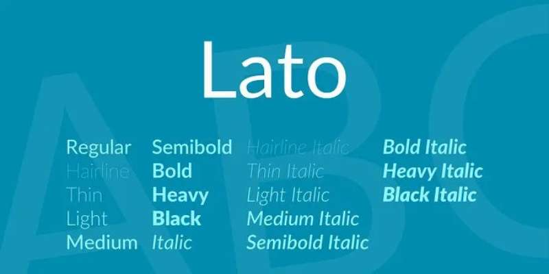
Lato is a humanist sans-serif typeface designed by Lukasz Dziedzic, released in 2010 through Google Fonts under the SIL Open Font License. It combines a semi-rounded stroke structure with a large x-height that maintains legibility across newsletter body text and heading sizes.
Lato works best for brand-driven newsletters that need warmth without sacrificing readability. It supports 10 weights from Thin 100 to Black 900, covering every typographic role in a newsletter hierarchy from a single family. As of 2018, Lato served over one billion views per day on Google Fonts — making it one of the most production-tested web fonts available.
—
What makes Lato suitable for newsletters?
Lato’s semi-rounded stroke terminals — distinct from the hard cuts of Arial or the open apertures of Open Sans — give it a slightly warmer tone without reducing readability. Its x-height is comparable to Verdana, which means it stays legible at 14px on mobile screens. The 10-weight range allows designers to establish a full newsletter hierarchy (body, subheading, heading, display) without loading a second typeface.
Key attributes:
| Attribute | Value |
| Classification | Humanist sans-serif |
| Designer | Lukasz Dziedzic, 2010 |
| Weight range | Thin 100 to Black 900 (10 weights) |
| Variable font | No |
| Recommended sizes | 14px–16px body; 22px–30px headings |
| Letter-spacing default | 0 (slightly tight at large sizes) |
| License | SIL Open Font License — free for commercial use |
| Available on | Google Fonts, Adobe Fonts |
| Price | Free |
—
How does Lato perform in newsletter email rendering?
Lato loads via @font-face in Apple Mail and select Outlook versions, but falls back to Arial or Helvetica Neue in Gmail desktop. The fallback is visually acceptable because Lato’s proportions are close to Arial’s. At display sizes above 28px, Lato’s Light 300 weight reads as elegant without requiring letter-spacing adjustments. At body sizes, Regular 400 performs best for reading comfort.
—
What are the best pairings for Lato in newsletters?
Lato pairs with Merriweather when the newsletter uses a serif body and sans-serif heading structure — Merriweather’s authority balances Lato’s warmth. It pairs with Georgia for a fully web-safe fallback combination when both fonts fail, keeping the visual relationship intact. The Lato + Merriweather pairing is unconventional in that both fonts share humanist roots, creating harmony rather than sharp contrast.
—
What are the limitations of Lato for newsletters?
Lato is not web-safe and requires a declared fallback font in the CSS font stack. At sizes below 12px, Lato’s semi-rounded strokes lose definition faster than Arial or Verdana on low-DPI Android screens.
—
Lato — Recommended Use Cases Within Newsletter Design
- Best for: Brand newsletters, lifestyle content, Apple Mail-majority audiences
- Avoid for: Newsletters read primarily on low-DPI Android devices below 12px
- Optimal weight: Regular 400 for body; Bold 700 for subheadings; Black 900 for main headings
- Optimal size range: 14px–16px body; 24px–32px headings
—
Roboto
Roboto is a neo-grotesque sans-serif typeface designed by Christian Robertson, released by Google in 2011 as the system font for Android 4.0. It delivers mechanical, geometric letterforms with open apertures that render clearly across Android-native email clients.
Roboto works best for newsletters targeting Android-heavy audiences because it is the default system font on Android devices, which means Gmail on Android renders it natively without any font loading required. It supports 12 weights across Regular and Condensed variants, providing wide hierarchy coverage from a single family.
—
What makes Roboto suitable for newsletters?
Roboto combines a geometric skeleton with humanist proportions — a dual structure that keeps it legible at 14px body text while giving it more personality than a pure geometric sans-serif. Its x-height is comparable to Open Sans, and its letter-spacing sits at a neutral default that works without adjustment in most single-column email templates. The 12-weight family (Thin 100 through Black 900, plus Condensed widths) makes it the most weight-diverse option on this list.
Key attributes:
| Attribute | Value |
| Classification | Neo-grotesque / geometric sans-serif |
| Designer | Christian Robertson, 2011 |
| Weight range | Thin 100 to Black 900 (12 weights including Condensed variants) |
| Variable font | Yes (Roboto Flex) |
| Recommended sizes | 14px–16px body; 22px–32px headings |
| Letter-spacing default | 0 (neutral) |
| License | Apache License 2.0 — free for commercial use |
| Available on | Google Fonts, Adobe Fonts; pre-installed on Android |
| Price | Free |
—
How does Roboto perform in newsletter email rendering?
Roboto renders natively on Android email clients, which cover a significant portion of global email opens. On desktop Gmail and Outlook, it falls back to Arial — a visually close substitute given their similar proportions. At 15px Regular, it reads cleanly in single-column layouts. Roboto Flex (the variable font version) is not supported in HTML email contexts and should not be declared in email CSS.
—
What are the best pairings for Roboto in newsletters?
Roboto pairs with Georgia for newsletters that need a serif body option — Roboto handles headings and UI elements while Georgia carries long-form body text. It pairs with Open Sans when a fully sans-serif layout is preferred, using Roboto for structure elements and Open Sans for body copy to create subtle tonal contrast.
—
What are the limitations of Roboto for newsletters?
Roboto’s geometric character gives it a clinical, product-interface feel that can read as impersonal in editorial or lifestyle newsletter contexts. It is not web-safe on macOS or Windows desktop, so Gmail desktop substitutes it with Arial.
—
Roboto — Recommended Use Cases Within Newsletter Design
- Best for: Tech, SaaS, and product newsletters; Android-heavy audiences; Material Design-aligned brands
- Avoid for: Editorial, lifestyle, or luxury newsletters where warmth and brand personality matter
- Optimal weight: Regular 400 for body; Medium 500 for subheadings; Bold 700 for headings
- Optimal size range: 14px–16px body; 22px–30px headings
—
Times New Roman
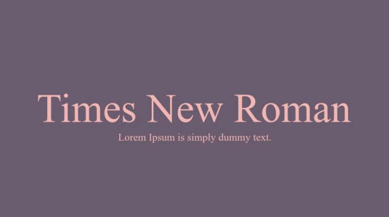
Times New Roman is a transitional serif font designed by Stanley Morison and Victor Lardent, released by Monotype in 1932 for The Times newspaper of London. It delivers a formal, authoritative typeface that is pre-installed on every major operating system.
Times New Roman suits newsletters targeting audiences in formal sectors — legal, financial, academic — where the typeface’s institutional association signals authority. It is among the most recognized typefaces in the world, which means readers form trust associations quickly. The tradeoff is that it reads as dated in consumer-facing newsletter contexts.
—
What makes Times New Roman suitable for newsletters?
Times New Roman has a narrower width than Georgia, fitting more characters per line — useful in text-dense newsletters with word-count pressure. Its high stroke contrast and sharp serifs produce clear hierarchy in headings at 24px and above. As a pre-installed system font, it renders with zero fallback risk across all major email clients.
Key attributes:
| Attribute | Value |
| Classification | Transitional serif |
| Designer | Stanley Morison & Victor Lardent, 1932 |
| Weight range | Regular 400, Bold 700 |
| Variable font | No |
| Recommended sizes | 16px+ body (narrow at small sizes); 24px+ headings |
| Letter-spacing default | Tight (narrower than Georgia) |
| License | Microsoft/Monotype proprietary — free pre-install; commercial redistribution restricted |
| Available on | Pre-installed on Windows and macOS |
| Price | Free (pre-installed) |
—
How does Times New Roman perform in newsletter rendering?
Times New Roman renders consistently across all major email clients as a pre-installed system font. Its narrow proportions can cause readability issues below 16px on mobile — the tight letter-spacing, designed for print column widths, does not translate as cleanly to single-column mobile email layouts as Georgia does. Mailchimp’s own documentation recommends it specifically for heading text rather than body copy in email contexts.
—
What are the best pairings for Times New Roman in newsletters?
Times New Roman pairs with Arial for the most conventional web-safe serif/sans-serif combination — Arial headings, Times New Roman body copy — which signals professional formality without requiring font loading. It pairs with Helvetica when a more modern sans-serif heading is preferred, creating stronger contrast between heading and body weights.
—
What are the limitations of Times New Roman for newsletters?
Times New Roman carries a strong association with default word processor output, which undermines brand authority in consumer-facing newsletters. Its narrow stroke width produces noticeably thinner rendering than Georgia at equivalent body sizes, making it a weaker choice for mobile-first email layouts.
—
Times New Roman — Recommended Use Cases Within Newsletter Design
- Best for: Legal, financial, and academic newsletters; heading text where institutional authority is the goal
- Avoid for: Consumer newsletters, body text below 16px, mobile-first email layouts
- Optimal weight: Regular 400 for body (16px+); Bold 700 for headings
- Optimal size range: 16px–18px body; 26px–34px headings
—
Trebuchet MS
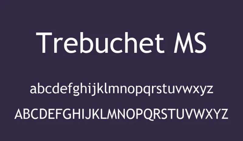
Trebuchet MS is a humanist sans-serif typeface designed by Vincent Connare in 1996, released by Microsoft as part of the Core Fonts for the Web package. It combines elements of geometric and humanist letterforms to produce a distinctive, personality-driven alternative to Arial and Verdana.
Trebuchet MS works best for newsletter headings and subheadings in informal or creative brand contexts, because its narrow capitals and distinctive lowercase letterforms create visual contrast against body text without requiring a second typeface. Microsoft describes it as “a good web design font” — one of the few explicit endorsements in their typography documentation.
—
What makes Trebuchet MS suitable for newsletters?
Trebuchet MS uses a large x-height and clean lines that maintain legibility at small sizes, combined with narrow capital letters that make headings space-efficient. Its two-story lowercase “g” and open “e” bowl reduce character confusion in heading strings on mobile. The true italic design — unusual for a sans-serif of its era — makes it the first Microsoft sans-serif family with a genuine italic rather than a slanted roman, which improves pull quote and emphasis rendering in newsletters.
Key attributes:
| Attribute | Value |
| Classification | Humanist sans-serif (geometric/humanist hybrid) |
| Designer | Vincent Connare, 1996 |
| Weight range | Regular 400, Bold 700 (Trebuchet 2010 adds Black) |
| Variable font | No |
| Recommended sizes | 14px–16px body; 20px–28px headings |
| Letter-spacing default | 0 (slightly condensed capitals) |
| License | Microsoft proprietary — free pre-install; bundled with Windows/macOS/Office |
| Available on | Pre-installed on Windows and macOS; Adobe Fonts |
| Price | Free (pre-installed) |
—
How does Trebuchet MS perform in newsletter email rendering?
Trebuchet MS renders across Gmail, Outlook, and Apple Mail as a pre-installed system font with no fallback risk. Its narrow capital proportions make it efficient for heading strings — fitting more words per line than Arial at the same font size. At body text sizes below 13px, its more complex letterforms (the distinctive “g”, “l”, and “v”) can produce distracting visual noise, so it performs better in heading roles than long-form body copy.
—
What are the best pairings for Trebuchet MS in newsletters?
Trebuchet MS pairs with Georgia for newsletters that use a personality-driven heading and a traditional serif body — the contrast between Trebuchet’s informal structure and Georgia’s Scotch Roman forms creates effective hierarchy. It also pairs with Verdana when both heading and body must remain web-safe, using Trebuchet at 22px+ for headings and Verdana at 14px–15px for body text.
—
What are the limitations of Trebuchet MS for newsletters?
Trebuchet MS offers only Regular and Bold weights in the standard system install, with no Light or SemiBold options — limiting the hierarchy range compared to Lato or Open Sans. Its distinctive letterforms, while readable, can feel informal in contexts that require institutional authority (legal, financial, or academic newsletters).
—
Trebuchet MS — Recommended Use Cases Within Newsletter Design
- Best for: Creative brand newsletters, subheadings, heading text in informal or media contexts
- Avoid for: Body text below 14px; formal institutional newsletters
- Optimal weight: Regular 400 for body; Bold 700 for headings
- Optimal size range: 14px–16px body; 20px–28px headings
—
Helvetica
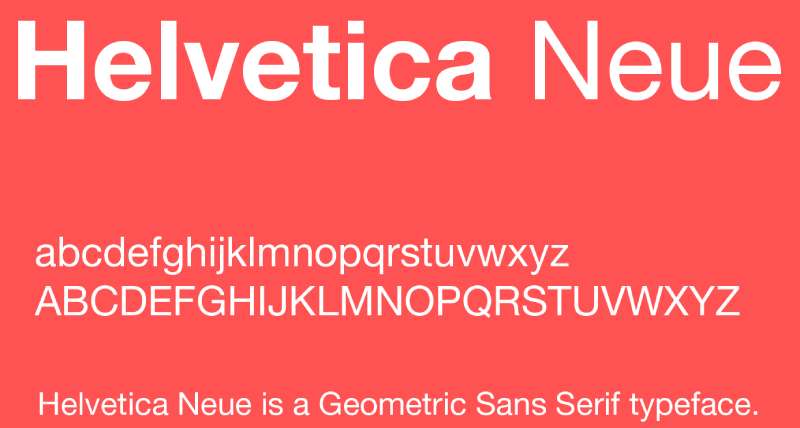
Helvetica is a neo-grotesque sans-serif font designed by Max Miedinger and Eduard Hoffmann in 1957, released by Haas Type Foundry in Switzerland. It delivers clean, neutral typography at heading and display sizes with high brand recognition across global markets.
Helvetica works best for newsletter headings in brand-aligned contexts because its tight letter-spacing and uniform stroke width create a structured, authoritative visual identity at 22px and above. It is the default font in Apple Mail, which means a significant portion of newsletter audiences see it natively rendered without any substitution.
—
What makes Helvetica suitable for newsletters?
Helvetica has a high x-height relative to its cap height, which improves lowercase legibility at display sizes. Its uniform stroke weight — minimal variation between thick and thin strokes — renders consistently across screen resolutions and email client rendering engines. As Apple Mail’s default font, it renders natively on macOS and iOS email clients, which account for a large share of newsletter opens in consumer markets.
Key attributes:
| Attribute | Value |
| Classification | Neo-grotesque sans-serif |
| Designer | Max Miedinger & Eduard Hoffmann, 1957 |
| Weight range | Thin 100 to Black 900 (Helvetica Neue) |
| Variable font | Yes (Helvetica Now Variable) |
| Optical sizes | Yes (Micro, Text, Display) |
| Recommended sizes | 16px+ body; 22px+ headings |
| Letter-spacing default | Tight |
| License | Commercial (Monotype) |
| Available on | macOS (pre-installed), Adobe Fonts, Monotype |
| Price | Included with macOS; paid desktop/web license otherwise |
—
How does Helvetica perform in newsletter email rendering?
Helvetica renders natively on Apple Mail (macOS and iOS) and falls back to Arial on Windows and Android email clients — a visually acceptable substitution given their near-identical character widths. Its tight letter-spacing, which works well at display sizes, becomes a readability issue in body text below 16px on mobile. Campaign Monitor’s email design documentation notes that Helvetica works for short heading strings but recommends caution for extended body copy.
—
What are the best pairings for Helvetica in newsletters?
Helvetica pairs with Georgia for a high-contrast serif vs. sans-serif combination that is reliable across all email clients — Helvetica for headings (Apple Mail renders it natively), Georgia for body text (pre-installed everywhere). It also pairs with Garamond in print-oriented newsletters, though Garamond’s limited email-client support makes a Georgia fallback essential.
—
What are the limitations of Helvetica for newsletters?
Helvetica requires a commercial Monotype license for web or email embedding — using it as a declared @font-face font without a license violates the typeface’s terms. In practice, most newsletter teams use it as a system font fallback only (declared after Helvetica Neue in the CSS font stack), which means its rendering is not guaranteed on non-Apple platforms.
—
Helvetica — Recommended Use Cases Within Newsletter Design
- Best for: Apple Mail-primary newsletters; heading and display text; brand-aligned newsletters for companies already using Helvetica in their identity
- Avoid for: Body text below 16px; newsletters with Gmail or Outlook as the primary client without an Arial fallback declared
- Optimal weight: Regular 400 for body (16px+); Bold 700 for headings
- Optimal size range: 16px–18px body; 24px–36px headings
body { font-family: Georgia, ‘Times New Roman’, serif; color: #1a1a1a; line-height: 1.7; max-width: 820px; margin: 0 auto; padding: 2rem 1.5rem; } h2 { font-size: 2rem; font-weight: 700; margin-bottom: 1.2rem; color: #111; } h3 { font-size: 1.35rem; font-weight: 700; margin-top: 2.5rem; margin-bottom: 0.8rem; color: #111; } h4 { font-size: 1rem; font-weight: 700; margin-top: 1.6rem; margin-bottom: 0.5rem; color: #333; } p { margin-bottom: 1.1rem; } table { border-collapse: collapse; width: 100%; margin: 1rem 0 1.5rem; font-family: Arial, sans-serif; font-size: 0.88rem; } th { background: #f4f4f4; text-align: left; padding: 8px 12px; border: 1px solid #ddd; font-weight: 700; } td { padding: 7px 12px; border: 1px solid #ddd; vertical-align: top; } tr:nth-child(even) td { background: #fafafa; } ul { padding-left: 1.4rem; margin-bottom: 1rem; } li { margin-bottom: 0.4rem; } a { color: #1a56db; text-decoration: underline; } strong { font-weight: 700; }
What Determines Whether a Font Works in an Email Newsletter?
Two factors decide everything: whether the font actually renders in the recipient’s email client, and whether it stays legible at body text sizes on mobile. Get either wrong and all the design work above it doesn’t matter.
| Font Type | Renders in Gmail | Renders in Outlook | Renders in Apple Mail |
| Web-safe fonts (Arial, Georgia, Verdana) | Yes | Yes | Yes |
| Web fonts via @font-face (Open Sans, Lato) | No | Partial | Yes |
| Custom brand fonts (no fallback declared) | No | No | Sometimes |
The three structural attributes that control readability at 14px–16px on mobile are x-height, letter-spacing, and aperture. A large x-height keeps lowercase characters visible at small sizes. Wide letter-spacing prevents characters from merging. Open apertures in letters like “c”, “e”, and “a” reduce misread characters on low-DPI screens.
The CSS font stack is the practical solution to rendering gaps. Declaring Georgia as a fallback after Merriweather, for example, keeps the visual relationship close enough that layout rarely breaks.
Most newsletter typography guidelines — including Mailchimp’s and Campaign Monitor’s — cap the typeface count at two per newsletter. More than two introduces visual noise without adding structural hierarchy.
What is the difference between an email-safe font and a web font?
Email-safe fonts are pre-installed on Windows, macOS, iOS, and Android. They load from the operating system, not from an external server. Arial, Georgia, Verdana, Trebuchet MS, Times New Roman, and Helvetica are all email-safe.
Web fonts load via a URL reference in the email’s CSS. Google Fonts (Open Sans, Lato, Merriweather, Roboto) work this way. Apple Mail and some Outlook versions support them. Gmail desktop does not.
- Email-safe fonts: zero rendering risk, limited design personality
- Web fonts: more typographic options, require a declared fallback
- Custom fonts embedded as images: no rendering risk, but not selectable text
The practical default for most newsletter teams is a web font for headings (where fallback substitution has less visual impact) paired with an email-safe font for body copy.
How do Gmail, Outlook, and Apple Mail handle font rendering differently?
Gmail desktop strips @font-face declarations entirely. Any web font declared as the primary typeface falls back to the system sans-serif — usually Arial on Windows, Helvetica on macOS — with no warning.
Outlook 2016/2019 on Windows uses the Word rendering engine, which does not support @font-face. It falls back to Times New Roman for serif declarations and Arial for sans-serif.
Apple Mail on macOS and iOS fully supports @font-face and renders web fonts correctly. Because iPhone users account for 28.4% of all mobile email opens (TrueList, 2024), Apple Mail’s support matters significantly for consumer newsletter audiences.
The implication: any font that looks correct in Apple Mail may render as a completely different typeface for Gmail users on the same list.
—
How Do Serif and Sans-Serif Fonts Perform Differently in Newsletter Body Text?
The serif vs. sans-serif decision in email is less about aesthetics and more about rendering behavior at small sizes on varied screen resolutions.
Most people spend no more than 10–12 seconds reading or scanning a business email, according to Mailchimp. At that reading speed, character-level legibility matters more than typographic personality.
When does a serif font outperform a sans-serif in newsletter readability?
Serif fonts gain an advantage in text-heavy, long-form newsletters where stroke contrast helps guide the eye across lines. Georgia’s alternating thick and thin strokes remain visible at 15px on 96 DPI screens, where fine detail in serifs is still resolved.
Stroke contrast comparison:
| Font | Type | Stroke Contrast | Best Body Size | Best Use |
| Georgia | Serif | High (transitional) | 15px–17px | Editorial, long reads |
| Times New Roman | Serif | High (narrow) | 16px+ | Formal, institutional |
| Arial | Sans-serif | Low (uniform) | 14px–16px | Transactional, broad compatibility |
| Verdana | Sans-serif | Low (wide) | 13px–15px | Mobile-first, accessibility |
Sans-serif fonts hold the advantage on mobile. Their uniform stroke weight renders consistently on screens between 150–200 DPI, where the fine serifs of Times New Roman or Georgia can blur at body sizes below 14px.
The combined serif heading + sans-serif body configuration is the most common in editorial newsletter design. Georgia or Merriweather at 24px–32px for headings, with Arial or Open Sans at 15px–16px for body copy, creates enough visual contrast to establish hierarchy without a third font.
The Washington Post and The Guardian both used Georgia for digital body text during the peak years of web typography standardization. That real-world track record reflects the font’s documented performance in text-dense, scroll-heavy reading environments — which share significant overlap with newsletter reading behavior.
—
What Font Size, Weight, and Line Height Should Newsletter Body Text Use?
Click Laboratory tested a single change: increasing an Arial body text block from 10pt to 13pt and adding proportional line spacing. The result was a 133% increase in conversion rate and a 10% reduction in bounce rate. That’s the most cited evidence that newsletter typography specifications have measurable commercial impact.
The implication isn’t that larger is always better. It’s that body text below 14px on mobile consistently underperforms because it creates friction before the reader reaches the message.
Recommended size and spacing specifications
Body text: 14px minimum on mobile; 15px–16px is the industry standard for single-column newsletter layouts. Anything below 14px fails on most Android email clients without pinch-zooming.
Headings: 22px–36px range. The size gap between body text and the primary heading needs to be large enough that readers can scan hierarchy without reading every word.
Line height: 1.5x–1.6x the font size for body copy. At 16px body text, that’s a line height of 24px–25.6px. Tighter than 1.4x causes lines to visually crowd on mobile screens.
Weight guidance by role:
- Body copy: Regular 400
- Subheadings: SemiBold 600 (where available) or Bold 700
- Primary headings: Bold 700
- CTAs: Bold 700 — never Light or Regular, which reduces tap target legibility on mobile
Mailchimp’s email typography documentation specifies a range of 10pt to 16pt for body text, with a note that very large sizes can appear distorted in some email clients. That matches the 14px–16px recommendation above when converted from points to pixels at standard screen DPI.
—
How Does Font Choice Affect Newsletter Readability on Mobile Devices?
Mobile devices account for 55% of all email opens globally (LocalIQ, 2024). Some audience segments — particularly B2C and leisure brands — see mobile open rates above 60%. Font decisions made for desktop layouts routinely fail on the screen where most readers actually encounter the newsletter.
Font performance on low-DPI Android screens
Verdana was designed specifically to solve the character-separation problem on low-resolution screens. Its wide apertures prevent the “rn” glyph pair from rendering as “m” at 13px — a documented legibility failure on screens below 200 DPI that Arial and Helvetica do not fully address.
The difference at 13px–14px body text on a 150 DPI Android screen:
- Verdana: wide letter-spacing, large x-height, distinct character pairs — high legibility
- Arial: standard spacing, moderate x-height — adequate but not optimized
- Times New Roman: narrow tracking, fine serifs — legibility degrades below 16px
About 42% of recipients delete emails that are not optimized for mobile, according to Stripo’s 2024 mobile email analysis. That deletion rate applies before the message is even read — which means font-driven readability failures occur at the scan stage, not the engagement stage.
Dark mode rendering and font weight
Litmus research shows 35% of consumers used dark mode when opening emails in 2022, with adoption continuing to climb as 82% of smartphone users now have dark mode enabled at the OS level (Earthweb, 2024).
Dark mode inverts background and text colors in most email clients. Bold 700 weight body text — when rendered as white on dark backgrounds — can appear visually heavier than intended, reducing reading comfort for extended newsletter content.
The practical recommendation for dark-mode-aware newsletter design:
- Use Regular 400 for body text (it maintains weight balance on inverted backgrounds)
- Test Bold 700 headings in dark mode — most render acceptably but some narrow serifs lose definition
- WCAG 2.1 requires a 4.5:1 contrast ratio for normal text in both light and dark configurations
Single-column layouts with 16px body text and 1.6x line height are the current standard for mobile-first newsletter design, per Campaign Monitor and Mailchimp’s published template specifications.
—
What Font Pairings Work Best for Newsletter Heading and Body Text?
A font pairing in a newsletter has one job: create visual hierarchy that lets a reader scan in under 10 seconds and choose which sections to read in full. The pairing doesn’t need to be unusual. It needs to be readable and consistent across email clients.
Web-safe pairings that render across Gmail, Outlook, and Apple Mail
These three combinations require no @font-face declarations and render correctly in every major email client:
| Heading Font | Body Font | Character | Best For |
| Georgia | Arial | Serif authority + clean body | Editorial, media |
| Trebuchet MS | Georgia | Informal heading + traditional body | Creative brands |
| Arial (Bold 700) | Verdana | Neutral heading + high-legibility body | Accessibility-focused |
The Georgia and Arial combination is the most widely deployed web-safe pairing in HTML email design. Both fonts are pre-installed on every major platform, the serif/sans-serif contrast creates clear hierarchy, and neither requires a fallback declaration.
Web font pairings with fallback stacks
Merriweather + Open Sans is the most common free font combination in editorial newsletter templates. Merriweather handles headings (with Georgia as fallback), Open Sans handles body copy (with Arial as fallback). Both are available on Google Fonts under the SIL Open Font License.
Lato + Merriweather reverses the typical role assignment: sans-serif headings, serif body. This works in lifestyle and culture newsletters where warmth matters more than institutional authority. Declare Arial as Lato’s fallback; Georgia as Merriweather’s fallback.
Roboto + Georgia is the Android-optimized combination. Roboto renders natively on Android email clients. Georgia covers the body text with full system font coverage across all other platforms.
The “hybrid approach” works well in practice: use a web font for headings, where a fallback substitution is less visually disruptive, and a web-safe font for body copy, where consistency matters most. This covers the majority of email clients without sacrificing typographic range at the top of the visual hierarchy.
—
How Does Font Choice Affect Newsletter Accessibility?
Color contrast is the #1 accessibility violation on the web, found on 83.6% of all websites analyzed in WebAIM’s 2024 Million study. In email newsletters, the same pattern holds — contrast failures in body text are far more common than structural or semantic accessibility issues.
Font choice contributes to accessibility through three measurable dimensions: character legibility, contrast ratio compliance, and line length at specified sizes.
Contrast requirements and font weight interaction
WCAG 2.1 Level AA sets a minimum contrast ratio of 4.5:1 for normal text (body copy below 24px) and 3:1 for large text (24px or larger). These ratios apply in both light and dark mode configurations.
Font weight interacts with contrast in a specific way: bold text at 18.5px or larger qualifies as “large text” under WCAG definitions, which reduces the minimum contrast requirement to 3:1. This means a Bold 700 subheading at 20px carries a lower contrast obligation than a Regular 400 body text block at 16px.
The practical implication for newsletter design:
- Regular 400 body text at 16px: must meet 4.5:1 contrast against background
- Bold 700 heading at 24px: 3:1 contrast is sufficient for WCAG Level AA
- Dark mode text on dark backgrounds: the 4.5:1 ratio applies to the inverted color pair, not the original
Fonts with structural accessibility advantages
Verdana was explicitly designed for character disambiguation. Its lowercase “i”, “j”, “l”, and the numeral “1” were drawn with maximum distinctiveness — an important attribute for newsletters targeting audiences with dyslexia or low vision.
Open Sans uses open apertures in letters like “c”, “e”, and “a” that reduce character confusion at small sizes. Its humanist letterforms track more closely to handwritten character shapes than geometric alternatives, which reduces cognitive load for readers with reading difficulties.
Line length is the third factor. The accessible reading range in body text is 50–75 characters per line. At 16px with a 600px-wide single-column email template, most fonts hit this range naturally. Verdana at 14px runs slightly wide per line due to its generous character spacing, which can push past 75 characters and require either a font-size increase or a narrower column.
Semrush’s newsletter uses Arial with strong brand color contrast — a practical example of how an otherwise generic font performs effectively when paired with deliberate contrast and layout decisions.
body { font-family: Georgia, ‘Times New Roman’, serif; color: #1a1a1a; line-height: 1.75; max-width: 800px; margin: 0 auto; padding: 2rem 1.5rem; font-size: 16px; } h2 { font-size: 1.75rem; font-weight: 700; margin: 2.5rem 0 1rem; color: #111; line-height: 1.3; } h3 { font-size: 1.15rem; font-weight: 700; margin: 2rem 0 0.75rem; color: #222; } p { margin: 0 0 1.2rem; } ul { margin: 0.5rem 0 1.2rem; padding-left: 1.4rem; } li { margin-bottom: 0.4rem; } table { border-collapse: collapse; width: 100%; margin: 1rem 0 1.5rem; font-family: Arial, sans-serif; font-size: 0.875rem; } th { background: #f4f4f4; text-align: left; padding: 8px 12px; border: 1px solid #ddd; font-weight: 700; } td { padding: 7px 12px; border: 1px solid #ddd; vertical-align: top; } tr:nth-child(even) td { background: #fafafa; } hr { border: none; border-top: 1px solid #e0e0e0; margin: 2.5rem 0; } a { color: #1a56db; text-decoration: underline; } strong { font-weight: 700; }
FAQ on The Best Fonts For Newsletters
What is the best font for newsletter body text?
Georgia and Arial are the most reliable choices. Georgia suits editorial, long-form content. Arial works for transactional emails and broad compatibility. Both are email-safe fonts that render correctly across Gmail, Outlook, and Apple Mail without fallback issues.
What font size should I use in a newsletter?
Use a minimum of 14px for body text on mobile, with 15px–16px being the standard. Headings work best between 22px and 32px. Anything below 14px forces readers to zoom, which increases deletion rates significantly across Android email clients.
Are serif or sans-serif fonts better for newsletters?
Neither is universally better. Serif fonts like Georgia suit long editorial reads. Sans-serif fonts like Arial and Verdana perform better on low-DPI mobile screens. Many newsletter designers combine both: a serif heading with a sans-serif body.
Which fonts are safe to use in all email clients?
The core web-safe fonts — Arial, Georgia, Verdana, Trebuchet MS, Times New Roman, and Helvetica — are pre-installed on Windows, macOS, iOS, and Android. They render without fallback substitution in Gmail, Outlook, and Apple Mail across all major versions.
Can I use Google Fonts in a newsletter?
Yes, with limitations. Google Fonts like Open Sans, Lato, and Merriweather load via @font-face. Apple Mail supports them. Gmail desktop does not. Always declare a web-safe fallback — Arial for sans-serif fonts, Georgia for serifs — in your CSS font stack.
How many fonts should a newsletter use?
Two fonts maximum. One for headings, one for body copy. Using more than two introduces visual noise and fragments the reading experience. A single font at two different weights — for example, Bold 700 for headings and Regular 400 for body — is often enough.
What is the best font pairing for newsletters?
Georgia paired with Arial is the most widely used email-safe combination. For web font setups, Merriweather and Open Sans is the standard editorial pairing. Both combinations create clear hierarchy between heading and body text without requiring a third typeface.
What line height should newsletter body text use?
Set line height between 1.5x and 1.6x the font size. At 16px body text, that means 24px–25.6px line height. Tighter spacing causes lines to crowd on mobile screens. Generous line spacing directly reduces the effort required to read dense newsletter copy.
Does font choice affect email deliverability?
Not directly. Fonts do not trigger spam filters. But poor font rendering leads to faster deletions and lower engagement rates, which email service providers use as quality signals over time. Low engagement can indirectly affect inbox placement in subsequent campaigns.
What fonts work best for accessible newsletters?
Verdana and Open Sans are the strongest choices. Both use wide apertures and generous spacing that help readers with dyslexia or low vision. Pair them with a 4.5:1 contrast ratio against the background — the WCAG 2.1 Level AA minimum for normal body text.
body { font-family: Georgia, ‘Times New Roman’, serif; color: #1a1a1a; line-height: 1.75; max-width: 800px; margin: 0 auto; padding: 2rem 1.5rem; font-size: 16px; } h2 { font-size: 1.75rem; font-weight: 700; margin: 0 0 1.5rem; color: #111; line-height: 1.3; } h3 { font-size: 1.15rem; font-weight: 700; margin: 1.8rem 0 0.6rem; color: #222; } p { margin: 0 0 1rem; } strong { font-weight: 700; }
Conclusion
This conclusion is for an article presenting the best fonts for newsletters — and the core takeaway is straightforward: font choice is a technical decision as much as a design one.
Email client compatibility, x-height, weight range, and fallback behavior all determine whether your newsletter reads cleanly or gets deleted before the first scroll.
Georgia handles editorial body copy. Verdana leads on mobile legibility. Open Sans gives you the widest weight range for free. Arial remains the safest pick when cross-client rendering is the priority.
Pair a serif with a sans-serif, keep body text at 16px with 1.5x line height, and always declare a fallback font in your CSS stack.
Get those basics right, and your newsletter typography works — on Gmail, on Outlook, and on every mobile screen in between.
body { font-family: Georgia, ‘Times New Roman’, serif; color: #1a1a1a; line-height: 1.75; max-width: 800px; margin: 0 auto; padding: 2rem 1.5rem; font-size: 16px; } h2 { font-size: 1.75rem; font-weight: 700; margin: 0 0 1.5rem; color: #111; line-height: 1.3; } p { margin: 0 0 1.1rem; } strong { font-weight: 700; }

Renowned for his expertise in logo design and visual branding, Bogdan has developed a multitude of logos for various clients.
His skills extend to creating posters, vector illustrations, business cards, and brochures. Additionally, Bogdan's UI kits were featured on marketplaces like Visual Hierarchy and UI8.
He also wrote in the past years on sites like Design Your Way, WebDesignerDepot, WPDean, Designmodo, Speckyboy, Slider Revolution, and more.
- Best Visual Regression Testing Tools for Web and App Design in 2026 - 13 October 2026
- Jujutsu Kaisen Font Generator - 12 October 2026
- The Windsurf Logo History, Colors, Font, And Meaning - 10 October 2026

Bogdan Sandu is a seasoned designer who has been designing websites since 2008. Renowned for his expertise in logo design and visual branding, Bogdan has developed a multitude of logos for various clients. His skills extend to creating posters, vector illustrations, business cards, and brochures. Additionally, Bogdan's UI kits were featured on marketplaces like Visual Hierarchy and UI8. He also wrote in the past years on sites like Design Your Way, WebDesignerDepot, WPDean, Designmodo, Speckyboy, Slider Revolution, and more.
You Might Also Like