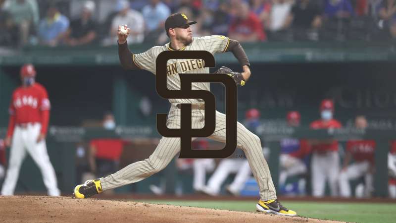
The San Diego Padres logo is one of the most recognizable marks in Major League Baseball. It carries more than five decades of history, multiple redesigns, and a deep connection to the city it represents. The current version, an interlocking “SD” monogram in brown and gold, was introduced for the 2020 season after years of fan demand for a return to the franchise’s original color scheme.
Since the team’s founding in 1969, the Padres have gone through roughly eleven logo variations. Some were minor color swaps. Others were complete overhauls. The brand has moved from a cartoon friar swinging a bat to a clean typographic monogram, and the journey between those two points tells you a lot about how sports branding has changed over the past half century.
What makes the Padres’ visual identity stand out among baseball team logos is the sheer range of looks they have adopted. Brown and gold. Brown and orange. Navy and orange. Navy and sand. And then back to brown and gold again. Few MLB franchises have experimented this much with their color palette.
What Is the San Diego Padres Logo?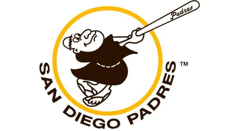
The San Diego Padres logo is a combination mark featuring interlocking serif letters “S” and “D,” representing San Diego. Introduced in its current brown and gold form for the 2020 season and designed by Brian Gundell, the mark connects the franchise to its 1969 roots and the Franciscan friars who founded the city.
Here is a breakdown of the current logo’s key attributes:
- Design Type: Combination mark (monogram-based). The interlocking “SD” serves as both the primary cap logo and the foundation of the broader brand identity.
- Primary Elements: Two serif letters, “S” and “D,” interlocked so the S wraps around the vertical stroke of the D. The letterforms use a custom serif typeface with subtle nods to the team’s 1970s and 2012-era wordmarks.
- Official Introduction Date: November 9, 2019 (unveiled at Petco Park). First used in regular season play during the 2020 MLB season.
- Designer: Brian Gundell, a freelance graphic designer who also created the updated Swinging Friar sleeve patch and a custom name-and-number typeface for the uniforms.
- Trademark Status: Registered and renewed with the USPTO under Padres L.P. The original Swinging Friar logo was first trademarked in 1975 (Registration No. 1015484). The franchise currently holds over 80 active trademarks.
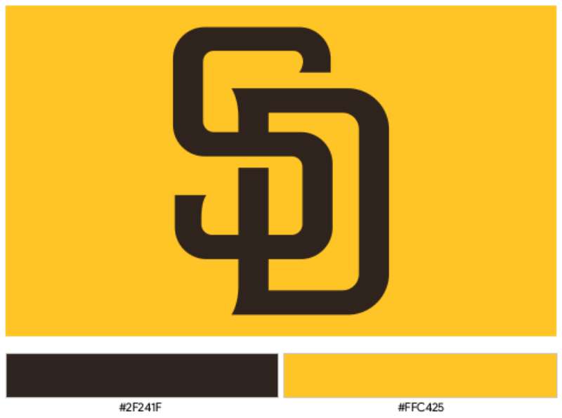
- Color Palette: Padres Brown (#2F241D) and Padres Gold (#FFC425), with white (#FFFFFF) as a supporting color.
- Usage Context: Jerseys, caps, Petco Park signage, digital platforms, licensed merchandise, broadcast graphics, and all official team communications.
How Has the San Diego Padres Logo Evolved Over Time?
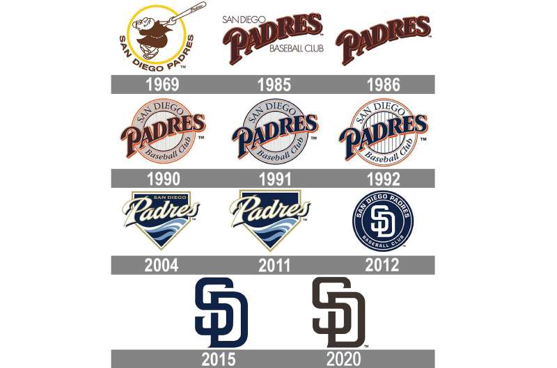
The Padres logo has gone through four main design concepts since 1969. The franchise started with a cartoon mascot, shifted to bold script wordmarks, experimented with circular badge designs, then landed on the interlocking monogram used today. Along the way, the color scheme changed at least four times.
That is a lot of change for one team. And each shift reflected something bigger, whether it was a new stadium, a new owner, or just the design trends of the era pulling the brand in a different direction.
Original Swinging Friar Logo (1969-1984)
- Years Active: 1969 to 1984
- Design Description: A cartoonish friar swinging a baseball bat, enclosed in a yellow circular frame with “San Diego Padres” text arched around the exterior. The friar wore a brown robe and sandals.
- Color Scheme: Brown, gold (yellow), and white. These were the team’s original colors and they would become the palette fans eventually demanded back decades later.
- Designer: Created by a San Diego High School graduate (specific name not publicly documented).
- Context: The Padres entered MLB as an expansion franchise in 1969. The friar character was a direct reference to the Franciscan missionaries who founded San Diego in 1769. The playful mascot fit the lighthearted early years of the franchise.
- Cultural Significance: The Swinging Friar became the team’s most beloved symbol. Even though it has not served as the primary logo since the mid-1980s, it still appears as an alternate logo and sleeve patch on current uniforms. It is, in many ways, the emotional heart of the brand.
Script Wordmark Era (1985-1989)
- Years Active: 1985 to 1989
- Design Description: A bold, diagonally slanted “Padres” wordmark in an elegant serif script. Early versions included “San Diego” above and “Baseball Club” below in lighter-weight text. By 1986, the extra text was removed.
- Color Scheme: Brown and orange replaced the original brown and gold. The orange added a warmer, more aggressive feel to the brand.
- Designer: The 1989 version, which placed the script inside a circular badge, was designed by Sidjakov Berman & Gomez.
- Context: This was a deliberate move toward a more mature, traditional baseball look. The cartoon friar felt outdated by mid-decade, and the franchise wanted something that read as more serious. The era coincided with the Padres’ first World Series appearance in 1984.
- Key Changes from Previous: Complete departure from the mascot-based logo. Dropped the illustrated character in favor of pure typography.
- Cultural Significance: This era established the Padres as a franchise willing to make bold visual changes. The brown-and-orange combination became closely associated with players like Tony Gwynn and Steve Garvey.
Circular Badge and Navy Blue Era (1990-2003)
- Years Active: 1990 to 2003
- Design Description: The “Padres” script was placed inside a circular badge reading “San Diego Baseball Club.” The badge featured vertical pinstripes in the center circle, creating a layered, crest-like look.
- Color Scheme: Started as brown and orange in 1990. Switched to navy blue and yellow in 1991. Further refined to navy blue, orange, and white in 1992. The colors kept shifting throughout this period.
- Context: The switch to navy blue in 1991 was one of the most controversial decisions in the team’s visual history. Many fans felt the franchise lost its unique identity by adopting a blue-heavy scheme that looked like half the other teams in baseball.
- Key Changes from Previous: Addition of the circular frame. Removal of brown as a primary color (until its eventual return in 2020). Introduction of navy blue for the first time.
- Cultural Significance: This was the Padres’ look during their second World Series run in 1998. Despite being a successful era on the field, many fans and the sports design community considered this the team’s weakest visual period. The phrase “chromatic limbo” got thrown around a lot.
Pennant and Home Plate Logo (2004-2011)
- Years Active: 2004 to 2011
- Design Description: A completely new concept shaped like a home plate or pennant with a pointed bottom. “San Diego” appeared in a sand-colored font at the top, with “Padres” in a new script across the center. Waves finished the bottom section.
- Color Scheme: Navy blue, white, sand beige, and gold. The sandy tones were meant to reflect San Diego’s beaches and coastline.
- Context: This redesign coincided with the team’s move from Qualcomm Stadium to Petco Park. New stadium, new look. The wave elements at the bottom of the pennant referenced the Pacific Ocean.
- Key Changes from Previous: Ditched the circular badge entirely. Introduced a unique non-traditional shape. Added geographic references (waves, sand tones) for the first time.
- Cultural Significance: Mixed reception. Some fans appreciated the attempt to tie the brand to San Diego’s geography. Others found it busy and forgettable compared to what came before and what would come after.
Interlocking SD Monogram Era (2012-Present)
- Years Active: 2012 to present
- Design Description: Interlocking serif letters “S” and “D” where the S wraps around the vertical stroke of the D. Initially rendered in navy blue and white (2012-2019), then updated to brown and gold for 2020 by designer Brian Gundell.
- Color Scheme: Navy blue and white (2012-2015). Navy blue and gold (2016). Navy blue and white again (2017-2019). Brown and gold (2020-present).
- Context: The 2020 rebrand was driven entirely by fan demand. The Padres front office heard the calls for brown and gold and committed to doing it right rather than rushing. Brian Gundell was brought on in March 2019 to refine the SD letterforms and create a full brand family.
- Key Changes from Previous: Stripped away all the extra elements. No pennants, no waves, no badges. Just two letters. The minimalist approach worked.
- Cultural Significance: The brown and gold return was a huge moment for the fanbase. Fernando Tatis Jr. said it best: “They’re going to know who’s playing right away when they see the brown and gold.” The Padres became the only team in MLB without a grey road uniform, choosing brown instead.
What Do the Design Elements of the San Diego Padres Logo Mean?
Every piece of the current Padres logo carries intent. The interlocking SD monogram represents San Diego itself. The serif letterforms connect the modern brand to baseball tradition. And the brown and gold palette pulls the franchise all the way back to 1969, when a group of Franciscan friars gave the city (and eventually the team) its name.
The simplicity is the point. After decades of busy designs, circular badges, and pennant shapes, the Padres stripped everything back to two letters. That kind of restraint says something about confidence in the brand.
Why Did the San Diego Padres Choose These Specific Colors?
Brown is the signature color. Not many professional sports teams use it, which is exactly why it works for the Padres. Here are the specifics:
- Padres Brown – Hex: #2F241D | RGB: (47, 36, 29) | CMYK: (61, 66, 72, 72) | Pantone: PMS 412 C. This deep, earthy brown references the robes of the Franciscan friars. It also connects to San Diego’s Mission-era architecture. And honestly, no other MLB team owns this color. That distinctiveness is the whole point.
- Padres Gold – Hex: #FFC425 | RGB: (255, 196, 37) | CMYK: (0, 24, 93, 0) | Pantone: PMS 7-8 C. The gold represents California sunshine and the warmth of San Diego. Paired with the brown, it creates a complementary combination that stands out on the field and on merchandise.
- White – Hex: #FFFFFF. Used as a supporting color for home uniforms and background applications. Keeps the primary palette from feeling too heavy.
The psychology behind these colors leans heavily into warmth, reliability, and heritage. Brown signals stability. Gold signals achievement. Together, they tell fans: we know who we are.
What Typography Style Is Used in the San Diego Padres Logo?
The SD monogram uses a custom serif letterform designed by Brian Gundell. It blends characteristics from the team’s 1972 wordmark with the 2012 interlocking SD.
The serifs are relatively compact. They were actually reduced in size during the 2020 update, with smoother transitions from the serifs to the main strokes. Gundell also created a full custom headline typeface and a name-and-number font for the uniforms.
The “A” in the jersey wordmark “PADRES” has a distinctive pointed shape that the team says resembles a mission bell, a nod to Hall of Fame closer Trevor Hoffman’s signature bell sound effect at Petco Park.
What Are the Hidden Meanings in the San Diego Padres Logo?
The most talked-about detail is how the S wraps around the D’s vertical stroke, almost like the letters are protecting each other. It is a visual representation of the team’s connection to its city.
The friar imagery, while no longer the primary logo, still shows up everywhere. The updated Swinging Friar patch on the uniform sleeve was also redesigned by Gundell, based on his work for the team’s 50th anniversary logo. It sits inside a yellow circle, calling back to the original 1969 design.
Nothing in the current brand is accidental. Even the choice to skip grey road uniforms (the Padres are the only MLB team to do this) sends a message about being different.
How Does the San Diego Padres Logo Compare to Competitor Logos?
Within the NL West, the Padres sit in an interesting spot visually. The Los Angeles Dodgers logo is a classic script wordmark that has barely changed in decades. The San Francisco Giants logo uses an interlocking “SF” that shares some DNA with the Padres’ SD approach. The Arizona Diamondbacks logo leans more toward a stylized initial. And the Colorado Rockies logo uses a mountain-themed wordmark.
The Padres’ brown and gold makes them the easiest to spot in any lineup. No one else in baseball uses that combination. Compare that to the navy-and-white period, when you could squint and confuse the Padres with maybe six other teams.
Across the broader MLB landscape, the trend has been toward heritage looks. The Houston Astros brought back their classic orange and blue star. The Milwaukee Brewers revived their ball-in-glove logo. The Padres’ return to brown and gold fits this same pattern of teams going back to what fans actually loved in the first place.
What Are the Technical Specifications of the San Diego Padres Logo?
Official Color Codes
- Primary Color: Padres Brown
- Hex: #2F241D
- RGB: (47, 36, 29)
- CMYK: (61, 66, 72, 72)
- Pantone: PMS 412 C
- Secondary Color: Padres Gold
- Hex: #FFC425
- RGB: (255, 196, 37)
- CMYK: (0, 24, 93, 0)
- Pantone: PMS 7-8 C
- Accent Color: White
- Hex: #FFFFFF
- RGB: (255, 255, 255)
- CMYK: (0, 0, 0, 0)
Dimensions and Proportions
The interlocking SD is designed as a vector graphic, which means it scales to any size without losing quality. Standard logo files are distributed at 250 x 250 pixels in transparent PNG format for digital use.
MLB brand guidelines require clear space around any team logo. The Padres logo must maintain a minimum clear zone equal to the height of the “S” character on all sides. This prevents the mark from being crowded by other visual elements.
For print applications, the logo should be reproduced at a minimum DPI of 300 to maintain crispness, especially on merchandise and signage.
What Cultural Impact Has the San Diego Padres Logo Had?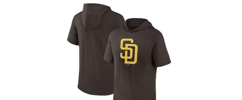
The Padres logo has become much more than a sports mark. In San Diego, it functions as a civic symbol. After the Chargers left for Los Angeles, the Padres became the city’s only major professional sports franchise. That raised the stakes for the brand considerably.
The 2020 return to brown and gold was treated like a citywide event. The unveiling at Petco Park drew massive attention from both the local community and the national sports design world. Fans had petitioned for the change for years.
The Swinging Friar remains a cultural touchstone in San Diego. You see it on murals, tattoos, and bar signs across the city. The friar represents something that goes beyond baseball. It connects to San Diego’s founding story and its Spanish missionary heritage.
The team was also the first in MLB to wear camouflage uniforms, honoring San Diego’s large military community. While not a logo change per se, it showed how the franchise uses its visual identity to reflect the city.
How Does the San Diego Padres Logo Fit Into the Overall Brand Identity?
The logo is just one piece of a larger system. The Padres brand includes the SD monogram, the Swinging Friar alternate mark, the “Padres” wordmark for jerseys, and the mission-bell-inspired “A” letterform. All of these work together under the brown and gold umbrella.
Petco Park itself acts as a brand extension. The stadium’s location in the Gaslamp Quarter of downtown San Diego, its incorporation of the historic Western Metal Supply Co. building, and its open views of the city skyline all reinforce what the brand is about: San Diego, first and foremost.
The brand style guide covers everything from spacing around the logo to approved color usage on different backgrounds. The team worked with their internal creative department alongside Brian Gundell to build a cohesive system that could hold up across jerseys, digital platforms, broadcast, and licensed merchandise.
The result is a brand that feels unified for the first time in a long time. No more color scheme changes every few years. No more identity confusion. Just brown, gold, and the letters SD.
How Should the San Diego Padres Logo Be Used?
If you want to use the Padres logo for any purpose, here is what you need to know:
- Official Usage Guidelines: The logo must always appear in its approved color combinations. Brown on gold, gold on brown, or white versions for dark backgrounds. Stretching, rotating, or altering the proportions of the mark is not allowed under MLB licensing rules.
- Where to Access Official Logos: MLB’s official licensing portal and the Padres’ media relations department provide approved logo files for press, broadcast, and licensed partners. Public-facing versions are available through sites like SportsLogos.net for educational and reference purposes.
- Licensing Information: All Padres logos are intellectual property of Padres L.P. Commercial use requires a license through MLB Properties. This covers everything from apparel and accessories to food packaging and promotional materials. The MLB licensing structure handles this centrally for all 30 teams.
- Trademark Protection: The franchise holds over 80 active trademarks with the USPTO. The original Swinging Friar logo was registered in 1975. The “Padres” wordmark was trademarked in 1981. Unauthorized reproduction on merchandise is a licensing violation and subject to legal action.
The Padres, like all MLB teams, take trademark protection seriously. If you are creating fan content for personal, non-commercial use, you are generally fine. But the moment money is involved, you need a license. That is the standard across professional sports.
FAQ on The San Diego Padres Logo
What does the San Diego Padres logo look like?
The current Padres logo features interlocking letters “S” and “D” in a custom serif style. The S wraps around the D’s vertical stroke. It is rendered in Padres Brown and Padres Gold, the franchise’s original 1969 colors that returned for the 2020 season.
When did the Padres change their logo to brown and gold?
The brown and gold rebrand was unveiled on November 9, 2019, at Petco Park. It went into use for the 2020 MLB season.
Designer Brian Gundell led the project, refining the SD monogram and creating a custom uniform typeface. Fans had pushed for the color change for years.
What is the Swinging Friar logo?
The Swinging Friar is a cartoon monk holding a baseball bat. It was the Padres’ original logo from 1969 and references the Franciscan friars who founded San Diego. It still appears as an alternate mark and sleeve patch on current uniforms.
How many logos have the San Diego Padres had?
The franchise has used roughly eleven logo variations since joining the National League West in 1969. Four main design concepts define the timeline: the Swinging Friar, the script wordmark, the circular badge, and the interlocking SD. Most changes between those were color or detail refinements.
What are the official Padres logo colors?
Padres Brown (Hex: #2F241D) and Padres Gold (Hex: #FFC425) are the primary colors. White serves as a supporting accent. The team previously used navy blue, orange, and sand across different eras. Brown and gold is the original and current combination.
Who designed the current Padres logo?
Brian Gundell handled the 2020 rebrand. The Padres reached out to him in March 2019 ahead of the Nike x MLB takeover.
He refined the SD letterforms, updated the Swinging Friar patch, and built a custom headline and jersey display typeface. The club’s internal creative team developed the uniform designs.
Why are the Padres called the Padres?
“Padres” means “fathers” in Spanish. The name honors the Franciscan missionaries who established Mission San Diego de Alcala in 1769. The team inherited the name from the San Diego Padres of the Pacific Coast League, who played in the city starting in 1936.
Can I use the Padres logo on my own products?
Not without a license. All Padres logos are trademarked property of Padres L.P. Commercial reproduction requires approval through MLB Properties. Personal, non-commercial fan use is generally acceptable. But selling anything with the mark on it without authorization is a trademark violation.
What font does the Padres logo use?
The SD monogram uses a custom serif letterform. It is not a commercially available typeface. Gundell created it by blending the team’s 1972 wordmark style with the 2012 interlocking SD. The jersey wordmark also uses a proprietary face with a distinctive mission-bell-shaped “A.”
Where can I download the official Padres logo?
MLB’s licensing portal provides approved files for press and broadcast partners. Sites like SportsLogos.net host transparent PNG versions at 250 x 250 pixels for educational reference. For high-resolution vector files, you would need to contact the Padres’ media relations department directly.
Conclusion
The San Diego Padres logo tells the story of a franchise that tried a lot of looks before figuring out what actually worked. Brown and gold was always the answer. It just took a few decades and some questionable navy blue experiments to get back there.
From the original Swinging Friar to the interlocking SD monogram, every redesign reflects a shift in how the team sees itself within MLB and within San Diego.
The current mark is clean, distinct, and built to last. Brian Gundell’s work gave the Padres a visual identity that finally matches the passion of the fanbase at Petco Park.
Few professional sports logos carry this much history in two letters. That is what good logo design does. It says everything without saying too much.

Renowned for his expertise in logo design and visual branding, Bogdan has developed a multitude of logos for various clients.
His skills extend to creating posters, vector illustrations, business cards, and brochures. Additionally, Bogdan's UI kits were featured on marketplaces like Visual Hierarchy and UI8.
He also wrote in the past years on sites like Design Your Way, WebDesignerDepot, WPDean, Designmodo, Speckyboy, Slider Revolution, and more.
- The Cursor Logo History, Colors, Font, And Meaning - 24 September 2026
- Top 7 Web Design Subscription Services That Replace Full-Time Hires - 24 September 2026
- Canva vs PowerPoint: Which Is Better for Presentations? - 22 September 2026

Bogdan Sandu is a seasoned designer who has been designing websites since 2008. Renowned for his expertise in logo design and visual branding, Bogdan has developed a multitude of logos for various clients. His skills extend to creating posters, vector illustrations, business cards, and brochures. Additionally, Bogdan's UI kits were featured on marketplaces like Visual Hierarchy and UI8. He also wrote in the past years on sites like Design Your Way, WebDesignerDepot, WPDean, Designmodo, Speckyboy, Slider Revolution, and more.
You Might Also Like