The Miami Marlins Logo History, Colors, Font, and Meaning
Imagine a symbol that captures the essence of sun-drenched afternoons, the roar of a crowd, and the thrills of America’s favorite pastime. The Miami Marlins logo is more than mere design; it’s the heart of a bustling city’s pride and passion for baseball.
This emblem embodies the spirit of both the players and fans who come alive with every crack of the bat.
Delve into the intricate dance of color and form that gives the Marlins their visual identity, an identity fiercely embraced amidst the vibrant Miami landscape. Here, we unravel the threads that weave together a story of community, ambition, and the undying love for the game.
By journey’s end, you’ll see far beyond the surface of this emblematic creation. You’ll grasp the significance of sports brand identity and Major League Baseball narratives that are stitched into the very fabric of the Marlins emblem.
Join me as we peel back the layers of a symbol that resonates with a city and echoes through the annals of sports marketing.
The Meaning Behind the Miami Marlins Logo
![]()
Oh, the charm of Miami! Dive deep into the waves and emerge with the spirit of the Marlins. That logo isn’t just another emblem; it’s an embodiment of the city and its ties to the ocean.
A Glimpse of the Ocean
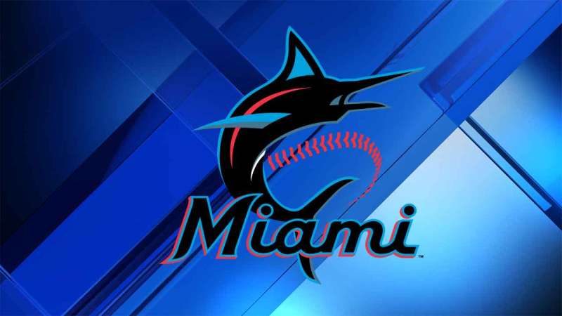
When you lay eyes on the Miami Marlins logo, you’re diving straight into Miami’s marine heart. It’s not just about baseball; it’s about the passion, the city, the oceanic beauty. The marlin in the emblem speaks of agility, the spirit of the sea, and the chase.
Miami’s Vibes
Beyond just the marlin, there’s the energy of Miami – lively, energetic, and young at heart. The logo captures that vibrant spirit, almost like a dance of colors on the canvas of the city.
The History of the Miami Marlins Logo
Oh man, taking a trip down memory lane with the Marlins logo? It’s like unwrapping layers of stories, each revealing a bit more about the journey of the team and the city.
The Beginnings
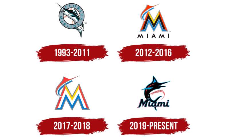
The story started with the Florida Marlins. They had a different aesthetic, a different name. But the soul? That’s been consistent: dynamic, resilient, and oceanic.
Evolving Waves
Just as Miami has evolved, so has the logo. Over the years, there were tweaks and nudges, each trying to bring out more of the essence of the city and the team. It’s not just about rebranding; it’s about capturing the growth and transformation of the spirit.
The Colors of the Miami Marlins Logo
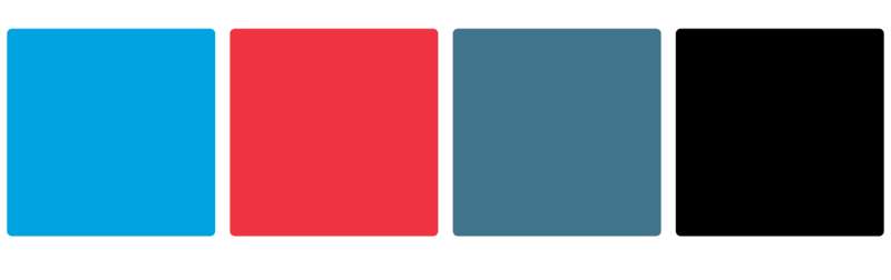
Colors, oh, they’re the unsung heroes, painting emotions and vibes. The Marlins logo? It’s a carnival of colors that paints a vivid picture of Miami.
Caliente Coral & Miami Blue
What’s Miami without its popping colors? Caliente Coral gives that heat, the zest. Then there’s Miami Blue, the embodiment of the vast, endless ocean. Together? They’re a splash of Miami’s essence.
Midnight Black & Gray
These shades anchor the logo. Midnight Black is like the night sky over Miami – deep, mysterious, full of stories. And the gray? It’s the balance, the neutral tone that binds all the other colors.
The Font Used in the Miami Marlins Logo
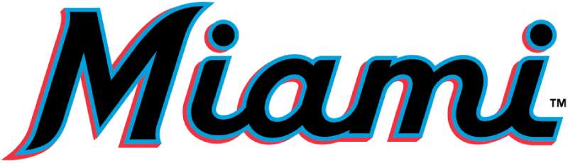
The font isn’t just letters; it’s like the outfit that adorns the spirit of the message.
Sleek and Modern
The typography is sleek, and modern, like Miami’s skyscrapers kissing the horizon. It has curves, and fluidity, resonating with the waters that surround the city.
The Bold Statement
The weight of the font? Bold! Just like the audacity and confidence of Miami and its people. It speaks loudly but with elegance, making a statement without screaming.
Evolution Over Time
The Miami Marlins logo, like wine, has evolved, bringing out more flavor and depth over the years.
The Nuanced Shifts
From the Florida Marlins days, the emblem has seen nuanced shifts. It’s like watching your favorite show and seeing characters grow and evolve. Those shifts represent the journey, the highs, the lows, the victories, and the challenges.
Adapting to Modern Times
With modern times come modern sensibilities. The Miami Marlins logo has not just been a static picture. It’s adapted, resonated, and flowed with the changing times, just like the rhythms of the city.
The Fan Connect
What’s a team without its fans? And oh, how the logo plays a part in that!
A Symbol of Unity
For the fans, the emblem is more than just a visual. It’s a badge, a symbol of unity. When they wear it, they’re not just supporting a team; they’re part of a tribe, a community.
The Nostalgia and the Future
For many, the logo brings back memories – the first game, the nail-biting finishes, the cheers, the tears. But it’s not just about the past; it’s also a beacon of hope, a promise of many thrilling games and moments to come.
FAQ On The Miami Marlins Logo
What Inspired the Miami Marlins Logo?
The stunning Miami Marlins logo, with its sleek marlin leaping over a bold “M”, is a visual ode to Miami’s coastal roots and vibrant culture. It cleverly intertwines the dynamic spirit of baseball with the city’s aquatic elegance and rich, diverse heritage.
How Has the Marlins Logo Evolved Over Time?
From its inception, the logo has seen transformations mirroring the team’s evolution. Initially embracing Florida’s eccentric palette, it matured into a more refined emblem—reflecting a sleek, modern aesthetic while maintaining its tribute to MLB and Miami’s unique zest.
What Do the Colors in the Marlins Logo Represent?
The color scheme cleverly captures Miami’s essence: orange for the fiery sunsets, blue for the ocean’s depths, and black for a touch of sleek sophistication. This powerful trifecta harmonizes to epitomize the city’s heartbeat.
Are There Hidden Meanings in the Marlins Logo?
Hidden meanings impart depth to this visual beacon. The marlin symbolizes agility and fight, consonant with a team’s battling spirit. Moreover, the vibrant colors and specific angles were chosen to reflect Miami’s dynamic energy and forward momentum.
How Often Has the Miami Marlins Logo Been Redesigned?
The franchise, initially known as the Florida Marlins, has revisited its logo design sparingly, ensuring each iteration meaningfully resonates with ever-evolving brand and team ethos.
The current design was unrolled as part of a strategic rebranding effort, aligning with new ownerships’ vision.
What Challenges Accompany Redesigning a Sports Team Logo?
Changing a symbol so interwoven with a team’s identity is daunting. It requires balancing heritage with reinvention—ensuring fans’ nostalgia is respected while steering the visual identity toward a contemporary horizon.
A harmonious blend of tradition and innovation is paramount.
How Does the Marlins Logo Compare to Other MLB Team Logos?
While each MLB team logo channels its unique city spirit, the Marlins’ stands out with its minimalist, yet impactful design. The focus on the single leaping marlin significantly differentiates it from other more intricate or historically rooted emblems.
How Do Fans Feel About the Miami Marlins Logo?
Fan reception varies—some wrap themselves in the new visual identity like a flag of pride, while others reminisce over former designs. Overall, the logo successfully channels Miami’s lively urban ethos and draws in a fandom excited for growth and new chapters.
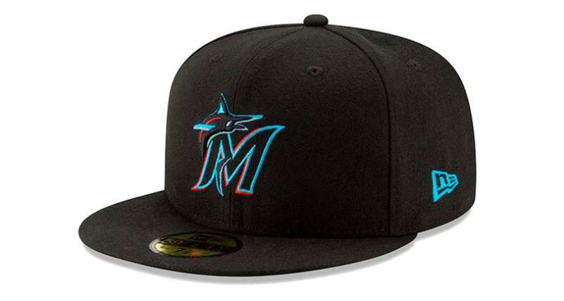
What Role Does the Marlins Logo Play in Merchandising?
An imperative one. The logo’s design significantly affects merchandising, encouraging a dynamic range of apparel and memorabilia that appeals to fans and ignites their connection to the team.
The vibrant, versatile emblem inspires a comprehensive sports merchandise design.
Can You Describe the Process of Redesigning the Miami Marlins Logo?
It’s a meticulous journey of artistic and marketing collaboration. Hours of conceptualizing and refining lead to a single tangential moment where brand identity converges with public image.
Feedback loops, fan insights, and sports marketing strategies congeal—resulting in an emblem that resonates both on and off the field.
Conclusion
The journey through the evolution of the Miami Marlins logo unfurls a vibrant tapestry of creativity and regional homage. It’s a narrative that captures the visual mythology of a Major League Baseball team as iconic as the city it represents.
- We traveled from its genesis, where flamboyant hues mirrored Miami’s boldness, to the contemporary leap of the marlin, now portrayed with sophistication and verve.
- We discovered the designers’ careful deliberation over each color, each curve, interpreting the soul of both team and town.
This emblem isn’t merely a mark of a franchise; it’s a beacon — a lodestar guiding fans and players alike through innings and eras. As the sun sets on this exploration, take with you an appreciation for the profound thought embedded in the curves and colors of a symbol that stands as a testament to the team, the sport, and a city alive with diversity and dynamism. In the dance of light and shadow, Marlins Park and its warriors find their emblem shining, undiminished.
If you liked this article about the Miami Marlins logo, you should check out this article about the Arizona Diamondbacks logo.
There are also similar articles discussing the Colorado Rockies logo, the Houston Astros logo, the Chicago White Sox logo, and the New York Yankees logo.
And let’s not forget about articles on the Philadelphia Phillies logo, the Toronto Blue Jays logo, the Kansas City Royals logo, and the Los Angeles Dodgers logo.
Bogdan Sandu, a seasoned designer with 15 years of diverse experience, has been designing websites since 2008.
Renowned for his expertise in logo design and visual branding, Bogdan has developed a multitude of logos for various clients.
His skills extend to creating posters, vector illustrations, business cards, and brochures. Additionally, Bogdan's UI kits were featured on marketplaces like Visual Hierarchy and UI8.
Latest posts by Bogdan Sandu (see all)
- The Bethesda Logo History, Colors, Font, And Meaning - 28 April 2024
- Out of This World: Space Color Palettes for Cosmic Designs - 28 April 2024
- The Bungie Logo History, Colors, Font, And Meaning - 27 April 2024