

The Philadelphia Phillies Logo History, Colors, Font, and Meaning
Imagine the crack of the bat, the cheer of the crowd, a symbol igniting the spirit of an entire city. The Philadelphia Phillies logo transcends mere design; it speaks of heritage, a testament to a chronicle steeped in triumphs and heartaches.
Within the fibers of its iconic emblem, stories unfold—where each stitch resonates with the legacy of baseball’s indelible march through time.
In this exploration, we delve into the fabric of a logo that does more than just adorn caps and jerseys.
Readers are invited on a journey through the lore of the Philadelphia Phillies, unveiling the mastery behind a sports logo design that encapsulates not just a team, but an enduring love affair with America’s pastime.
Dive deep into a narrative rich with historical threads, from the classic pinstripes to the symbolism of the Liberty Bell. Understand why this isn’t just about branding, but about creating a visual echo that reverberates with each chant of “Go Phills!”
By the final sign-off, expect an intimate understanding of how a logo can capture the soul of sports merchandising, influence fan apparel, and become an indelible part of a city’s identity.
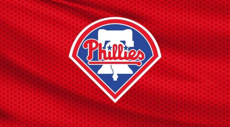
The Meaning Behind the Philadelphia Phillies Logo
![]()
Alright, let’s dive deep into the world of logos, and today’s main actor. The Philadelphia Phillies emblem!
Hidden Symbols
You see, logos aren’t just pretty pictures. They carry meanings, tell stories, and form identities.
Now, the Phillies logo? It’s more than just a baseball with stitches. The seam of the baseball forms a kind of “P”, representing Philadelphia. Simple but smart, right?
Emotional Impact
The beauty of the Phillies logo is its familiarity. It resonates with the local pride of Philadelphia. It’s a badge, a symbol of collective passion, and a connection to memories of roaring stadiums and thrilling matches.
The History of the Philadelphia Phillies Logo
![]()
Now, for a journey back in time!
Vintage Vibes
Baseball and history are like peanut butter and jelly. They just fit. From the older, classic emblems to the modern takes, the Phillies logo has seen numerous transformations, always keeping the essence of its origin.
Era Evolution
Over the years, the design has shifted, adapted, and evolved. From classic leather gloves to the sleeker designs of the 21st century, the emblem has reflected the times while always staying true to its roots.
The Colors of the Philadelphia Phillies Logo

Colors speak. No, really. They do!
The Power of Red
Red is dynamic. It’s fiery, energetic, and powerful. By painting their logo with this vibrant hue, the Phillies encapsulate the excitement of the game and the intensity of competition.
Subtle Blue Touches
Now, we can’t ignore that touch of blue. Blue evokes trust and reliability. It’s the backbone, the steady hand in a storm. Combined with red? It’s a balance of passion and trust.
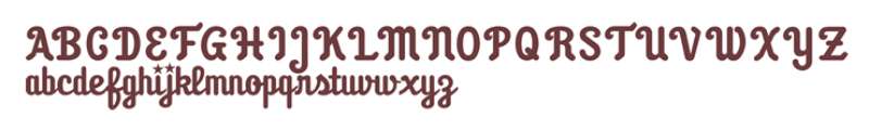
The Font Used in the Philadelphia Phillies Logo
Words matter, but how do they look? Just as crucial!
Curves and Slants
The Phillies typography has this charming blend of old-school and contemporary. The letters? They’re curvy, almost like they’re swinging a bat. But they’re also bold, making a statement.
Distinctive yet Familiar
It’s an art to craft letters that are both unique to a brand and instantly recognizable to fans. And this logo? Nails it.
Influence on Popular Culture
Logo ain’t just for jerseys!
Merch Madness
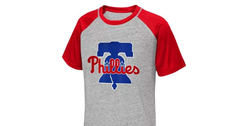
T-shirts, caps, mugs – you name it! This emblem has found its place in a plethora of merchandise, making fans feel closer to the heart of the game.
Tattoos and Street Art
That’s right! The Phillies logo has inked its place, literally, on some fans’ bodies. And if that’s not dedication, I don’t know what is. Plus, let’s not forget the street art tributes.
Global Recognition of the Logo
Stepping beyond Philly!
International Love
The love for baseball isn’t just confined to Philly. Fans around the globe recognize and respect the Phillies logo, making it an international icon.
Media Appearances
Ever caught that logo in movies or TV shows? It’s not just there for aesthetics. It’s a symbol of passion, dedication, and history.
FAQ On The Philadelphia Phillies Logo
What does the Philadelphia Phillies logo represent?
Embodied in a swirl of red and white, the logo stands for more than a baseball team; it’s a banner of civic pride.
Symbolizing both the heritage of the Philadelphia sports scene and the tenacity of a city, it captures the essence of relentless pursuit characteristic of the Phillies franchise history.
Has the Phillies logo changed over time?
Indeed, it has. The journey from simplistic letterings to the current design reflects an evolution. The emblem transformed, narrating the team’s saga, embracing modernity while nodding to tradition, much like the city of Philadelphia itself—constantly evolving, yet ever faithful to its roots.
What role does the Liberty Bell play in the Phillies logo?
The Liberty Bell is more than a mere symbol; it’s a powerful echo of freedom, seamlessly woven into the Phillies insignia. It adds a distinctive flair, reminding all of the Philadelphia Phillies’ connection to one of America’s most historic cities.
Why do the Phillies use red and white in their logo?
It’s a color scheme that screams passion and purity, blood, and victory. Red and white are hues steeped in baseball tradition, paramount to the Phillies branding. They encapsulate the energy of the game and the camaraderie of the team, resonating with fans’ beating hearts.
Can the Philadelphia Phillies logo be used on merchandise?
Absolutely, and it is! A staple on everything from hats to hoodies, this emblem fuels a bustling market of sports merchandise. A token of allegiance for the fans, these items serve both utility and identity, binding the Phillies Nation together in sartorial solidarity.
Who designed the current Philadelphia Phillies logo?
Alas, the creator often remains unsung, blurred in the annals of the team’s branding history. What is known is that it’s a collective image, shaped by time, refined by the insights of those who understand the ethos of both the sport and the Major League Baseball (MLB).
What was the Phillies logo before the current design?
A tale of eras: prior motifs ranged from simple lettering to a blue jay.
Each iteration carrying a reflection of the moment, with some designs notably featuring a baseball within a diamond, and others a more minimalist approach, showcasing the team’s evolution in sports logo design.
Does the team mascot appear in the Phillies logo?
Not directly—while the Phillie Phanatic is the soul of cheer, the team’s visual stamp has kept a more classic approach. The mascot steals the show in the stadium, leaving the logo to uphold the dignity of the esteemed Major League Baseball heritage.
Are the Phillies logo colors consistent with their uniform?
Consistency is key in the kingdom of Phillies branding. Classic pinstripes, bold in red, instill a sense of identity—the team’s attire a canvas, the logo its crowning jewel. From the field to fan’s wardrobes, the colors herald a unified front.
How has the fandom influenced the Philadelphia Phillies logo design?
Fans’ fervor shapes the soul of the logo—it’s a dialogue between the bleachers and the boardroom.
Embracing changing tastes while holding fast to what resonates with the Phillies Nation, the design reflects the balance between tradition and the heartbeat of a new generation of baseball enthusiasts.
Conclusion
In contemplating the visual voyage of the Philadelphia Phillies logo, its indelible mark on the fabric of America’s pastime is unquestioned. Worn as a badge of honor by citizens and champions alike, this emblem marries heritage with the high stakes of Major League Baseball.
- It’s a symbol that has witnessed epic rises and turbulent falls.
- A crest carrying the weight of a city’s hope with each pitch.
- An insignia that has evolved, paying homage to the legacies of legends and the melody of Philadelphia’s heartstrings.
In the realm of sports design, few logos stir such a visceral response. Fewer still encapsulate a community’s soul, its undying love for the game, its players, and its communal victories. From the crack of the bat to the roar of the Phillies Nation, this visual icon will continue shaping sports merchandising and inspiring generations of fans who bleed Phillies red.
The Philadelphia Phillies logo isn’t just art; it’s a lasting piece of culture, as timeless as the sport it represents.
If you liked this article about the Philadelphia Phillies logo, you should check out this article about the Arizona Diamondbacks logo.
There are also similar articles discussing the Colorado Rockies logo, the Houston Astros logo, the Miami Marlins logo, and the Chicago White Sox logo.
And let’s not forget about articles on the New York Yankees logo, the Toronto Blue Jays logo, the Kansas City Royals logo, and the Los Angeles Dodgers logo.
Bogdan Sandu, a seasoned designer with 15 years of diverse experience, has been designing websites since 2008.
Renowned for his expertise in logo design and visual branding, Bogdan has developed a multitude of logos for various clients.
His skills extend to creating posters, vector illustrations, business cards, and brochures. Additionally, Bogdan's UI kits were featured on marketplaces like Visual Hierarchy and UI8.
Latest posts by Bogdan Sandu (see all)
- The Guinness Logo History, Colors, Font, And Meaning - 15 May 2024
- Vibrant Orange Color Palettes for Energetic Designs - 15 May 2024
- Publishing Elegance: What Font Does Time Magazine Use? - 15 May 2024