The Los Angeles Dodgers logo is one of the most recognized marks in professional sports. It has been around, in some form, since the late 1800s. But the version most people picture today, that blue script “Dodgers” with a red baseball shooting across it, dates back to 1958 when the franchise packed up and left Brooklyn for California.
The club was founded in 1883 as the Brooklyn Grays. Over the next several decades, the team changed names more times than most fans realize. Grays, Bridegrooms, Superbas, Robins, and finally Dodgers. Each name shift brought a new logo along with it. Since landing in LA, the primary mark has only seen about five subtle updates. The current version was last touched up in 2012.
Within the broader history of baseball team logos, the Dodgers mark stands out for its consistency. While other franchises have gone through total overhauls every decade or so, LA has kept the same basic concept for over 60 years. That kind of visual stability is rare in professional sports branding.
What Is the Los Angeles Dodgers Logo?

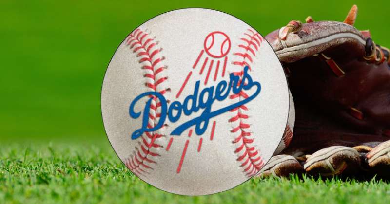
The Los Angeles Dodgers logo is a combination mark featuring a custom blue script wordmark reading “Dodgers” with a red baseball and motion streaks positioned above and through the lettering. It was introduced in 1958 when the team relocated from Brooklyn to Los Angeles. The original flying ball concept was first drawn by sports illustrator Henry Alonzo Keller.
- Design Type: Combination mark (wordmark plus graphic element)
- Primary Elements: Custom cursive “Dodgers” script in blue, red baseball with motion streaks, diagonal text placement
- Official Introduction Date: 1958 (current iteration refined in 2012)
- Original Designer: Henry Alonzo Keller created the initial flying ball concept. The 2012 refinement was handled under the direction of Ross Yoshida and the team’s graphic design department
- Trademark Status: Registered trademark of the Los Angeles Dodgers LLC, managed under MLB Properties
- Color Palette: Dodger Blue (#005A9C), Red (#EF3E42), White (#FFFFFF), Silver (#A5ACAF)
- Usage Context: Jerseys, caps (the interlocking “LA” monogram is used on caps), merchandise, Dodger Stadium signage, digital platforms, broadcast graphics, and marketing materials
How Has the Los Angeles Dodgers Logo Evolved Over Time?

The Dodgers franchise has used roughly 18 different logos since 1899. The early Brooklyn years featured a stylized letter “B” in various forms.
When the team moved west in 1958, the “B” was dropped entirely. The now-famous script wordmark with the flying baseball became the primary identity.
Since then, changes have been subtle. Thicker lines here, thinner strokes there, a color shade adjustment in the 1970s. The 2012 update cleaned up letter connections and removed the decorative tail from the “O.”
Brooklyn Era Logos (1899-1957)
- Years Active: 1899-1957
- Design Description: The franchise started with a Gothic-style capital “B” in red (1899-1901), switching to blue in 1902. Over the next few decades, the “B” went through multiple style changes. Sometimes it sat inside a diamond shape, other times inside a red circle. By 1938, the team spelled out “Dodgers” in script for the first time. In 1945, the flying baseball element appeared for the first time above the wordmark
- Color Scheme: Red initially, then blue and white became the primary combination from 1902 onward, with occasional red accents
- Designer: Various in-house designers. Bill Hackathorn, a team cartoonist and graphic artist, created the original 1938 cursive wordmark
- Context: The “B” represented Brooklyn. Each name change (Superbas, Robins, Dodgers) often triggered a logo update. The team played at Ebbets Field and was deeply tied to Brooklyn’s identity
- Cultural Significance: The Brooklyn “B” became linked to Jackie Robinson breaking baseball’s color barrier in 1947. That letter carries historical weight far beyond sports branding
First Los Angeles Dodgers Logo (1958-1967)
- Years Active: 1958-1967
- Design Description: Blue script “Dodgers” wordmark placed on a slight diagonal, with a white baseball outlined in red and motion streaks extending from it. The stitching detail on the ball was removed compared to the 1945 Brooklyn version
- Color Scheme: Blue script, red and white baseball, white background
- Designer: Based on Henry Alonzo Keller’s original concept, adapted for the LA move
- Context: The franchise relocated to Los Angeles before the 1958 season. Owner Walter O’Malley needed a mark that kept the “Dodgers” name recognition while ditching the Brooklyn-specific “B.” The interlocking “LA” monogram was introduced for caps at this time
- Key Changes from Previous: Complete departure from the single-letter format. Full team name in script became the focal point
- Cultural Significance: Marked the beginning of West Coast Major League Baseball. This logo helped establish the Dodgers as an LA institution
Bolder Script Version (1968-1971)
- Years Active: 1968-1971
- Design Description: The same basic layout, but the colors became more intense. The script lines were made thicker, giving the wordmark a heavier, more prominent feel. It almost looked like calligraphy brush strokes
- Color Scheme: Deeper blue, bolder red accents
- Key Changes from Previous: Bolder line weight throughout. The ball was made slightly smaller relative to the text
- Cultural Significance: Coincided with the Dodgers establishing themselves as perennial contenders in the National League West
Royal Blue Shift (1972-1978)
- Years Active: 1972-1978
- Design Description: Same structure, but the wordmark color shifted from a dark, deep blue to a royal blue. It was a subtle change that most casual fans missed entirely
- Color Scheme: Royal blue replaced the darker blue. Red and white elements stayed the same
- Key Changes from Previous: The hue shift was the main update. This signaled the transition to what would become known as “Dodger Blue”
- Cultural Significance: Tommy Lasorda, who would later popularize the phrase “bleed Dodger Blue,” joined the coaching staff during this period
Refined Script Logo (1979-2011)
- Years Active: 1979-2011
- Design Description: The wordmark got bigger while the stroke got thinner, creating a more streamlined look. The baseball and motion streaks were also made thinner, so they stood out more clearly from the text. Everything looked more refined and elegant
- Color Scheme: Dodger Blue, red, white
- Key Changes from Previous: Thinner, more elegant lettering. Better separation between the graphic elements and the text
- Cultural Significance: This version was used during some of the franchise’s biggest moments, including Kirk Gibson’s legendary 1988 World Series home run. It lasted 32 years, making it the longest-running version of the LA-era logo
Current Los Angeles Dodgers Logo (2012-Present)
- Years Active: 2012-present
- Design Description: Thicker line weight on the ball and streaks. The “O” lost its left-side tail for a cleaner look. The connection between “G” and “E” was smoothed out. The wordmark tail now ends with an inverted rounding line instead of a flat line, matching the jersey version more closely
- Color Scheme: Dodger Blue (#005A9C), Red (#EF3E42), White, Silver (#A5ACAF)
- Designer: Refined under Ross Yoshida’s direction in the team’s graphic design department
- Context: Introduced around the same time the franchise was sold to Guggenheim Baseball Management for $2 billion
- Key Changes from Previous: Removed the “O” tail, smoothed the “G” to “E” transition, thickened the baseball and streaks, inverted the wordmark tail ending
- Cultural Significance: Represents the modern era of Dodgers dominance, including back-to-back World Series titles in 2020 and 2024
What Do the Design Elements of the Los Angeles Dodgers Logo Mean?
The Dodgers logo tells a story of motion and tradition. The flying baseball suggests a ball in play, a hit soaring out of the park.
The diagonal placement of the script creates a sense of forward momentum. Nothing about this mark feels static.
Every piece works together to communicate energy, speed, and a connection to the game itself.
Why Did the Los Angeles Dodgers Choose These Specific Colors?

Blue has been part of the Dodgers identity since 1902. It stuck around through every name change, every redesign, every relocation. The specific shade, Pantone 294 C, is now so closely tied to the franchise that people just call it “Dodger Blue.”
From a color psychology standpoint, blue communicates trust, stability, and professionalism. Red adds energy and urgency. White keeps things clean and readable.
Here are the official codes:
- Dodger Blue: Hex #005A9C | RGB (0, 90, 156) | CMYK (100, 56, 0, 18.5) | Pantone PMS 294 C. Represents loyalty, tradition, and the LA connection
- Red: Hex #EF3E42 | RGB (239, 62, 66) | CMYK (0, 91, 76, 0) | Pantone PMS 185 C. Used for the baseball and streaks, adding energy and a visual pop against the blue
- Silver: Hex #A5ACAF | RGB (191, 192, 191) | CMYK (5, 0, 0, 20) | Pantone PMS 877 C. Used as a supporting accent on alternate logos and trim details
- White: Hex #FFFFFF. The primary background and jersey base color, providing contrast and readability
What Typography Style Is Used in the Los Angeles Dodgers Logo?

The Dodgers use a custom cursive script font that was originally drawn by Bill Hackathorn in 1938. It is not based on any commercially available typeface.
The letters slant forward, giving the whole wordmark a feeling of speed. Curves are smooth and connected (mostly), with the “D” standing slightly apart from the rest. The kerning between letters is tight but not cramped.
It falls into that classic baseball script tradition. Hand-lettered, flowing, and unapologetically retro. The kind of lettering you just don’t see created from scratch anymore.
What Are the Hidden Meanings in the Los Angeles Dodgers Logo?
The flying baseball is the most obvious symbolic element. It represents a ball hit hard, soaring up and away. Some have interpreted the motion streaks as speed lines showing the ball’s trajectory after a powerful swing.
The diagonal placement of the whole wordmark adds to this feeling. Nothing sits flat. Everything moves upward and to the right, which in Western visual culture generally means progress and forward motion.
The name “Dodgers” itself carries history. It comes from “Trolley Dodgers,” a nickname for Brooklyn pedestrians who had to dodge streetcars. So even the text is a nod to the franchise’s New York roots.
How Does the Los Angeles Dodgers Logo Compare to Competitor Logos?
The Dodgers script sits among a handful of truly classic baseball wordmarks. The New York Yankees logo with its interlocking “NY” is probably the only MLB mark that carries more brand recognition globally.
Where the Boston Red Sox logo leans on a pair of red socks and the St. Louis Cardinals logo uses a bird-on-bat illustration, the Dodgers keep it purely typographic with that single graphic accent. It is a simpler approach than most.
Their NL West rivals offer an interesting comparison. The San Francisco Giants logo uses a similar script style but in orange and black. The San Diego Padres logo went through a major rebrand in recent years, returning to brown and gold. The Arizona Diamondbacks logo is much more modern and aggressive with its angular “A” mark.
The Dodgers approach is different. They haven’t chased trends. While teams like the Miami Marlins have completely reinvented themselves, the Dodgers have barely touched their core identity in six decades. That restraint is, honestly, what makes the mark so strong.
What Are the Technical Specifications of the Los Angeles Dodgers Logo?
Official Color Codes
- Primary Color, Dodger Blue: Hex #005A9C | RGB (0, 90, 156) | CMYK (100, 56, 0, 18.5) | Pantone PMS 294 C
- Secondary Color, Red: Hex #EF3E42 | RGB (239, 62, 66) | CMYK (0, 91, 76, 0) | Pantone PMS 185 C
- Accent Color, Silver: Hex #A5ACAF | RGB (191, 192, 191) | CMYK (5, 0, 0, 20) | Pantone PMS 877 C
- Base Color, White: Hex #FFFFFF | RGB (255, 255, 255) | CMYK (0, 0, 0, 0)
Dimensions and Proportions
The Dodgers primary logo has a roughly 2:1 width-to-height ratio due to the horizontal script layout. MLB’s brand guidelines specify clear space requirements around the mark, typically equal to the height of the “D” on all sides.
Minimum reproduction size ensures the script remains readable, particularly the thinner letter connections. For digital use, the logo should be rendered as vector graphics whenever possible to maintain crisp edges at any scale. The DPI for print applications should be at least 300 to keep details sharp, especially the motion streaks on the baseball.
The interlocking “LA” cap logo, used as the secondary mark, follows its own set of proportions and spacing rules separate from the primary script logo.
What Cultural Impact Has the Los Angeles Dodgers Logo Had?
The Dodgers logo has become something bigger than a sports mark. It is a symbol of Los Angeles itself.
You see the interlocking “LA” on hats worn by people who have never watched a single inning of baseball. It shows up in hip-hop videos, on streetwear, in movies set in Southern California. The Dodgers cap became a cultural signifier for LA in the same way a Yankees cap represents New York.
From Jackie Robinson breaking the color line in Brooklyn to Shohei Ohtani signing the largest contract in professional sports history, this logo has been present for some of the biggest moments in baseball. It carries that weight.
The “Dodger Blue” color itself has entered common language. Tommy Lasorda’s famous quote, “Cut me and I’ll bleed Dodger Blue,” turned a Pantone value into an emotional statement about loyalty. Not many color palettes can claim that kind of cultural reach.
How Does the Los Angeles Dodgers Logo Fit Into the Overall Brand Identity?
The Dodgers brand system is built on three main visual assets. The primary script logo with the flying baseball. The interlocking “LA” monogram used on caps and as a secondary identifier. And the “Los Angeles” road script used on away jerseys.
All three share the same custom typography DNA and the Dodger Blue color. They work as a family. You can see any one of them in isolation and know immediately it is the Dodgers.
Dodger Stadium itself reinforces the brand. The same blue shows up on seats, signage, and structural elements throughout the park. The consistency between the logo, uniforms, stadium environment, and merchandise creates a tight identity system that most franchises struggle to achieve.
The brand style guide keeps everything locked in. From how the script sits on a jersey to how the “LA” appears on a batting helmet, there are rules for every application. That level of control is part of why the Dodgers brand feels so cohesive whether you are watching on TV, sitting in the stands, or browsing the team shop online.
How Should the Los Angeles Dodgers Logo Be Used?
The Dodgers logo is a registered trademark. You cannot use it for commercial purposes without a license from MLB Properties, which manages intellectual property rights for all 30 Major League Baseball clubs.
Official usage guidelines include:
- Do not alter the colors, proportions, or orientation of the logo
- Do not place the logo on backgrounds that reduce readability or clash with the official color scheme
- Maintain required clear space around the mark at all times
- Do not combine the logo with other graphic elements that are not part of the approved identity system
- Use only official, approved logo files provided through MLB or the Dodgers organization
Official logo files for media and licensed partners are available through MLB’s brand portal. Fan use for personal, non-commercial projects is generally tolerated but not formally licensed. If you are producing merchandise, promotional items, or any commercial materials, you need written permission.
The Dodgers organization and MLB actively protect against unauthorized use. Counterfeit merchandise is a big issue, and the league monitors trademark violations across both physical and digital channels.
FAQ on The Los Angeles Dodgers Logo
What does the Los Angeles Dodgers logo look like?
The primary logo features a custom blue script spelling “Dodgers” on a diagonal slant. A red baseball with motion streaks flies above and through the lettering. The team also uses an interlocking “LA” monogram on caps.
When was the current Dodgers logo introduced?
The current version was refined in 2012. But the core design, the script wordmark with the flying baseball, has been in use since 1958 when the franchise moved from Brooklyn to Los Angeles.
What are the official colors of the Dodgers logo?
The official color palette includes Dodger Blue (Hex #005A9C), Red (Hex #EF3E42), White, and Silver (Hex #A5ACAF). Blue has been the team’s signature color since 1902.
Who designed the Los Angeles Dodgers logo?
Sports illustrator Henry Alonzo Keller created the original flying ball concept. Bill Hackathorn drew the 1938 cursive wordmark. The 2012 update was handled under Ross Yoshida’s direction within the team’s graphic design department.
What font is used in the Dodgers logo?
The Dodgers use a custom hand-lettered cursive typeface. It is not a commercially available font. The lettering slants forward with smooth curves, rooted in classic baseball script typography traditions from the early 1900s.
What does the flying baseball in the Dodgers logo mean?
The red baseball with streaks represents a ball hit hard and soaring upward. It suggests power and energy. The motion lines show trajectory, giving the whole mark a feeling of speed and action on the field.
How many times has the Dodgers logo changed?
The franchise has used roughly 18 different logos since 1899. The Brooklyn era featured various “B” lettermarks. Since relocating to LA in 1958, the script logo has only been updated about five times, mostly minor tweaks.
Can I use the Dodgers logo for my own project?
Not commercially. The logo is a registered trademark managed by MLB Properties. You need written permission for merchandise or promotional materials. Personal, non-commercial use is generally tolerated but never formally licensed.
What is the difference between the Dodgers primary logo and the cap logo?
The primary logo is the full “Dodgers” script with the flying baseball. The cap logo is the interlocking “LA” monogram in Dodger Blue. Both follow the same brand guidelines but serve different applications across jerseys, hats, and merchandise.
Why is the Dodgers logo considered iconic?
Consistency. The core design has barely changed in over 60 years. That visual stability, combined with the team’s World Series championships and cultural presence in Los Angeles, made it one of the most recognized marks in all of professional sports.
Conclusion
The Los Angeles Dodgers logo proves that you don’t need constant redesigns to stay relevant. A custom script wordmark, a flying red baseball, and Dodger Blue have carried this franchise’s visual identity for over six decades.
From Ebbets Field in Brooklyn to Chavez Ravine, the mark has survived a cross-country relocation, ownership changes, and countless shifts in graphic design movements. It still works.
The interlocking LA cap logo became a cultural symbol far beyond MLB merchandise. Fans, artists, and the city itself claimed it.
Few blue logos in professional sports carry this much weight. That says everything about what smart, restrained branding can do over time.

Renowned for his expertise in logo design and visual branding, Bogdan has developed a multitude of logos for various clients.
His skills extend to creating posters, vector illustrations, business cards, and brochures. Additionally, Bogdan's UI kits were featured on marketplaces like Visual Hierarchy and UI8.
He also wrote in the past years on sites like Design Your Way, WebDesignerDepot, WPDean, Designmodo, Speckyboy, Slider Revolution, and more.
- Canva AI Features Reviewed: Are They Actually Useful? - 4 October 2026
- The Substack Logo History, Colors, Font, And Meaning - 2 October 2026
- How UX Design Impacts SaaS User Retention and Churn - 1 October 2026

Bogdan Sandu is a seasoned designer who has been designing websites since 2008. Renowned for his expertise in logo design and visual branding, Bogdan has developed a multitude of logos for various clients. His skills extend to creating posters, vector illustrations, business cards, and brochures. Additionally, Bogdan's UI kits were featured on marketplaces like Visual Hierarchy and UI8. He also wrote in the past years on sites like Design Your Way, WebDesignerDepot, WPDean, Designmodo, Speckyboy, Slider Revolution, and more.
You Might Also Like