The Cleveland Indians logo carries more weight than most baseball team logos in American sports. It represents over a century of professional baseball, multiple name changes, and one of the most talked-about mascot controversies in MLB history.
Founded in 1901 as the Cleveland Bluebirds, the franchise went through several names before landing on “Indians” in 1915. That name stuck until 2021. Throughout that stretch, the team used more than 15 different logos, moving from simple letter marks to Native American imagery and back again to a stripped-down block “C.”
The most well-known version, Chief Wahoo, was created in 1947 by Walter Goldbach, a 17-year-old draftsman working at the J.F. Novak Company in Cleveland. It stayed on uniforms and merchandise for decades before being officially retired after the 2018 season.
The Cleveland Indians logo is a case study in how brand identity shifts under cultural pressure. Few sports marks have gone through this much public scrutiny.
What Is the Cleveland Indians Logo?

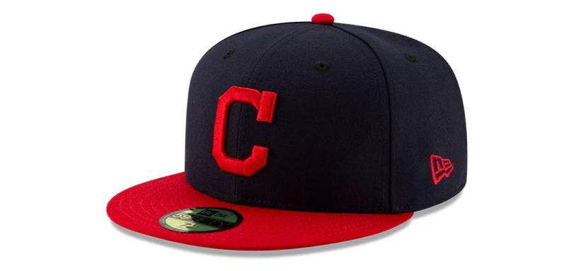
The Cleveland Indians logo is a red block “C” representing Cleveland, introduced as the team’s primary mark in 2014. Created as a cleaner alternative to the controversial Chief Wahoo mascot, it draws from a design originally used by the franchise back in 1904. The block “C” was the last official primary logo before the team became the Cleveland Guardians in 2022.
Here are the key attributes of the Cleveland Indians logo:
- Design Type: Combination mark. The franchise used both a letterform (block “C”) and a mascot-based logo (Chief Wahoo) during different eras. The final primary mark was a standalone letterform.
- Primary Elements: A bold, curved letter “C” in red with white interior space. Chief Wahoo, the secondary logo, featured a cartoonish Native American face with a red complexion, black hair, and a single feather.
- Official Introduction Date: The block “C” was introduced as primary logo on April 2, 2014. Chief Wahoo first appeared in 1947 and its most recognized version dates to 1951.
- Designer/Agency: Walter Goldbach, a teenage employee of the J.F. Novak Company, designed Chief Wahoo in 1947 at the request of team owner Bill Veeck. The block “C” was developed internally by the franchise.
- Trademark Status: The team retains federal trademark registrations for Chief Wahoo, the word “Tribe,” and “Wahoo.” Limited merchandise sales continue in Ohio to prevent trademark abandonment.
- Color Palette: Red (#E31937), Navy Blue (#0C2340), and White (#FFFFFF). The block “C” uses red and white only. Chief Wahoo combined all three.
- Usage Context: The block “C” appeared on game caps, jerseys, merchandise, and digital platforms from 2014 to 2021. Chief Wahoo was removed from on-field use after 2018 but persists on licensed merchandise sold in Northeast Ohio.
How Has the Cleveland Indians Logo Evolved Over Time?
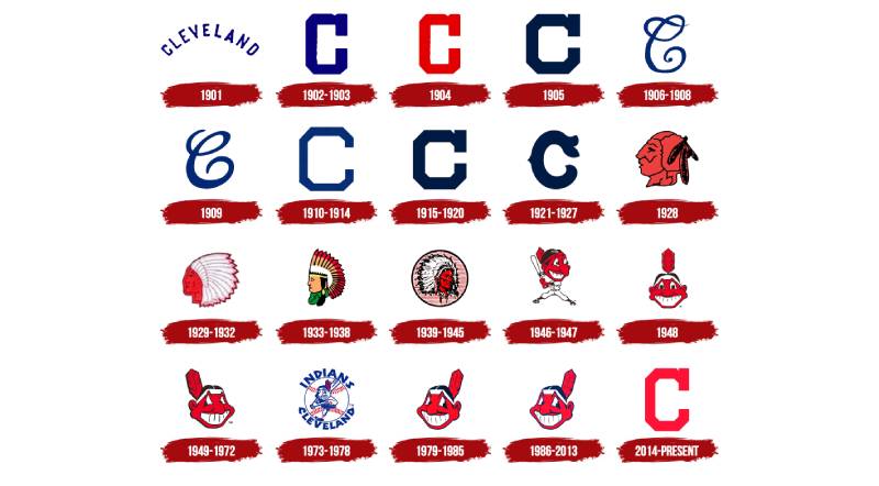
The Cleveland Indians logo went through more than 15 versions across 106 years (1915-2021). The earliest marks used stylized letter “C” designs, followed by Native American profile imagery in 1928, the introduction of Chief Wahoo in 1947, and a return to the block “C” as primary logo in 2014.
Original Cleveland Lettermark (1901-1927)
Years Active: 1901-1927
The franchise started with no Native American imagery at all. For over two decades, the team wore uniforms featuring either the word “Cleveland” or a stylized capital “C.”
The letter was blue on white, thick and bold. In 1906, the “C” got more decorative, with curling serifs added. But the overall look stayed clean and simple.
Even after adopting the “Indians” name in 1915, there was nothing on the uniforms to suggest it. Just the letter. Just the city name. The lone exception was 1921, when the jersey read “Worlds Champions” after their 1920 World Series win.
Color Scheme: Blue and white
Cultural Significance: These early marks set a pattern the franchise would eventually return to. The block “C” that became the final primary logo in 2014 traces its roots directly back to this period.
Native American Profile Era (1928-1945)
Years Active: 1928-1945
In 1928, the team placed a patch on the left breast of the home uniform showing the profile of a Native American man wearing a feathered headdress. Rendered in red and black, it was the first time the “Indians” name found visual expression on the jersey.
A year later, the portrait was redrawn in red and white. The headdress got bigger. The lines got softer.
By 1933, the color scheme shifted to yellow, brown, and red. More detail showed up. The face looked more refined than the blocky 1928 original.
In 1939, a new version appeared with a red face, a white and black headdress, set against a circle of red and white stripes. Each iteration got more detailed, but all of them were profile shots. No cartoon grins yet.
Designer: Uncredited, likely created through the team’s internal design process
Key Changes from Previous: First use of Native American imagery. Moved away from the lettermark approach entirely.
Cultural Significance: These logos established the visual connection between the team name and Native American representation that would define (and later haunt) the franchise for decades.
Chief Wahoo Introduction (1946-1950)
Years Active: 1946-1950
This is where everything changed. Team owner Bill Veeck hired the J.F. Novak Company in 1947 to create something new. Walter Goldbach, just 17 years old and fresh out of Rhodes High School, got the assignment.
He later said he had trouble “figuring out how to make an Indian look like a cartoon.” The result was a smiling face with yellow-orange skin and an oversized nose. A single feather stuck out from the back.
In 1948, a full body was added. The character held a bat. The skin color changed to red.
The name “Chief Wahoo” didn’t appear right away. It started being used around 1950, possibly borrowed from a newspaper comic strip called “Big Chief Wahoo” that ran from 1936 to 1947.
Color Scheme: Red, black, white, with yellow-orange skin in the earliest version
Designer: Walter Goldbach, J.F. Novak Company, Cleveland
Context: Cartoon mascots were popular across baseball in the late 1940s. Goldbach was influenced by the prevailing cartoon style of the era. Fred George Reinert, a cartoonist for the Cleveland Plain Dealer, had drawn a similar “Little Indian” character starting in 1932, but was never formally credited.
Iconic Chief Wahoo (1951-2013)
Years Active: 1951-2013 (with modifications)
The 1951 redesign produced the Chief Wahoo most people picture. Smaller nose. Triangle eyes. That toothy grin. Black hair. Red skin. One red feather. A black outline around the whole thing.
This version barely changed for over sixty years. That kind of staying power is rare in sports branding.
In 1973, designers put the character inside a full-color baseball with “INDIANS” on top and “CLEVELAND” below, rendered in blue. Wahoo held a bat, mid-swing. It was the first time the full team name appeared on the logo.
By 1979, the simpler face-only version returned as the primary mark. Blue outlines were added. That look held steady until 2013.
Color Scheme: Red, white, navy blue, black
Key Changes from Previous: Significant facial redesign in 1951. The character’s proportions and features were standardized.
Cultural Significance: Chief Wahoo became one of the most recognized and most protested logos in American professional sports. Native American groups had been publicly objecting since the 1970s. The logo generated an estimated $20 million per year in merchandise revenue at its peak.
Block “C” Era (2014-2021)
Years Active: 2014-2021
On April 2, 2014, the Cleveland Indians made the block “C” their primary logo. It was a red, curved letter “C” with a white outline, visually similar to the 1904 version used when the team was still the Cleveland Bluebirds.
Chief Wahoo moved to secondary status. It still appeared on some caps and sleeve patches, but the writing was on the wall.
On January 29, 2018, the team announced Chief Wahoo would be removed from all on-field uniforms starting in 2019. MLB Commissioner Rob Manfred called it “no longer appropriate for on-field use.”
The block “C” remained the sole primary mark until the franchise officially became the Cleveland Guardians after the 2021 season.
Color Scheme: Red (#E31937) and white (#FFFFFF)

Designer: Internal franchise design
Context: The 2016 World Series put Chief Wahoo back in the national spotlight, accelerating pressure for change. The 2019 MLB All-Star Game in Cleveland provided additional motivation to finalize the transition.
Key Changes from Previous: Complete removal of human imagery. Return to a geometric letterform. The simplest Cleveland Indians logo since the early 1900s.
What Do the Design Elements of the Cleveland Indians Logo Mean?
The Cleveland Indians logo communicated different things depending on the era. The block “C” represents Cleveland as a city and its baseball tradition. Chief Wahoo was originally meant to express “pure joy and unbridled enthusiasm,” according to designer Walter Goldbach, though its meaning became much more contested over time.
What Does the Block “C” Symbol Represent?
The block “C” stands for Cleveland, plain and simple. It ties the franchise to the city rather than to any cultural imagery.
The letter’s curved, wishbone-style shape first appeared in 1904 and came back repeatedly throughout the team’s history. It works as a geographic identifier, nothing more.
That simplicity was the point. When the franchise needed to move away from Chief Wahoo, they picked the one element that carried zero cultural baggage. The psychology of shapes matters here. A single rounded letter reads as approachable and neutral, which was exactly what the team needed after decades of controversy.
Why Did Cleveland Indians Choose These Specific Colors?
The official Cleveland Indians colors are red, navy blue, and white. These have been consistent since the mid-20th century, though the earliest uniforms used different shades of blue.
- Red (#E31937, Pantone PMS 199): Red dominates the block “C” and was the primary skin color on Chief Wahoo. In color psychology, red signals energy, aggression, and passion, which fits a competitive sports context.
- Navy Blue (#0C2340, Pantone PMS 289): Used in secondary elements, outlines, and wordmarks. Navy blue communicates stability and professionalism. It grounded the more aggressive red.
- White (#FFFFFF): Background and accent color. Provides contrast and keeps the overall mark readable at small sizes.
The red and navy combination is common across baseball. Look at the Boston Red Sox logo or the Minnesota Twins logo, and you’ll see similar palettes. Cleveland’s specific shades helped it stand apart, but not by much.
What Typography Style Is Used in the Cleveland Indians Logo?
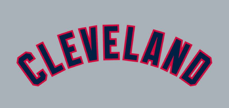
The block “C” isn’t really a font in the traditional sense. It’s custom lettering, a drawn letterform that doesn’t match any standard typeface.
The curves are smooth and wide. The stroke weight is heavy and consistent. There are no serifs in the conventional sense, though the letter’s terminals flare slightly at the ends.
When “INDIANS” or “CLEVELAND” appeared as wordmarks on jerseys or the 1973 full-body logo, the team used custom sans-serif lettering with thick strokes and straight cuts. It had a blocky, geometric feel. Some versions carried a slight Mayan influence in the letter shapes, which is an interesting choice for a team named “Indians.”
What Are the Hidden Meanings in the Cleveland Indians Logo?
The block “C” doesn’t carry hidden messages. It’s direct and intentional. What you see is what you get.
Chief Wahoo is a different story. The oversized grin, single feather, and red skin were designed as a lighthearted cartoon in 1947. But critics pointed out that these features reduced an entire culture to a caricature.
The single feather was particularly contentious. In many Native American traditions, feathers carry deep cultural and spiritual meaning. A chief would wear a full headdress, not a lone feather. That mismatch highlighted the logo’s disconnect from actual Native American identity.
How Does the Cleveland Indians Logo Compare to Competitor Logos?
Among American League teams, the Cleveland Indians logo sits in an unusual position. Its final primary mark, the block “C,” is one of the simplest logos in Major League Baseball. Single-letter logos are common in baseball, but most teams pair them with additional graphical elements.
The Chicago Cubs logo wraps its “C” inside a circle. The Cincinnati Reds logo tilts its “C” with a mustached character peeking through. The New York Yankees logo layers the “NY” monogram into a top hat and bat arrangement.
Cleveland’s block “C” stands alone. No supporting graphic. No secondary symbol layered in. That’s either refreshingly clean or slightly boring, depending on who you ask.
The controversy angle sets it apart entirely. No other active MLB logo has gone through the same level of public debate. The Atlanta Braves logo has faced some criticism over Native American imagery, but it has not resulted in the same kind of full-scale identity overhaul.
Among red logos in sports, Cleveland’s mark reads well at distance but lacks the distinctiveness that makes certain NBA logos or NFL logos immediately identifiable from across a room.
What Are the Technical Specifications of the Cleveland Indians Logo?
Official Color Codes
- Primary Color: Red
- Hex: #E31937
- RGB: (227, 25, 55)
- CMYK: (0, 100, 65, 0)
- Pantone: PMS 199
- Secondary Color: Navy Blue
- Hex: #0C2340
- RGB: (12, 35, 64)
- CMYK: (100, 60, 0, 56)
- Pantone: PMS 289
- Accent Color: White
- Hex: #FFFFFF
- RGB: (255, 255, 255)
- CMYK: (0, 0, 0, 0)
Dimensions and Proportions
The block “C” follows a roughly square aspect ratio. The letter’s stroke width is consistent throughout, with gentle curves at the terminals.
MLB standardizes logo placement on caps, jerseys, and helmets. The cap logo sits centered on the crown. Jersey logos follow league-wide brand guidelines for minimum size and clear space.
For print production, the logo should maintain at least 300 DPI for merchandise and printed materials. Digital use follows standard pixel-based rendering. The mark works well at small sizes thanks to its simple geometry, a benefit of having just one letter with no fine detail to lose.
What Cultural Impact Has the Cleveland Indians Logo Had?
The Cleveland Indians logo, specifically Chief Wahoo, became one of the most debated symbols in American sports history. It sparked conversations about representation, racial stereotyping, and who gets to define a team’s identity.
Native American organizations protested the logo starting in the 1970s. The National Congress of American Indians, the Penobscot Indian Nation, and over 115 professional organizations published statements calling for its retirement.
The 2016 World Series amplified things to a national level. Legal challenges were filed in Toronto. Media coverage was constant. You couldn’t talk about the team’s on-field performance without also talking about the logo.
A 28-foot neon Chief Wahoo sign stood above Cleveland Municipal Stadium from 1962 to 1994. When the stadium was torn down, the sign was donated to the Western Reserve Historical Society, where it’s still displayed with materials showing multiple perspectives on the debate.
That’s the tricky part of the Cleveland Indians logo story. It means different things to different people. For some fans, it’s nostalgia and team pride. For Native Americans and their allies, it represents decades of harmful stereotyping.
How Does the Cleveland Indians Logo Fit Into the Overall Brand Identity?
The Cleveland Indians brand identity extended well beyond the logo itself. It included team colors, typography, stadium signage at Progressive Field, merchandise, and the team’s public-facing persona.
The block “C” served as the anchor of the visual system from 2014 onward. It appeared on caps manufactured by New Era, jerseys produced by Nike, and across all digital channels.
Chief Wahoo, even in its secondary role, remained a powerful brand asset. It drove merchandise sales estimated at around $15 million annually during the team’s peak years in the late 1990s.
The transition to the Guardians in 2022 brought a completely new brand style guide. A geometric “G” replaced the “C.” The Guardians of Traffic, art deco statues on Cleveland’s Hope Memorial Bridge, became the new brand inspiration. That shift represented a full reset of everything the Indians logo had been built around.
How Should the Cleveland Indians Logo Be Used?
This gets complicated because the Cleveland Indians no longer exist as an active team name. The franchise is now the Cleveland Guardians. But the old logos still float around, and there are rules.
Official usage guidelines:
- Chief Wahoo merchandise is licensed for sale only in Northeast Ohio and Goodyear, Arizona. This limited distribution is specifically maintained to preserve the team’s federal trademark rights.
- The block “C” and Chief Wahoo logos remain the intellectual property of the Cleveland Guardians organization and Major League Baseball.
- Any commercial reproduction requires a license through MLB’s centralized licensing program.
- Chief Wahoo is barred from future National Baseball Hall of Fame plaques and merchandise sold outside of Ohio.
Where to access official logos: MLB’s official licensing portal handles all requests. Third-party use without authorization can result in trademark enforcement action. The team has historically been aggressive about protecting these marks.
What you should not do:
- Don’t reproduce the logo on merchandise, social media graphics, or commercial materials without an MLB license
- Don’t modify the colors, proportions, or elements of any version of the logo
- Don’t create derivative works that incorporate Chief Wahoo imagery for commercial sale
Unofficial Chief Wahoo stickers, decals, and apparel continue to circulate through fan-produced channels. These aren’t sanctioned by the team or MLB, and they exist in a legal gray area.
For historical or educational use, the logos can generally be referenced and discussed. But commercial use is a different conversation entirely.
FAQ on The Cleveland Indians Logo
What does the Cleveland Indians logo look like?
The final primary logo is a bold red block “C” representing the city of Cleveland. Before 2014, the team used Chief Wahoo, a cartoonish Native American face with red skin, black hair, and a single feather.
The block “C” draws from a design the franchise first used back in 1904.
Who designed the Chief Wahoo logo?
Walter Goldbach created it in 1947. He was 17 years old, working at the J.F. Novak Company in Cleveland.
Team owner Bill Veeck commissioned the design. Goldbach later said he struggled to figure out how to turn a person into a cartoon.
When was Chief Wahoo retired from Cleveland Indians uniforms?
The team announced the removal on January 29, 2018. Chief Wahoo came off all on-field jerseys and caps starting with the 2019 MLB season.
MLB Commissioner Rob Manfred called it “no longer appropriate for on-field use.”
Why did Cleveland change from Chief Wahoo to the block C?
Decades of protests from Native American organizations and growing pressure from Major League Baseball drove the change. The National Congress of American Indians and over 115 professional groups called for its removal.
The 2016 World Series put the mascot controversy on a national stage.
What are the official Cleveland Indians logo colors?
Red (#E31937), navy blue (#0C2340), and white (#FFFFFF). The block “C” uses only red and white.
Chief Wahoo combined all three colors. Earlier versions from the 1930s and 1940s also used yellow, brown, and black in various combinations.
Can you still buy merchandise with Chief Wahoo on it?
Yes, but only in limited areas. The Cleveland franchise sells licensed Chief Wahoo merchandise in Northeast Ohio and Goodyear, Arizona.
This restricted distribution protects their federal trademark registration from abandonment claims.
How many logos did the Cleveland Indians use throughout their history?
More than 15 official logos between 1901 and 2021. The team cycled through stylized “C” lettermarks, Native American profile images, multiple Chief Wahoo versions, and the final block “C.”
Some lasted a single season. Others stuck around for decades.
What is the difference between the Cleveland Indians and Cleveland Guardians logos?
The Indians used a red block “C” as their last primary mark. The Cleveland Guardians introduced a geometric “G” inspired by the Guardians of Traffic statues on Cleveland’s Hope Memorial Bridge.
Completely different visual identity. Different name, different symbol.
Is the Cleveland Indians logo trademarked?
Yes. The franchise holds active federal trademarks on both the block “C” and Chief Wahoo through MLB’s licensing program. They also hold trademarks on the words “Tribe” and “Wahoo.”
Unauthorized commercial use can trigger enforcement action.
What was the first Cleveland Indians logo?
The earliest logo was a stylized blue letter “C” used when the team was still the Cleveland Bluebirds in 1901. No Native American imagery appeared until 1928.
The “Indians” name was adopted in 1915, but uniforms didn’t reflect it for another 13 years.
Conclusion
The Cleveland Indians logo tells the story of a franchise that went from simple lettermarks to one of the most debated symbols in professional baseball. Chief Wahoo, the block “C,” and everything in between shaped how fans and critics viewed the Cleveland baseball brand for over a century.
That journey ended when the team became the Cleveland Guardians after the 2021 season. The old logos still carry trademark protection and limited merchandise rights.
But the cultural conversation they started about Native American mascot imagery in the American League and across MLB isn’t going away anytime soon.
Few sports logo redesigns have carried this much weight. The Cleveland Indians logo history is proof that team identity goes far beyond what’s stitched on a cap.

Renowned for his expertise in logo design and visual branding, Bogdan has developed a multitude of logos for various clients.
His skills extend to creating posters, vector illustrations, business cards, and brochures. Additionally, Bogdan's UI kits were featured on marketplaces like Visual Hierarchy and UI8.
He also wrote in the past years on sites like Design Your Way, WebDesignerDepot, WPDean, Designmodo, Speckyboy, Slider Revolution, and more.
- The Windsurf Logo History, Colors, Font, And Meaning - 10 October 2026
- How to Remove Background From Product Photos (No Photoshop) - 10 October 2026
- How Designers can Build a Stronger Online Creative Identity - 9 October 2026

Bogdan Sandu is a seasoned designer who has been designing websites since 2008. Renowned for his expertise in logo design and visual branding, Bogdan has developed a multitude of logos for various clients. His skills extend to creating posters, vector illustrations, business cards, and brochures. Additionally, Bogdan's UI kits were featured on marketplaces like Visual Hierarchy and UI8. He also wrote in the past years on sites like Design Your Way, WebDesignerDepot, WPDean, Designmodo, Speckyboy, Slider Revolution, and more.
You Might Also Like