


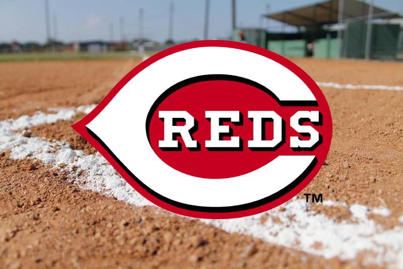
The Cincinnati Reds Logo History, Colors, Font, and Meaning
Branding isn’t just business; it’s the heartthrob of a sports fan’s allegiance—especially when it comes to iconic symbols like the Cincinnati Reds logo. This emblem of Ohio’s baseball heritage stretches beyond a mere design; it’s a saga woven into the fabric of Major League Baseball.
In analyzing this enduring icon, we’ll delve into the rich tapestry that has become the Reds’ visual identifier. Expect to unravel the timeline of logos past and explore the essence of contemporary graphic design within sports.
By article’s end, you’ll have a clearer vision of not just a logo, but a legacy, and the prowess behind creating symbols that ignite passions and foster community spirit.
Through this exploration, the spotlight falls on the fibers that bind fans and branding, spotlighting elements from Mr. Redlegs to the stitches of Reds cap insignia.
This piece holds the key to appreciating the intricate dance between tradition and modernity, ensuring that every curve and color of a logo tells the team’s ongoing story.
The Meaning Behind the Cincinnati Reds Logo
![]()
Oh, the stories that logos can tell! And the Cincinnati Reds logo? Man, it’s got layers.
Deep Dive into Its Symbolism
You see, logos aren’t just pretty designs. They’re visual tales, giving us a snapshot of a brand’s soul.
The Cincinnati Reds logo? It isn’t just about baseball. It represents the spirit, the hustle, the history, and the pride of Cincinnati.
The Passion and Energy
The baseball in the logo? It’s not just a sport. It’s the heart of Cincinnati. Every stitch, every curve, it’s like the bloodline of this city. It tells of every game, every cheer, and the undying love of the fans.
The History of the Cincinnati Reds Logo
![]()
Ah, the chronicles of time. Just like your grandma’s attic, there’s a trove of memories stored in the evolution of this logo.
The Humble Beginnings
Every legend starts somewhere, right? The Cincinnati Reds logo kicked off its journey in the late 1800s. It wasn’t all glam back then, but it had character. You could see the makings of something iconic.
Modern Twists and Turns
Through the years, this logo has undergone some makeovers. From subtle tweaks to complete redesigns, it has donned several avatars while keeping its essence alive. And oh boy, the transitions? Pure artwork!
The Colors of the Cincinnati Reds Logo
![]()
Colors, man, they’re more than just eye-candy. They’re emotions, vibes, and messages wrapped in visual delight.
The Deep Reds
That signature red? It’s fierce. It’s bold. It stands for passion, energy, and determination. It’s the same fire the players bring onto the field.
The Crisp Whites
It’s not just a filler. The white in the logo? It brings in purity, simplicity, and clarity. It’s the canvas that lets the red shine, yet holds its own.
The Font Used in the Cincinnati Reds Logo
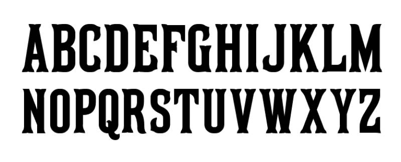
Font, the unsung hero of designs. It adds that touch of personality, you know?
The Boldness of It
There’s strength in those letters. It’s solid, commanding attention but without being too shouty. It says, “We’re here, and we mean business.”
The Curves and Nuances
Those subtle curves, the little details? They add fluidity and dynamism. It’s like a batter swinging, a dance between strength and grace.
Evolution Over the Decades
Time changes everything, even logos. And with every change, the Cincinnati Reds logo captured the essence of its era.
Vintage Vibes
Going back to the early days, the logo was simpler, raw, and full of potential. It was like watching a young player, full of dreams and promises.
The Contemporary Cool
Fast forward to today, and it’s all about striking a balance. Between history and modernity, tradition and innovation. The logo now feels fresh yet familiar.
The Impact on Pop Culture
You know you’ve nailed it when your logo becomes a part of pop culture.
Sports Merch and Beyond
From caps to tees, mugs to posters, the Cincinnati Reds logo is EVERYWHERE. It’s not just sports merchandise; it’s a lifestyle statement.
Iconic Moments
There have been times when this logo wasn’t just on the field but was making headlines, becoming synonymous with iconic moments in baseball history. Moments that fans cherish and newcomers get curious about.
FAQ On The Cincinnati Reds Logo
What is the history behind the Cincinnati Reds logo?
The Reds’ emblem has evolved, reflecting the stages of the team’s storied past. It originated with a simple ‘C’ and has traversed various iterations, each symbolizing eras, triumphs, and evolution within MLB’s branding landscape.
What do the colors in the Cincinnati Reds logo represent?
Crimson for vigor; white symbolizing purity. Together, these hues weave the visual identity of the team, standing for both passion and integrity on and off the baseball field.
Why has the Mr. Redlegs character been a part of the logo?
He’s the jovial spirit of the franchise, an emblematic figure that harks back to the 1950s. Mr. Redlegs personifies the team’s essence, the community ties, and the fun-filled nature of America’s favorite pastime.
How often has the Cincinnati Reds logo changed?
From a simplistic letter ‘C’ to the detailed Mr. Redlegs, changes occurred sporadically—often decades apart. Each rendition denotes an era of the team‘s progress, aligning with design trends and fan expectations.
Can the Cincinnati Reds logo be used for personal or commercial purposes?
Legal bounds strictly regulate the logo’s use. Without explicit permission, it’s a no-go zone. Even personal projects must respect trademark laws, safeguarding this critical element of sports branding.
What was the most controversial change to the Cincinnati Reds logo?
The 1950s saw the advent of Mr. Redlegs; this bold leap was met with mixed sentiments. But as with many changes, the unfamiliar soon became beloved, deeply intertwined with Cincinnati and baseball aficionados.
Are there any hidden meanings in the Cincinnati Reds logo?
While not crafted with secret symbols, each component is deliberate. The classic ‘C’ is well-crafted simplicity, Mr. Redlegs—a nod to history. Together, they bear the hallmark of Cincinnati’s heritage and sporting spirit.
How is the logo incorporated into Cincinnati Reds merchandise?
With the meticulous application, the logo graces everything from uniform patches to fan memorabilia. Each item is steeped in pride, imbibing the Reds’ identity into sports merchandise galore.
What are the guidelines for creating a Cincinnati Reds fan-art logo?
Creativity is welcomed, yet respect for copyrights and trademarks is paramount. Fan art must never mislead as official or infringe upon the protected emblem’s integrity.
How does the Cincinnati Reds logo compare to other MLB logos in terms of design popularity?
Standing proudly, it embodies tradition enchanting those who cherish the nostalgia of America’s baseball history. It holds its own, a timeless classic in the MLB’s branding echelons.
Conclusion
In the tapestry of MLB iconography, the Cincinnati Reds logo stands as a testament to the enduring soul of baseball in the American heartland. This visual beacon tells a tale larger than the sum of its stitches—an enduring emblem steeped in heritage and a future that promises to honor its storied past.
As the final brushstroke on this canvas, remember, logos like this aren’t just marks. They are the rallying cries that pull us into stadiums with hearts throbbing in anticipation of the next pitch. The Reds’ insignia—a harmonious blend of history, heart, and Ohio’s sporting saga—continues to stitch together generations.
Let this article be a love letter to graphic tradition, a nod to the meticulous craft behind the icons we hold dear, and an appreciation for the narratives woven into the fabric of every Reds cap insignia purchased.
Carry forward the knowledge of how identity thrives beyond the diamond – it lives in every hue, curve, and story it inspires.
If you liked this article about the Cincinnati Reds logo, you should check out this article about the St. Louis Cardinals logo.
There are also similar articles discussing the Oakland Athletics logo, the San Diego Padres logo, the Detroit Tigers logo, and the Boston Red Sox logo.
And let’s not forget about articles on the Tampa Bay Rays logo, the Seattle Mariners logo, the Pittsburgh Pirates logo, and the Los Angeles Angels logo.
Bogdan Sandu, a seasoned designer with 15 years of diverse experience, has been designing websites since 2008.
Renowned for his expertise in logo design and visual branding, Bogdan has developed a multitude of logos for various clients.
His skills extend to creating posters, vector illustrations, business cards, and brochures. Additionally, Bogdan's UI kits were featured on marketplaces like Visual Hierarchy and UI8.
Latest posts by Bogdan Sandu (see all)
- The Tecate Logo History, Colors, Font, And Meaning - 5 May 2024
- REM to PX Converter - 5 May 2024
- The Asahi Logo History, Colors, Font, And Meaning - 4 May 2024