

The Oakland Athletics Logo History, Colors, Font, and Meaning

The verdant hues and golden accents of the Oakland Athletics logo are woven into the fabric of Major League Baseball’s visual anthology. Its iconic ‘A’ crowned by a minimalist elephant stands as a sentinel of storied traditions and a beacon for future glories on the diamond.
Delving beyond the stitches of jerseys and the flutter of pennants, the emblem embodies a unique synergy between graphic artistry and athletic endeavor.
A visual odyssey awaits, unraveling the threads of this emblem’s evolution, its cultural resonance that echoes through the streets of Oakland, and the indelible mark it leaves on merchandise collected with fervor by fans near and far.
Explore the intersection of sports logos and fan engagement, uncover the alchemy in color palettes that stir emotions, and grasp the intricacies of brand identity as told through the lens of a professional immersed in the world where creativity meets sports.
In this exploration, discern the subtleties of professional baseball logo design, the rigors of intellectual property rights, and the vibrant dance of a community rallying behind a symbol.
Embark, and by this article’s conclusion, the iconic Athletics visual identity promises to reveal its stories, not just as an emblem, but as a narrative stitched into the very fabric of Major League Baseball folklore.
The Meaning Behind the Oakland Athletics Logo
![]()
Oh man, you’re diving deep into one of the most iconic baseball symbols, huh? Alright, let’s dive in together!
Symbolism and Legacy
The Oakland Athletics logo is not just a mere design. It’s screaming tradition, pride, and the spirit of the sport.
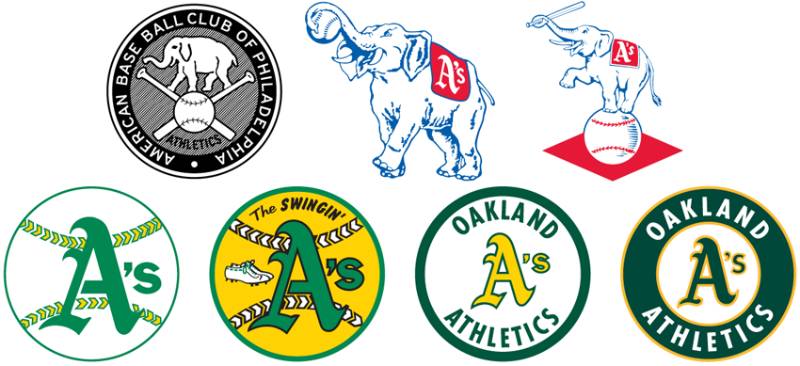
The primary logo features a white, round shape with “Oakland Athletics” written around it. In the center, there’s an elephant balancing on a baseball. Random, right? But there’s an old tale about how the Athletics got associated with an elephant.
They were once called the “white elephants.” Instead of taking offense, they owned it! And there you have it, an elephant in the logo.
Community and Resonance
For the people of Oakland, this isn’t just a logo. It’s a representation of their commitment, resilience, and strength. Like an elephant, they are strong and powerful, yet graceful.
The logo’s design brilliantly captures the essence of the Athletics and connects with the community it represents.
The History of the Oakland Athletics Logo
From Philadelphia to Oakland
The Athletics started their journey in Philadelphia and moved through Kansas City before finally settling in Oakland. The logo saw various changes, adaptations, and evolutions throughout its existence.
Key Transformations
From a simple blue elephant in 1902 to the intricate green and gold design today, the logo’s changes reflect the team’s journey. The incorporation of the elephant as a central figure and the eventual shift to the gold and green palette – it’s been a ride!
The Colors of the Oakland Athletics Logo

Colors. They’re not just shades on a canvas; they tell a story.
The Bold Green
It stands for freshness, growth, and ambition. Green screams, “Watch out world, here we come!” It’s that energy, that zest the Athletics bring to the baseball diamond.
The Striking Gold
A color that’s synonymous with value, with grandeur. It tells the story of the Athletics’ golden moments, their triumphs, and their legacy.
The Font Used in the Oakland Athletics Logo

Fonts, they’re like the voice of the logo. And the font in this one? Speaks volumes.
Typeface and Impact
The custom script font is vibrant and dynamic. It adds an element of movement, almost like the swing of a bat or the throw of a pitcher.
Team Spirit and Fans
Passion Runs Deep
Every time the crowd sees that logo, they’re reminded of the thrills, the highs, the lows, and the pure, unadulterated love for the game.
Merchandise and More

Caps, jerseys, mugs, posters – the logo has found its place in the hearts and homes of countless fans.
Logo Design – Beyond Just Aesthetics
Design Principles
Looking at the Oakland Athletics logo from a pure design perspective, it’s clear that a lot of thought has gone into it. Balance, contrast, emphasis – it’s all there!
Evolution with Time
Modern design trends may come and go, but there’s a timelessness to the Athletics logo. Yet, it’s kept in line with contemporary sensibilities, proving that good design can transcend time.
FAQ On The Oakland Athletics Logo
What does the Oakland Athletics logo represent?
The logo is steeped in history, reflecting the team’s origins. The green and gold colors signify prosperity and wealth, while the elephant symbolizes strength and an underdog spirit, a nod to an old insult that turned into a symbol of pride for the Athletics.
Why does the Oakland Athletics logo feature an elephant?
It’s an intriguing story; the elephant was a retort to a rival manager’s quip implying the team was a “white elephant” and unwanted. Yet, the Athletics embraced the elephant, converting it to a mascot of resilience, becoming a central piece of the A’s emblem.
Who designed the original Oakland Athletics logo?
The original Athletics logo was likely a collaborative design, typical of early sports branding. Its evolution has been touched by various hands over time with each iteration of the Athletics team symbol reflecting both the era and the team’s character.
When was the Oakland Athletics logo last updated?
The Athletics emblem underwent its last major update in the 1990s. Even though tweaks have occurred since to streamline and modernize the look, its essence — the green, gold, and the elephant — remains a constant fixture in the MLB team’s branding.
Are the colors of the Oakland Athletics logo significant?
Absolutely, they are more than just aesthetics. The green symbolizes the playing field, and the gold is for the “Golden State” of California. Together, they form a distinctive part of the A’s insignia, signifying the team’s geographic and historical roots.
Is the Oakland Athletics logo copyrighted?
Yes, the logo is protected intellectual property, a common practice for MLB team logos. This ensures control over the team’s trademarks and use in merchandise, guarding against unauthorized or counterfeit use and maintaining brand integrity.
Can I use the Oakland Athletics logo for my personal project?
While personal projects can be a sign of fandom, usage of the Oakland A’s insignia without permission is a no-go due to copyright laws. Always seek official clearance to avoid infringing on the team’s trademarks.
What is the story behind the change from an ‘A’ to an elephant in the Oakland Athletics logo?
The move wasn’t a straightforward change but a gradual adoption. Initially, the ‘A’ was prominent, then the elephant, once a sleeve patch, ascended to primary status. A delightful case of embracing criticism and turning it into an iconic piece of the MLB team’s identity.
How does the Oakland Athletics logo compare to other MLB logos?
It’s regarded as distinctive — the green and gold color combo is rare, and the elephant is a unique mascot in MLB. The logo distinguishes itself with a splash of individuality, standing out in the sea of Major League Baseball branding.
Where can I buy official merchandise with the Oakland Athletics logo?
Official merchandise teeming with the A’s emblem can be acquired directly from the team’s official store, MLB’s website, or authorized retailers. Ensure authenticity to support the team and enjoy the quality worthy of the Athletics’ visual identity.
Conclusion
Infused with a rich palette of tradition, the vibrancy of the St. Louis Cardinals logo speaks volumes—its iconic birds perched upon the bat, a fusion of meticulous artistry and athletic spirit. Graphic design in sports doesn’t simply stop at aesthetics; it narrates a history, ignites passion, and forges an identity that transcends the boundaries of the ballgame.
Within this crucible of passion and tradition, the Cardinals’ emblem stands as a testament to the enduring legacy that generations of fans and players have cultivated. A symbol, yes, but also a beacon, guiding the heartbeat of a city synonymous with baseball excellence.
In every stitch of their jerseys, in every cap donned by a fan, the logo endures, signifying not just a team, but a community tightly interwoven into the fabric of America’s pastime.
- A beacon of camaraderie.
- A legacy embodied.
- A timeless piece of MLB’s thriving tableau.
To hold this emblem high is to clutch a piece of history, ever unfurling its wings towards the future.
If you liked this article about the Oakland Athletics logo, you should check out this article about the St. Louis Cardinals logo.
There are also similar articles discussing the Cincinnati Reds logo, the San Diego Padres logo, the Detroit Tigers logo, and the Boston Red Sox logo.
And let’s not forget about articles on the Tampa Bay Rays logo, the Seattle Mariners logo, the Pittsburgh Pirates logo, and the Los Angeles Angels logo.
Bogdan Sandu, a seasoned designer with 15 years of diverse experience, has been designing websites since 2008.
Renowned for his expertise in logo design and visual branding, Bogdan has developed a multitude of logos for various clients.
His skills extend to creating posters, vector illustrations, business cards, and brochures. Additionally, Bogdan's UI kits were featured on marketplaces like Visual Hierarchy and UI8.
Latest posts by Bogdan Sandu (see all)
- Glow of Dusk: Sunset Color Palettes for Warm Designs - 1 May 2024
- Inspiration For Furniture Website Design: 14 Sites - 1 May 2024
- The Columbia University Logo History, Colors, Font, And Meaning - 30 April 2024