The Tampa Bay Rays Logo History, Colors, Font, and Meaning
Imagine this: the glint of the sun hits your eyes just as a powerful crack of the bat resounds through Tropicana Field. That heart-racing moment where everything hangs in balance, it’s the same electric thrill infused in the slickest curve of the Tampa Bay Rays logo.
This emblem isn’t merely an arrangement of colors and shapes; it’s a beacon of identity and pride, a distilled symbol of passion for both player and fan alike.
As the fabric of the Rays’ uniform threads through the grand tapestry of Major League Baseball, so too does the importance of a logo in representing the team’s spirit and history.
Delving deep, this article unravels the genius of this emblem’s design, exploring the evolution and sports branding that shape the visual harbingers of our favorite teams.
By the final punctuation, you’ll grasp not just the visual identity of the Rays but the strategic stitch-work behind crafting a professional sports branding icon that rallies a wave of fan merchandise and baseball memorabilia collectors.
Prepare: to embrace the sunburst, to decode the hues, to chart the journey of a logo that sails high over the diamond.
The Meaning Behind the Tampa Bay Rays Logo
![]()
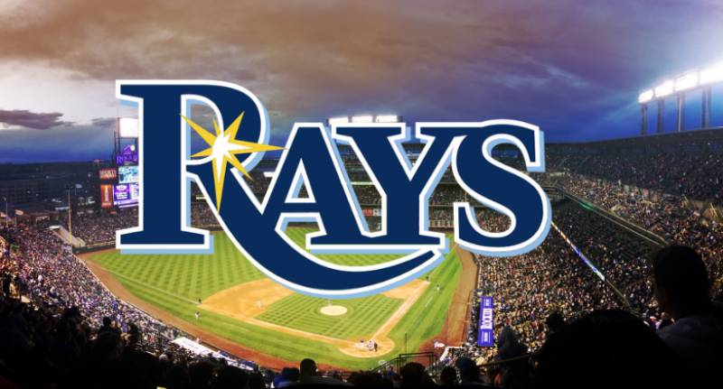
Yo, when you glance at the Tampa Bay Rays logo, what strikes you? It’s more than just a piece of artwork, right? It’s a symbol. Dive with me, and let’s decrypt this iconic emblem.
Deep Blue Sea Emotion
See that brilliant shade of blue? It doesn’t just represent water. It’s about the emotion.
Tampa Bay is surrounded by water, and this blue screams of the depth, the mystery, the power, and the calmness of the sea. The logo envelops the essence of the city and the mood of the team.
Sunshine Connection
Now the bright yellow. Tampa is known for its sunny disposition. The splash of sunray in the logo? It ain’t just for show. It’s symbolic of the city’s sunny vibes and the optimism of the team.
The History of the Tampa Bay Rays Logo
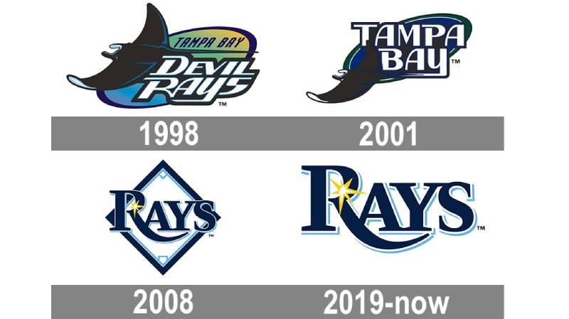
Time for a flashback!
Early Days: A Fresh Identity
Way back, when the team first kicked off, they sported a different vibe. The original logo? It was aquatic, with a literal ray. It symbolized their roots, their connection to the waters of Tampa Bay.
Evolution: From Sea Creatures to Sunrays
But here’s the deal – things evolve. And so did the Rays. They embraced a new identity, transitioning from the marine theme to sunrays. It was a transformation – keeping the essence but embracing a broader meaning.
The Colors of the Tampa Bay Rays Logo

Colors ain’t just about aesthetics, folks.
The Navy Blue
Again, it’s the sea, the depth, and the mystery. But it’s also strength and determination. Navy blue speaks of resilience, a nod to the team’s never-give-up spirit.
The Light Blue & Yellow
And then, there’s that softer blue and the vibrant yellow. A blend of tranquility and exuberance. It’s like a chill day at the beach with sudden splashes of energetic waves. The yellow? That’s the optimism, the golden rays of hope.
The Font Used in the Tampa Bay Rays Logo

Ah, typography. The unsung hero of designs.
Bold & Energetic
You won’t find any delicate, cursive letters here. Nah, the Rays go for something solid. Bold, yet friendly. It’s dynamic, suggesting action, movement, and energy.
Simplicity Speaks
Simple, straightforward fonts have a voice. And for the Rays, it’s saying, “We’re direct, we mean business, but we’re here for the love of the game.”
Fan Connection: Beyond the Logo
Ever noticed how fans wear the logo like a badge of honor?
A Symbol of Pride
For the locals, the logo isn’t just a team symbol. It represents Tampa. Its waters, its sunshine, its spirit. It’s a shared identity.
A Rallying Cry
In stadiums, that logo is more than a design. It’s a rallying cry. A shared symbol of hope, of nerve, of shared moments of euphoria and heartbreak.
Global Recognition: The Impact
Every logo has a reach, and boy, does this one spread its wings (or should I say, rays?).
The MLB Stage
In Major League Baseball, logos are identity markers. The Rays logo stands out, making its mark in the sea of MLB emblems.
Beyond Baseball
Merchandise, pop culture mentions, fan tattoos! The Rays logo isn’t just confined to baseball. It’s a part of the broader cultural canvas. And it’s pretty rad seeing how far a simple design can travel, right?
FAQ On The Tampa Bay Rays Logo
What’s the story behind the Tampa Bay Rays logo?
The logo captures the essence of the team and the area – those rays of sunshine synonymous with Florida and the fierce, glimmering devil ray, a nod to the region’s marine life. Intricately balancing aesthetics and roots, it symbolizes athleticism and local pride.
How has the Tampa Bay Rays logo evolved over time?
From a dark blue creature leaping from the sea to the current sleek design with a burst of light, their logo reflects the team’s metamorphosis. It’s a journey from literal to abstract, increasingly focused on the “ray” of sunlight and modern visual identity.
What do the colors of the Tampa Bay Rays logo represent?
Blue for the sea, yellow for the sun—these colors intertwine to epitomize the vibrancy and spirit of Tampa Bay. They’re a harmonious blend that channels the energy and enthusiasm that the Rays bring to the ballpark.
Why did the Tampa Bay Rays change their logo?
Change signifies growth, a new direction. The overhaul aligns with a refreshed brand strategy, aiming to resonate more with fans and convey a dynamic future. It was a strategic move as much about marketing as it was about baseball.
Who designed the Tampa Bay Rays logo?
Professional branding teams often helm such redesigns, though the Rays haven’t publicly detailed the individual or agency behind the emblem. The creator’s blend of marketing savvy and graphic artistry is undeniably astute.
Are there alternative versions of the Tampa Bay Rays logo?
Absolutely. The team has alternate logos including a stylized “TB” and a version featuring a ray of light sans the text—diverse assets for varying contexts, from merchandise to digital media. It’s all part of a broader branding ecosystem.
What is the significance of the sunburst in the Tampa Bay Rays logo?
The sunburst is a beacon of warmth, vitality, and relentless optimism. It’s a universal icon that reaches beyond baseball, signaling new beginnings and the promise of a bright future, a daily spectacle that Tampa Bay residents know well.
Is the Tampa Bay Rays logo trademarked?
Undoubtedly. In the competitive world of professional sports, protecting one’s brand is paramount. The logo, like those of all MLB franchises, is legally shielded against unauthorized use, upholding its value and uniqueness.
How do the Tampa Bay Rays logo and branding impact fan engagement?
Robust branding encapsulated in a logo can evoke strong emotions, kindle loyalty, and bolster the fan experience. It’s more than a static image; it’s a rallying point, an emblem worn proudly by those who stand by the team’s side.
How does the Tampa Bay Rays logo compare to other MLB team logos?
It stands as a bastion of modern design, emphasizing simplicity and symbolism over intricate details. While each team’s logo holds its particular charm, the Rays’ version speaks to the era’s design sensibilities—clean, bold, and unfettered by the superfluous.
Conclusion
Embarking on the visual odyssey of the Tampa Bay Rays logo, one can’t help but admire the convergence of creativity and strategy. A salute to both sky and sea, the emblem stands as a hallmark of team identity within the grand arena of Major League Baseball. It’s far more than an exercise in aesthetics; it’s a crafted narrative in hues of blue and yellow, encapsulating Tampa Bay’s vibrancy.
This journey through the evolution of a logo has been as revealing as the sunburst is radiant. The meticulous design process, the nuances of fan engagement, and the strategic rebranding endeavors—these layers combine, forming a compelling story of tradition, transition, and anticipation.
In summary, whether stitched on a jersey, emblazoned across fan merchandise, or proudly flown as a flag outside Tropicana Field, the Rays’ logo remains an unwavering symbol of the enduring bond between a team, its fans, and the community they call home.
If you liked this article about the Tampa Bay Rays logo, you should check out this article about the St. Louis Cardinals logo.
There are also similar articles discussing the Oakland Athletics logo, the Cincinnati Reds logo, the San Diego Padres logo, and the Detroit Tigers logo.
And let’s not forget about articles on the Boston Red Sox logo, the Seattle Mariners logo, the Pittsburgh Pirates logo, and the Los Angeles Angels logo.
Bogdan Sandu, a seasoned designer with 15 years of diverse experience, has been designing websites since 2008.
Renowned for his expertise in logo design and visual branding, Bogdan has developed a multitude of logos for various clients.
His skills extend to creating posters, vector illustrations, business cards, and brochures. Additionally, Bogdan's UI kits were featured on marketplaces like Visual Hierarchy and UI8.
Latest posts by Bogdan Sandu (see all)
- The Bethesda Logo History, Colors, Font, And Meaning - 28 April 2024
- Out of This World: Space Color Palettes for Cosmic Designs - 28 April 2024
- The Bungie Logo History, Colors, Font, And Meaning - 27 April 2024