The Seattle Mariners Logo History, Colors, Font, and Meaning
Drenched in the hues of aqua and navy, a beacon of the Pacific Northwest, the Seattle Mariners logo transcends simple design. It encapsulates passion, unity, and the undying spirit of baseball in Seattle.
Through its evolution, from the iconic trident to the modern compass rose, each iteration narrates a chapter of the city’s love affair with its beloved Mariners.
In the heart of T-Mobile Park, this emblem isn’t just stitched onto jerseys—it’s etched into the heartbeat of a community. Marked by storied athletes like Ken Griffey Jr.
and Edgar Martinez, the logo becomes synonymous with legend. Mariners’ insignia is a legacy, a brand, an identity proudly displayed by fans from the bustling Pike Place Market to the serene Olympic Peninsula.
By the article’s conclusion, a veil will be lifted, offering enlightenment on how sports branding intertwines with city culture, the craft behind creating a timeless symbol, and how a single image can capture the unyielding spirit of the team it represents.
Dive into an ocean of rich history and color, where each curve of the “S” tells its own tale.
The Meaning Behind the Seattle Mariners Logo
![]()
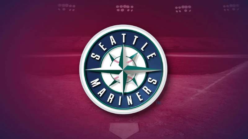
When you dive deep into the Seattle Mariners logo, there’s more than just a snazzy design. There’s a story, a tale, and a lot of emotions wrapped up in that icon.
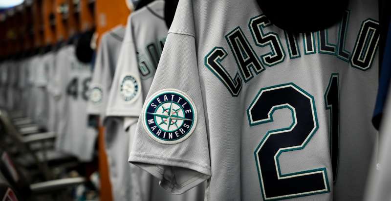
The Compass Rose
One of the first things people notice is the compass rose. A fitting symbol, isn’t it? Mariners, after all, are sailors, and what do sailors use? Compasses!
This isn’t just about navigation on the waters, but also represents the team’s aspiration to navigate their way to victory in the baseball world.
The Baseball
The main element of the logo is, of course, the baseball. It’s the heart and soul of the game, representing the pure love and passion for baseball.
The History of the Seattle Mariners Logo
![]()
Dive into the archives, and you’ll realize the Mariners logo has sailed through time, evolving as it went.
Early Days
When the team started out, they had a logo that’s a world apart from what we see now. Change is inevitable, right? It began as a simple design, but as the team grew, so did their emblem.
Modern Evolution
The present-day design is a product of years of refinement, representing the Mariners’ journey through the highs and lows of baseball seasons.
The Colors of the Seattle Mariners Logo
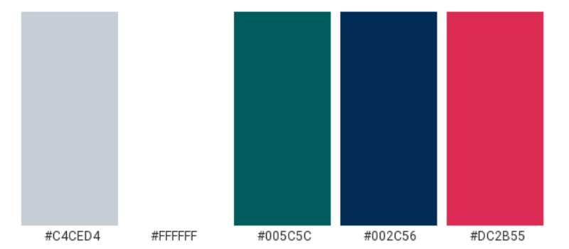
Colors aren’t just shades; they’re feelings, vibes, and emotions.
Navy Blue
A dominant shade, navy blue, resonates with strength and determination. It’s the kind of steadfastness you’d want in a team, don’t you think?
Teal
Teal’s an interesting choice. It’s fresh, vibrant, and has that zesty energy, mirroring the spirit of the players and the fans.
The Font Used in the Seattle Mariners Logo
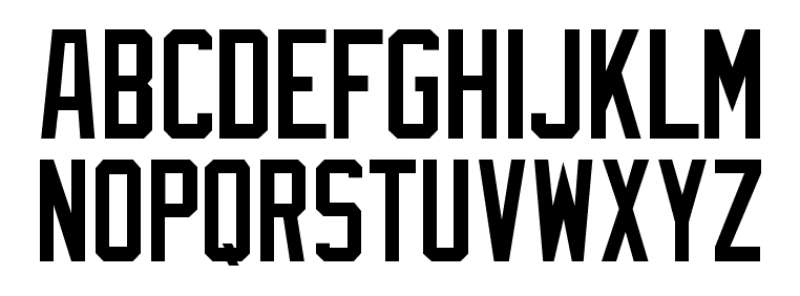
Fonts, believe it or not, speak volumes. They’re not just letters; they’re personalities.
Sleek and Strong
The font used for the Seattle Mariners is both sleek and powerful, representing a team that’s both strategic and fierce on the field.
How the Logo Has Influenced Merchandise
You might have noticed, but Mariners merch is EVERYWHERE. And why not? It’s snazzy.
Apparel Game
Caps, jerseys, tees – the logo breathes life into them all. It transforms everyday clothing into a statement piece. Talk about wearable pride!
Souvenirs and Memorabilia
From keychains to posters, the Seattle Mariners logo has become a collector’s dream. That compass rose makes for some fantastic designs!
Fan Perspectives on the Logo
The fans, the true heart of any sport, have their own stories tied to the logo.
The Nostalgia
For many, it’s not just a logo. It’s summer evenings, the cheer of the crowd, the thrill of a home run. It’s memories.
Modern Fans and Fresh Views
New-age fans bring in a fresh perspective. For them, the logo is about contemporary baseball, digital games, and social media banter.
FAQ On The Seattle Mariners Logo
What does the Seattle Mariners logo represent?
The Mariners logo, a bold compass rose encircling an “S,” symbolizes maritime heritage and a direction-forward mindset. It unites the city’s seafaring roots with the pioneering spirit of its baseball community.
How has the Seattle Mariners logo evolved over time?
From the initial trident “M” to the current compass, the logo matured. Reflecting changes in sports branding, it now incorporates Northwest green and a graphic representing Seattle’s nautical culture and love for its MLB team.
Who designed the Seattle Mariners logo?
The logo’s original version was a collaboration of MLB’s creative team and local contributions, while later updates were often crafted by specialized brand agencies interfacing closely with Mariners’ management to encapsulate the franchise history aptly.
What are the official colors of the Seattle Mariners logo?
Mariners’ official colors are Northwest green, navy blue, silver, and white. These emblematic colors in their logo underscore the regional affiliation and distinguish their team uniforms and merchandise.
Can the Seattle Mariners logo be used for personal or commercial use?
Generally, the logo is trademarked and its usage without consent can invite legal repercussions. Personal, non-commercial usage, like fan art, is sometimes tolerated, however, commercial use requires explicit permission from the team.
What symbolism is present in the elements of the Mariners logo?
The compass rose represents navigational excellence, the color scheme draws from Puget Sound’s deep blues and lush greens, while the “S” ties back to the city itself. Collectively, these elements render the logo a microcosm of Seattle’s identity.
Are there alternative versions of the Seattle Mariners logo in use?
Yes, the team has alternate logos, like a standalone compass or the “S” without the compass, used situationally for various Jersey designs or fan gear.
Why was the trident removed from the Seattle Mariners logo?
The trident was perceived by some as symbolizing bad luck due to its downward orientation and was eventually replaced to rejuvenate the team’s identity and image in conjunction with emerging sports logo design trends.
Is the Seattle Mariners logo considered iconic?
Certainly, it’s become an MLB insignia recognized beyond the realms of baseball for its intrinsic link with Seattle’s culture, contributing to its iconic status.
How does the Seattle Mariners logo compare to other MLB team logos in terms of design?
It distinguishes itself through maritime themes uncommon in other MLB logos, reflecting Seattle’s unique local character and standing out in the league’s brand landscape.
Conclusion
With each stitched thread of the Seattle Mariners logo, a story is told. A story not just of a team, or a city, but of a franchise history rich with triumph and tribulation. This emblem—emboldened with Northwest green and profound navy—mirrors Seattle’s intimate connection to both earth and sea, a symbol etched into the cultural fabric.
The journey across decades—shifts from the trident to the compass—reflects an evolution, a brand’s voyage through design and time. These changes aren’t simply aesthetic but carry the weight of progress, of Major League Baseball‘s ever-spinning narrative.
In conclusion, when one gazes upon this logo, you are not just seeing an icon; you are witnessing a beacon for the fans, a masthead for the players past and present, and a compass guiding the relentless pursuit of greatness. The Mariners’ compass symbol doesn’t just mark where they’ve been; it points toward the infinite possibilities of where they can go.
If you liked this article about the Seattle Mariners logo, you should check out this article about the St. Louis Cardinals logo.
There are also similar articles discussing the Oakland Athletics logo, the Cincinnati Reds logo, the San Diego Padres logo, and the Detroit Tigers logo.
And let’s not forget about articles on the Boston Red Sox logo, the Tampa Bay Rays logo, the Pittsburgh Pirates logo, and the Los Angeles Angels logo.
Bogdan Sandu, a seasoned designer with 15 years of diverse experience, has been designing websites since 2008.
Renowned for his expertise in logo design and visual branding, Bogdan has developed a multitude of logos for various clients.
His skills extend to creating posters, vector illustrations, business cards, and brochures. Additionally, Bogdan's UI kits were featured on marketplaces like Visual Hierarchy and UI8.
Latest posts by Bogdan Sandu (see all)
- After Dark: Night Color Palettes for Mysterious Designs - 27 April 2024
- The Capcom Logo History, Colors, Font, And Meaning - 26 April 2024
- Earth Color Palettes Grounded in Nature: 40 Examples - 26 April 2024