The Boston Red Sox Logo History, Colors, Font, and Meaning
Imagine clutching the fluttering ticket that leads you through the hallowed gates of Fenway Park. There, the crisp Boston air carries with it the electrifying buzz of anticipatory fans—a sea of red and navy rallying beneath the heraldic symbol of their allegiance: the Boston Red Sox logo.
This storied emblem is no mere design; it’s the heartbeat of Red Sox Nation, a legacy stitched into the fabric of the city and its beloved baseball heritage.
Diving into the essence of this iconic sports emblem, you’re embarking on a journey through the annals of Major League Baseball history and the evolution of team branding.
With every curve of the “B” and hue of its colors, stories of championships, legends like Ted Williams and David Ortiz, and the echoes of “Sweet Caroline” resonate.
By article’s end, you’ll unearth the roots of the Boston Red Sox logo, uncover the influences of baseball logo design, and appreciate the power of symbols in forging an unbreakable sports brand identity.
Prepare to decipher the chapters of nostalgia, pride, and fierce loyalty encoded within this emblematic insignia.
The Meaning Behind the Boston Red Sox Logo
Let’s break this down, folks. The Boston Red Sox logo isn’t just some random graphic. No siree! There’s a story here, layers of significance that scream “Boston Pride”.
Deep Dive into the Socks
So, two socks right? Maybe it sounds basic, but there’s this killer underlying theme. Those socks? They’re not just clothing items. They’re symbols. Of teamwork. Of the grind. The endless sweat and perseverance that the team brings every game.
Beantown Pride
Boston isn’t called “Beantown” just because it’s catchy. Beans are all about nourishment, sustainability, and, of course, Boston’s rich history. That logo represents more than a team; it’s a nod to the city’s heart and soul.
The History of the Boston Red Sox Logo
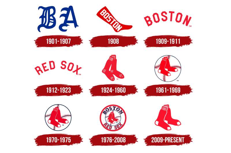
Diving back, wayyy back. The logo has seen its fair share of revamps.
Vintage Vibes
The early days? Very vintage. We had a dude holding socks. Yeah, literal representation. But as decades rolled, the logo became sleeker, more iconic.
Modern Glow-Up
Fast forward to now, and you see the emblem we all know and love. The twin socks, the bold red, and that crisp font. It’s like watching your scrappy little brother grow into a dashing gentleman.
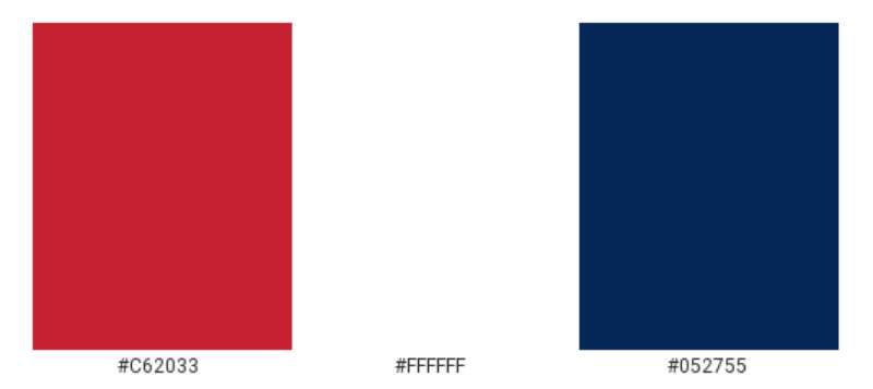
The Colors of the Boston Red Sox Logo
Red, Red, and More Red
There’s no ignoring that bold shade. It’s the hue of passion, energy, and let’s be real, it’s right there in the name. The red isn’t just a color choice; it’s a battle cry.
Subtle Blue
While red dominates, there’s this calming blue that complements it. Represents the waters, the horizon, and adds depth to the logo. Balances out the fierce intensity of the red.
The Font Used in the Boston Red Sox Logo
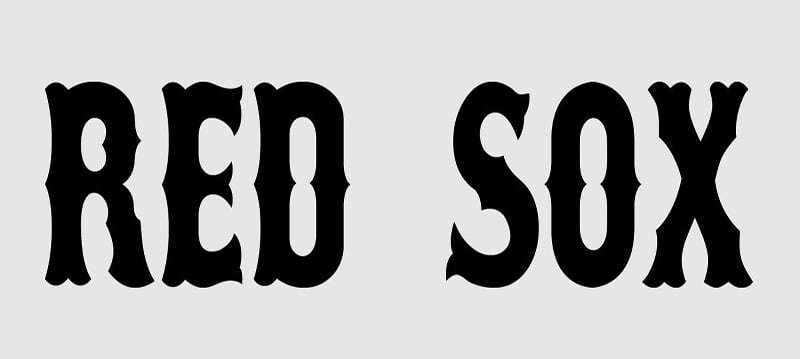
Fonts, am I right? They can make or break a design.
Classic Yet Stylish
The letters? They’re neat, upright, a touch old-school, but with modern swag. It’s like pairing vintage sneakers with a snazzy new suit.
Why It Works
The font stands strong. No frills. It’s a declaration, a statement. Every time you see it, you know the deal. You’re in Red Sox territory now.
The Evolution Over the Years
From Literal to Symbolic
There was a time when logos were all literal. But with time, the Red Sox emblem moved from an obvious depiction to the sleek symbol it is today.
The Times They Are A-Changin’
Cultural shifts, design trends, fan feedback – all these played roles in the logo’s tweaks and changes. Like a favorite song getting a fresh remix.
Fan Tributes and Spin-offs
Tattoos and Memorabilia
Oh, the inks I’ve seen! From tiny sock tattoos to grand murals of the emblem, fans show their loyalty in wild ways.
DIY Versions
Hand-painted jackets, custom kicks, and even bedazzled caps – the creativity of the fandom knows no bounds. They’ve taken the logo and made it their playground.
FAQ On The Boston Red Sox Logo
What’s the history behind the Boston Red Sox logo?
The logo’s roots are as storied as the team itself, emerging from the early 20th century. It evolved from simple typography to the iconic “B” representing not just the team, but Fenway Park, and the spirit of Boston’s baseball legacy, underscored by a rich palette of red and navy.
Why does the logo predominantly feature the letter ‘B’?
Emphasizing ‘B’ symbolizes Boston, binding the team to its home city. This singular letter encapsulates an entire community’s identity, reflecting a unifying force within Red Sox Nation and the broader realm of Major League Baseball.
Has the Boston Red Sox logo changed over the years?
Yes, it’s undergone several redesigns, reflecting sports brand identity trends and the team’s transformations.
These changes are touchstones of their eras, reflecting the ebb and flow of design language within the baseball uniforms and team merchandise over generations.
What colors are used in the current logo?
The present logo leverages a timeless duo of red and navy. These colors are synonymous with the Red Sox heritage, stirring a pride that’s palpable in every corner of New England sports culture and every stitch of authentic Red Sox apparel.
Are there any hidden meanings in the logo?
While not explicitly designed with hidden features, the logo’s elements evoke feelings of unity and tradition. Each part—the font, the colors—it all resonates with the history of the team and the nostalgic memories of the Fenway Park experience.
How does the logo reflect the team’s brand and culture?
The logo is a distillation of the team’s brand and culture, heralding a rich history of World Series Championships and legendary baseball Hall of Fame inductees. It’s more than a brand; it’s a cultural nexus that fans wear as a badge of honor.
Does the logo differ on various Red Sox merchandise?
While consistent in essence, the logo’s rendition may vary subtly across products.
This flexibility allows the emblem to adapt to diverse forms—from jerseys and caps to sports memorabilia—while maintaining its core identity that taps into the heart of the sports fan gear market.
What was the original logo like?
The original logo was typographic, showcasing the full “Boston Red Sox” name in a traditional font. Devoid of today’s striking simplicity, it mapped out a starting point for an evolution that would journey through varying aesthetic phases within baseball logo design.
Are there alternate versions of the Red Sox logo used officially?
Yes, the team has employed alternate logos over time. These include variations of the “hanging socks” emblem and throwbacks for special occasions. Each iteration is a nod to the past while embracing the dynamism of modern sports logo evolution.
Why is the Red Sox logo so well-recognized in sports?
The iconic status of the Red Sox logo stems from a dynasty of excellence on the diamond, an unwavering fanbase, and the universal appeal of its clean, bold aesthetic. It’s a graphic testament to the Red Sox’s indelible imprint on the tapestry of American sports franchises.
Conclusion
Peeling back the veil on the Boston Red Sox logo, we’ve danced through a timeline woven with threads of red and navy, resonating with frissons of nostalgia and echoes of triumph. The journey has carried us from Fenway Park’s timeless arches to the contemporary clutches of sports logo evolution. We’ve dissected how a simple “B” can become entwined with the cultural fabric of not just a city but an entire following—each stitch a story, every color a chapter.
In closing this exploration, the realization dawns that team insignia—these emblems we’ve examined—aren’t just marks. They’re snapshots capturing the zeitgeist of eras, the prowess of legends, and the collective breath of fans mid-cheer. The logo, as we part ways, isn’t merely an image. It’s history, identity, and legacy, forever entwined with the historic baseball franchises and held dear by Red Sox Nation.
If you liked this article about the Boston Red Sox logo, you should check out this article about the St. Louis Cardinals logo.
There are also similar articles discussing the Oakland Athletics logo, the Cincinnati Reds logo, the San Diego Padres logo, and the Detroit Tigers logo.
And let’s not forget about articles on the Tampa Bay Rays logo, the Seattle Mariners logo, the Pittsburgh Pirates logo, and the Los Angeles Angels logo.
- The Asahi Logo History, Colors, Font, And Meaning - 4 May 2024
- Playtime Perfection: Fun Kids Color Palettes - 4 May 2024
- PX to REM Converter - 4 May 2024


