The Pittsburgh Pirates Logo History, Colors, Font, and Meaning

Imagine the surge of the crowd, a sea of black and gold; it’s more than just a game, it’s a legacy, a symbol etched into the heart of the city. Here, the Pittsburgh Pirates logo stands not simply as a design but as an emblem of unwavering spirit and storied history.
This article unfurls the tapestry behind the iconic Jolly Roger flag, delving deep into the fibers that bind the Buccos branding with Pittsburgh sports culture.
By journey’s end, unravel how a logo transcends the mundane, embedding itself into the fabric of sports branding identity. Explore the evolution of this quintessential sports logo, its impact on fan apparel and accessories, and its influence extending beyond the diamond.
This piece is your compass to navigate the swashbuckling symbolism aboard the Pirates’ ship—a symbol known to every denizen of Pittsburgh and respected across the Major League Baseball landscape.
Prepare to hoist the colors high and sail through the story of the Pittsburgh Pirates—where design meets devotion.
The Meaning Behind the Pittsburgh Pirates Logo
Deep Dive into Symbols
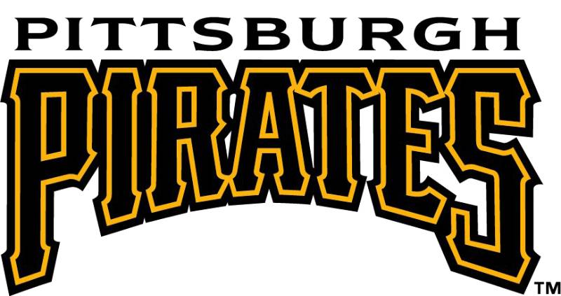
The Pittsburgh Pirates logo isn’t just a simple design – nope! It’s like a treasure chest, brimming with stories and hidden gems. At a first glance, you might think, “Ah, cool, pirates!” But there’s more to it than just a swashbuckling seafarer.
Pirates represent a certain freedom, a challenge to the status quo. Similarly, the Pittsburgh Pirates – the baseball team – wanted to represent that boldness, that sense of adventure.
Their logo captures the spirit of the sea, the adventure of the unknown, and the challenge that comes with facing fierce competitors.
The Cap and Crossbones
I mean, c’mon. That cool cap? Those crossed bats? They aren’t just there for decoration. The cap, with its confident tilt, speaks volumes about the team’s attitude.
Always up for a challenge, always raring to go. The crossed bats? They’re a nod to the weapons of choice in baseball and a clever twist on the traditional pirate’s skull and crossbones. It’s like saying, “Yeah, we’re here to play, but we play hard.”
The History of the Pittsburgh Pirates Logo
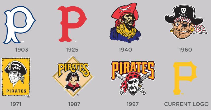
Once Upon A Time…
So, let’s time-travel a bit. Way back, the logo was, well, different. Over time, it evolved, adapted, and transformed to match the team’s journey and identity.
The Evolution
From the very first emblem to the present day, you can trace the changes in design philosophy and trends. It’s like watching the pages of a style magazine flip but in slow motion.
There were times the design leaned minimalistic, and times it screamed, “Look at me!” But through it all, the essence remained. That fierce Pirate spirit.
The Colors of the Pittsburgh Pirates Logo
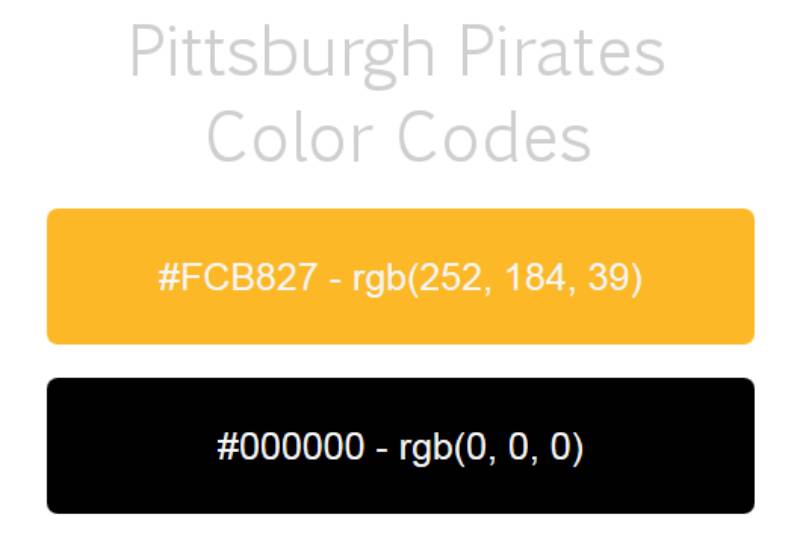
Black and Gold, Baby!
Black and gold. Ever wondered why? Black screams power, authority, strength. It’s the color of determination, of focus. Then there’s gold. Ah, gold! It stands for victory, luxury, and quality. Combined, these colors perfectly encapsulate the essence of the Pittsburgh Pirates.
Emotion in Colors
Every time the team takes the field, those colors send a message. A message of confidence, of promise, and of a never-dying spirit.
The Font Used in the Pittsburgh Pirates Logo
Typography Tells Tales
Let’s chat about the font, shall we? The Pittsburgh Pirates logo boasts a font that’s robust, bold, and impossible to ignore. It demands attention.
Details, Details, Details
The small nuances, the way the letters curve, the weight – it all adds character. It speaks of a legacy and a future. Every letter, every curve is a testament to the team’s identity.
The Influence on Pop Culture
When Baseball Meets Fashion
Ever seen folks rocking Pirates’ merch even if they’re not die-hard baseball fans? The logo, with its iconic design, has become more than just a symbol for a team. It’s now a fashion statement, a symbol of the city’s spirit, and a nod to a rich history.
In Film and Music
The Pittsburgh Pirates logo has also found its way into various movies and songs, not just as a representation of baseball, but as an emblem of gritty determination and the city’s undying love for its team.
The Art of Designing a Sports Logo
Balancing Tradition with Innovation
Designing for sports isn’t just about making something look good. It’s about capturing a legacy. The Pittsburgh Pirates logo is a testament to this balance. While staying true to its roots, it’s also evolved with the times.
The Emotion Behind Every Stroke
A logo represents hope, joy, tears, victories, and even losses. It’s not just a piece of art; it’s a piece of history. The Pittsburgh Pirates logo encapsulates a roller coaster of emotions and a journey that’s spanned decades.
FAQ On The Pittsburgh Pirates Logo
What’s the history behind the Pittsburgh Pirates logo?
The Pirates logo, a storied emblem steeped in tradition, has sailed through time since the early 1900s. Evolving from simplistic designs to the modern, bold Jolly Roger, it encapsulates the team’s tenacious spirit and MLB heritage—a visual anchor in sports branding identity.
Why does the logo feature a pirate?
Pirates are synonymous with daring and adventure. The logo mirrors this ethos, capturing the team’s fighting spirit—Pittsburgh sports culture personified.
Timelessly linking the pirate ship symbol with baseball, it forges a unique identity within the Major League Baseball realm.
Are there any controversies linked to the Pirates logo?
Over decades, controversy remained distant from the Pirates’ ensign. Its iterations have steered clear of contentious waters, focusing on heritage and community rather than divisive imagery—a symbol of unity in the dynamic seas of sports merchandising and team allegiance.
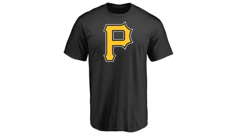
How has the Pirates logo changed over time?
The logo has sailed through various incarnations—initially donning a simple but striking “P” to today’s distinctive pirate ship symbol.
Each iteration carefully woven into the sports logo evolution, reflective of the era and the fan’s expectations, it stands as an ever-dynamic token of the franchise.
What do the colors of the logo represent?
Black and gold—the war colors of Pittsburgh. From steel mills to stadiums, these hues paint the town’s resilience and pride. Not just colors, they are badges of honor for a city inseparable from its sports icons, worn by players and Pirates fans alike.
Is there a special meaning to the logo’s font?
Crisp, intimidating, the logo’s font is no happenstance. It’s chiseled to echo shouts of victory, with sharp serifs that hint at swashbuckling adventure. A typeface not merely read but felt, capturing the hearts of those who treasure baseball’s lore.
How often is the logo updated or altered?
Alterations come not on a whim but with thoughtful consideration. The logo maintains continuity with the past while embracing the future—a delicate dance between brand identity and modern aesthetics, updated only when the narrative of the team or fan gear trends necessitate it.
Are there other versions of the Pirates logo for different merchandise?
Indeed, the Pirates emblem decks a fleet of merchandise. Each tailored for the item it adorns—from classic tees to contemporary caps, ensuring the logo radiates the Pirates’ essence, whether etched on a keychain or emblazoned across a jersey’s back.
How do fans feel about the Pirates logo?
To the layperson, it’s just a logo; to Pirates fans, it’s a rallying cry. The Jolly Roger summons a sense of belonging, a communal passion symbolized in black and gold. Treasured as a piece of personal identity, it carries colossal fanfare.
What’s the impact of the Pirates logo on Pittsburgh’s identity?
Beyond the diamond, this emblem is Pittsburgh’s silent sentinel. Not simply within PNC Park—but throughout the cityscape, it’s a beacon of unity, a testament to the undying spirit woven through Pittsburgh sports culture and beyond.
Conclusion
In essence, the Pittsburgh Pirates logo—an emblem, a hallmark, a storied crest—transcends mere graphical representation to embody the rich tapestry of a Major League legacy. It’s more than stitches on a cap or a decal on a jersey; it’s a badge of honor for every Pittsburgher, a symbol that resonates with the echoes of PNC Park.
- The black and gold stand boldly,
- A city’s endurance,
- A team’s heart,
- The fan apparel a canvas,
- Each stitch, a note in the symphony of Pittsburgh sports culture.
Crafting this narrative has unfolded layers, unwrapped the essence behind the visual roar of the Buccos branding, and perhaps offered a new vantage point for those who stand, hands over hearts, when the Pirates take to the field. It’s a circle, a cycle of design, meaning, and identity, beautifully interwoven and reflecting back on those who bear its mark. May the Jolly Roger continue to unfurl, majestically, eternally.
If you liked this article about the Pittsburgh Pirates logo, you should check out this article about the St. Louis Cardinals logo.
There are also similar articles discussing the Oakland Athletics logo, the Cincinnati Reds logo, the San Diego Padres logo, and the Detroit Tigers logo.
And let’s not forget about articles on the Boston Red Sox logo, the Tampa Bay Rays logo, the Seattle Mariners logo, and the Los Angeles Angels logo.
Bogdan Sandu, a seasoned designer with 15 years of diverse experience, has been designing websites since 2008.
Renowned for his expertise in logo design and visual branding, Bogdan has developed a multitude of logos for various clients.
His skills extend to creating posters, vector illustrations, business cards, and brochures. Additionally, Bogdan's UI kits were featured on marketplaces like Visual Hierarchy and UI8.
Latest posts by Bogdan Sandu (see all)
- Rainbow Color Palettes for Joyful Designs - 29 April 2024
- The Bethesda Logo History, Colors, Font, And Meaning - 28 April 2024
- Out of This World: Space Color Palettes for Cosmic Designs - 28 April 2024